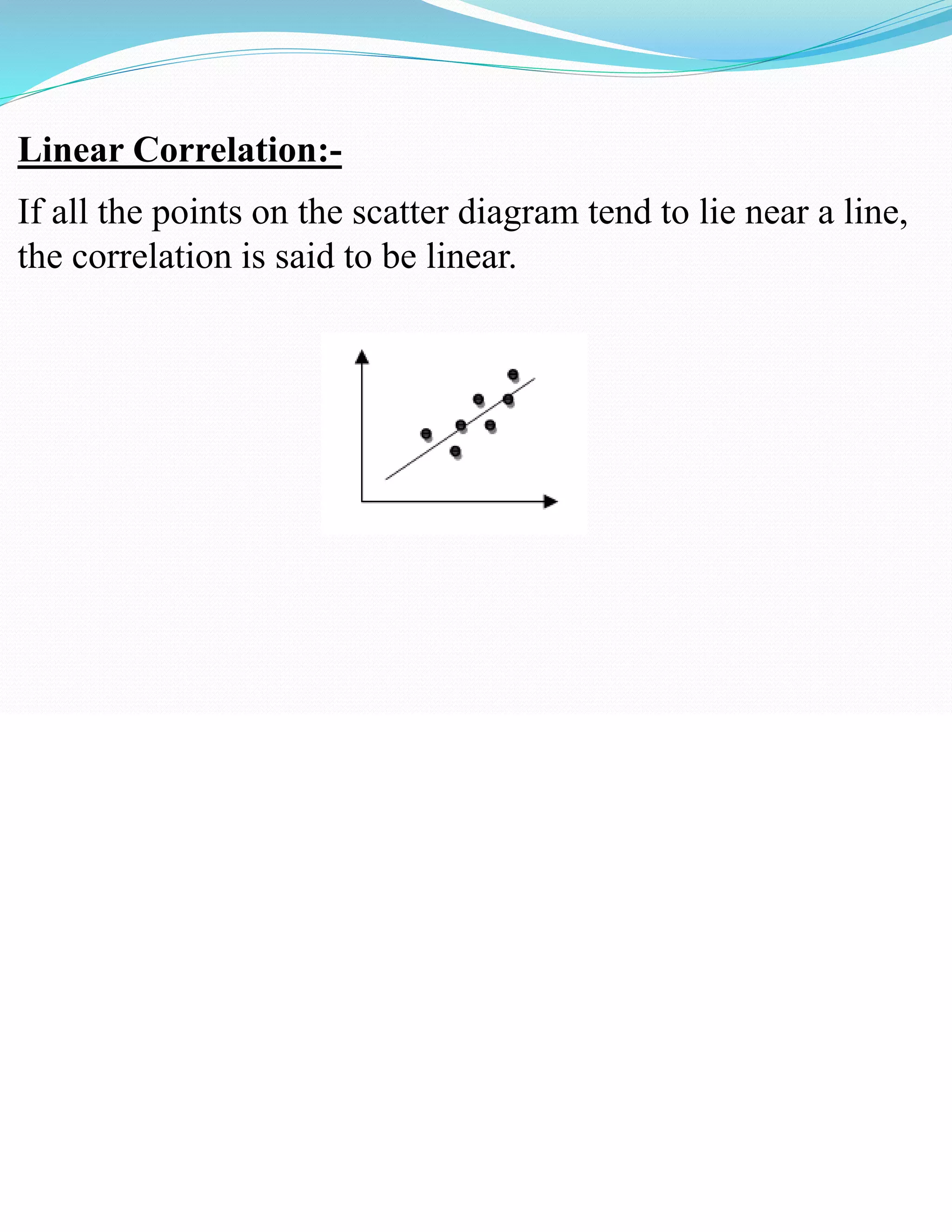
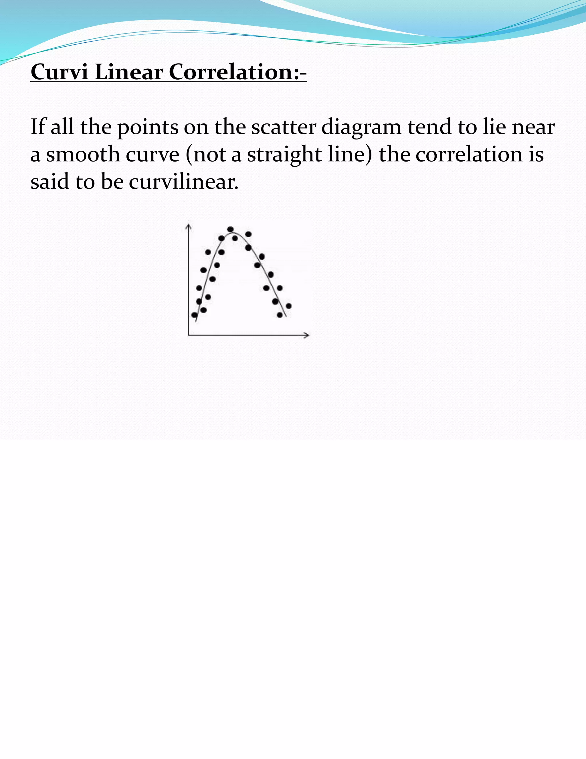
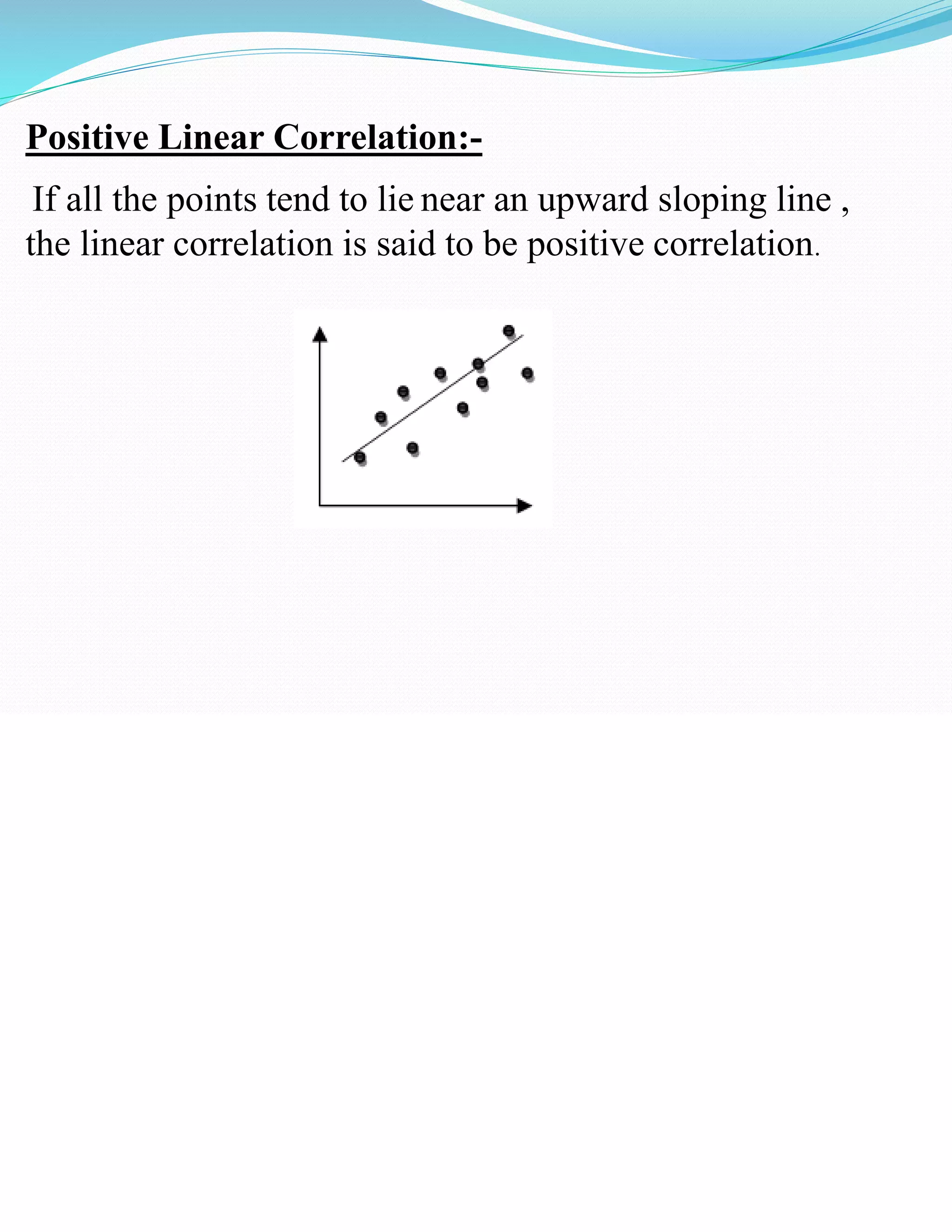
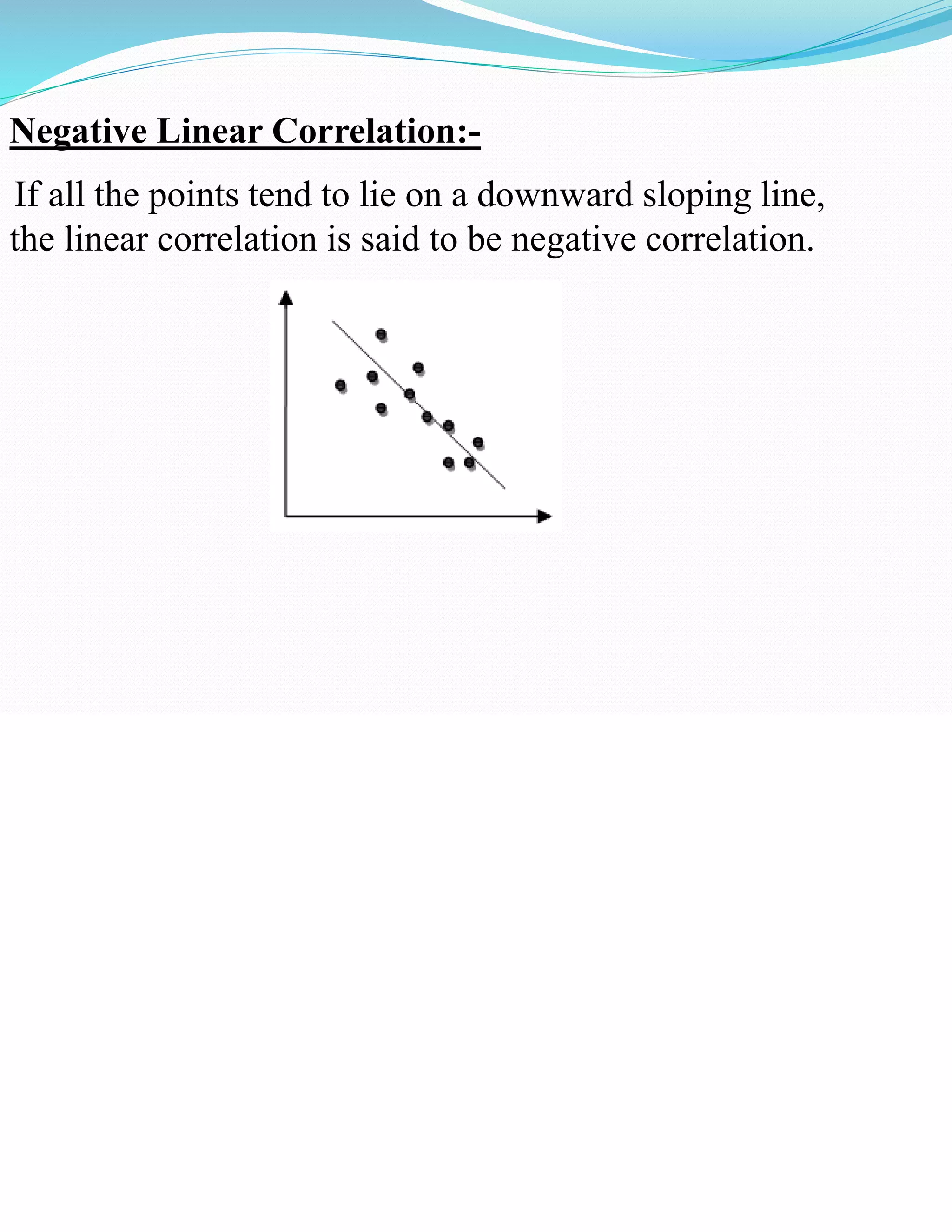
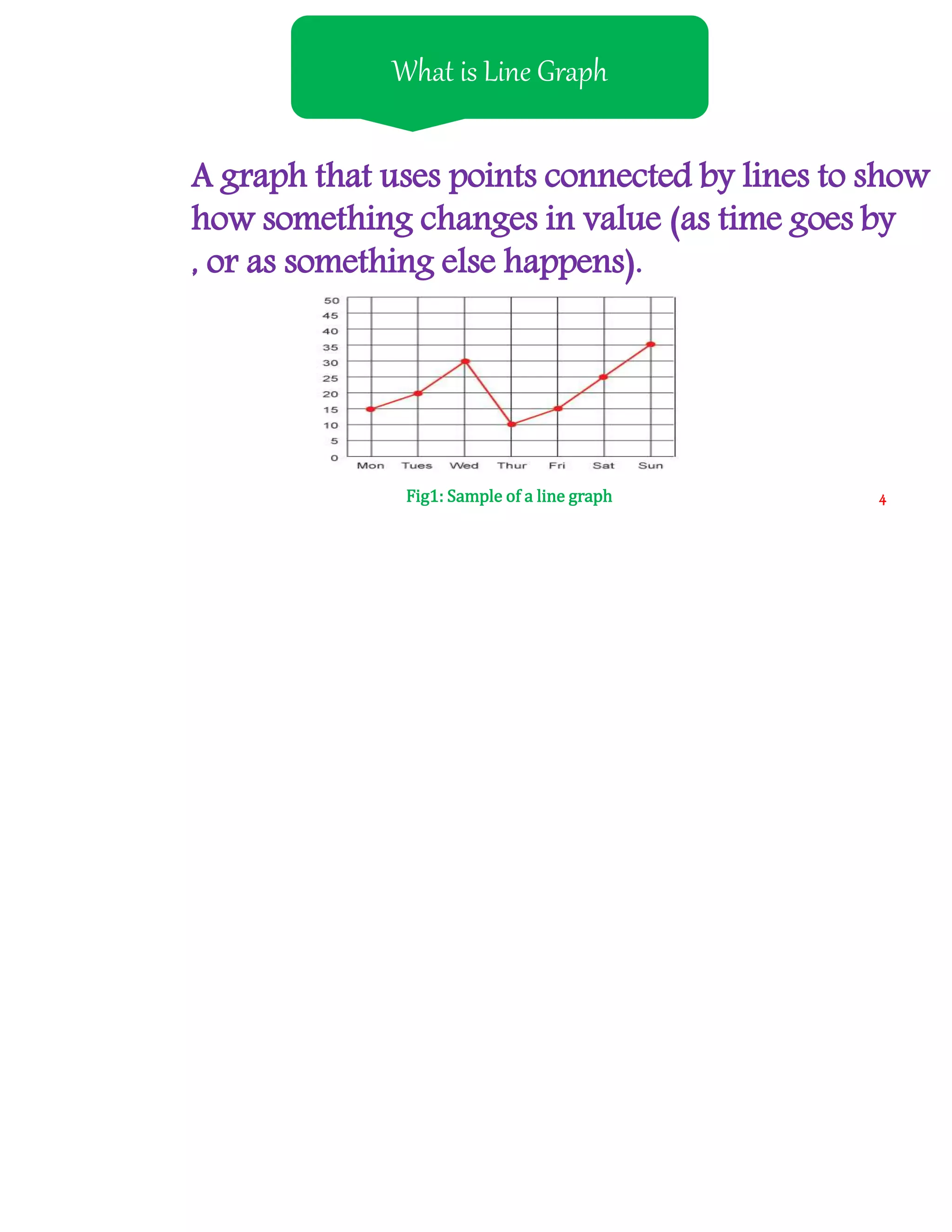
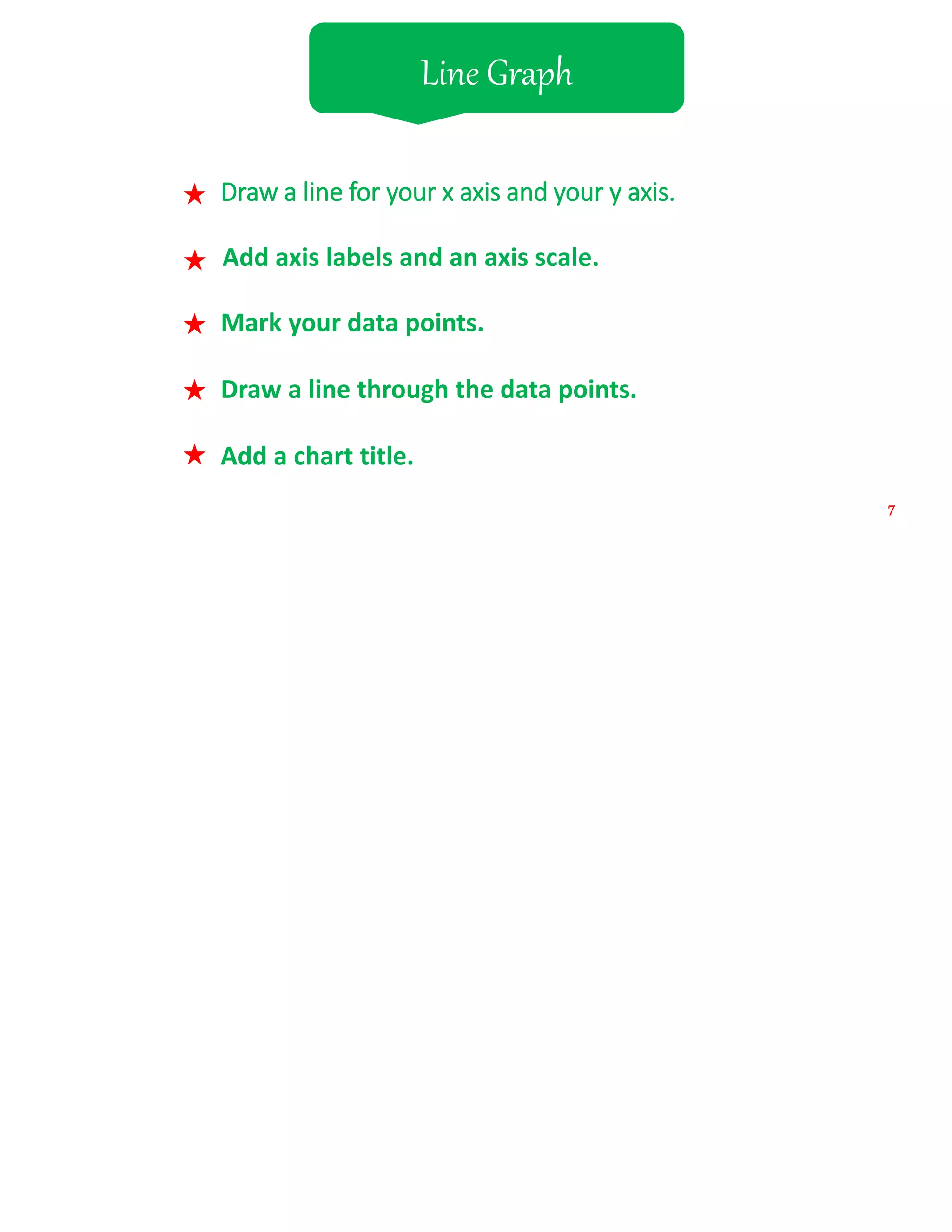
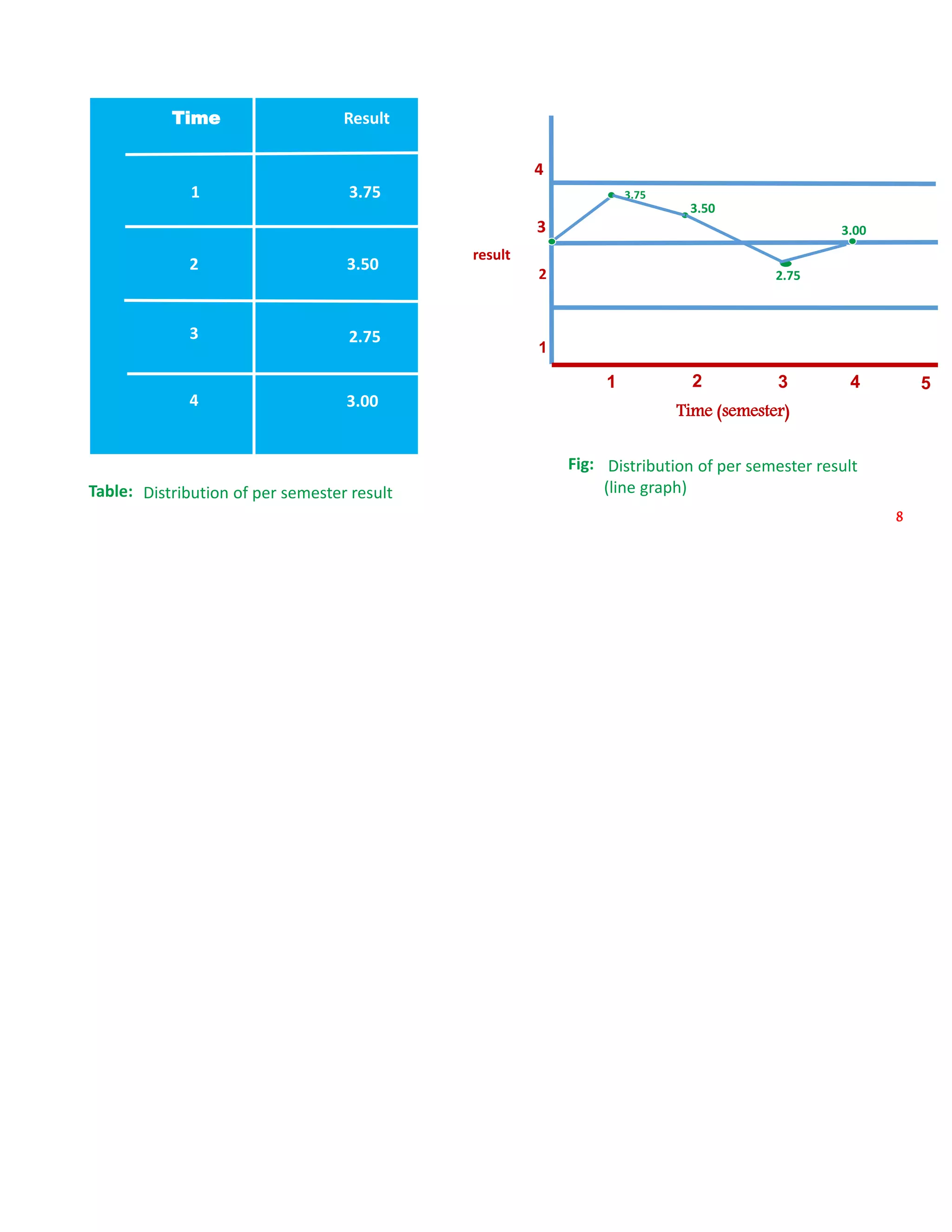
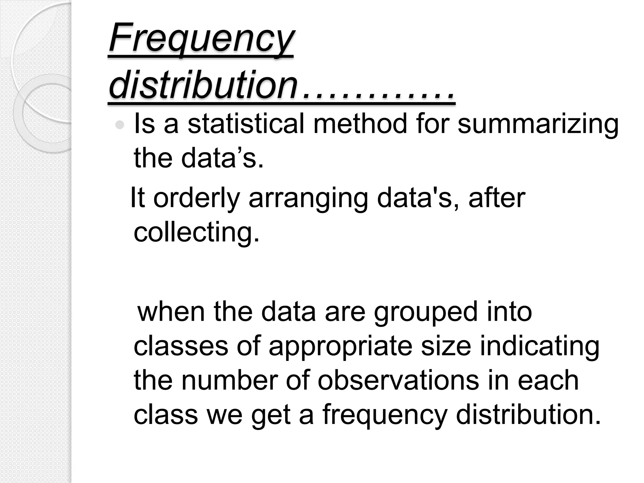
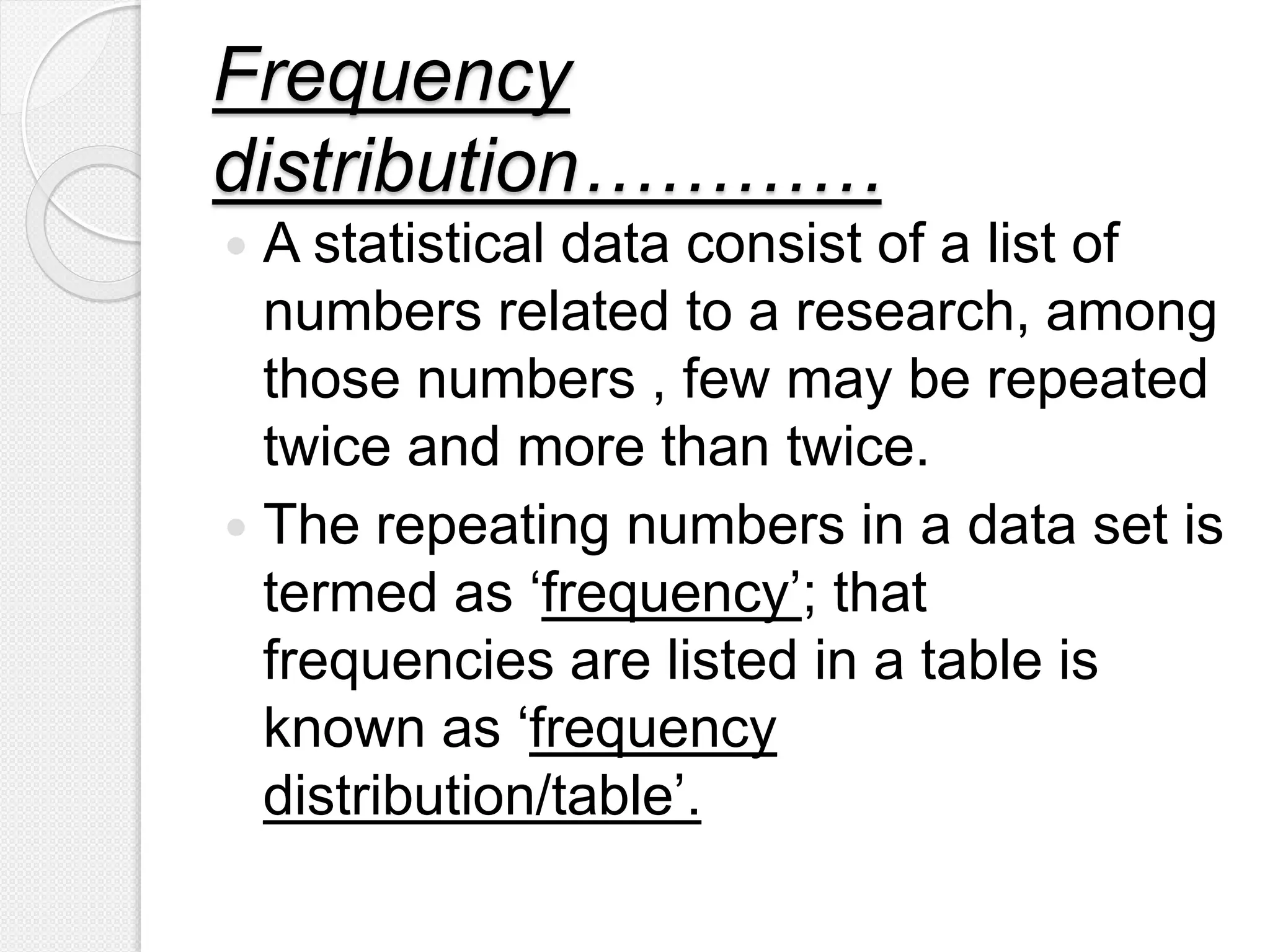
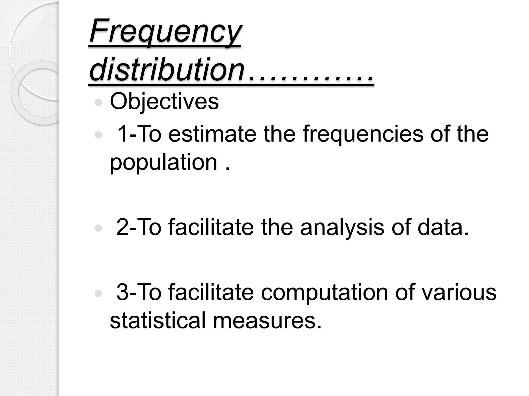
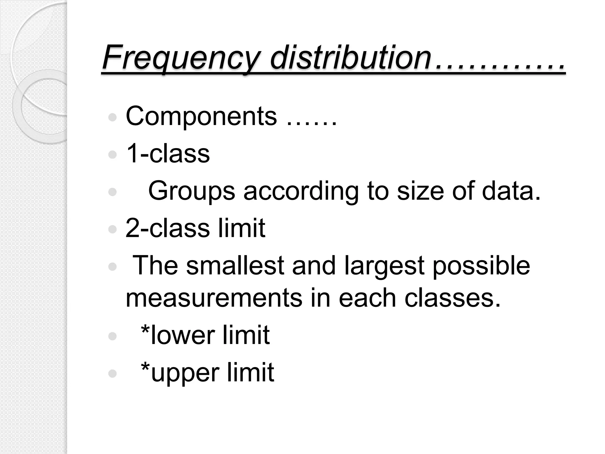
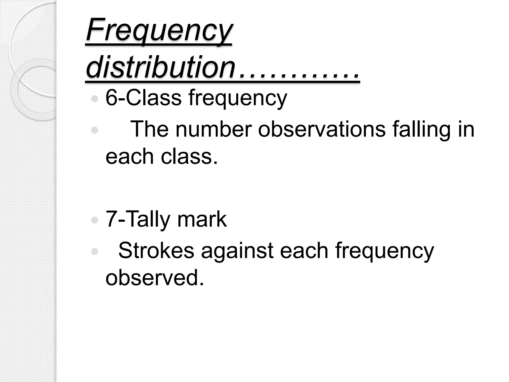
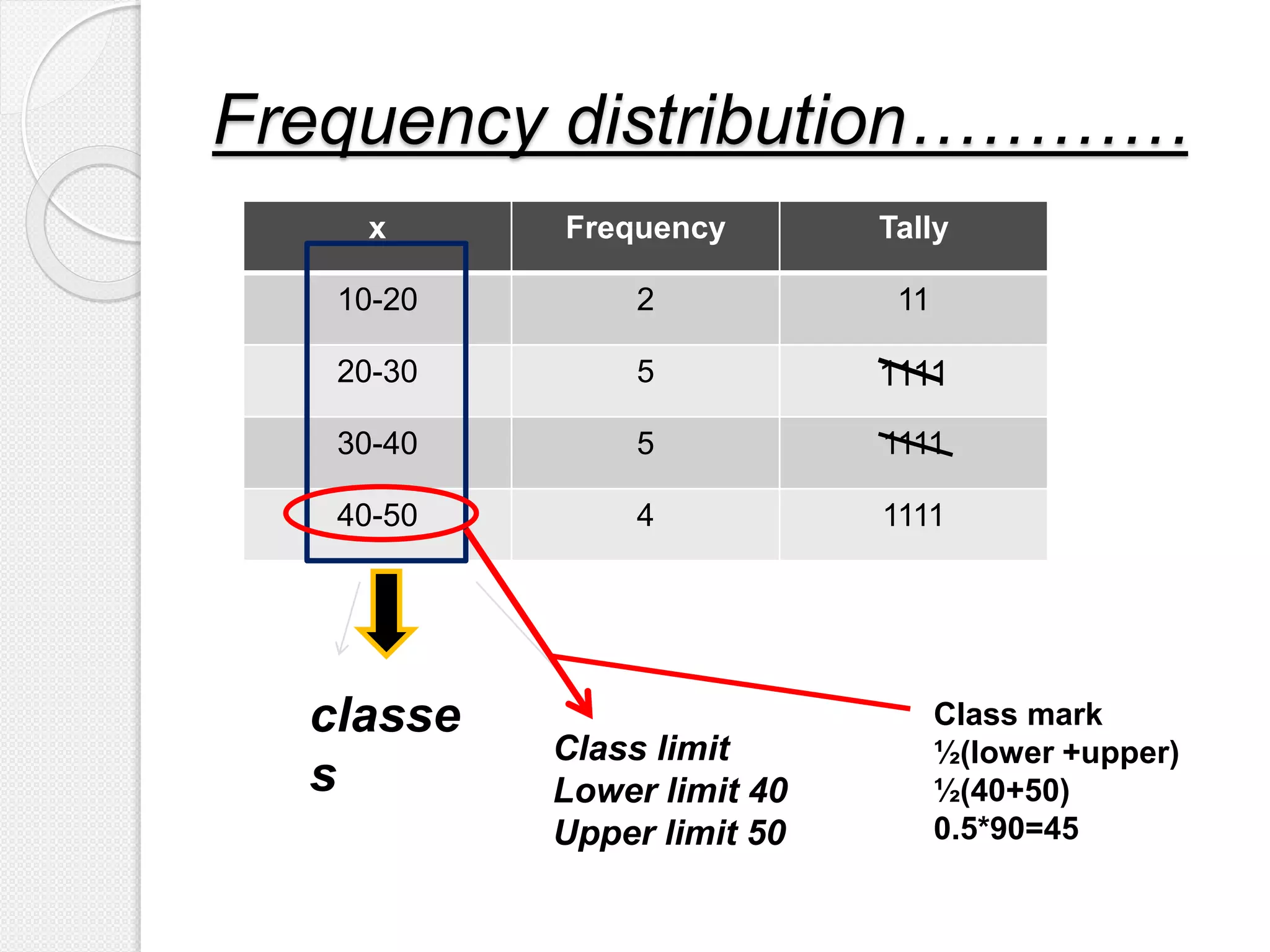
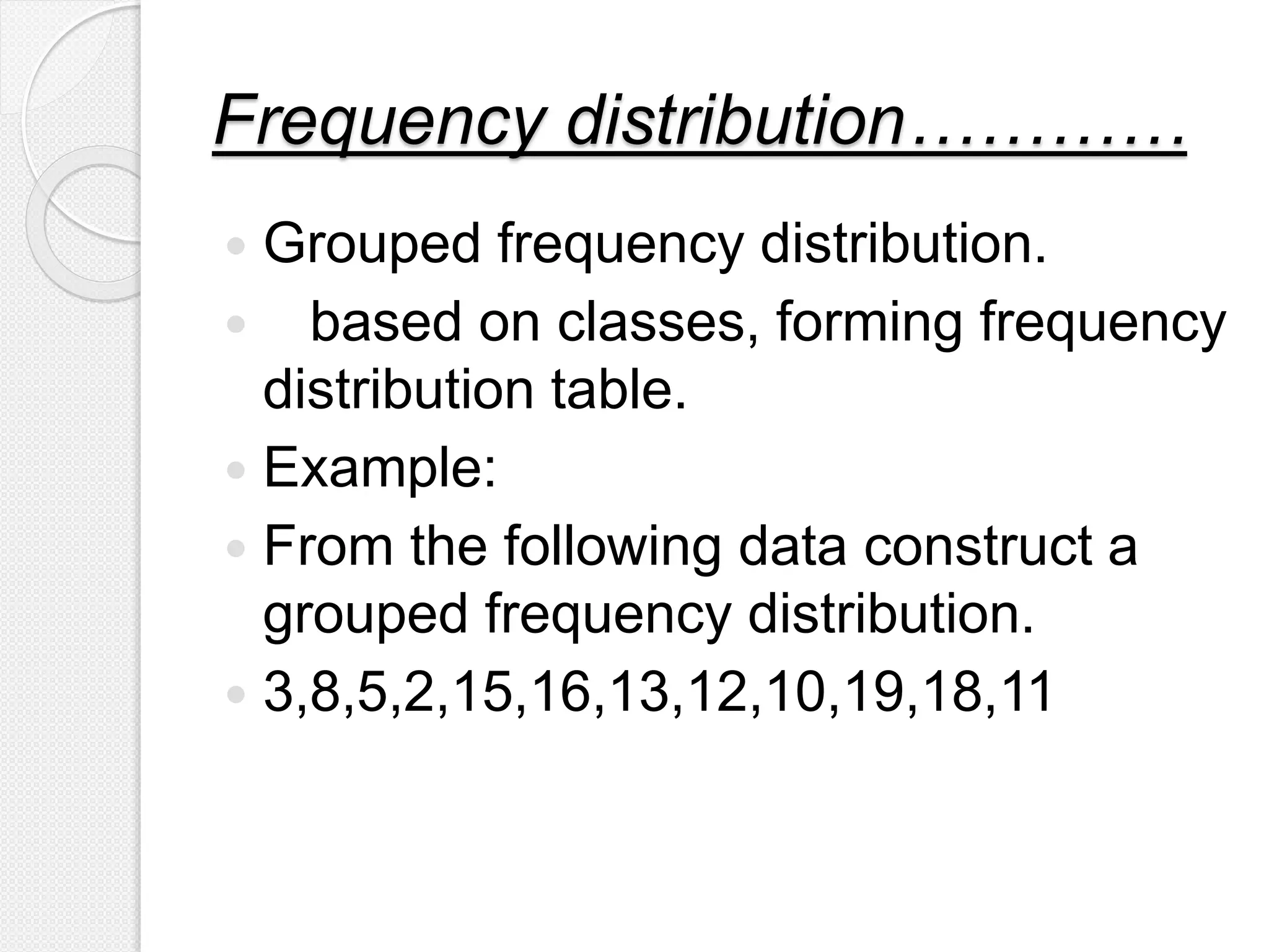
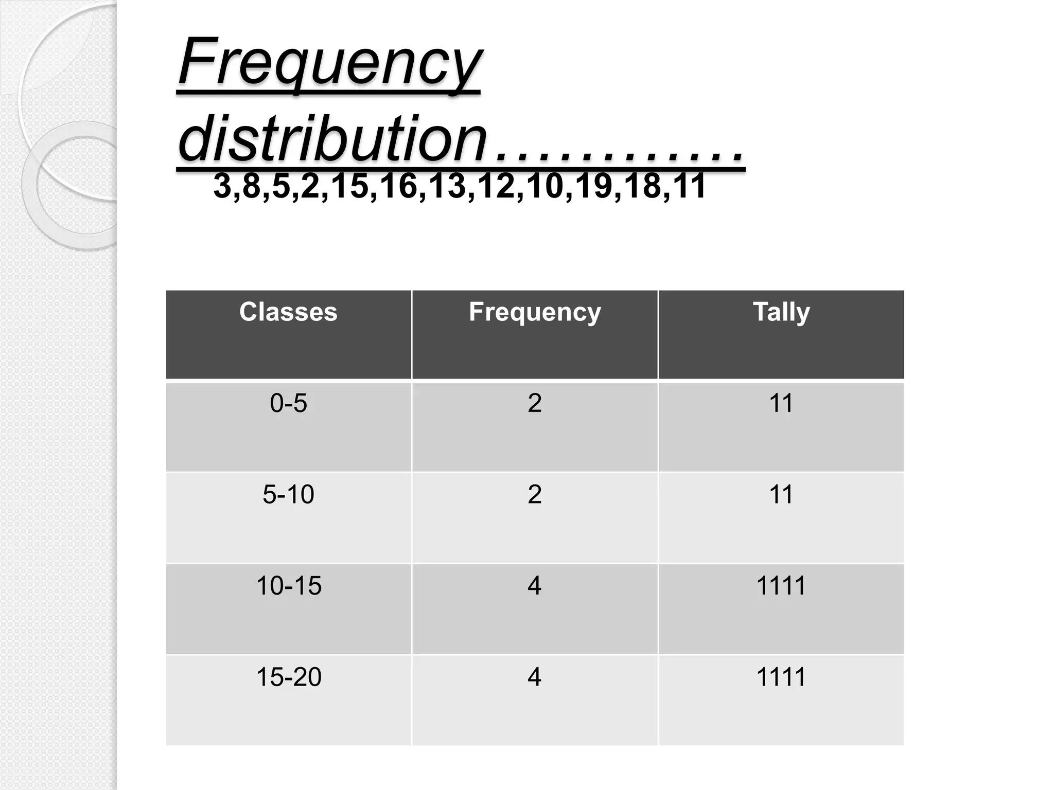
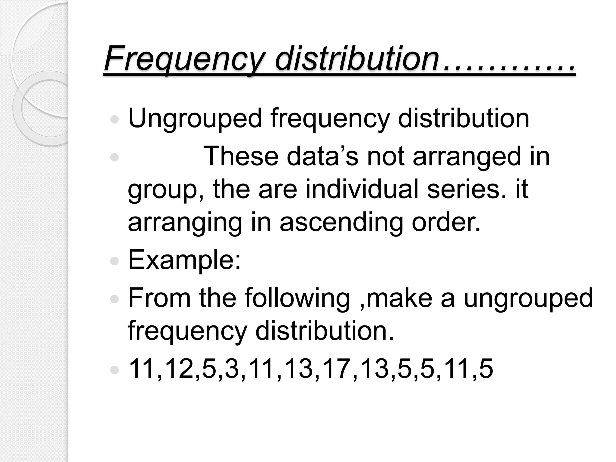
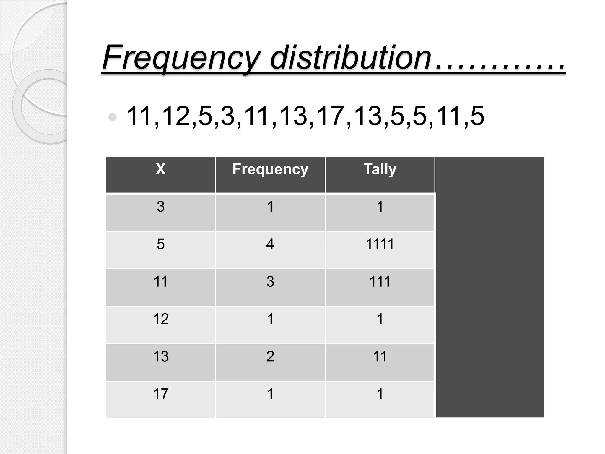
The document discusses line graphs and frequency distributions.
1) A line graph uses points connected by lines to show how a value changes over time or as another variable changes. Line graphs are used to track qualitative data and compare changes over time for multiple groups.
2) A frequency distribution organizes data into classes and counts the frequency of observations in each class. It can group or ungroup data. The distribution includes the class, frequency, and tally marks.
This slideshow describes about type of data, its tabular and graphical representation by various ways. It is slideshow is useful for bio statisticians and students.
Prelude
PART (A) TYPES OF GRAPHS
Line graphs
Pie charts
Bar graph
Scatter plot
Stem and plot
Histogram
Frequency polygon
Frequency curve
Cumulative frequency or ogives
PART (B) FLOW CHART
PART (C) LOG AND SEMILOG GRAPH
Graphs(Biostatistics and Research Methodology) B.pharmacy(8th sem.)Pranjal Saxena
This slides contains the description about the Graphs(Histograms, Pie-Chart, Cubic Graph, Response surface Plot, Counter surface plot ) mainly Histograms with advantages, disadvantages and examples, Pie-chart with advantages, disadvantages and examples, Cubic Graph with examples, Response surface plot and Counter plot with examples and uses.
Understanding the graphical representation of data in researchDrShalooSaini
This Power Point Presentation has been made while referring to the research books written by eminent, renowned and expert authors as mentioned in the references section. The purpose of this Presentation is to help the research students in developing an insight about the Graphical Representation of Data in Research. I hope the students will find this presentation useful for them.
Lecture on Introduction to Descriptive Statistics - Part 1 and Part 2. These slides were presented during a lecture at the Colombo Institute of Research and Psychology.
Unit 8 - Information and Communication Technology (Paper I).pdfThiyagu K
This slides describes the basic concepts of ICT, basics of Email, Emerging Technology and Digital Initiatives in Education. This presentations aligns with the UGC Paper I syllabus.
June 3, 2024 Anti-Semitism Letter Sent to MIT President Kornbluth and MIT Cor...Levi Shapiro
Letter from the Congress of the United States regarding Anti-Semitism sent June 3rd to MIT President Sally Kornbluth, MIT Corp Chair, Mark Gorenberg
Dear Dr. Kornbluth and Mr. Gorenberg,
The US House of Representatives is deeply concerned by ongoing and pervasive acts of antisemitic
harassment and intimidation at the Massachusetts Institute of Technology (MIT). Failing to act decisively to ensure a safe learning environment for all students would be a grave dereliction of your responsibilities as President of MIT and Chair of the MIT Corporation.
This Congress will not stand idly by and allow an environment hostile to Jewish students to persist. The House believes that your institution is in violation of Title VI of the Civil Rights Act, and the inability or
unwillingness to rectify this violation through action requires accountability.
Postsecondary education is a unique opportunity for students to learn and have their ideas and beliefs challenged. However, universities receiving hundreds of millions of federal funds annually have denied
students that opportunity and have been hijacked to become venues for the promotion of terrorism, antisemitic harassment and intimidation, unlawful encampments, and in some cases, assaults and riots.
The House of Representatives will not countenance the use of federal funds to indoctrinate students into hateful, antisemitic, anti-American supporters of terrorism. Investigations into campus antisemitism by the Committee on Education and the Workforce and the Committee on Ways and Means have been expanded into a Congress-wide probe across all relevant jurisdictions to address this national crisis. The undersigned Committees will conduct oversight into the use of federal funds at MIT and its learning environment under authorities granted to each Committee.
• The Committee on Education and the Workforce has been investigating your institution since December 7, 2023. The Committee has broad jurisdiction over postsecondary education, including its compliance with Title VI of the Civil Rights Act, campus safety concerns over disruptions to the learning environment, and the awarding of federal student aid under the Higher Education Act.
• The Committee on Oversight and Accountability is investigating the sources of funding and other support flowing to groups espousing pro-Hamas propaganda and engaged in antisemitic harassment and intimidation of students. The Committee on Oversight and Accountability is the principal oversight committee of the US House of Representatives and has broad authority to investigate “any matter” at “any time” under House Rule X.
• The Committee on Ways and Means has been investigating several universities since November 15, 2023, when the Committee held a hearing entitled From Ivory Towers to Dark Corners: Investigating the Nexus Between Antisemitism, Tax-Exempt Universities, and Terror Financing. The Committee followed the hearing with letters to those institutions on January 10, 202
The French Revolution, which began in 1789, was a period of radical social and political upheaval in France. It marked the decline of absolute monarchies, the rise of secular and democratic republics, and the eventual rise of Napoleon Bonaparte. This revolutionary period is crucial in understanding the transition from feudalism to modernity in Europe.
For more information, visit-www.vavaclasses.com
Macroeconomics- Movie Location
This will be used as part of your Personal Professional Portfolio once graded.
Objective:
Prepare a presentation or a paper using research, basic comparative analysis, data organization and application of economic information. You will make an informed assessment of an economic climate outside of the United States to accomplish an entertainment industry objective.
Biological screening of herbal drugs: Introduction and Need for
Phyto-Pharmacological Screening, New Strategies for evaluating
Natural Products, In vitro evaluation techniques for Antioxidants, Antimicrobial and Anticancer drugs. In vivo evaluation techniques
for Anti-inflammatory, Antiulcer, Anticancer, Wound healing, Antidiabetic, Hepatoprotective, Cardio protective, Diuretics and
Antifertility, Toxicity studies as per OECD guidelines
How to Make a Field invisible in Odoo 17Celine George
It is possible to hide or invisible some fields in odoo. Commonly using “invisible” attribute in the field definition to invisible the fields. This slide will show how to make a field invisible in odoo 17.
Model Attribute Check Company Auto PropertyCeline George
In Odoo, the multi-company feature allows you to manage multiple companies within a single Odoo database instance. Each company can have its own configurations while still sharing common resources such as products, customers, and suppliers.
Synthetic Fiber Construction in lab .pptxPavel ( NSTU)
Synthetic fiber production is a fascinating and complex field that blends chemistry, engineering, and environmental science. By understanding these aspects, students can gain a comprehensive view of synthetic fiber production, its impact on society and the environment, and the potential for future innovations. Synthetic fibers play a crucial role in modern society, impacting various aspects of daily life, industry, and the environment. ynthetic fibers are integral to modern life, offering a range of benefits from cost-effectiveness and versatility to innovative applications and performance characteristics. While they pose environmental challenges, ongoing research and development aim to create more sustainable and eco-friendly alternatives. Understanding the importance of synthetic fibers helps in appreciating their role in the economy, industry, and daily life, while also emphasizing the need for sustainable practices and innovation.
Palestine last event orientationfvgnh .pptxRaedMohamed3
An EFL lesson about the current events in Palestine. It is intended to be for intermediate students who wish to increase their listening skills through a short lesson in power point.
Introduction to AI for Nonprofits with Tapp NetworkTechSoup
Dive into the world of AI! Experts Jon Hill and Tareq Monaur will guide you through AI's role in enhancing nonprofit websites and basic marketing strategies, making it easy to understand and apply.
Francesca Gottschalk - How can education support child empowerment.pptxEduSkills OECD
Francesca Gottschalk from the OECD’s Centre for Educational Research and Innovation presents at the Ask an Expert Webinar: How can education support child empowerment?
2. What is Line Graph
A graph that uses points connected by lines to show
how something changes in value (as time goes by
, or as something else happens).
Fig1: Sample of a line graph 4
3. Line graphs are used for “qualitative data”. Line graphs are
used to track changes over short and long periods of time.
When smaller changes exist, line graphs are better to use.
Line graphs can also be used to compare changes over the
same period of time for more than one group.
What is a line graph used for
5
4. • Qualitative data is information about qualities;
information that can't actually be measured.
• Example:
Hair Color
Softness Of Skin
Gender
About Qualitative Data
6
5. Line Graph
Draw a line for your x axis and your y axis.
Add axis labels and an axis scale.
Mark your data points.
Draw a line through the data points.
Add a chart title.
7
6. 1
2
3
4
1 2 3 4 5
Time (semester)
result
3.75
3.50
2.75
3.00
Time Result
1
2
3
4
3.75
3.50
2.75
3.00
Fig:
Table:
8
Distribution of per semester result
(line graph)Distribution of per semester result
7. Scatter Diagram:
The simplest method of investigating the relationship
between two variables is to plot a scatter diagram
Let there will be two series ‘x’ (Independent Variable) and
‘y’ (Dependent Variable) to be represented graphically.
Take the items in ‘x’ series along the axis of ‘x’ and the
corresponding items in ‘y’ series along the y-axis. The
diagram so formed will be a dotted one and scattered,
showing some relationship, such a diagram is called a
scattered.
8. Scatter diagram can be used to find that there is any
correlation between the variable, whether the correlation
is linear or non- linear and whether it is positive or
negative.
Interpretation of correlation is done in the following ways.
9. Linear Correlation:-
If all the points on the scatter diagram tend to lie near a line,
the correlation is said to be linear.
10. Curvi Linear Correlation:-
If all the points on the scatter diagram tend to lie near
a smooth curve (not a straight line) the correlation is
said to be curvilinear.
11. Positive Linear Correlation:-
If all the points tend to lie near an upward sloping line ,
the linear correlation is said to be positive correlation.
12. Negative Linear Correlation:-
If all the points tend to lie on a downward sloping line,
the linear correlation is said to be negative correlation.
13. Perfect Positive Correlation:-
If all the points tend to lie on an upward sloping line
the correlation is perfectly positive correlation.
14. Perfect Negative Correlation:-
If all the points tend to lie on a downward sloping line the
correlation is perfectly negative correlation.
15. Null Correlation:-
If the points on a scatter diagram do not show a definite
movement then there is no correlation between the variables.
17. Frequency
distribution…………
Is a statistical method for summarizing
the data’s.
It orderly arranging data's, after
collecting.
when the data are grouped into
classes of appropriate size indicating
the number of observations in each
class we get a frequency distribution.
18. Frequency
distribution…………
A statistical data consist of a list of
numbers related to a research, among
those numbers , few may be repeated
twice and more than twice.
The repeating numbers in a data set is
termed as ‘frequency’; that
frequencies are listed in a table is
known as ‘frequency
distribution/table’.
19. Frequency
distribution…………
Objectives
1-To estimate the frequencies of the
population .
2-To facilitate the analysis of data.
3-To facilitate computation of various
statistical measures.
20. Frequency distribution…………
Components ……
1-class
Groups according to size of data.
2-class limit
The smallest and largest possible
measurements in each classes.
*lower limit
*upper limit
21. Frequency distribution…………
3-class mark
Also known as middle value.
½(lower limit + upper limit)
4-Class interval
Upper limit - lower limit
5-class boundaries
23. Frequency distribution…………
x Frequency Tally
10-20 2 11
20-30 5 1111
30-40 5 1111
40-50 4 1111
classe
s
Class limit
Lower limit 40
Upper limit 50
Class mark
½(lower +upper)
½(40+50)
0.5*90=45
24. Frequency distribution…………
Grouped frequency distribution.
based on classes, forming frequency
distribution table.
Example:
From the following data construct a
grouped frequency distribution.
3,8,5,2,15,16,13,12,10,19,18,11
26. Frequency distribution…………
Ungrouped frequency distribution
These data’s not arranged in
group, the are individual series. it
arranging in ascending order.
Example:
From the following ,make a ungrouped
frequency distribution.
11,12,5,3,11,13,17,13,5,5,11,5