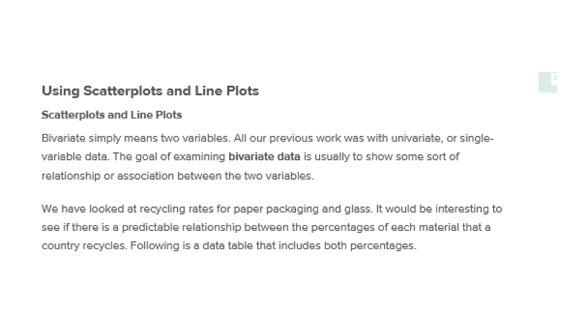
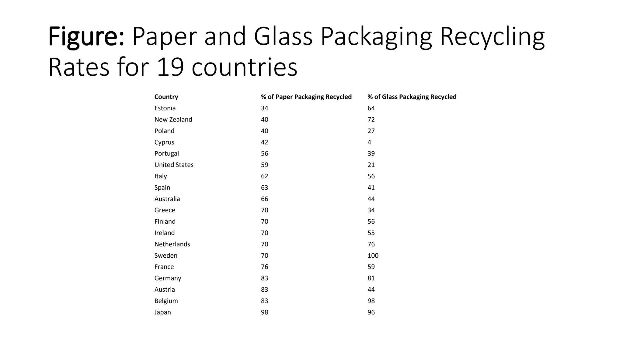
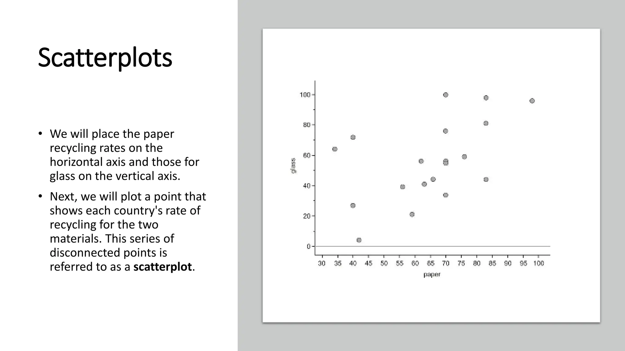
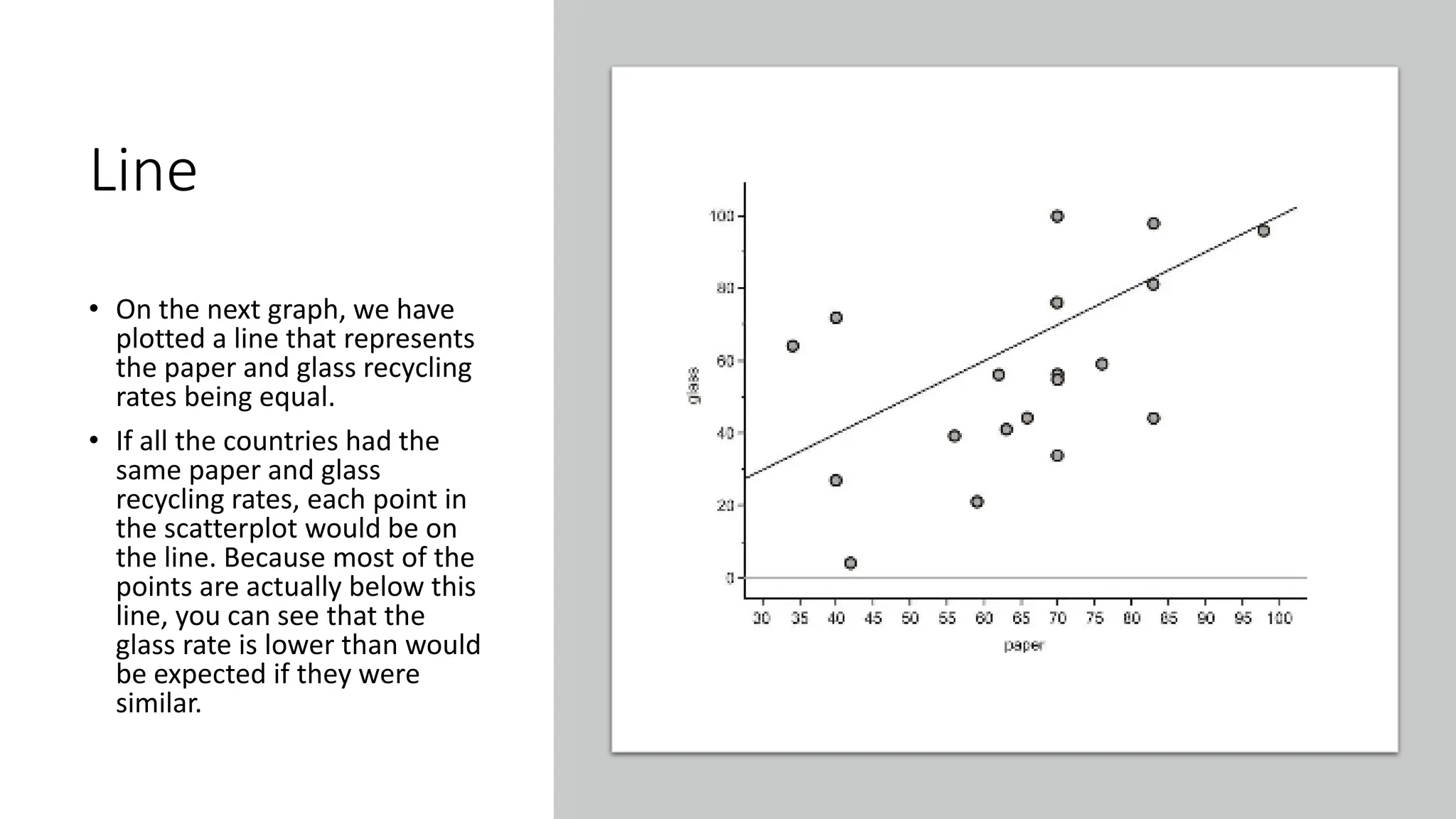
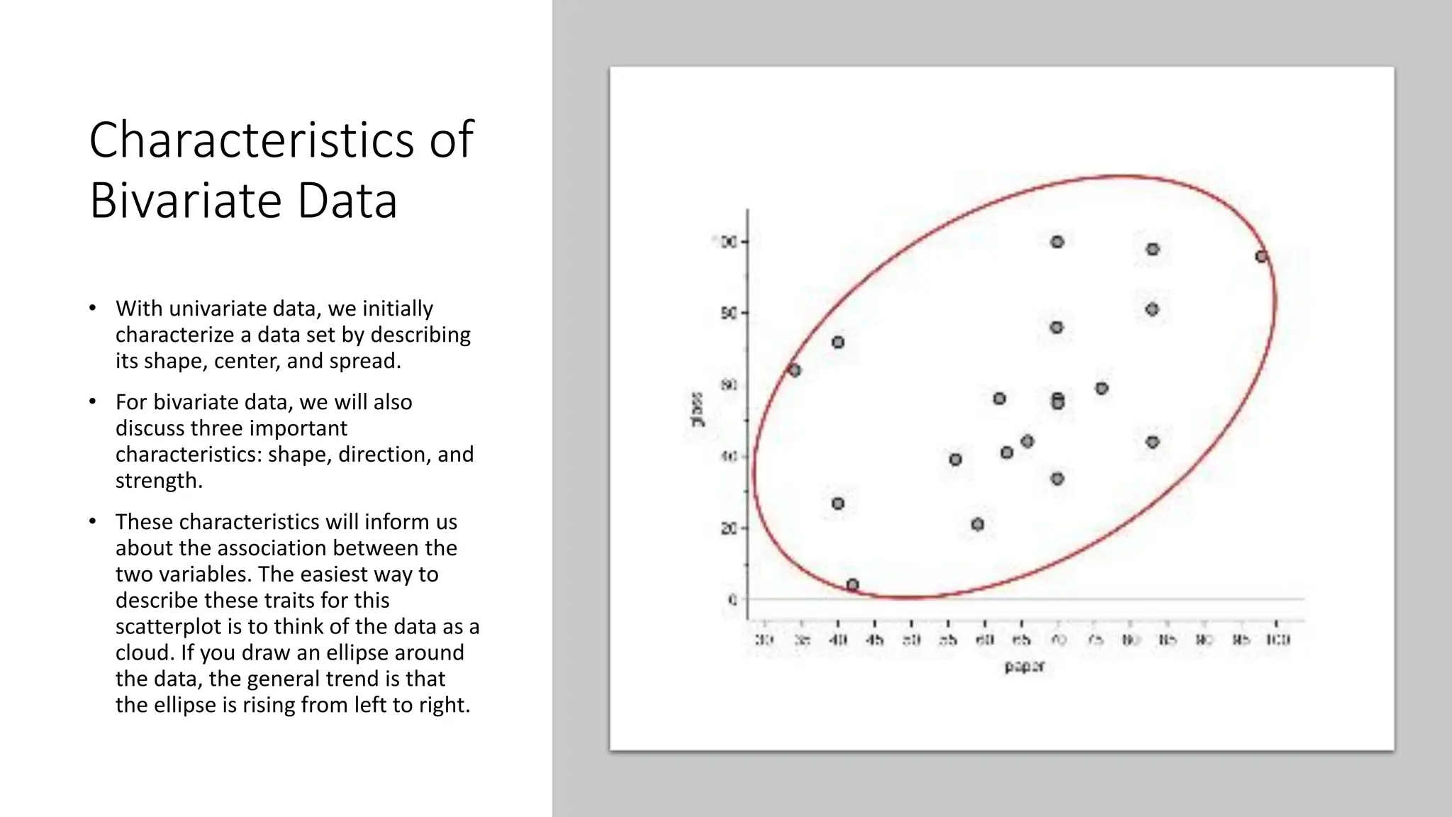
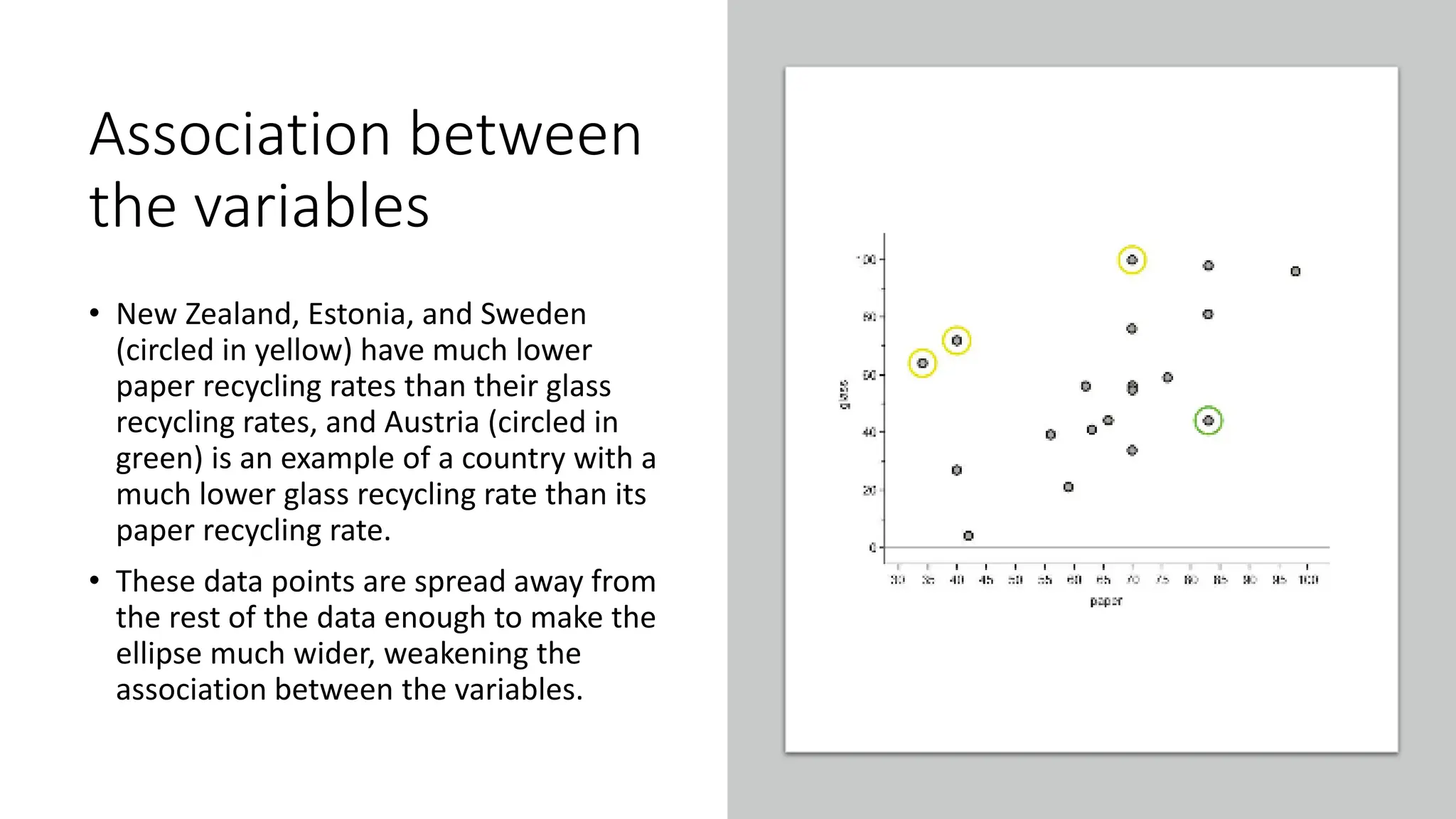
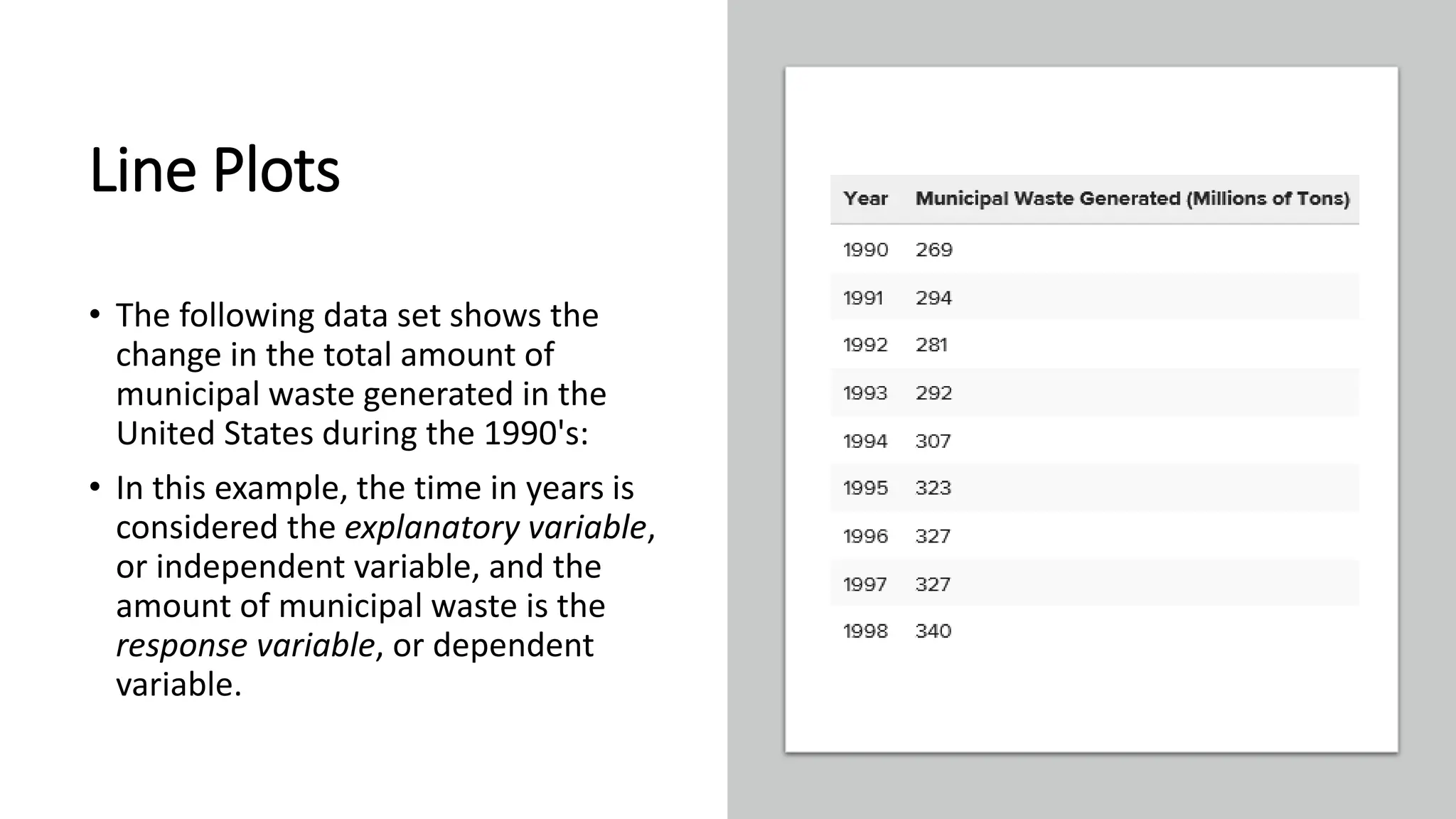
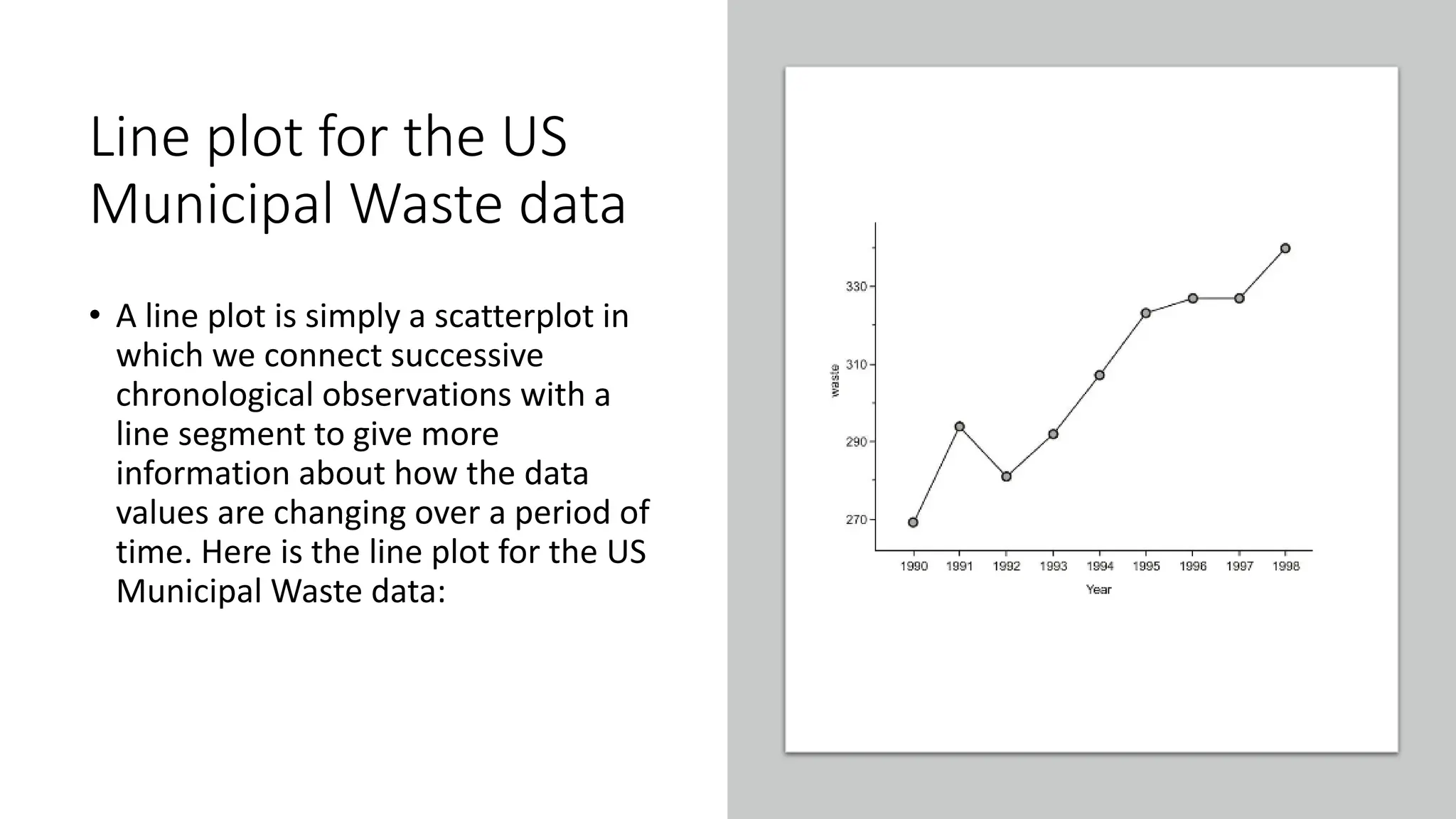
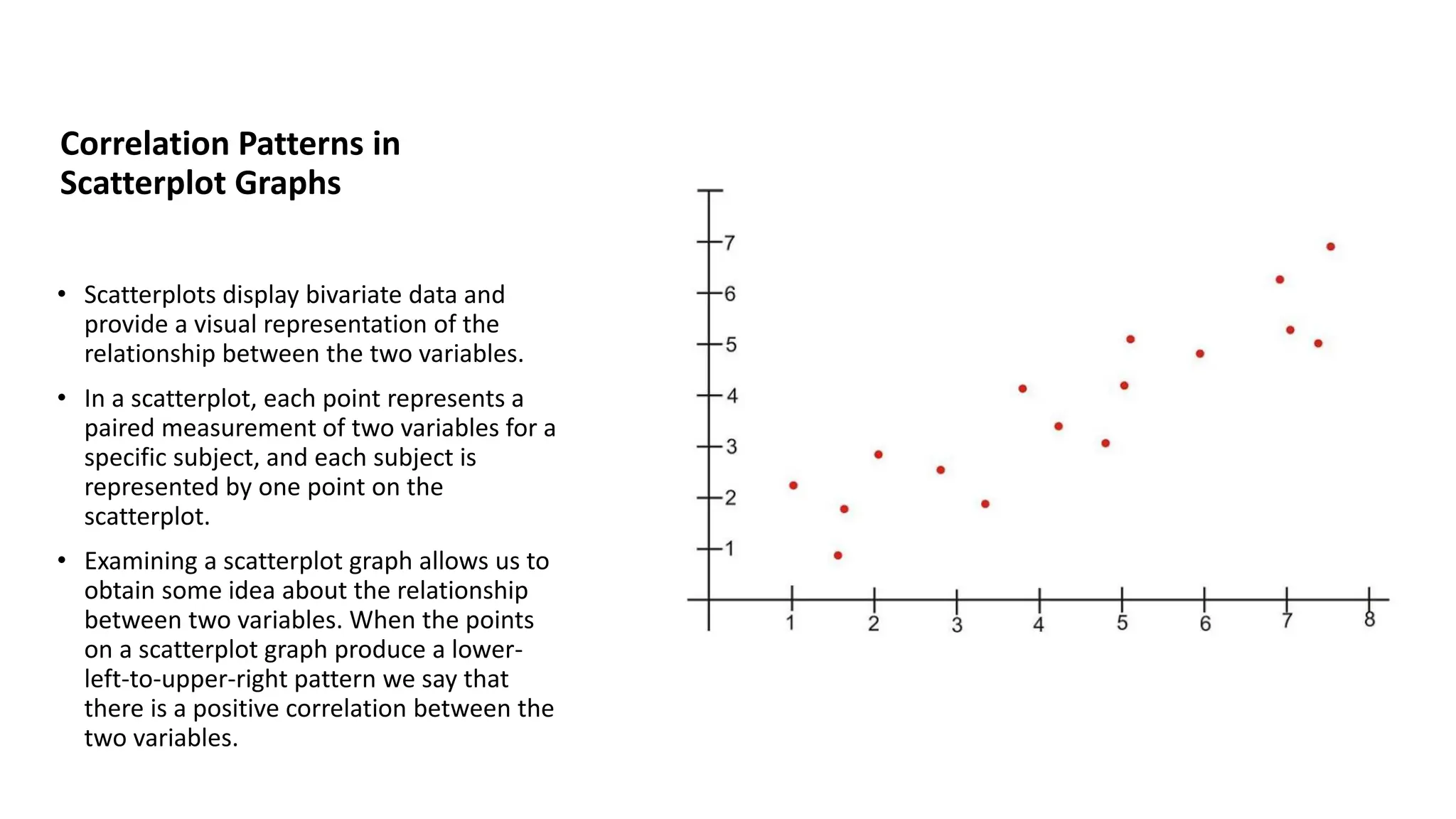
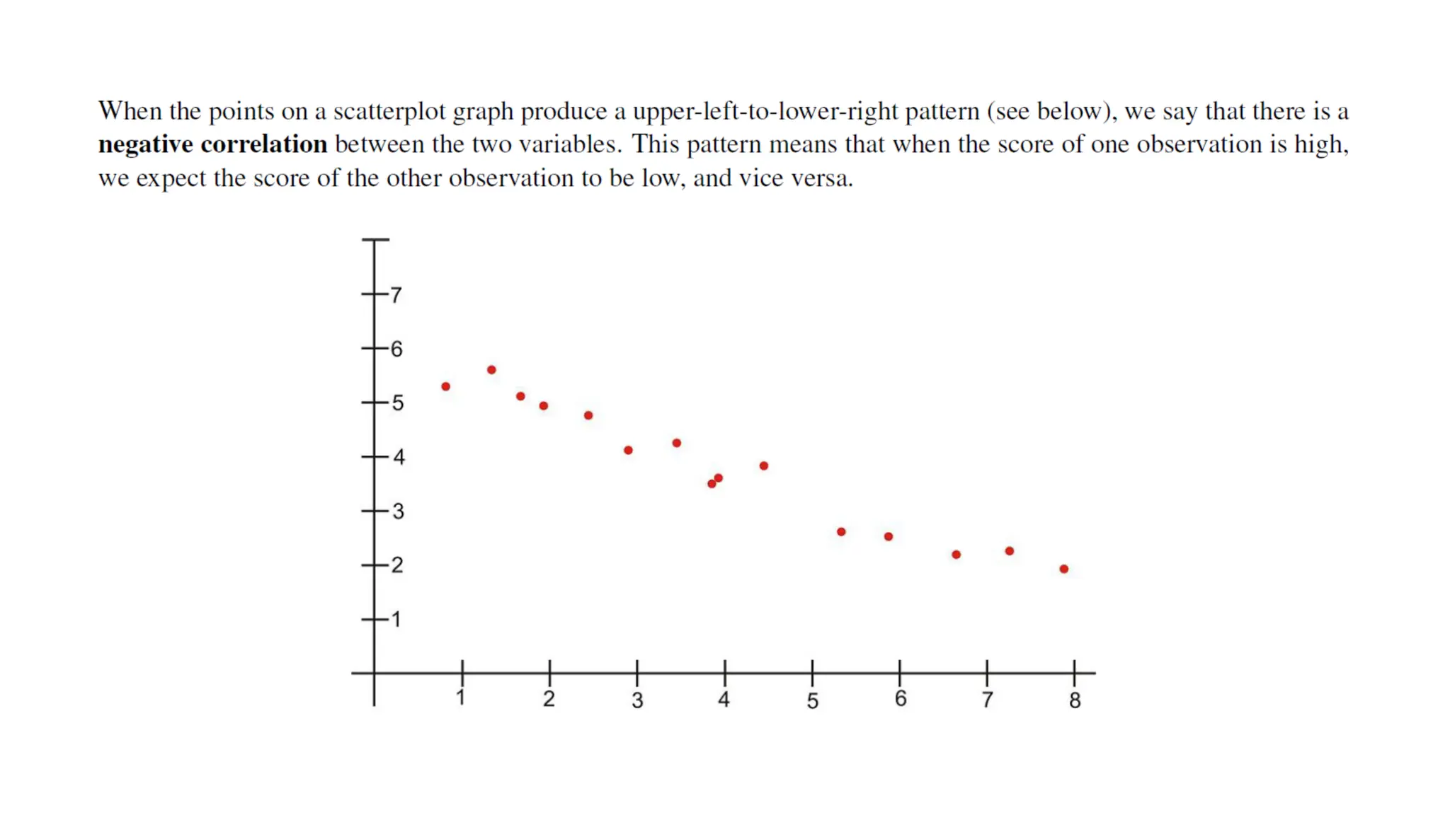
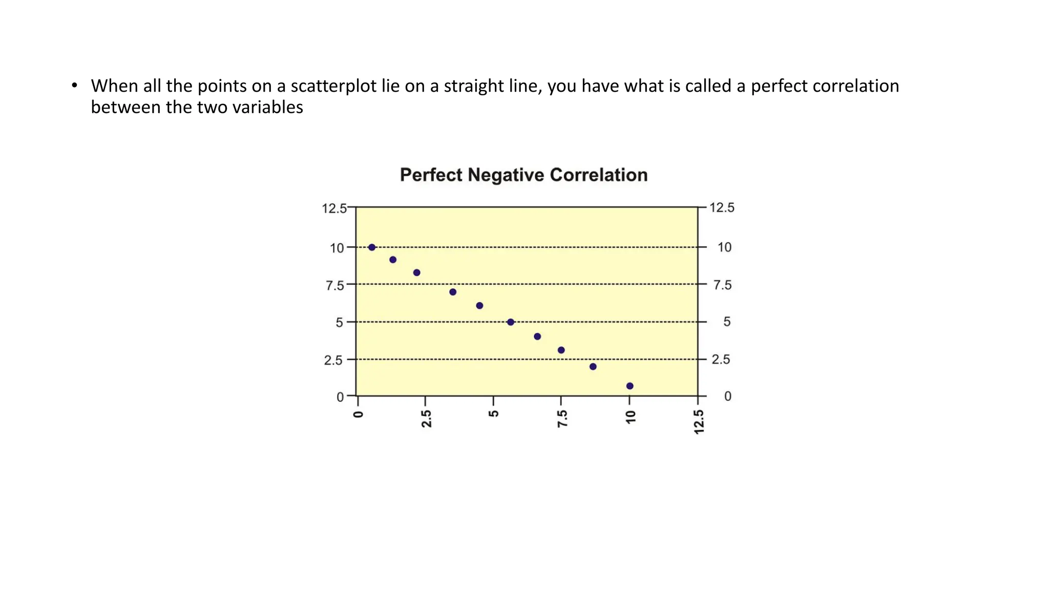
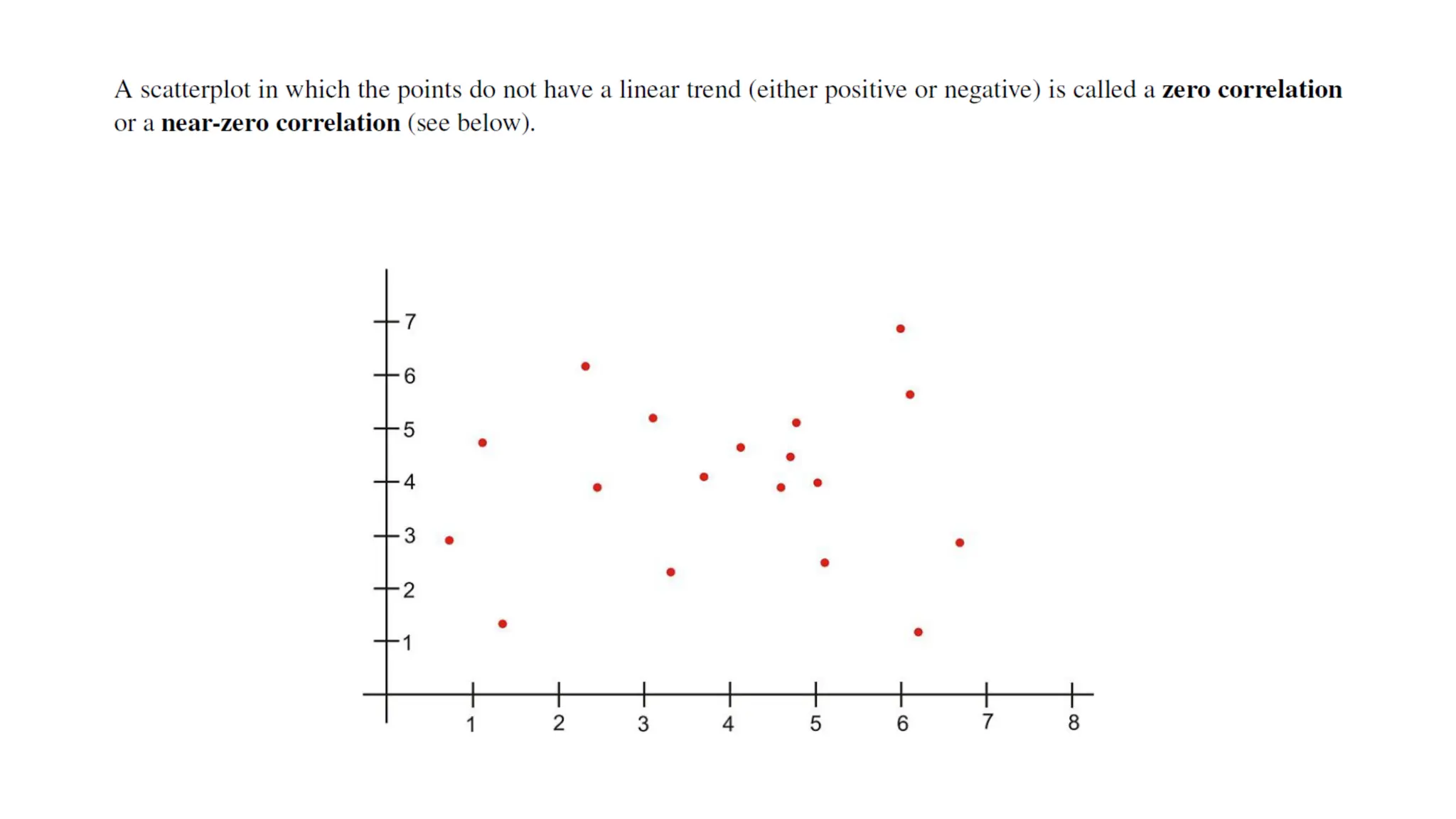
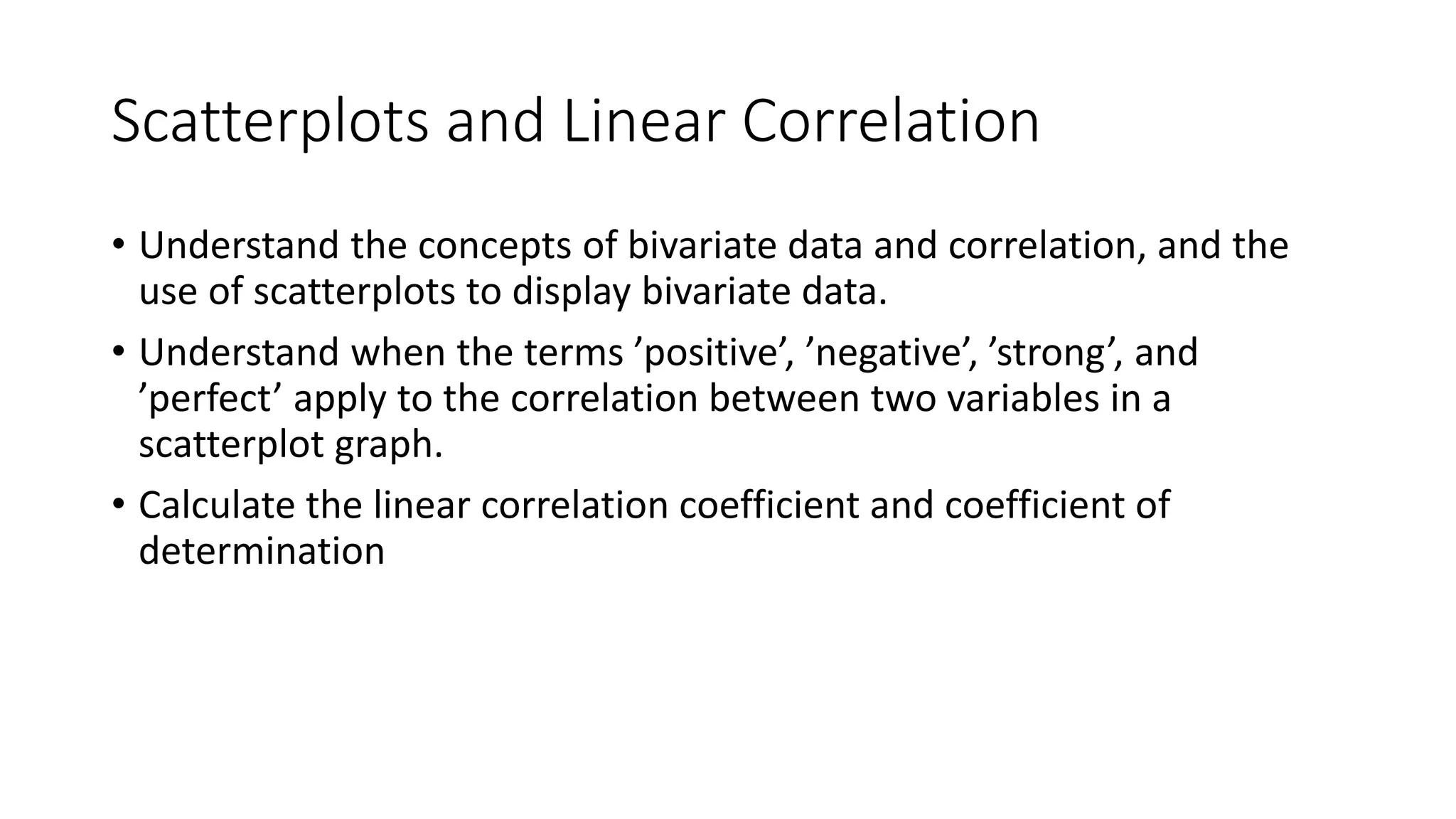
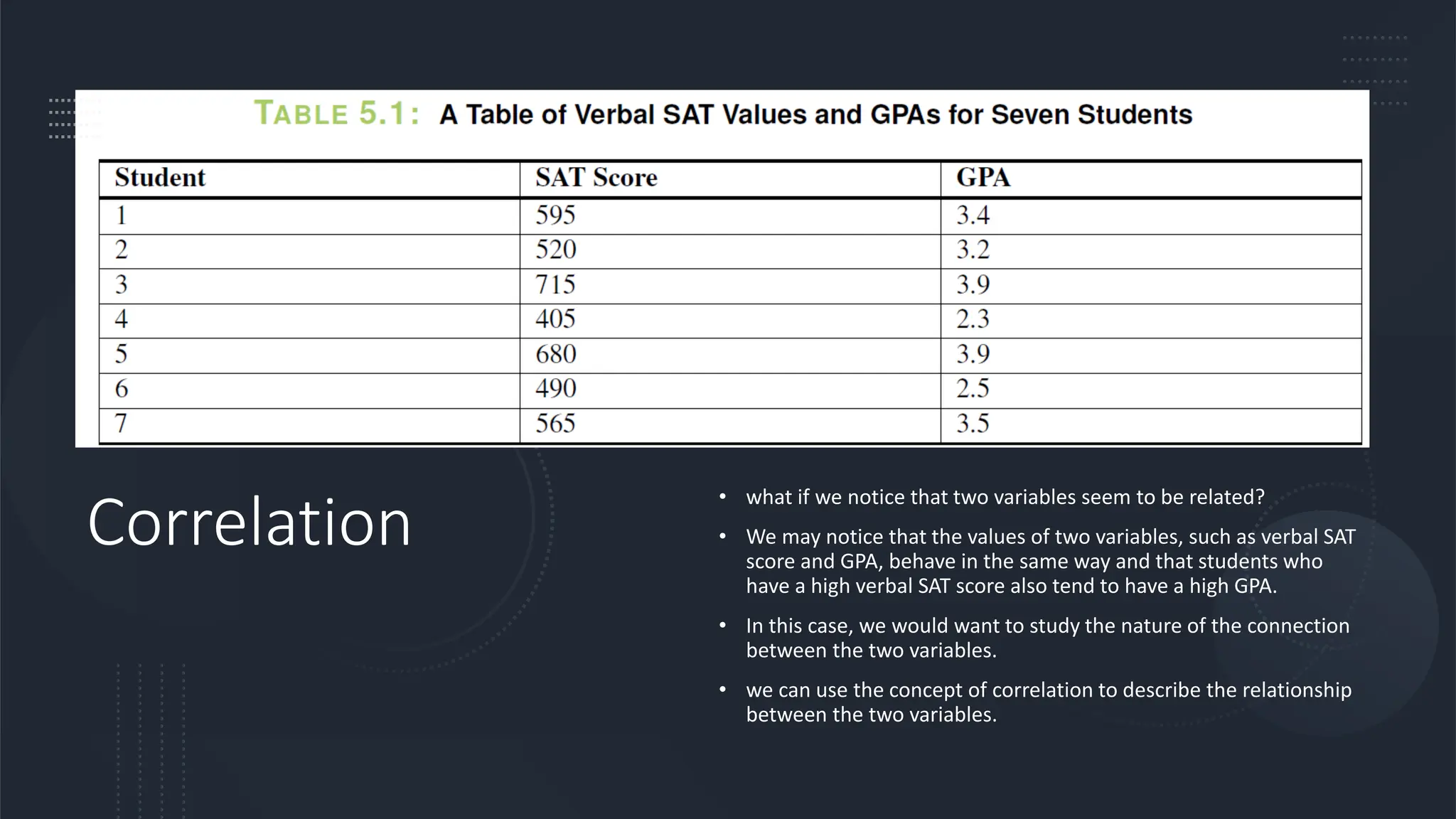
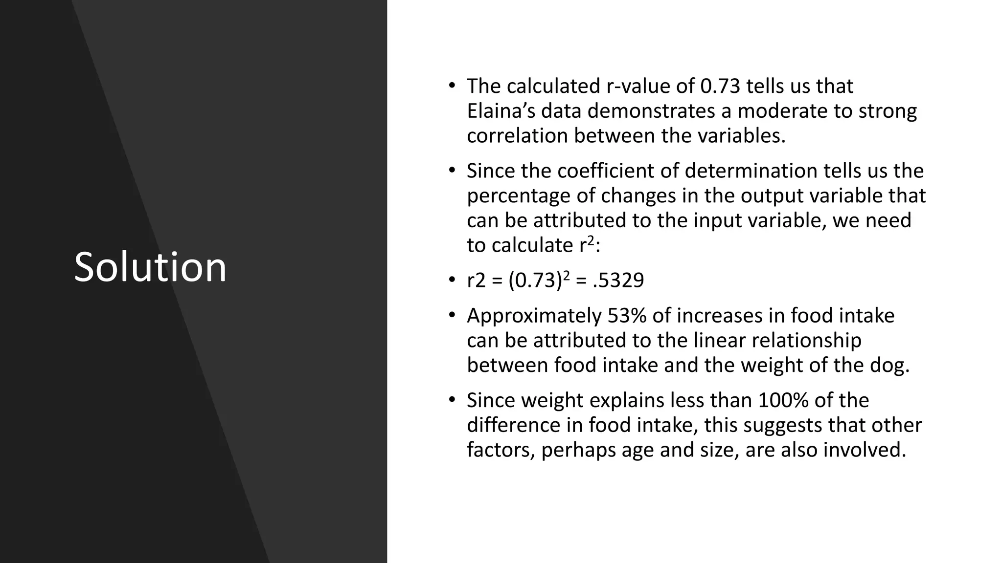
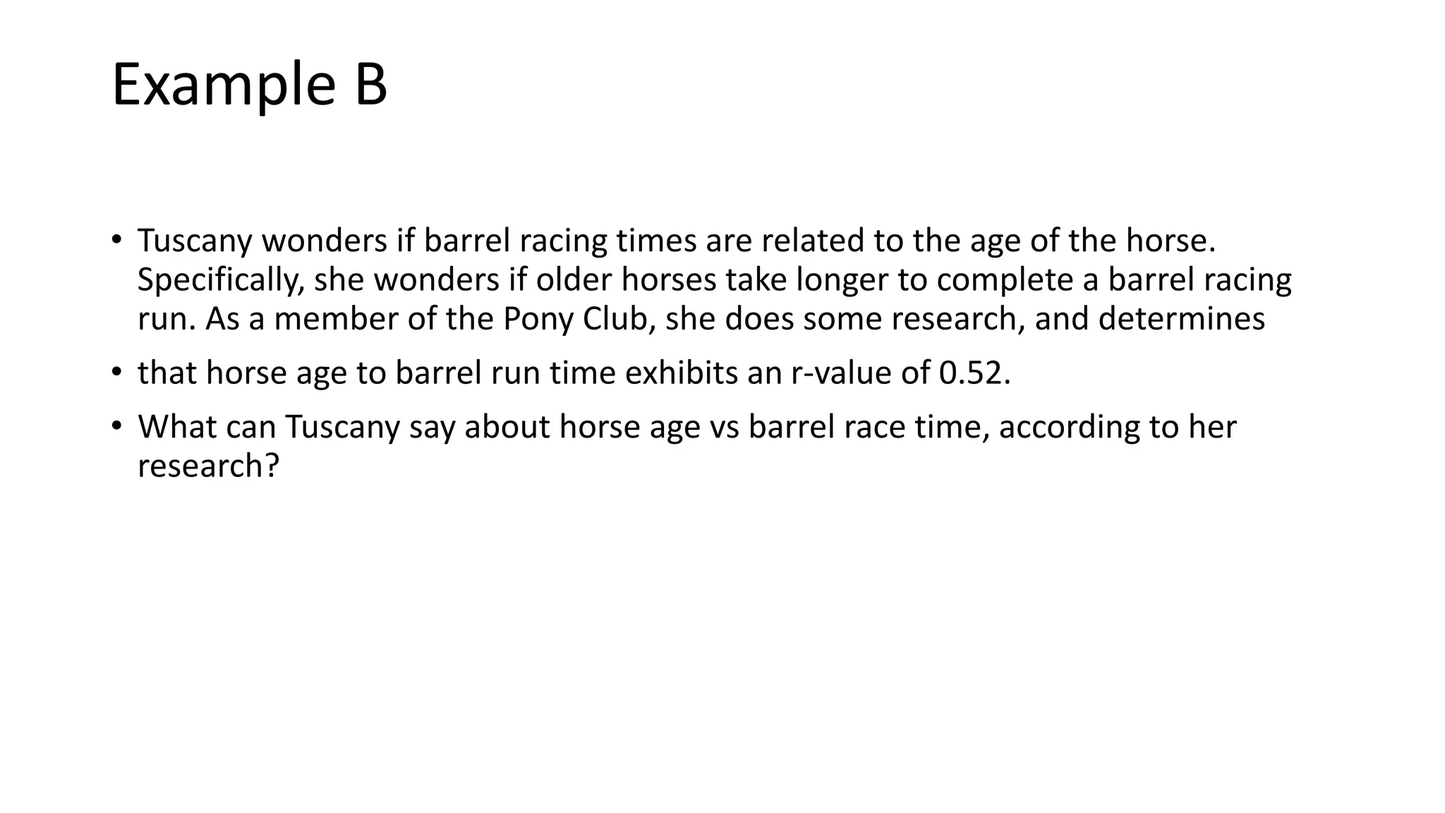
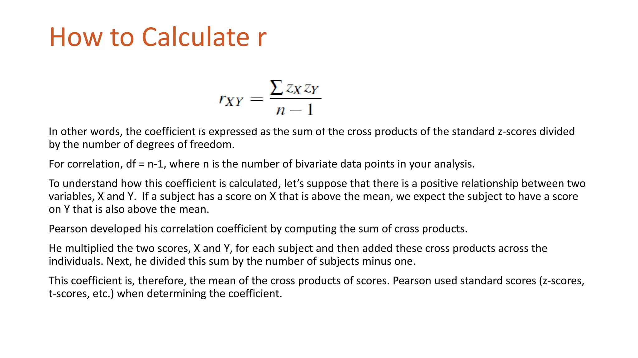
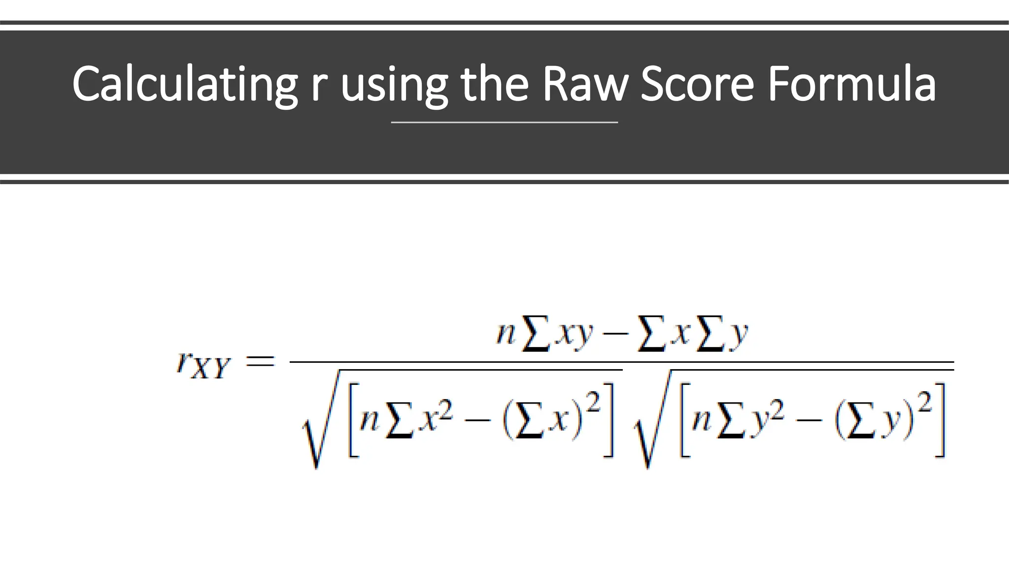
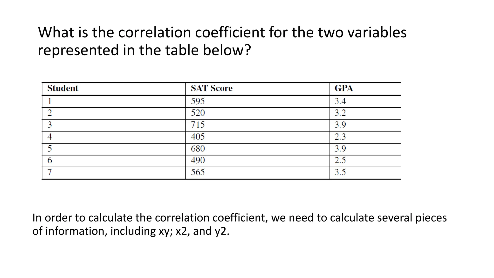
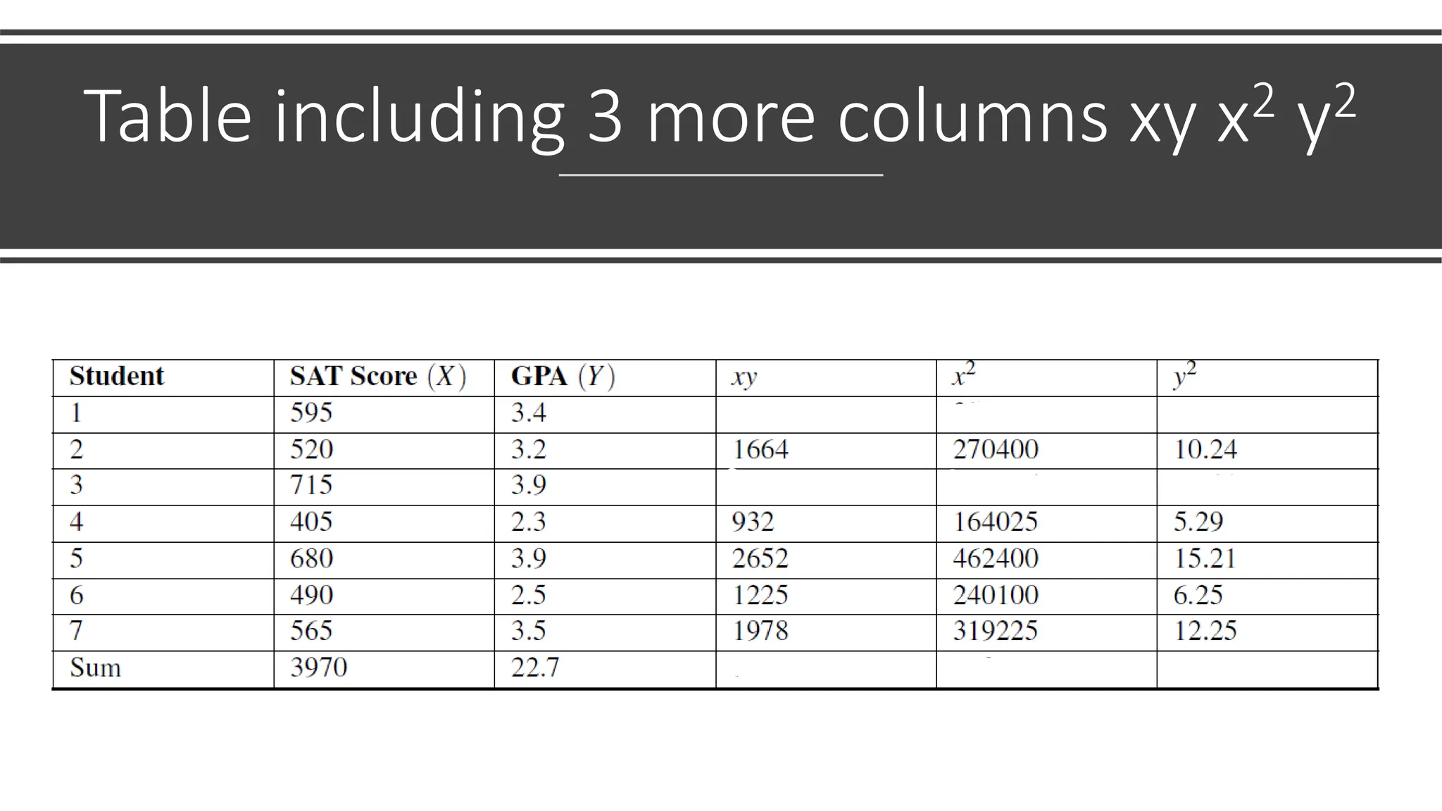
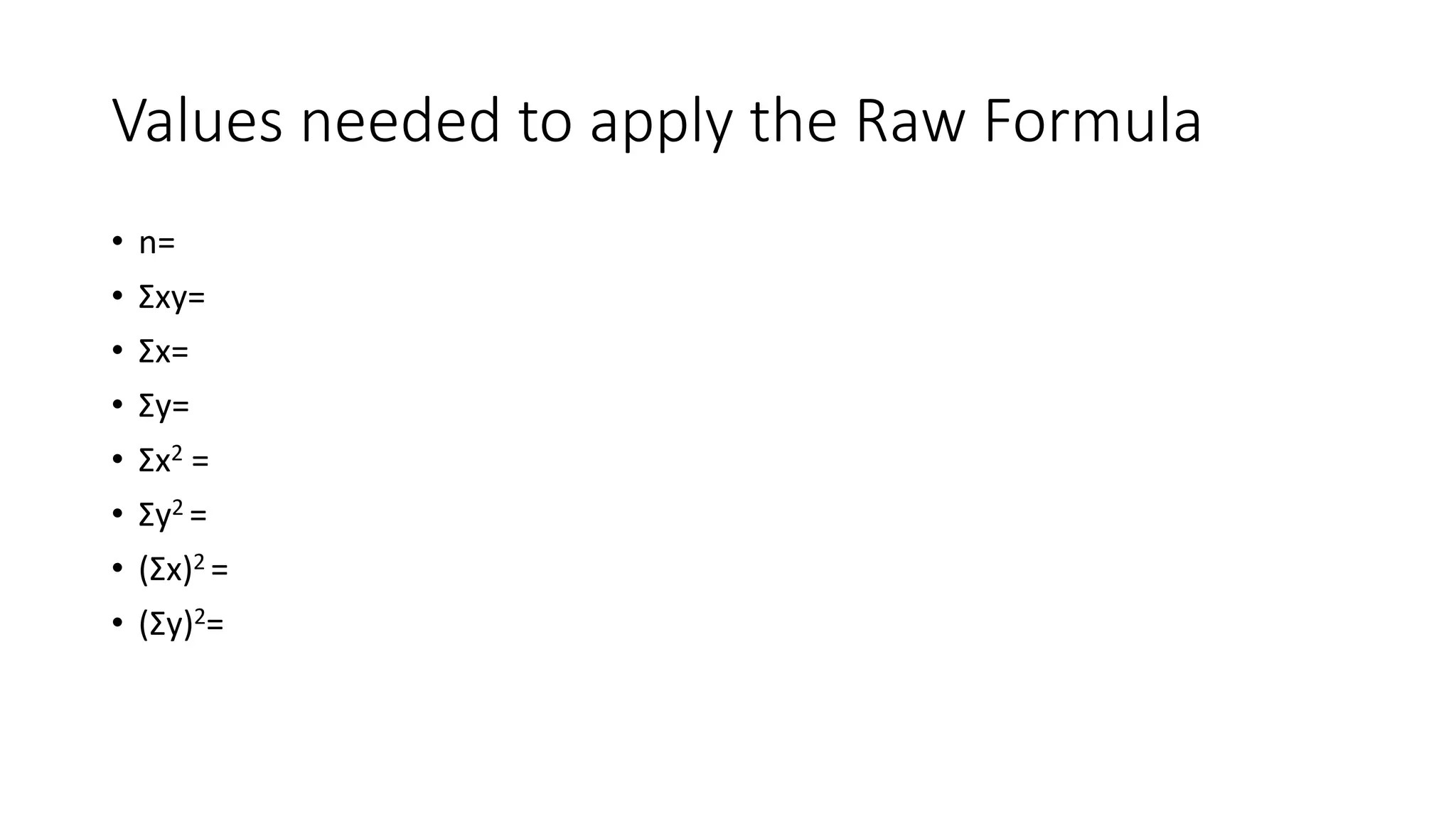
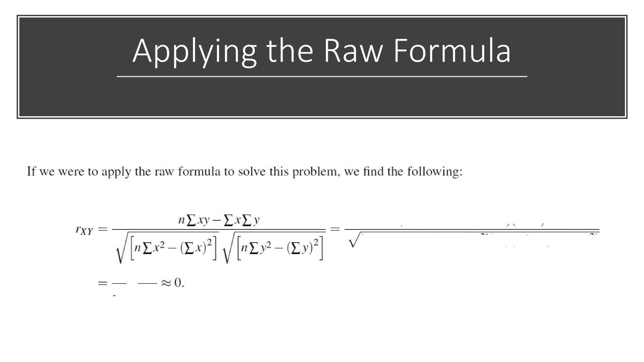
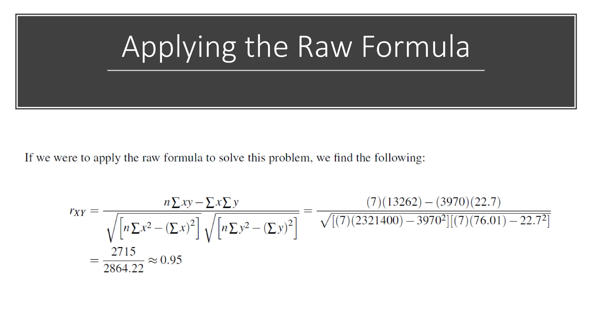
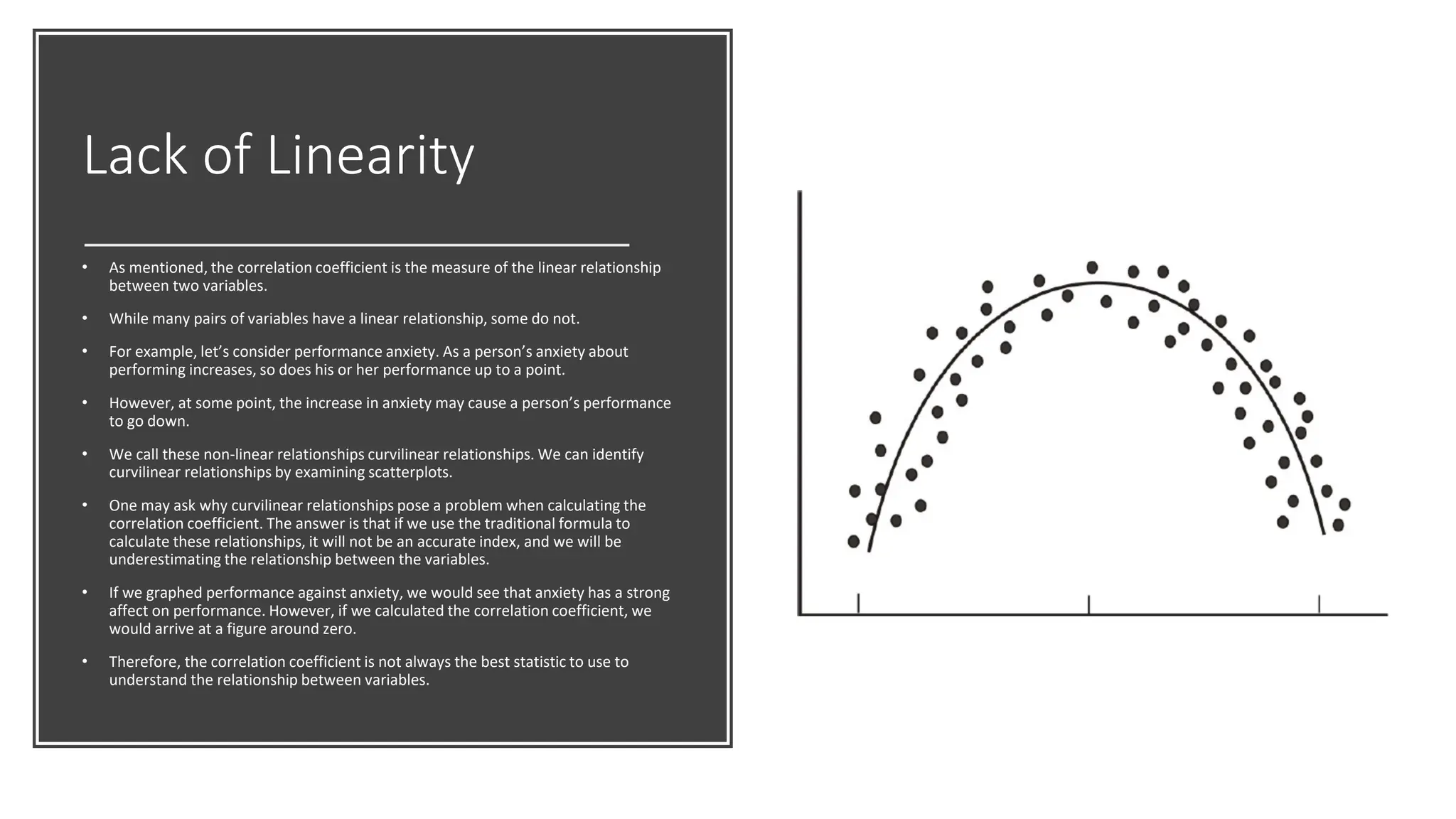
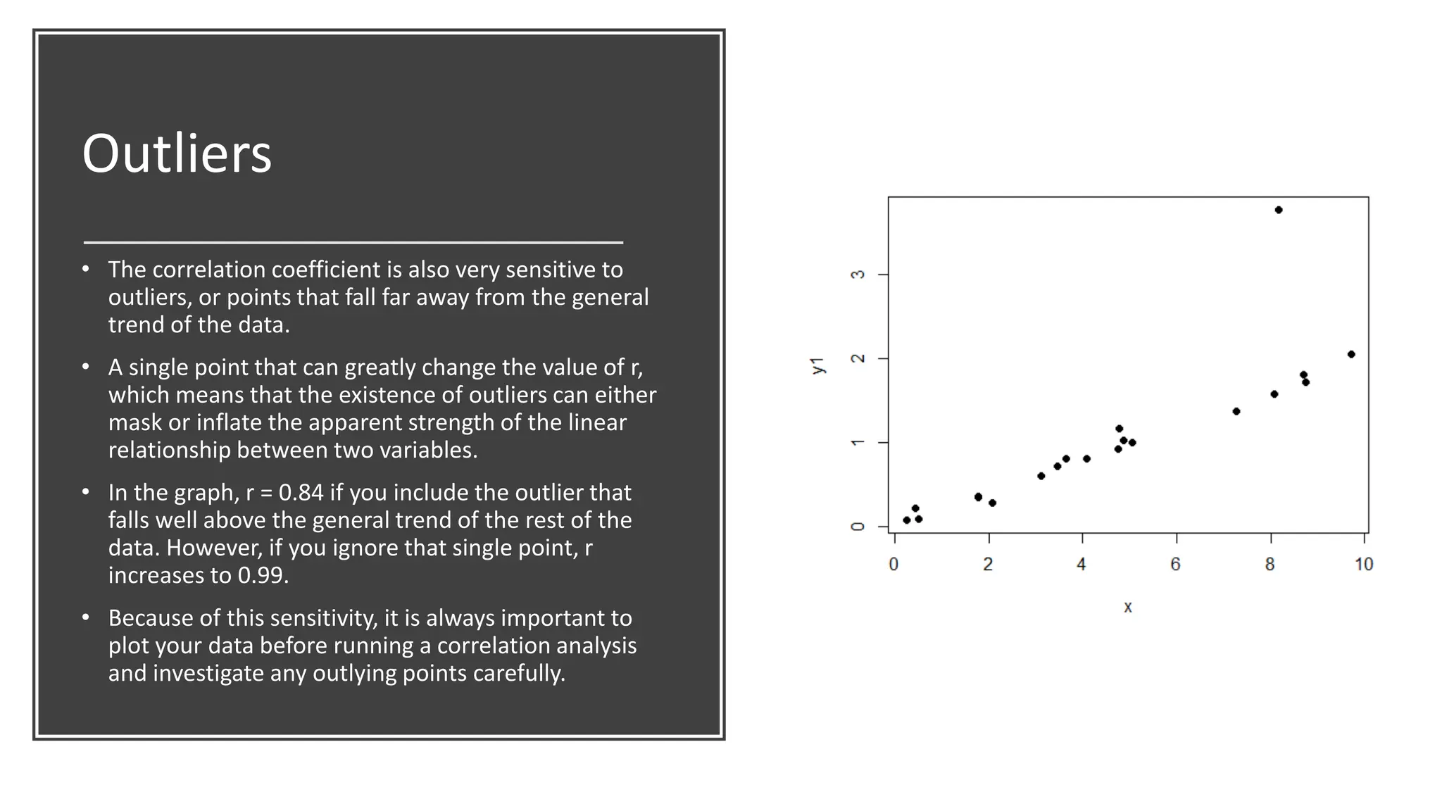
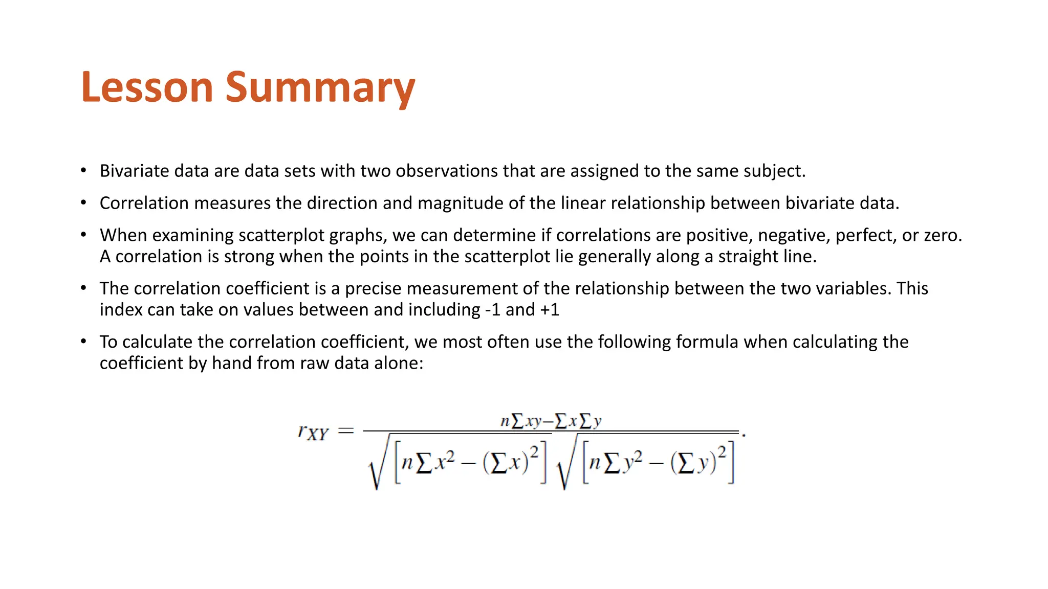
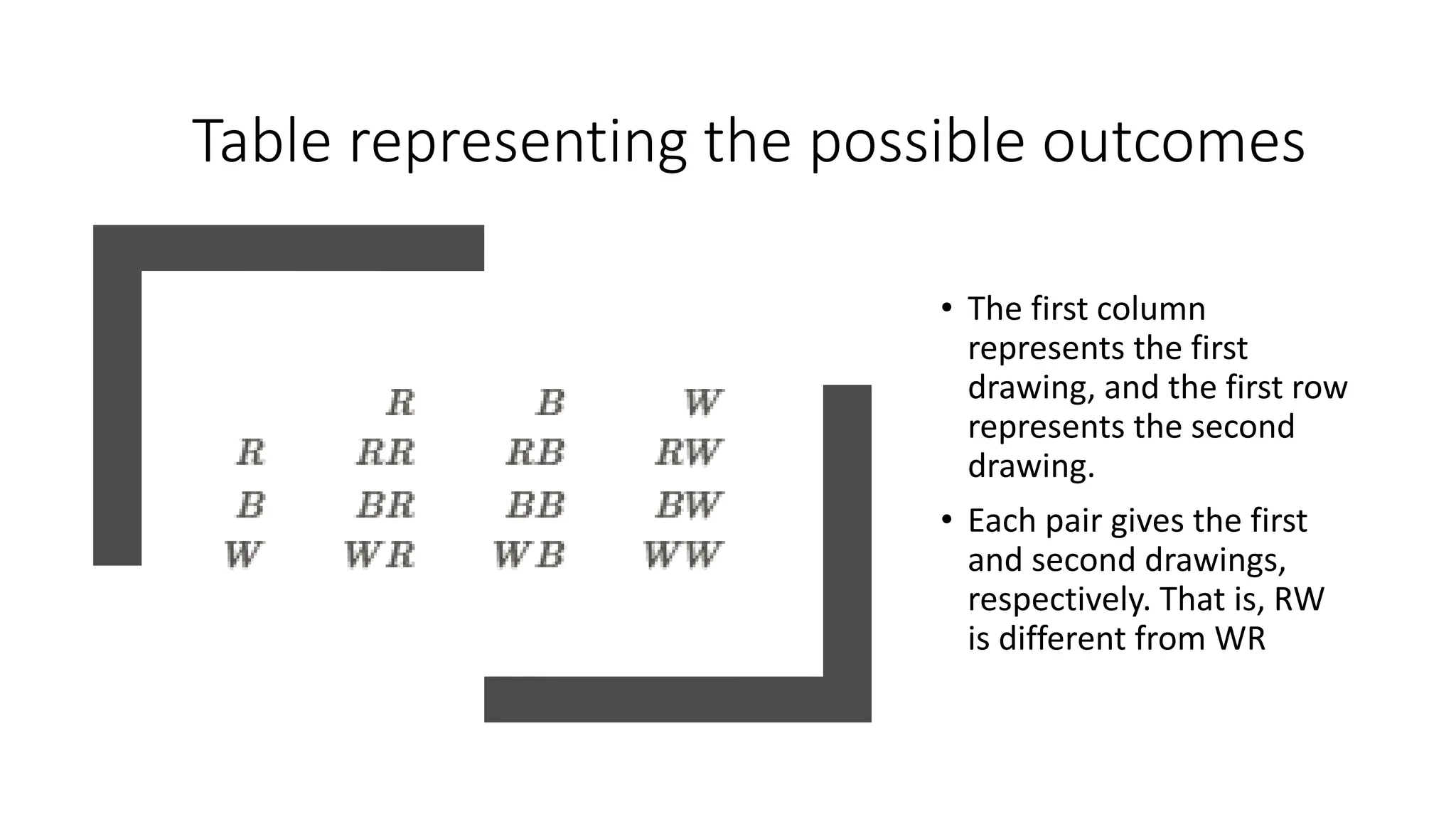
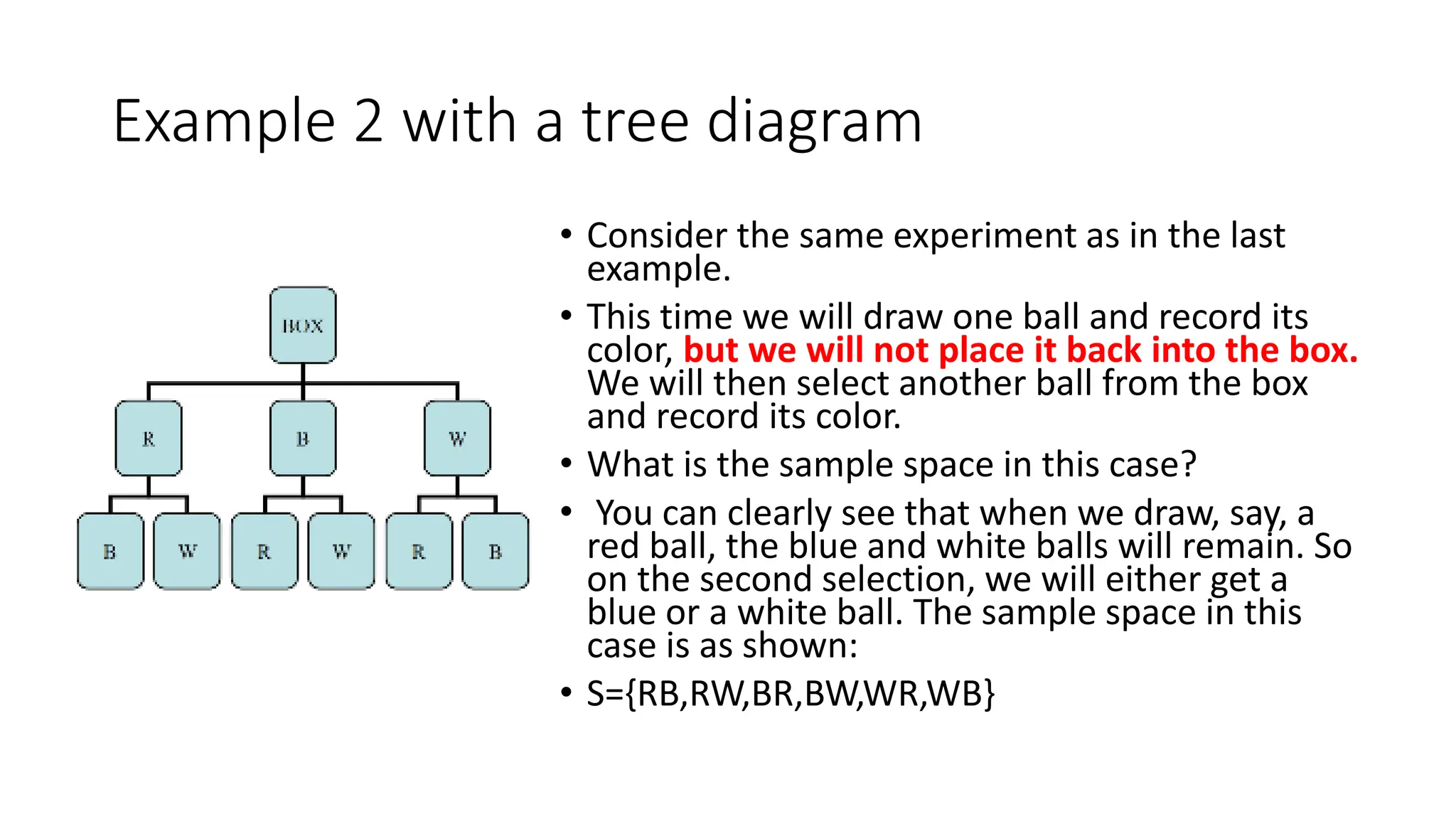
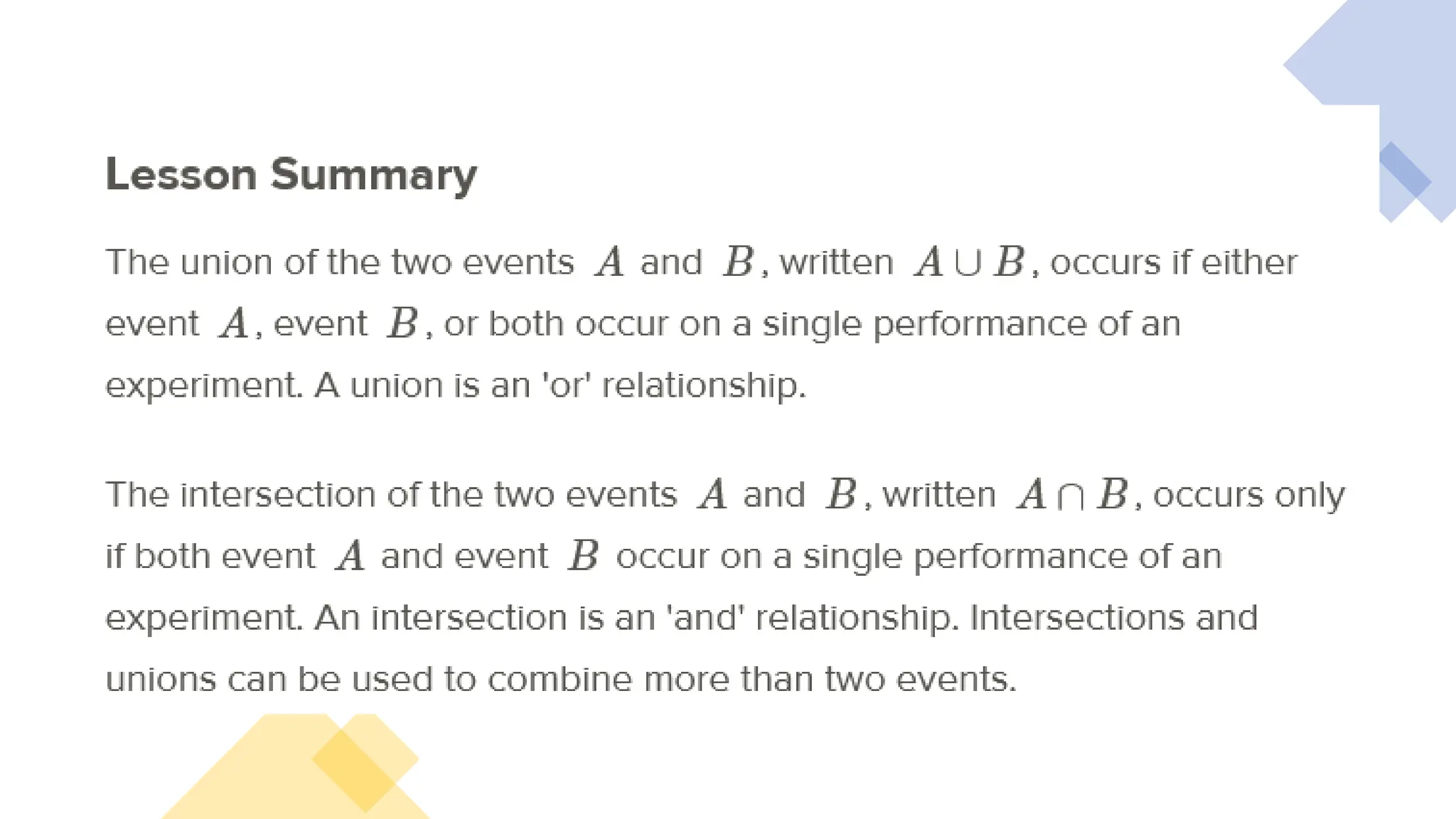
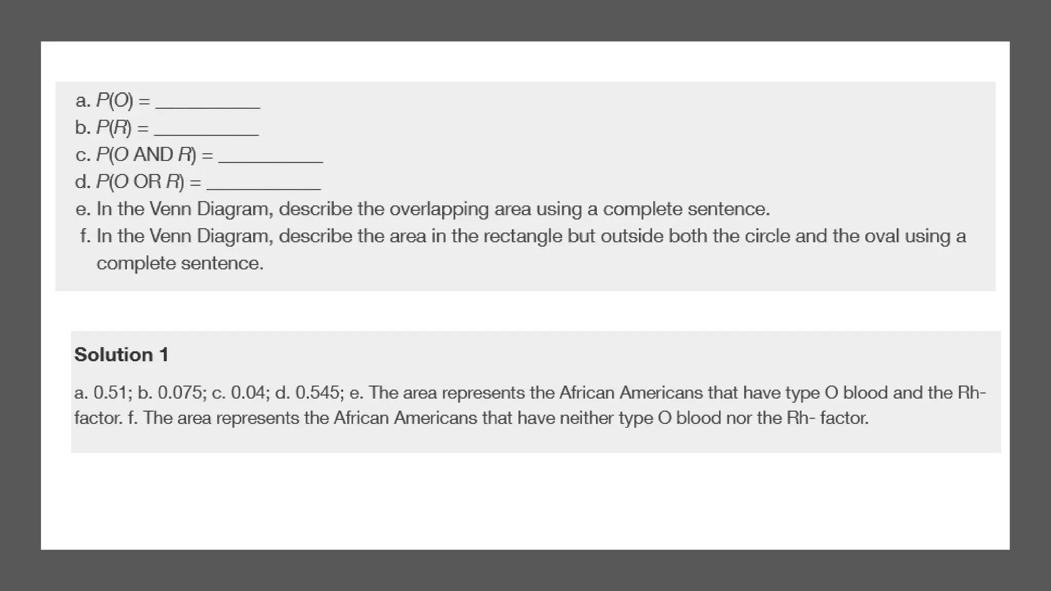
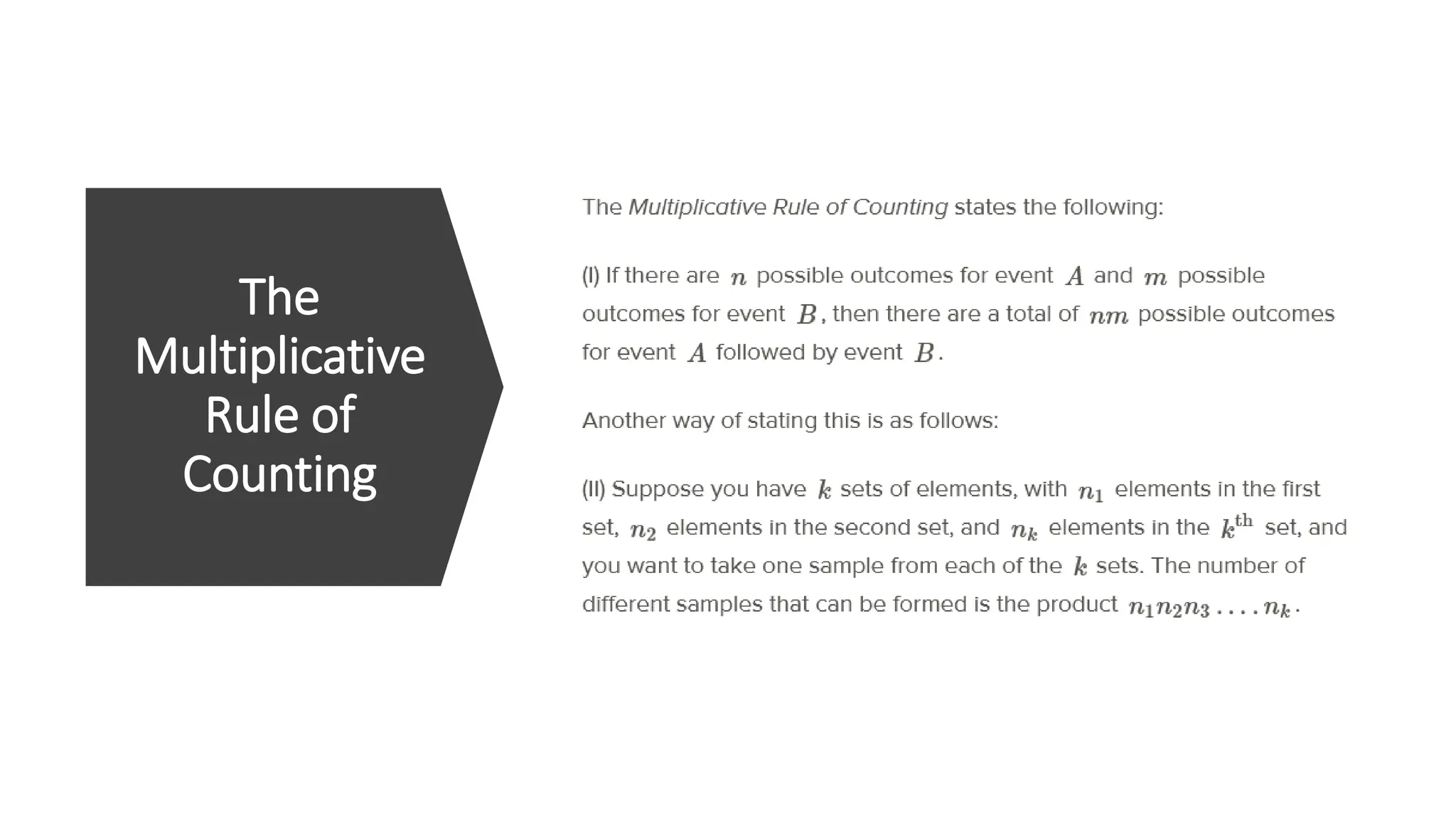
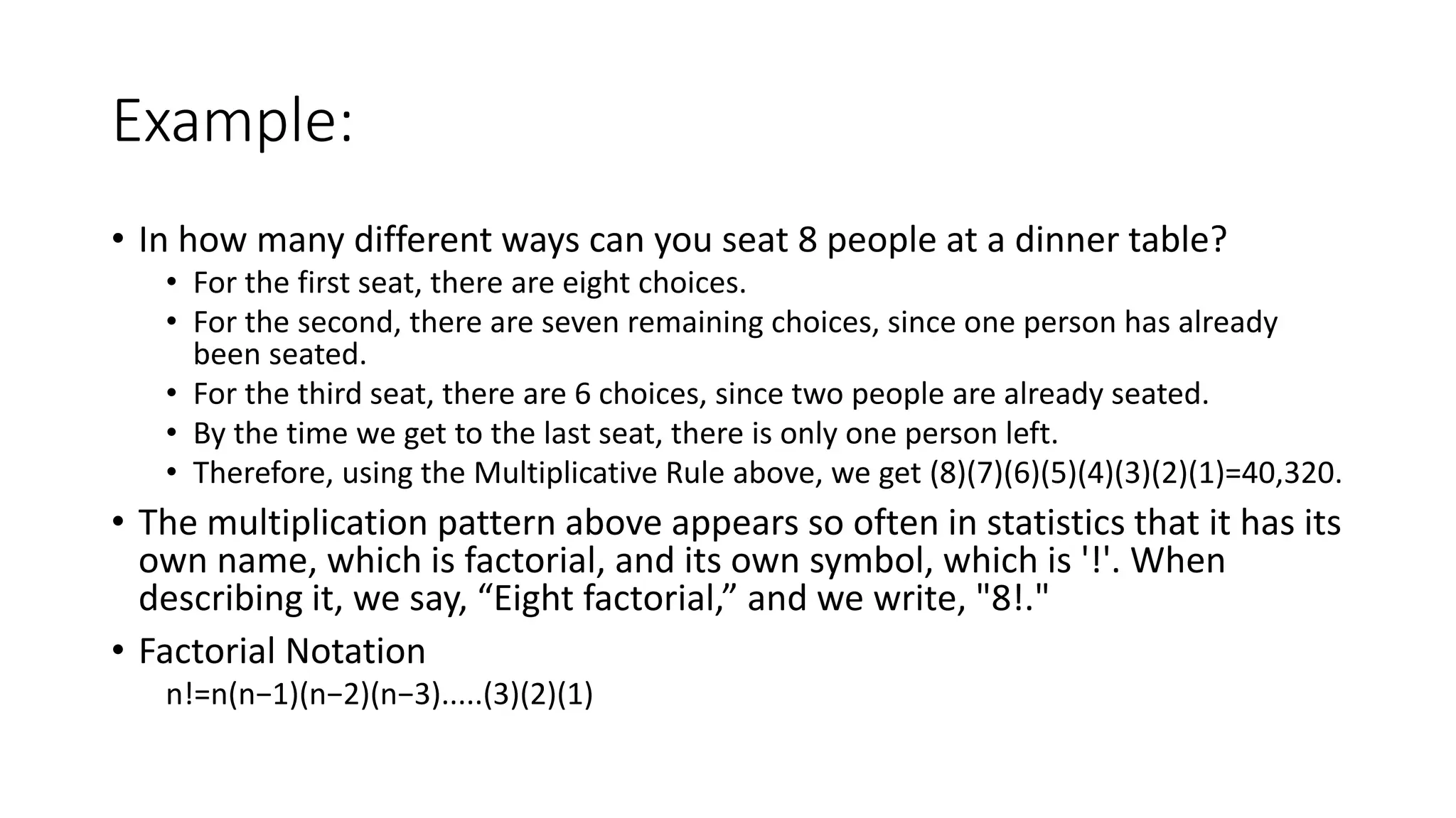
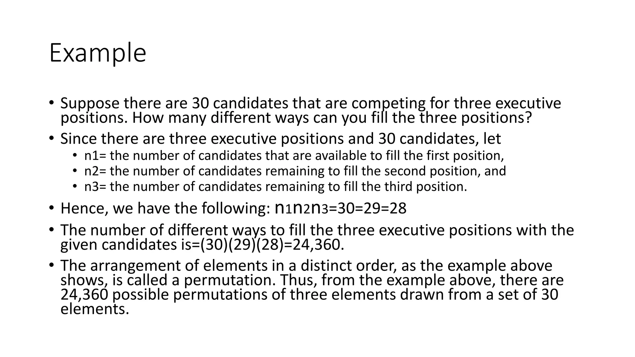
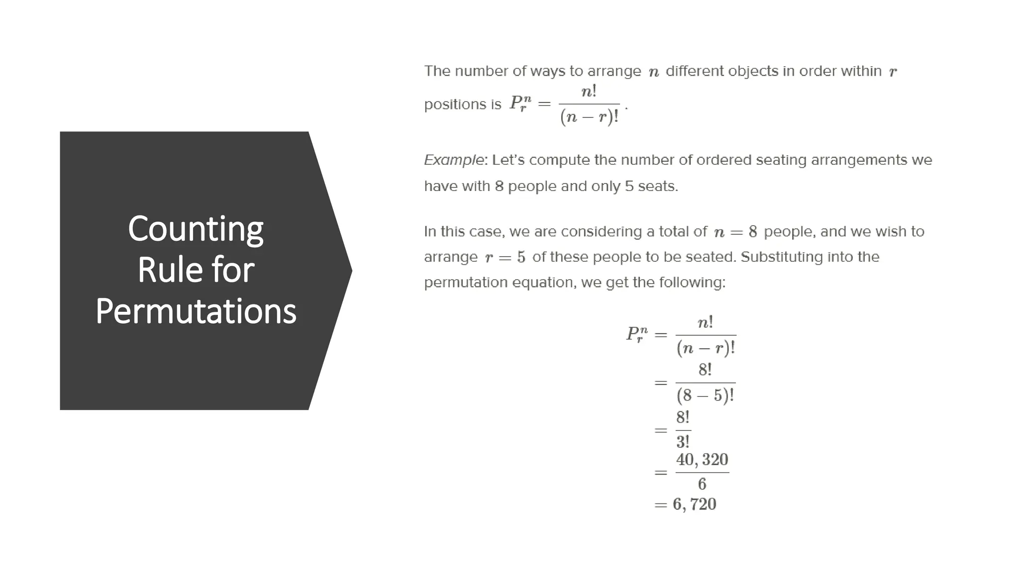
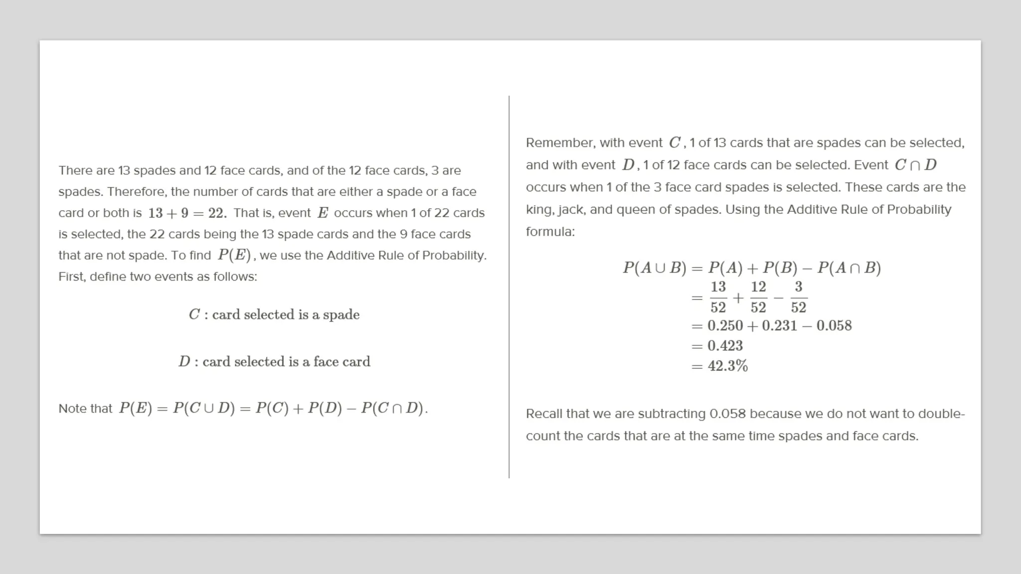
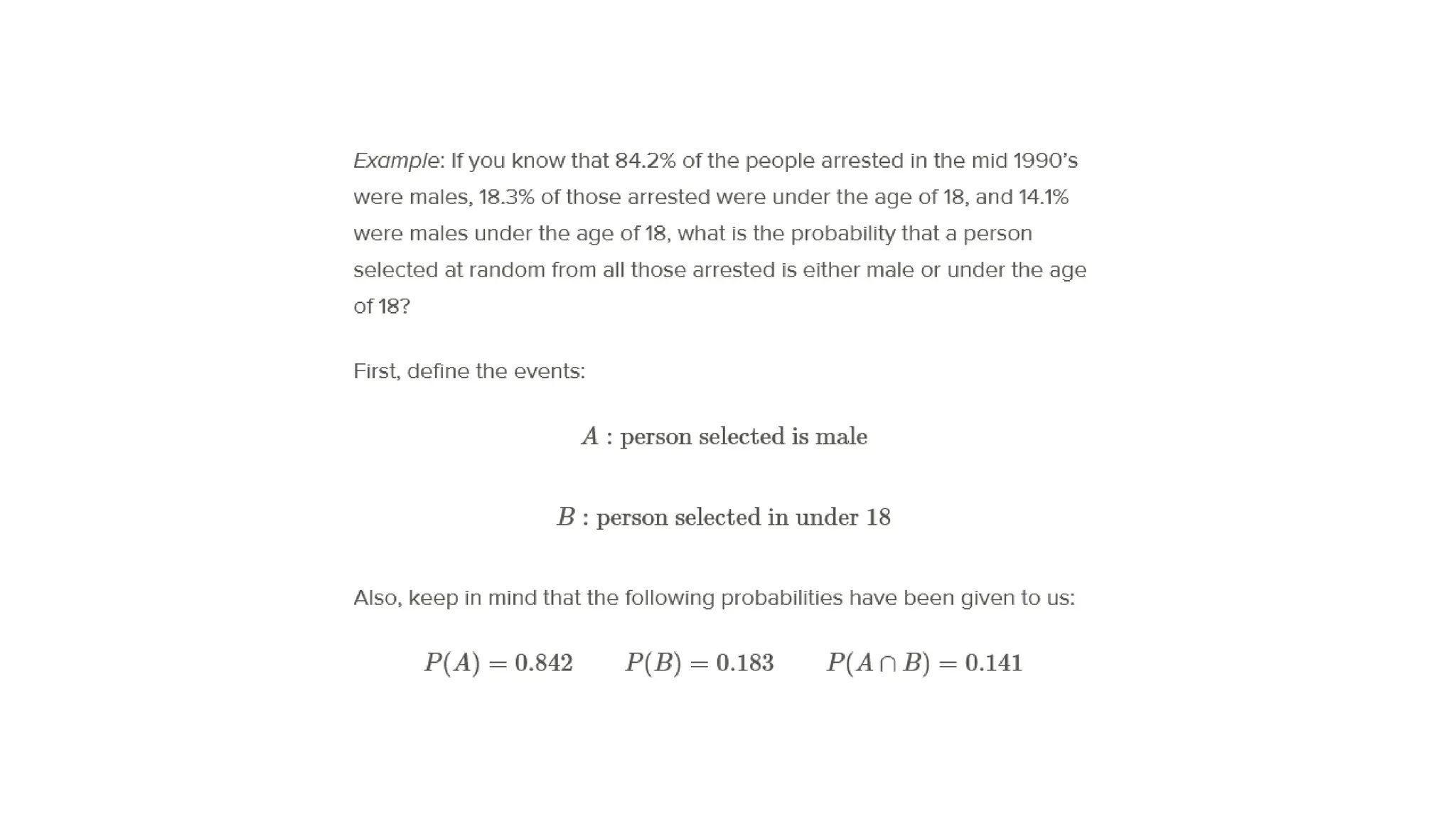
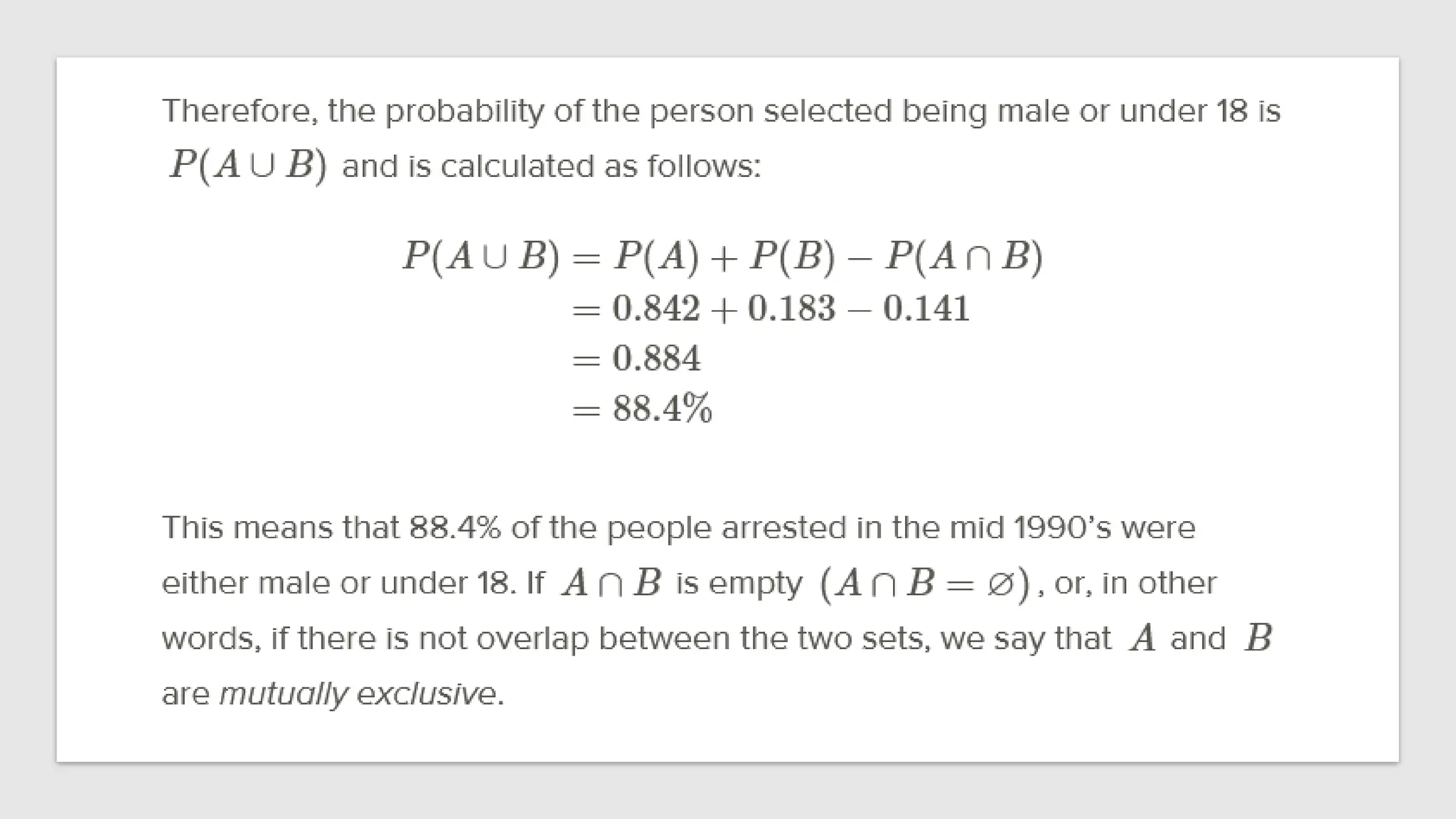
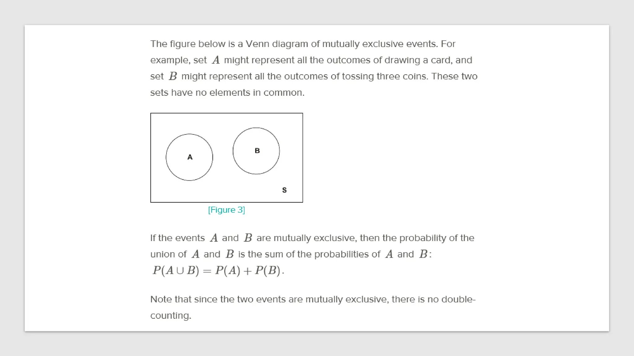
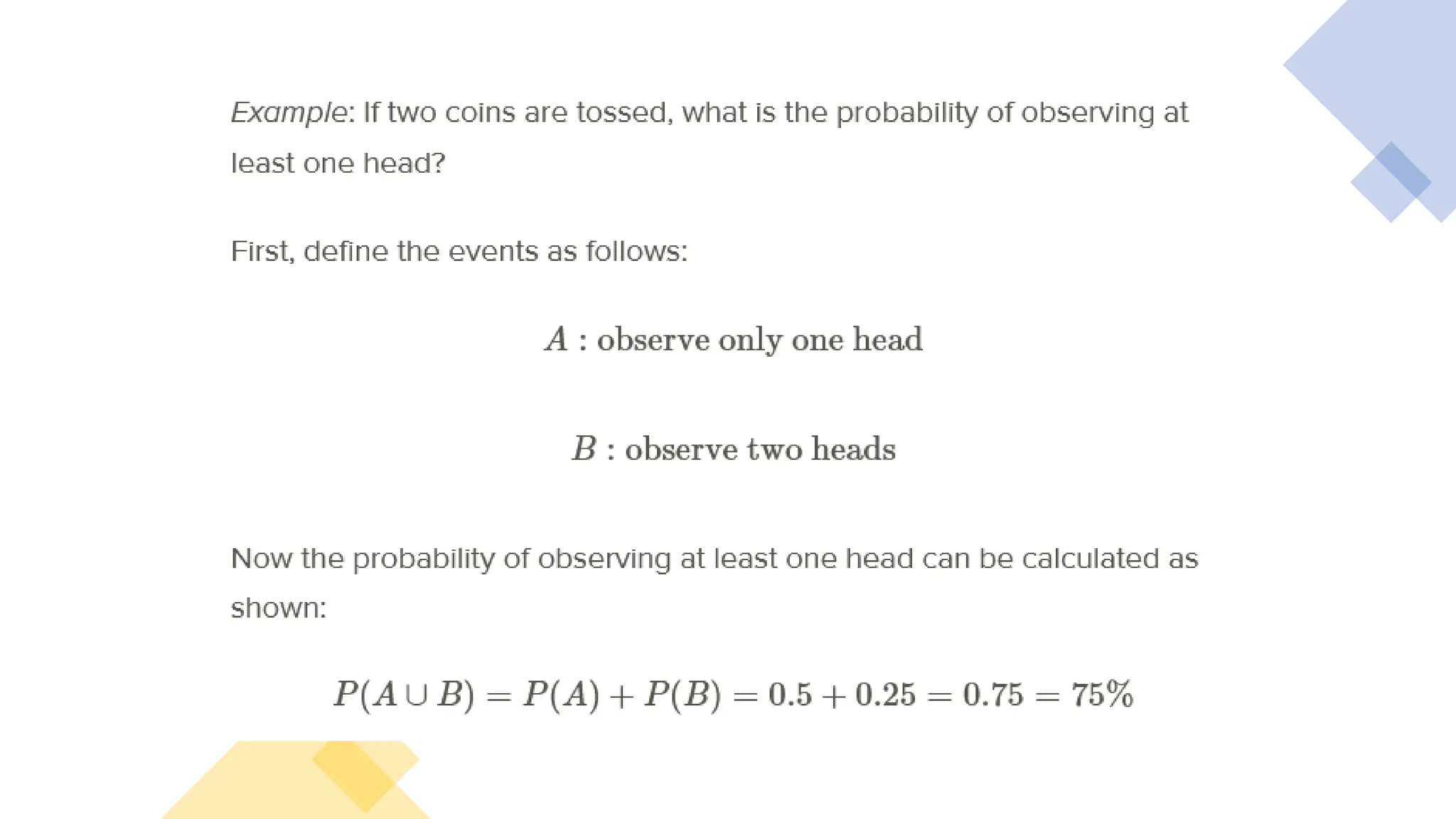
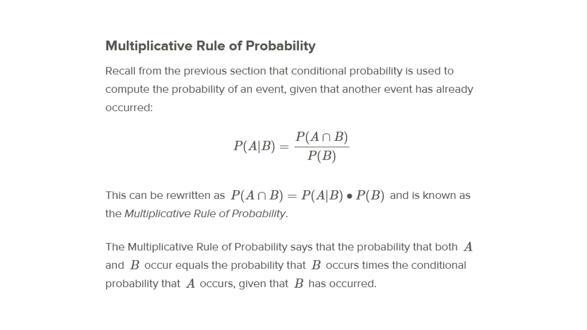
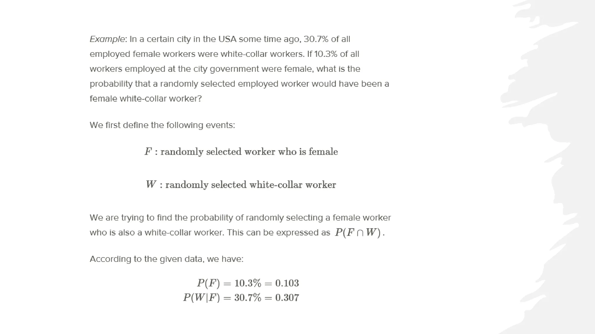
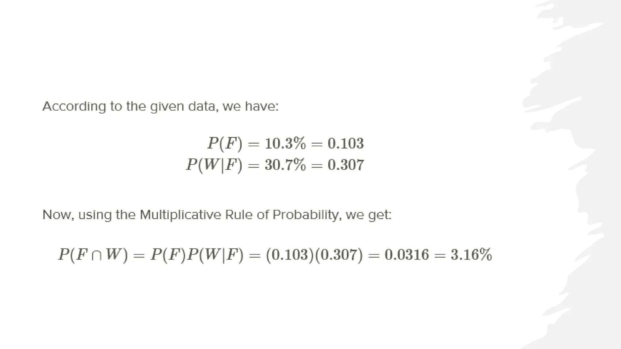
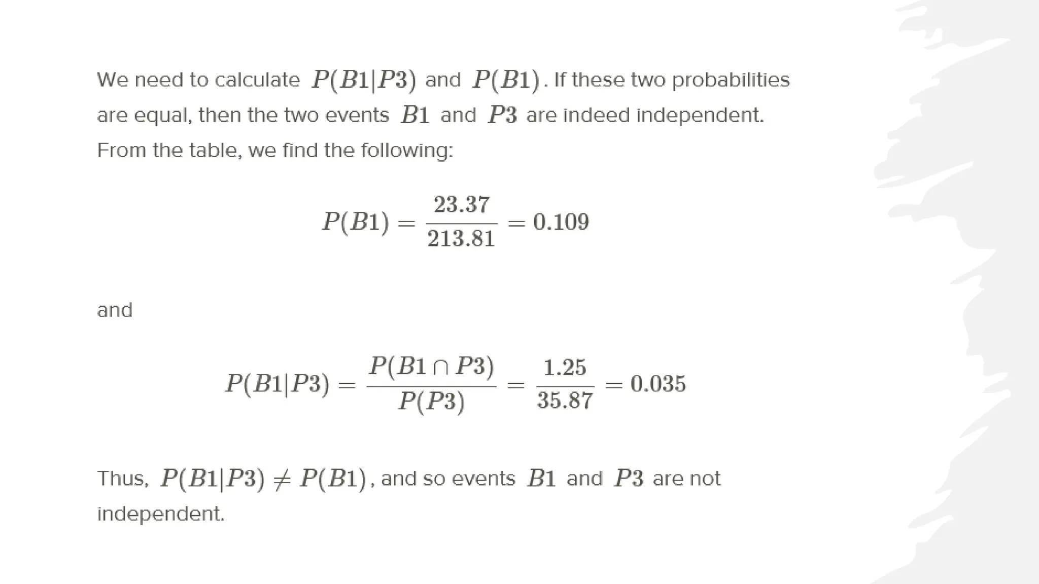
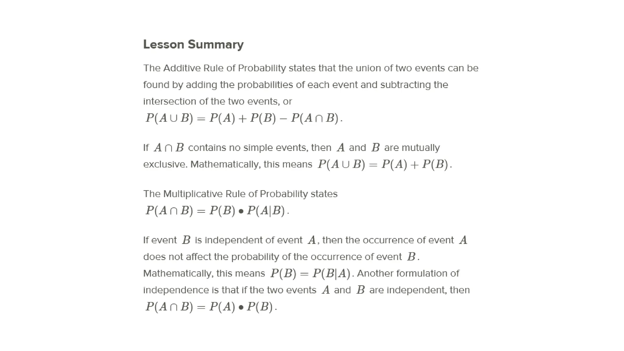
Displaying Bivariate Data
UNIT 2
Figure: Paper and Glass Packaging Recycling
Rates for 19 countries
Country % of Paper Packaging Recycled % of Glass Packaging Recycled
Estonia 34 64
New Zealand 40 72
Poland 40 27
Cyprus 42 4
Portugal 56 39
United States 59 21
Italy 62 56
Spain 63 41
Australia 66 44
Greece 70 34
Finland 70 56
Ireland 70 55
Netherlands 70 76
Sweden 70 100
France 76 59
Germany 83 81
Austria 83 44
Belgium 83 98
Japan 98 96
Scatterplots
• We will place the paper
recycling rates on the
horizontal axis and those for
glass on the vertical axis.
• Next, we will plot a point that
shows each country's rate of
recycling for the two
materials. This series of
disconnected points is
referred to as a scatterplot.
Line
• On the next graph, we have
plotted a line that represents
the paper and glass recycling
rates being equal.
• If all the countries had the
same paper and glass
recycling rates, each point in
the scatterplot would be on
the line. Because most of the
points are actually below this
line, you can see that the
glass rate is lower than would
be expected if they were
similar.
Characteristics of
Bivariate Data
• With univariate data, we initially
characterize a data set by describing
its shape, center, and spread.
• For bivariate data, we will also
discuss three important
characteristics: shape, direction, and
strength.
• These characteristics will inform us
about the association between the
two variables. The easiest way to
describe these traits for this
scatterplot is to think of the data as a
cloud. If you draw an ellipse around
the data, the general trend is that
the ellipse is rising from left to right.
The linear association of the data
• Data that are oriented in this manner are said to have a positive linear
association. That is, as one variable increases, the other variable also
increases.
• In this example, it is mostly true that countries with higher paper recycling rates have
higher glass recycling rates.
• Lines that rise in this direction have a positive slope, and lines that trend
downward from left to right have a negative slope.
• If the ellipse cloud were trending down in this manner, we would say the
data had a negative linear association.
• For example, we might expect this type of relationship if we graphed a country's
glass recycling rate with the percentage of glass that ends up in a landfill. As the
recycling rate increases, the landfill percentage would have to decrease.
Strength of the linear association
• The ellipse cloud also gives us some information about the strength of
the linear association.
• If there were a strong linear relationship between the glass and paper
recycling rates, the cloud of data would be much longer than it is
wide.
• Long and narrow ellipses mean a strong linear association, while
shorter and wider ones show a weaker linear relationship.
• In this example, there are some countries for which the glass and
paper recycling rates do not seem to be related.
Association between
the variables
• New Zealand, Estonia, and Sweden
(circled in yellow) have much lower
paper recycling rates than their glass
recycling rates, and Austria (circled in
green) is an example of a country with a
much lower glass recycling rate than its
paper recycling rate.
• These data points are spread away from
the rest of the data enough to make the
ellipse much wider, weakening the
association between the variables.
Line Plots
• The following data set shows the
change in the total amount of
municipal waste generated in the
United States during the 1990's:
• In this example, the time in years is
considered the explanatory variable,
or independent variable, and the
amount of municipal waste is the
response variable, or dependent
variable.
Time as an explanatory variable
• It is not only the passage of time that causes our waste to increase. Other
factors, such as population growth, economic conditions, and societal
habits and attitudes also contribute as causes.
• However, it would not make sense to view the relationship between time
and municipal waste in the opposite direction.
• When one of the variables is time, it will almost always be the explanatory
variable.
• Because time is a continuous variable, and we are very often interested in
the change a variable exhibits over a period of time, there is some meaning
to the connection between the points in a plot involving time as an
explanatory variable.
• In this case, we use a line plot.
Line plot for the US
Municipal Waste data
• A line plot is simply a scatterplot in
which we connect successive
chronological observations with a
line segment to give more
information about how the data
values are changing over a period of
time. Here is the line plot for the US
Municipal Waste data:
• Interpreting Graphs for Bivariate Data
• It is easy to see general trends from scatter plots or line plots. For
Example B, we can spot the year in which the most dramatic increase
occurred (1990) by looking at the steepest line. We can also spot the
years in which the waste output decreased and/or remained about
the same (1991 and 1996). It would be interesting to investigate some
possible reasons for the behaviors of these individual years.
Interpreting the
Trend
• Following is a scatterplot of
the number of lives births per
10,000 23-year-old women in
the United States between
1917 and 1975.
• Comment on the pattern this
shows of birthrate over time.
• Birthrate, over time, appears to be cyclic. There was a dip in birthrate
in 1932, then a gradual increase to a high in 1956. After that there
was a drop in the birthrate.
Make a scatter
plot of this data
• Data from a British
government survey of
household spending may be
used to examine the
relationship between
household spending on
tobacco products and
alcoholic beverages. The data
gathered is included in the
following table.
Steps in Excel
• 1. Select the range
• 2. On the Insert tab, in the Charts group, click the Scatter symbol.
• 3. Click Scatter. Or Click Scatter with Straight Lines.
Add a horizontal and vertical axis title. The horizontal axis of a scatter
plot is a value axis, so you have more axis scaling options (the same as a
vertical axis which always is a value axis).
Here is what the image
in Excel should look like
for your scatter plot:
• Comment of the relationship
between household spending on
alcohol and tobacco products: It
appears that household spending on
alcohol productions and household
spending on tobacco products are
directly related. That is, as one goes
up, the other goes up.
Relationships between
Quantitative Variables
Unit 3
Scatterplots and Linear Correlation
• Understand the concepts of bivariate data and correlation, and the
use of scatterplots to display bivariate data.
• Understand when the terms ’positive’, ’negative’, ’strong’, and
’perfect’ apply to the correlation between two variables in a
scatterplot graph.
• Calculate the linear correlation coefficient and coefficient of
determination
Correlation
• what if we notice that two variables seem to be related?
• We may notice that the values of two variables, such as verbal SAT
score and GPA, behave in the same way and that students who
have a high verbal SAT score also tend to have a high GPA.
• In this case, we would want to study the nature of the connection
between the two variables.
• we can use the concept of correlation to describe the relationship
between the two variables.
Correlation and Bivariate Data
• Correlation measures the linear relationship between two quantitative variables. Correlation is possible
when we have bivariate data.
• In other words, when the subjects in our dataset have scores on two separate quantitative variables, we
have bivariate data.
• In our example above, we notice that there are two observations (verbal SAT score and GPA) for each subject
(in this case, a student).
• Can you think of other scenarios when we would use bivariate data?
Correlation Patterns in
Scatterplot Graphs
• Scatterplots display bivariate data and
provide a visual representation of the
relationship between the two variables.
• In a scatterplot, each point represents a
paired measurement of two variables for a
specific subject, and each subject is
represented by one point on the
scatterplot.
• Examining a scatterplot graph allows us to
obtain some idea about the relationship
between two variables. When the points
on a scatterplot graph produce a lower-
left-to-upper-right pattern we say that
there is a positive correlation between the
two variables.
• When all the points on a scatterplot lie on a straight line, you have what is called a perfect correlation
between the two variables
Correlation Coefficient
• While examining scatterplots gives us some idea about the relationship between
two variables, we use a statistic called the Pearson correlation coefficient to give
us a more precise measurement of the relationship between the two variables.
• We use r to denote the correlation coefficient, and r has the following properties:
• r is always a value between -1 and +1
• The further an r value is from zero, the stronger the relationship between the
two variables. The absolute value of the coefficient indicates the magnitude, or
strength, of the relationship.
• The sign of r indicates the nature of the relationship: A positive r indicates a
positive relationship, and a negative r indicates a negative relationship.
Correlation Coefficient
• If two variables have a perfect linear relationship (meaning they fall on a straight
line), then r is equal to 1.0 or -1.0, depending on the direction of the
relationship.
• When there is no linear relationship between two variables, r=0.
• It is important to remember that a correlation coefficient of 0 means that there is
no linear relationship, but there may still be a relationship between the two
variables.
• For example, there could be a quadratic relationship between them.
Generally speaking, you may think of the
values of r in the following manner:
Coefficient of Determination
• The coefficient of determination is very simple to calculate if you know the
correlation coefficient, since it is just r2. The coefficient of determination can be
interpreted as the percentage of variation of the y variable that can be attributed
to the relationship.
• In other words, a value of r2 = 0.63 can be interpreted as 63% of the variation in Y
can be attributed to the variation in X.
• Thus, the correlation coefficient not only provides a measure of the relationship
between the variables, but it also gives us an idea about how much of the total
variance of one variable can be associated with the variance of the other.
• The higher the correlation we have between two variables, the larger the portion
of the variance that can be explained by the independent variable.
Example
• Elaina is curious about the relationship between the
weight of a dog and the amount of food it eats.
• Specifically, she wonders if heavier dogs eat more
food, or if age and size factor in. She works at the
Humane Society, and does some research.
• After some calculation, she determines that dog
weight and food weight exhibit an r-value of 0.73.
• What can Elaina say about the relationship, based on
her research? What percentage of the increases in
food intake can she attribute to weight, according to
her research?
Solution
• The calculated r-value of 0.73 tells us that
Elaina’s data demonstrates a moderate to strong
correlation between the variables.
• Since the coefficient of determination tells us the
percentage of changes in the output variable that
can be attributed to the input variable, we need
to calculate r2:
• r2 = (0.73)2 = .5329
• Approximately 53% of increases in food intake
can be attributed to the linear relationship
between food intake and the weight of the dog.
• Since weight explains less than 100% of the
difference in food intake, this suggests that other
factors, perhaps age and size, are also involved.
Example B
• Tuscany wonders if barrel racing times are related to the age of the horse.
Specifically, she wonders if older horses take longer to complete a barrel racing
run. As a member of the Pony Club, she does some research, and determines
• that horse age to barrel run time exhibits an r-value of 0.52.
• What can Tuscany say about horse age vs barrel race time, according to her
research?
Solution
• Tuscany’s research suggests that there is a moderate to weak correlation between horse age and barrel run
time.
• In other words, the research suggests that (0.52)2 = .27 = 27% of the differences between barrel run times
could be attributable to the linear relationship between barrel run time and the age of the horse.
How to Calculate r
In other words, the coefficient is expressed as the sum of the cross products of the standard z-scores divided
by the number of degrees of freedom.
For correlation, df = n-1, where n is the number of bivariate data points in your analysis.
To understand how this coefficient is calculated, let’s suppose that there is a positive relationship between two
variables, X and Y. If a subject has a score on X that is above the mean, we expect the subject to have a score
on Y that is also above the mean.
Pearson developed his correlation coefficient by computing the sum of cross products.
He multiplied the two scores, X and Y, for each subject and then added these cross products across the
individuals. Next, he divided this sum by the number of subjects minus one.
This coefficient is, therefore, the mean of the cross products of scores. Pearson used standard scores (z-scores,
t-scores, etc.) when determining the coefficient.
How to Calculate the
Correlation Coefficient
Unit 3
Calculating r using the Raw Score Formula
What is the correlation coefficient for the two variables
represented in the table below?
In order to calculate the correlation coefficient, we need to calculate several pieces
of information, including xy; x2, and y2.
Table including 3 more columns xy x2 y2
Table - Solution
Values needed to apply the Raw Formula
• n=
• Σxy=
• Σx=
• Σy=
• Σx2 =
• Σy2 =
• (Σx)2 =
• (Σy)2=
Applying the Raw Formula
The Properties and Common Errors of Correlation
• Correlation is a measure of the linear relationship between two variables-it does
not necessarily state that one variable is caused by another.
• For example, a third variable or a combination of other things may be causing the
two correlated variables to relate as they do.
• Therefore, it is important to remember that we are interpreting the variables and
the variance not as causal, but instead as relational.
• When examining correlation, there are four things that could affect our results:
• lack of linearity,
• outliers,
• Homogeneity of the group,
• and sample size.
Lack of Linearity
• As mentioned, the correlation coefficient is the measure of the linear relationship
between two variables.
• While many pairs of variables have a linear relationship, some do not.
• For example, let’s consider performance anxiety. As a person’s anxiety about
performing increases, so does his or her performance up to a point.
• However, at some point, the increase in anxiety may cause a person’s performance
to go down.
• We call these non-linear relationships curvilinear relationships. We can identify
curvilinear relationships by examining scatterplots.
• One may ask why curvilinear relationships pose a problem when calculating the
correlation coefficient. The answer is that if we use the traditional formula to
calculate these relationships, it will not be an accurate index, and we will be
underestimating the relationship between the variables.
• If we graphed performance against anxiety, we would see that anxiety has a strong
affect on performance. However, if we calculated the correlation coefficient, we
would arrive at a figure around zero.
• Therefore, the correlation coefficient is not always the best statistic to use to
understand the relationship between variables.
Outliers
• The correlation coefficient is also very sensitive to
outliers, or points that fall far away from the general
trend of the data.
• A single point that can greatly change the value of r,
which means that the existence of outliers can either
mask or inflate the apparent strength of the linear
relationship between two variables.
• In the graph, r = 0.84 if you include the outlier that
falls well above the general trend of the rest of the
data. However, if you ignore that single point, r
increases to 0.99.
• Because of this sensitivity, it is always important to
plot your data before running a correlation analysis
and investigate any outlying points carefully.
Homogeneity of the Group (Restriction of
Range)
• Another error we could encounter when calculating the correlation coefficient is homogeneity of
the group.
• When a group is homogeneous, or possesses similar characteristics, the range of scores on either
or both of the variables is restricted.
• For example, suppose we are interested in finding out the correlation between IQ and salary.
• If only members of the Mensa Club (a club for people with IQs over 140) are sampled, we will
most likely find a very low correlation between IQ and salary, since most members will have a
consistently high IQ, but their salaries will still vary.
• This does not mean that there is not a relationship-it simply means that the restriction of the
sample limited the magnitude of the correlation coefficient.
• This is sometimes referred to as a "restriction of range" problem.
Sample Size
• Finally, we should consider sample size.
• One may assume that the number of observations used in the calculation of the
correlation coefficient may influence the magnitude of the coefficient itself.
• However, this is not the case.
• While the sample size does not affect the correlation coefficient, it may affect the
accuracy of the relationship.
• The larger the sample, the more accurate of a predictor the correlation
coefficient will be of the relationship between the two variables.
Lesson Summary
• Bivariate data are data sets with two observations that are assigned to the same subject.
• Correlation measures the direction and magnitude of the linear relationship between bivariate data.
• When examining scatterplot graphs, we can determine if correlations are positive, negative, perfect, or zero.
A correlation is strong when the points in the scatterplot lie generally along a straight line.
• The correlation coefficient is a precise measurement of the relationship between the two variables. This
index can take on values between and including -1 and +1
• To calculate the correlation coefficient, we most often use the following formula when calculating the
coefficient by hand from raw data alone:
Group Work
Relationships between
Categorical Variables
Contingency Tables
Learning Objective
• How to create and use contingency tables.
• How to find the marginal distribution of a variable.
Contingency Tables
• Suppose you wanted to evaluate how gender affects the type of
movie chosen by movie-goers.
• How might you organize data on male and female watchers, and
action, romance, comedy, and horror movie types, so it would be easy
to compare the different combinations?
• Contingency tables are used to evaluate the interaction of two
different categorical variables.
• Contingency tables are sometimes called two-way tables because
they are organized with the outputs of one variable across the top,
and another down the side.
Contingency Table- Example
• This is a contingency table comparing the variable ’Gender’ with the variable ’Candy
Preference’.
• You can see that, across the top of the table are the two gender options for this
particular study: ’male students’ and ’female students’.
• Down the left side are the two candy preference options: ’chocolate’ and ’fruit’. The data
in the center of the table indicates the reported candy preferences of the 200 students
polled during the study.
Add a column and a row for totals
• Notice that you can run a quick check on the calculation of totals, since the “total
of totals” should be the same from either direction: 119+81 = 200 = 100+100.
• Commonly, there will be one additional row and column for totals, like this:
Marginal Distribution
• A marginal distribution is how many overall responses there were for each
category of the variable.
• The marginal distribution of a variable can be determined by looking at the
"Total" column (for type of candy) or the "Total" row (for gender).
• For example, we can see that the marginal totals for type of candy are 119
chocolate and 81 fruit.
• Similarly, the marginal total for gender tells us there were an equal number of
males and females in the study.
Construct a
contingency
table to
display the
following
data:
• 250 mall shoppers were asked if they intended to
eat at the in-mall food court or go elsewhere for
lunch. Of the 117 male shoppers, 68 intended to
stay, compared to only 62 of the 133 female
shoppers
• Solution: First, let’s identify our variables and set up
the table with the appropriate row and column
headers.
• The variables are gender and lunch location choice:
Fill in the values in the Table
• Now we can fill in the values we have directly from the text:
• Now we can fill in the missing data with simple addition/subtraction:
Referencing data from the previous Example , answer the
following:
• a. What percentage of food-court eaters are female?
• b. What is the distribution of male lunch-eaters?
• c. What is the marginal distribution of the variable “lunch location preference”?
• d. What is the marginal distribution of the variable “Gender”?
• e. What percentage of females prefer to eat out?
Referencing data from the previous Example , answer the
following:
• a. What percentage of food-court eaters are female? If we read across the row “Food
Court”, we see that there were a total of 130 shoppers eating “in”, and that 62 of them
were female. To calculate percentage, we simply divide: 62 /130 =0.477 or 47.7%.
• b. What is the distribution of male lunch-eaters? The male shoppers were distributed as
68 food court and 49 out of mall.
• c. What is the marginal distribution of the variable “lunch location preference”? The
marginal distribution is the distribution of data “in the margin”, or in the TOTAL column.
In this case, we are interested in the data on lunch location preference, which is found in
the far right column: 130 food court and 120 out of mall.
• d. What is the marginal distribution of the variable “Gender”? The marginal distribution
of gender can be found in the bottom row: 117 males and 133 females
• e. What percentage of females prefer to eat out? Here we are interested in data from the
females, so we will be dealing with the ’female’ column. From the data in the column, we
see that 71 of the 133 females preferred to eat out. This is a percentage of: 71 /133 =
0.534 or 53.4%.
Example-Using the given data:
a. Construct a contingency table
b. Identify the marginal distributions
c. Identify 3 different percentage-based observations
• Out of 213 polled amateur drag racers, 37 drove cars
with turbo-chargers, 59 had superchargers, and the
rest were normally aspirated. The racers themselves
were split between 102 rookies and 111 veterans.
The rookies evidently preferred turbos, since 29 of
them had turbo-charged vehicles, and avoided
superchargers, since there were only 12 of them.
Identify the marginal distributions
The marginal distribution refers to the overall data for each of the two variables:
• Aspiration type is distributed as follows: 37 Turbos, 59 Superchargers, and 117
normally aspirated.
• Driver experience distribution: 102 Rookies and 111 Veterans.
Identify 3 different percentage-based observations
Vocabulary
• A contingency table or two-way table is used to organize data from multiple
categories of two variables so that various assessments may be made.
• A marginal distribution is the distribution of data “in the margin” of a table. It
may also be described as the distribution of the data for a single variable.
Extra Practice
Solution (there is a mistake in this table)
Events, Sample Spaces and
Probability
Week 4
Learning Objectives
• Know basic statistical terminology.
• List simple events and sample spaces.
• Know the basic rules of probability.
What is an Event?
• An event is something that occurs, or happens. For example, flipping a
coin is an event, and so is walking in the park and passing by a bench.
Anything that could possibly happen is an event.
• Every event has one or more possible outcomes. While tossing a coin
is an event, getting tails is the outcome of that event. Likewise, while
walking in the park is an event, finding your friend sitting on the
bench is an outcome of that event.
Simple Events
• Suppose a coin is tossed once. There are two possible
outcomes, either heads, H, or tails, T. Notice that if the
experiment is conducted only once, you will observe only
one of the two possible outcomes.
• An experiment is the process of taking a measurement or
making an observation.
• These individual outcomes for an experiment are each
called simple events.
• Example: A die has six possible outcomes: 1, 2, 3, 4, 5, or 6.
When we toss it once, only one of the six outcomes of this
experiment will occur. The one that does occur is called a
simple event.
The Sample Space
• Example: Suppose that two pennies are tossed simultaneously. We
could have both pennies land heads up (which we write as HH), or the
first penny could land heads up and the second one tails up (which
we write as HT), etc.
• We will see that there are four possible outcomes for each toss,
which are HH,HT,TH, and TT. The table below shows all the possible
outcomes.
What is the Sample Space
What we have accomplished so
far is a listing of all the possible
simple events of an experiment.
This collection is called the
sample space of the
experiment.
The sample space is the set of
all possible outcomes of an
experiment, or the collection of
all the possible simple events of
an experiment. We will denote
a sample space by S.
determine the sample space of throwing a die
• As we know, there are 6 possible outcomes for
throwing a die. We may get 1, 2, 3, 4, 5, or 6, so we
write the sample space as the set of all possible
outcomes:
• S={1,2,3,4,5,6}
Drawing a tree diagram to illustrate all the posible
selections
• Suppose a box contains three balls,
one red, one blue, and one white.
• One ball is selected, its color is
observed, and then the ball is
placed back in the box.
• The balls are scrambled, and again,
a ball is selected and its color is
observed. What is the sample
space of the experiment?
• As you can see from the tree
diagram, it is possible that you will
get the red ball, R, on the first
drawing and then another red one
on the second, RR. we can see that
the sample space is as follows:
• S={RR,RB,RW,BR,BB,BW,WR,WB,W
W}
Table representing the possible outcomes
• The first column
represents the first
drawing, and the first row
represents the second
drawing.
• Each pair gives the first
and second drawings,
respectively. That is, RW
is different from WR
Example 2 with a tree diagram
• Consider the same experiment as in the last
example.
• This time we will draw one ball and record its
color, but we will not place it back into the box.
We will then select another ball from the box
and record its color.
• What is the sample space in this case?
• You can clearly see that when we draw, say, a
red ball, the blue and white balls will remain. So
on the second selection, we will either get a
blue or a white ball. The sample space in this
case is as shown:
• S={RB,RW,BR,BW,WR,WB}
Probability of an Event
• Now let us return to the concept of probability and relate it to the concepts
of sample space and simple events.
• If you toss a fair coin, the chance of getting tails, T, is the same as the
chance of getting heads, H.
• Thus, we say that the probability of observing heads is 0.5, and the
probability of observing tails is also 0.5.
• The probability, P, of an outcome, A, always falls somewhere between two
extremes: 0, which means the outcome is an impossible event, and 1,
which means the outcome is guaranteed to happen.
• Most outcomes have probabilities somewhere in-between.
• Property 1: 0≤P(A)≤1, for any event, A.
• The probability of an event, A, ranges from 0 (impossible) to 1 (certain).
Sum of the probabilities of all possible
outcomes
• The probabilities of all possible simple outcomes of an event must
add up to 1. This 1 represents certainty that one of the outcomes
must happen. For example, tossing a coin will produce either heads or
tails. Each of these two outcomes has a probability of 0.5. This means
that the total probability of the coin landing either heads or tails is
0.5+0.5=1. That is, we know that if we toss a coin, we are certain to
get heads or tails.
• Property 2: ∑P(A)=1 when summed over all possible simple outcomes.
• The sum of the probabilities of all possible outcomes must add up to
1.
Classical Probability
• Notice that tossing a coin or throwing a die results in outcomes that are all
equally probable.
• That is, each outcome has the same probability as all the other outcomes
in the same sample space.
• Getting heads or tails when tossing a coin produces an equal probability for
each outcome, 0.5.
• Throwing a die has 6 possible outcomes, each also having the same
probability, 1/6.
• We refer to this kind of probability as classical probability. Classical
probability is defined to be the ratio of the number of cases favorable to
an event to the number of all outcomes possible, where each of the
outcomes is equally likely.
Formula to calculate the probability of an
outcome occurring
• Probability is usually denoted by P, and the respective elements of the
sample space (the outcomes) are denoted by A,B,C, etc. The
mathematical notation that indicates the probability that an outcome,
A, happens is P(A).
Exercise
• When tossing two coins, what is the probability of getting a head on
both coins, HH? Is the probability classical?
• Since there are 4 elements (outcomes) in the sample space set,
{HH,HT,TH,TT}, its size is 4.
• Furthermore, there is only 1 HH outcome that can occur.
• Notice that each of the 4 possible outcomes is equally likely. The
probability of each is 0.25. Also notice that the total probability of all
possible outcomes in the sample space is 1.
• What is the probability of throwing a die and getting A=2,3, or 4?
• There are 6 possible outcomes when you toss a die. Thus, the total
number of outcomes in the sample space is 6. The event we are
interested in is getting a 2, 3, or 4, and there are three ways for this
event to occur.
• Therefore, there is a probability of 0.5 or 50% that we will get 2, 3, or
4.
Exercise: Probability table for
flipping two weighted coins.
• Consider tossing two coins. Assume the coins
are not balanced. The design of the coins is
such that they produce the probabilities shown
in the table.
• What is the probability of observing exactly
one head, and what is the probability of
observing at least one head?
Solution
• Notice that the simple
events HT and TH each
contain only one head.
Thus, we can easily
calculate the probability
of observing exactly one
head by simply adding the
probabilities of the two
simple events:
Lesson Summary
• An event is something that occurs, or happens, with one or more
possible outcomes.
• An experiment is the process of taking a measurement or making an
observation.
• A simple event is the simplest outcome of an experiment.
• The sample space is the set of all possible outcomes of an
experiment, typically denoted by S.
Plix exercises
• https://www.ck12.org/assessment/tools/geometry-
tool/plix.html?eId=MAT.PRB.201.04&questionId=546d336c8e0e0842
1c43a5bc&artifactID=2184220&conceptCollectionHandle=probability
-::-measurement-of-
probability&collectionCreatorID=3&plix_redirect=1
• https://www.ck12.org/assessment/tools/geometry-
tool/plix.html?eId=MAT.PRB.201.02&questionId=56f437df5aa41363b
118e75c&artifactID=2515869&conceptCollectionHandle=probability-
::-definition-of-
probability&collectionCreatorID=3&noReturn=true&plix_redirect=1
Compound Events
Second Term
Dependent and Independent Events
• Learning Objectives
• Know basic operations of unions and intersections.
• Calculate the probability of occurrence of two (or more) simultaneous
events.
• Calculate the probability of occurrence of either of two (or more)
events.
• Introduction
• In this lesson, you will learn how to combine two or more events by
finding the union of the two events or the intersection of the two
events. You will also learn how to calculate probabilities related to
unions and intersections.
Union and
Intersection
Example:
Watch this Video
• https://www.ck12.org/c/probability/recognizing-independent-and-
dependent-events/plix/Counting-Events-Flipping-Unfair-Coins-
557b5d315aa413592077fccf
• https://www.ck12.org/c/probability/conditional-
probability/plix/Intersection-of-Compound-Events-Candy-Store-
556ccdb25aa4131f0a43b821
The Complement of an Event
Week 5-Class 2
• Learning Objectives
• Know the definition of the complement of an event.
• Use the complement of an event to calculate the probability of an
event.
• Understand the Complement Rule.
Sample Spaces and Events-Game Plix
• https://www.ck12.org/assessment/tools/geometry-
tool/plix.html?eId=MAT.PRB.203.06&questionId=56fdb2e25aa413123
d569043&artifactID=2524742&conceptCollectionHandle=probability-
::-sample-spaces-and-events&collectionCreatorID=3&plix_redirect=1
• Introduction
• In this lesson, you will learn what is meant by the complement of an
event, and you will be introduced to the Complement Rule. You will
also learn how to calculate probabilities when the complement of an
event is involved.
The
Complement
of an Event
• This leads us to say that the sum of the possible outcomes for event
A and the possible outcomes for its complement, A′, is all the possible
outcomes in the sample space of the experiment.
• Therefore, the probabilities of an event and its complement must sum
to 1.
Watch this Video and answer the Qs
Answer these questions about the first
exercise shown in the video
• What is the probability of drawing an ace?
• What is the probability of not drawing an ace?
• Why do we need to substract the probability of ace from 1 to obtain
the probability of not ace?
Basic Counting Rules
2nd Term – Week 2
• Learning Objectives
• Understand the definition of simple random sample.
• Calculate ordered arrangements using factorials.
• Calculate combinations and permutations.
• Calculate probabilities with factorials.
Introduction
• Inferential Statistics is a method of statistics that consists of drawing conclusions
about a population based on information obtained from samples. Samples are
used because it can be quite costly in time and money to study an entire
population. In addition, because of the inability to actually reach everyone in a
census, a sample can be more accurate than a census.
• The most important characteristic of any sample is that it must be a very good
representation of the population. It would not make sense to use the average
height of basketball players to make an inference about the average height of the
entire US population. Likewise, it would not be reasonable to estimate the
average income of the entire state of California by sampling the average income
of the wealthy residents of Beverly Hills. The goal of sampling is to obtain a
representative sample. There are a number of different methods for taking
representative samples, and in this lesson, you will learn about simple random
samples. You will also be presented with the various counting rules used to
calculate probabilities.
Simple Random Sample
• A simple random sample of size n is one in which all samples of size n are
equally likely to be selected. In other words, if n elements are selected
from a population in such a way that every set of n elements in the
population has an equal probability of being selected, then the n elements
form a simple random sample.
• Example: Suppose you randomly select 4 cards from a deck of playing
cards, and all the cards selected are kings. Would you conclude that the
deck is an ordinary deck, or would you conclude the deck is not an ordinary
one and probably contains more than 4 kings?
• The answer depends on how the cards were drawn. It is possible that the 4 kings
were intentionally put on top of the deck, and hence, the drawing of the 4 kings was
not unusual, and in fact, it was actually certain. However, if the deck was shuffled
well, getting 4 kings is highly improbable.
Example
• Suppose a lottery consists of 100 tickets, and one winning ticket is to be chosen. What
would be a fair method of selecting a winning ticket?
• First, we must require that each ticket has an equal chance of winning. That is, each
ticket must have a probability of 1/100 of being selected. One fair way of doing this is
to mix up all the tickets in a container and blindly pick one ticket. This is an example
of random sampling.
• However, this method would not be too practical if we were dealing with a very large
population, such as, say, a million tickets, and we were asked to select 5 winning
tickets. One method of picking a simple random sample is to give each element in
the population a number. Then use a random number generator to pick 5 numbers.
The people who were assigned one of the five numbers would then be the winners.
• Some experiments have so many simple events that it is impractical to list them all. Tree
diagrams are helpful in determining probabilities in these situations.
Tree diagram-Example
• Suppose there are six balls in a box. They are identical, except in color.
Two balls are red, three are blue, and one is yellow. We will draw one
ball, record its color, and then set it aside. Next, we will draw another
ball and record its color. With the aid of a tree diagram, calculate the
probability of each of the possible outcomes of the experiment.
• We first draw a tree diagram to aid us in seeing all the possible
outcomes of this experiment.
• The tree diagram shows us the two
stages of drawing two balls without
putting the first one back into the box. In
the first stage, we pick a ball blindly.
Since there are 2 red balls, 3 blue balls,
and 1 yellow ball, the probability of
getting a red ball is 2/6, the probability
of getting a blue ball is 3/6, and the
probability of getting a yellow ball is 1/6.
• Remember that the probability
associated with the second ball depends
on the color of the first ball. Therefore,
the two stages are not independent. To
calculate the probabilities when
selecting the second ball, we can look
back at the tree diagram.
When taking the first ball and the second ball into
account, there are eight possible outcomes for the
experiment:
RR: red on the 1st and red on the 2nd
RB: red on the 1st and blue on the 2nd
RY: red on the 1st and yellow on the 2nd
BR: blue on the 1st and red on the 2nd
BB: blue on the 1st and blue on the 2nd
BY: blue on the 1st and yellow on the 2nd
YR: yellow on the 1st and red on the 2nd
YB: yellow on the 1st and blue on the 2nd
• Notice that all of the probabilities add up to 1, as they should.
• When using a tree diagram to compute probabilities, you multiply the
probabilities as you move along a branch.
• In the example, if we are interested in the outcome RR, we note that
the probability of picking a red ball on the first draw is 2/6. We then
go to the second branch, choosing a red ball on the second draw, the
probability of which is 1/5. Therefore, the probability of choosing RR
is (2/6)(1/5).
• The method used to solve the example above can be generalized to
any number of stages.
Example:
• A restaurant offers a special dinner menu every day. There are three entrées, five
appetizers, and four desserts to choose from. A customer can only select one
item from each category. How many different meals can be ordered from the
special dinner menu?
• Let’s summarize what we have.
• Entrees: 3
• Appetizer: 5
• Dessert: 4
•We use the Multiplicative Rule above to calculate the number of different dinners
that can be selected. We simply multiply each of the numbers of choices per item
together: (3)(5)(4)=60. Thus, there are 60 different dinners that can be ordered by
the customers.
The
Multiplicative
Rule of
Counting
Example:
• In how many different ways can you seat 8 people at a dinner table?
• For the first seat, there are eight choices.
• For the second, there are seven remaining choices, since one person has already
been seated.
• For the third seat, there are 6 choices, since two people are already seated.
• By the time we get to the last seat, there is only one person left.
• Therefore, using the Multiplicative Rule above, we get (8)(7)(6)(5)(4)(3)(2)(1)=40,320.
• The multiplication pattern above appears so often in statistics that it has its
own name, which is factorial, and its own symbol, which is '!'. When
describing it, we say, “Eight factorial,” and we write, "8!."
• Factorial Notation
n!=n(n−1)(n−2)(n−3).....(3)(2)(1)
Example
• Suppose there are 30 candidates that are competing for three executive
positions. How many different ways can you fill the three positions?
• Since there are three executive positions and 30 candidates, let
• n1= the number of candidates that are available to fill the first position,
• n2= the number of candidates remaining to fill the second position, and
• n3= the number of candidates remaining to fill the third position.
• Hence, we have the following: n1n2n3=30=29=28
• The number of different ways to fill the three executive positions with the
given candidates is=(30)(29)(28)=24,360.
• The arrangement of elements in a distinct order, as the example above
shows, is called a permutation. Thus, from the example above, there are
24,360 possible permutations of three elements drawn from a set of 30
elements.
Counting
Rule for
Permutations
• Another way of solving this problem is to use the Multiplicative Rule of
Counting.
• Since there are only 5 seats available for 8 people, for the first seat, there
are 8 people available.
• For the second seat, there are 7 remaining people available, since one
person has already been seated.
• For the third seat, there are 6 people available, since two people have
already been seated.
• For the fourth seat, there are 5 people available, and for the fifth seat,
there are 4 people available.
• After that, we run out of seats. Thus, (8)(7)(6)(5)(4)=6,720.
Counting Rule
for
Combinations
Lesson Summary
• Inferential Statistics is a method of statistics
that consists of drawing conclusions about a
population based on information obtained
from a subset or sample of the population.
• A random sampling is a procedure in which
each sample of a given size is equally likely to
be selected.
• The Multiplicative Rule of Counting states that
if there are n possible outcomes for event A
and m possible outcomes for event B, then
there are a total of nm possible outcomes for
the series of events A followed by B.
Watch this video
Exercise: Basic Counting Rules: Sandwich Shop
• https://www.ck12.org/assessment/tools/geometry-
tool/plix.html?eId=MAT.PRB.101.02&questionId=54c2dd7b8e0e082e
c93ed26a&artifactID=2207422&conceptCollectionHandle=probability
-::-basic-counting-rules&collectionCreatorID=3&plix_redirect=1
Additive and Multiplicative
Rules
2nd Term
Learning Objectives
• Calculate probabilities using the Additive Rule.
• Calculate probabilities using the Multiplicative Rule.
• Identify events that are not mutually exclusive and explain how to
represent them in a Venn diagram.
• Understand the condition of independence.
• Introduction
• In this lesson, you will learn how to combine probabilities with the
Additive Rule and the Multiplicative Rule. Through the examples in
this lesson, it will become clear when to use which rule. You will also
be presented with information about mutually exclusive events and
independent events.
Venn Diagrams
• When the probabilities of certain events are known, we can use these
probabilities to calculate the probabilities of their respective unions
and intersections.
• We use two rules, the Additive Rule and the Multiplicative Rule, to
find these probabilities.
• The examples that follow will illustrate how we can do this.
Example
• Suppose we have a loaded
(unfair) die, and we toss it
several times and record the
outcomes. We will define the
following events:
Additive Rule
of Probability
• For an explanation of how to find the probability of 'and' statements
and independent events
Activity in Plix
• https://www.ck12.org/assessment/tools/geometry-
tool/plix.html?eId=MAT.PRB.203.085&questionId=557b5d315aa4135
92077fccf&artifactID=2207427&conceptCollectionHandle=probability
-::-counting-events&collectionCreatorID=3&plix_redirect=1

the didactic material of Statistics II .pdf

  • 1.
  • 3.
    Figure: Paper andGlass Packaging Recycling Rates for 19 countries Country % of Paper Packaging Recycled % of Glass Packaging Recycled Estonia 34 64 New Zealand 40 72 Poland 40 27 Cyprus 42 4 Portugal 56 39 United States 59 21 Italy 62 56 Spain 63 41 Australia 66 44 Greece 70 34 Finland 70 56 Ireland 70 55 Netherlands 70 76 Sweden 70 100 France 76 59 Germany 83 81 Austria 83 44 Belgium 83 98 Japan 98 96
  • 4.
    Scatterplots • We willplace the paper recycling rates on the horizontal axis and those for glass on the vertical axis. • Next, we will plot a point that shows each country's rate of recycling for the two materials. This series of disconnected points is referred to as a scatterplot.
  • 5.
    Line • On thenext graph, we have plotted a line that represents the paper and glass recycling rates being equal. • If all the countries had the same paper and glass recycling rates, each point in the scatterplot would be on the line. Because most of the points are actually below this line, you can see that the glass rate is lower than would be expected if they were similar.
  • 6.
    Characteristics of Bivariate Data •With univariate data, we initially characterize a data set by describing its shape, center, and spread. • For bivariate data, we will also discuss three important characteristics: shape, direction, and strength. • These characteristics will inform us about the association between the two variables. The easiest way to describe these traits for this scatterplot is to think of the data as a cloud. If you draw an ellipse around the data, the general trend is that the ellipse is rising from left to right.
  • 7.
    The linear associationof the data • Data that are oriented in this manner are said to have a positive linear association. That is, as one variable increases, the other variable also increases. • In this example, it is mostly true that countries with higher paper recycling rates have higher glass recycling rates. • Lines that rise in this direction have a positive slope, and lines that trend downward from left to right have a negative slope. • If the ellipse cloud were trending down in this manner, we would say the data had a negative linear association. • For example, we might expect this type of relationship if we graphed a country's glass recycling rate with the percentage of glass that ends up in a landfill. As the recycling rate increases, the landfill percentage would have to decrease.
  • 8.
    Strength of thelinear association • The ellipse cloud also gives us some information about the strength of the linear association. • If there were a strong linear relationship between the glass and paper recycling rates, the cloud of data would be much longer than it is wide. • Long and narrow ellipses mean a strong linear association, while shorter and wider ones show a weaker linear relationship. • In this example, there are some countries for which the glass and paper recycling rates do not seem to be related.
  • 9.
    Association between the variables •New Zealand, Estonia, and Sweden (circled in yellow) have much lower paper recycling rates than their glass recycling rates, and Austria (circled in green) is an example of a country with a much lower glass recycling rate than its paper recycling rate. • These data points are spread away from the rest of the data enough to make the ellipse much wider, weakening the association between the variables.
  • 10.
    Line Plots • Thefollowing data set shows the change in the total amount of municipal waste generated in the United States during the 1990's: • In this example, the time in years is considered the explanatory variable, or independent variable, and the amount of municipal waste is the response variable, or dependent variable.
  • 11.
    Time as anexplanatory variable • It is not only the passage of time that causes our waste to increase. Other factors, such as population growth, economic conditions, and societal habits and attitudes also contribute as causes. • However, it would not make sense to view the relationship between time and municipal waste in the opposite direction. • When one of the variables is time, it will almost always be the explanatory variable. • Because time is a continuous variable, and we are very often interested in the change a variable exhibits over a period of time, there is some meaning to the connection between the points in a plot involving time as an explanatory variable. • In this case, we use a line plot.
  • 12.
    Line plot forthe US Municipal Waste data • A line plot is simply a scatterplot in which we connect successive chronological observations with a line segment to give more information about how the data values are changing over a period of time. Here is the line plot for the US Municipal Waste data:
  • 13.
    • Interpreting Graphsfor Bivariate Data • It is easy to see general trends from scatter plots or line plots. For Example B, we can spot the year in which the most dramatic increase occurred (1990) by looking at the steepest line. We can also spot the years in which the waste output decreased and/or remained about the same (1991 and 1996). It would be interesting to investigate some possible reasons for the behaviors of these individual years.
  • 14.
    Interpreting the Trend • Followingis a scatterplot of the number of lives births per 10,000 23-year-old women in the United States between 1917 and 1975. • Comment on the pattern this shows of birthrate over time.
  • 15.
    • Birthrate, overtime, appears to be cyclic. There was a dip in birthrate in 1932, then a gradual increase to a high in 1956. After that there was a drop in the birthrate.
  • 16.
    Make a scatter plotof this data • Data from a British government survey of household spending may be used to examine the relationship between household spending on tobacco products and alcoholic beverages. The data gathered is included in the following table.
  • 17.
    Steps in Excel •1. Select the range • 2. On the Insert tab, in the Charts group, click the Scatter symbol. • 3. Click Scatter. Or Click Scatter with Straight Lines. Add a horizontal and vertical axis title. The horizontal axis of a scatter plot is a value axis, so you have more axis scaling options (the same as a vertical axis which always is a value axis).
  • 18.
    Here is whatthe image in Excel should look like for your scatter plot: • Comment of the relationship between household spending on alcohol and tobacco products: It appears that household spending on alcohol productions and household spending on tobacco products are directly related. That is, as one goes up, the other goes up.
  • 19.
  • 20.
    Scatterplots and LinearCorrelation • Understand the concepts of bivariate data and correlation, and the use of scatterplots to display bivariate data. • Understand when the terms ’positive’, ’negative’, ’strong’, and ’perfect’ apply to the correlation between two variables in a scatterplot graph. • Calculate the linear correlation coefficient and coefficient of determination
  • 21.
    Correlation • what ifwe notice that two variables seem to be related? • We may notice that the values of two variables, such as verbal SAT score and GPA, behave in the same way and that students who have a high verbal SAT score also tend to have a high GPA. • In this case, we would want to study the nature of the connection between the two variables. • we can use the concept of correlation to describe the relationship between the two variables.
  • 22.
    Correlation and BivariateData • Correlation measures the linear relationship between two quantitative variables. Correlation is possible when we have bivariate data. • In other words, when the subjects in our dataset have scores on two separate quantitative variables, we have bivariate data. • In our example above, we notice that there are two observations (verbal SAT score and GPA) for each subject (in this case, a student). • Can you think of other scenarios when we would use bivariate data?
  • 23.
    Correlation Patterns in ScatterplotGraphs • Scatterplots display bivariate data and provide a visual representation of the relationship between the two variables. • In a scatterplot, each point represents a paired measurement of two variables for a specific subject, and each subject is represented by one point on the scatterplot. • Examining a scatterplot graph allows us to obtain some idea about the relationship between two variables. When the points on a scatterplot graph produce a lower- left-to-upper-right pattern we say that there is a positive correlation between the two variables.
  • 25.
    • When allthe points on a scatterplot lie on a straight line, you have what is called a perfect correlation between the two variables
  • 27.
    Correlation Coefficient • Whileexamining scatterplots gives us some idea about the relationship between two variables, we use a statistic called the Pearson correlation coefficient to give us a more precise measurement of the relationship between the two variables. • We use r to denote the correlation coefficient, and r has the following properties: • r is always a value between -1 and +1 • The further an r value is from zero, the stronger the relationship between the two variables. The absolute value of the coefficient indicates the magnitude, or strength, of the relationship. • The sign of r indicates the nature of the relationship: A positive r indicates a positive relationship, and a negative r indicates a negative relationship.
  • 28.
    Correlation Coefficient • Iftwo variables have a perfect linear relationship (meaning they fall on a straight line), then r is equal to 1.0 or -1.0, depending on the direction of the relationship. • When there is no linear relationship between two variables, r=0. • It is important to remember that a correlation coefficient of 0 means that there is no linear relationship, but there may still be a relationship between the two variables. • For example, there could be a quadratic relationship between them.
  • 29.
    Generally speaking, youmay think of the values of r in the following manner:
  • 30.
    Coefficient of Determination •The coefficient of determination is very simple to calculate if you know the correlation coefficient, since it is just r2. The coefficient of determination can be interpreted as the percentage of variation of the y variable that can be attributed to the relationship. • In other words, a value of r2 = 0.63 can be interpreted as 63% of the variation in Y can be attributed to the variation in X. • Thus, the correlation coefficient not only provides a measure of the relationship between the variables, but it also gives us an idea about how much of the total variance of one variable can be associated with the variance of the other. • The higher the correlation we have between two variables, the larger the portion of the variance that can be explained by the independent variable.
  • 31.
    Example • Elaina iscurious about the relationship between the weight of a dog and the amount of food it eats. • Specifically, she wonders if heavier dogs eat more food, or if age and size factor in. She works at the Humane Society, and does some research. • After some calculation, she determines that dog weight and food weight exhibit an r-value of 0.73. • What can Elaina say about the relationship, based on her research? What percentage of the increases in food intake can she attribute to weight, according to her research?
  • 32.
    Solution • The calculatedr-value of 0.73 tells us that Elaina’s data demonstrates a moderate to strong correlation between the variables. • Since the coefficient of determination tells us the percentage of changes in the output variable that can be attributed to the input variable, we need to calculate r2: • r2 = (0.73)2 = .5329 • Approximately 53% of increases in food intake can be attributed to the linear relationship between food intake and the weight of the dog. • Since weight explains less than 100% of the difference in food intake, this suggests that other factors, perhaps age and size, are also involved.
  • 33.
    Example B • Tuscanywonders if barrel racing times are related to the age of the horse. Specifically, she wonders if older horses take longer to complete a barrel racing run. As a member of the Pony Club, she does some research, and determines • that horse age to barrel run time exhibits an r-value of 0.52. • What can Tuscany say about horse age vs barrel race time, according to her research?
  • 34.
    Solution • Tuscany’s researchsuggests that there is a moderate to weak correlation between horse age and barrel run time. • In other words, the research suggests that (0.52)2 = .27 = 27% of the differences between barrel run times could be attributable to the linear relationship between barrel run time and the age of the horse.
  • 35.
  • 36.
    Scatterplots and LinearCorrelation • Understand the concepts of bivariate data and correlation, and the use of scatterplots to display bivariate data. • Understand when the terms ’positive’, ’negative’, ’strong’, and ’perfect’ apply to the correlation between two variables in a scatterplot graph. • Calculate the linear correlation coefficient and coefficient of determination
  • 37.
    Correlation • what ifwe notice that two variables seem to be related? • We may notice that the values of two variables, such as verbal SAT score and GPA, behave in the same way and that students who have a high verbal SAT score also tend to have a high GPA. • In this case, we would want to study the nature of the connection between the two variables. • we can use the concept of correlation to describe the relationship between the two variables.
  • 38.
    Correlation and BivariateData • Correlation measures the linear relationship between two quantitative variables. Correlation is possible when we have bivariate data. • In other words, when the subjects in our dataset have scores on two separate quantitative variables, we have bivariate data. • In our example above, we notice that there are two observations (verbal SAT score and GPA) for each subject (in this case, a student). • Can you think of other scenarios when we would use bivariate data?
  • 39.
    Correlation Patterns in ScatterplotGraphs • Scatterplots display bivariate data and provide a visual representation of the relationship between the two variables. • In a scatterplot, each point represents a paired measurement of two variables for a specific subject, and each subject is represented by one point on the scatterplot. • Examining a scatterplot graph allows us to obtain some idea about the relationship between two variables. When the points on a scatterplot graph produce a lower- left-to-upper-right pattern we say that there is a positive correlation between the two variables.
  • 41.
    • When allthe points on a scatterplot lie on a straight line, you have what is called a perfect correlation between the two variables
  • 43.
    Correlation Coefficient • Whileexamining scatterplots gives us some idea about the relationship between two variables, we use a statistic called the Pearson correlation coefficient to give us a more precise measurement of the relationship between the two variables. • We use r to denote the correlation coefficient, and r has the following properties: • r is always a value between -1 and +1 • The further an r value is from zero, the stronger the relationship between the two variables. The absolute value of the coefficient indicates the magnitude, or strength, of the relationship. • The sign of r indicates the nature of the relationship: A positive r indicates a positive relationship, and a negative r indicates a negative relationship.
  • 44.
    Correlation Coefficient • Iftwo variables have a perfect linear relationship (meaning they fall on a straight line), then r is equal to 1.0 or -1.0, depending on the direction of the relationship. • When there is no linear relationship between two variables, r=0. • It is important to remember that a correlation coefficient of 0 means that there is no linear relationship, but there may still be a relationship between the two variables. • For example, there could be a quadratic relationship between them.
  • 45.
    Generally speaking, youmay think of the values of r in the following manner:
  • 46.
    Coefficient of Determination •The coefficient of determination is very simple to calculate if you know the correlation coefficient, since it is just r2. The coefficient of determination can be interpreted as the percentage of variation of the y variable that can be attributed to the relationship. • In other words, a value of r2 = 0.63 can be interpreted as 63% of the variation in Y can be attributed to the variation in X. • Thus, the correlation coefficient not only provides a measure of the relationship between the variables, but it also gives us an idea about how much of the total variance of one variable can be associated with the variance of the other. • The higher the correlation we have between two variables, the larger the portion of the variance that can be explained by the independent variable.
  • 47.
    Example • Elaina iscurious about the relationship between the weight of a dog and the amount of food it eats. • Specifically, she wonders if heavier dogs eat more food, or if age and size factor in. She works at the Humane Society, and does some research. • After some calculation, she determines that dog weight and food weight exhibit an r-value of 0.73. • What can Elaina say about the relationship, based on her research? What percentage of the increases in food intake can she attribute to weight, according to her research?
  • 48.
    Solution • The calculatedr-value of 0.73 tells us that Elaina’s data demonstrates a moderate to strong correlation between the variables. • Since the coefficient of determination tells us the percentage of changes in the output variable that can be attributed to the input variable, we need to calculate r2: • r2 = (0.73)2 = .5329 • Approximately 53% of increases in food intake can be attributed to the linear relationship between food intake and the weight of the dog. • Since weight explains less than 100% of the difference in food intake, this suggests that other factors, perhaps age and size, are also involved.
  • 49.
    Example B • Tuscanywonders if barrel racing times are related to the age of the horse. Specifically, she wonders if older horses take longer to complete a barrel racing run. As a member of the Pony Club, she does some research, and determines • that horse age to barrel run time exhibits an r-value of 0.52. • What can Tuscany say about horse age vs barrel race time, according to her research?
  • 50.
    Solution • Tuscany’s researchsuggests that there is a moderate to weak correlation between horse age and barrel run time. • In other words, the research suggests that (0.52)2 = .27 = 27% of the differences between barrel run times could be attributable to the linear relationship between barrel run time and the age of the horse.
  • 51.
    How to Calculater In other words, the coefficient is expressed as the sum of the cross products of the standard z-scores divided by the number of degrees of freedom. For correlation, df = n-1, where n is the number of bivariate data points in your analysis. To understand how this coefficient is calculated, let’s suppose that there is a positive relationship between two variables, X and Y. If a subject has a score on X that is above the mean, we expect the subject to have a score on Y that is also above the mean. Pearson developed his correlation coefficient by computing the sum of cross products. He multiplied the two scores, X and Y, for each subject and then added these cross products across the individuals. Next, he divided this sum by the number of subjects minus one. This coefficient is, therefore, the mean of the cross products of scores. Pearson used standard scores (z-scores, t-scores, etc.) when determining the coefficient.
  • 52.
    How to Calculatethe Correlation Coefficient Unit 3
  • 53.
    Calculating r usingthe Raw Score Formula
  • 54.
    What is thecorrelation coefficient for the two variables represented in the table below? In order to calculate the correlation coefficient, we need to calculate several pieces of information, including xy; x2, and y2.
  • 55.
    Table including 3more columns xy x2 y2
  • 56.
  • 57.
    Values needed toapply the Raw Formula • n= • Σxy= • Σx= • Σy= • Σx2 = • Σy2 = • (Σx)2 = • (Σy)2=
  • 58.
  • 59.
  • 60.
    The Properties andCommon Errors of Correlation • Correlation is a measure of the linear relationship between two variables-it does not necessarily state that one variable is caused by another. • For example, a third variable or a combination of other things may be causing the two correlated variables to relate as they do. • Therefore, it is important to remember that we are interpreting the variables and the variance not as causal, but instead as relational. • When examining correlation, there are four things that could affect our results: • lack of linearity, • outliers, • Homogeneity of the group, • and sample size.
  • 61.
    Lack of Linearity •As mentioned, the correlation coefficient is the measure of the linear relationship between two variables. • While many pairs of variables have a linear relationship, some do not. • For example, let’s consider performance anxiety. As a person’s anxiety about performing increases, so does his or her performance up to a point. • However, at some point, the increase in anxiety may cause a person’s performance to go down. • We call these non-linear relationships curvilinear relationships. We can identify curvilinear relationships by examining scatterplots. • One may ask why curvilinear relationships pose a problem when calculating the correlation coefficient. The answer is that if we use the traditional formula to calculate these relationships, it will not be an accurate index, and we will be underestimating the relationship between the variables. • If we graphed performance against anxiety, we would see that anxiety has a strong affect on performance. However, if we calculated the correlation coefficient, we would arrive at a figure around zero. • Therefore, the correlation coefficient is not always the best statistic to use to understand the relationship between variables.
  • 62.
    Outliers • The correlationcoefficient is also very sensitive to outliers, or points that fall far away from the general trend of the data. • A single point that can greatly change the value of r, which means that the existence of outliers can either mask or inflate the apparent strength of the linear relationship between two variables. • In the graph, r = 0.84 if you include the outlier that falls well above the general trend of the rest of the data. However, if you ignore that single point, r increases to 0.99. • Because of this sensitivity, it is always important to plot your data before running a correlation analysis and investigate any outlying points carefully.
  • 63.
    Homogeneity of theGroup (Restriction of Range) • Another error we could encounter when calculating the correlation coefficient is homogeneity of the group. • When a group is homogeneous, or possesses similar characteristics, the range of scores on either or both of the variables is restricted. • For example, suppose we are interested in finding out the correlation between IQ and salary. • If only members of the Mensa Club (a club for people with IQs over 140) are sampled, we will most likely find a very low correlation between IQ and salary, since most members will have a consistently high IQ, but their salaries will still vary. • This does not mean that there is not a relationship-it simply means that the restriction of the sample limited the magnitude of the correlation coefficient. • This is sometimes referred to as a "restriction of range" problem.
  • 64.
    Sample Size • Finally,we should consider sample size. • One may assume that the number of observations used in the calculation of the correlation coefficient may influence the magnitude of the coefficient itself. • However, this is not the case. • While the sample size does not affect the correlation coefficient, it may affect the accuracy of the relationship. • The larger the sample, the more accurate of a predictor the correlation coefficient will be of the relationship between the two variables.
  • 65.
    Lesson Summary • Bivariatedata are data sets with two observations that are assigned to the same subject. • Correlation measures the direction and magnitude of the linear relationship between bivariate data. • When examining scatterplot graphs, we can determine if correlations are positive, negative, perfect, or zero. A correlation is strong when the points in the scatterplot lie generally along a straight line. • The correlation coefficient is a precise measurement of the relationship between the two variables. This index can take on values between and including -1 and +1 • To calculate the correlation coefficient, we most often use the following formula when calculating the coefficient by hand from raw data alone:
  • 66.
  • 67.
  • 68.
    Learning Objective • Howto create and use contingency tables. • How to find the marginal distribution of a variable.
  • 69.
    Contingency Tables • Supposeyou wanted to evaluate how gender affects the type of movie chosen by movie-goers. • How might you organize data on male and female watchers, and action, romance, comedy, and horror movie types, so it would be easy to compare the different combinations? • Contingency tables are used to evaluate the interaction of two different categorical variables. • Contingency tables are sometimes called two-way tables because they are organized with the outputs of one variable across the top, and another down the side.
  • 70.
    Contingency Table- Example •This is a contingency table comparing the variable ’Gender’ with the variable ’Candy Preference’. • You can see that, across the top of the table are the two gender options for this particular study: ’male students’ and ’female students’. • Down the left side are the two candy preference options: ’chocolate’ and ’fruit’. The data in the center of the table indicates the reported candy preferences of the 200 students polled during the study.
  • 71.
    Add a columnand a row for totals • Notice that you can run a quick check on the calculation of totals, since the “total of totals” should be the same from either direction: 119+81 = 200 = 100+100. • Commonly, there will be one additional row and column for totals, like this:
  • 72.
    Marginal Distribution • Amarginal distribution is how many overall responses there were for each category of the variable. • The marginal distribution of a variable can be determined by looking at the "Total" column (for type of candy) or the "Total" row (for gender). • For example, we can see that the marginal totals for type of candy are 119 chocolate and 81 fruit. • Similarly, the marginal total for gender tells us there were an equal number of males and females in the study.
  • 73.
    Construct a contingency table to displaythe following data: • 250 mall shoppers were asked if they intended to eat at the in-mall food court or go elsewhere for lunch. Of the 117 male shoppers, 68 intended to stay, compared to only 62 of the 133 female shoppers • Solution: First, let’s identify our variables and set up the table with the appropriate row and column headers. • The variables are gender and lunch location choice:
  • 74.
    Fill in thevalues in the Table • Now we can fill in the values we have directly from the text: • Now we can fill in the missing data with simple addition/subtraction:
  • 75.
    Referencing data fromthe previous Example , answer the following: • a. What percentage of food-court eaters are female? • b. What is the distribution of male lunch-eaters? • c. What is the marginal distribution of the variable “lunch location preference”? • d. What is the marginal distribution of the variable “Gender”? • e. What percentage of females prefer to eat out?
  • 76.
    Referencing data fromthe previous Example , answer the following: • a. What percentage of food-court eaters are female? If we read across the row “Food Court”, we see that there were a total of 130 shoppers eating “in”, and that 62 of them were female. To calculate percentage, we simply divide: 62 /130 =0.477 or 47.7%. • b. What is the distribution of male lunch-eaters? The male shoppers were distributed as 68 food court and 49 out of mall. • c. What is the marginal distribution of the variable “lunch location preference”? The marginal distribution is the distribution of data “in the margin”, or in the TOTAL column. In this case, we are interested in the data on lunch location preference, which is found in the far right column: 130 food court and 120 out of mall. • d. What is the marginal distribution of the variable “Gender”? The marginal distribution of gender can be found in the bottom row: 117 males and 133 females • e. What percentage of females prefer to eat out? Here we are interested in data from the females, so we will be dealing with the ’female’ column. From the data in the column, we see that 71 of the 133 females preferred to eat out. This is a percentage of: 71 /133 = 0.534 or 53.4%.
  • 77.
    Example-Using the givendata: a. Construct a contingency table b. Identify the marginal distributions c. Identify 3 different percentage-based observations • Out of 213 polled amateur drag racers, 37 drove cars with turbo-chargers, 59 had superchargers, and the rest were normally aspirated. The racers themselves were split between 102 rookies and 111 veterans. The rookies evidently preferred turbos, since 29 of them had turbo-charged vehicles, and avoided superchargers, since there were only 12 of them.
  • 79.
    Identify the marginaldistributions The marginal distribution refers to the overall data for each of the two variables: • Aspiration type is distributed as follows: 37 Turbos, 59 Superchargers, and 117 normally aspirated. • Driver experience distribution: 102 Rookies and 111 Veterans.
  • 80.
    Identify 3 differentpercentage-based observations
  • 81.
    Vocabulary • A contingencytable or two-way table is used to organize data from multiple categories of two variables so that various assessments may be made. • A marginal distribution is the distribution of data “in the margin” of a table. It may also be described as the distribution of the data for a single variable.
  • 82.
  • 83.
    Solution (there isa mistake in this table)
  • 84.
    Events, Sample Spacesand Probability Week 4
  • 85.
    Learning Objectives • Knowbasic statistical terminology. • List simple events and sample spaces. • Know the basic rules of probability.
  • 86.
    What is anEvent? • An event is something that occurs, or happens. For example, flipping a coin is an event, and so is walking in the park and passing by a bench. Anything that could possibly happen is an event. • Every event has one or more possible outcomes. While tossing a coin is an event, getting tails is the outcome of that event. Likewise, while walking in the park is an event, finding your friend sitting on the bench is an outcome of that event.
  • 87.
    Simple Events • Supposea coin is tossed once. There are two possible outcomes, either heads, H, or tails, T. Notice that if the experiment is conducted only once, you will observe only one of the two possible outcomes. • An experiment is the process of taking a measurement or making an observation. • These individual outcomes for an experiment are each called simple events. • Example: A die has six possible outcomes: 1, 2, 3, 4, 5, or 6. When we toss it once, only one of the six outcomes of this experiment will occur. The one that does occur is called a simple event.
  • 88.
    The Sample Space •Example: Suppose that two pennies are tossed simultaneously. We could have both pennies land heads up (which we write as HH), or the first penny could land heads up and the second one tails up (which we write as HT), etc. • We will see that there are four possible outcomes for each toss, which are HH,HT,TH, and TT. The table below shows all the possible outcomes.
  • 89.
    What is theSample Space What we have accomplished so far is a listing of all the possible simple events of an experiment. This collection is called the sample space of the experiment. The sample space is the set of all possible outcomes of an experiment, or the collection of all the possible simple events of an experiment. We will denote a sample space by S.
  • 90.
    determine the samplespace of throwing a die • As we know, there are 6 possible outcomes for throwing a die. We may get 1, 2, 3, 4, 5, or 6, so we write the sample space as the set of all possible outcomes: • S={1,2,3,4,5,6}
  • 91.
    Drawing a treediagram to illustrate all the posible selections • Suppose a box contains three balls, one red, one blue, and one white. • One ball is selected, its color is observed, and then the ball is placed back in the box. • The balls are scrambled, and again, a ball is selected and its color is observed. What is the sample space of the experiment? • As you can see from the tree diagram, it is possible that you will get the red ball, R, on the first drawing and then another red one on the second, RR. we can see that the sample space is as follows: • S={RR,RB,RW,BR,BB,BW,WR,WB,W W}
  • 92.
    Table representing thepossible outcomes • The first column represents the first drawing, and the first row represents the second drawing. • Each pair gives the first and second drawings, respectively. That is, RW is different from WR
  • 93.
    Example 2 witha tree diagram • Consider the same experiment as in the last example. • This time we will draw one ball and record its color, but we will not place it back into the box. We will then select another ball from the box and record its color. • What is the sample space in this case? • You can clearly see that when we draw, say, a red ball, the blue and white balls will remain. So on the second selection, we will either get a blue or a white ball. The sample space in this case is as shown: • S={RB,RW,BR,BW,WR,WB}
  • 94.
    Probability of anEvent • Now let us return to the concept of probability and relate it to the concepts of sample space and simple events. • If you toss a fair coin, the chance of getting tails, T, is the same as the chance of getting heads, H. • Thus, we say that the probability of observing heads is 0.5, and the probability of observing tails is also 0.5. • The probability, P, of an outcome, A, always falls somewhere between two extremes: 0, which means the outcome is an impossible event, and 1, which means the outcome is guaranteed to happen. • Most outcomes have probabilities somewhere in-between. • Property 1: 0≤P(A)≤1, for any event, A. • The probability of an event, A, ranges from 0 (impossible) to 1 (certain).
  • 95.
    Sum of theprobabilities of all possible outcomes • The probabilities of all possible simple outcomes of an event must add up to 1. This 1 represents certainty that one of the outcomes must happen. For example, tossing a coin will produce either heads or tails. Each of these two outcomes has a probability of 0.5. This means that the total probability of the coin landing either heads or tails is 0.5+0.5=1. That is, we know that if we toss a coin, we are certain to get heads or tails. • Property 2: ∑P(A)=1 when summed over all possible simple outcomes. • The sum of the probabilities of all possible outcomes must add up to 1.
  • 96.
    Classical Probability • Noticethat tossing a coin or throwing a die results in outcomes that are all equally probable. • That is, each outcome has the same probability as all the other outcomes in the same sample space. • Getting heads or tails when tossing a coin produces an equal probability for each outcome, 0.5. • Throwing a die has 6 possible outcomes, each also having the same probability, 1/6. • We refer to this kind of probability as classical probability. Classical probability is defined to be the ratio of the number of cases favorable to an event to the number of all outcomes possible, where each of the outcomes is equally likely.
  • 97.
    Formula to calculatethe probability of an outcome occurring • Probability is usually denoted by P, and the respective elements of the sample space (the outcomes) are denoted by A,B,C, etc. The mathematical notation that indicates the probability that an outcome, A, happens is P(A).
  • 98.
    Exercise • When tossingtwo coins, what is the probability of getting a head on both coins, HH? Is the probability classical? • Since there are 4 elements (outcomes) in the sample space set, {HH,HT,TH,TT}, its size is 4. • Furthermore, there is only 1 HH outcome that can occur. • Notice that each of the 4 possible outcomes is equally likely. The probability of each is 0.25. Also notice that the total probability of all possible outcomes in the sample space is 1.
  • 99.
    • What isthe probability of throwing a die and getting A=2,3, or 4? • There are 6 possible outcomes when you toss a die. Thus, the total number of outcomes in the sample space is 6. The event we are interested in is getting a 2, 3, or 4, and there are three ways for this event to occur. • Therefore, there is a probability of 0.5 or 50% that we will get 2, 3, or 4.
  • 100.
    Exercise: Probability tablefor flipping two weighted coins. • Consider tossing two coins. Assume the coins are not balanced. The design of the coins is such that they produce the probabilities shown in the table. • What is the probability of observing exactly one head, and what is the probability of observing at least one head?
  • 101.
    Solution • Notice thatthe simple events HT and TH each contain only one head. Thus, we can easily calculate the probability of observing exactly one head by simply adding the probabilities of the two simple events:
  • 102.
    Lesson Summary • Anevent is something that occurs, or happens, with one or more possible outcomes. • An experiment is the process of taking a measurement or making an observation. • A simple event is the simplest outcome of an experiment. • The sample space is the set of all possible outcomes of an experiment, typically denoted by S.
  • 103.
    Plix exercises • https://www.ck12.org/assessment/tools/geometry- tool/plix.html?eId=MAT.PRB.201.04&questionId=546d336c8e0e0842 1c43a5bc&artifactID=2184220&conceptCollectionHandle=probability -::-measurement-of- probability&collectionCreatorID=3&plix_redirect=1 •https://www.ck12.org/assessment/tools/geometry- tool/plix.html?eId=MAT.PRB.201.02&questionId=56f437df5aa41363b 118e75c&artifactID=2515869&conceptCollectionHandle=probability- ::-definition-of- probability&collectionCreatorID=3&noReturn=true&plix_redirect=1
  • 104.
  • 105.
  • 106.
    • Learning Objectives •Know basic operations of unions and intersections. • Calculate the probability of occurrence of two (or more) simultaneous events. • Calculate the probability of occurrence of either of two (or more) events.
  • 107.
    • Introduction • Inthis lesson, you will learn how to combine two or more events by finding the union of the two events or the intersection of the two events. You will also learn how to calculate probabilities related to unions and intersections.
  • 108.
  • 109.
  • 112.
  • 116.
  • 117.
    The Complement ofan Event Week 5-Class 2
  • 118.
    • Learning Objectives •Know the definition of the complement of an event. • Use the complement of an event to calculate the probability of an event. • Understand the Complement Rule.
  • 119.
    Sample Spaces andEvents-Game Plix • https://www.ck12.org/assessment/tools/geometry- tool/plix.html?eId=MAT.PRB.203.06&questionId=56fdb2e25aa413123 d569043&artifactID=2524742&conceptCollectionHandle=probability- ::-sample-spaces-and-events&collectionCreatorID=3&plix_redirect=1
  • 120.
    • Introduction • Inthis lesson, you will learn what is meant by the complement of an event, and you will be introduced to the Complement Rule. You will also learn how to calculate probabilities when the complement of an event is involved.
  • 121.
  • 122.
    • This leadsus to say that the sum of the possible outcomes for event A and the possible outcomes for its complement, A′, is all the possible outcomes in the sample space of the experiment. • Therefore, the probabilities of an event and its complement must sum to 1.
  • 123.
    Watch this Videoand answer the Qs
  • 124.
    Answer these questionsabout the first exercise shown in the video • What is the probability of drawing an ace? • What is the probability of not drawing an ace? • Why do we need to substract the probability of ace from 1 to obtain the probability of not ace?
  • 134.
    Basic Counting Rules 2ndTerm – Week 2
  • 135.
    • Learning Objectives •Understand the definition of simple random sample. • Calculate ordered arrangements using factorials. • Calculate combinations and permutations. • Calculate probabilities with factorials.
  • 136.
    Introduction • Inferential Statisticsis a method of statistics that consists of drawing conclusions about a population based on information obtained from samples. Samples are used because it can be quite costly in time and money to study an entire population. In addition, because of the inability to actually reach everyone in a census, a sample can be more accurate than a census. • The most important characteristic of any sample is that it must be a very good representation of the population. It would not make sense to use the average height of basketball players to make an inference about the average height of the entire US population. Likewise, it would not be reasonable to estimate the average income of the entire state of California by sampling the average income of the wealthy residents of Beverly Hills. The goal of sampling is to obtain a representative sample. There are a number of different methods for taking representative samples, and in this lesson, you will learn about simple random samples. You will also be presented with the various counting rules used to calculate probabilities.
  • 137.
    Simple Random Sample •A simple random sample of size n is one in which all samples of size n are equally likely to be selected. In other words, if n elements are selected from a population in such a way that every set of n elements in the population has an equal probability of being selected, then the n elements form a simple random sample. • Example: Suppose you randomly select 4 cards from a deck of playing cards, and all the cards selected are kings. Would you conclude that the deck is an ordinary deck, or would you conclude the deck is not an ordinary one and probably contains more than 4 kings? • The answer depends on how the cards were drawn. It is possible that the 4 kings were intentionally put on top of the deck, and hence, the drawing of the 4 kings was not unusual, and in fact, it was actually certain. However, if the deck was shuffled well, getting 4 kings is highly improbable.
  • 138.
    Example • Suppose alottery consists of 100 tickets, and one winning ticket is to be chosen. What would be a fair method of selecting a winning ticket? • First, we must require that each ticket has an equal chance of winning. That is, each ticket must have a probability of 1/100 of being selected. One fair way of doing this is to mix up all the tickets in a container and blindly pick one ticket. This is an example of random sampling. • However, this method would not be too practical if we were dealing with a very large population, such as, say, a million tickets, and we were asked to select 5 winning tickets. One method of picking a simple random sample is to give each element in the population a number. Then use a random number generator to pick 5 numbers. The people who were assigned one of the five numbers would then be the winners. • Some experiments have so many simple events that it is impractical to list them all. Tree diagrams are helpful in determining probabilities in these situations.
  • 139.
    Tree diagram-Example • Supposethere are six balls in a box. They are identical, except in color. Two balls are red, three are blue, and one is yellow. We will draw one ball, record its color, and then set it aside. Next, we will draw another ball and record its color. With the aid of a tree diagram, calculate the probability of each of the possible outcomes of the experiment. • We first draw a tree diagram to aid us in seeing all the possible outcomes of this experiment.
  • 140.
    • The treediagram shows us the two stages of drawing two balls without putting the first one back into the box. In the first stage, we pick a ball blindly. Since there are 2 red balls, 3 blue balls, and 1 yellow ball, the probability of getting a red ball is 2/6, the probability of getting a blue ball is 3/6, and the probability of getting a yellow ball is 1/6. • Remember that the probability associated with the second ball depends on the color of the first ball. Therefore, the two stages are not independent. To calculate the probabilities when selecting the second ball, we can look back at the tree diagram.
  • 141.
    When taking thefirst ball and the second ball into account, there are eight possible outcomes for the experiment: RR: red on the 1st and red on the 2nd RB: red on the 1st and blue on the 2nd RY: red on the 1st and yellow on the 2nd BR: blue on the 1st and red on the 2nd BB: blue on the 1st and blue on the 2nd BY: blue on the 1st and yellow on the 2nd YR: yellow on the 1st and red on the 2nd YB: yellow on the 1st and blue on the 2nd
  • 142.
    • Notice thatall of the probabilities add up to 1, as they should. • When using a tree diagram to compute probabilities, you multiply the probabilities as you move along a branch. • In the example, if we are interested in the outcome RR, we note that the probability of picking a red ball on the first draw is 2/6. We then go to the second branch, choosing a red ball on the second draw, the probability of which is 1/5. Therefore, the probability of choosing RR is (2/6)(1/5). • The method used to solve the example above can be generalized to any number of stages.
  • 143.
    Example: • A restaurantoffers a special dinner menu every day. There are three entrées, five appetizers, and four desserts to choose from. A customer can only select one item from each category. How many different meals can be ordered from the special dinner menu? • Let’s summarize what we have. • Entrees: 3 • Appetizer: 5 • Dessert: 4 •We use the Multiplicative Rule above to calculate the number of different dinners that can be selected. We simply multiply each of the numbers of choices per item together: (3)(5)(4)=60. Thus, there are 60 different dinners that can be ordered by the customers.
  • 144.
  • 145.
    Example: • In howmany different ways can you seat 8 people at a dinner table? • For the first seat, there are eight choices. • For the second, there are seven remaining choices, since one person has already been seated. • For the third seat, there are 6 choices, since two people are already seated. • By the time we get to the last seat, there is only one person left. • Therefore, using the Multiplicative Rule above, we get (8)(7)(6)(5)(4)(3)(2)(1)=40,320. • The multiplication pattern above appears so often in statistics that it has its own name, which is factorial, and its own symbol, which is '!'. When describing it, we say, “Eight factorial,” and we write, "8!." • Factorial Notation n!=n(n−1)(n−2)(n−3).....(3)(2)(1)
  • 146.
    Example • Suppose thereare 30 candidates that are competing for three executive positions. How many different ways can you fill the three positions? • Since there are three executive positions and 30 candidates, let • n1= the number of candidates that are available to fill the first position, • n2= the number of candidates remaining to fill the second position, and • n3= the number of candidates remaining to fill the third position. • Hence, we have the following: n1n2n3=30=29=28 • The number of different ways to fill the three executive positions with the given candidates is=(30)(29)(28)=24,360. • The arrangement of elements in a distinct order, as the example above shows, is called a permutation. Thus, from the example above, there are 24,360 possible permutations of three elements drawn from a set of 30 elements.
  • 147.
  • 148.
    • Another wayof solving this problem is to use the Multiplicative Rule of Counting. • Since there are only 5 seats available for 8 people, for the first seat, there are 8 people available. • For the second seat, there are 7 remaining people available, since one person has already been seated. • For the third seat, there are 6 people available, since two people have already been seated. • For the fourth seat, there are 5 people available, and for the fifth seat, there are 4 people available. • After that, we run out of seats. Thus, (8)(7)(6)(5)(4)=6,720.
  • 149.
  • 151.
    Lesson Summary • InferentialStatistics is a method of statistics that consists of drawing conclusions about a population based on information obtained from a subset or sample of the population. • A random sampling is a procedure in which each sample of a given size is equally likely to be selected. • The Multiplicative Rule of Counting states that if there are n possible outcomes for event A and m possible outcomes for event B, then there are a total of nm possible outcomes for the series of events A followed by B.
  • 152.
  • 153.
    Exercise: Basic CountingRules: Sandwich Shop • https://www.ck12.org/assessment/tools/geometry- tool/plix.html?eId=MAT.PRB.101.02&questionId=54c2dd7b8e0e082e c93ed26a&artifactID=2207422&conceptCollectionHandle=probability -::-basic-counting-rules&collectionCreatorID=3&plix_redirect=1
  • 154.
  • 155.
    Learning Objectives • Calculateprobabilities using the Additive Rule. • Calculate probabilities using the Multiplicative Rule. • Identify events that are not mutually exclusive and explain how to represent them in a Venn diagram. • Understand the condition of independence.
  • 156.
    • Introduction • Inthis lesson, you will learn how to combine probabilities with the Additive Rule and the Multiplicative Rule. Through the examples in this lesson, it will become clear when to use which rule. You will also be presented with information about mutually exclusive events and independent events.
  • 157.
    Venn Diagrams • Whenthe probabilities of certain events are known, we can use these probabilities to calculate the probabilities of their respective unions and intersections. • We use two rules, the Additive Rule and the Multiplicative Rule, to find these probabilities. • The examples that follow will illustrate how we can do this.
  • 158.
    Example • Suppose wehave a loaded (unfair) die, and we toss it several times and record the outcomes. We will define the following events:
  • 161.
  • 180.
    • For anexplanation of how to find the probability of 'and' statements and independent events
  • 181.
    Activity in Plix •https://www.ck12.org/assessment/tools/geometry- tool/plix.html?eId=MAT.PRB.203.085&questionId=557b5d315aa4135 92077fccf&artifactID=2207427&conceptCollectionHandle=probability -::-counting-events&collectionCreatorID=3&plix_redirect=1