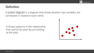
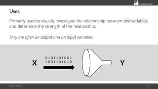
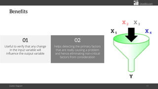
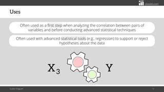
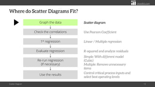
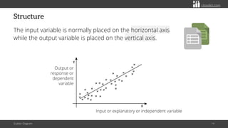
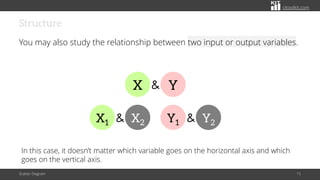
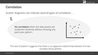
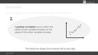
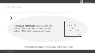
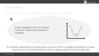
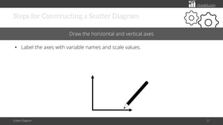
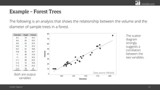
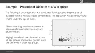
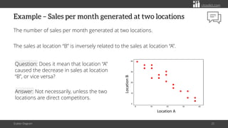
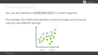
CITOOLKIT
Scatter Diagram
Exploring Variable Relationships with Scatter Diagram Analysis
citoolkit.com
Introduction
Many situations require the investigating whether a relationship exists
between two or more variables.
Scatter Diagram 2
citoolkit.com
Introduction
Scatter Diagram 3
A line manager may want to
check the relationship between
the number of training hours and
productivity of employees
He may then want to check if the
number of defects is a function
of the experience of the person
causing it
citoolkit.com
Introduction
Other Examples . . .
The relationship between equipment downtime and its cost of maintenance.
Scatter Diagram 4
citoolkit.com
Introduction
Other Examples . . .
The relationship between driving speed and fuel consumption.
Scatter Diagram 5
citoolkit.com
Introduction
Other Examples . . .
The relationship between the number of people working on a shift and the
average answer time in a call center.
Scatter Diagram 6
citoolkit.com
Introduction
Other Examples . . .
The relationship between the number of years of education someone has
and the annual income of that person.
Scatter Diagram 7
citoolkit.com
Definition
A scatter diagram is a diagram that shows whether two variables are
correlated or related to each other.
It shows patterns in the relationship
that cannot be seen by just looking
at the data.
Scatter Diagram 8
citoolkit.com
Data Type
It works with both continuous and count data.
Scatter Diagram 9
citoolkit.com
Uses
Primarily used to visually investigate the relationship between two variables
and determine the strength of the relationship.
They are often an output and an input variables.
Scatter Diagram 10
Y
0 1 0 1 1 0 1 0 0 1
1 0 0 1 1 0 1 0 1 0
X
citoolkit.com
Benefits
Scatter Diagram 11
X 1 X 4
X 2 X 3
Y
helps detecting the primary factors
that are really causing a problem
and hence eliminating non-critical
factors from consideration
02
Useful to verify that any change
in the input variable will
influence the output variable
01
citoolkit.com
Uses
Scatter Diagram 12
X3 Y
Often used as a first step when analyzing the correlation between pairs of
variables and before conducting advanced statistical techniques
Often used with advanced statistical tools (e.g., regression) to support or reject
hypotheses about the data
citoolkit.com
Where do Scatter Diagrams Fit?
Scatter Diagram 13
Graph the data Scatter diagram
Check the correlations Use Pearson Coefficient
1st regression Linear / Multiple regression
Evaluate regression R-squared and analyze residuals
Re-run regression
(If necessary)
Simple: With different model
(Cubic)
Multiple: Remove unnecessary
items
Use the results
Control critical process inputs and
select best operating levels
citoolkit.com
Structure
The input variable is normally placed on the horizontal axis
while the output variable is placed on the vertical axis.
Scatter Diagram 14
Input or explanatory or independent variable
Output or
response or
dependent
variable
citoolkit.com
Structure
You may also study the relationship between two input or output variables.
Scatter Diagram 15
X1 X2
& Y1 Y2
&
X Y
&
In this case, it doesn’t matter which variable goes on the horizontal axis and which
goes on the vertical axis.
citoolkit.com
Correlation
Scatter diagrams can indicate several types of correlation . . .
Scatter Diagram 16
X
X
X
X
X
X
X
X
X
X
X
No correlation when the data points are
scattered randomly without showing any
particular pattern.
1.
This lack of pattern suggests that there is no apparent relationship between the two
variables being plotted
citoolkit.com
Correlation
Scatter diagrams can indicate several types of correlation . . .
Scatter Diagram 17
2.
A positive correlation occurs when the
values of one variable increase as the
values of the other variable increase.
X
X
X
X
X
X
X
X
X
X
X
The fitted line slopes from bottom left to top right
citoolkit.com
Correlation
Scatter diagrams can indicate several types of correlation . . .
Scatter Diagram 18
The fitted line slopes from upper left to lower right
3.
A negative correlation occurs when the
values of one variable increase as the
values of the other variable decrease.
X
X
X
X
X
X
X
X
X
X
X
X
citoolkit.com
Correlation
Scatter diagrams can indicate several types of correlation . . .
Scatter Diagram 19
In nonlinear relationships, the data points tend not to form a straight-line pattern or cluster
around a line, but instead exhibit curved or irregular patterns on the scatter plot
4.
Scatter diagrams can also indicate
nonlinear relationships between
variables.
X
X
X
X
X
X
X
X
X
X
X
citoolkit.com
Steps for Constructing a Scatter Diagram
Scatter Diagram 20
Collect the two paired sets of data
• Create a summary table of the data.
Variable 1 Variable 2
citoolkit.com
Steps for Constructing a Scatter Diagram
Scatter Diagram 21
Draw the horizontal and vertical axes
• Label the axes with variable names and scale values.
citoolkit.com
Steps for Constructing a Scatter Diagram
Scatter Diagram 22
Plot the data pairs on the diagram by placing a dot at the intersection of each data pair
• Look at how the pattern appears and how the two variables vary together.
Y
X
X
X
X
X
X
citoolkit.com
Example – Forest Trees
The following is an analysis that shows the relationship between the volume and the
diameter of sample trees in a forest.
Scatter Diagram 23
Data source: Minitab
Both are output
variables
The scatter
diagram
strongly
suggests a
correlation
between the
two variables.
citoolkit.com
Example – Presence of Diabetes at a Workplace
The following is an analysis that was conducted for diagnosing the presence of
diabetes within a workplace (see sample data). The population was generally young
(75.8% under the age of thirty).
Scatter Diagram 24
The scatter diagram does not reveal an
obvious relationship between age and
glucose levels.
High glucose levels are observed across
all age groups, and normal glucose levels
are observed in older age groups.
citoolkit.com
Example – Sales per month generated at two locations
The number of sales per month generated at two locations.
The sales at location “B” is inversely related to the sales at location “A”.
Scatter Diagram 25
Location A
Location
B
Question: Does it mean that location “A”
caused the decrease in sales at location
“B”, or vice versa?
Answer: Not necessarily, unless the two
locations are direct competitors.
citoolkit.com
Matrix Plot
Summarizes the relationship between pairs of multiple variables in one
graph.
Scatter Diagram 26
3 variables
X1 X2
& Y
&
Allows to visually assess the variables that might be related.
citoolkit.com
Matrix Plot
It produces a scatter diagram for every combination of variables.
Scatter Diagram 27
X
X
X
X
X
X
X
X
X
X
X
X
X
X
X
X
X
X
X
X
X
X
X
X
X
X
X
X
X
X
X
X
X
X
X
X
X
X
X
X
X
X
X
X
X
X
X
X
X
X
X
X
X
X
X
X
X
X
X
X
X
X
X
X
X
X
X
X
X
X
X
X
Potential correlations between pairs of variables can then be identified.
citoolkit.com
Matrix Plot - Example
Scatter Diagram 28
1 00
80
60
20
1 0
0
9
6
3
9
6
3
1 00
80
60
20
1 0
0
Salary
Publication
Years
# of publications doesn't appear to be correlated with the years of experience.
There may be a relationship between the years of experience and salaries.
Is there a correlation between the number of publication and salaries?
citoolkit.com
Further Information
When the relationship is not so clear, correlation can be used to help
validate if a relationship exists between the variables.
Scatter Diagram 29
# of defects
Years of experience
Regression techniques go a step further
by defining the relationship in a
mathematical format.
citoolkit.com
Further Information
Be careful before concluding that there is a direct cause-and-effect
relationship between the variables.
There might be a third factor that is causing the change in the two
variables.
Scatter Diagram 30
Y=f(x)
citoolkit.com
Further Information
No correlation on the other hand does not mean there is no cause-and-
effect relationship.
There might be a relationship over a wider range of data or a different
portion of the range.
Scatter Diagram 31
citoolkit.com
Further Information
You can also illustrate a stratification factor in scatter diagrams.
For example, the relationship between a process output and a process
input for two different settings.
Scatter Diagram 32
Setting 1 Setting 2
© Copyright Citoolkit.com. All Rights Reserved.
CITOOLKIT
Made with by
The Continuous Improvement Toolkit
www.citoolkit.com

Exploring Variable Relationships with Scatter Diagram Analysis

  • 1.
    CITOOLKIT Scatter Diagram Exploring VariableRelationships with Scatter Diagram Analysis
  • 2.
    citoolkit.com Introduction Many situations requirethe investigating whether a relationship exists between two or more variables. Scatter Diagram 2
  • 3.
    citoolkit.com Introduction Scatter Diagram 3 Aline manager may want to check the relationship between the number of training hours and productivity of employees He may then want to check if the number of defects is a function of the experience of the person causing it
  • 4.
    citoolkit.com Introduction Other Examples .. . The relationship between equipment downtime and its cost of maintenance. Scatter Diagram 4
  • 5.
    citoolkit.com Introduction Other Examples .. . The relationship between driving speed and fuel consumption. Scatter Diagram 5
  • 6.
    citoolkit.com Introduction Other Examples .. . The relationship between the number of people working on a shift and the average answer time in a call center. Scatter Diagram 6
  • 7.
    citoolkit.com Introduction Other Examples .. . The relationship between the number of years of education someone has and the annual income of that person. Scatter Diagram 7
  • 8.
    citoolkit.com Definition A scatter diagramis a diagram that shows whether two variables are correlated or related to each other. It shows patterns in the relationship that cannot be seen by just looking at the data. Scatter Diagram 8
  • 9.
    citoolkit.com Data Type It workswith both continuous and count data. Scatter Diagram 9
  • 10.
    citoolkit.com Uses Primarily used tovisually investigate the relationship between two variables and determine the strength of the relationship. They are often an output and an input variables. Scatter Diagram 10 Y 0 1 0 1 1 0 1 0 0 1 1 0 0 1 1 0 1 0 1 0 X
  • 11.
    citoolkit.com Benefits Scatter Diagram 11 X1 X 4 X 2 X 3 Y helps detecting the primary factors that are really causing a problem and hence eliminating non-critical factors from consideration 02 Useful to verify that any change in the input variable will influence the output variable 01
  • 12.
    citoolkit.com Uses Scatter Diagram 12 X3Y Often used as a first step when analyzing the correlation between pairs of variables and before conducting advanced statistical techniques Often used with advanced statistical tools (e.g., regression) to support or reject hypotheses about the data
  • 13.
    citoolkit.com Where do ScatterDiagrams Fit? Scatter Diagram 13 Graph the data Scatter diagram Check the correlations Use Pearson Coefficient 1st regression Linear / Multiple regression Evaluate regression R-squared and analyze residuals Re-run regression (If necessary) Simple: With different model (Cubic) Multiple: Remove unnecessary items Use the results Control critical process inputs and select best operating levels
  • 14.
    citoolkit.com Structure The input variableis normally placed on the horizontal axis while the output variable is placed on the vertical axis. Scatter Diagram 14 Input or explanatory or independent variable Output or response or dependent variable
  • 15.
    citoolkit.com Structure You may alsostudy the relationship between two input or output variables. Scatter Diagram 15 X1 X2 & Y1 Y2 & X Y & In this case, it doesn’t matter which variable goes on the horizontal axis and which goes on the vertical axis.
  • 16.
    citoolkit.com Correlation Scatter diagrams canindicate several types of correlation . . . Scatter Diagram 16 X X X X X X X X X X X No correlation when the data points are scattered randomly without showing any particular pattern. 1. This lack of pattern suggests that there is no apparent relationship between the two variables being plotted
  • 17.
    citoolkit.com Correlation Scatter diagrams canindicate several types of correlation . . . Scatter Diagram 17 2. A positive correlation occurs when the values of one variable increase as the values of the other variable increase. X X X X X X X X X X X The fitted line slopes from bottom left to top right
  • 18.
    citoolkit.com Correlation Scatter diagrams canindicate several types of correlation . . . Scatter Diagram 18 The fitted line slopes from upper left to lower right 3. A negative correlation occurs when the values of one variable increase as the values of the other variable decrease. X X X X X X X X X X X X
  • 19.
    citoolkit.com Correlation Scatter diagrams canindicate several types of correlation . . . Scatter Diagram 19 In nonlinear relationships, the data points tend not to form a straight-line pattern or cluster around a line, but instead exhibit curved or irregular patterns on the scatter plot 4. Scatter diagrams can also indicate nonlinear relationships between variables. X X X X X X X X X X X
  • 20.
    citoolkit.com Steps for Constructinga Scatter Diagram Scatter Diagram 20 Collect the two paired sets of data • Create a summary table of the data. Variable 1 Variable 2
  • 21.
    citoolkit.com Steps for Constructinga Scatter Diagram Scatter Diagram 21 Draw the horizontal and vertical axes • Label the axes with variable names and scale values.
  • 22.
    citoolkit.com Steps for Constructinga Scatter Diagram Scatter Diagram 22 Plot the data pairs on the diagram by placing a dot at the intersection of each data pair • Look at how the pattern appears and how the two variables vary together. Y X X X X X X
  • 23.
    citoolkit.com Example – ForestTrees The following is an analysis that shows the relationship between the volume and the diameter of sample trees in a forest. Scatter Diagram 23 Data source: Minitab Both are output variables The scatter diagram strongly suggests a correlation between the two variables.
  • 24.
    citoolkit.com Example – Presenceof Diabetes at a Workplace The following is an analysis that was conducted for diagnosing the presence of diabetes within a workplace (see sample data). The population was generally young (75.8% under the age of thirty). Scatter Diagram 24 The scatter diagram does not reveal an obvious relationship between age and glucose levels. High glucose levels are observed across all age groups, and normal glucose levels are observed in older age groups.
  • 25.
    citoolkit.com Example – Salesper month generated at two locations The number of sales per month generated at two locations. The sales at location “B” is inversely related to the sales at location “A”. Scatter Diagram 25 Location A Location B Question: Does it mean that location “A” caused the decrease in sales at location “B”, or vice versa? Answer: Not necessarily, unless the two locations are direct competitors.
  • 26.
    citoolkit.com Matrix Plot Summarizes therelationship between pairs of multiple variables in one graph. Scatter Diagram 26 3 variables X1 X2 & Y & Allows to visually assess the variables that might be related.
  • 27.
    citoolkit.com Matrix Plot It producesa scatter diagram for every combination of variables. Scatter Diagram 27 X X X X X X X X X X X X X X X X X X X X X X X X X X X X X X X X X X X X X X X X X X X X X X X X X X X X X X X X X X X X X X X X X X X X X X X X Potential correlations between pairs of variables can then be identified.
  • 28.
    citoolkit.com Matrix Plot -Example Scatter Diagram 28 1 00 80 60 20 1 0 0 9 6 3 9 6 3 1 00 80 60 20 1 0 0 Salary Publication Years # of publications doesn't appear to be correlated with the years of experience. There may be a relationship between the years of experience and salaries. Is there a correlation between the number of publication and salaries?
  • 29.
    citoolkit.com Further Information When therelationship is not so clear, correlation can be used to help validate if a relationship exists between the variables. Scatter Diagram 29 # of defects Years of experience Regression techniques go a step further by defining the relationship in a mathematical format.
  • 30.
    citoolkit.com Further Information Be carefulbefore concluding that there is a direct cause-and-effect relationship between the variables. There might be a third factor that is causing the change in the two variables. Scatter Diagram 30 Y=f(x)
  • 31.
    citoolkit.com Further Information No correlationon the other hand does not mean there is no cause-and- effect relationship. There might be a relationship over a wider range of data or a different portion of the range. Scatter Diagram 31
  • 32.
    citoolkit.com Further Information You canalso illustrate a stratification factor in scatter diagrams. For example, the relationship between a process output and a process input for two different settings. Scatter Diagram 32 Setting 1 Setting 2
  • 33.
    © Copyright Citoolkit.com.All Rights Reserved. CITOOLKIT Made with by The Continuous Improvement Toolkit www.citoolkit.com