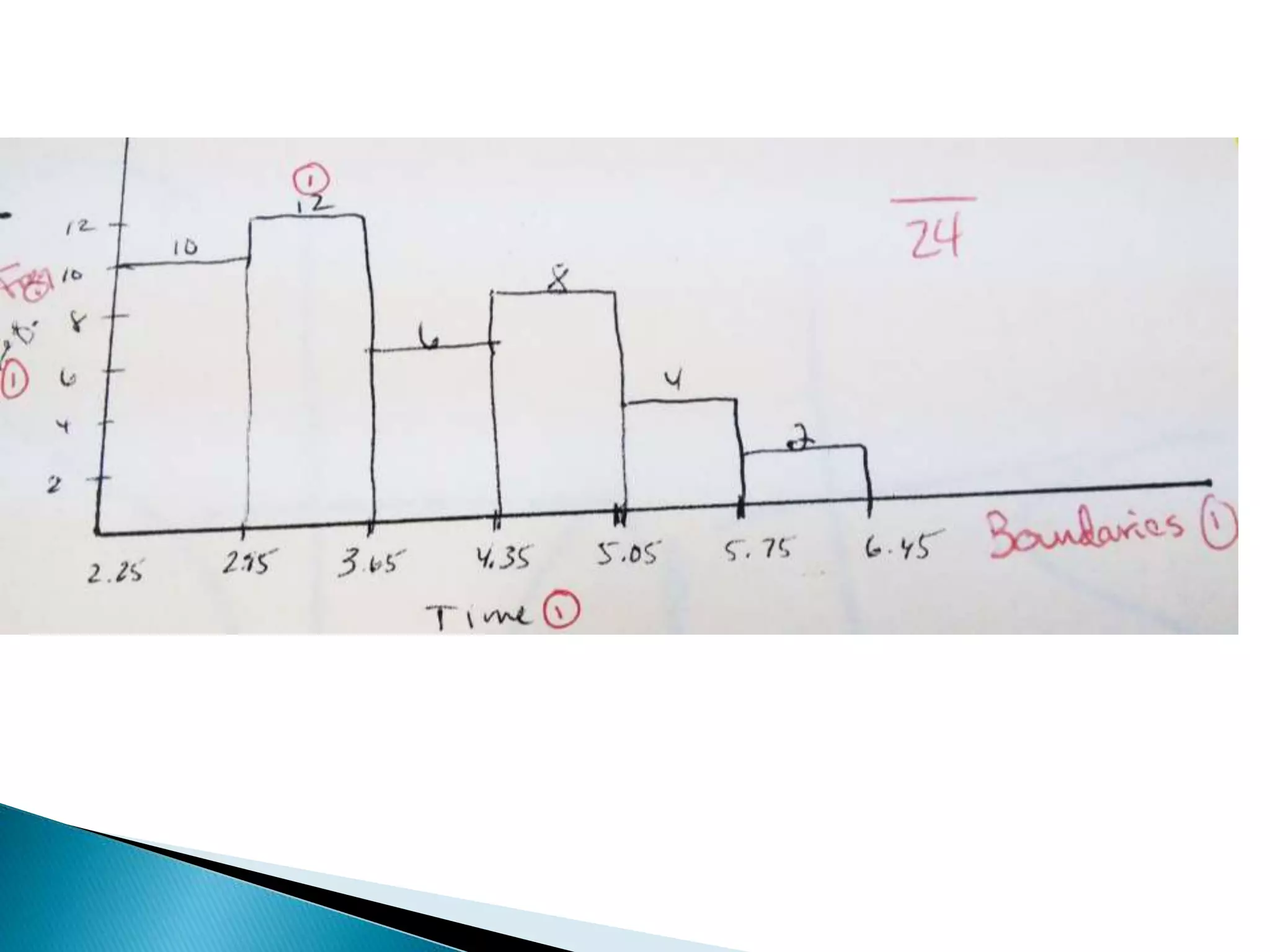
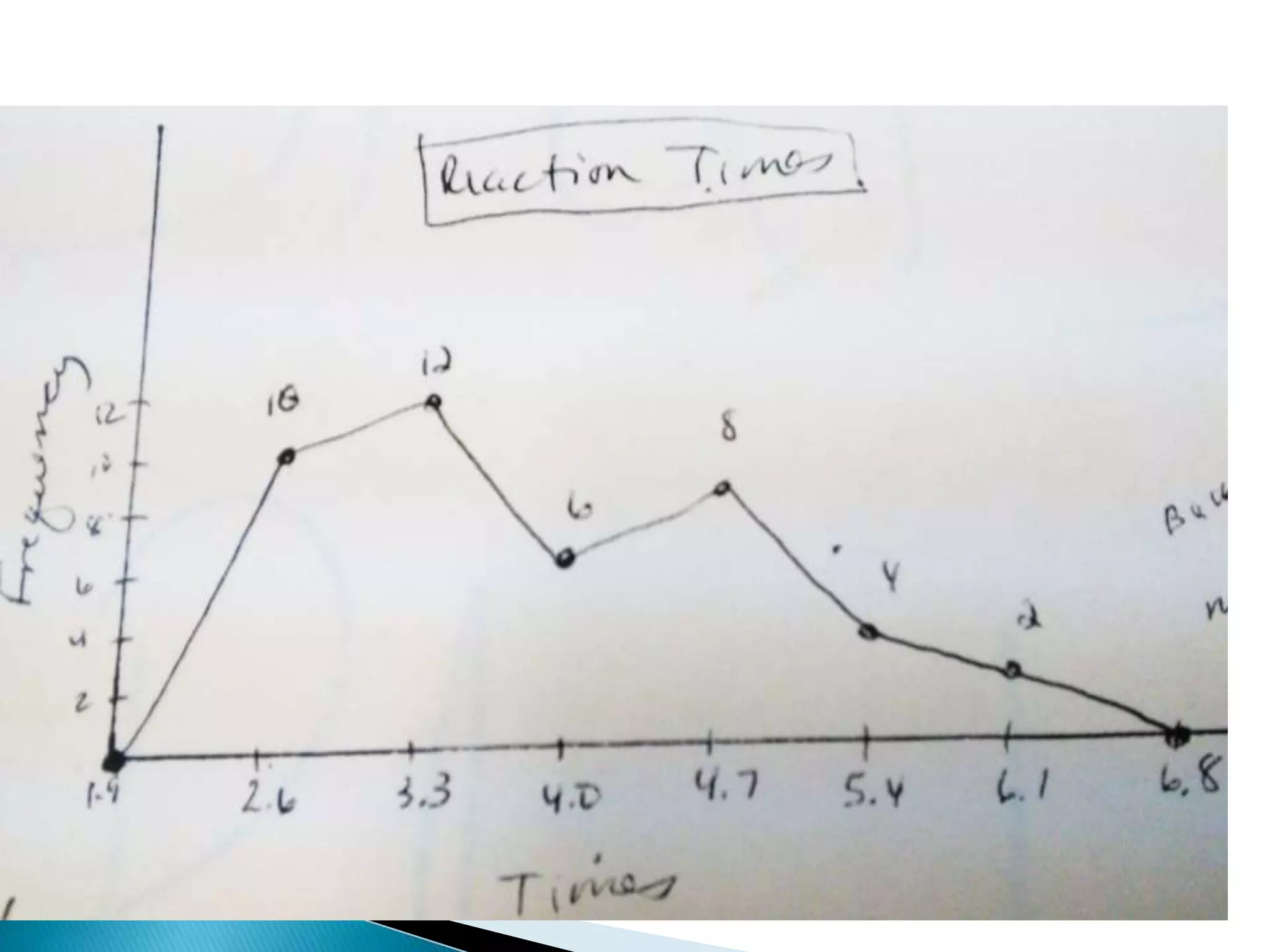
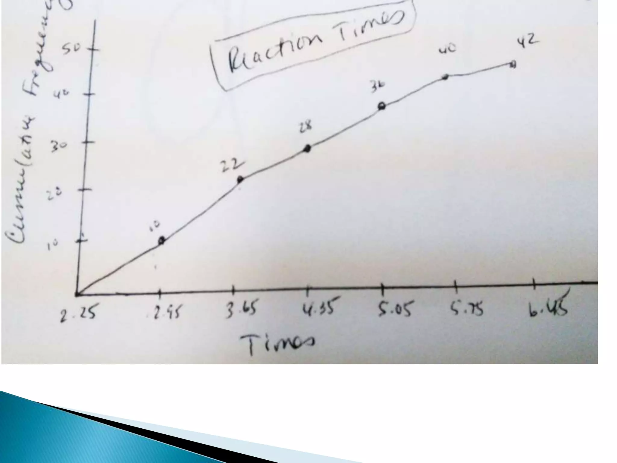
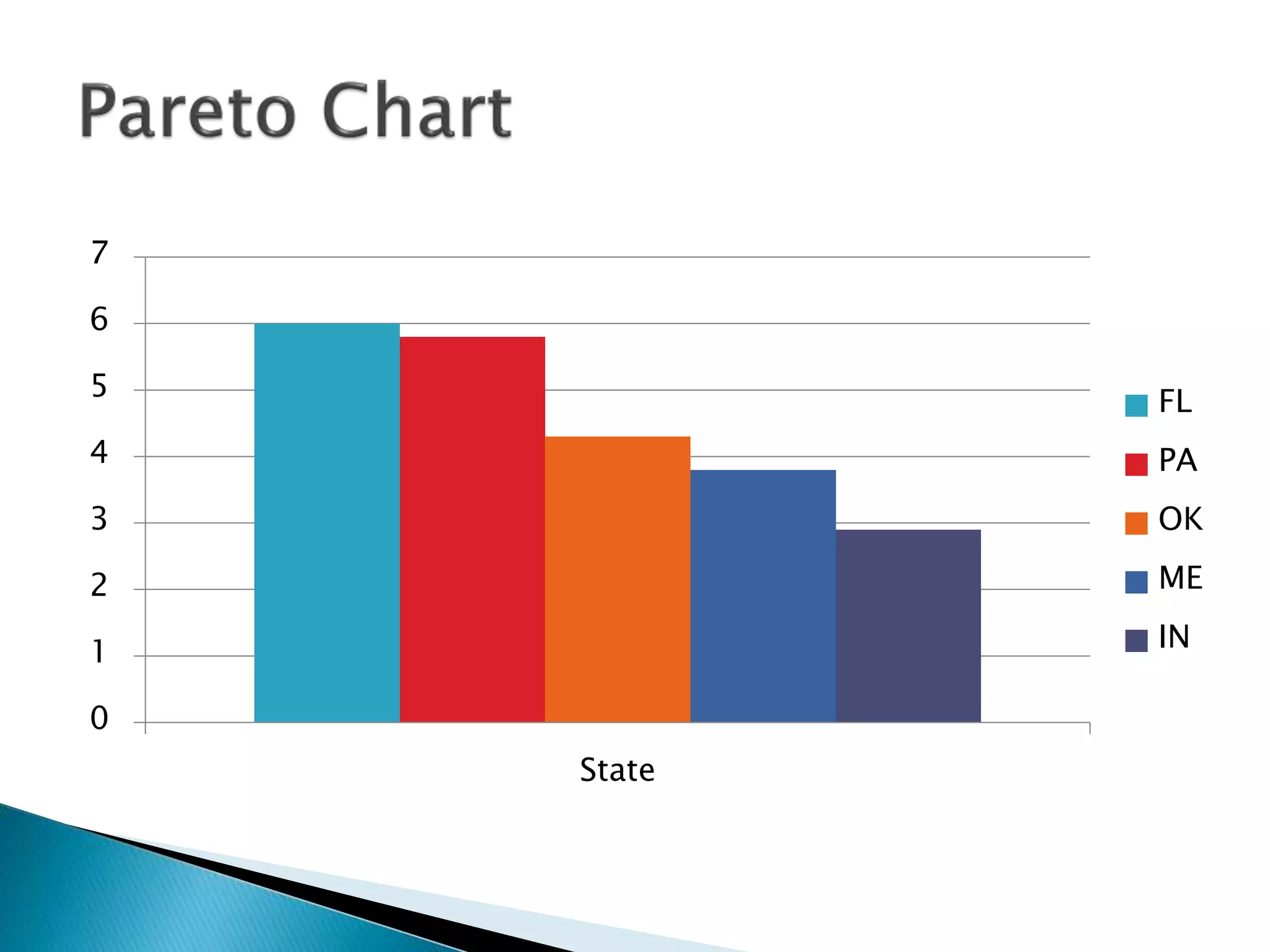
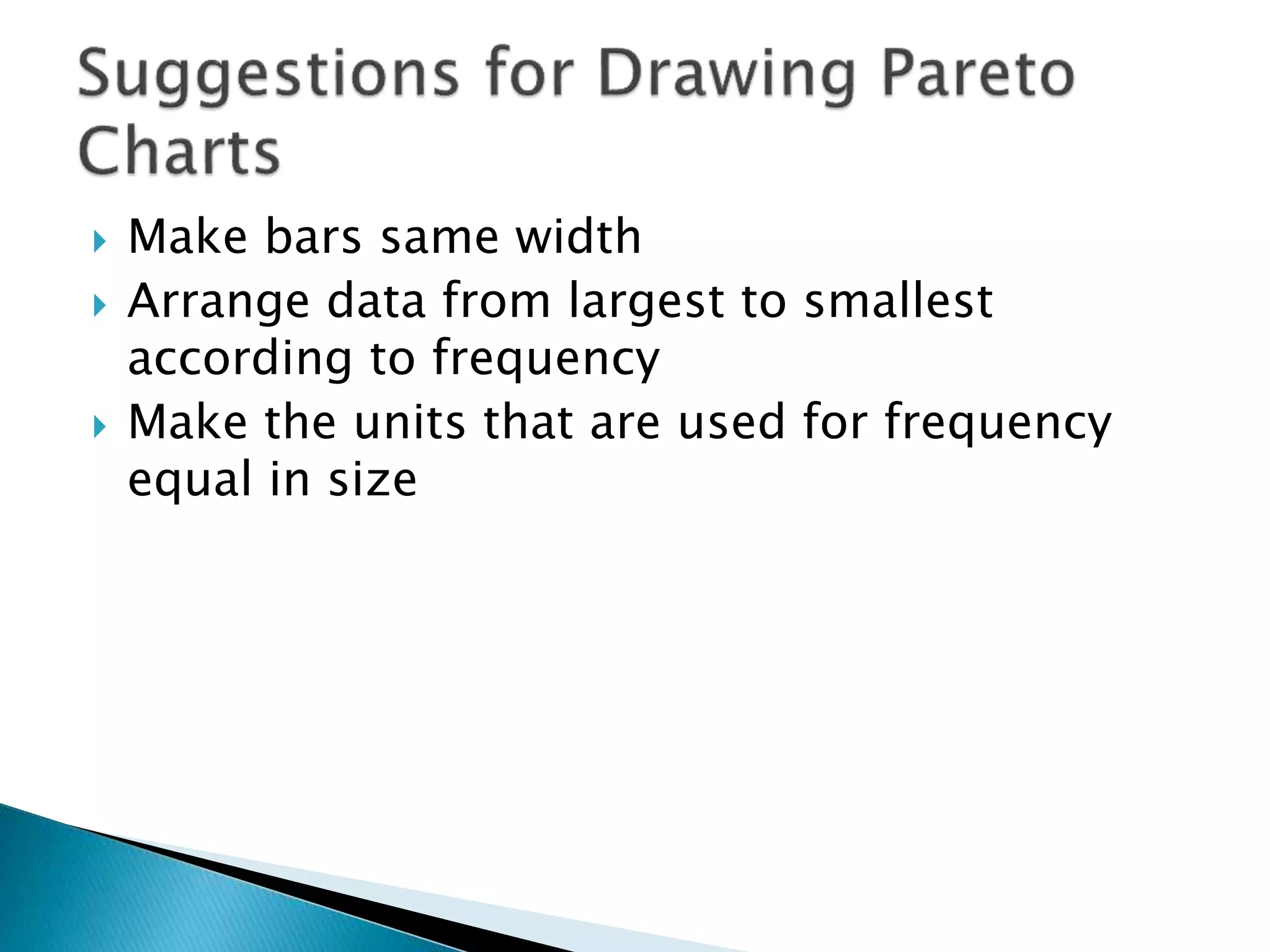
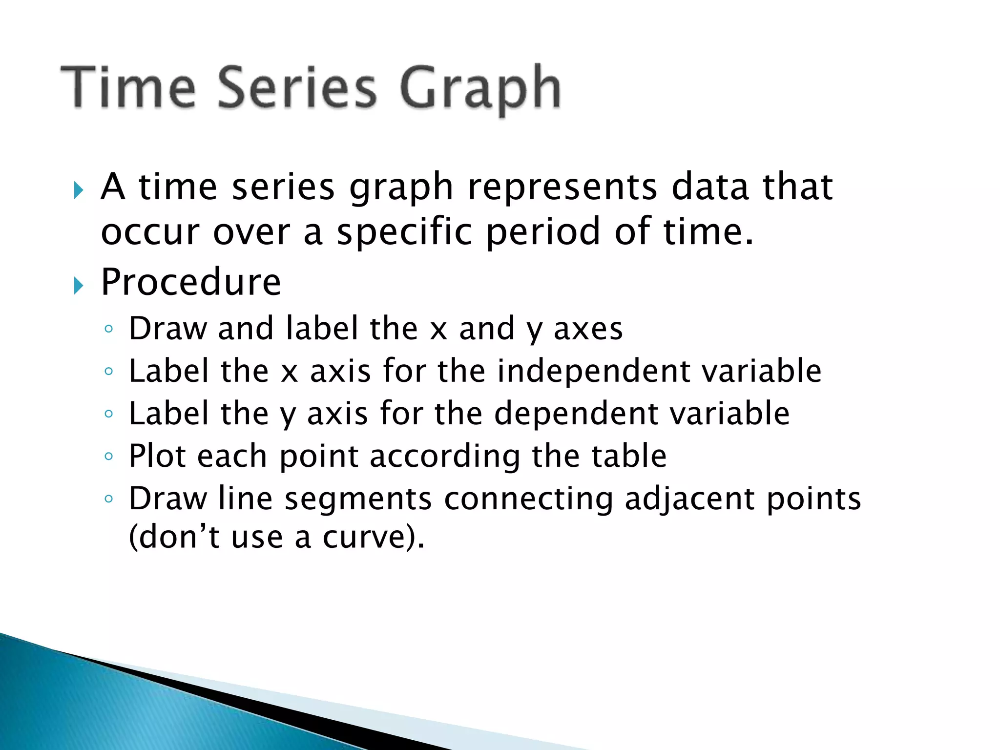
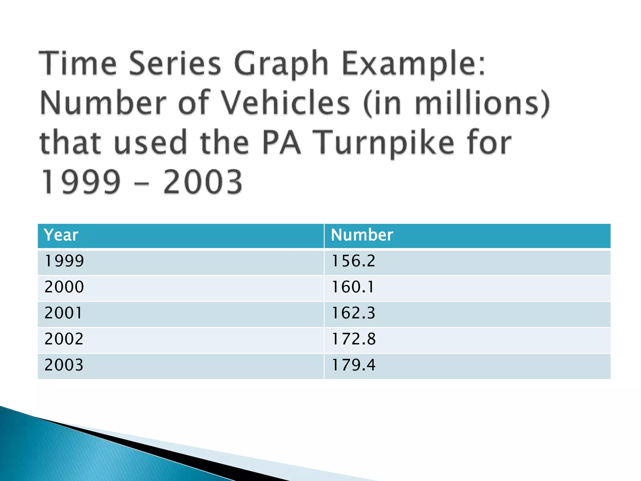
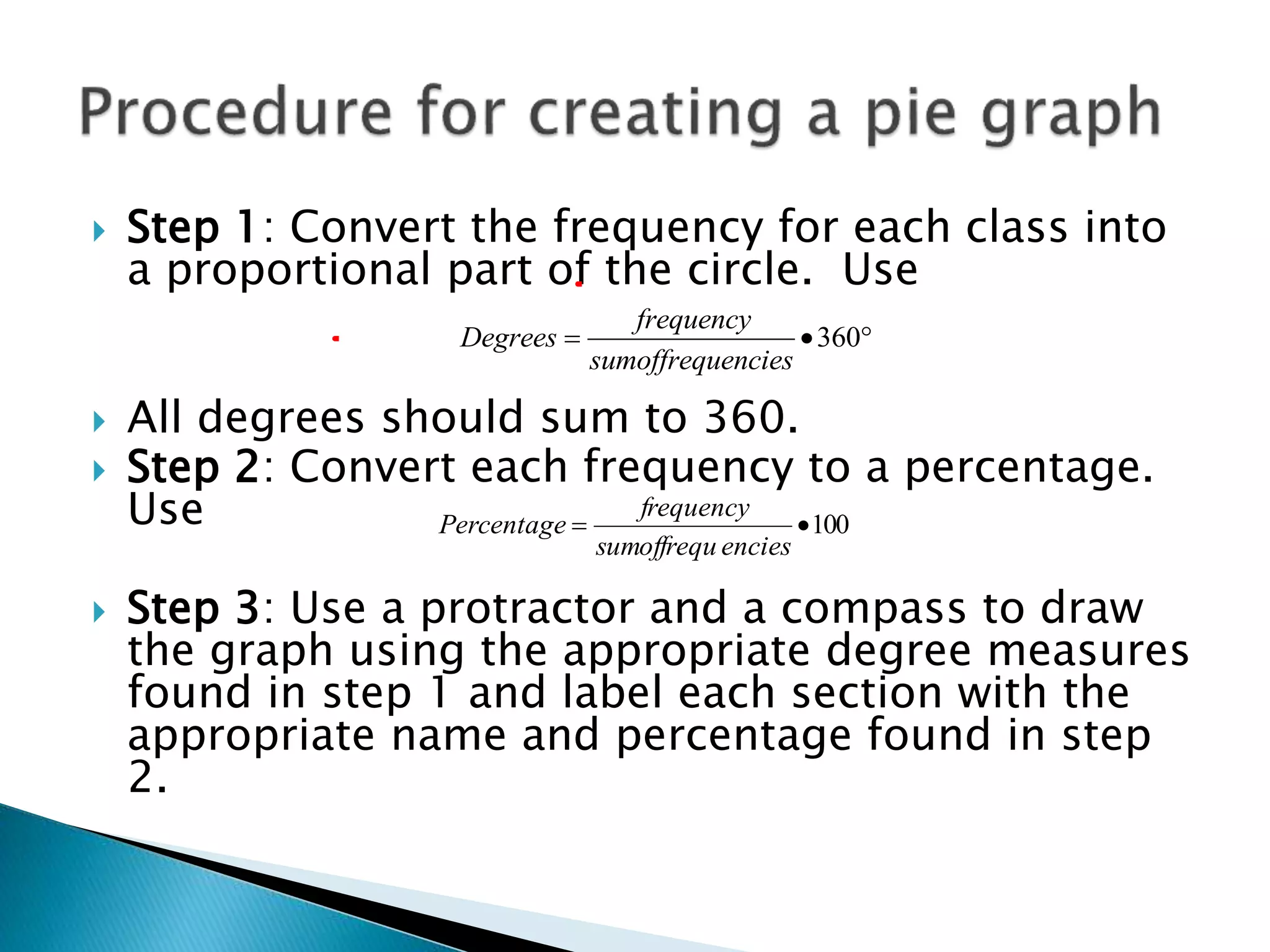
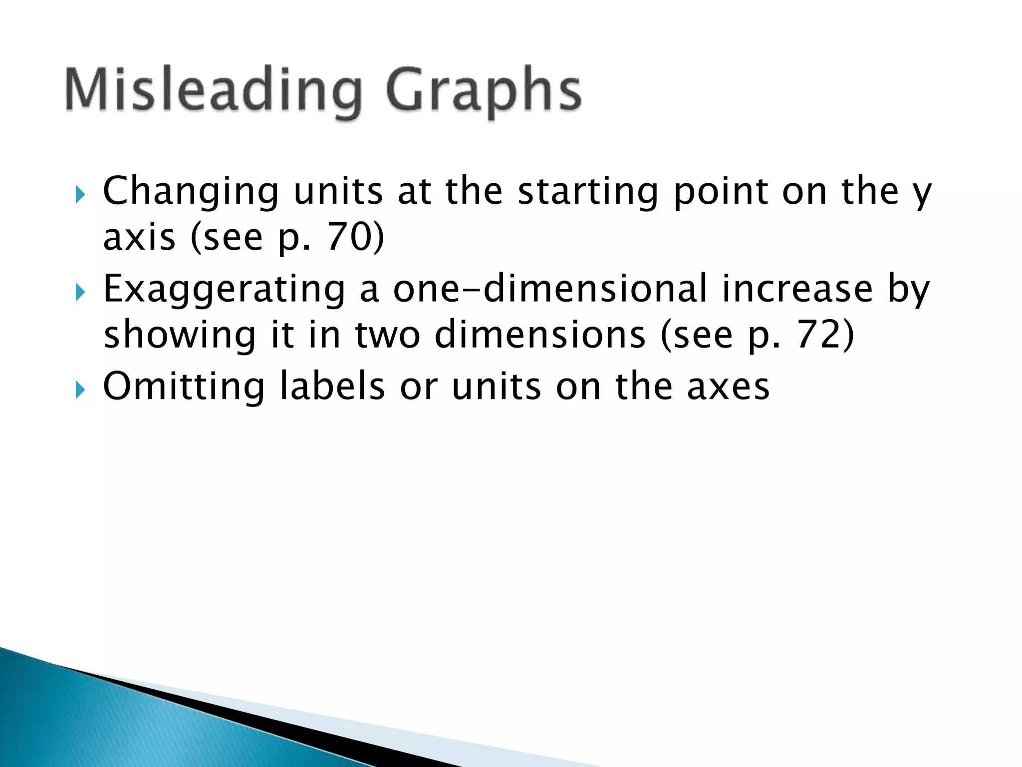
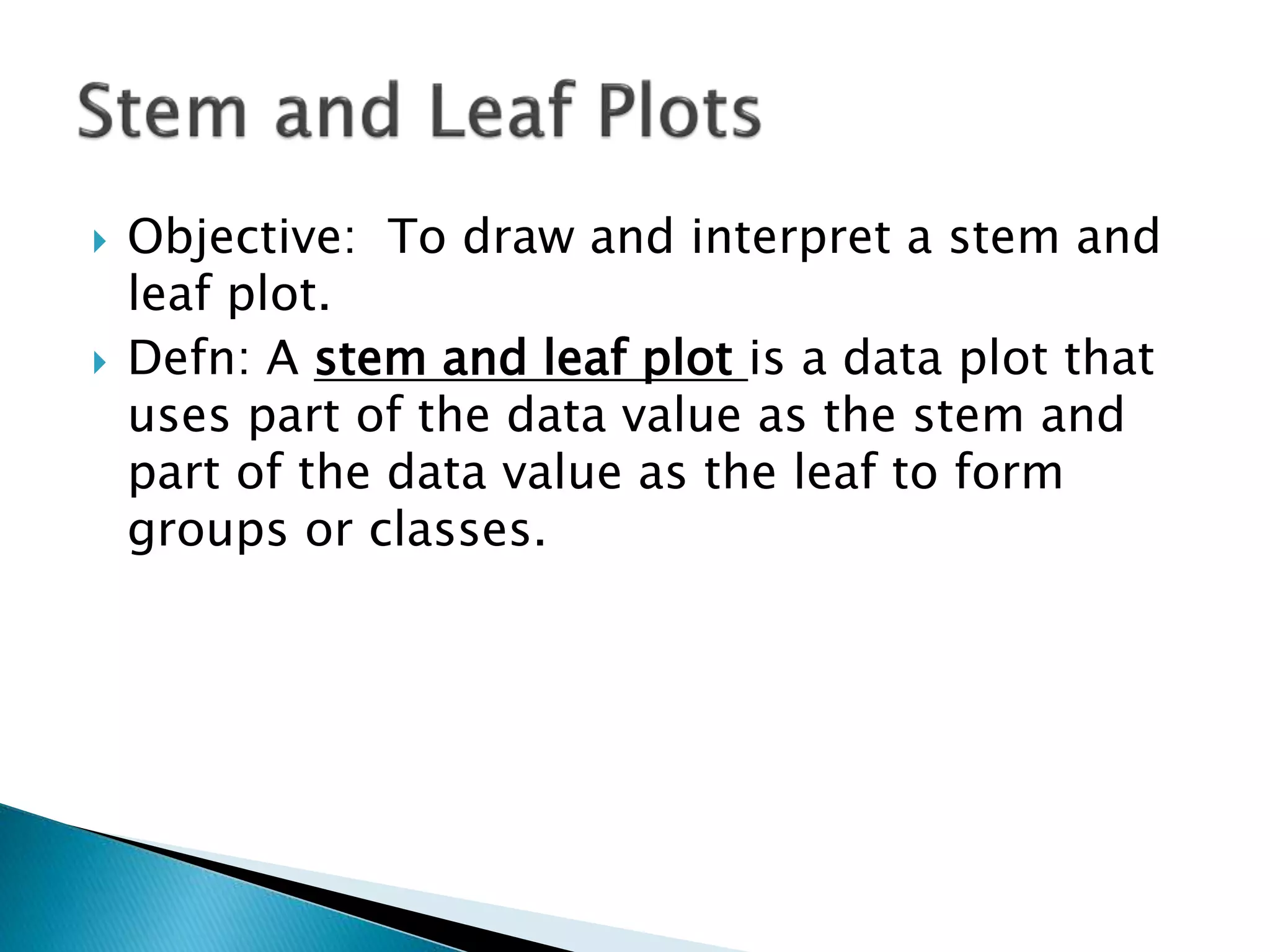
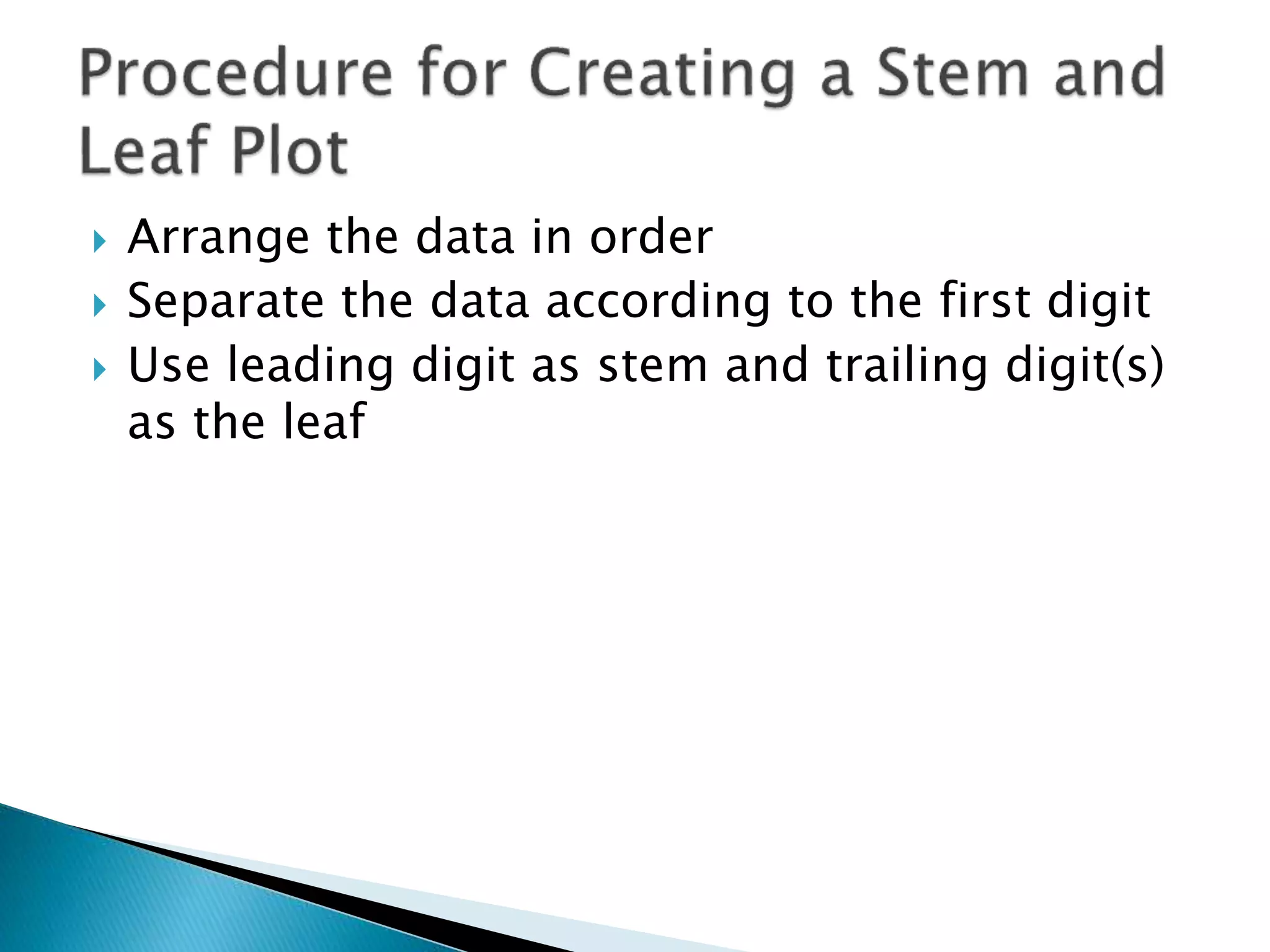
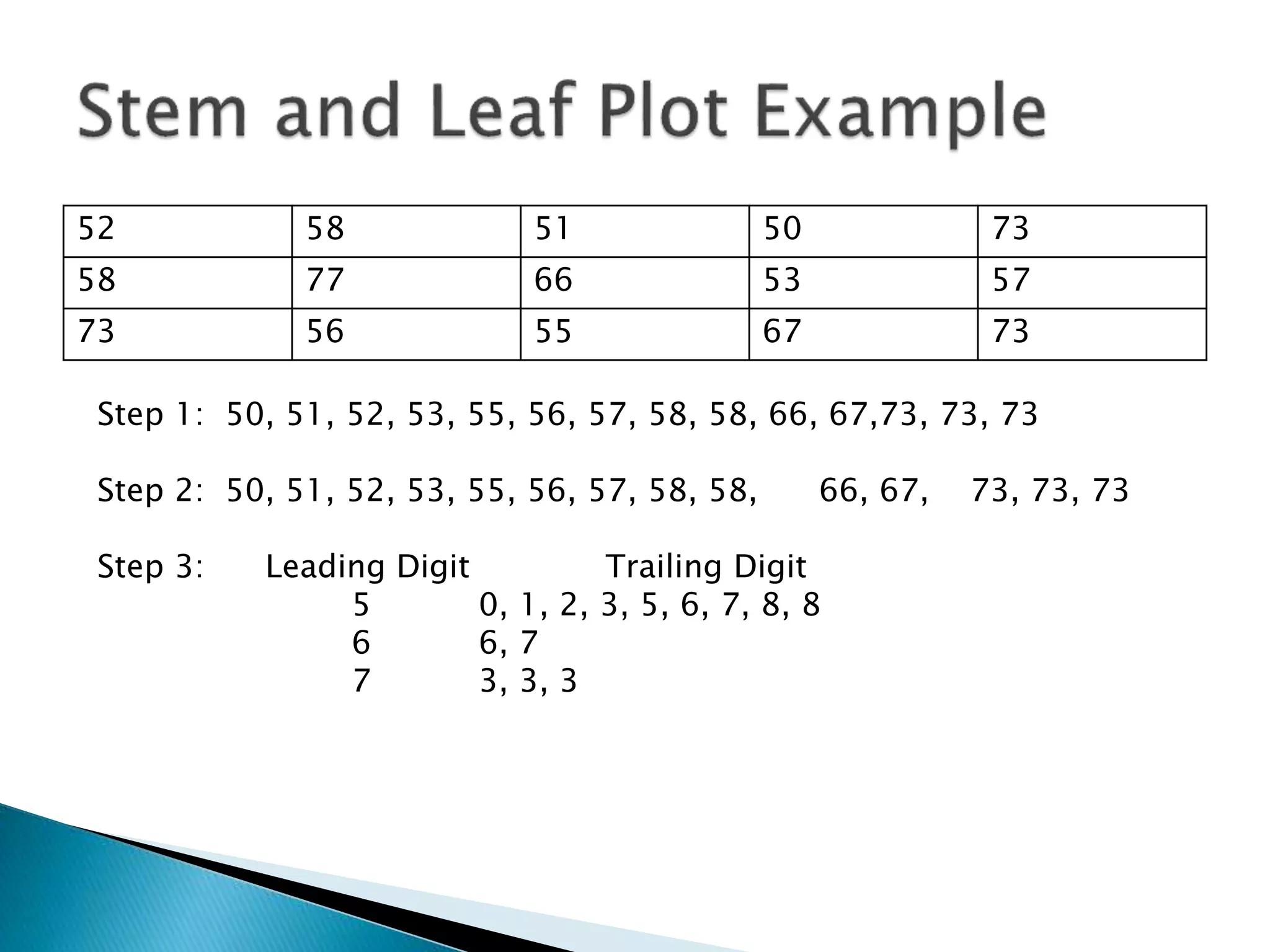
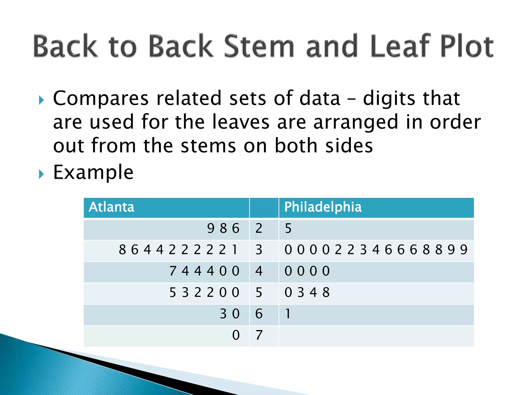
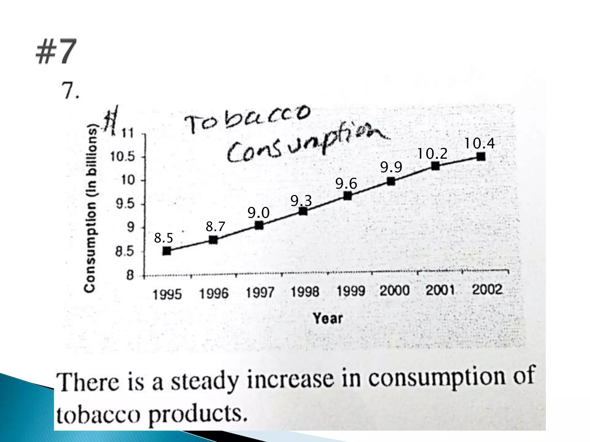
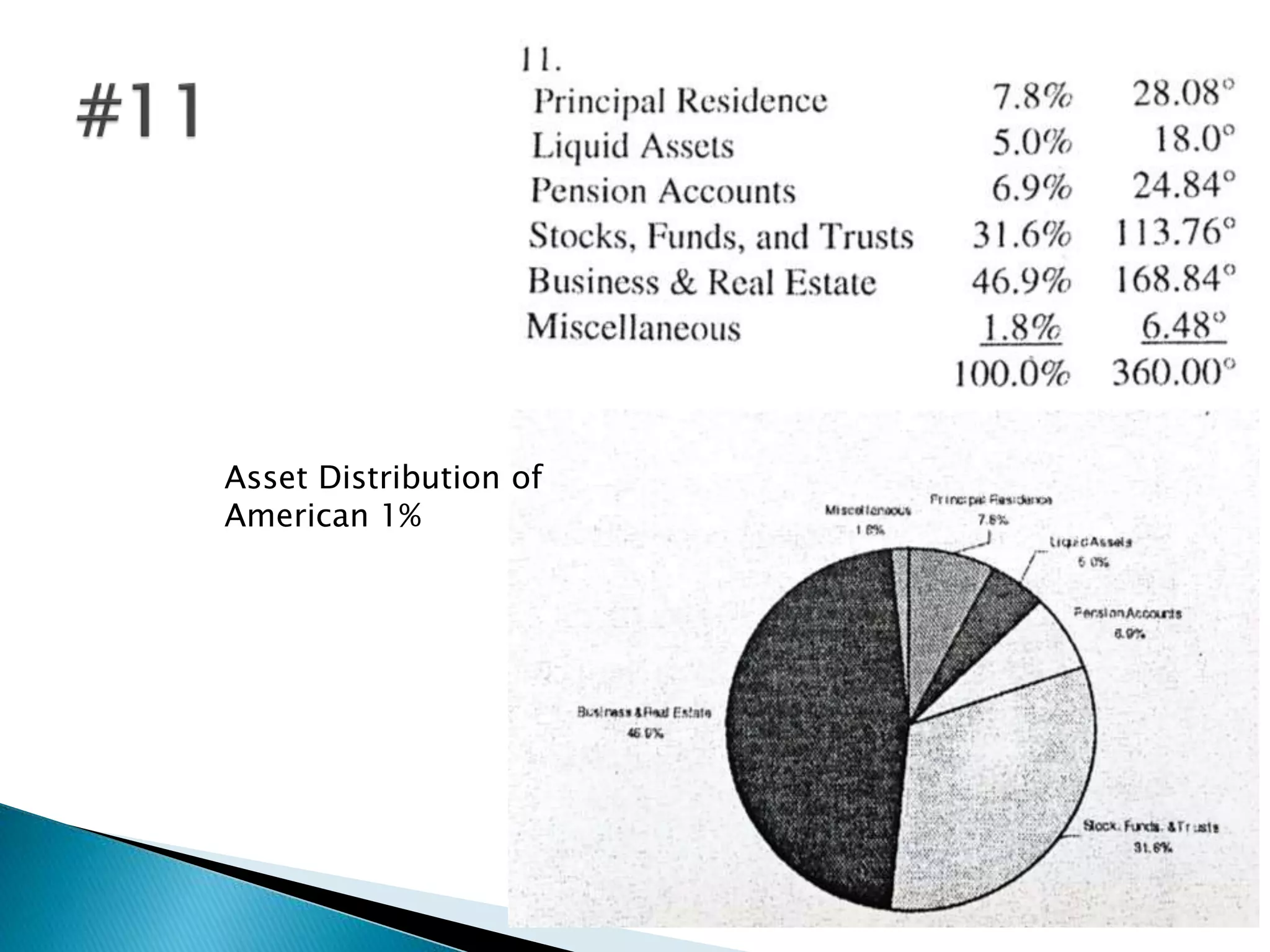
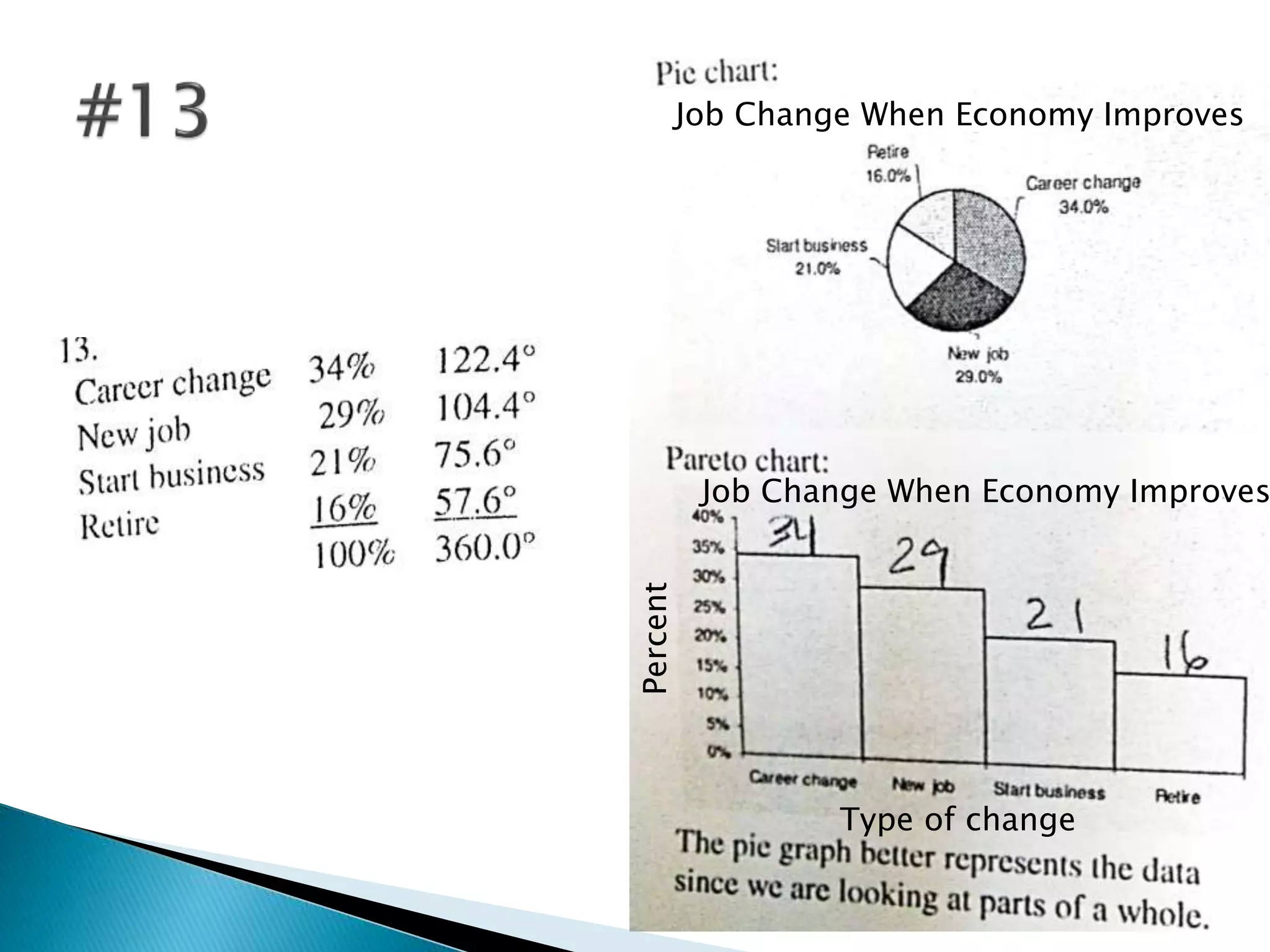
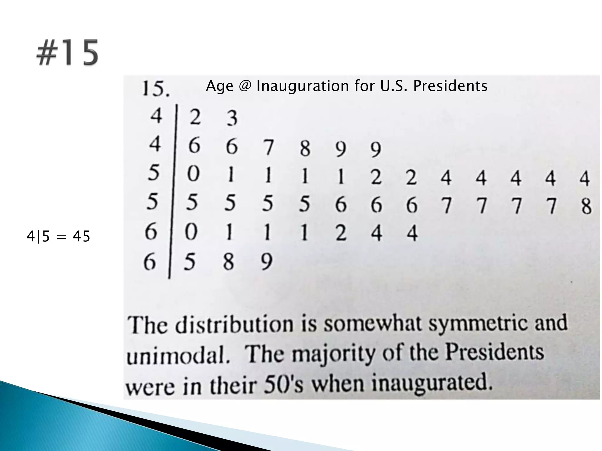
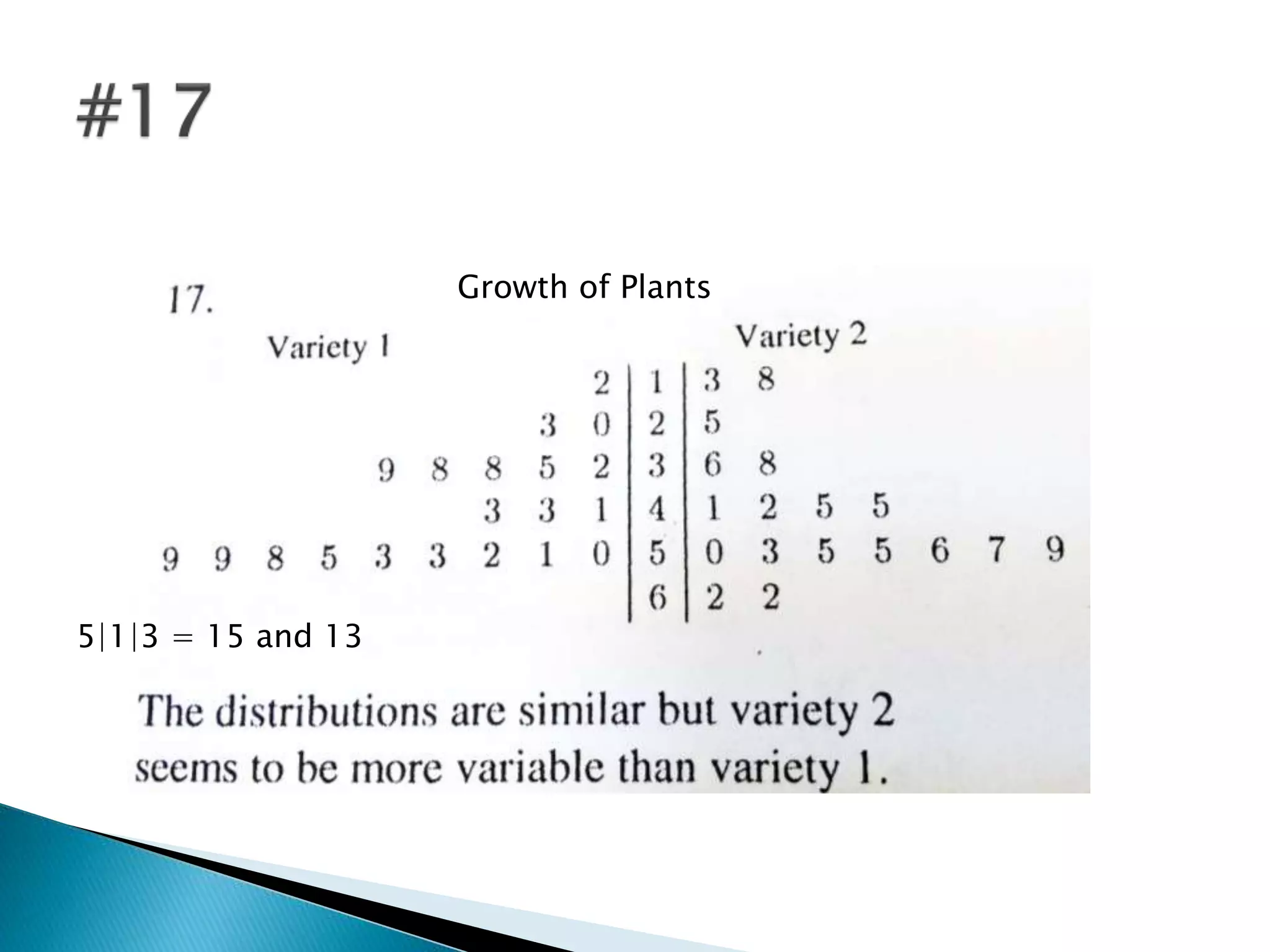
P.61-62
 To represent data using Pareto charts, time
series graphs, and pie graphs.
 A Pareto chart is used to represent a
frequency distribution for a categorical
variable and the frequencies are displayed by
the heights of vertical bars, which are
arranged in order from highest to lowest.
0
1
2
3
4
5
6
7
State
FL
PA
OK
ME
IN
 Make bars same width
 Arrange data from largest to smallest
according to frequency
 Make the units that are used for frequency
equal in size
 A time series graph represents data that
occur over a specific period of time.
 Procedure
◦ Draw and label the x and y axes
◦ Label the x axis for the independent variable
◦ Label the y axis for the dependent variable
◦ Plot each point according the table
◦ Draw line segments connecting adjacent points
(don’t use a curve).
Year Number
1999 156.2
2000 160.1
2001 162.3
2002 172.8
2003 179.4
 Two lines are used to compare two sets of
data on the same graph
 Purpose: To show the relationship of the
parts to the whole.
 Defn: A pie graph is a circle that is divided
into sections or wedges according to the
percentage of frequencies in each category of
the distribution.
 Step 1: Convert the frequency for each class into
a proportional part of the circle. Use
 All degrees should sum to 360.
 Step 2: Convert each frequency to a percentage.
Use
 Step 3: Use a protractor and a compass to draw
the graph using the appropriate degree measures
found in step 1 and label each section with the
appropriate name and percentage found in step
2.
360
frequency
Degrees
sumoffrequencies
  
100
enciessumoffrequ
frequency
Percentage
 Changing units at the starting point on the y
axis (see p. 70)
 Exaggerating a one-dimensional increase by
showing it in two dimensions (see p. 72)
 Omitting labels or units on the axes
 Objective: To draw and interpret a stem and
leaf plot.
 Defn: A stem and leaf plot is a data plot that
uses part of the data value as the stem and
part of the data value as the leaf to form
groups or classes.
 Arrange the data in order
 Separate the data according to the first digit
 Use leading digit as stem and trailing digit(s)
as the leaf
52 58 51 50 73
58 77 66 53 57
73 56 55 67 73
Step 1: 50, 51, 52, 53, 55, 56, 57, 58, 58, 66, 67,73, 73, 73
Step 2: 50, 51, 52, 53, 55, 56, 57, 58, 58, 66, 67, 73, 73, 73
Step 3: Leading Digit Trailing Digit
5 0, 1, 2, 3, 5, 6, 7, 8, 8
6 6, 7
7 3, 3, 3
 Compares related sets of data – digits that
are used for the leaves are arranged in order
out from the stems on both sides
 Example
Atlanta Philadelphia
9 8 6 2 5
8 6 4 4 2 2 2 2 2 1 3 0 0 0 0 2 2 3 4 6 6 6 8 8 9 9
7 4 4 4 0 0 4 0 0 0 0
5 3 2 2 0 0 5 0 3 4 8
3 0 6 1
0 7
 pp. 77-79 #1, 7, 11, 13, 14, 15, 17
 Bonus Projects:
1. p. 84 (TI-83 Plus)
2. p. 84 Excel (Pie Chart)
3. P. 84 Excel (Pareto Chart)
4. P. 85 Excel (Time Series Plot)
Type of Offense
8.5
8.7
9.0
9.3
9.6
9.9
10.2
10.4
Asset Distribution of
American 1%
Job Change When Economy Improves
Percent
Type of change
Age @ Inauguration for U.S. Presidents
4|5 = 45
Growth of Plants
5|1|3 = 15 and 13

2.4 Other Types of Graphs

  • 4.
  • 6.
     To representdata using Pareto charts, time series graphs, and pie graphs.
  • 7.
     A Paretochart is used to represent a frequency distribution for a categorical variable and the frequencies are displayed by the heights of vertical bars, which are arranged in order from highest to lowest.
  • 8.
  • 9.
     Make barssame width  Arrange data from largest to smallest according to frequency  Make the units that are used for frequency equal in size
  • 10.
     A timeseries graph represents data that occur over a specific period of time.  Procedure ◦ Draw and label the x and y axes ◦ Label the x axis for the independent variable ◦ Label the y axis for the dependent variable ◦ Plot each point according the table ◦ Draw line segments connecting adjacent points (don’t use a curve).
  • 11.
    Year Number 1999 156.2 2000160.1 2001 162.3 2002 172.8 2003 179.4
  • 12.
     Two linesare used to compare two sets of data on the same graph
  • 13.
     Purpose: Toshow the relationship of the parts to the whole.  Defn: A pie graph is a circle that is divided into sections or wedges according to the percentage of frequencies in each category of the distribution.
  • 14.
     Step 1:Convert the frequency for each class into a proportional part of the circle. Use  All degrees should sum to 360.  Step 2: Convert each frequency to a percentage. Use  Step 3: Use a protractor and a compass to draw the graph using the appropriate degree measures found in step 1 and label each section with the appropriate name and percentage found in step 2. 360 frequency Degrees sumoffrequencies    100 enciessumoffrequ frequency Percentage
  • 15.
     Changing unitsat the starting point on the y axis (see p. 70)  Exaggerating a one-dimensional increase by showing it in two dimensions (see p. 72)  Omitting labels or units on the axes
  • 16.
     Objective: Todraw and interpret a stem and leaf plot.  Defn: A stem and leaf plot is a data plot that uses part of the data value as the stem and part of the data value as the leaf to form groups or classes.
  • 17.
     Arrange thedata in order  Separate the data according to the first digit  Use leading digit as stem and trailing digit(s) as the leaf
  • 18.
    52 58 5150 73 58 77 66 53 57 73 56 55 67 73 Step 1: 50, 51, 52, 53, 55, 56, 57, 58, 58, 66, 67,73, 73, 73 Step 2: 50, 51, 52, 53, 55, 56, 57, 58, 58, 66, 67, 73, 73, 73 Step 3: Leading Digit Trailing Digit 5 0, 1, 2, 3, 5, 6, 7, 8, 8 6 6, 7 7 3, 3, 3
  • 19.
     Compares relatedsets of data – digits that are used for the leaves are arranged in order out from the stems on both sides  Example Atlanta Philadelphia 9 8 6 2 5 8 6 4 4 2 2 2 2 2 1 3 0 0 0 0 2 2 3 4 6 6 6 8 8 9 9 7 4 4 4 0 0 4 0 0 0 0 5 3 2 2 0 0 5 0 3 4 8 3 0 6 1 0 7
  • 20.
     pp. 77-79#1, 7, 11, 13, 14, 15, 17  Bonus Projects: 1. p. 84 (TI-83 Plus) 2. p. 84 Excel (Pie Chart) 3. P. 84 Excel (Pareto Chart) 4. P. 85 Excel (Time Series Plot)
  • 21.
  • 22.
  • 23.
  • 24.
    Job Change WhenEconomy Improves Job Change When Economy Improves Percent Type of change
  • 25.
    Age @ Inaugurationfor U.S. Presidents 4|5 = 45
  • 26.