Downloaded 308 times
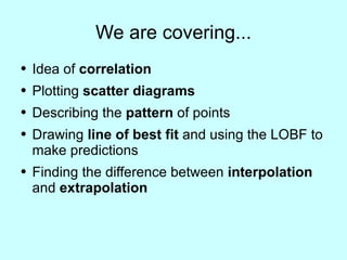
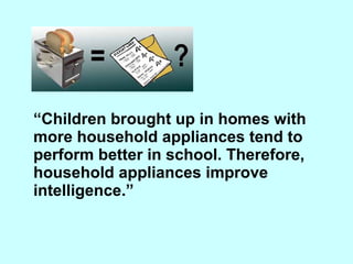

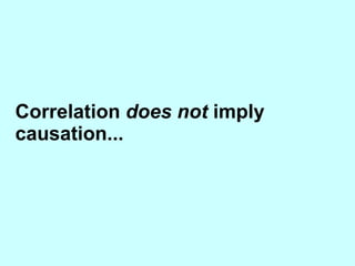
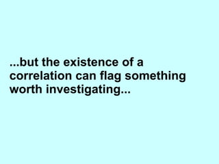
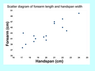
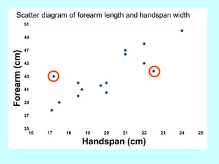

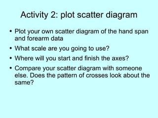
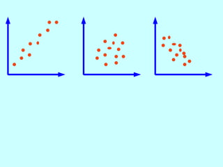
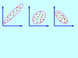
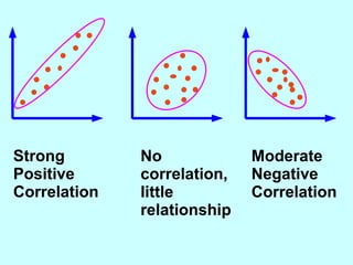
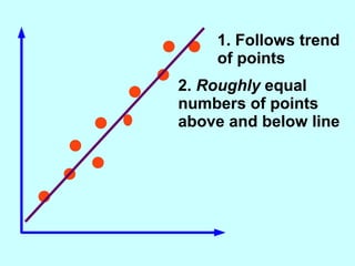
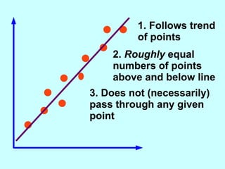
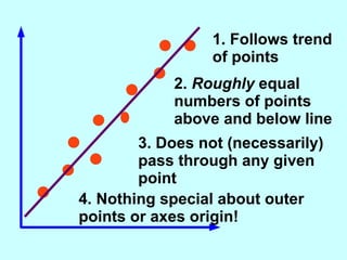

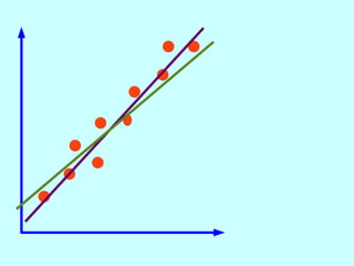
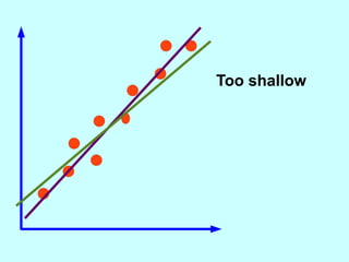
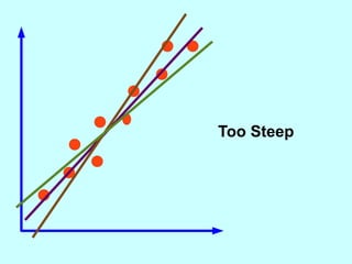
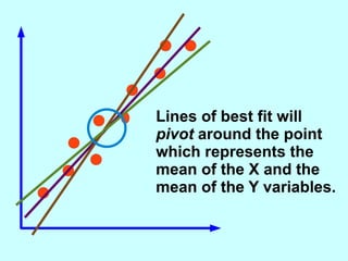
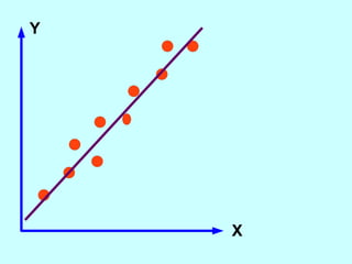
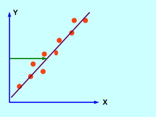
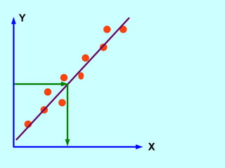
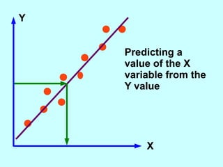

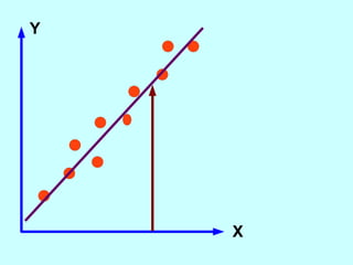
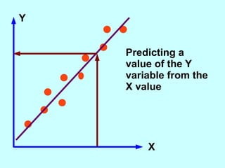
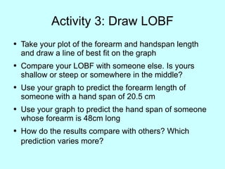
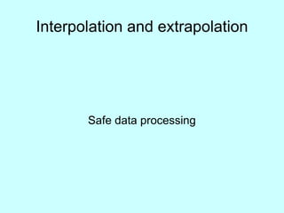
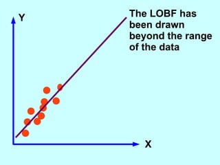
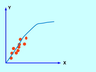
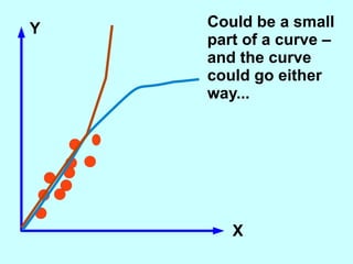

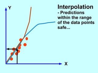
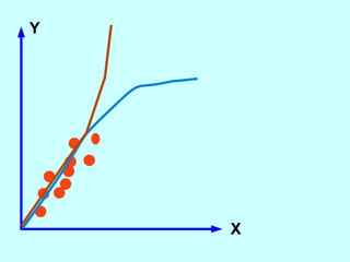
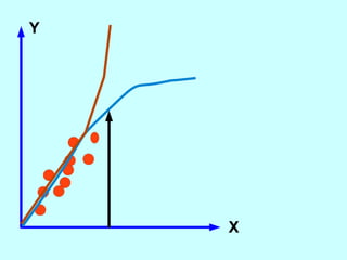
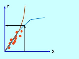
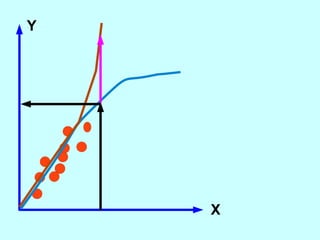
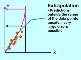
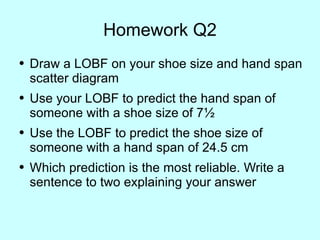

The document explores the concept of correlation between variables, emphasizing the use of scatter diagrams to visualize relationships and the importance of the line of best fit (LOBF) in making predictions. It discusses the differences between interpolation (predicting within the data range) and extrapolation (predicting outside the data range), along with activities to practice plotting and analyzing data. Additionally, it highlights common logical fallacies in correlational arguments and encourages critical thinking regarding causation and correlation.


