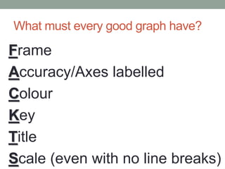
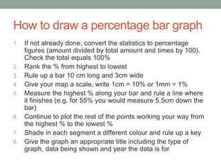
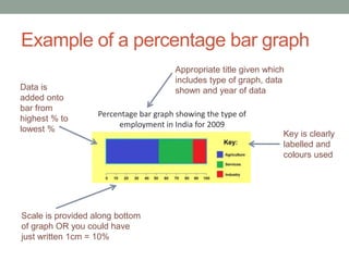
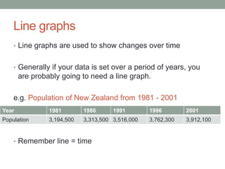
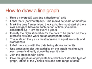
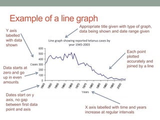
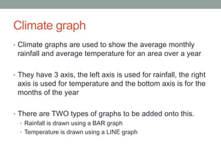
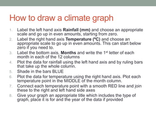
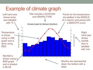
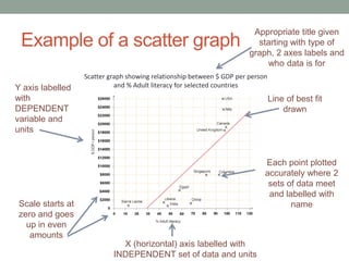
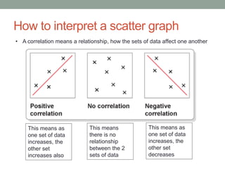
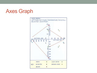
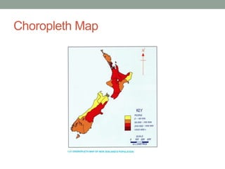
1.4 REVISION WORKSHOP 
1. Constructing Graphs 
2. Interpreting Graphs 
3. Scale 
4. Taonga 
5. Q&A
GRAPHING SKILLS 
A ‘how to’ guide to constructing the perfect 
graph for any occasion
What must every good graph have? 
Frame 
Accuracy/Axes labelled 
Colour 
Key 
Title 
Scale (even with no line breaks)
Bar Graphs 
‱ Bar graphs are used to show comparisons between 2 
different sets of data 
‱ There are 2 different types of bar graphs 
‱ Histograms (this is where all the bars are touching). These are used for 
continuous data e.g. weight of snapper caught 
‱ Column graphs (this is where there are gaps between bars). These are 
used for non-continuous data e.g. colour of cars
How to draw a bar graph 
1. Draw a x (horizontal) and y (vertical) axes using a ruler 
2. Choose an appropriate scale for the vertical axis. Make sure this 
starts at zero and goes up in EVEN amounts 
3. Label the y (vertical) axis with what data is being shown and put the 
measurement units in brackets 
4. Label the x (horizontal) axis with the data being shown 
5. If your data is continuous, start your bar right next to the y axis and 
make sure your bars are touching. If your data is separate, leave a 
gap between the y axis and your first bar. 
6. Make sure your bars are all of equal width and that any gaps 
between bars are all the same width if drawing a histogram 
7. Label each bar below the x axis 
8. Shade in the bars 
9. Give the graph an appropriate title. This should include the type of 
graph, both labels of the axes and year of data if known
Example of a bar graph 
1.2 
1 
0.8 
0.6 
0.4 
0.2 
0 
Bar graph showing GNP per person 
(US$) for selected countries in 2001 
Country 
GNP per person ($US) 
Y axis labelled 
with units and 
data being 
shown 
Scale 
goes up in 
equal 
amounts 
and starts 
at zero 
Title includes type of graph, labels 
of both axes and year of data 
Bars all 
equal size 
and gaps 
consistent 
All bars 
labelled and 
correctly 
shaded 
X axis labelled 
with data 
being shown
Percentage bar graphs 
‱ A percentage bar graph is another type of graph used to 
shown percentage figures 
‱ It is easier to construct than a pie graph as you only need 
a ruler and you don’t need a compass or protractor
How to draw a percentage bar graph 
1. If not already done, convert the statistics to percentage 
figures (amount divided by total amount and times by 100). 
Check the total equals 100% 
2. Rank the % from highest to lowest 
3. Rule up a bar 10 cm long and 3cm wide 
4. Give your map a scale, write 1cm = 10% or 1mm = 1% 
5. Measure the highest % along your bar and rule a line where 
it finishes (e.g. for 55% you would measure 5.5cm down the 
bar) 
6. Continue to plot the rest of the points working your way from 
the highest % to the lowest % 
7. Shade in each segment a different colour and rule up a key 
8. Give the graph an appropriate title including the type of 
graph, data being shown and year the data is for
Example of a percentage bar graph 
Appropriate title given which 
includes type of graph, data 
shown and year of data 
Percentage bar graph showing the type of 
employment in India for 2009 
Key is clearly 
labelled and 
colours used 
Data is 
added onto 
bar from 
highest % to 
lowest % 
Scale is provided along bottom 
of graph OR you could have 
just written 1cm = 10%
Line graphs 
‱ Line graphs are used to show changes over time 
‱ Generally if your data is set over a period of years, you 
are probably going to need a line graph. 
e.g. Population of New Zealand from 1981 - 2001 
Year 1981 1986 1991 1996 2001 
Population 3,194,500 3,313,500 3,516,000 3,762,300 3,912,100 
‱ Remember line = time
How to draw a line graph 
1. Rule a y (vertical) axis and x (horizontal) axis 
2. Label the x (horizontal) axis Time (could be years or months) 
3. Mark the time frames along the x axis, this must start at the y 
axis and gaps between each period of time should be 
consistent e.g. 1 cm for every 5 years 
4. Identify the highest number for the data to be placed on the y 
(vertical) axis and work out an appropriate scale 
5. The scale up the y axis must increase in equal amounts and 
start at zero 
6. Label the y axis with the data being shown and units 
7. Use crosses to plot the statistics on the graph making sure 
each cross is directly above the year it is for 
8. Join the crosses with a line 
9. Give the graph an appropriate title which includes the type of 
graph, labels of the y and x axis and date range of data
Example of a line graph 
Y axis 
labelled 
with data 
shown 
Data starts at 
zero and go 
up in even 
amounts 
Dates start on y 
axis, no gap 
between first data 
point and axis 
Appropriate title given with type of graph, 
data being shown and date range given 
Line graph showing reported tetanus cases by 
year 1945-2003 
Each point 
plotted 
accurately and 
joined by a line 
X axis labelled with time and years 
increase at regular intervals
Climate graph 
‱ Climate graphs are used to show the average monthly 
rainfall and average temperature for an area over a year 
‱ They have 3 axis, the left axis is used for rainfall, the right 
axis is used for temperature and the bottom axis is for the 
months of the year 
‱ There are TWO types of graphs to be added onto this. 
‱ Rainfall is drawn using a BAR graph 
‱ Temperature is drawn using a LINE graph
How to draw a climate graph 
1. Label the left hand axis Rainfall (mm) and choose an appropriate 
scale and go up in even amounts, starting from zero. 
2. Label the right hand axis Temperature (ÂșC) and choose an 
appropriate scale to go up in even amounts. This can start below 
zero if you need to. 
3. Label the bottom axis, Months and write the 1st letter of each 
month in each of the 12 columns 
4. Plot the data for rainfall using the left hand axis and by ruling bars 
that take up the whole column. 
5. Shade in the bars BLUE 
6. Plot the data for temperature using the right hand axis. Plot each 
temperature point in the MIDDLE of the month column. 
7. Connect each temperature point with a smooth RED line and join 
these to the right and left hand side axes 
8. Give your graph an appropriate title which includes the type of 
graph, place it is for and the year of the data if provided
Example of climate graph 
Left hand axis 
shows temp, 
axis labelled 
with ÂșC 
Temperature 
is shown 
using a LINE 
graph and is 
done using 
RED 
Title includes LOCATION 
and GRAPH TYPE 
Rainfall is 
shown using a 
BAR graph 
and is shaded 
in BLUE 
Points for the temperature 
are plotted in the MIDDLE 
of a column and joined with 
a SMOOTH curve 
Right 
hand axis 
shows 
rainfall. 
Axis is 
labelled 
with mm 
Months are represented 
down the bottom with a 
letter
Interpreting climate graphs 
‱ Know your seasons – in the Southern hemisphere: Winter 
is June, July, August, Summer is December, January, 
February 
‱ Look at which seasons are the driest or wettest by adding 
up the amount of rainfall for the seasons 
‱ Calculate what seasons are the hottest or coldest by 
averaging up the temperature for winter and summer (add 
temperature for 3 months together and divide by 3) 
‱ Figure out the temperature range of the area (highest 
temperature minus the lowest temperature = temperature 
range)
Statistical Mapping 
‱ A statistical map is when you draw a series of small 
graphs over a map all with the same scale. 
‱ The graph is located on the map where the information is 
for 
e.g. if you had population information for Auckland, 
Wellington and Christchurch. You would draw a 
small bar graph for each, you would draw Auckland’s 
population graph on where Auckland is on the map, 
Wellington’s population graph on where Wellington 
is on the map etc.
How to draw a statistical map 
1. Choose a suitable graph form for the type of information 
given e.g. percentage bar graph, bar graph 
2. Decide on a scale you will use for the whole map e.g. 
1cm = 100,000 people or 1mm = 1% 
3. Write the scale for the graphs on your map 
4. Draw individual graphs using the above scale on each 
region to display the data needed 
5. Shade in the graphs and create a key if needed 
6. Give the map an appropriate title including type of 
graph, information being shown and year of data
Example of a statistic map
Pictographs 
‱ Pictographs are a type of graph that use symbols or 
pictures that represent an amount of data 
‱ You could be asked to interpret the information on one of 
these (USE THE KEY) or complete one already started for 
you 
‱ If you need to complete one, use the symbol/picture given 
and check the key to see how much each picture 
represents. It is okay to only use Œ or œ of a symbol if 
needed
How to interpret a pictograph 
‱ Look for the key 
‱ This will tell you 
about how much 
each symbol/picture 
represents 
‱ Use the key to add 
up how much is for 
each day, if only half 
a symbol, only add 
half the amount in 
the key
Scatter graphs 
‱ Scatter graphs are used to show a relationship between 
two sets of data. 
‱ The relationship may be negative if one set of data 
increases as the other decreases 
‱ The relationship can be positive if both sets of data 
increase 
‱ There may be no relationship if your crosses end up all 
over the show
How to draw a scatter graph 
1. Determine which set of data is independent (not reliant on the 
other) and which set of data is dependent (relies on the other) 
2. Rule a x (horizontal) axis and label with independent set of data 
title. Look at the highest value of this data and work out an 
appropriate scale to go up in even amounts starting from zero 
3. Rule a y (vertical) axis and label with the dependent set of data 
title. Look at the highest value of this data and work out an 
appropriate scale to go up in even amounts starting from zero 
4. Give the graph an appropriate title including the type of graph, 
labels plus units used on both axes and the year of data if given 
5. Use crosses to plot the points where the 2 sets of data meet for 
each. Label each point with it’s name OR use a key 
6. Rule a line of best fit through the crosses. This line should show the 
general trend of the graph and should go through the pathway of 
the most amount of crosses. It does NOT connect the crosses
Example of a scatter graph 
Scatter graph showing relationship between $ GDP per person 
and Y axis labelled % Adult literacy for selected countries 
with 
DEPENDENT 
variable and 
units 
Scale starts at 
zero and goes 
up in even 
amounts 
Appropriate title given 
starting with type of 
graph, 2 axes labels and 
who data is for 
X (horizontal) axis labelled with 
INDEPENDENT set of data and units 
Line of best fit 
drawn 
Each point plotted 
accurately where 2 
sets of data meet 
and labelled with 
name
How to interpret a scatter graph 
‱ A correlation means a relationship, how the sets of data affect one another 
This means as 
one set of data 
increases, the 
other set 
increases also 
This means 
there is no 
relationship 
between the 2 
sets of data 
This means as 
one set of data 
increases, the 
other set 
decreases
Axes Graph
Choropleth Map
Comparative Column Graphs
Dot Distribution Map
Proportional Circles Map
Triple Axes Graph
Stepwise Migration Model
Urban Zone 
Models
WORKING OUT RATIO SCALE 
1m = 100cm 
1km = 100,000cm 
So if you measured on your topographic map and 3cm = 
1km how would you change this into a ratio scale? 
1. Firstly you write out
 
3cm=1km then
 
2. You need to change the km into cm therefore
. 
3cm = 100,000cm but
 
3. A ratio must start with 1 therefore you need to divide 
both sides by 3 SO
 
4. 1cm = 33,333cm and as a ratio 1:33,333
Taonga 
This is the Maori concept you will need to apply to the given 
resources in the 1.4 exam and it is the same as your practice exam. 
“A resource either physical or cultural that can be found in the 
environment” 
‱ Natural features could be lakes, rivers, mountains etc. 
‱ Cultural features could be people, Te Reo, whakapapa etc. 
The question could ask you to describe the Taonga, explain its 
significance or say what is being done to protect certain Taonga
ANY 
QUESTIONS?

1.4 revision week session

  • 1.
    1.4 REVISION WORKSHOP 1. Constructing Graphs 2. Interpreting Graphs 3. Scale 4. Taonga 5. Q&A
  • 2.
    GRAPHING SKILLS A‘how to’ guide to constructing the perfect graph for any occasion
  • 3.
    What must everygood graph have? Frame Accuracy/Axes labelled Colour Key Title Scale (even with no line breaks)
  • 4.
    Bar Graphs ‱Bar graphs are used to show comparisons between 2 different sets of data ‱ There are 2 different types of bar graphs ‱ Histograms (this is where all the bars are touching). These are used for continuous data e.g. weight of snapper caught ‱ Column graphs (this is where there are gaps between bars). These are used for non-continuous data e.g. colour of cars
  • 5.
    How to drawa bar graph 1. Draw a x (horizontal) and y (vertical) axes using a ruler 2. Choose an appropriate scale for the vertical axis. Make sure this starts at zero and goes up in EVEN amounts 3. Label the y (vertical) axis with what data is being shown and put the measurement units in brackets 4. Label the x (horizontal) axis with the data being shown 5. If your data is continuous, start your bar right next to the y axis and make sure your bars are touching. If your data is separate, leave a gap between the y axis and your first bar. 6. Make sure your bars are all of equal width and that any gaps between bars are all the same width if drawing a histogram 7. Label each bar below the x axis 8. Shade in the bars 9. Give the graph an appropriate title. This should include the type of graph, both labels of the axes and year of data if known
  • 6.
    Example of abar graph 1.2 1 0.8 0.6 0.4 0.2 0 Bar graph showing GNP per person (US$) for selected countries in 2001 Country GNP per person ($US) Y axis labelled with units and data being shown Scale goes up in equal amounts and starts at zero Title includes type of graph, labels of both axes and year of data Bars all equal size and gaps consistent All bars labelled and correctly shaded X axis labelled with data being shown
  • 7.
    Percentage bar graphs ‱ A percentage bar graph is another type of graph used to shown percentage figures ‱ It is easier to construct than a pie graph as you only need a ruler and you don’t need a compass or protractor
  • 8.
    How to drawa percentage bar graph 1. If not already done, convert the statistics to percentage figures (amount divided by total amount and times by 100). Check the total equals 100% 2. Rank the % from highest to lowest 3. Rule up a bar 10 cm long and 3cm wide 4. Give your map a scale, write 1cm = 10% or 1mm = 1% 5. Measure the highest % along your bar and rule a line where it finishes (e.g. for 55% you would measure 5.5cm down the bar) 6. Continue to plot the rest of the points working your way from the highest % to the lowest % 7. Shade in each segment a different colour and rule up a key 8. Give the graph an appropriate title including the type of graph, data being shown and year the data is for
  • 9.
    Example of apercentage bar graph Appropriate title given which includes type of graph, data shown and year of data Percentage bar graph showing the type of employment in India for 2009 Key is clearly labelled and colours used Data is added onto bar from highest % to lowest % Scale is provided along bottom of graph OR you could have just written 1cm = 10%
  • 10.
    Line graphs ‱Line graphs are used to show changes over time ‱ Generally if your data is set over a period of years, you are probably going to need a line graph. e.g. Population of New Zealand from 1981 - 2001 Year 1981 1986 1991 1996 2001 Population 3,194,500 3,313,500 3,516,000 3,762,300 3,912,100 ‱ Remember line = time
  • 11.
    How to drawa line graph 1. Rule a y (vertical) axis and x (horizontal) axis 2. Label the x (horizontal) axis Time (could be years or months) 3. Mark the time frames along the x axis, this must start at the y axis and gaps between each period of time should be consistent e.g. 1 cm for every 5 years 4. Identify the highest number for the data to be placed on the y (vertical) axis and work out an appropriate scale 5. The scale up the y axis must increase in equal amounts and start at zero 6. Label the y axis with the data being shown and units 7. Use crosses to plot the statistics on the graph making sure each cross is directly above the year it is for 8. Join the crosses with a line 9. Give the graph an appropriate title which includes the type of graph, labels of the y and x axis and date range of data
  • 12.
    Example of aline graph Y axis labelled with data shown Data starts at zero and go up in even amounts Dates start on y axis, no gap between first data point and axis Appropriate title given with type of graph, data being shown and date range given Line graph showing reported tetanus cases by year 1945-2003 Each point plotted accurately and joined by a line X axis labelled with time and years increase at regular intervals
  • 13.
    Climate graph ‱Climate graphs are used to show the average monthly rainfall and average temperature for an area over a year ‱ They have 3 axis, the left axis is used for rainfall, the right axis is used for temperature and the bottom axis is for the months of the year ‱ There are TWO types of graphs to be added onto this. ‱ Rainfall is drawn using a BAR graph ‱ Temperature is drawn using a LINE graph
  • 14.
    How to drawa climate graph 1. Label the left hand axis Rainfall (mm) and choose an appropriate scale and go up in even amounts, starting from zero. 2. Label the right hand axis Temperature (ÂșC) and choose an appropriate scale to go up in even amounts. This can start below zero if you need to. 3. Label the bottom axis, Months and write the 1st letter of each month in each of the 12 columns 4. Plot the data for rainfall using the left hand axis and by ruling bars that take up the whole column. 5. Shade in the bars BLUE 6. Plot the data for temperature using the right hand axis. Plot each temperature point in the MIDDLE of the month column. 7. Connect each temperature point with a smooth RED line and join these to the right and left hand side axes 8. Give your graph an appropriate title which includes the type of graph, place it is for and the year of the data if provided
  • 15.
    Example of climategraph Left hand axis shows temp, axis labelled with ÂșC Temperature is shown using a LINE graph and is done using RED Title includes LOCATION and GRAPH TYPE Rainfall is shown using a BAR graph and is shaded in BLUE Points for the temperature are plotted in the MIDDLE of a column and joined with a SMOOTH curve Right hand axis shows rainfall. Axis is labelled with mm Months are represented down the bottom with a letter
  • 16.
    Interpreting climate graphs ‱ Know your seasons – in the Southern hemisphere: Winter is June, July, August, Summer is December, January, February ‱ Look at which seasons are the driest or wettest by adding up the amount of rainfall for the seasons ‱ Calculate what seasons are the hottest or coldest by averaging up the temperature for winter and summer (add temperature for 3 months together and divide by 3) ‱ Figure out the temperature range of the area (highest temperature minus the lowest temperature = temperature range)
  • 17.
    Statistical Mapping ‱A statistical map is when you draw a series of small graphs over a map all with the same scale. ‱ The graph is located on the map where the information is for e.g. if you had population information for Auckland, Wellington and Christchurch. You would draw a small bar graph for each, you would draw Auckland’s population graph on where Auckland is on the map, Wellington’s population graph on where Wellington is on the map etc.
  • 18.
    How to drawa statistical map 1. Choose a suitable graph form for the type of information given e.g. percentage bar graph, bar graph 2. Decide on a scale you will use for the whole map e.g. 1cm = 100,000 people or 1mm = 1% 3. Write the scale for the graphs on your map 4. Draw individual graphs using the above scale on each region to display the data needed 5. Shade in the graphs and create a key if needed 6. Give the map an appropriate title including type of graph, information being shown and year of data
  • 19.
    Example of astatistic map
  • 20.
    Pictographs ‱ Pictographsare a type of graph that use symbols or pictures that represent an amount of data ‱ You could be asked to interpret the information on one of these (USE THE KEY) or complete one already started for you ‱ If you need to complete one, use the symbol/picture given and check the key to see how much each picture represents. It is okay to only use ÂŒ or œ of a symbol if needed
  • 21.
    How to interpreta pictograph ‱ Look for the key ‱ This will tell you about how much each symbol/picture represents ‱ Use the key to add up how much is for each day, if only half a symbol, only add half the amount in the key
  • 22.
    Scatter graphs ‱Scatter graphs are used to show a relationship between two sets of data. ‱ The relationship may be negative if one set of data increases as the other decreases ‱ The relationship can be positive if both sets of data increase ‱ There may be no relationship if your crosses end up all over the show
  • 23.
    How to drawa scatter graph 1. Determine which set of data is independent (not reliant on the other) and which set of data is dependent (relies on the other) 2. Rule a x (horizontal) axis and label with independent set of data title. Look at the highest value of this data and work out an appropriate scale to go up in even amounts starting from zero 3. Rule a y (vertical) axis and label with the dependent set of data title. Look at the highest value of this data and work out an appropriate scale to go up in even amounts starting from zero 4. Give the graph an appropriate title including the type of graph, labels plus units used on both axes and the year of data if given 5. Use crosses to plot the points where the 2 sets of data meet for each. Label each point with it’s name OR use a key 6. Rule a line of best fit through the crosses. This line should show the general trend of the graph and should go through the pathway of the most amount of crosses. It does NOT connect the crosses
  • 24.
    Example of ascatter graph Scatter graph showing relationship between $ GDP per person and Y axis labelled % Adult literacy for selected countries with DEPENDENT variable and units Scale starts at zero and goes up in even amounts Appropriate title given starting with type of graph, 2 axes labels and who data is for X (horizontal) axis labelled with INDEPENDENT set of data and units Line of best fit drawn Each point plotted accurately where 2 sets of data meet and labelled with name
  • 25.
    How to interpreta scatter graph ‱ A correlation means a relationship, how the sets of data affect one another This means as one set of data increases, the other set increases also This means there is no relationship between the 2 sets of data This means as one set of data increases, the other set decreases
  • 26.
  • 27.
  • 28.
  • 29.
  • 30.
  • 31.
  • 32.
  • 33.
  • 34.
    WORKING OUT RATIOSCALE 1m = 100cm 1km = 100,000cm So if you measured on your topographic map and 3cm = 1km how would you change this into a ratio scale? 1. Firstly you write out
 3cm=1km then
 2. You need to change the km into cm therefore
. 3cm = 100,000cm but
 3. A ratio must start with 1 therefore you need to divide both sides by 3 SO
 4. 1cm = 33,333cm and as a ratio 1:33,333
  • 35.
    Taonga This isthe Maori concept you will need to apply to the given resources in the 1.4 exam and it is the same as your practice exam. “A resource either physical or cultural that can be found in the environment” ‱ Natural features could be lakes, rivers, mountains etc. ‱ Cultural features could be people, Te Reo, whakapapa etc. The question could ask you to describe the Taonga, explain its significance or say what is being done to protect certain Taonga
  • 36.