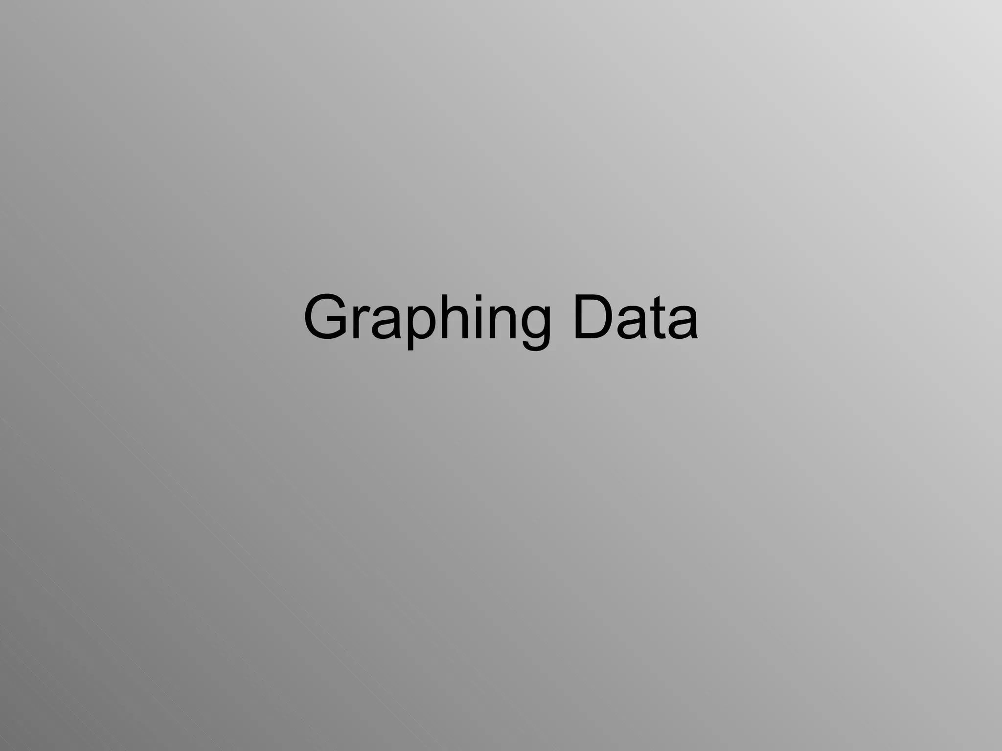
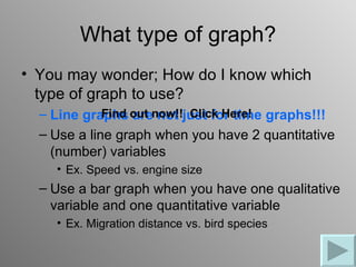
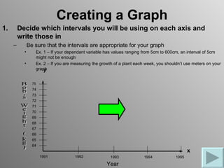
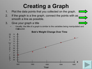
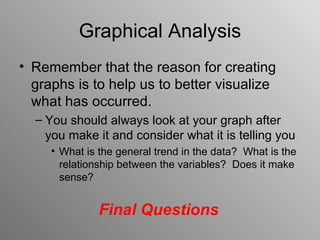
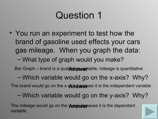
Graphing Data
Displaying and Analyzing Data
The best method for displaying and analyzing data is
through the use of graphs
Graphing is an important procedure used by scientists to
easily compare multiple variables.
There are many types of graphs, but the three most
common kinds are line graphs, bar graphs, and pie charts
      -- In this class, we will be primarily using line graphs
and bar graphs
   90
   80
   70
   60
   50
                                   E as t
   40
                                   W es t
   30
                                   N o rt h
   20
   10
    0
        1s t   2 nd   3 rd   4th
        Qtr    Qtr    Qtr    Qtr
What type of graph?
• You may wonder; How do I know which
  type of graph to use?
  – Line graphs out now!!just for time graphs!!!
             Find are not Click Here!
  – Use a line graph when you have 2 quantitative
    (number) variables
    • Ex. Speed vs. engine size
  – Use a bar graph when you have one qualitative
    variable and one quantitative variable
    • Ex. Migration distance vs. bird species
Creating a Graph
                                        y
• Draw and label the x-axis and the
   y-axis
      -- the x-axis is the horizontal
        axis and the y-axis is the
        vertical axis

8. Label what variable is on each
   axis
      -- the independent
      (manipulated) variable always
                                                               x
      goes on the x-axis and the
      dependent (responding)            Independent Variable
      variable always goes on the
      y-axis
Creating a Graph
1.       Decide which intervals you will be using on each axis and
         write those in
     –         Be sure that the intervals are appropriate for your graph
           •      Ex. 1 – If your dependant variable has values ranging from 5cm to 600cm, an interval of 5cm
                  might not be enough
           •      Ex. 2 – If you are measuring the growth of a plant each week, you shouldn’t use meters on your
                  graph
                      y

                 75
                 74
                 73
                 72
                 71
                 70
                 69
                 68
                 67
                 66
                 65
                 64
                                                                                                x
                      1991           1992              1993              1994            1995
                                                      Year
Creating a Graph
1.       Plot the data points that you collected on the graph.
2.       If the graph is a line graph, connect the points with as
         smooth a line as possible.
3.       Give your graph a title
     –         Usually, the title of a graph is similar to the variables being manipulated and
                 y
               measured.
                                 Bob’s Weight Change Over Time
          75
          74
          73
          72
          71
          70
          69
          68
          67
          66
          65
          64
                                                                                       x
               1991             1992             1993            1994           1995
                                               Year
Graphical Analysis
• Remember that the reason for creating
  graphs is to help us to better visualize
  what has occurred.
  – You should always look at your graph after
    you make it and consider what it is telling you
     • What is the general trend in the data? What is the
       relationship between the variables? Does it make
       sense?


               Final Questions
Question 1
• You run an experiment to test how the
  brand of gasoline used effects your cars
  gas mileage. When you graph the data:
   – What type of graph would you make?
  Bar Graph – brand is a qualitative variable, mileage is quantitative
                             Answer
   – Which variable would go on the x-axis? Why?
The brand would go on the x-axis because it is the independent variable
                            Answer
   – Which variable would go on the y-axis? Why?
The mileage would go on the y-axis because it is the dependant
                            Answer
variable
Question 2
 • You measure the height of everyone at
   GM and create a graph of average height
   for each age from 14 to 18
    – What type of graph should this be?
 This should be a line graph because both variables are quantitative
                               Answer
    – What trend do you expect to see in the data?
 The graph should have a positive (upward) slope. As students get older
                              Answer
 you would expect their heights to increase.


Remember to write out 2-5 questions about
the notes for class!!

graphing.data

  • 1.
  • 2.
    Displaying and AnalyzingData The best method for displaying and analyzing data is through the use of graphs Graphing is an important procedure used by scientists to easily compare multiple variables. There are many types of graphs, but the three most common kinds are line graphs, bar graphs, and pie charts -- In this class, we will be primarily using line graphs and bar graphs 90 80 70 60 50 E as t 40 W es t 30 N o rt h 20 10 0 1s t 2 nd 3 rd 4th Qtr Qtr Qtr Qtr
  • 3.
    What type ofgraph? • You may wonder; How do I know which type of graph to use? – Line graphs out now!!just for time graphs!!! Find are not Click Here! – Use a line graph when you have 2 quantitative (number) variables • Ex. Speed vs. engine size – Use a bar graph when you have one qualitative variable and one quantitative variable • Ex. Migration distance vs. bird species
  • 4.
    Creating a Graph y • Draw and label the x-axis and the y-axis -- the x-axis is the horizontal axis and the y-axis is the vertical axis 8. Label what variable is on each axis -- the independent (manipulated) variable always x goes on the x-axis and the dependent (responding) Independent Variable variable always goes on the y-axis
  • 5.
    Creating a Graph 1. Decide which intervals you will be using on each axis and write those in – Be sure that the intervals are appropriate for your graph • Ex. 1 – If your dependant variable has values ranging from 5cm to 600cm, an interval of 5cm might not be enough • Ex. 2 – If you are measuring the growth of a plant each week, you shouldn’t use meters on your graph y 75 74 73 72 71 70 69 68 67 66 65 64 x 1991 1992 1993 1994 1995 Year
  • 6.
    Creating a Graph 1. Plot the data points that you collected on the graph. 2. If the graph is a line graph, connect the points with as smooth a line as possible. 3. Give your graph a title – Usually, the title of a graph is similar to the variables being manipulated and y measured. Bob’s Weight Change Over Time 75 74 73 72 71 70 69 68 67 66 65 64 x 1991 1992 1993 1994 1995 Year
  • 7.
    Graphical Analysis • Rememberthat the reason for creating graphs is to help us to better visualize what has occurred. – You should always look at your graph after you make it and consider what it is telling you • What is the general trend in the data? What is the relationship between the variables? Does it make sense? Final Questions
  • 8.
    Question 1 • Yourun an experiment to test how the brand of gasoline used effects your cars gas mileage. When you graph the data: – What type of graph would you make? Bar Graph – brand is a qualitative variable, mileage is quantitative Answer – Which variable would go on the x-axis? Why? The brand would go on the x-axis because it is the independent variable Answer – Which variable would go on the y-axis? Why? The mileage would go on the y-axis because it is the dependant Answer variable
  • 9.
    Question 2 •You measure the height of everyone at GM and create a graph of average height for each age from 14 to 18 – What type of graph should this be? This should be a line graph because both variables are quantitative Answer – What trend do you expect to see in the data? The graph should have a positive (upward) slope. As students get older Answer you would expect their heights to increase. Remember to write out 2-5 questions about the notes for class!!