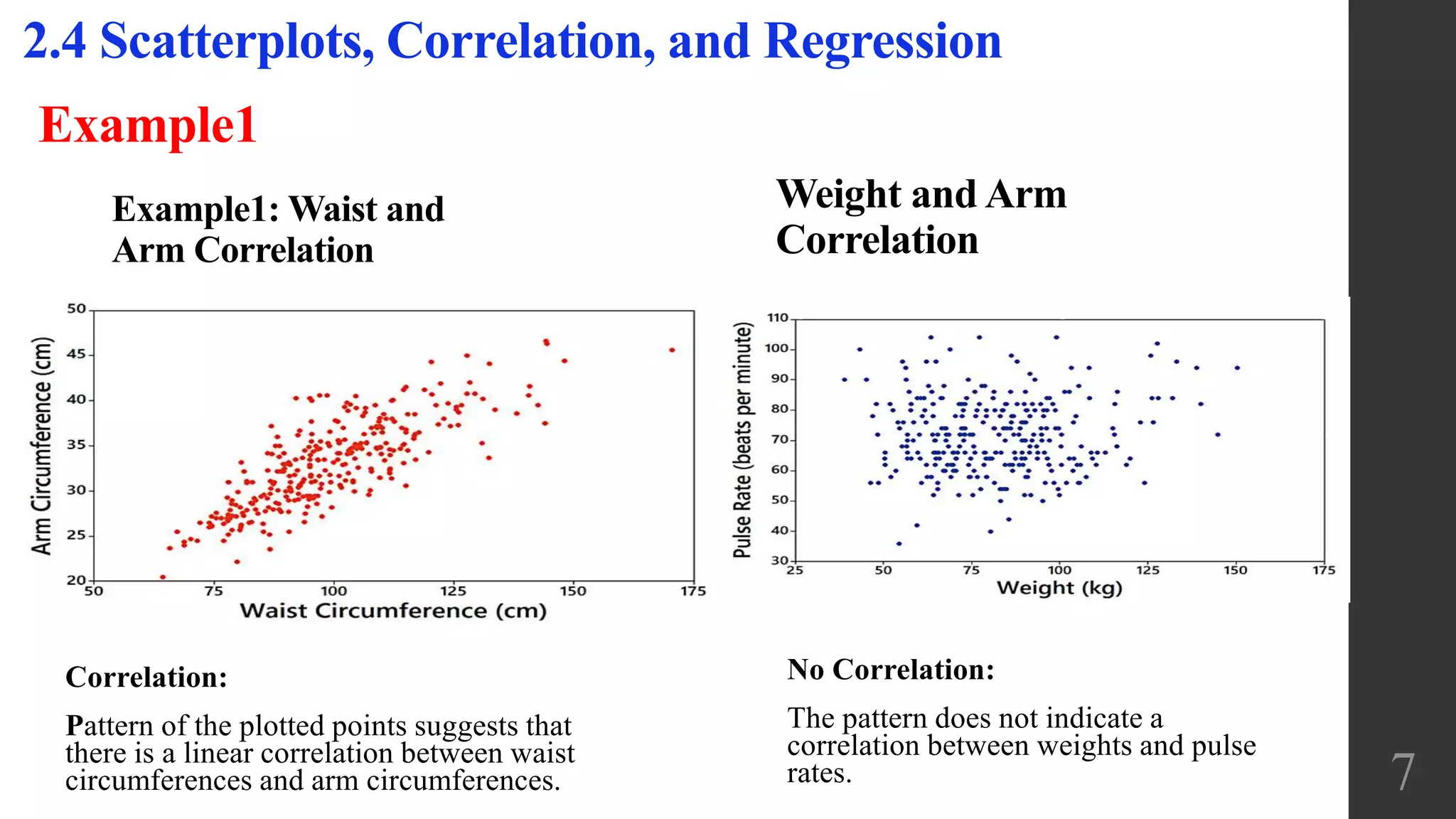
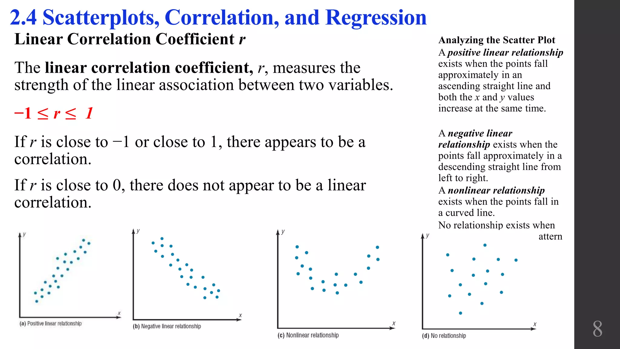
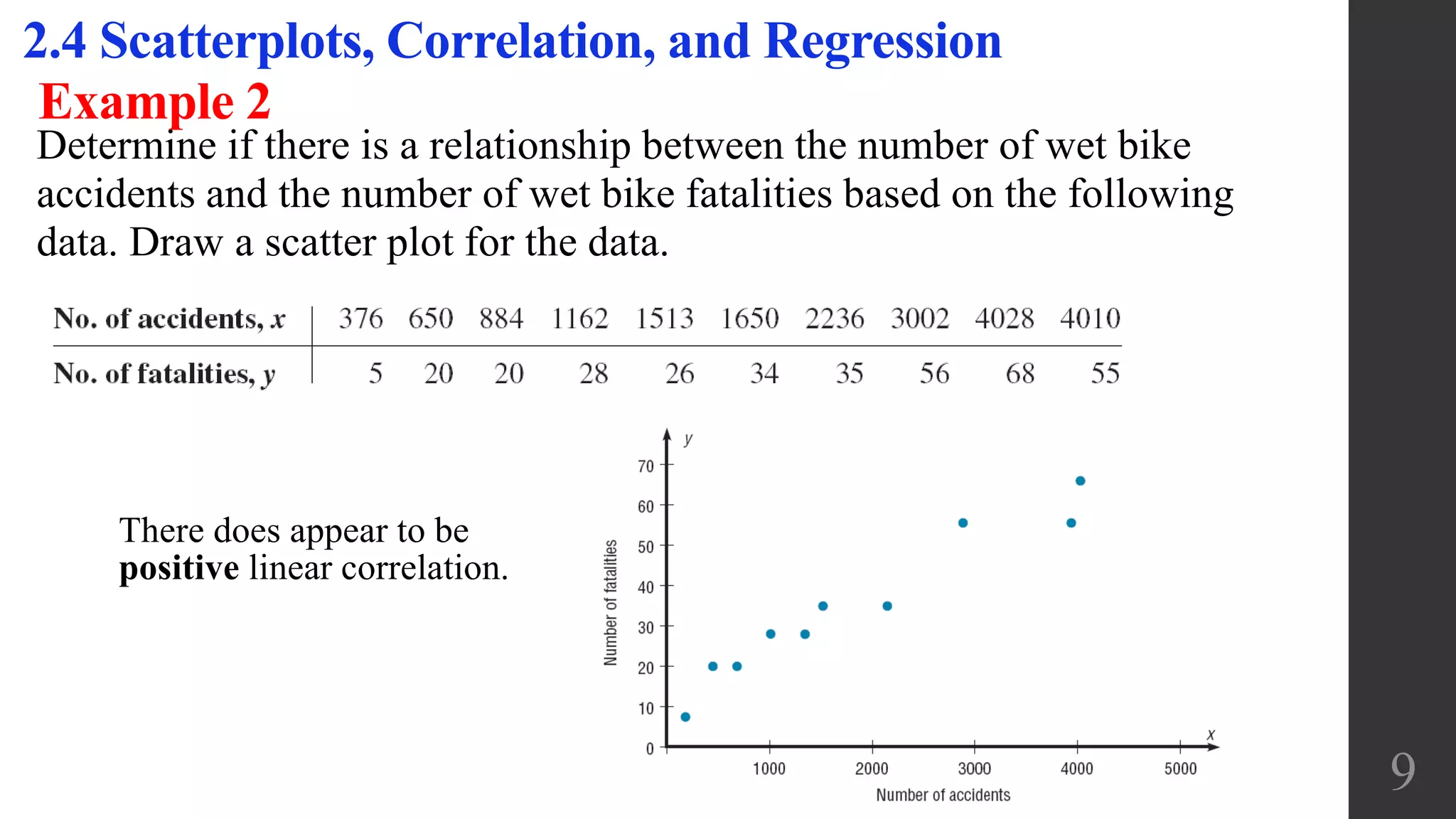
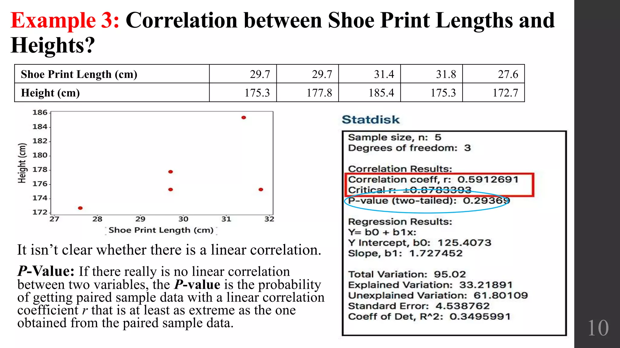
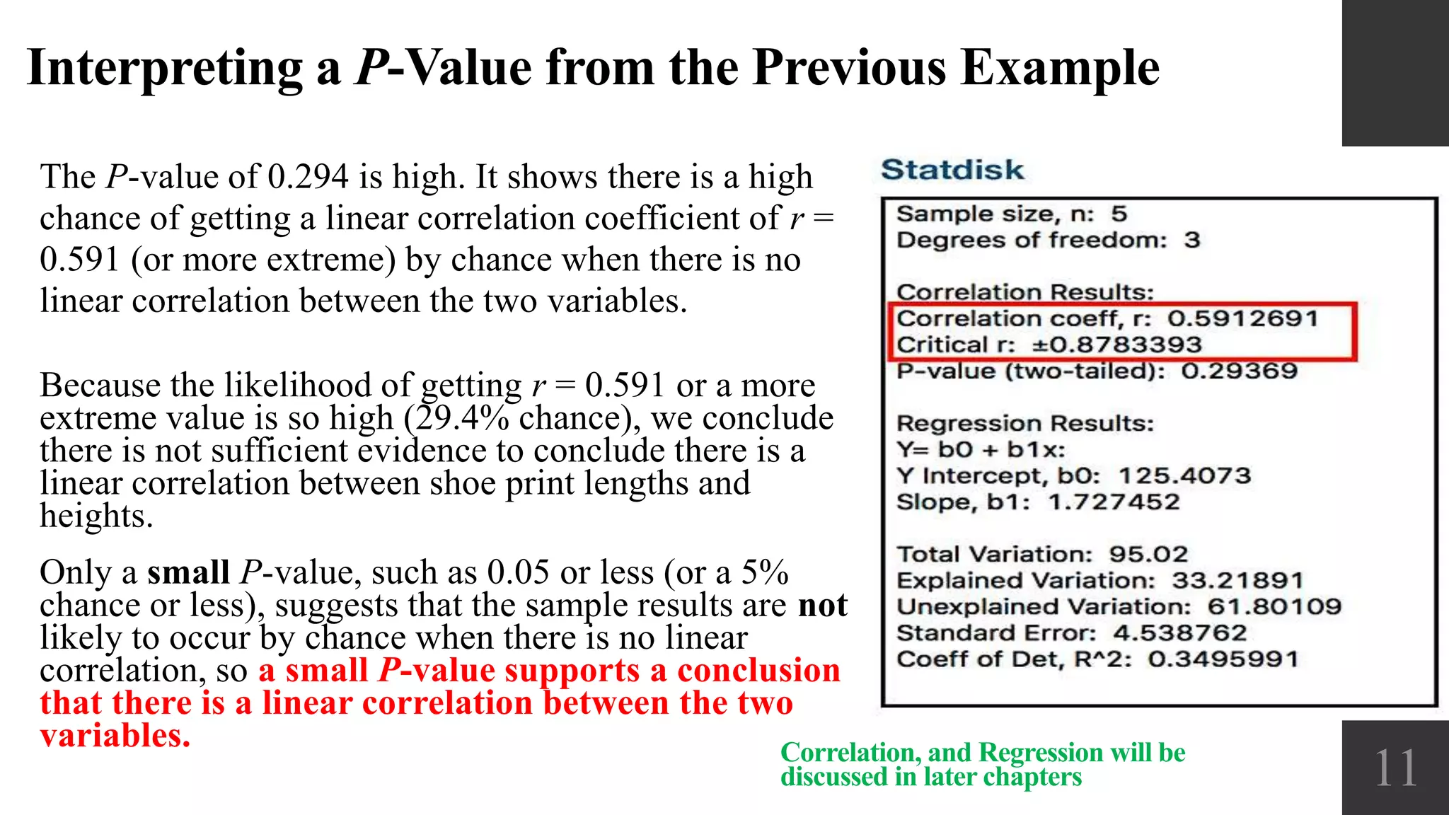
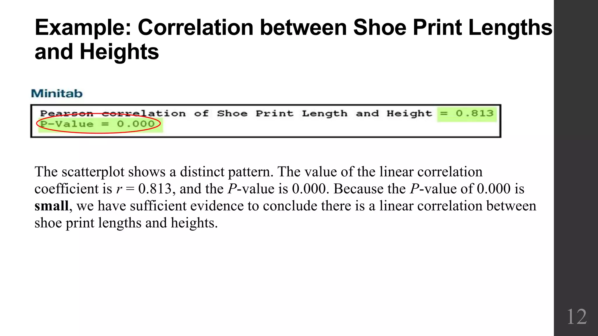
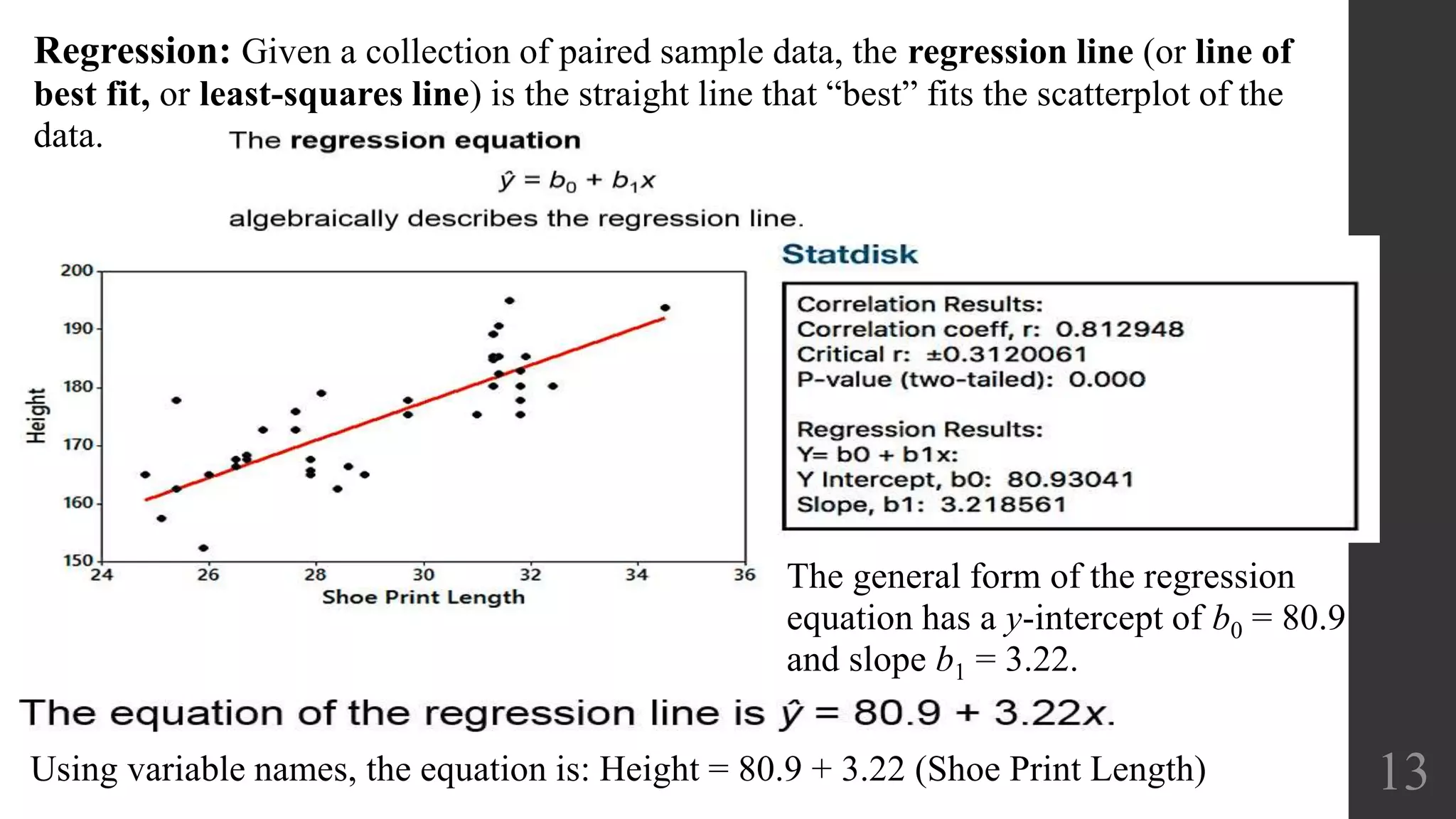
Elementary Statistics
Chapter 2:
Exploring Data with
Tables and Graphs
2.4 Scatterplots,
Correlation, and
Regression
1
Chapter 2:
Exploring Data with Tables and Graphs
2.1 Frequency Distributions for Organizing and
Summarizing Data
2.2 Histograms
2.3 Graphs that Enlighten and Graphs that Deceive
2.4 Scatterplots, Correlation, and Regression
2
Objectives:
1. Organize data using a frequency distribution.
2. Represent data in frequency distributions graphically using histograms, frequency polygons, and ogives.
3. Represent data using bar graphs, Pareto charts, time series graphs, and pie graphs.
4. Draw and interpret a stem and leaf plot.
5. Draw and interpret a scatter plot for a set of paired data.
Recall: 2.1 Frequency Distributions for Organizing and Summarizing Data
Data collected in original form is called raw data.
Frequency Distribution (or Frequency Table)
A frequency distribution is the organization of raw data in table form, using
classes and frequencies. It Shows how data are partitioned among several
categories (or classes) by listing the categories along with the number
(frequency) of data values in each of them.
Nominal- or ordinal-level data that can be placed in categories is organized in
categorical frequency distributions.
Lower class limits: The smallest numbers that can belong to each of the
different classes
Upper class limits: The largest numbers that can belong to each of the
different classes
Class boundaries: The numbers used to separate the classes, but without the
gaps created by class limits
Class midpoints: The values in the middle of the classes Each class midpoint
can be found by adding the lower class limit to the upper class limit and
dividing the sum by 2.
Class width: The difference between two consecutive lower class limits in a
frequency distribution
Procedure for Constructing a
Frequency Distribution
1. Select the number of classes,
usually between 5 and 20.
2. Calculate the class width: 𝑊 =
𝑀𝑎𝑥−𝑀𝑖𝑛
# 𝑜𝑓 𝑐𝑙𝑎𝑠𝑠𝑒𝑠
and round up
accordingly.
3. Choose the value for the first
lower class limit by using either
the minimum value or a
convenient value below the
minimum.
4. Using the first lower class limit
and class width, list the other
lower class limits.
5. List the lower class limits in a
vertical column and then
determine and enter the upper
class limits.
6. Take each individual data value
and put a tally mark in the
appropriate class. Add the tally
marks to get the frequency.
3
Normal Distribution:
Because this histogram is
roughly bell-shaped, we say that
the data have a normal
distribution.
4
Skewness
A distribution of
data is skewed if
it is not
symmetric and
extends more to
one side than
to the other.
Data skewed to the right
(positively skewed) have a
longer right tail.
Data skewed to the left
(negative skewed) have
a longer left tail.
Recall: 2.2 Histograms
Histogram: A graph consisting of bars of equal width drawn
adjacent to each other (unless there are gaps in the data)
The horizontal scale represents classes of quantitative data
values, and the vertical scale represents frequencies. The
heights of the bars correspond to frequency values.
Important Uses of a Histogram
Visually displays the shape of the distribution of the data
Shows the location of the center of the data
Shows the spread of the data & Identifies outliers
Dotplots & its Features: A graph of quantitative data in which each data value is plotted as a point (or dot) above a
horizontal scale of values. Dots representing equal values are stacked.
Displays the shape of distribution of data.It is usually possible to recreate the original list of data values.
Stemplots (or stem-and-leaf plot)
Represents quantitative data by separating each value into two parts: the stem (such as the leftmost digit) and the leaf (such as the rightmost
digit).
Time-Series Graph
A graph of time-series data, which are quantitative data that have been collected at different points in time, such as monthly or yearly
Bar Graphs
A graph of bars of equal width to show frequencies of categories of categorical (or qualitative) data. The bars may or
may not be separated by small gaps.
Pareto Charts
A Pareto chart is a bar graph for categorical data, with the added condition that the bars are arranged in descending
order according to frequencies, so the bars decrease in height from left to right.
Pie Charts
A very common graph that depicts categorical data as slices of a circle, in which the size of each slice is proportional to
the frequency count for the category
Feature of a Pie Chart
Shows the distribution of categorical data in a commonly used format.
Frequency Polygon
A graph using line segments connected to points located directly above class midpoint values
A frequency polygon is very similar to a histogram, but a frequency polygon uses line segments instead of bars.
An Ogive is a line graph that depicts cumulative frequencies
Recall: 2.3 Graphs that Enlighten and Graphs that Deceive
5
Graphs that Enlighten Graphs that Deceive
Nonzero Vertical Axis
A common deceptive graph involves
using a vertical scale that starts at some
value greater than zero to exaggerate
differences between groups.
Pictographs
Drawings of objects, called
pictographs, are often misleading.
Data that are one-dimensional in nature
(such as budget amounts) are often
depicted with two-dimensional objects
(such as dollar bills) or three-
dimensional objects (such as stacks of
coins, homes, or barrels).
By using pictographs, artists can create
false impressions that grossly distort
differences by using these simple
principles of basic geometry:
When you double each side of a square,
its area doesn’t merely double; it
increases by a factor of four.
When you double each side of a cube,
its volume doesn’t merely double; it
increases by a factor of eight.
Key Concept
Analysis of paired sample data, Correlation and the role of a graph called a scatterplot, Introduction to
the use of the linear correlation coefficient, linear regression, which involves the equation and graph of
the straight line that best fits the sample paired data.
Scatterplot and Correlation
Correlation
A correlation (association) exists between two variables when the values of one variable are
somehow associated with the values of the other variable.
Linear Correlation
A linear correlation exists between two variables when there is a correlation and the plotted
points of paired data result in a pattern that can be approximated by a straight line.
Scatterplot (or Scatter Diagram)
A scatterplot (or scatter diagram) is a plot of paired (x, y) quantitative data with a horizontal
x-axis and a vertical y-axis. The horizontal axis is used for the first variable (x), and the vertical
axis is used for the second variable (y).
2.4 Scatterplots, Correlation, and Regression
6
Example1: Waist and
Arm Correlation
Correlation:
Pattern of the plotted points suggests that
there is a linear correlation between waist
circumferences and arm circumferences.
2.4 Scatterplots, Correlation, and Regression
Example1
Weight and Arm
Correlation
No Correlation:
The pattern does not indicate a
correlation between weights and pulse
rates. 7
Linear Correlation Coefficient r
The linear correlation coefficient, r, measures the
strength of the linear association between two variables.
−1 ≤ r ≤ 1
If r is close to −1 or close to 1, there appears to be a
correlation.
If r is close to 0, there does not appear to be a linear
correlation.
2.4 Scatterplots, Correlation, and Regression
8
Analyzing the Scatter Plot
A positive linear relationship
exists when the points fall
approximately in an
ascending straight line and
both the x and y values
increase at the same time.
A negative linear
relationship exists when the
points fall approximately in a
descending straight line from
left to right.
A nonlinear relationship
exists when the points fall in
a curved line.
No relationship exists when
there is no discernible pattern
of the points.
Determine if there is a relationship between the number of wet bike
accidents and the number of wet bike fatalities based on the following
data. Draw a scatter plot for the data.
2.4 Scatterplots, Correlation, and Regression
9
There does appear to be
positive linear correlation.
Example 2
Example 3: Correlation between Shoe Print Lengths and
Heights?
Shoe Print Length (cm) 29.7 29.7 31.4 31.8 27.6
Height (cm) 175.3 177.8 185.4 175.3 172.7
10
It isn’t clear whether there is a linear correlation.
P-Value: If there really is no linear correlation
between two variables, the P-value is the probability
of getting paired sample data with a linear correlation
coefficient r that is at least as extreme as the one
obtained from the paired sample data.
Interpreting a P-Value from the Previous Example
The P-value of 0.294 is high. It shows there is a high
chance of getting a linear correlation coefficient of r =
0.591 (or more extreme) by chance when there is no
linear correlation between the two variables.
11Correlation, and Regression will be
discussed in later chapters
Because the likelihood of getting r = 0.591 or a more
extreme value is so high (29.4% chance), we conclude
there is not sufficient evidence to conclude there is a
linear correlation between shoe print lengths and
heights.
Only a small P-value, such as 0.05 or less (or a 5%
chance or less), suggests that the sample results are not
likely to occur by chance when there is no linear
correlation, so a small P-value supports a conclusion
that there is a linear correlation between the two
variables.
Example: Correlation between Shoe Print Lengths
and Heights
The scatterplot shows a distinct pattern. The value of the linear correlation
coefficient is r = 0.813, and the P-value is 0.000. Because the P-value of 0.000 is
small, we have sufficient evidence to conclude there is a linear correlation between
shoe print lengths and heights.
12
Regression: Given a collection of paired sample data, the regression line (or line of
best fit, or least-squares line) is the straight line that “best” fits the scatterplot of the
data.
13
The general form of the regression
equation has a y-intercept of b0 = 80.9
and slope b1 = 3.22.
Using variable names, the equation is: Height = 80.9 + 3.22 (Shoe Print Length)

2.4 Scatterplots, correlation, and regression

  • 1.
    Elementary Statistics Chapter 2: ExploringData with Tables and Graphs 2.4 Scatterplots, Correlation, and Regression 1
  • 2.
    Chapter 2: Exploring Datawith Tables and Graphs 2.1 Frequency Distributions for Organizing and Summarizing Data 2.2 Histograms 2.3 Graphs that Enlighten and Graphs that Deceive 2.4 Scatterplots, Correlation, and Regression 2 Objectives: 1. Organize data using a frequency distribution. 2. Represent data in frequency distributions graphically using histograms, frequency polygons, and ogives. 3. Represent data using bar graphs, Pareto charts, time series graphs, and pie graphs. 4. Draw and interpret a stem and leaf plot. 5. Draw and interpret a scatter plot for a set of paired data.
  • 3.
    Recall: 2.1 FrequencyDistributions for Organizing and Summarizing Data Data collected in original form is called raw data. Frequency Distribution (or Frequency Table) A frequency distribution is the organization of raw data in table form, using classes and frequencies. It Shows how data are partitioned among several categories (or classes) by listing the categories along with the number (frequency) of data values in each of them. Nominal- or ordinal-level data that can be placed in categories is organized in categorical frequency distributions. Lower class limits: The smallest numbers that can belong to each of the different classes Upper class limits: The largest numbers that can belong to each of the different classes Class boundaries: The numbers used to separate the classes, but without the gaps created by class limits Class midpoints: The values in the middle of the classes Each class midpoint can be found by adding the lower class limit to the upper class limit and dividing the sum by 2. Class width: The difference between two consecutive lower class limits in a frequency distribution Procedure for Constructing a Frequency Distribution 1. Select the number of classes, usually between 5 and 20. 2. Calculate the class width: 𝑊 = 𝑀𝑎𝑥−𝑀𝑖𝑛 # 𝑜𝑓 𝑐𝑙𝑎𝑠𝑠𝑒𝑠 and round up accordingly. 3. Choose the value for the first lower class limit by using either the minimum value or a convenient value below the minimum. 4. Using the first lower class limit and class width, list the other lower class limits. 5. List the lower class limits in a vertical column and then determine and enter the upper class limits. 6. Take each individual data value and put a tally mark in the appropriate class. Add the tally marks to get the frequency. 3
  • 4.
    Normal Distribution: Because thishistogram is roughly bell-shaped, we say that the data have a normal distribution. 4 Skewness A distribution of data is skewed if it is not symmetric and extends more to one side than to the other. Data skewed to the right (positively skewed) have a longer right tail. Data skewed to the left (negative skewed) have a longer left tail. Recall: 2.2 Histograms Histogram: A graph consisting of bars of equal width drawn adjacent to each other (unless there are gaps in the data) The horizontal scale represents classes of quantitative data values, and the vertical scale represents frequencies. The heights of the bars correspond to frequency values. Important Uses of a Histogram Visually displays the shape of the distribution of the data Shows the location of the center of the data Shows the spread of the data & Identifies outliers
  • 5.
    Dotplots & itsFeatures: A graph of quantitative data in which each data value is plotted as a point (or dot) above a horizontal scale of values. Dots representing equal values are stacked. Displays the shape of distribution of data.It is usually possible to recreate the original list of data values. Stemplots (or stem-and-leaf plot) Represents quantitative data by separating each value into two parts: the stem (such as the leftmost digit) and the leaf (such as the rightmost digit). Time-Series Graph A graph of time-series data, which are quantitative data that have been collected at different points in time, such as monthly or yearly Bar Graphs A graph of bars of equal width to show frequencies of categories of categorical (or qualitative) data. The bars may or may not be separated by small gaps. Pareto Charts A Pareto chart is a bar graph for categorical data, with the added condition that the bars are arranged in descending order according to frequencies, so the bars decrease in height from left to right. Pie Charts A very common graph that depicts categorical data as slices of a circle, in which the size of each slice is proportional to the frequency count for the category Feature of a Pie Chart Shows the distribution of categorical data in a commonly used format. Frequency Polygon A graph using line segments connected to points located directly above class midpoint values A frequency polygon is very similar to a histogram, but a frequency polygon uses line segments instead of bars. An Ogive is a line graph that depicts cumulative frequencies Recall: 2.3 Graphs that Enlighten and Graphs that Deceive 5 Graphs that Enlighten Graphs that Deceive Nonzero Vertical Axis A common deceptive graph involves using a vertical scale that starts at some value greater than zero to exaggerate differences between groups. Pictographs Drawings of objects, called pictographs, are often misleading. Data that are one-dimensional in nature (such as budget amounts) are often depicted with two-dimensional objects (such as dollar bills) or three- dimensional objects (such as stacks of coins, homes, or barrels). By using pictographs, artists can create false impressions that grossly distort differences by using these simple principles of basic geometry: When you double each side of a square, its area doesn’t merely double; it increases by a factor of four. When you double each side of a cube, its volume doesn’t merely double; it increases by a factor of eight.
  • 6.
    Key Concept Analysis ofpaired sample data, Correlation and the role of a graph called a scatterplot, Introduction to the use of the linear correlation coefficient, linear regression, which involves the equation and graph of the straight line that best fits the sample paired data. Scatterplot and Correlation Correlation A correlation (association) exists between two variables when the values of one variable are somehow associated with the values of the other variable. Linear Correlation A linear correlation exists between two variables when there is a correlation and the plotted points of paired data result in a pattern that can be approximated by a straight line. Scatterplot (or Scatter Diagram) A scatterplot (or scatter diagram) is a plot of paired (x, y) quantitative data with a horizontal x-axis and a vertical y-axis. The horizontal axis is used for the first variable (x), and the vertical axis is used for the second variable (y). 2.4 Scatterplots, Correlation, and Regression 6
  • 7.
    Example1: Waist and ArmCorrelation Correlation: Pattern of the plotted points suggests that there is a linear correlation between waist circumferences and arm circumferences. 2.4 Scatterplots, Correlation, and Regression Example1 Weight and Arm Correlation No Correlation: The pattern does not indicate a correlation between weights and pulse rates. 7
  • 8.
    Linear Correlation Coefficientr The linear correlation coefficient, r, measures the strength of the linear association between two variables. −1 ≤ r ≤ 1 If r is close to −1 or close to 1, there appears to be a correlation. If r is close to 0, there does not appear to be a linear correlation. 2.4 Scatterplots, Correlation, and Regression 8 Analyzing the Scatter Plot A positive linear relationship exists when the points fall approximately in an ascending straight line and both the x and y values increase at the same time. A negative linear relationship exists when the points fall approximately in a descending straight line from left to right. A nonlinear relationship exists when the points fall in a curved line. No relationship exists when there is no discernible pattern of the points.
  • 9.
    Determine if thereis a relationship between the number of wet bike accidents and the number of wet bike fatalities based on the following data. Draw a scatter plot for the data. 2.4 Scatterplots, Correlation, and Regression 9 There does appear to be positive linear correlation. Example 2
  • 10.
    Example 3: Correlationbetween Shoe Print Lengths and Heights? Shoe Print Length (cm) 29.7 29.7 31.4 31.8 27.6 Height (cm) 175.3 177.8 185.4 175.3 172.7 10 It isn’t clear whether there is a linear correlation. P-Value: If there really is no linear correlation between two variables, the P-value is the probability of getting paired sample data with a linear correlation coefficient r that is at least as extreme as the one obtained from the paired sample data.
  • 11.
    Interpreting a P-Valuefrom the Previous Example The P-value of 0.294 is high. It shows there is a high chance of getting a linear correlation coefficient of r = 0.591 (or more extreme) by chance when there is no linear correlation between the two variables. 11Correlation, and Regression will be discussed in later chapters Because the likelihood of getting r = 0.591 or a more extreme value is so high (29.4% chance), we conclude there is not sufficient evidence to conclude there is a linear correlation between shoe print lengths and heights. Only a small P-value, such as 0.05 or less (or a 5% chance or less), suggests that the sample results are not likely to occur by chance when there is no linear correlation, so a small P-value supports a conclusion that there is a linear correlation between the two variables.
  • 12.
    Example: Correlation betweenShoe Print Lengths and Heights The scatterplot shows a distinct pattern. The value of the linear correlation coefficient is r = 0.813, and the P-value is 0.000. Because the P-value of 0.000 is small, we have sufficient evidence to conclude there is a linear correlation between shoe print lengths and heights. 12
  • 13.
    Regression: Given acollection of paired sample data, the regression line (or line of best fit, or least-squares line) is the straight line that “best” fits the scatterplot of the data. 13 The general form of the regression equation has a y-intercept of b0 = 80.9 and slope b1 = 3.22. Using variable names, the equation is: Height = 80.9 + 3.22 (Shoe Print Length)