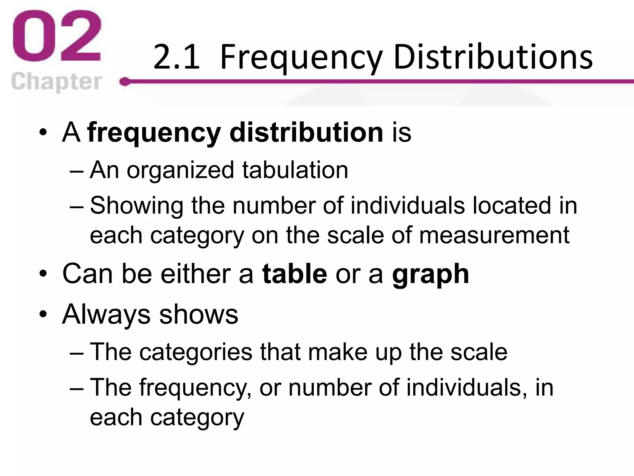
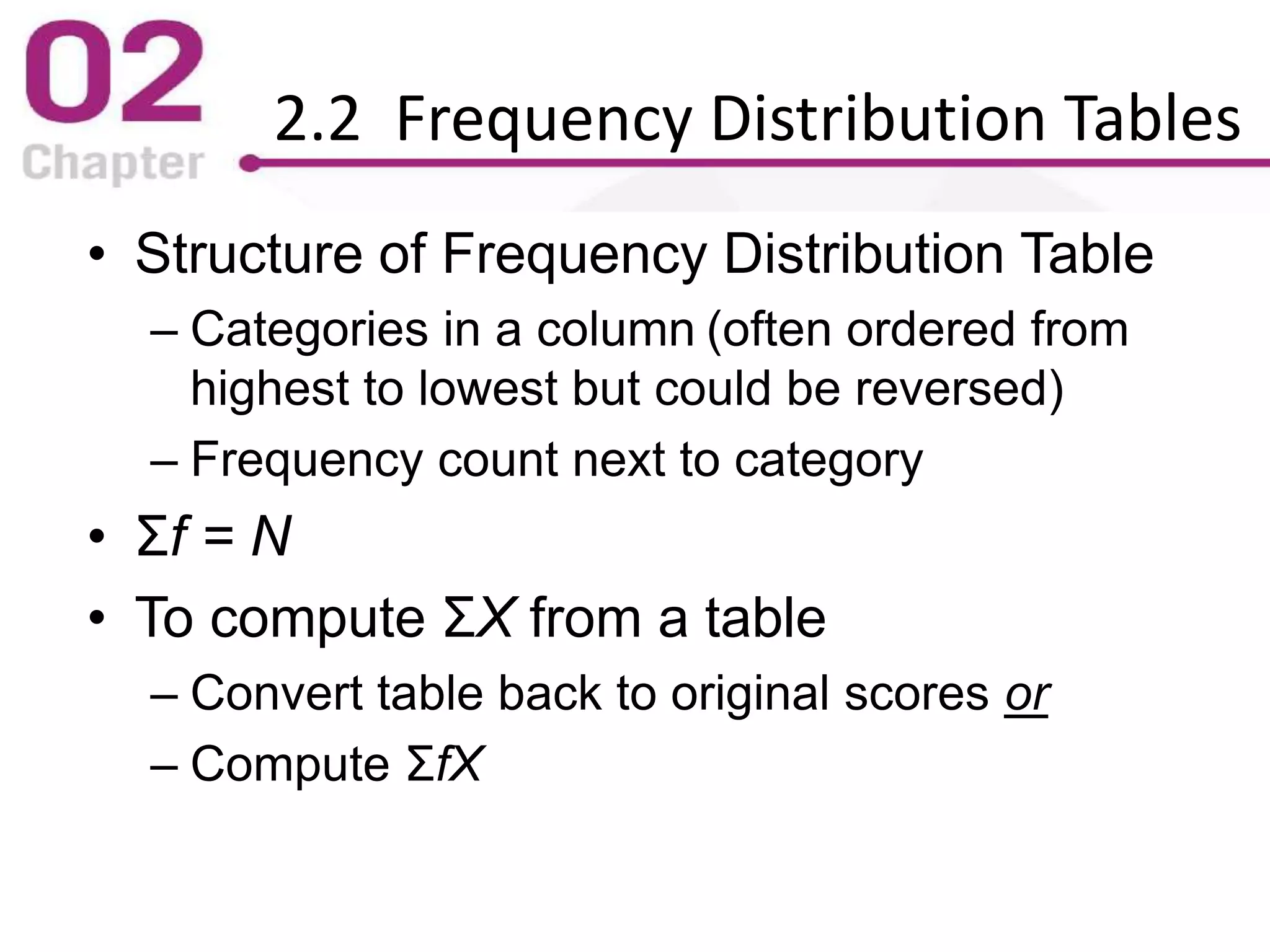
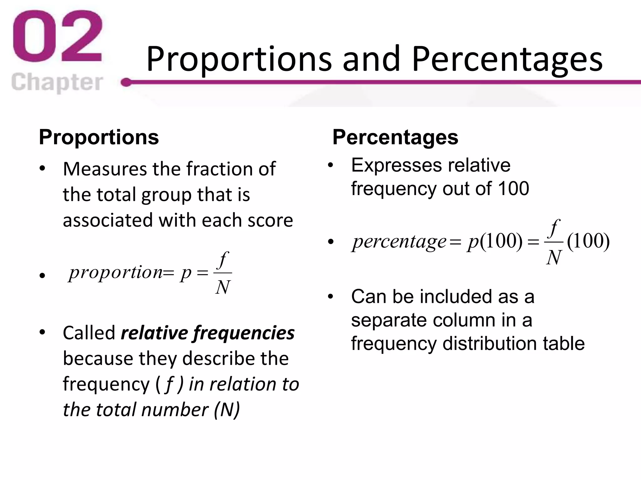
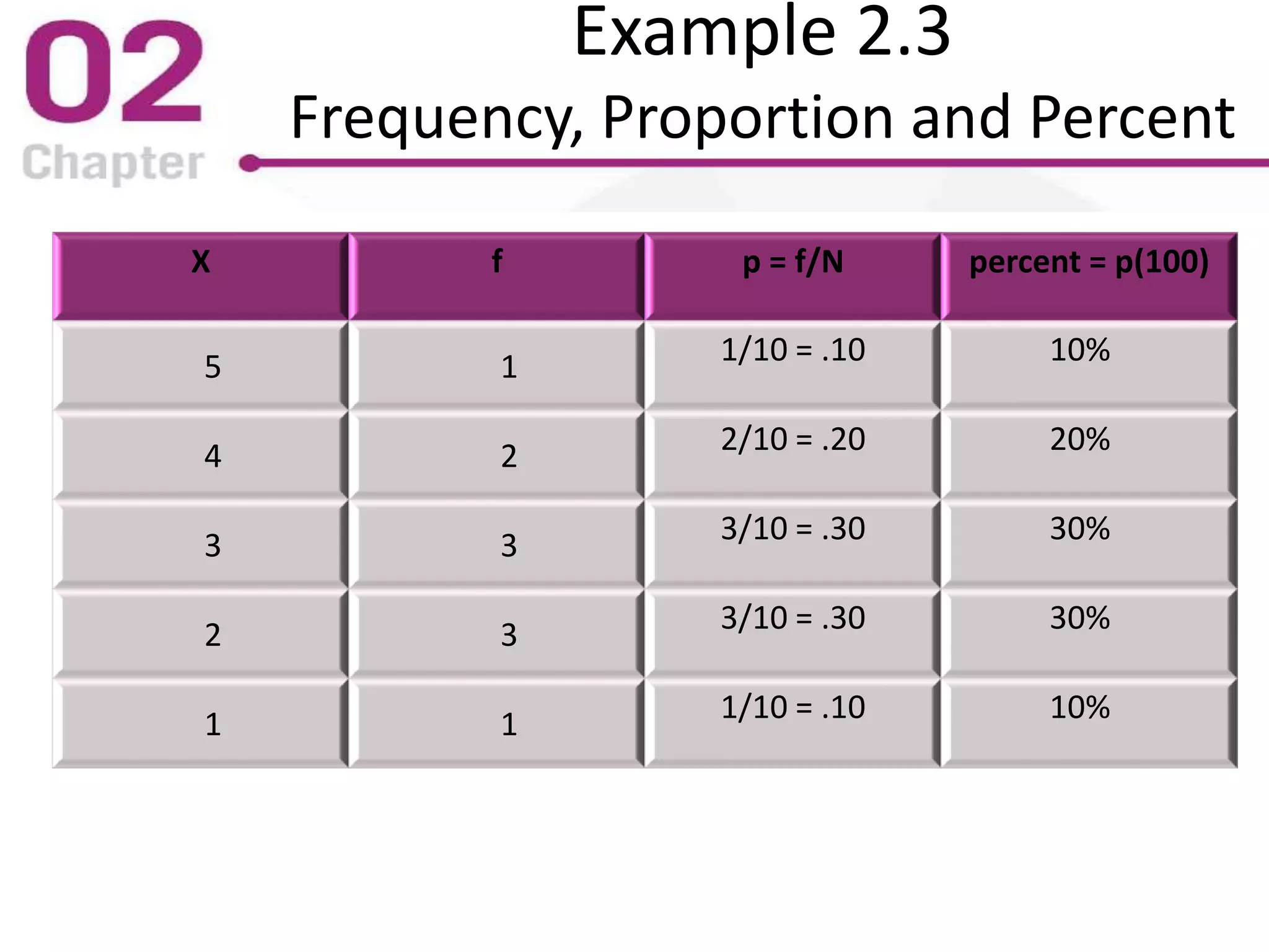
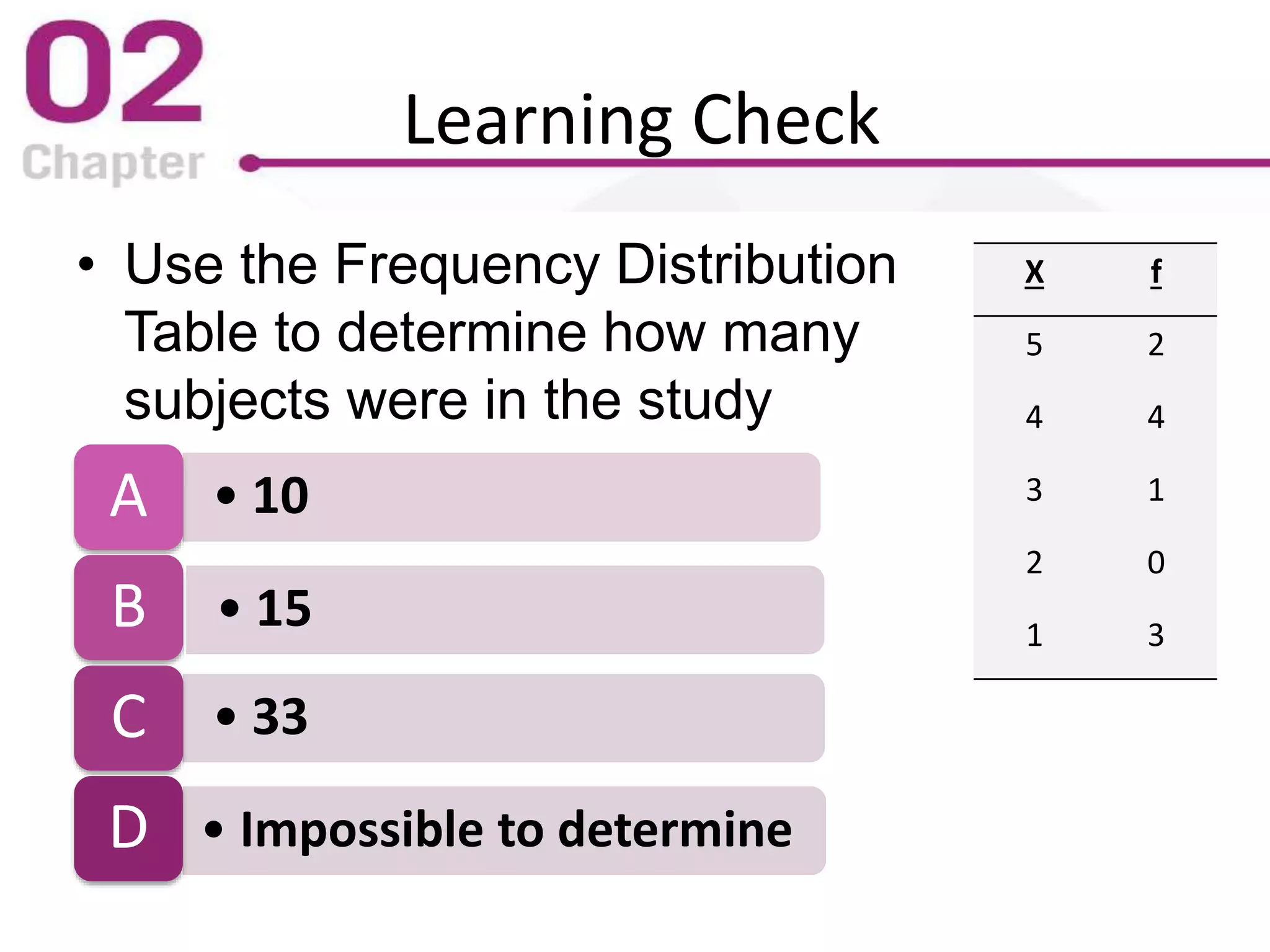
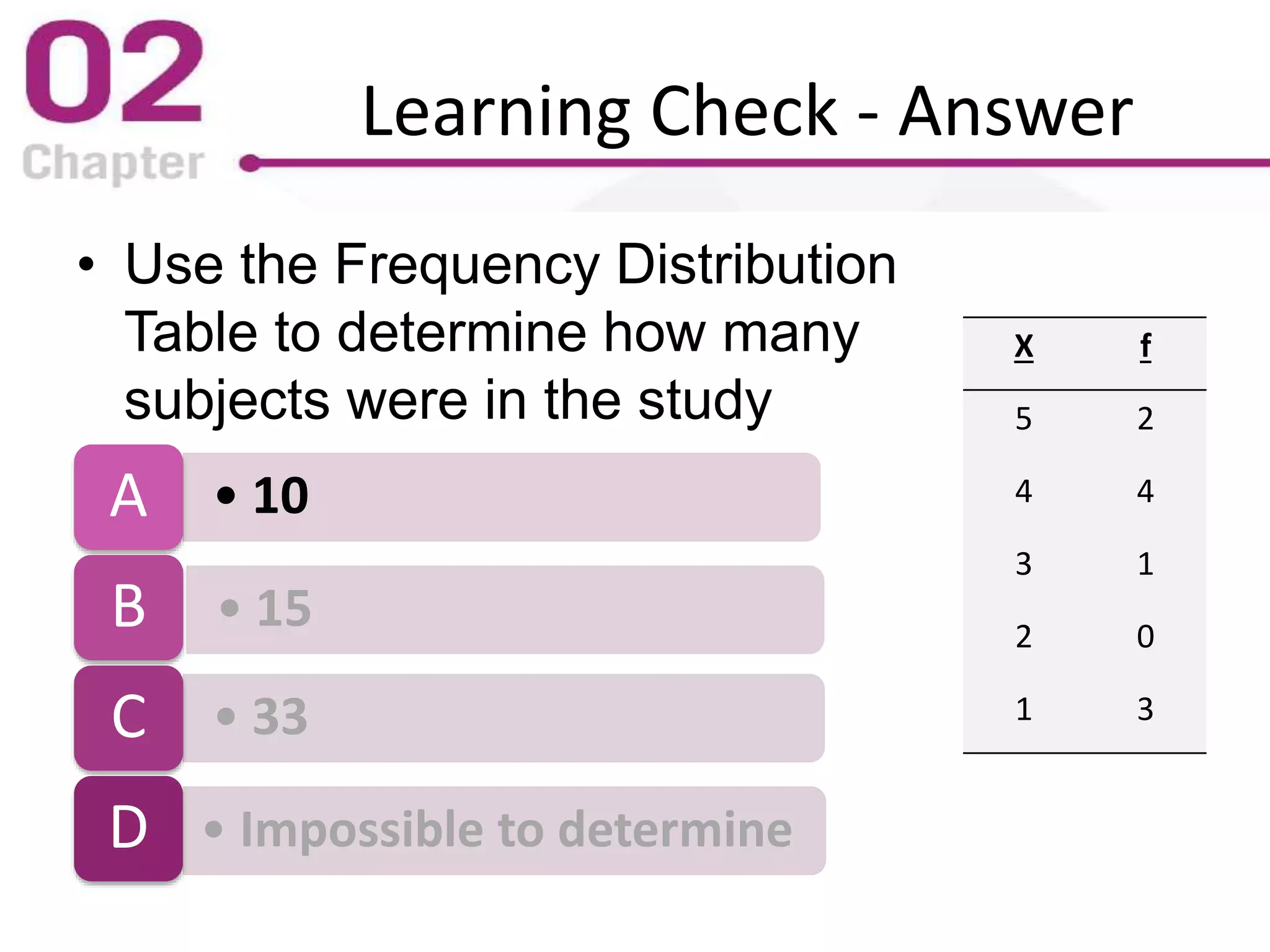
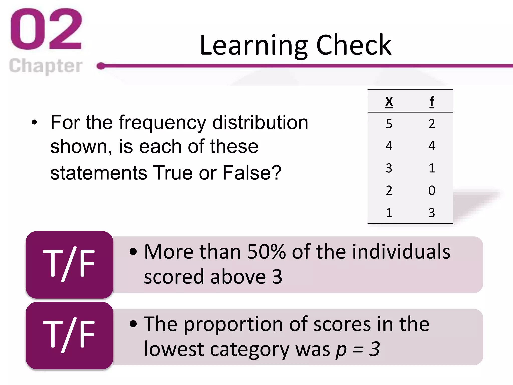
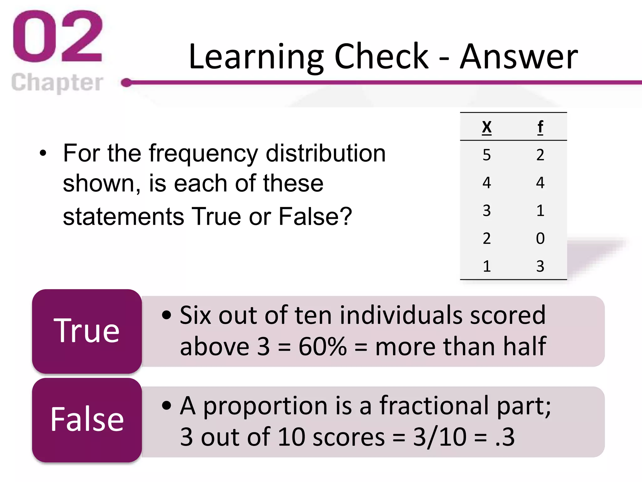
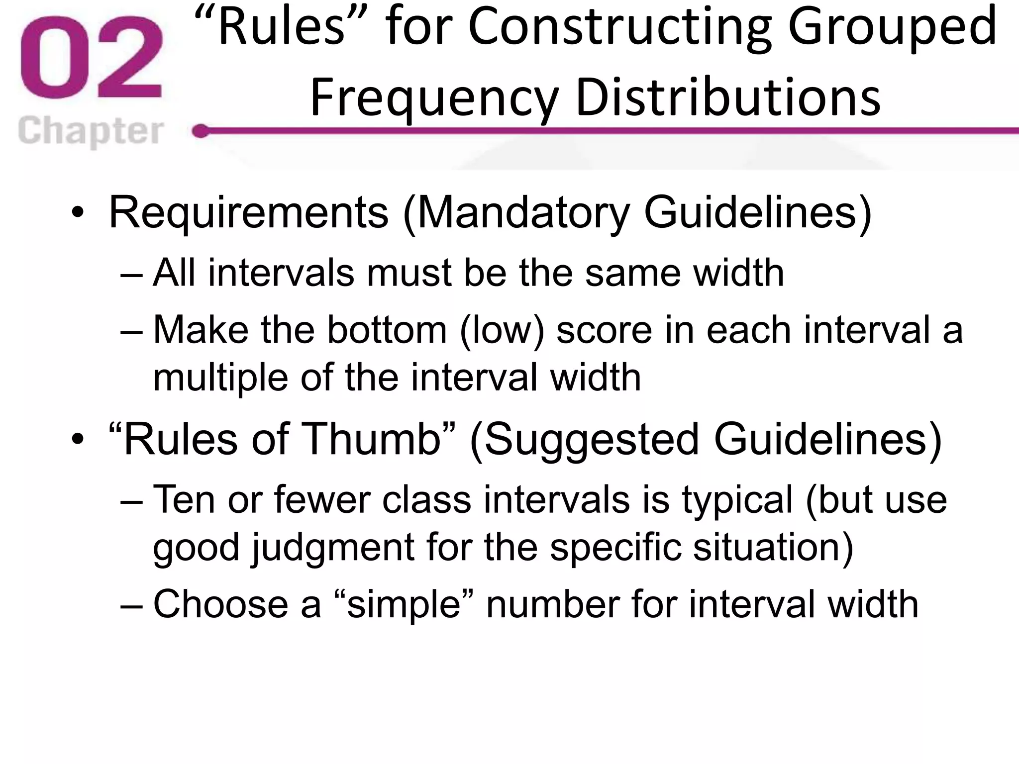
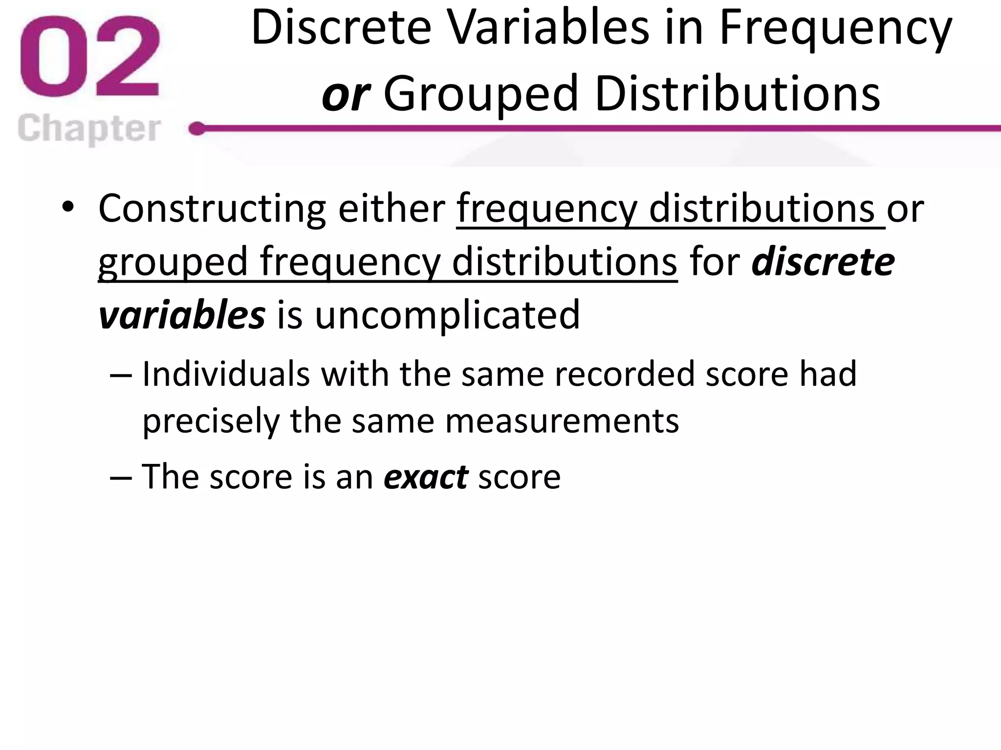
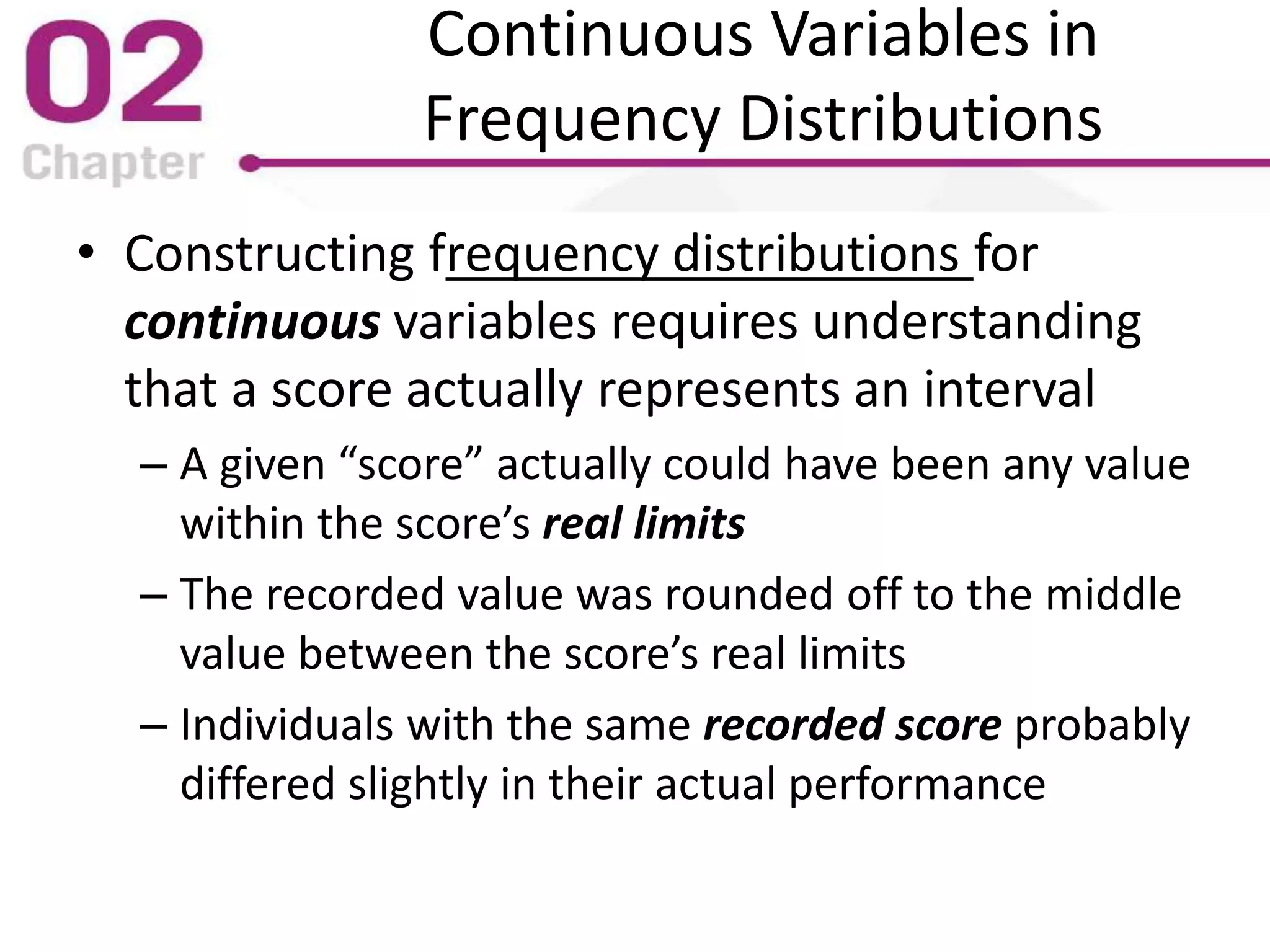
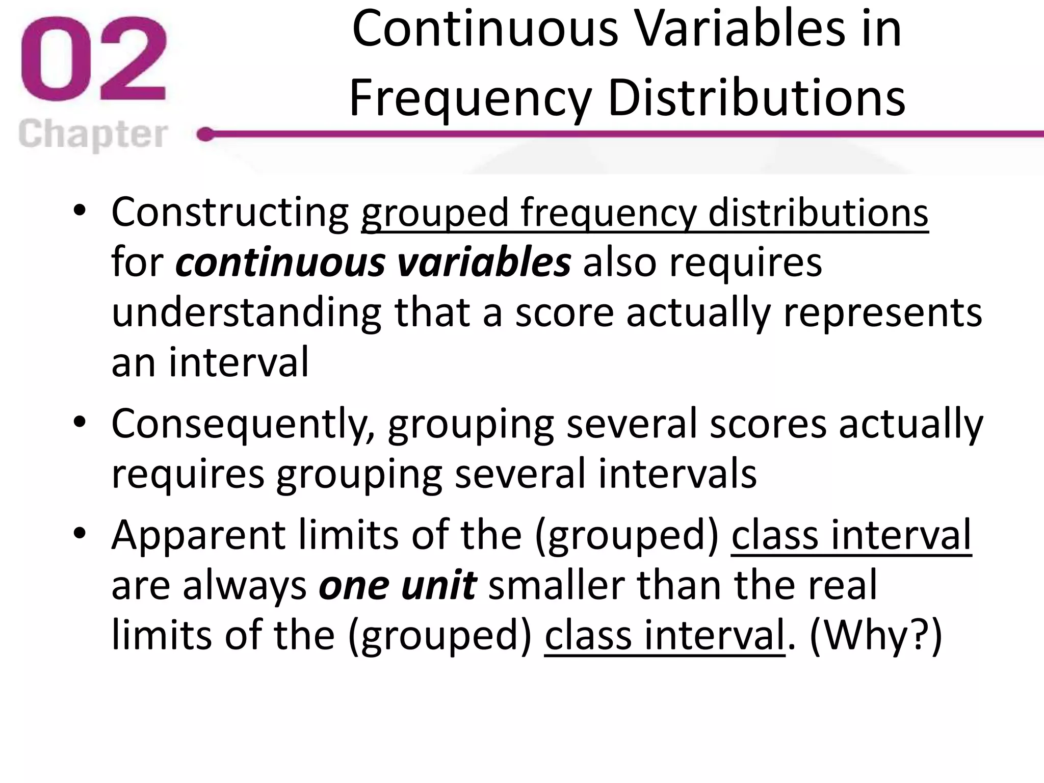
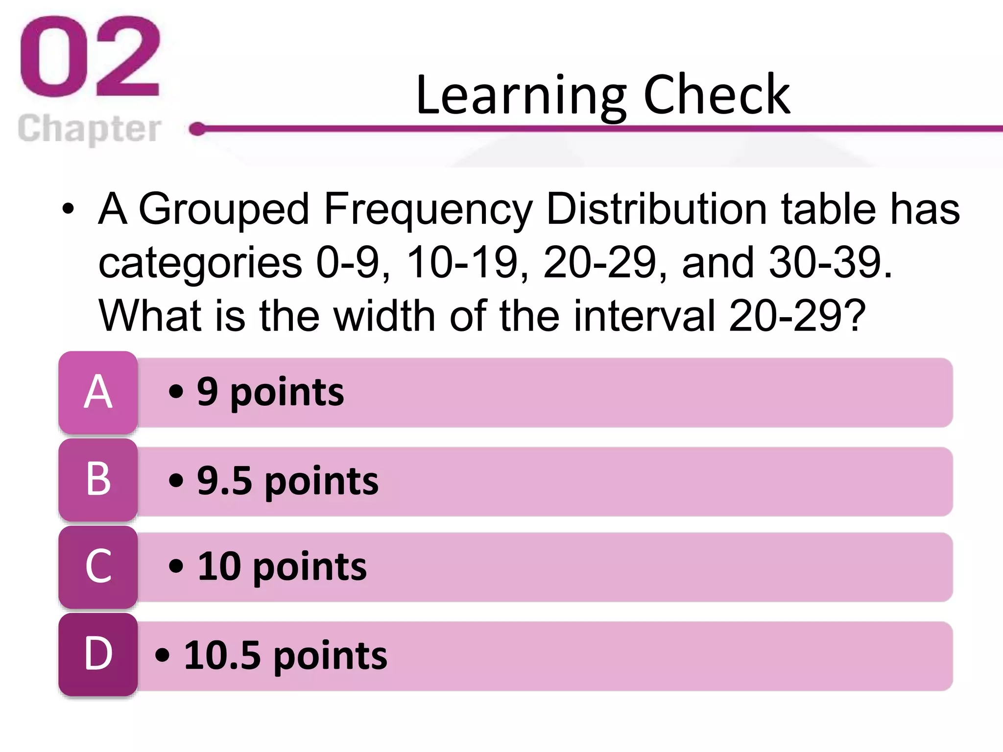
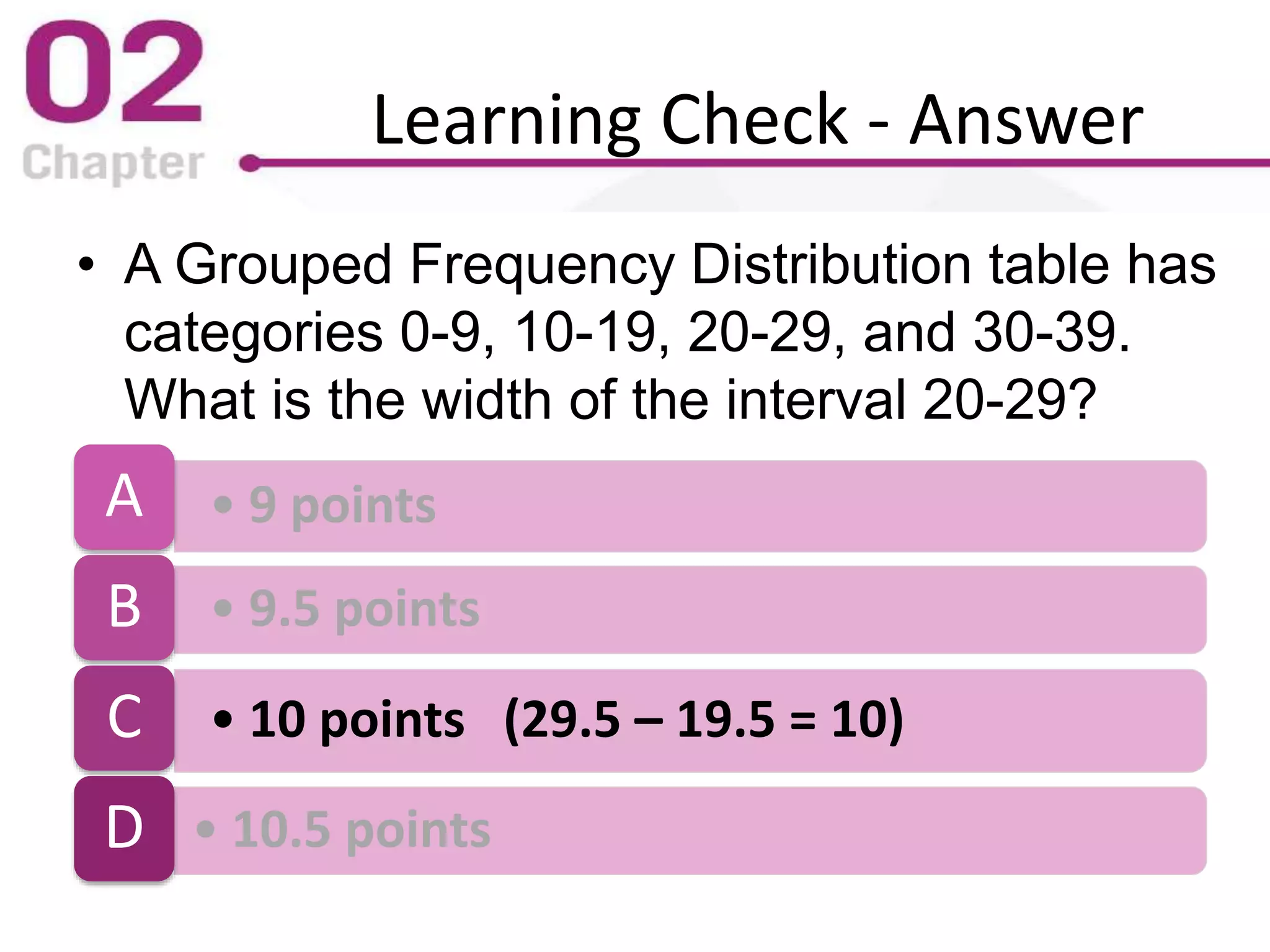
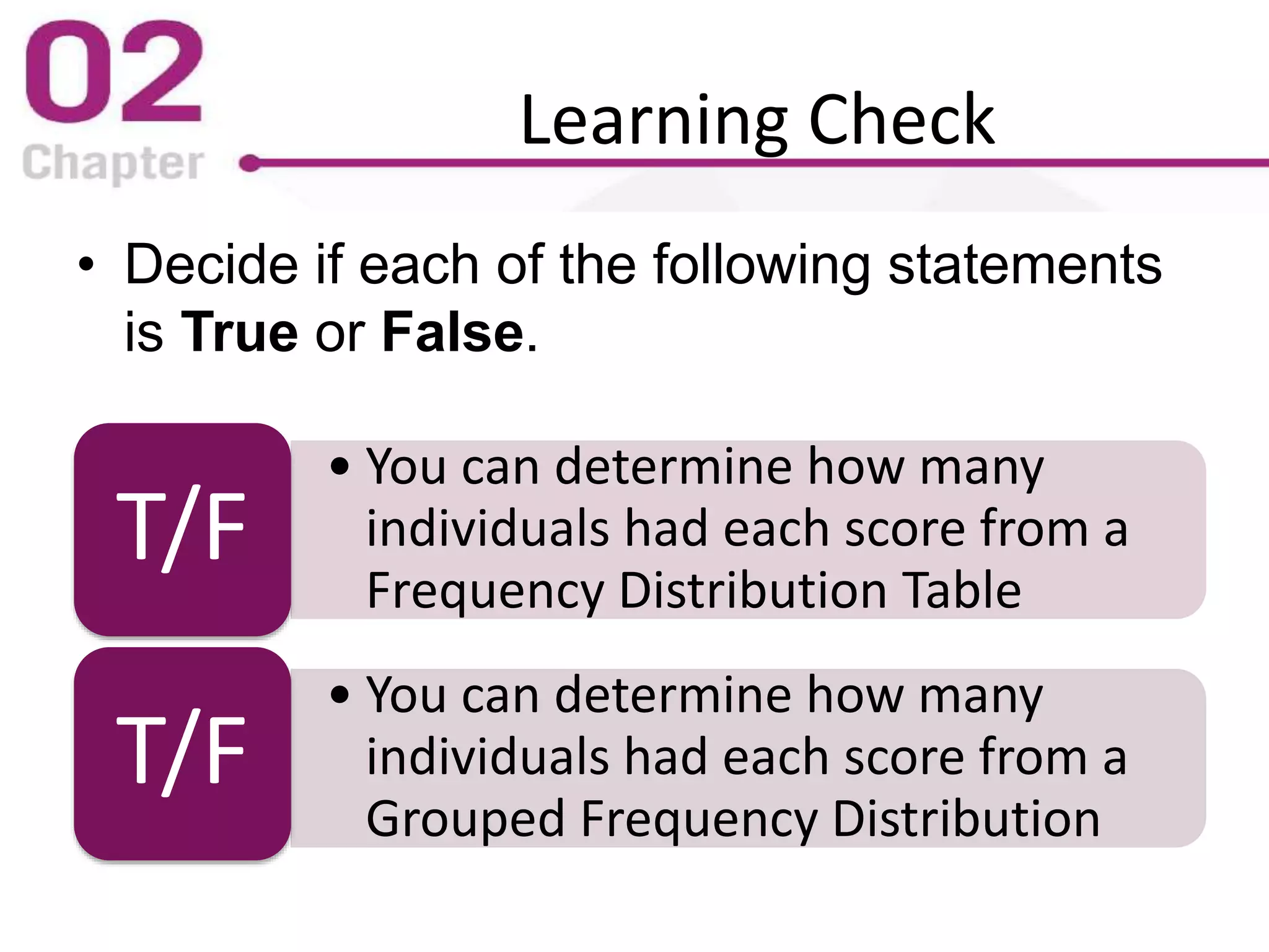
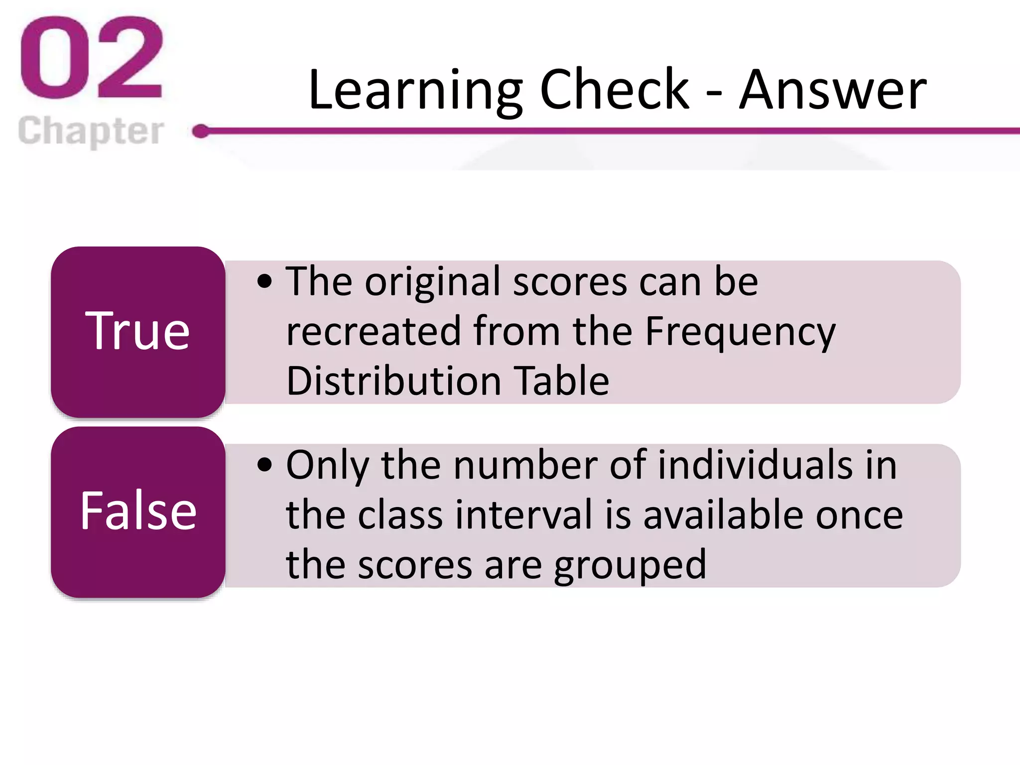
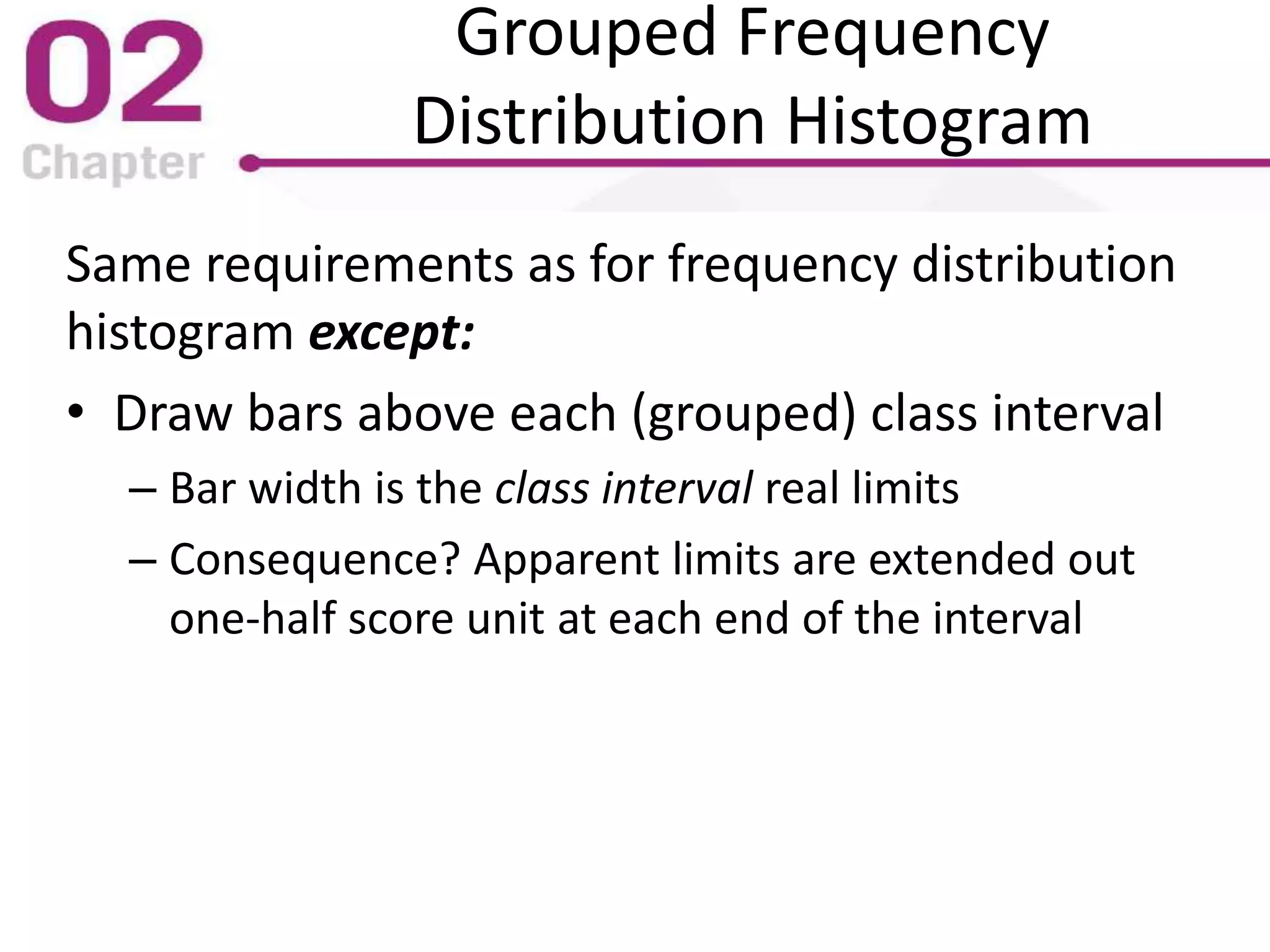
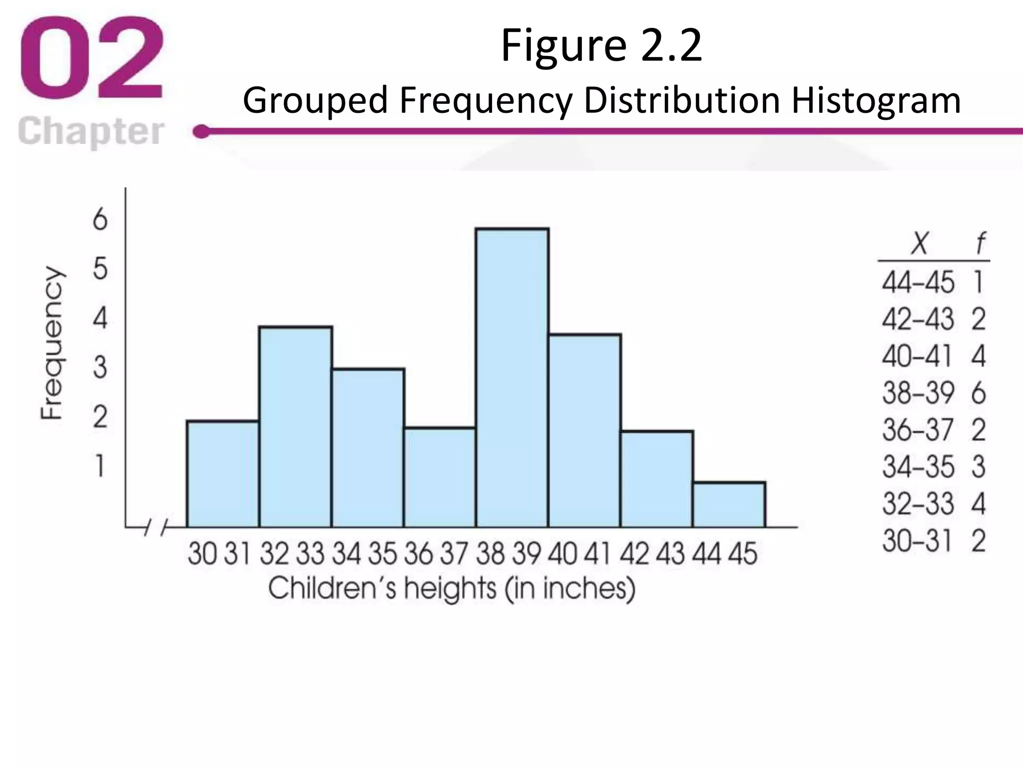
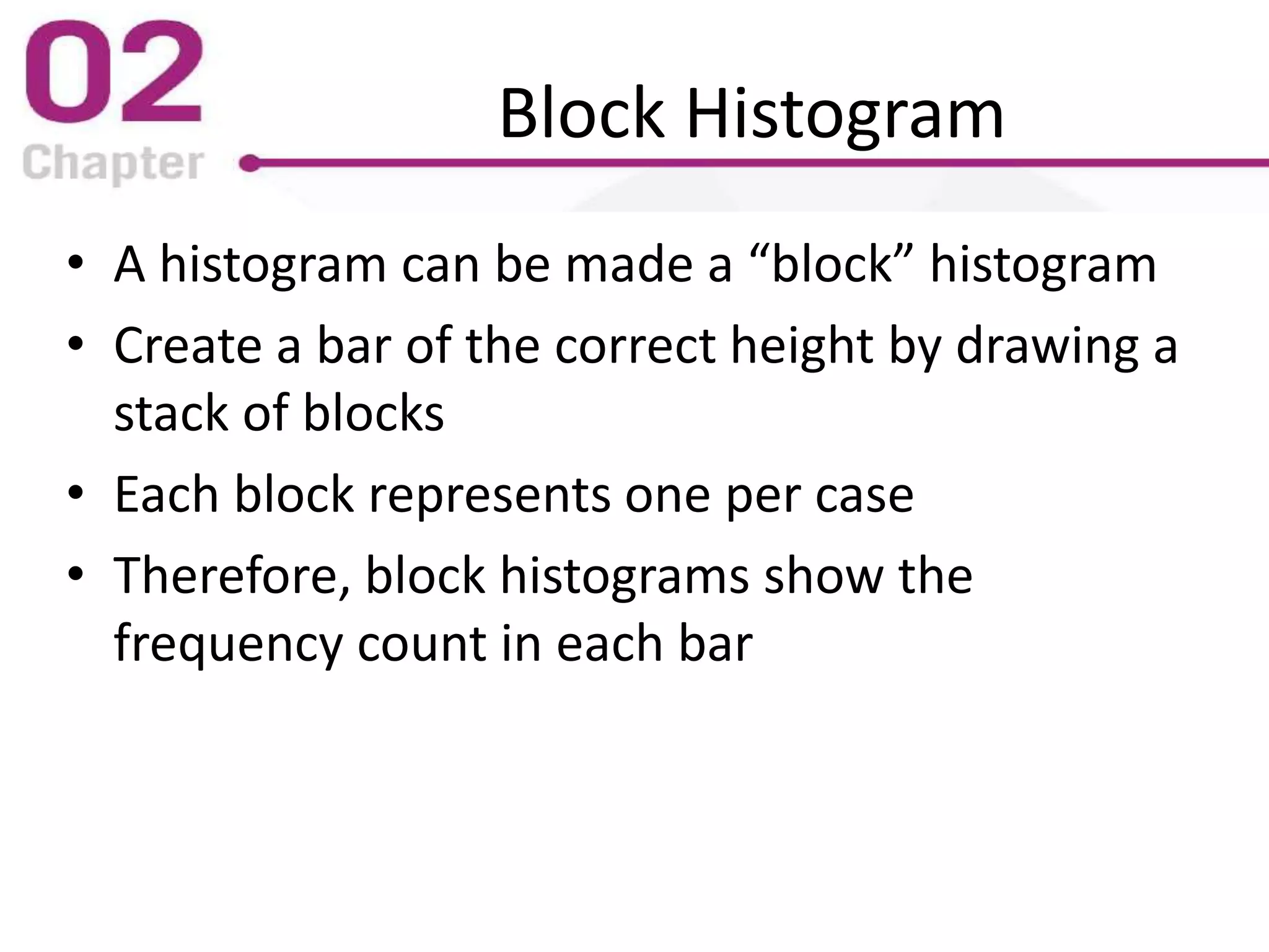
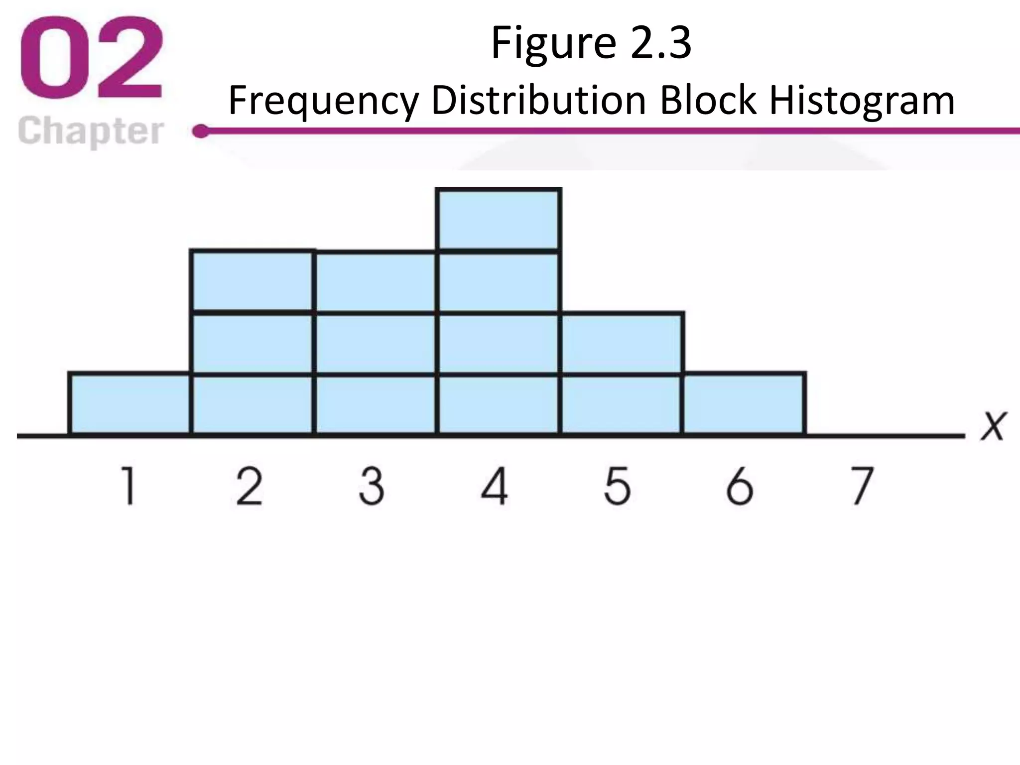
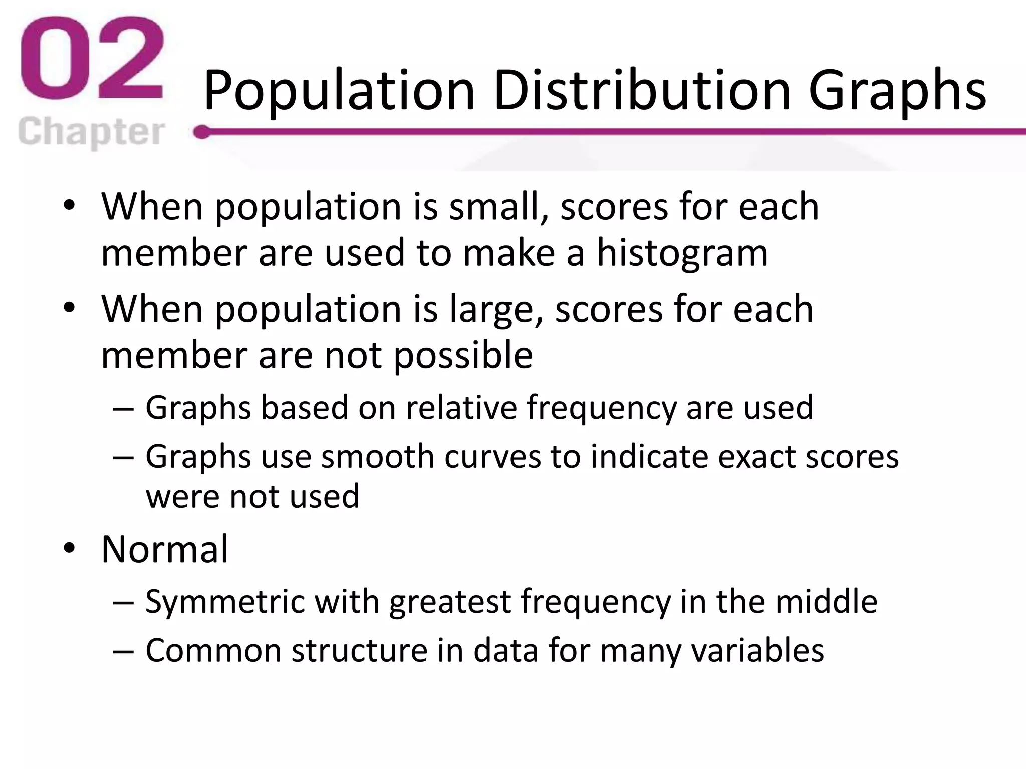
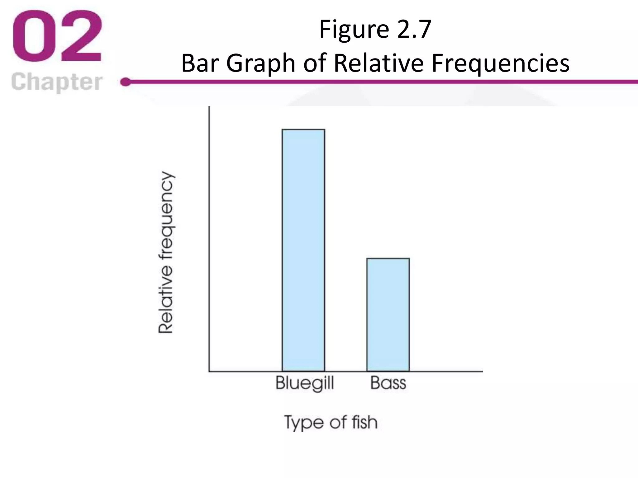
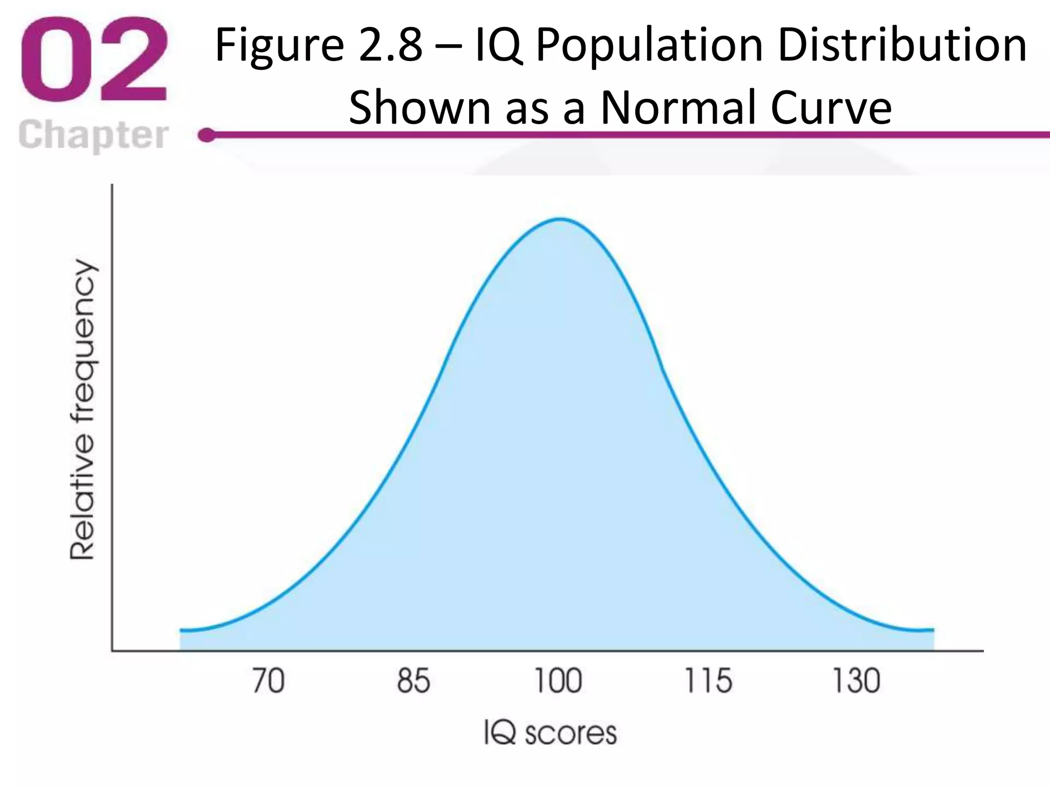
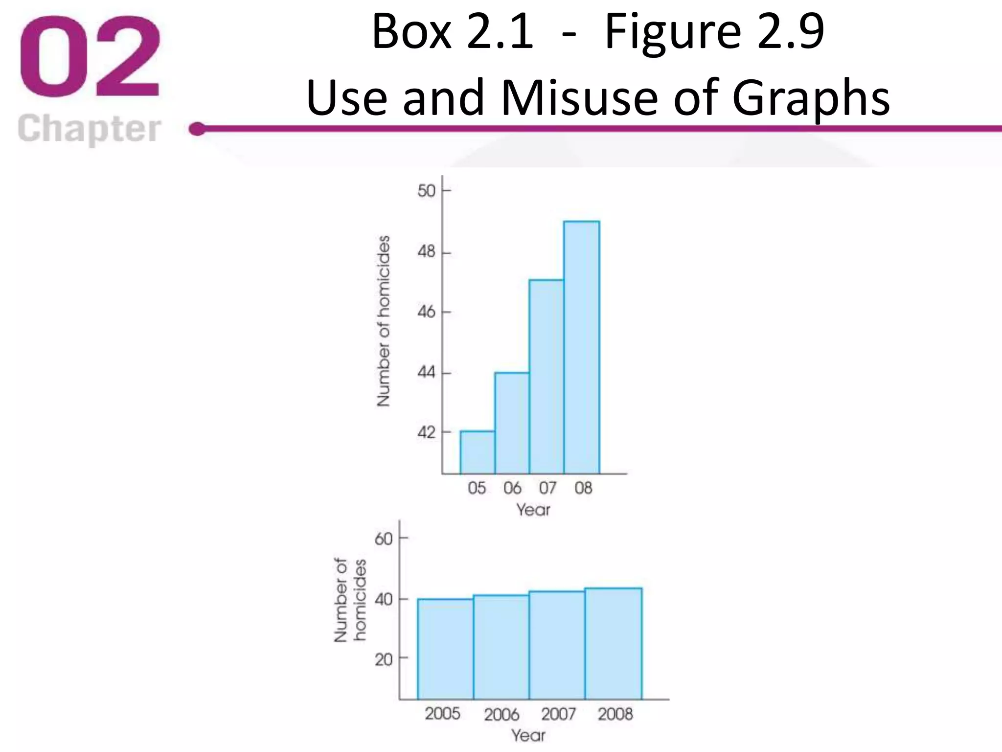
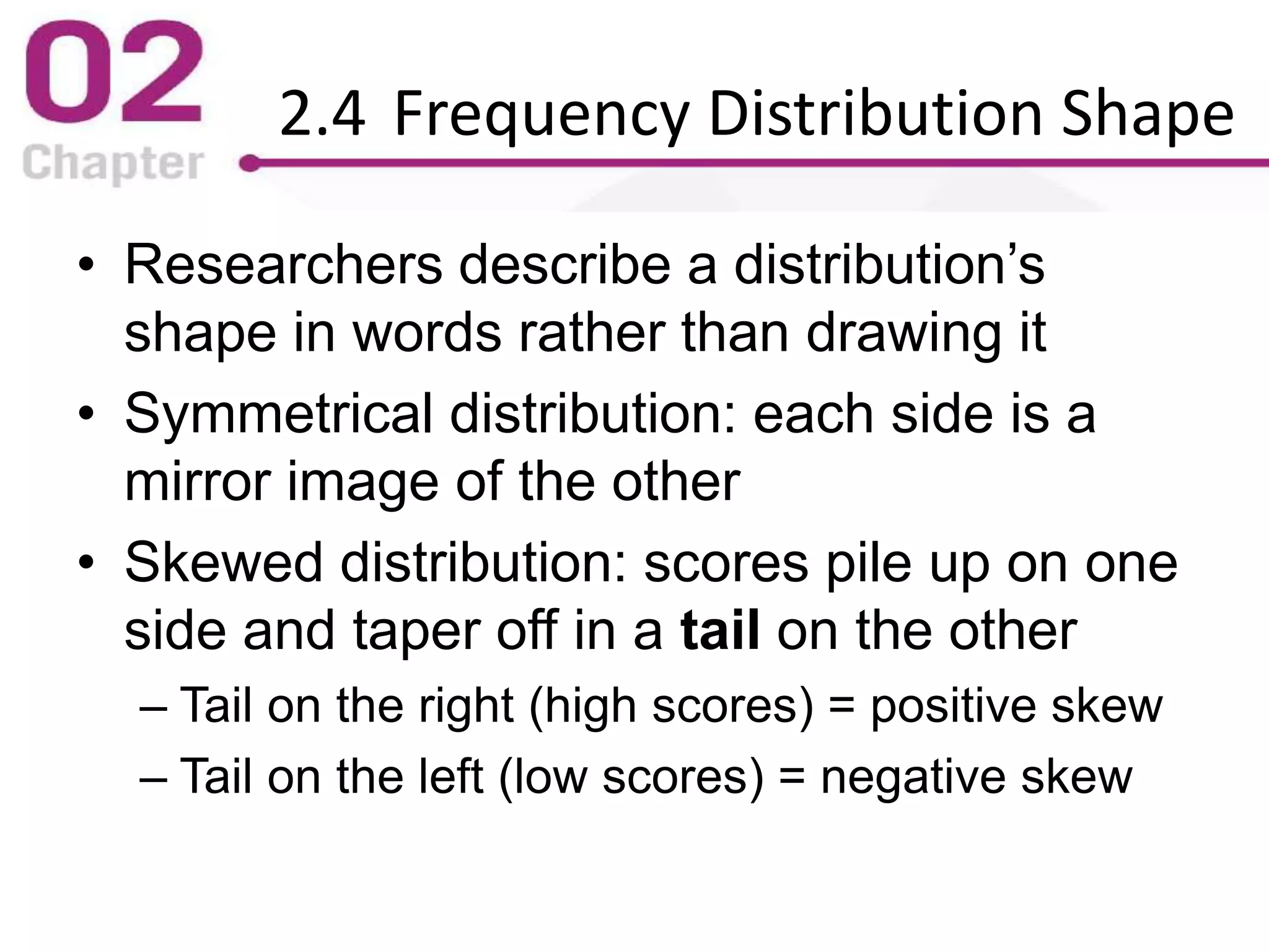
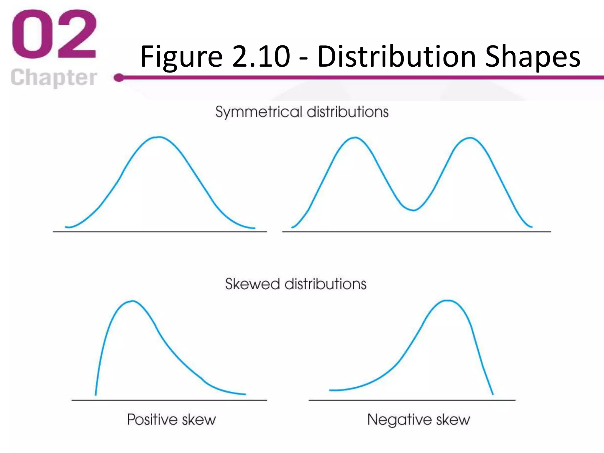
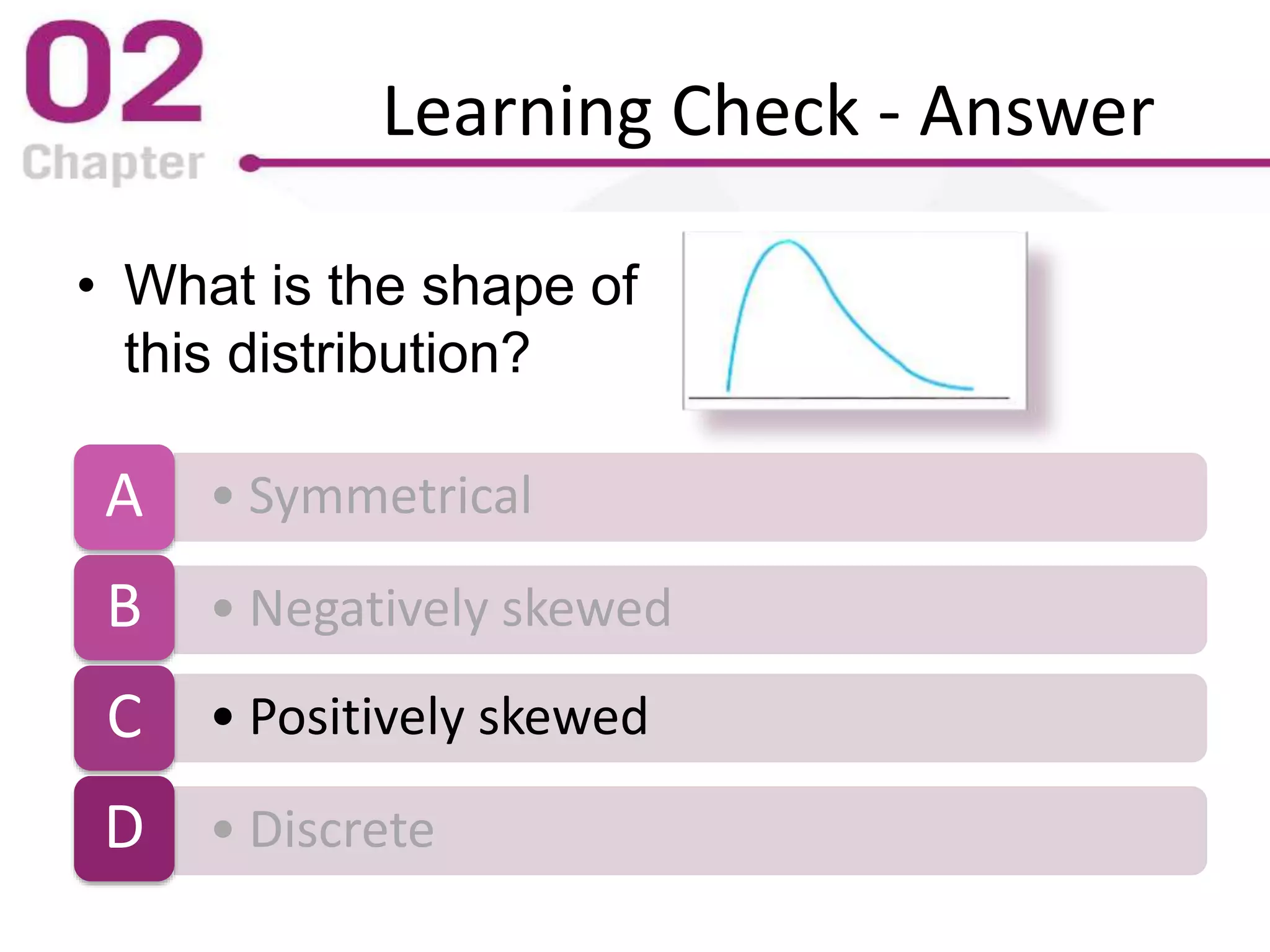
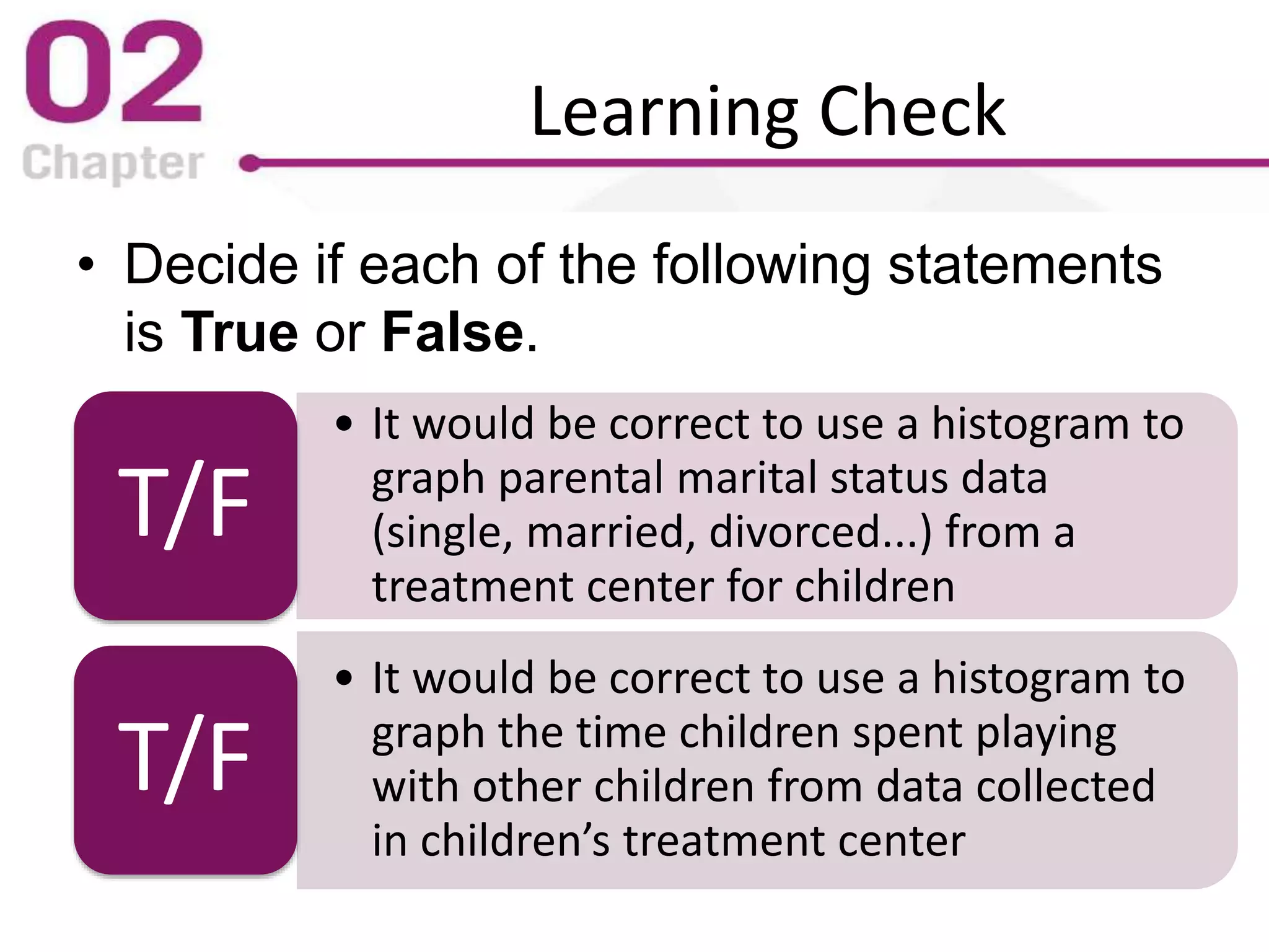
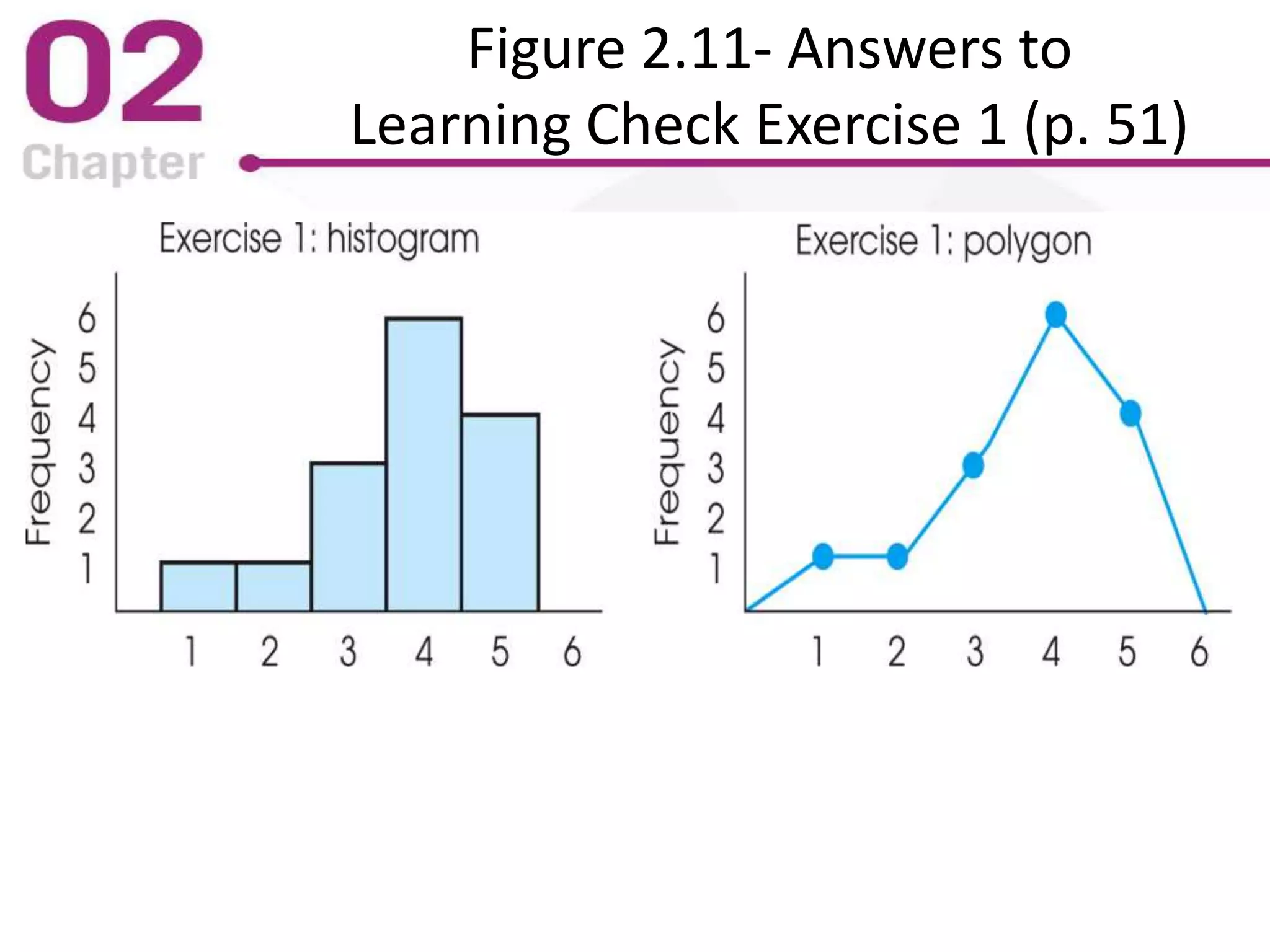
The PowerPoint lecture covers frequency distributions as essential tools in statistics, including how to organize data into frequency distribution tables and interpret them, both in tabular and graphical forms. It discusses the importance of proportions, percentages, and the differences in constructing frequency distributions for discrete and continuous variables, along with guidelines for grouped frequency distributions. Additionally, it provides insights into the graphical representation of data, explaining various types of graphs such as histograms and polygons, along with their respective uses and accurate interpretations.