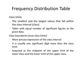
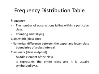
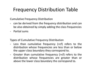
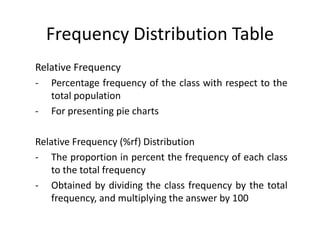
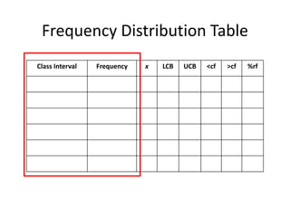
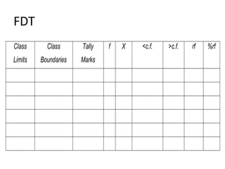
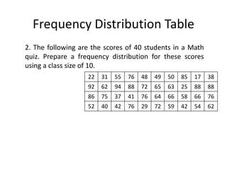
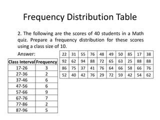
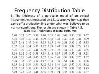
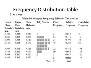
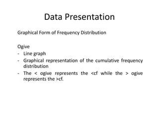
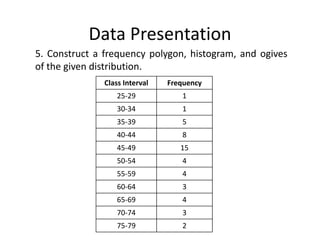
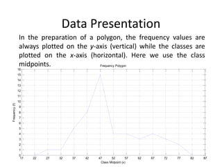
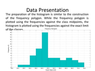
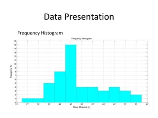
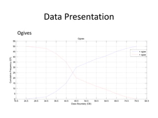
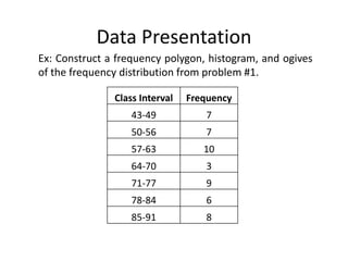
STAT 1 – Elementary Statistics
Frequency Distribution
Recall: Types of Data Presentation
• Textual Form
- Data presentation using sentences and paragraphs in
describing data
• Tabular Form
- Data presentation that uses tables arranged in rows
and columns for various parameters
• Graphical Form
- Pictorial representation of data
Grouped and Ungrouped Data
• Ungrouped Data
- Data points are treated individually.
• Grouped Data
- Data points are treated and grouped according to
categories.
Frequency Distribution Table
Numerous data can be analyzed by grouping the data
into different classes with equal class intervals and
determining the number of observations that fall within
each class. This procedure is done to lessen work done
in treating each data individually by treating the data by
group.
Frequency Distribution Table
Class limits
- The smallest and the largest values that fall within
the class interval (class)
- Taken with equal number of significant figures as the
given data.
Class boundaries (true class limits)
- More precise expression of the class interval
- It is usually one significant digit more than the class
limit.
- Acquired as the midpoint of the upper limit of the
lower class and the lower limit of the upper class
Frequency Distribution Table
Frequency
- The number of observations falling within a particular
class.
- Counting and tallying
Class width (class size)
- Numerical difference between the upper and lower class
boundaries of a class interval.
Class mark (class midpoint)
- Middle element of the class
- It represents the entire class and it is usually
symbolized by x.
Frequency Distribution Table
Cumulative Frequency Distribution
- can be derived from the frequency distribution and can
be also obtained by simply adding the class frequencies
- Partial sums
Types of Cumulative Frequency Distribution
- Less than cumulative frequency (<cf) refers to the
distribution whose frequencies are less than or below
the upper class boundary they correspond to.
- Greater than cumulative frequency (>cf) refers to the
distribution whose frequencies are greater than or
above the lower class boundary the correspond to.
Frequency Distribution Table
Relative Frequency
- Percentage frequency of the class with respect to the
total population
- For presenting pie charts
Relative Frequency (%rf) Distribution
- The proportion in percent the frequency of each class
to the total frequency
- Obtained by dividing the class frequency by the total
frequency, and multiplying the answer by 100
Frequency Distribution Table
Class Interval Frequency x LCB UCB <cf >cf %rf
FDT
Class
Limits
Class
Boundaries
Tally
Marks
f X <c.f. >c.f. rf %rf
Frequency Distribution Table
Steps in Constructing a Frequency Distribution Table (FDT)
1. Get the lowest and the highest value in the
distribution. We shall mark the highest and lowest
value in the distribution.
2. Get the value of the range. The range denoted by R,
refers to the difference between the highest and the
lowest value in the distribution. Thus,
R = H ─ L.
Frequency Distribution Table
3. Determine the number of classes. In the
determination of the number of classes, it should be
noted that there is no standard method to follow.
Generally, the number of classes must not be less than
5 and should not be more than 15. In some instances,
however, the number of classes can be approximated
by using the relation
𝑘 = 1 + 3.322 log 𝑛 (Sturges’ Formula),
where k = number of classes and n = sample size. is
the ceiling operator (meaning take the closest integer
above the calculated value).
Square root principle: 𝑘 = 𝑛
Frequency Distribution Table
4. Determine the size of the class interval. The value of C
can be obtained by dividing the range by the desired
number of classes. Hence, 𝐶 = 𝑅 𝑘.
5. Construct the classes. In constructing the classes, we
first determine the lower limit of the distribution. The
value of this lower limit can be chosen arbitrarily as
long as the lowest value shall be on the first interval
and the highest value to the last interval.
Frequency Distribution Table
6. Determine the frequency of each class. The
determination of the number of frequencies is done
by counting the number of items that shall fall in each
interval.
Frequency Distribution Table
Ex: 1. Using the steps discussed, construct the frequency
distribution of the following results of a test in statistics of
50 students given below.
88 62 63 88 65
85 83 76 72 63
60 46 85 71 67
75 78 87 70 43
63 90 63 60 73
55 62 62 83 79
78 43 51 56 80
90 47 48 54 77
86 55 76 52 76
43 52 72 43 60
Frequency Distribution Table
1. Using the steps discussed, construct the frequency
distribution of the following results of a test in statistics of
50 students given below.
Answer: 88 62 63 88 65
85 83 76 72 63
60 46 85 71 67
75 78 87 70 43
63 90 63 60 73
55 62 62 83 79
78 43 51 56 80
90 47 48 54 77
86 55 76 52 76
43 52 72 43 60
Class Interval Frequency
43-49 7
50-56 7
57-63 10
64-70 3
71-77 9
78-84 6
85-91 8
Frequency Distribution Table
2. The following are the scores of 40 students in a Math
quiz. Prepare a frequency distribution for these scores
using a class size of 10.
22 31 55 76 48 49 50 85 17 38
92 62 94 88 72 65 63 25 88 88
86 75 37 41 76 64 66 58 66 76
52 40 42 76 29 72 59 42 54 62
Frequency Distribution Table
2. The following are the scores of 40 students in a Math
quiz. Prepare a frequency distribution for these scores
using a class size of 10.
Answer: 22 31 55 76 48 49 50 85 17 38
92 62 94 88 72 65 63 25 88 88
86 75 37 41 76 64 66 58 66 76
52 40 42 76 29 72 59 42 54 62
Class Interval Frequency
17-26 3
27-36 2
37-46 6
47-56 6
57-66 9
67-76 7
77-86 2
87-96 5
Frequency Distribution Table
3. The thickness of a particular metal of an optical
instrument was measured on 121 successive items as they
came off a production line under what was believed to be
normal conditions. The results are shown in Table 4.5.
Frequency Distribution Table
3. Answer
Data Presentation
Graphical Form of Frequency Distribution
Frequency Polygon
- Line graph
- The points are plotted at the midpoint of the classes.
Histogram (Frequency Histogram or Relative Frequency
Histogram)
- Bar graph
- Plotted at the exact lower limits of the classes
Data Presentation
Graphical Form of Frequency Distribution
Ogive
- Line graph
- Graphical representation of the cumulative frequency
distribution
- The < ogive represents the <cf while the > ogive
represents the >cf.
Data Presentation
5. Construct a frequency polygon, histogram, and ogives
of the given distribution.
Class Interval Frequency
25-29 1
30-34 1
35-39 5
40-44 8
45-49 15
50-54 4
55-59 4
60-64 3
65-69 4
70-74 3
75-79 2
Data Presentation
In the preparation of a polygon, the frequency values are
always plotted on the y-axis (vertical) while the classes are
plotted on the x-axis (horizontal). Here we use the class
midpoints.
17 22 27 32 37 42 47 52 57 62 67 72 77 82 87
87
0
1
2
3
4
5
6
7
8
9
10
11
12
13
14
15
16
Class Midpoint (x)
Frequency
(f)
Frequency Polygon
Data Presentation
The preparation of the histogram is similar to the construction
of the frequency polygon. While the frequency polygon is
plotted using the frequencies against the class midpoints, the
histogram is plotted using the frequencies against the exact limit
of the classes.
19.5 24.5 29.5 34.5 39.5 44.5 49.5 54.5 59.5 64.5 69.5 74.5 79.5
0
1
2
3
4
5
6
7
8
9
10
11
12
13
14
15
16
Exact Class Limit
Frequency
(f)
Frequency Histogram
Data Presentation
Frequency Histogram
22 27 32 37 42 47 52 57 62 67 72 77 82
0
1
2
3
4
5
6
7
8
9
10
11
12
13
14
15
16
Class Midpoint (x)
Frequency
(f)
Frequency Histogram
Data Presentation
Ogives
19.5 24.5 29.5 34.5 39.5 44.5 49.5 54.5 59.5 64.5 69.5 74.5 79.5 84.5
0
5
10
15
20
25
30
35
40
45
50
55
55
Class Boundary (CB)
Cumulative
Frequency
(CF)
Ogives
< ogive
> ogive
Data Presentation
Ex: Construct a frequency polygon, histogram, and ogives
of the frequency distribution from problem #1.
Class Interval Frequency
43-49 7
50-56 7
57-63 10
64-70 3
71-77 9
78-84 6
85-91 8

3_-frequency_distribution.pptx

  • 1.
    STAT 1 –Elementary Statistics Frequency Distribution
  • 2.
    Recall: Types ofData Presentation • Textual Form - Data presentation using sentences and paragraphs in describing data • Tabular Form - Data presentation that uses tables arranged in rows and columns for various parameters • Graphical Form - Pictorial representation of data
  • 3.
    Grouped and UngroupedData • Ungrouped Data - Data points are treated individually. • Grouped Data - Data points are treated and grouped according to categories.
  • 4.
    Frequency Distribution Table FrequencyDistribution Table Numerous data can be analyzed by grouping the data into different classes with equal class intervals and determining the number of observations that fall within each class. This procedure is done to lessen work done in treating each data individually by treating the data by group.
  • 5.
    Frequency Distribution Table Classlimits - The smallest and the largest values that fall within the class interval (class) - Taken with equal number of significant figures as the given data. Class boundaries (true class limits) - More precise expression of the class interval - It is usually one significant digit more than the class limit. - Acquired as the midpoint of the upper limit of the lower class and the lower limit of the upper class
  • 6.
    Frequency Distribution Table Frequency -The number of observations falling within a particular class. - Counting and tallying Class width (class size) - Numerical difference between the upper and lower class boundaries of a class interval. Class mark (class midpoint) - Middle element of the class - It represents the entire class and it is usually symbolized by x.
  • 7.
    Frequency Distribution Table CumulativeFrequency Distribution - can be derived from the frequency distribution and can be also obtained by simply adding the class frequencies - Partial sums Types of Cumulative Frequency Distribution - Less than cumulative frequency (<cf) refers to the distribution whose frequencies are less than or below the upper class boundary they correspond to. - Greater than cumulative frequency (>cf) refers to the distribution whose frequencies are greater than or above the lower class boundary the correspond to.
  • 8.
    Frequency Distribution Table RelativeFrequency - Percentage frequency of the class with respect to the total population - For presenting pie charts Relative Frequency (%rf) Distribution - The proportion in percent the frequency of each class to the total frequency - Obtained by dividing the class frequency by the total frequency, and multiplying the answer by 100
  • 9.
    Frequency Distribution Table ClassInterval Frequency x LCB UCB <cf >cf %rf
  • 10.
  • 11.
    Frequency Distribution Table Stepsin Constructing a Frequency Distribution Table (FDT) 1. Get the lowest and the highest value in the distribution. We shall mark the highest and lowest value in the distribution. 2. Get the value of the range. The range denoted by R, refers to the difference between the highest and the lowest value in the distribution. Thus, R = H ─ L.
  • 12.
    Frequency Distribution Table 3.Determine the number of classes. In the determination of the number of classes, it should be noted that there is no standard method to follow. Generally, the number of classes must not be less than 5 and should not be more than 15. In some instances, however, the number of classes can be approximated by using the relation 𝑘 = 1 + 3.322 log 𝑛 (Sturges’ Formula), where k = number of classes and n = sample size. is the ceiling operator (meaning take the closest integer above the calculated value). Square root principle: 𝑘 = 𝑛
  • 13.
    Frequency Distribution Table 4.Determine the size of the class interval. The value of C can be obtained by dividing the range by the desired number of classes. Hence, 𝐶 = 𝑅 𝑘. 5. Construct the classes. In constructing the classes, we first determine the lower limit of the distribution. The value of this lower limit can be chosen arbitrarily as long as the lowest value shall be on the first interval and the highest value to the last interval.
  • 14.
    Frequency Distribution Table 6.Determine the frequency of each class. The determination of the number of frequencies is done by counting the number of items that shall fall in each interval.
  • 15.
    Frequency Distribution Table Ex:1. Using the steps discussed, construct the frequency distribution of the following results of a test in statistics of 50 students given below. 88 62 63 88 65 85 83 76 72 63 60 46 85 71 67 75 78 87 70 43 63 90 63 60 73 55 62 62 83 79 78 43 51 56 80 90 47 48 54 77 86 55 76 52 76 43 52 72 43 60
  • 16.
    Frequency Distribution Table 1.Using the steps discussed, construct the frequency distribution of the following results of a test in statistics of 50 students given below. Answer: 88 62 63 88 65 85 83 76 72 63 60 46 85 71 67 75 78 87 70 43 63 90 63 60 73 55 62 62 83 79 78 43 51 56 80 90 47 48 54 77 86 55 76 52 76 43 52 72 43 60 Class Interval Frequency 43-49 7 50-56 7 57-63 10 64-70 3 71-77 9 78-84 6 85-91 8
  • 17.
    Frequency Distribution Table 2.The following are the scores of 40 students in a Math quiz. Prepare a frequency distribution for these scores using a class size of 10. 22 31 55 76 48 49 50 85 17 38 92 62 94 88 72 65 63 25 88 88 86 75 37 41 76 64 66 58 66 76 52 40 42 76 29 72 59 42 54 62
  • 18.
    Frequency Distribution Table 2.The following are the scores of 40 students in a Math quiz. Prepare a frequency distribution for these scores using a class size of 10. Answer: 22 31 55 76 48 49 50 85 17 38 92 62 94 88 72 65 63 25 88 88 86 75 37 41 76 64 66 58 66 76 52 40 42 76 29 72 59 42 54 62 Class Interval Frequency 17-26 3 27-36 2 37-46 6 47-56 6 57-66 9 67-76 7 77-86 2 87-96 5
  • 19.
    Frequency Distribution Table 3.The thickness of a particular metal of an optical instrument was measured on 121 successive items as they came off a production line under what was believed to be normal conditions. The results are shown in Table 4.5.
  • 20.
  • 21.
    Data Presentation Graphical Formof Frequency Distribution Frequency Polygon - Line graph - The points are plotted at the midpoint of the classes. Histogram (Frequency Histogram or Relative Frequency Histogram) - Bar graph - Plotted at the exact lower limits of the classes
  • 22.
    Data Presentation Graphical Formof Frequency Distribution Ogive - Line graph - Graphical representation of the cumulative frequency distribution - The < ogive represents the <cf while the > ogive represents the >cf.
  • 23.
    Data Presentation 5. Constructa frequency polygon, histogram, and ogives of the given distribution. Class Interval Frequency 25-29 1 30-34 1 35-39 5 40-44 8 45-49 15 50-54 4 55-59 4 60-64 3 65-69 4 70-74 3 75-79 2
  • 24.
    Data Presentation In thepreparation of a polygon, the frequency values are always plotted on the y-axis (vertical) while the classes are plotted on the x-axis (horizontal). Here we use the class midpoints. 17 22 27 32 37 42 47 52 57 62 67 72 77 82 87 87 0 1 2 3 4 5 6 7 8 9 10 11 12 13 14 15 16 Class Midpoint (x) Frequency (f) Frequency Polygon
  • 25.
    Data Presentation The preparationof the histogram is similar to the construction of the frequency polygon. While the frequency polygon is plotted using the frequencies against the class midpoints, the histogram is plotted using the frequencies against the exact limit of the classes. 19.5 24.5 29.5 34.5 39.5 44.5 49.5 54.5 59.5 64.5 69.5 74.5 79.5 0 1 2 3 4 5 6 7 8 9 10 11 12 13 14 15 16 Exact Class Limit Frequency (f) Frequency Histogram
  • 26.
    Data Presentation Frequency Histogram 2227 32 37 42 47 52 57 62 67 72 77 82 0 1 2 3 4 5 6 7 8 9 10 11 12 13 14 15 16 Class Midpoint (x) Frequency (f) Frequency Histogram
  • 27.
    Data Presentation Ogives 19.5 24.529.5 34.5 39.5 44.5 49.5 54.5 59.5 64.5 69.5 74.5 79.5 84.5 0 5 10 15 20 25 30 35 40 45 50 55 55 Class Boundary (CB) Cumulative Frequency (CF) Ogives < ogive > ogive
  • 28.
    Data Presentation Ex: Constructa frequency polygon, histogram, and ogives of the frequency distribution from problem #1. Class Interval Frequency 43-49 7 50-56 7 57-63 10 64-70 3 71-77 9 78-84 6 85-91 8