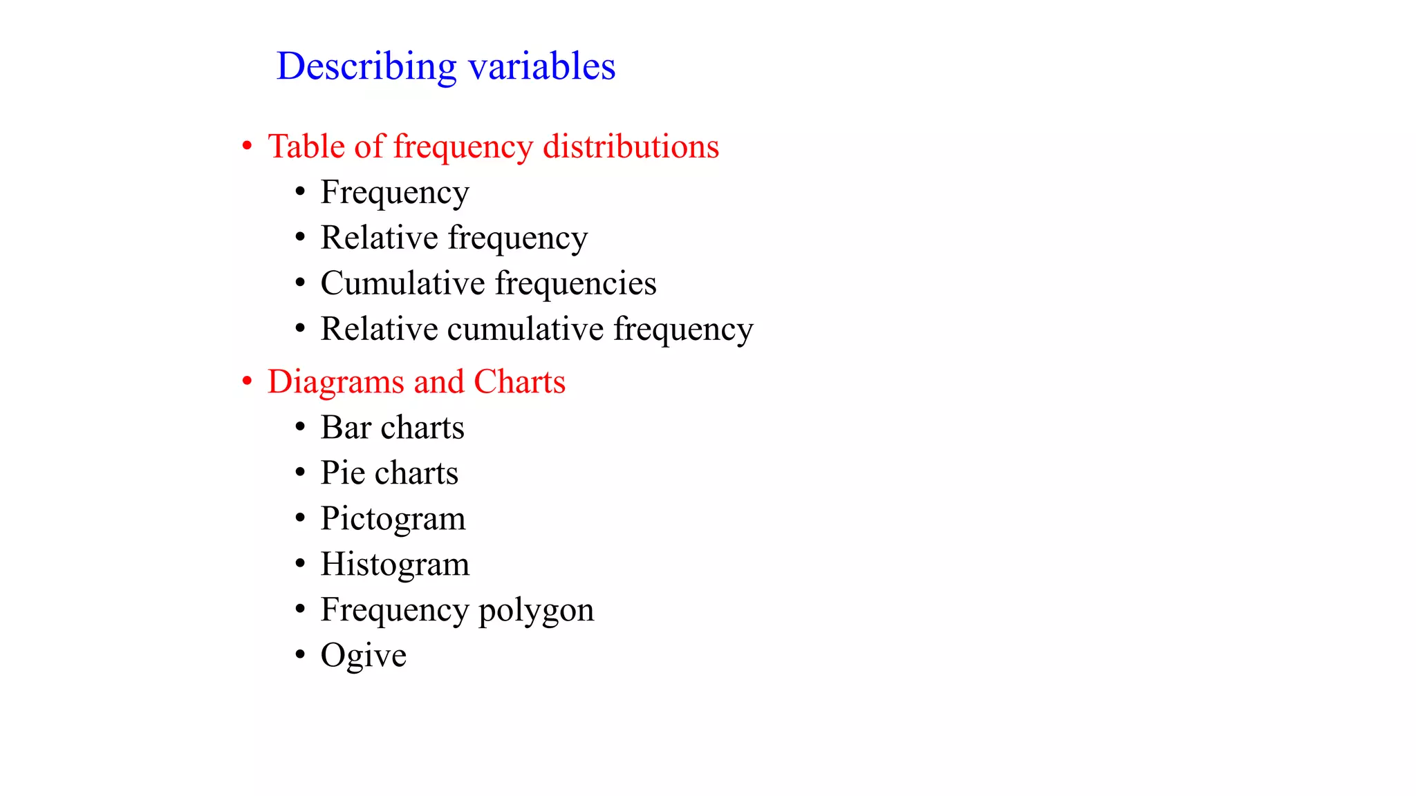
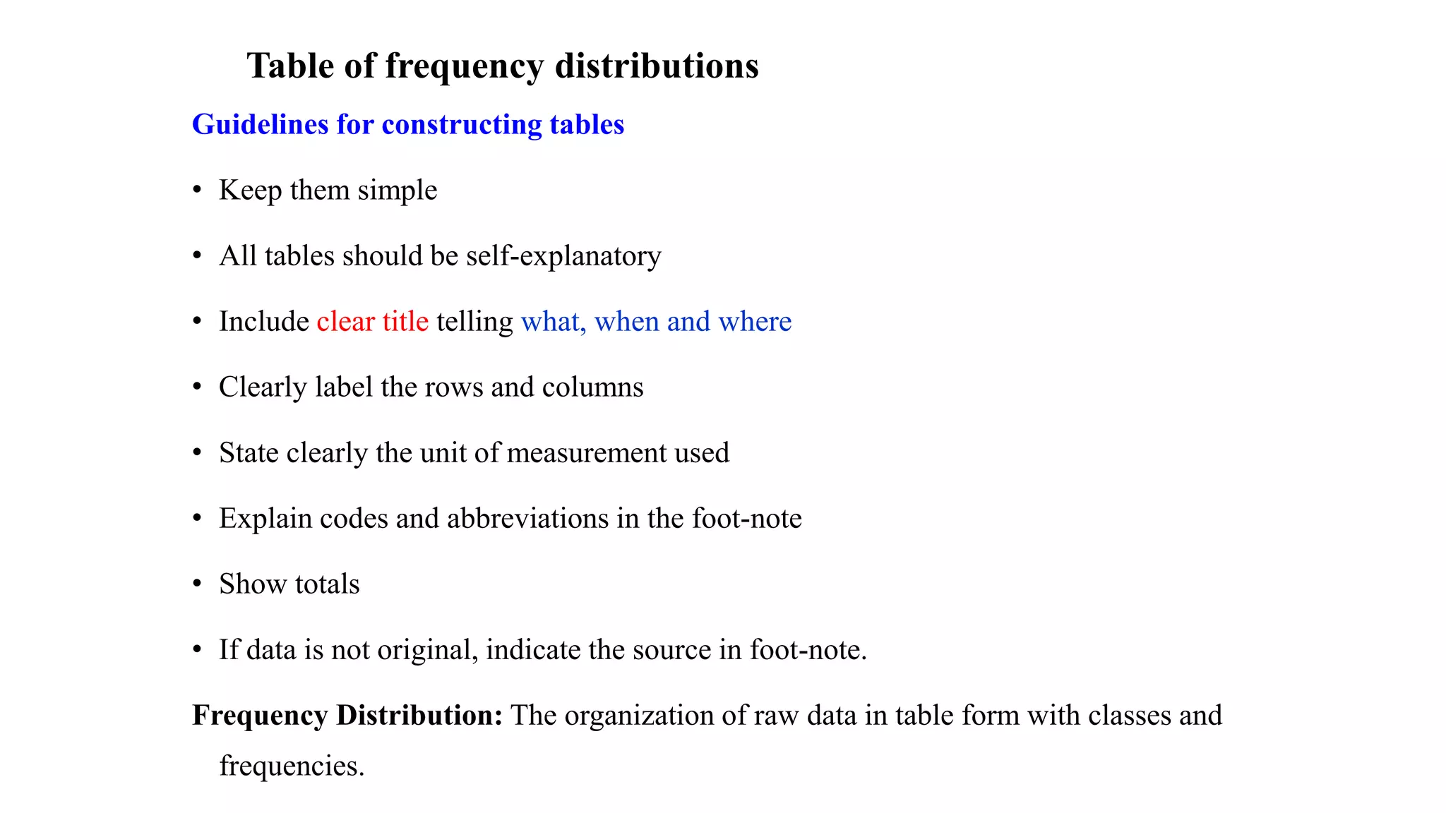
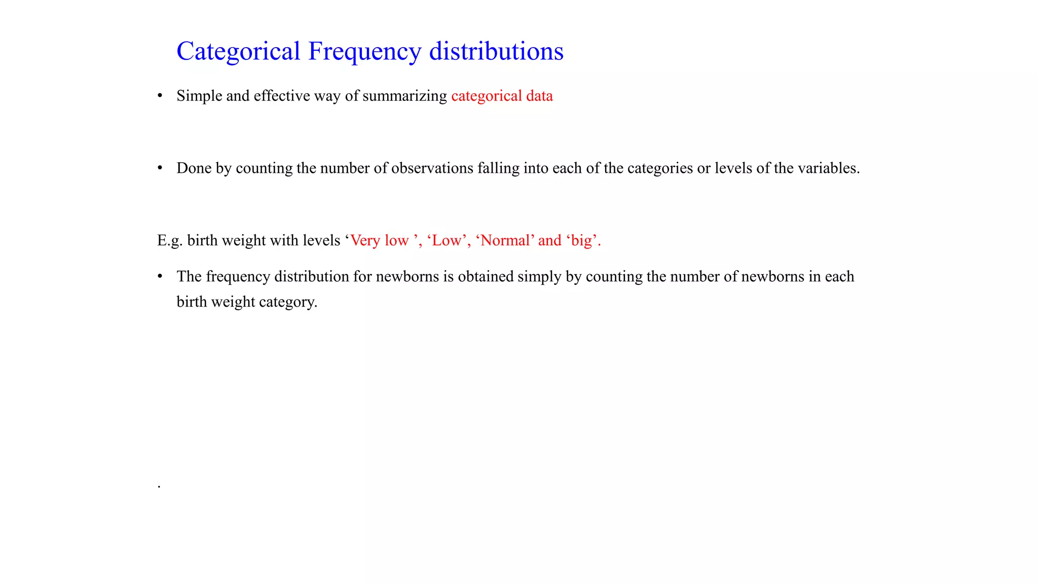
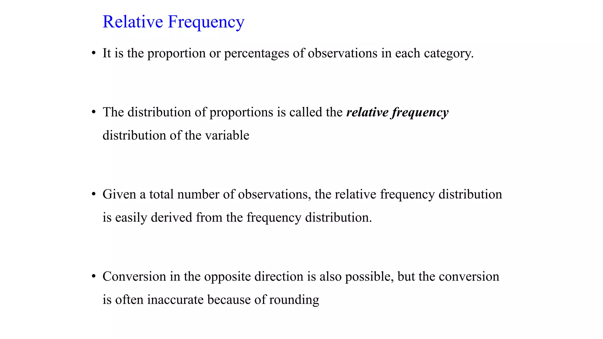
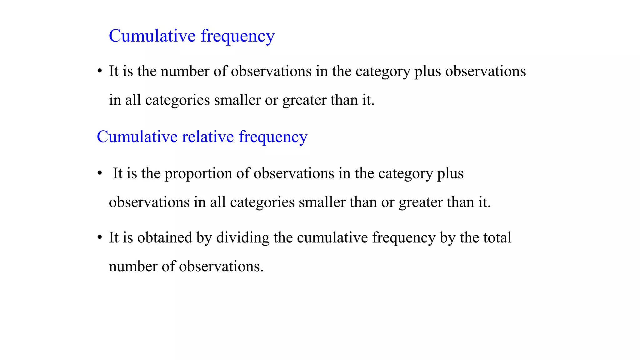
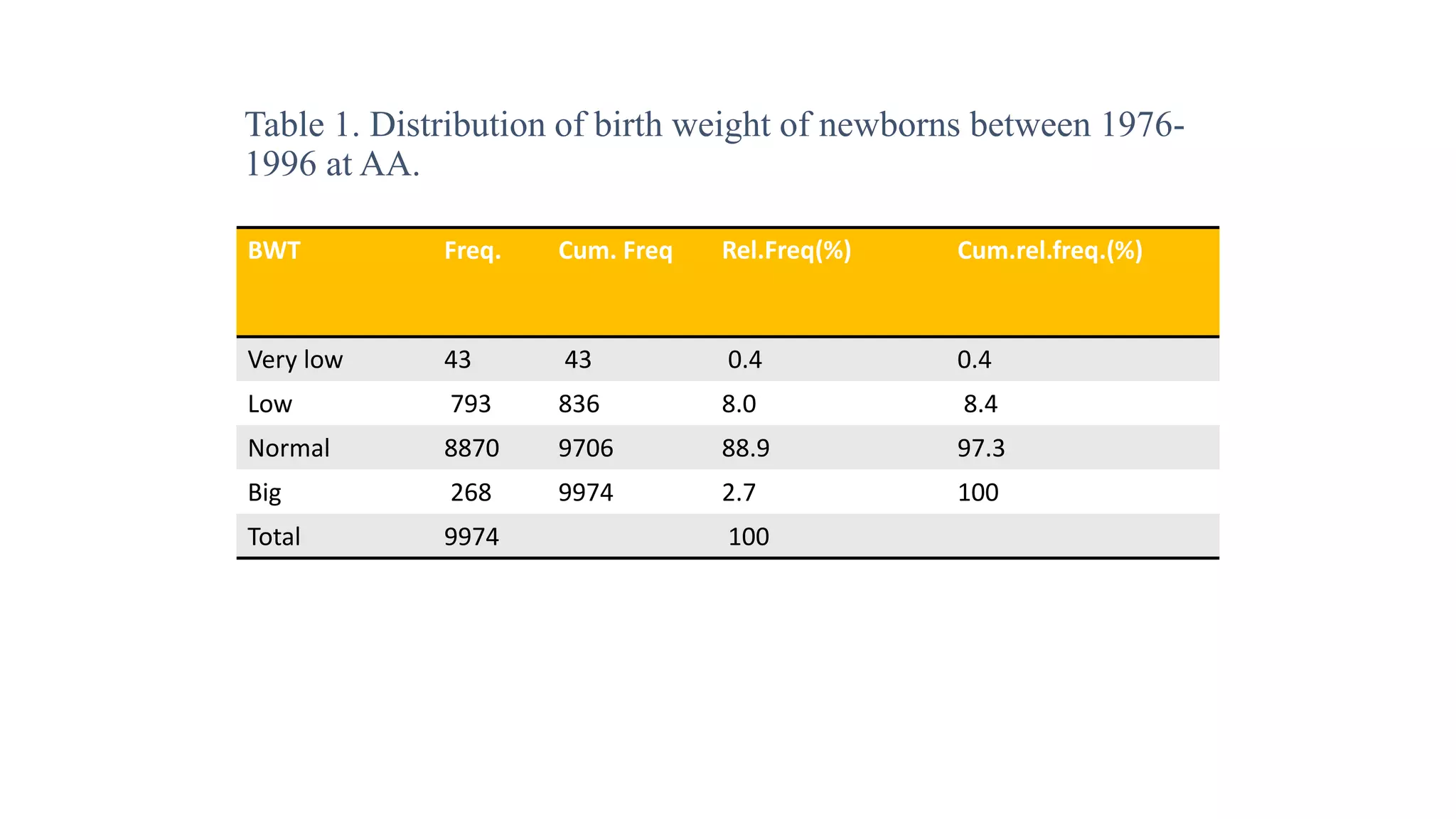
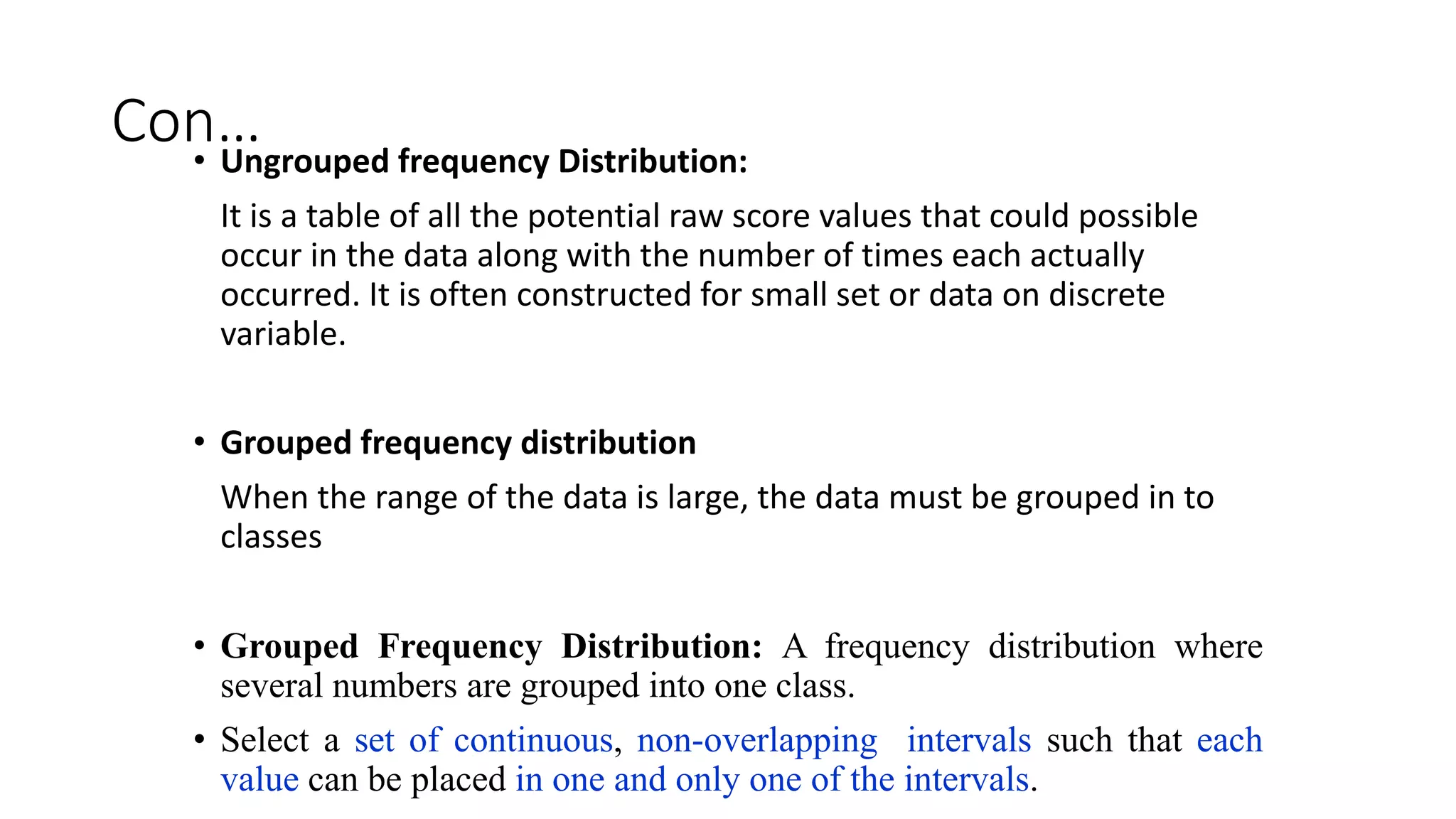
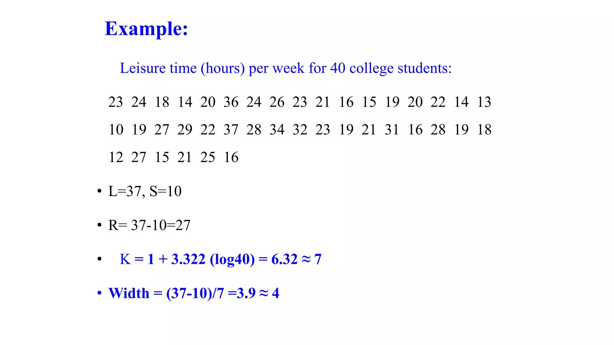
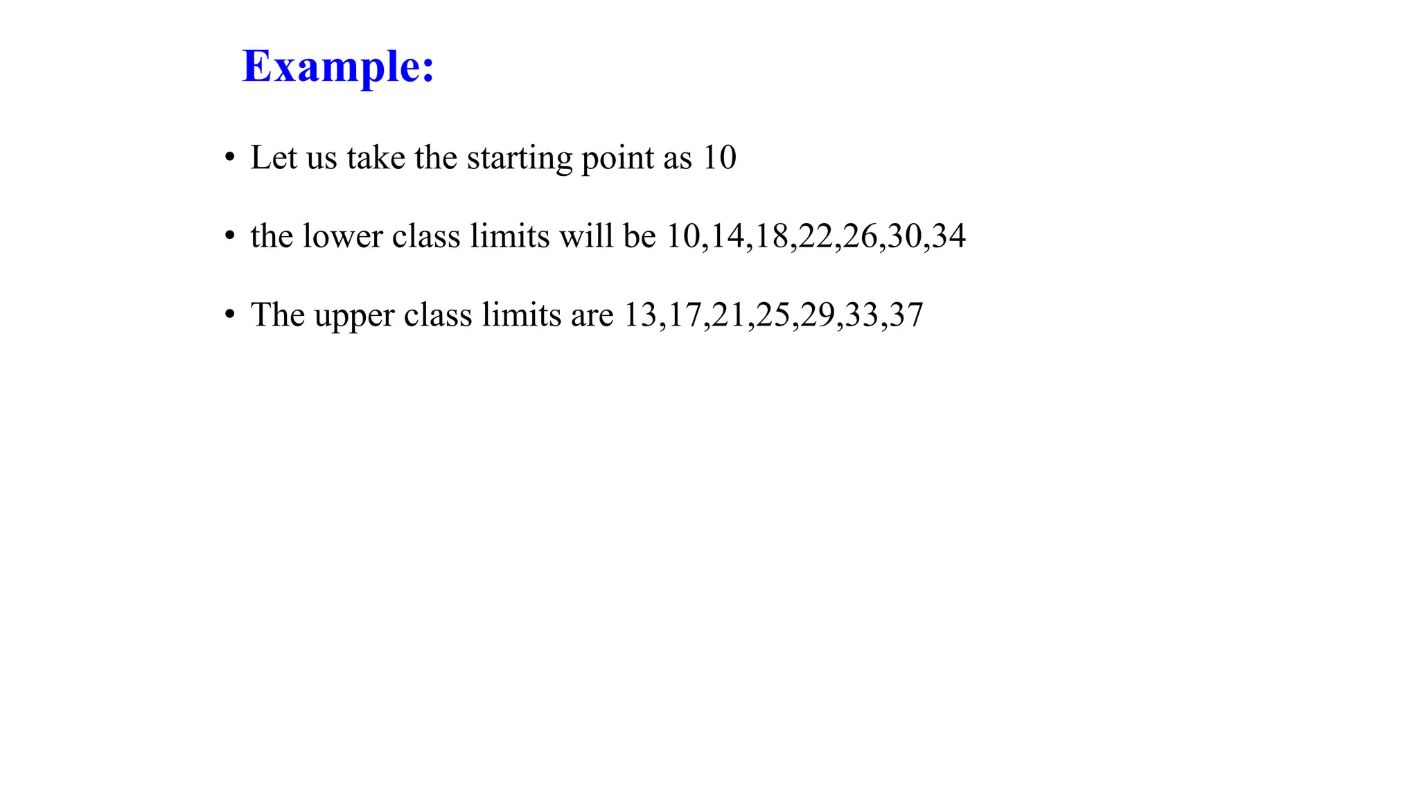
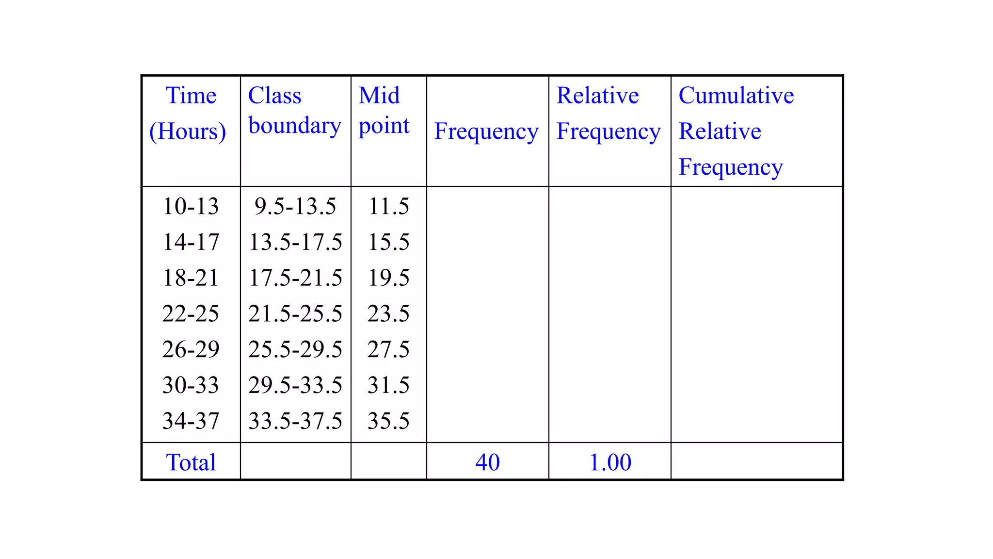
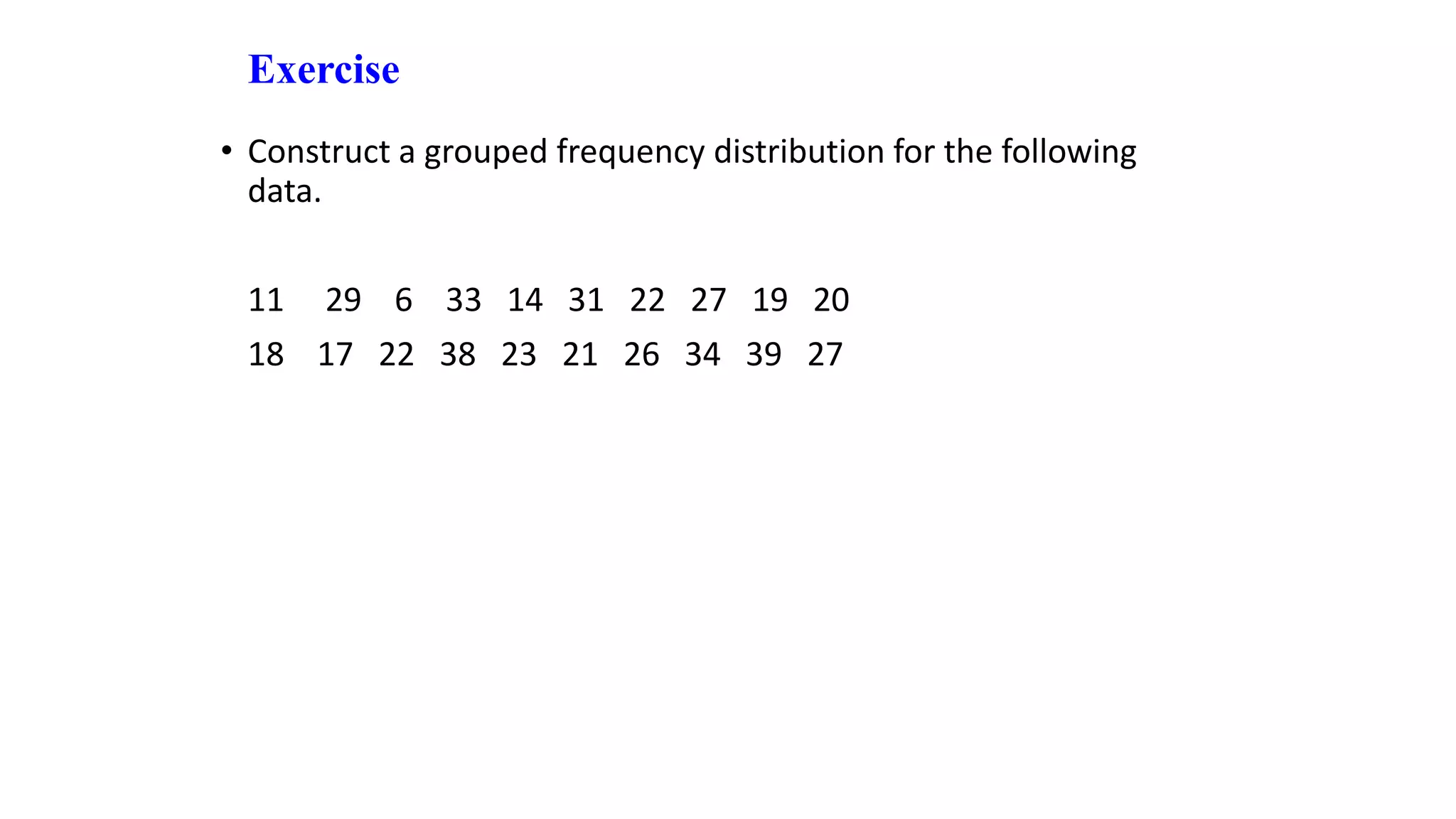
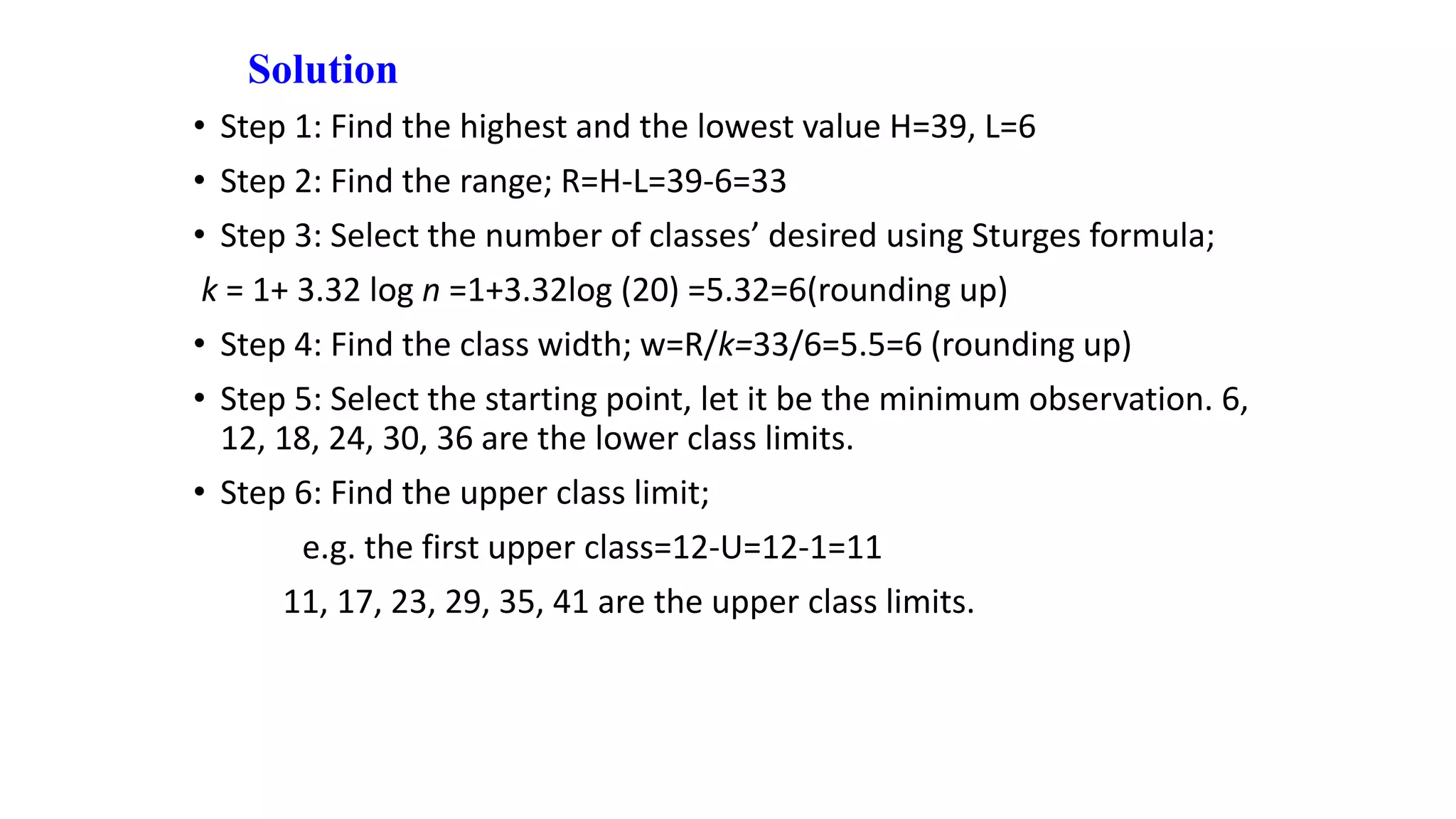
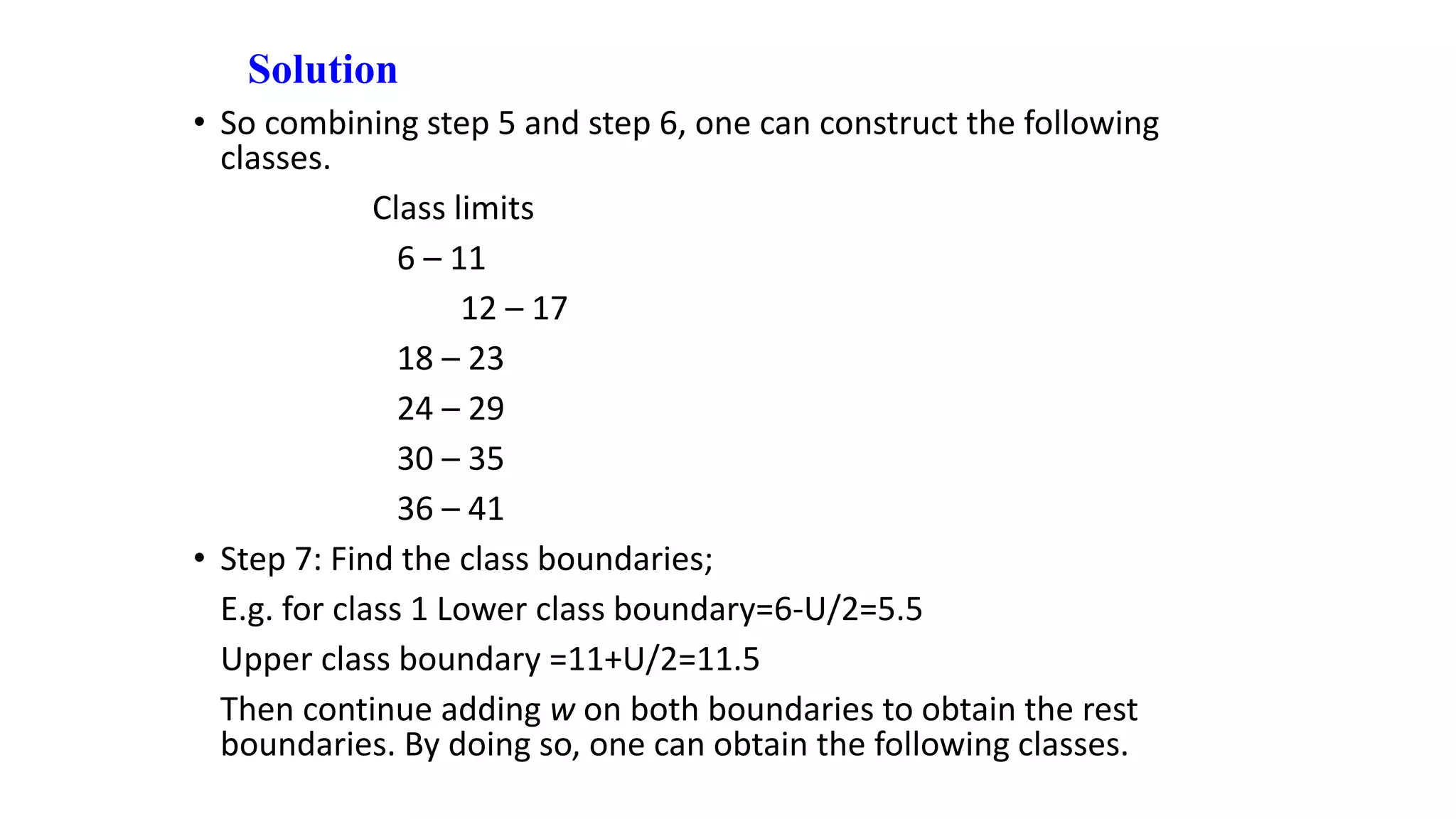
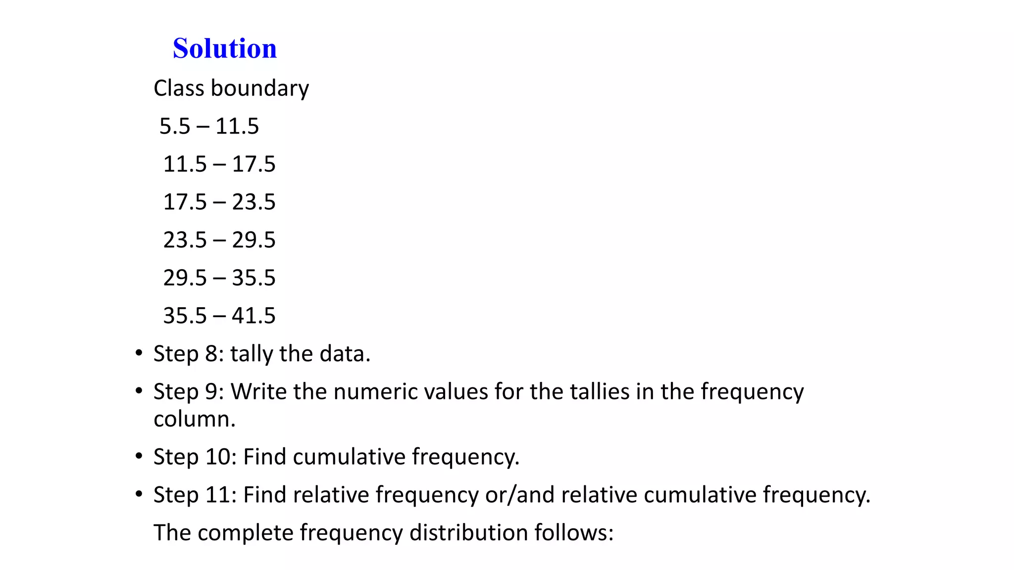
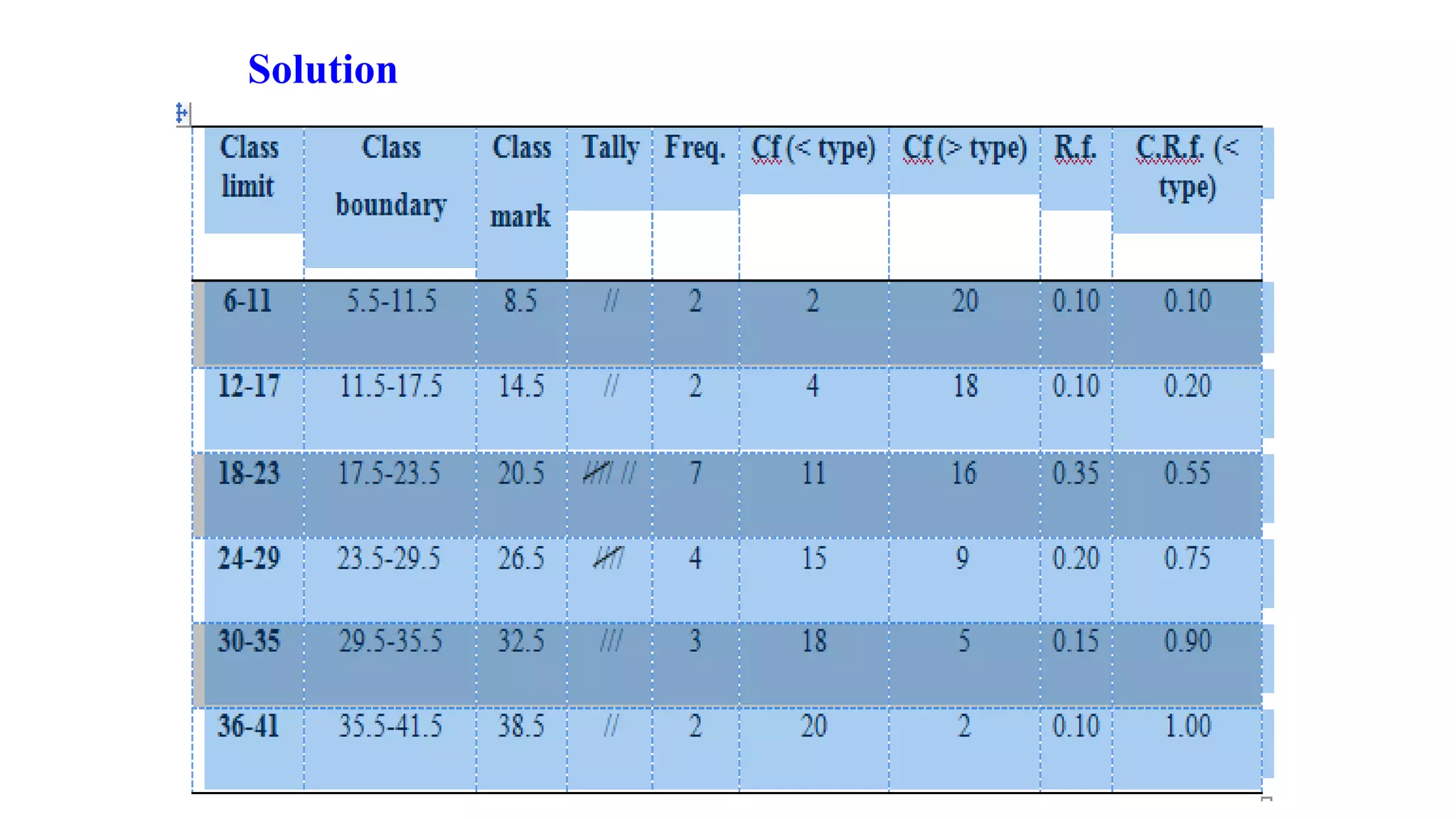
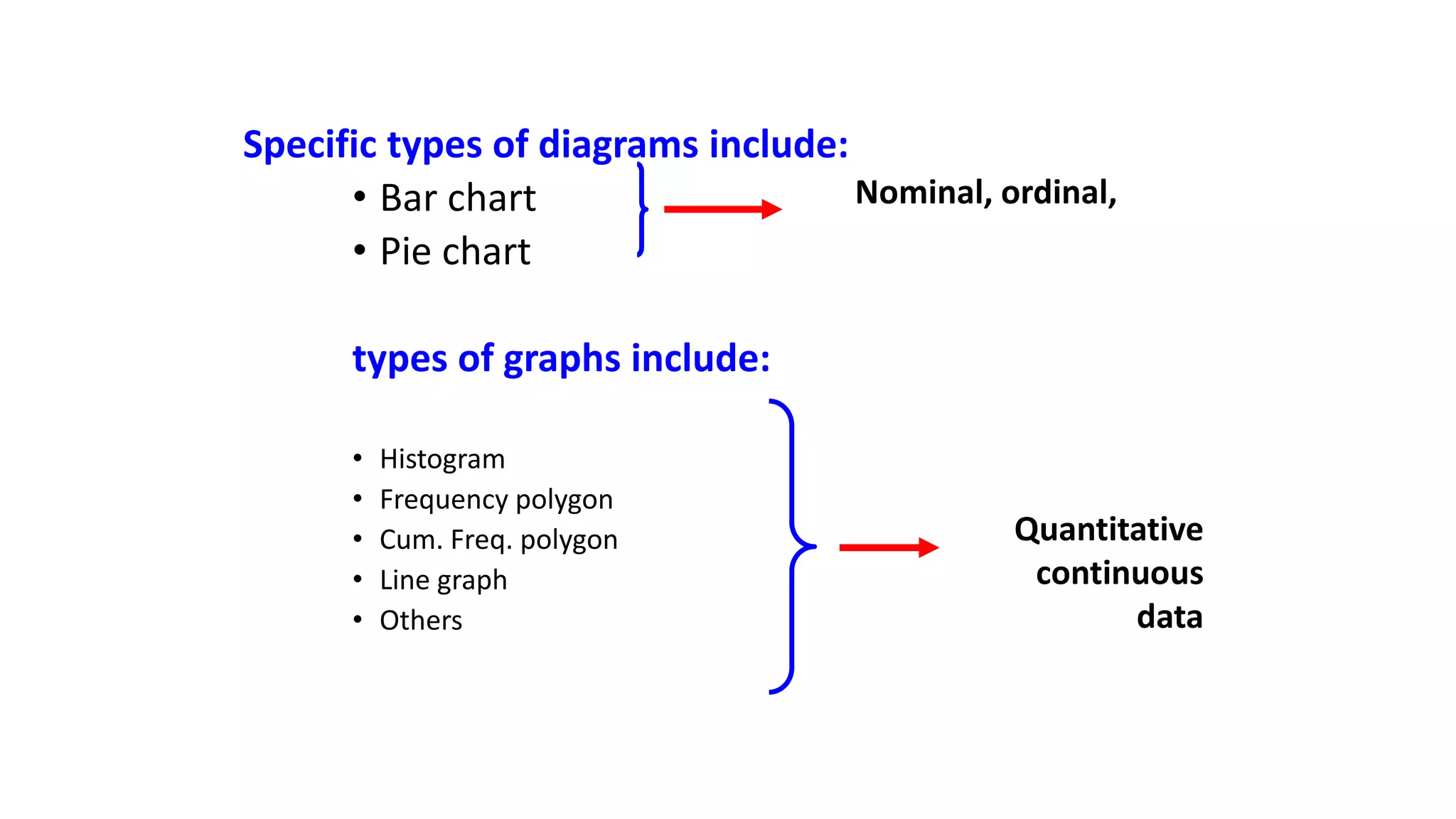
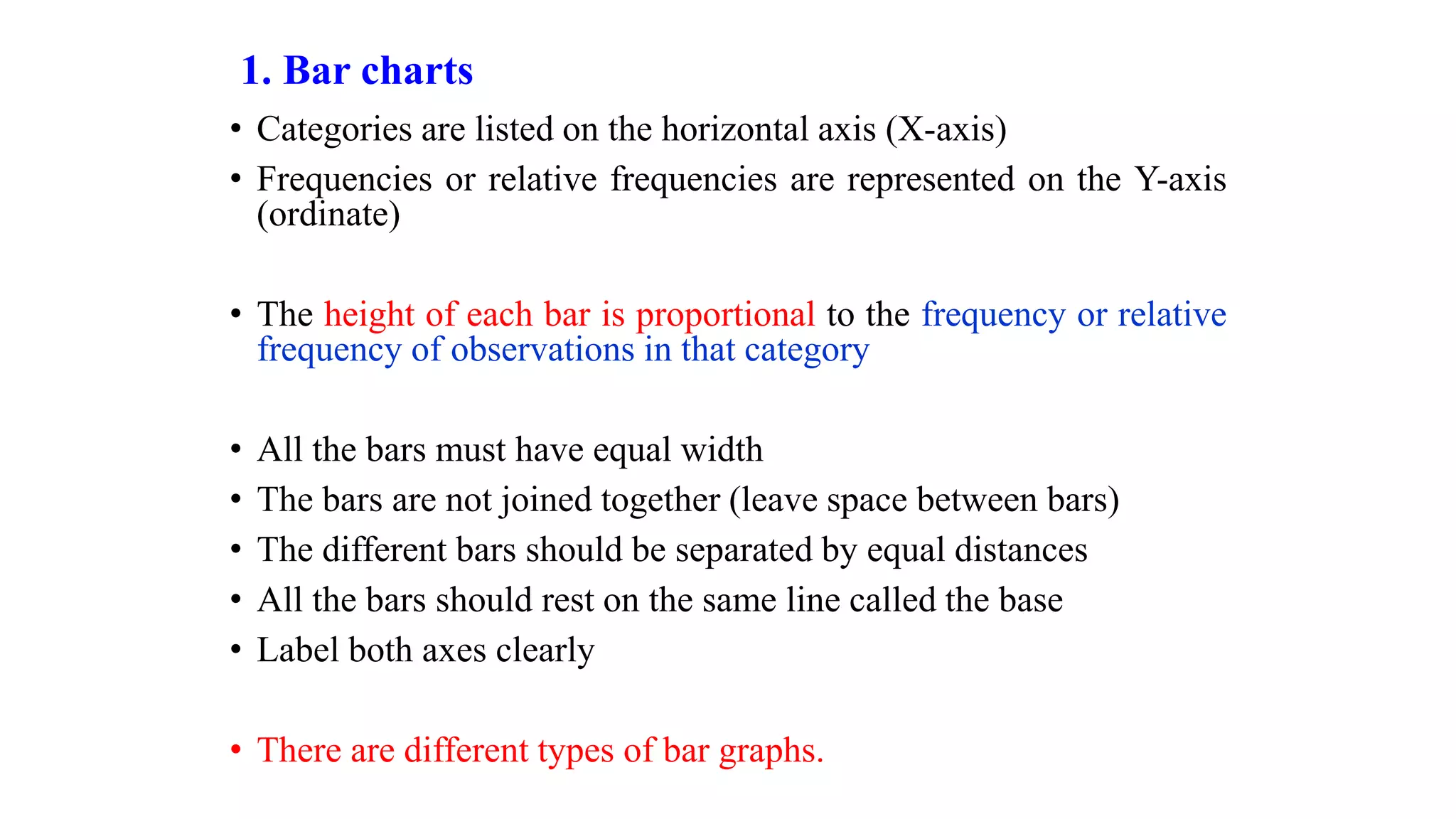
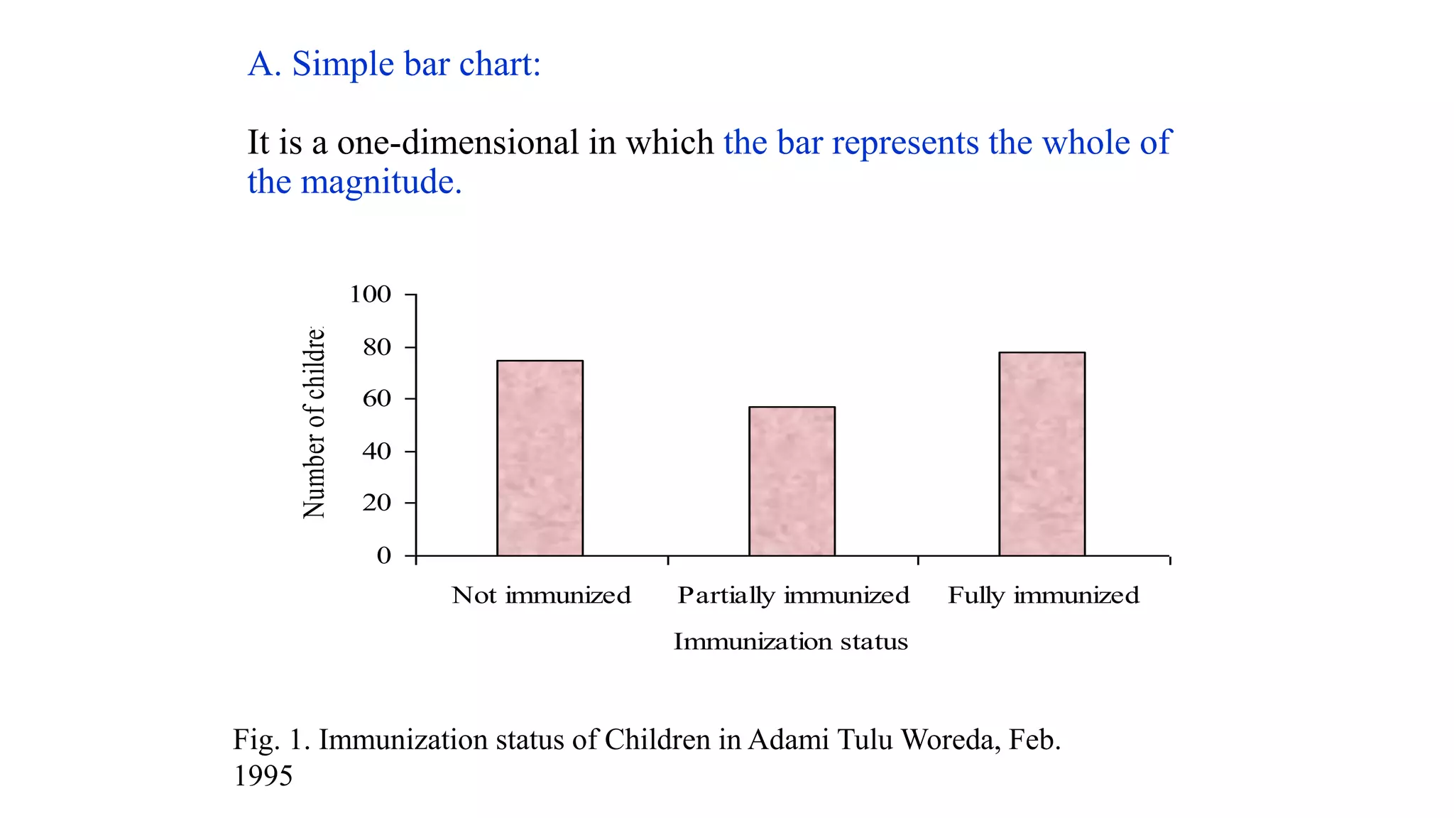
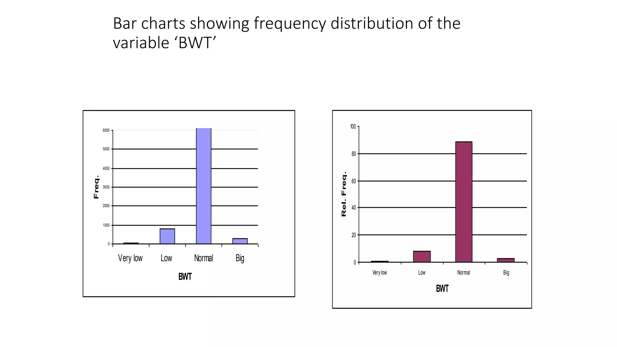
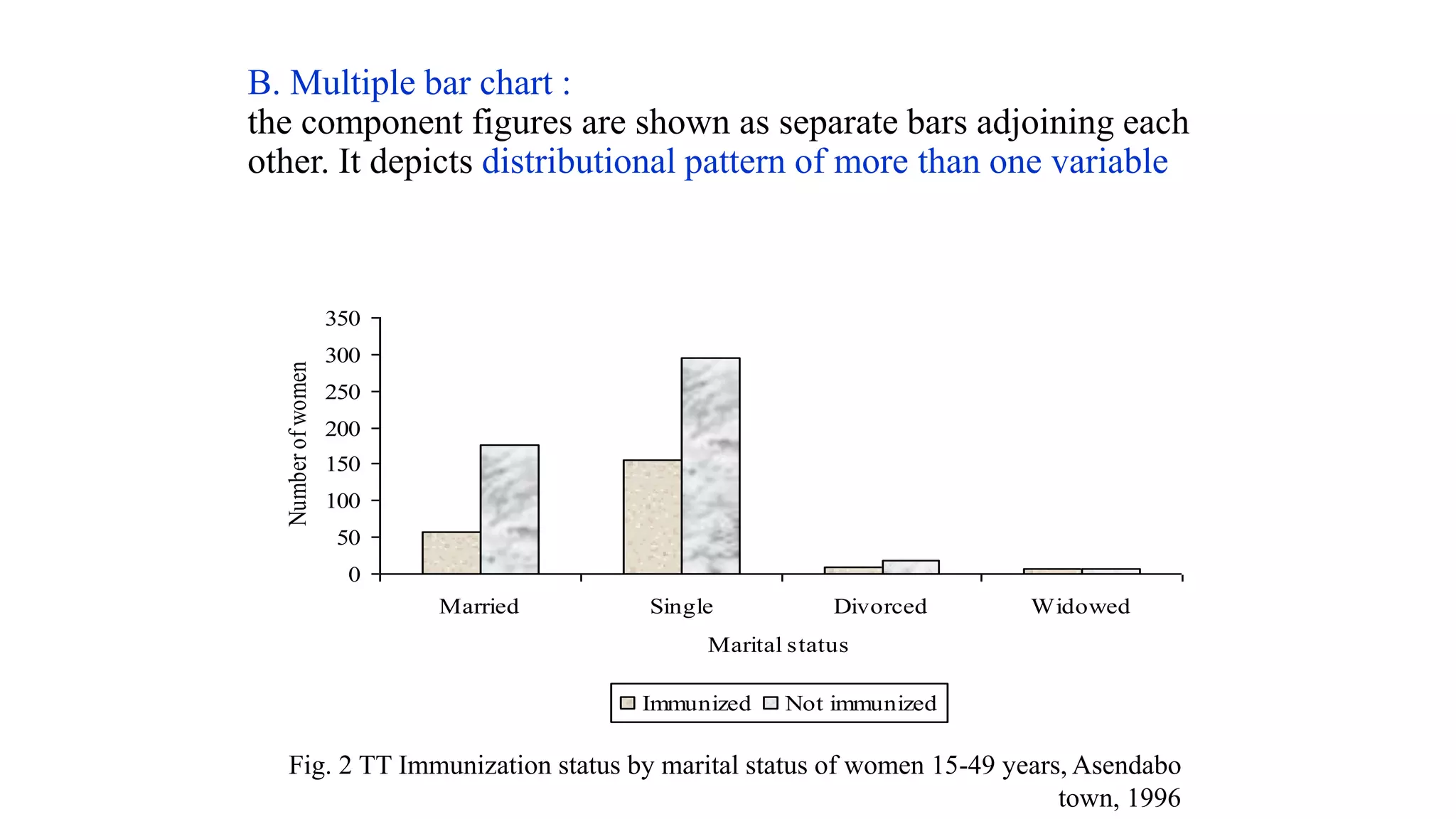
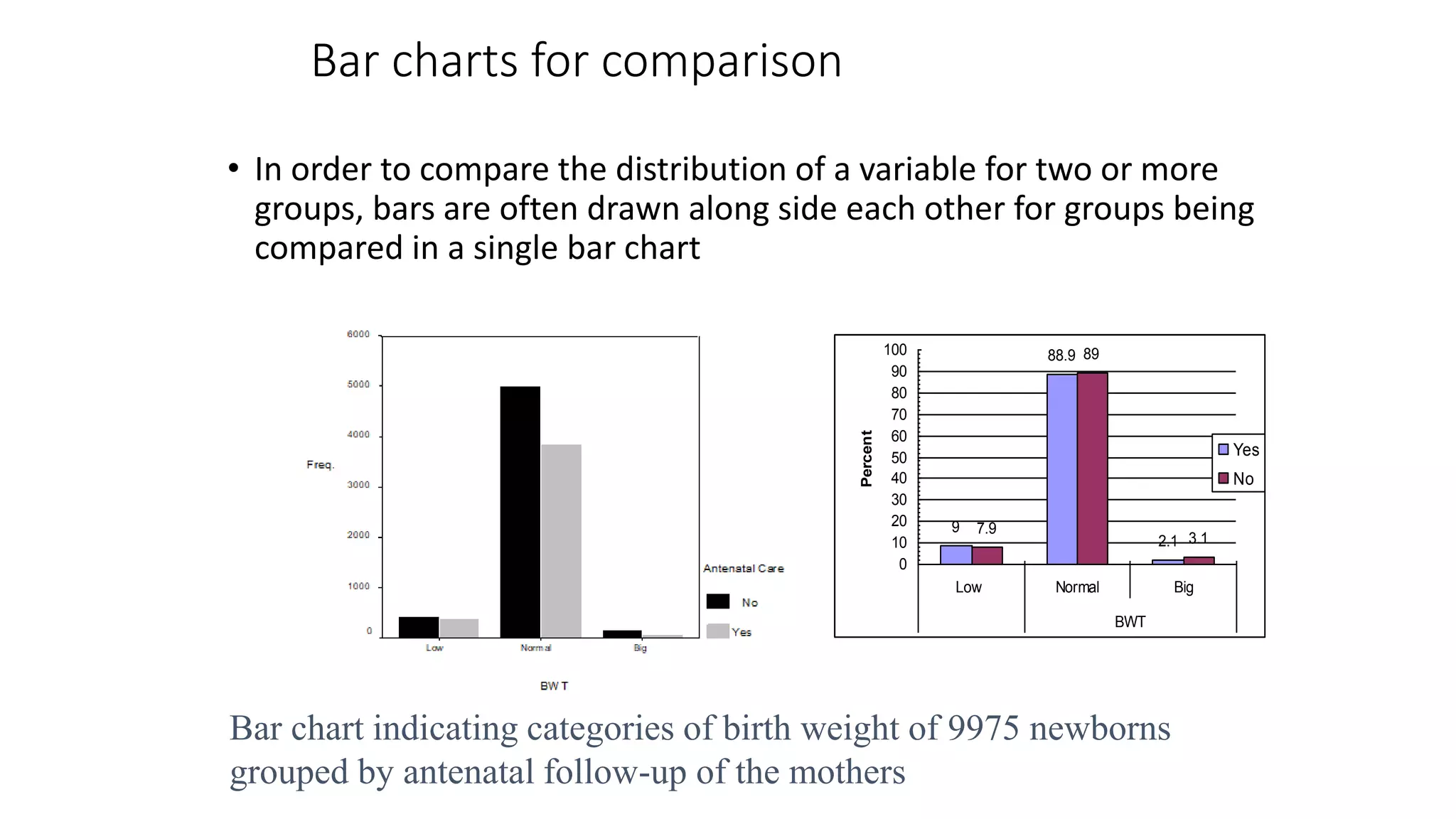
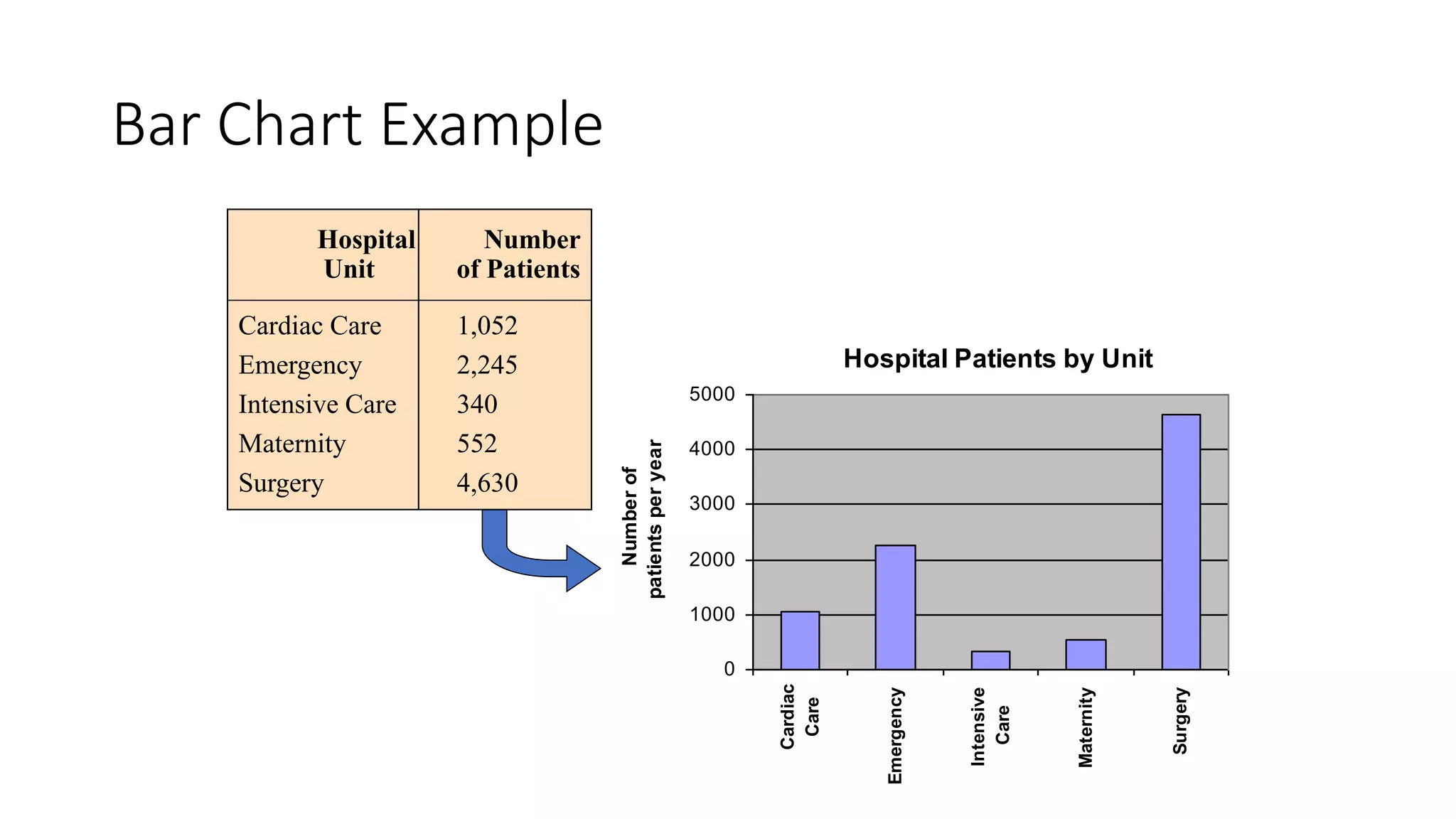
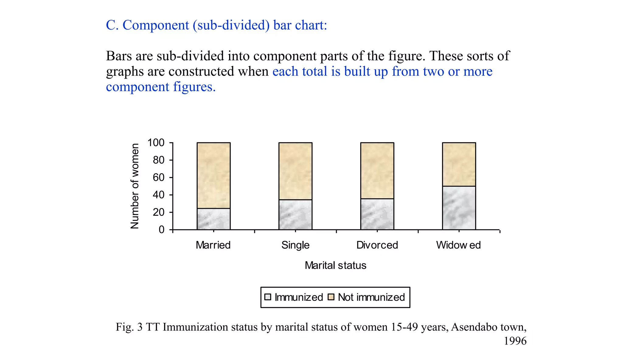
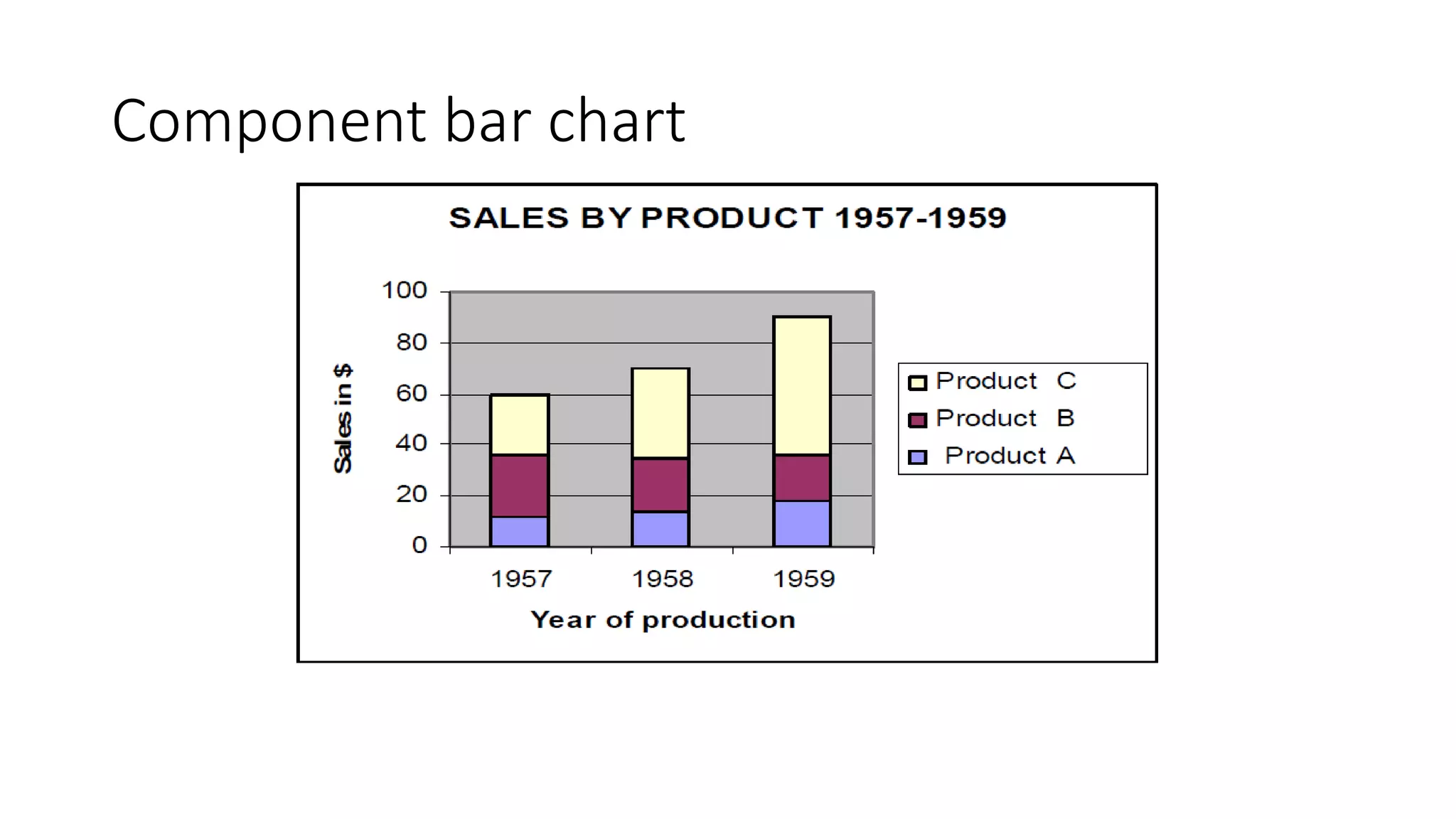
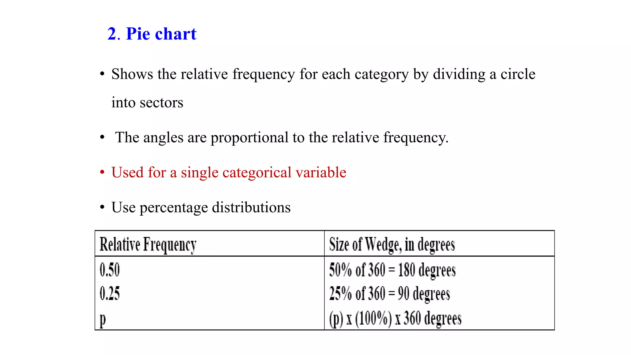
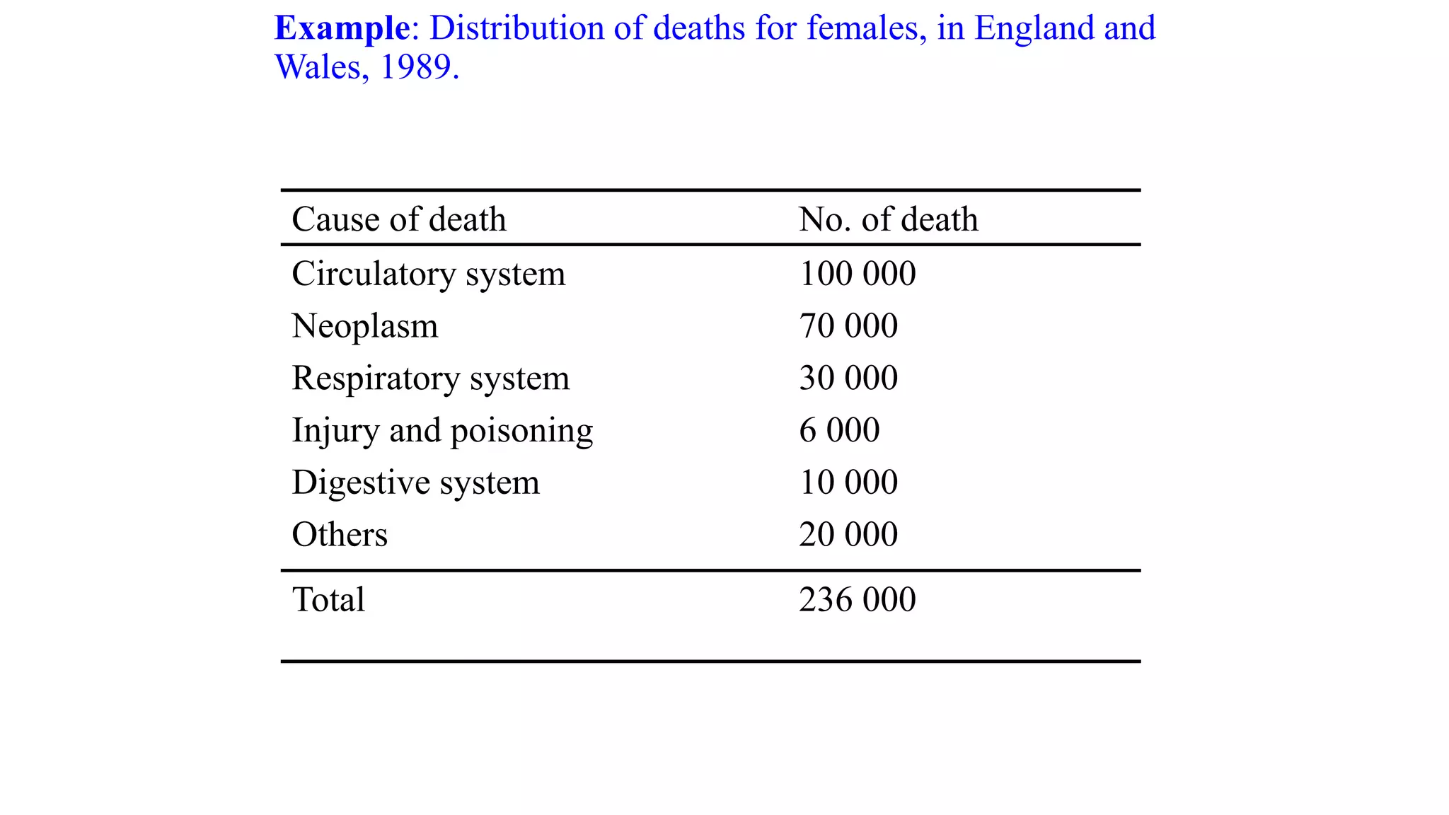
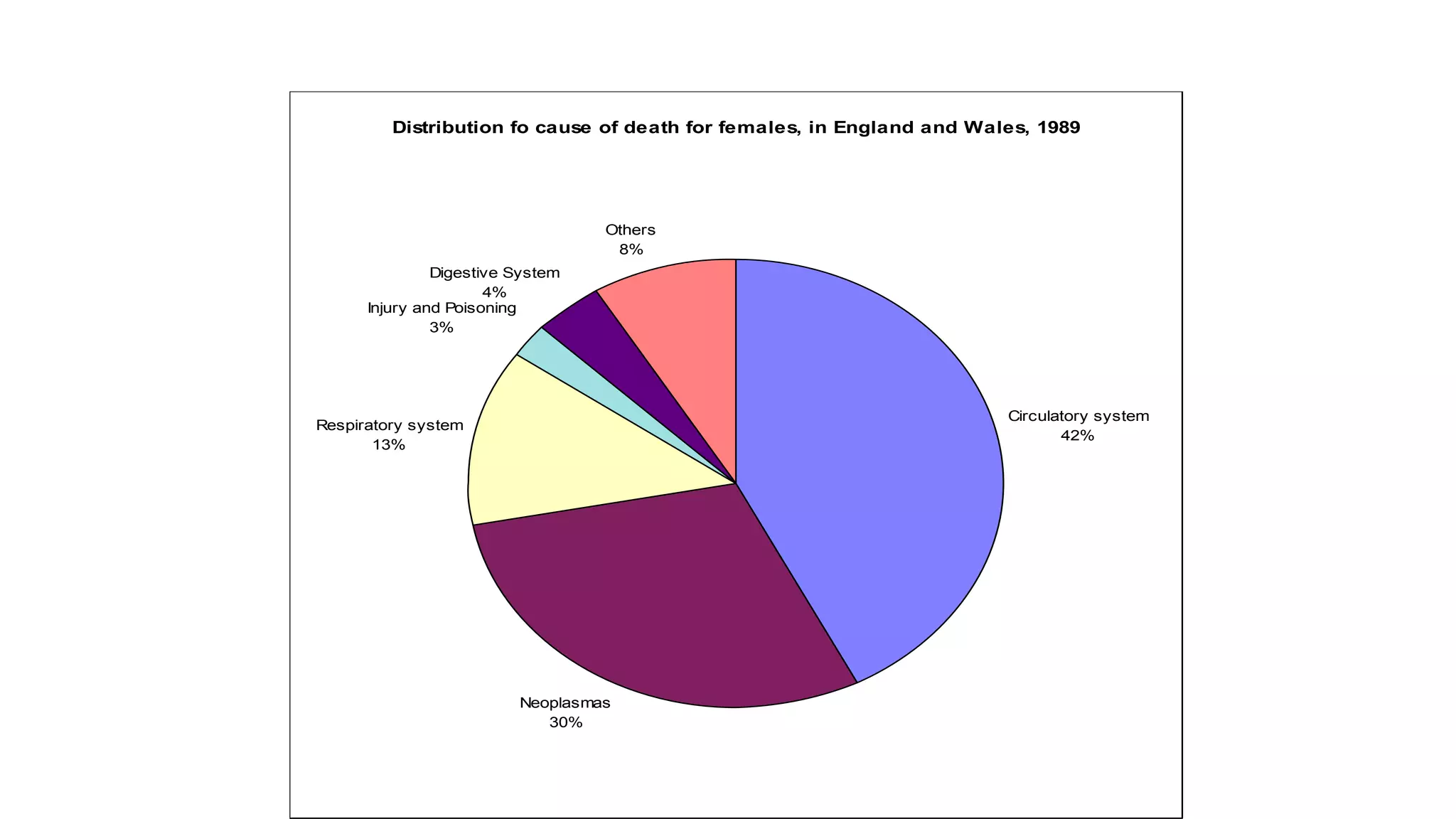
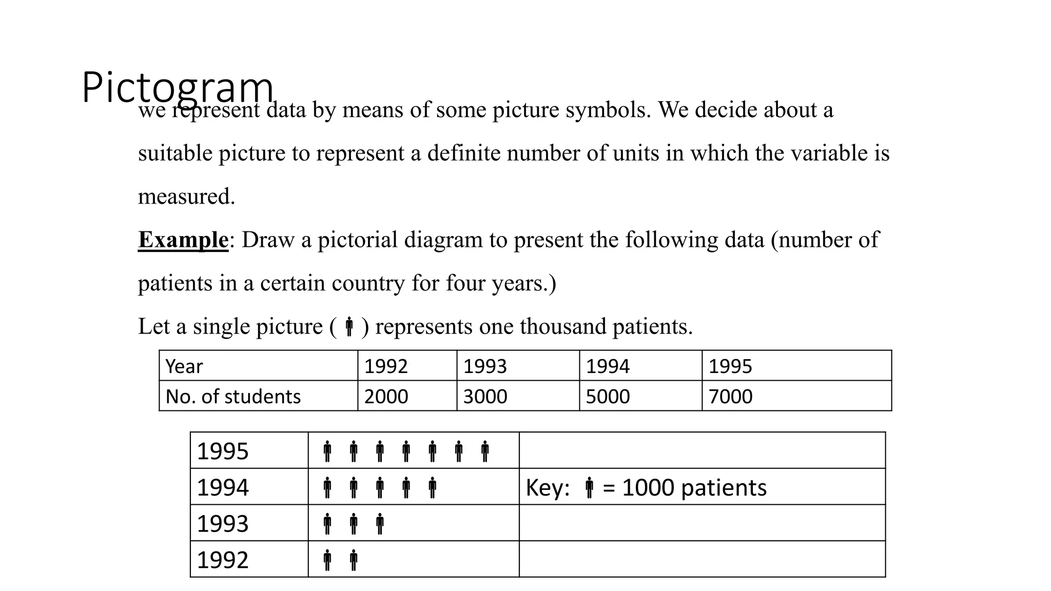
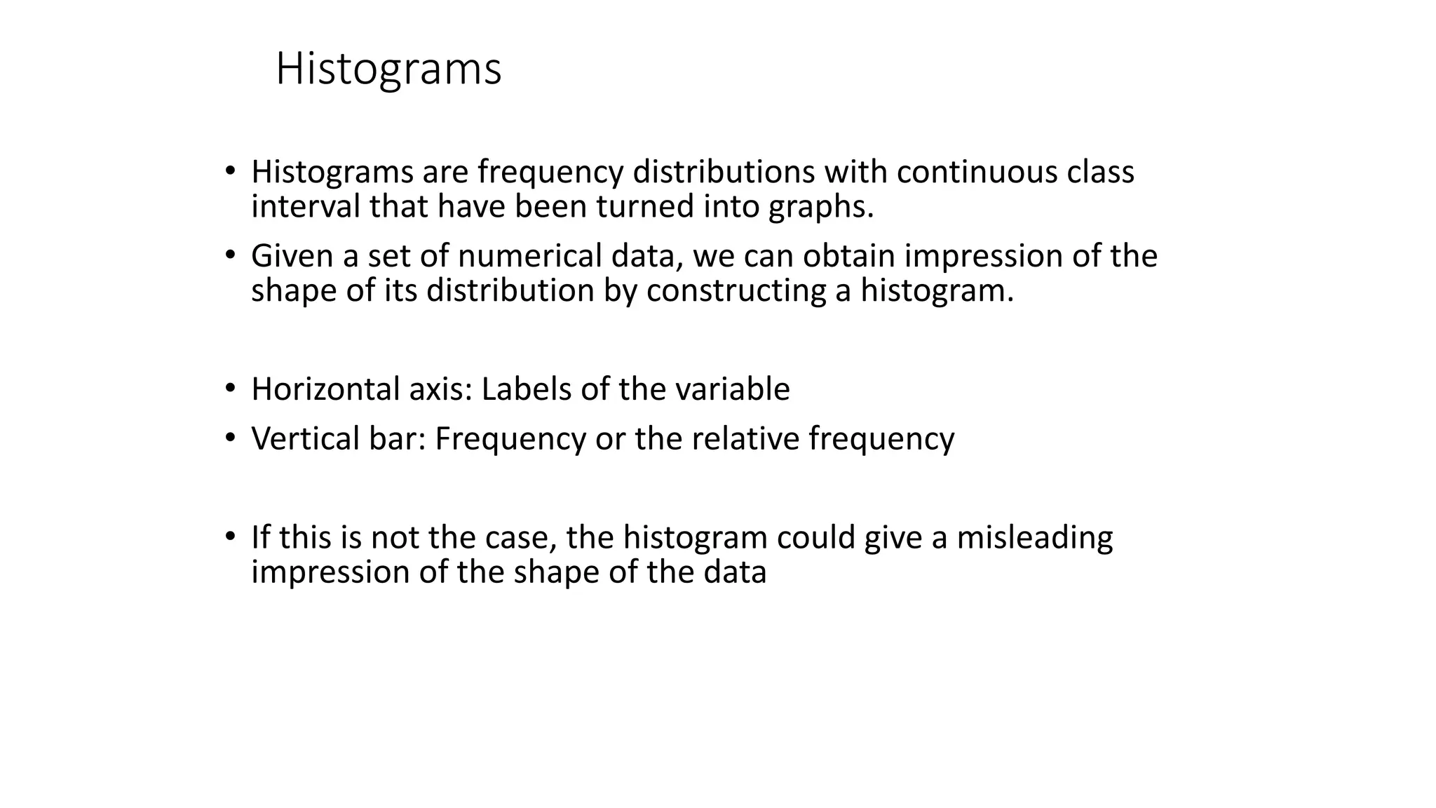
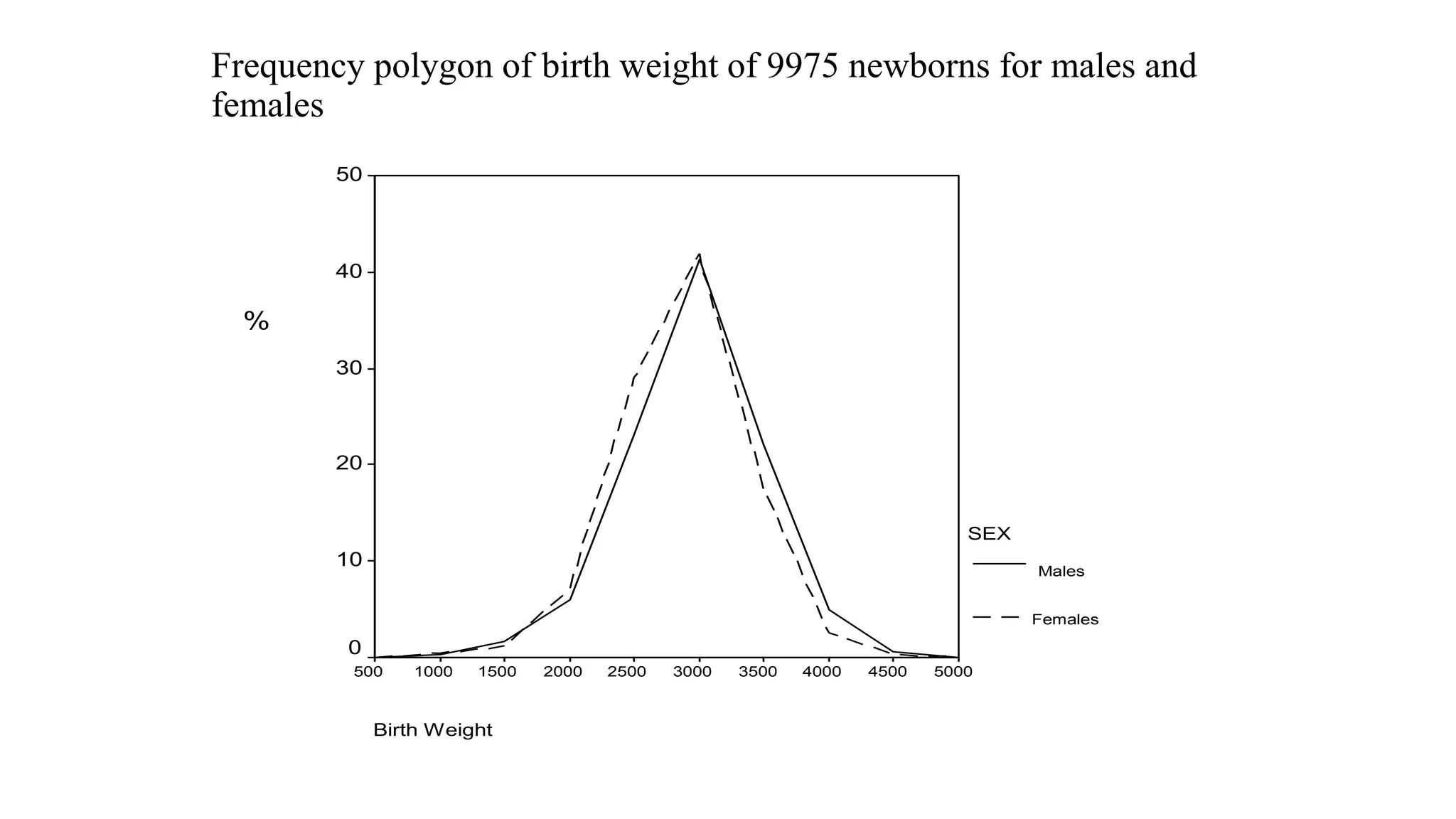
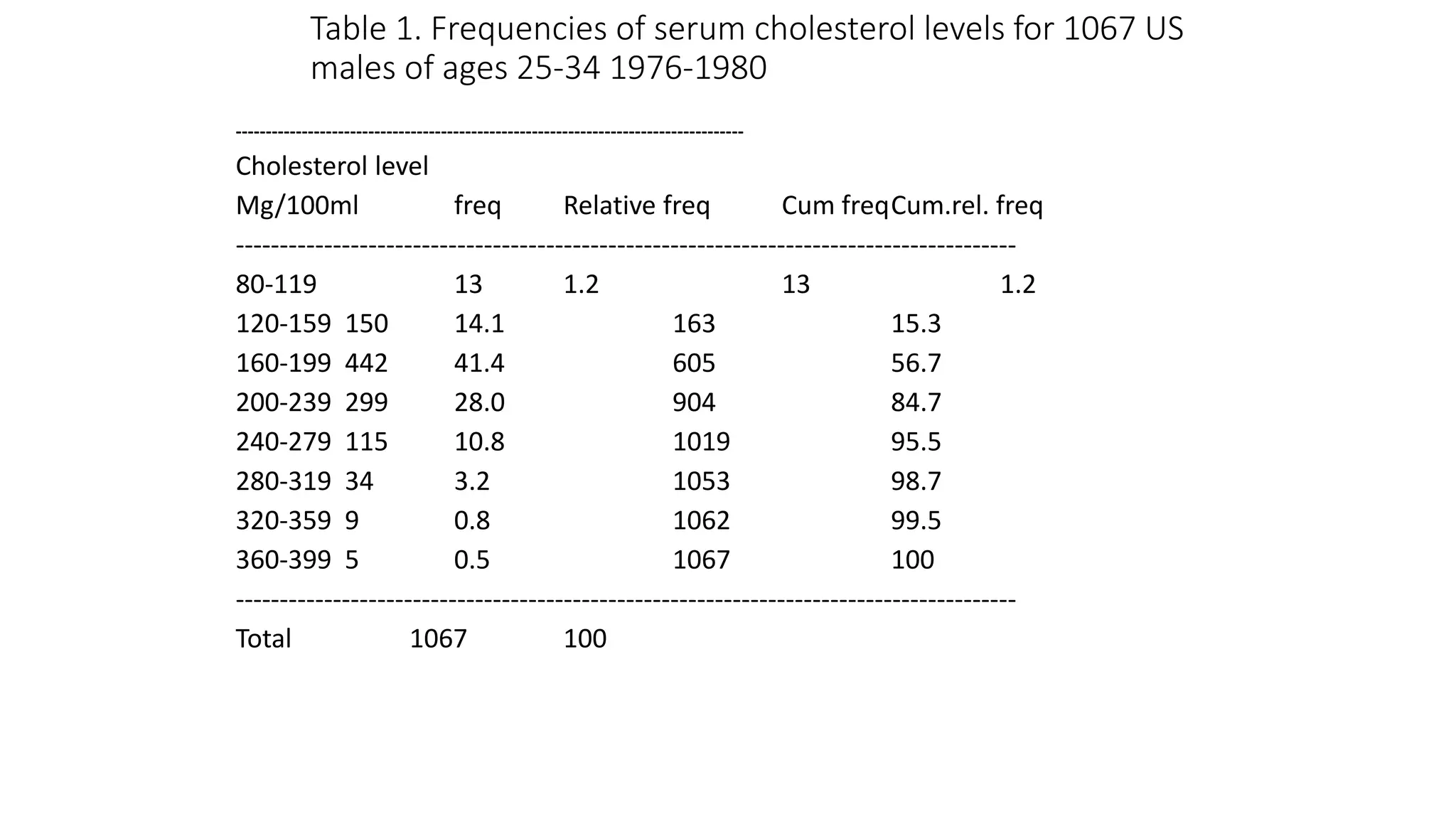
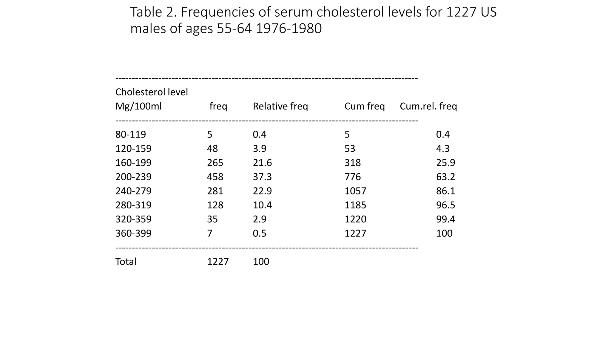
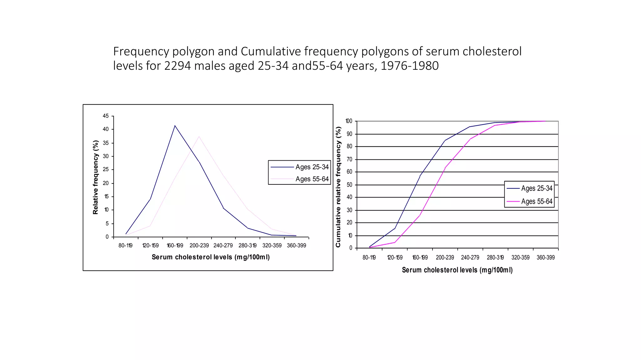
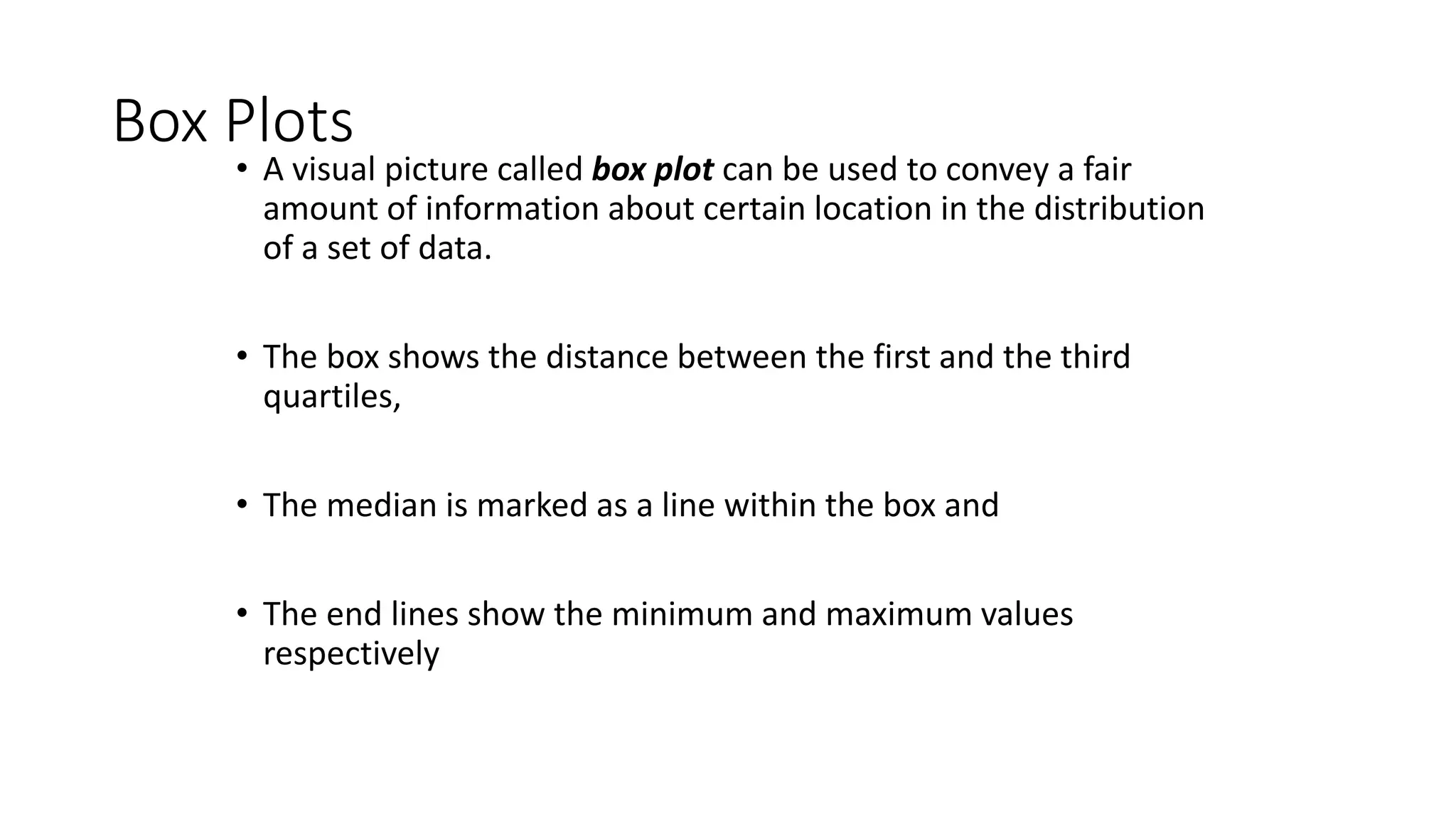
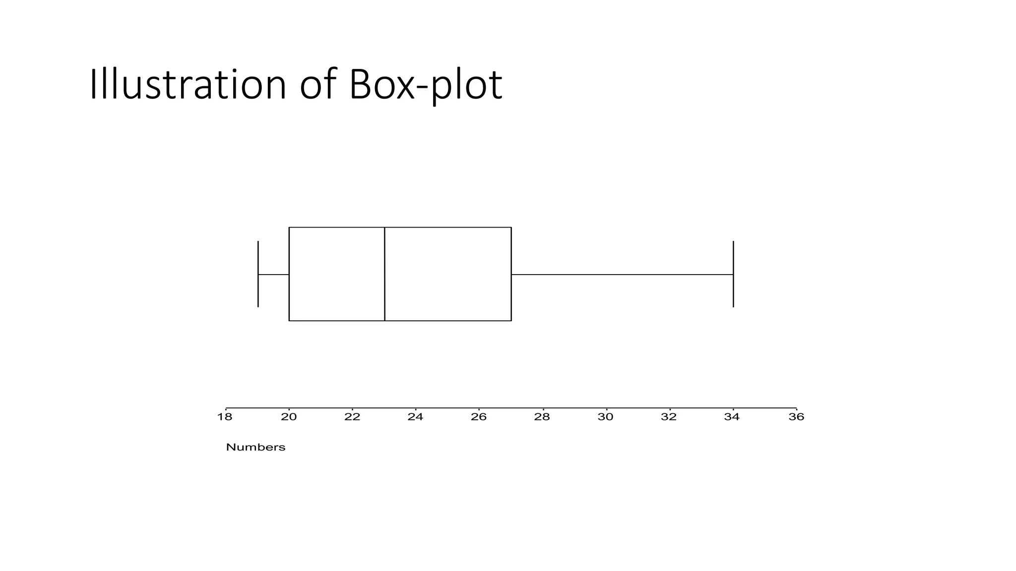
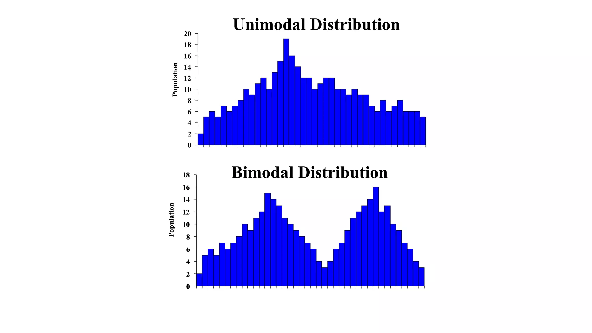
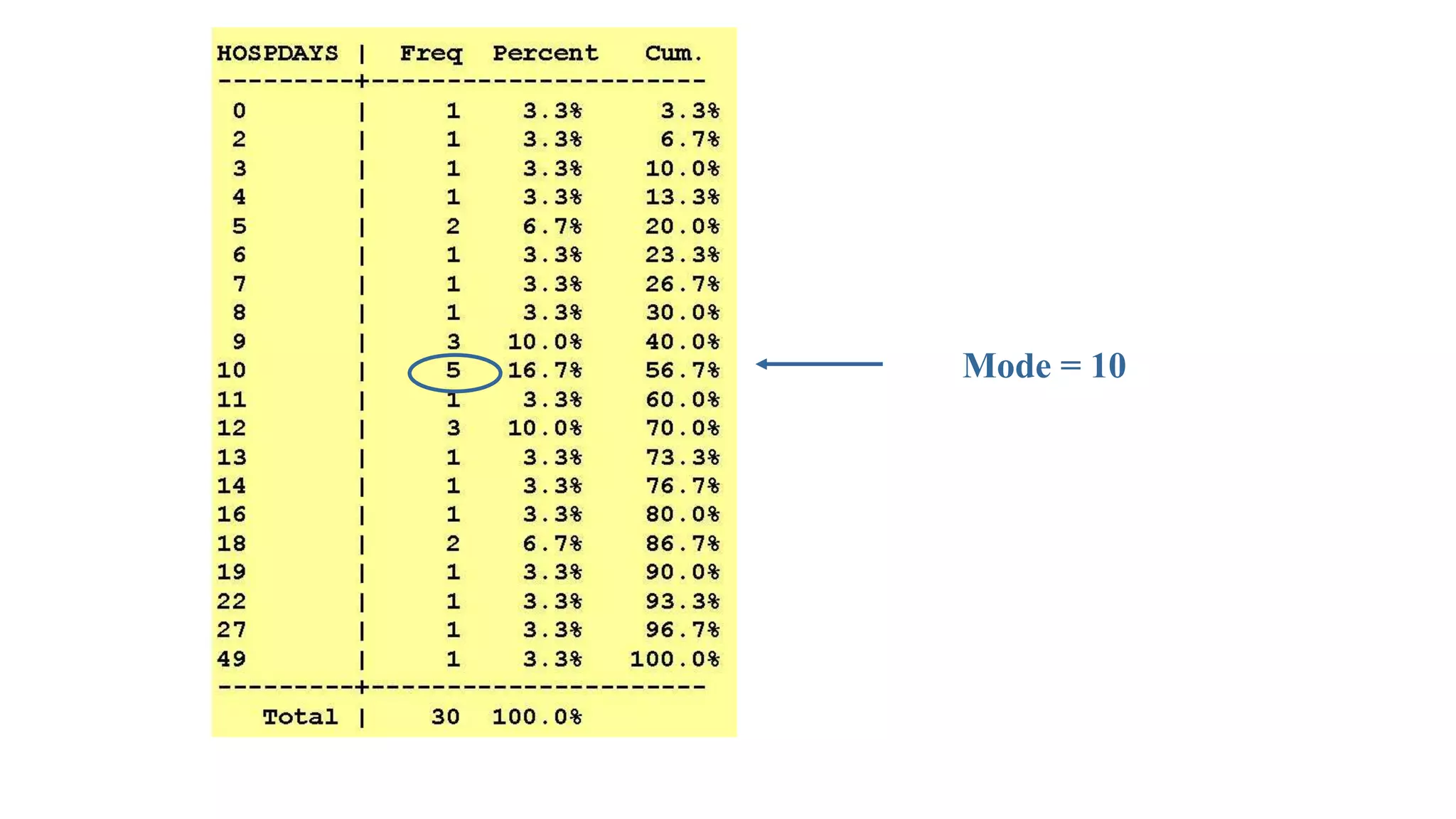
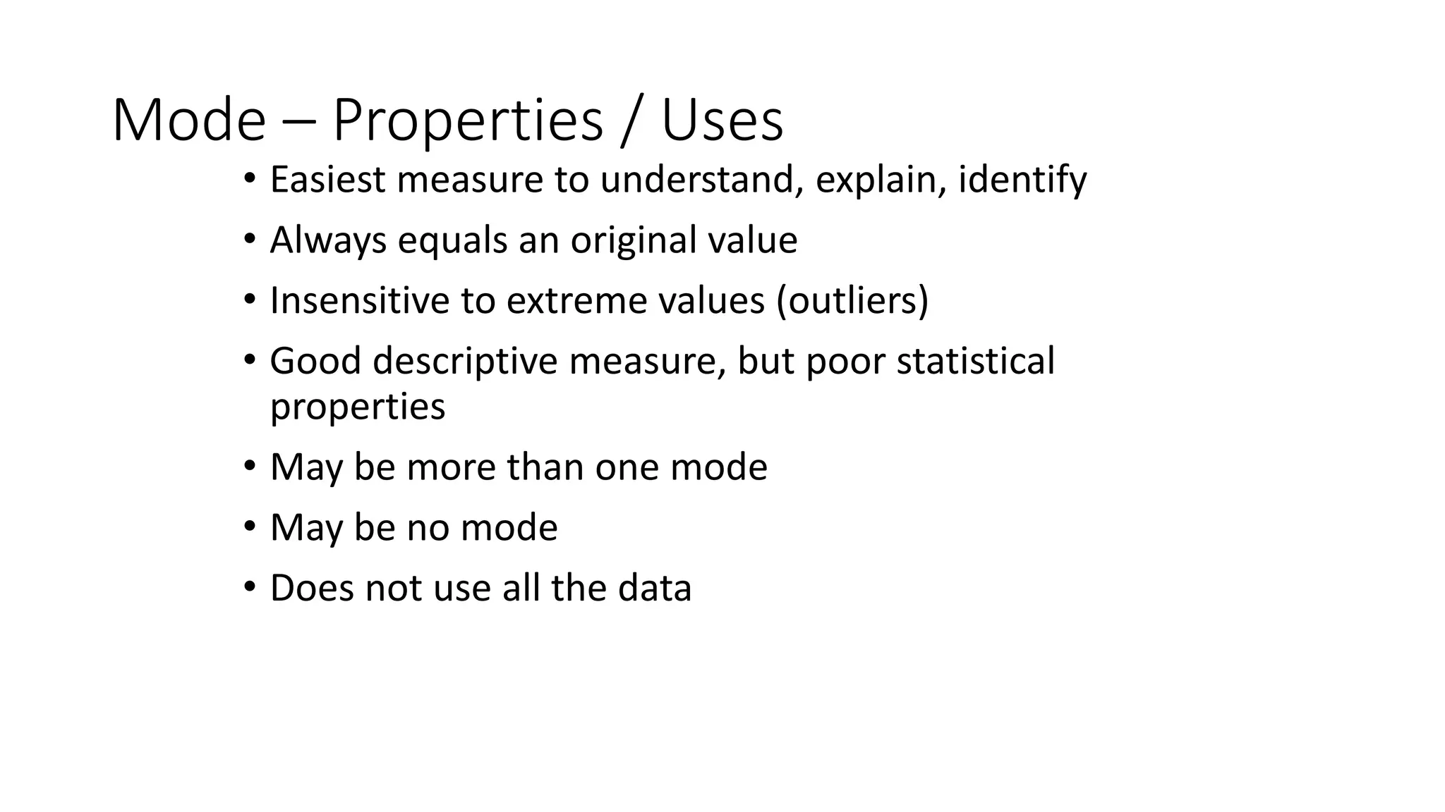
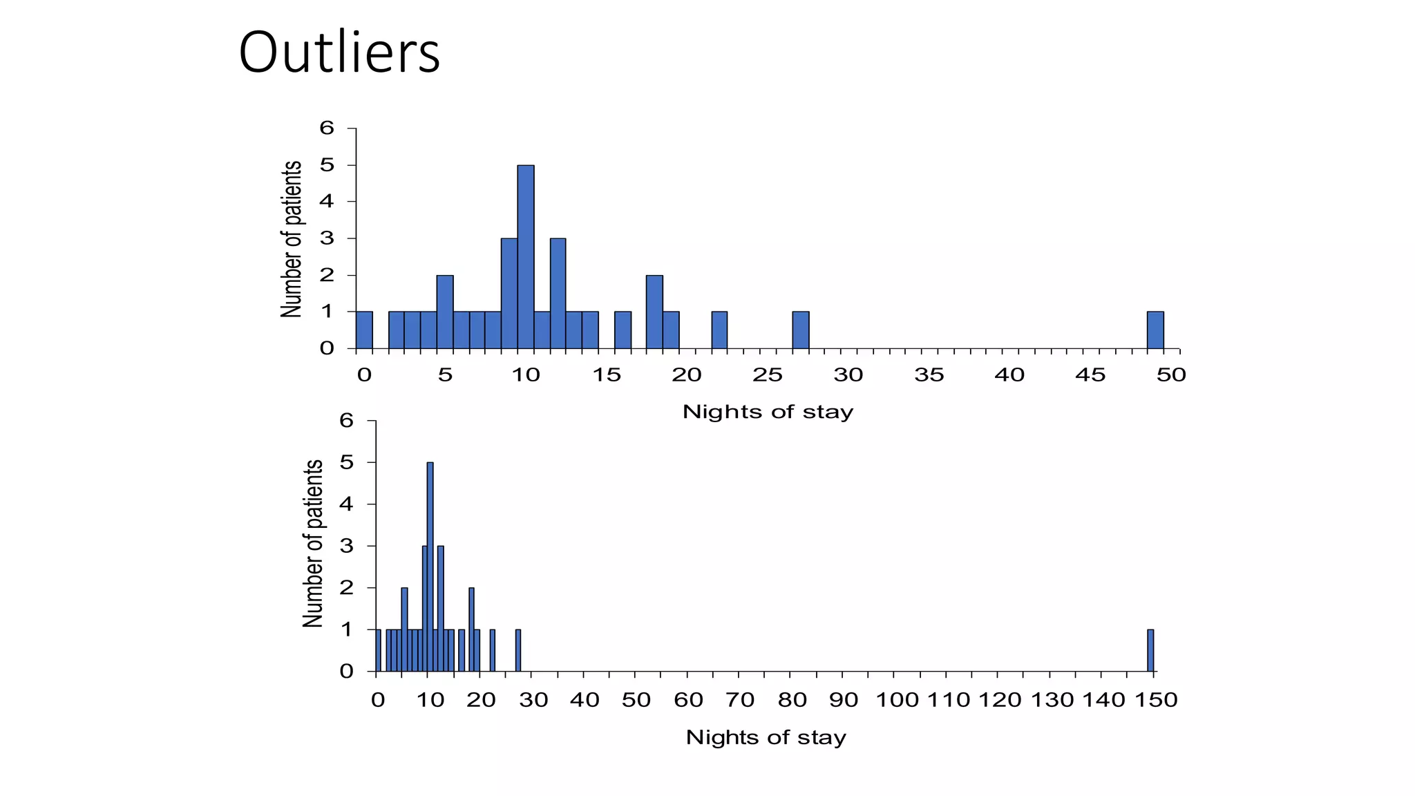
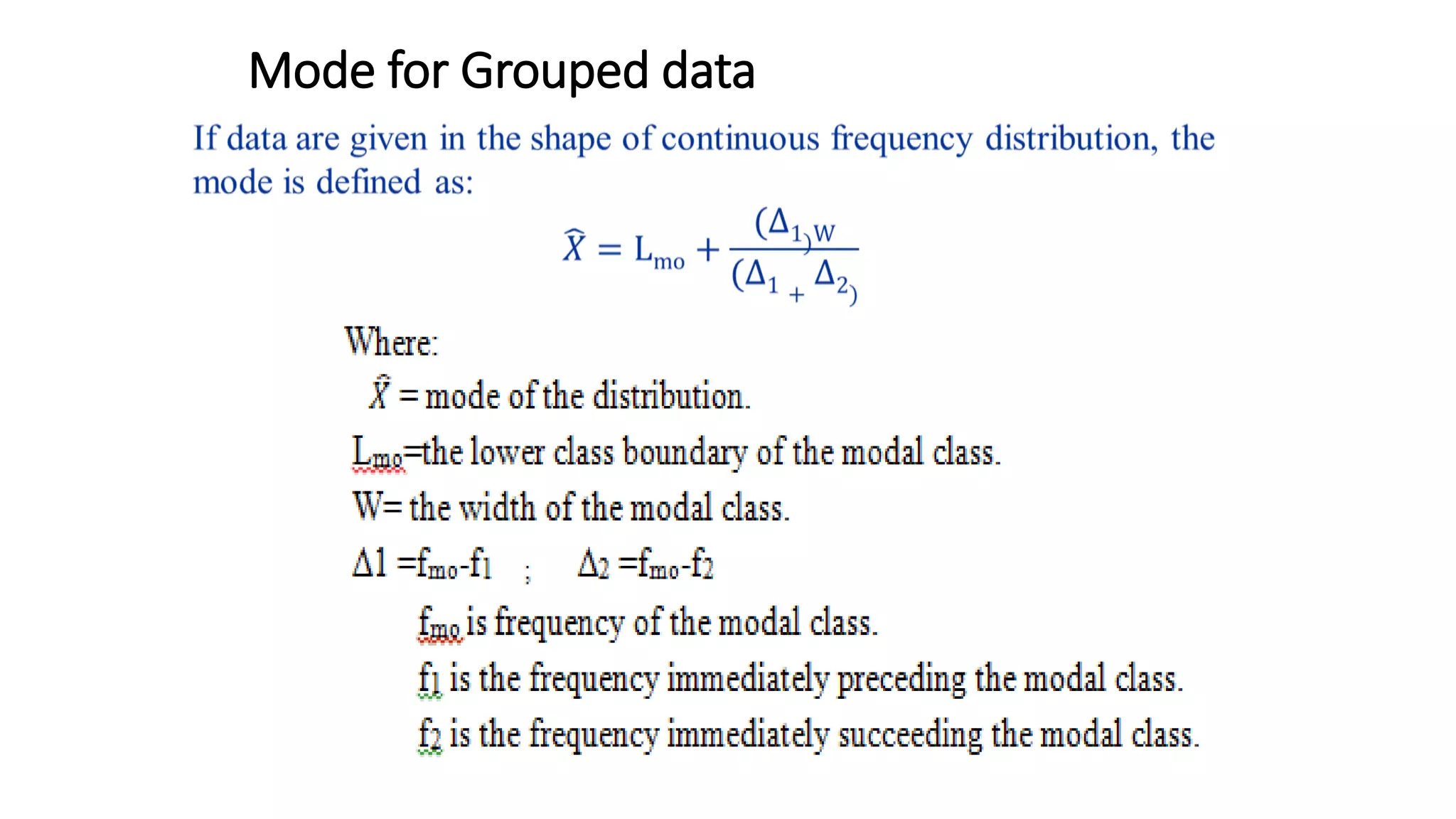
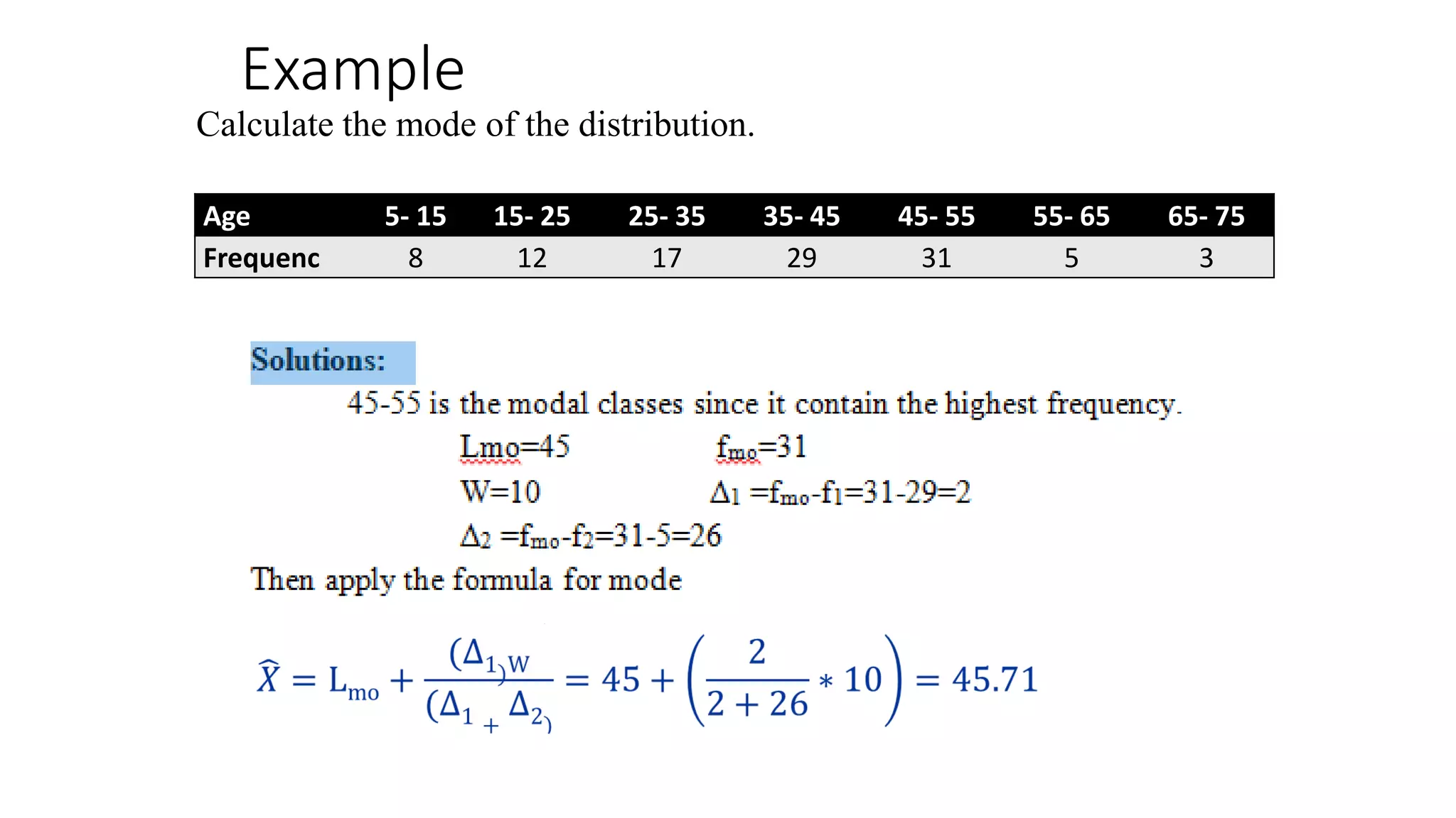
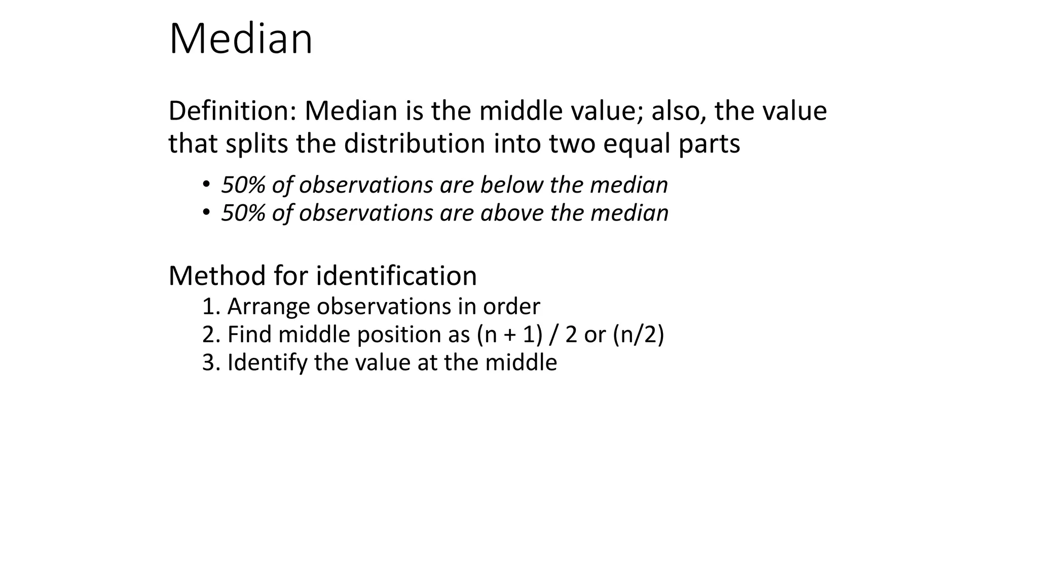
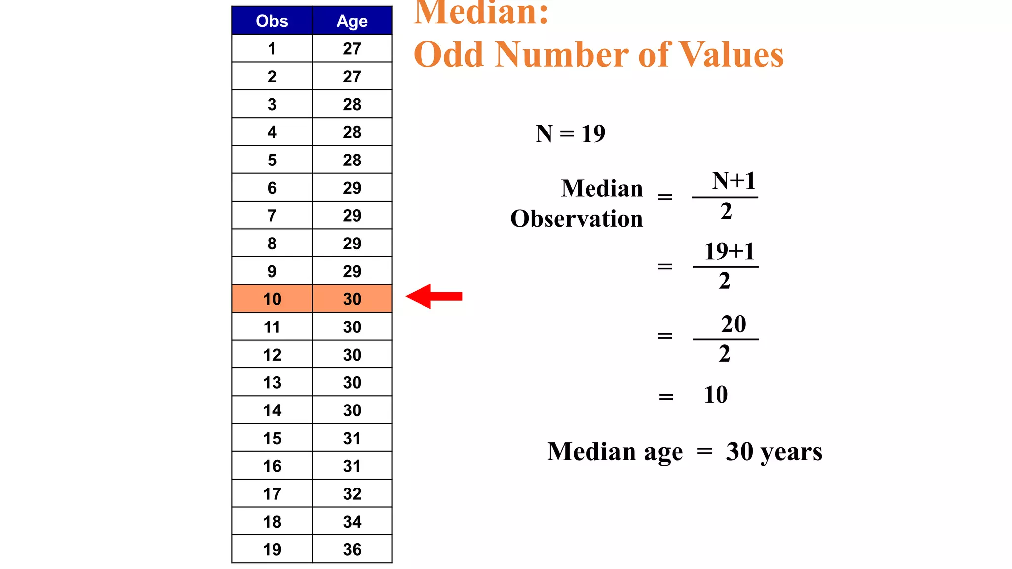
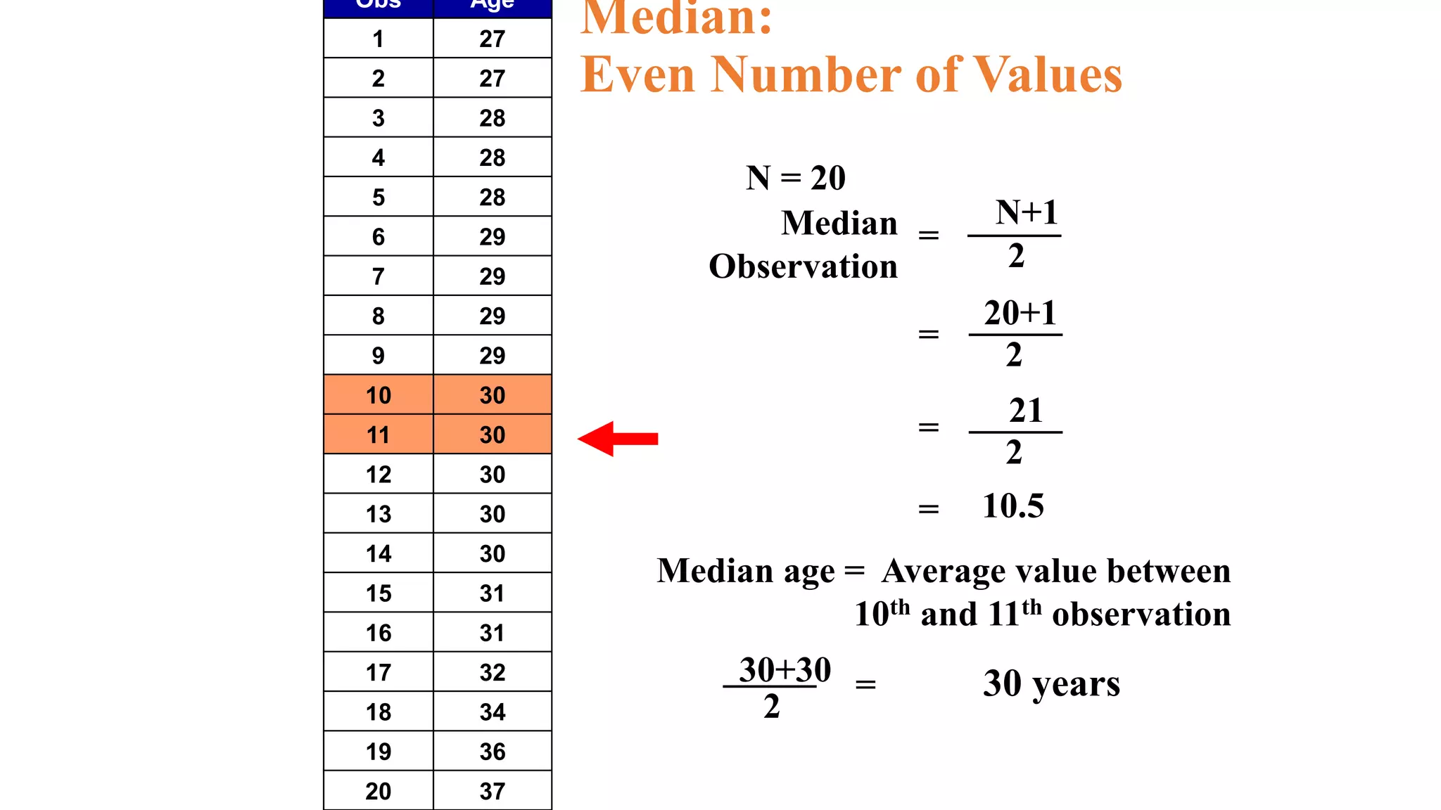
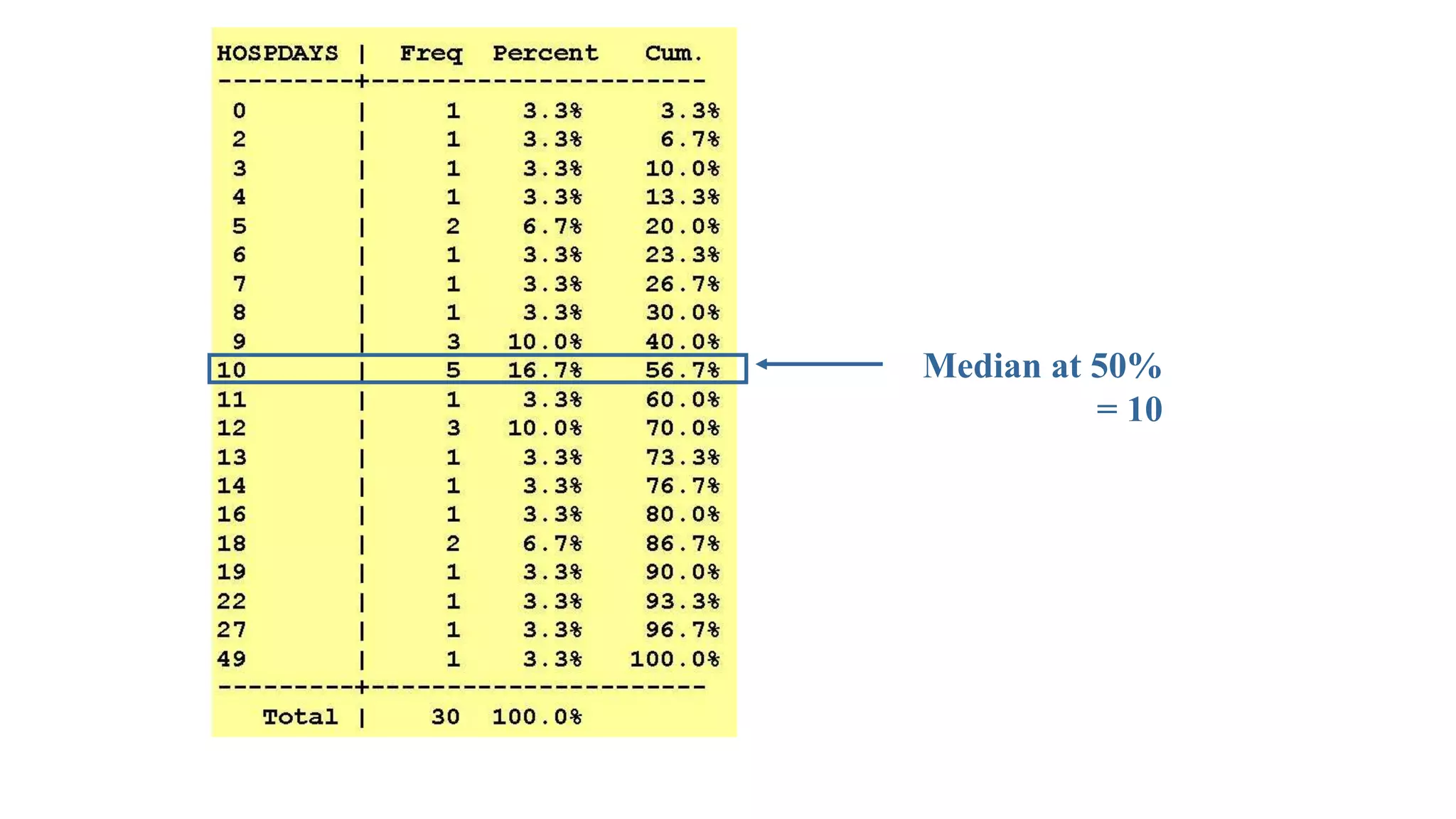
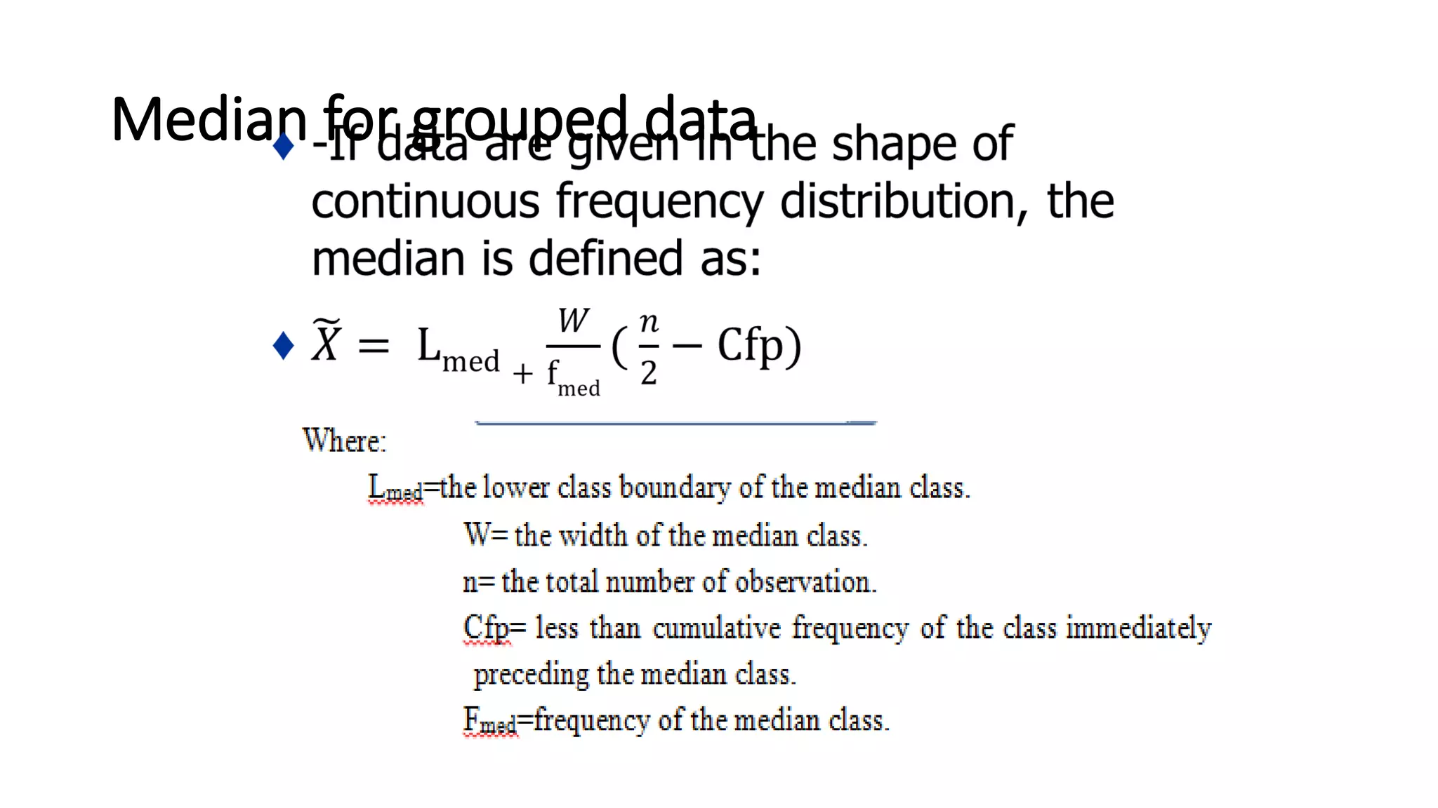
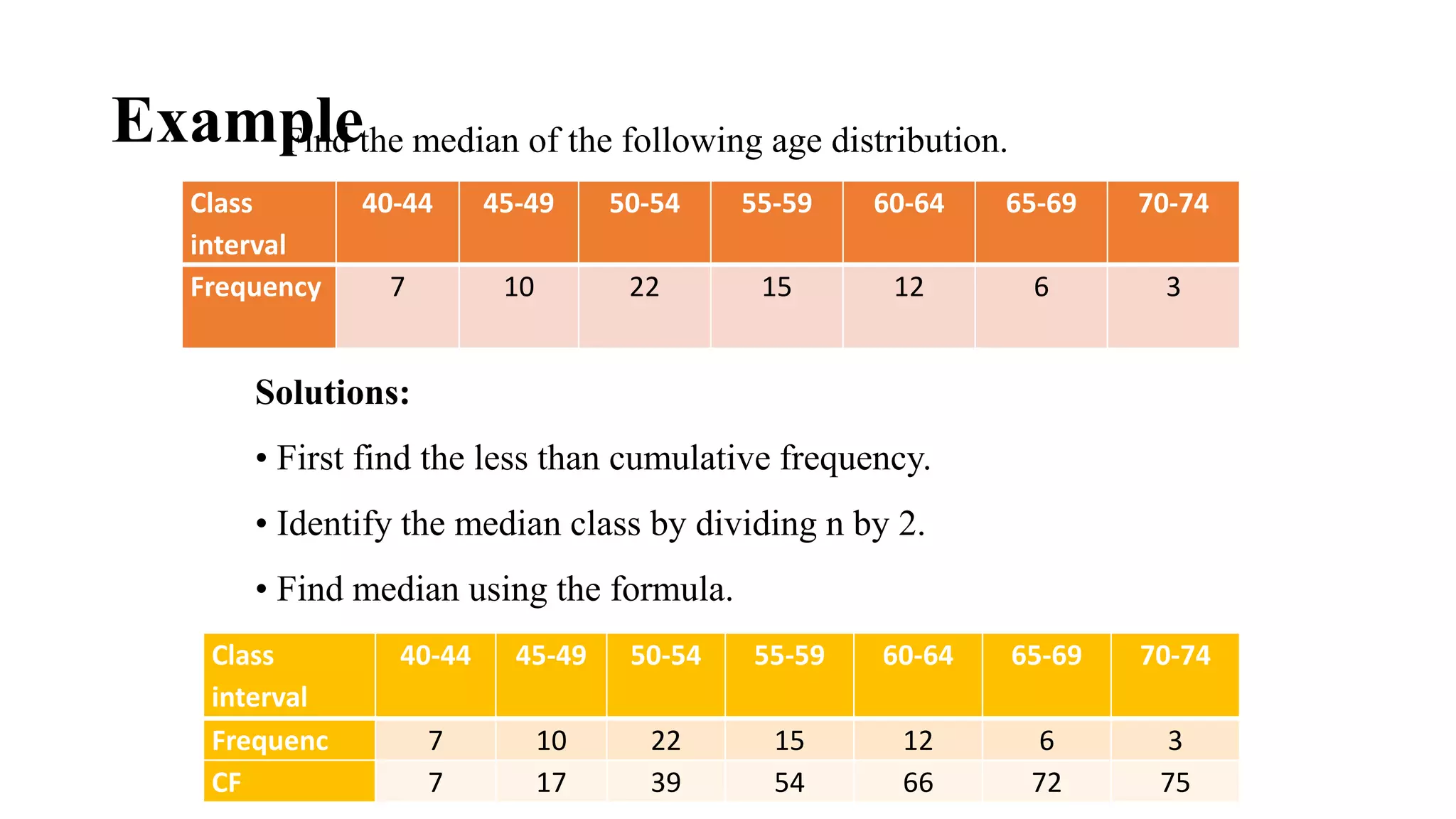
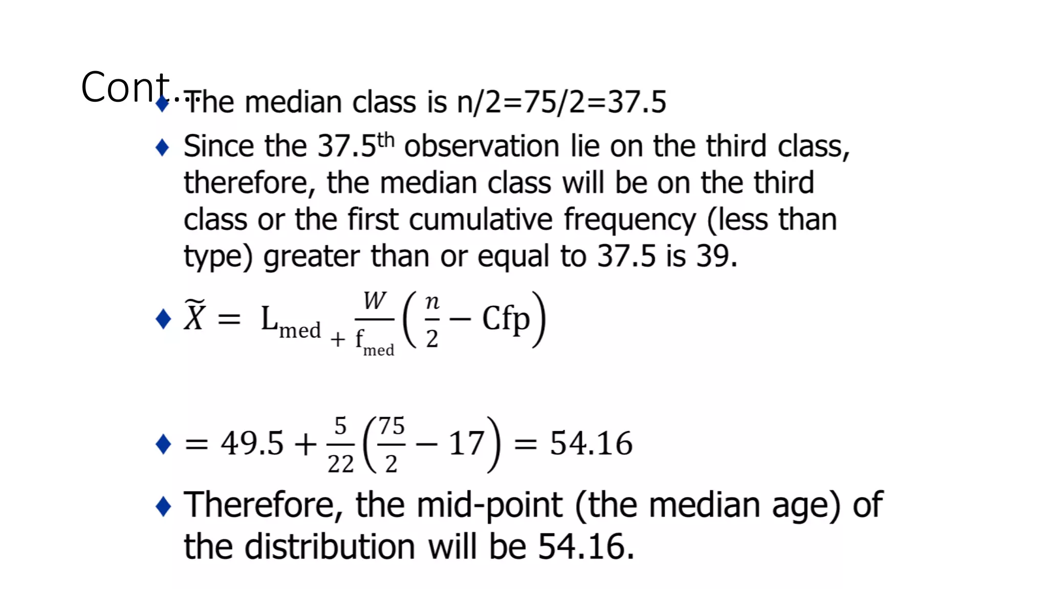
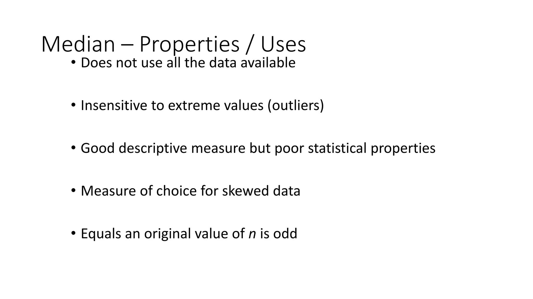
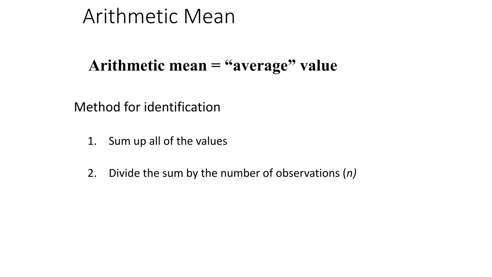
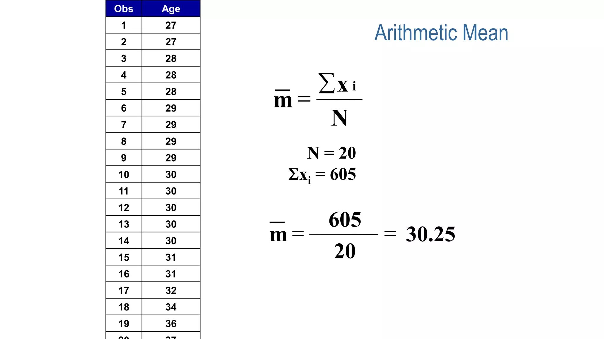
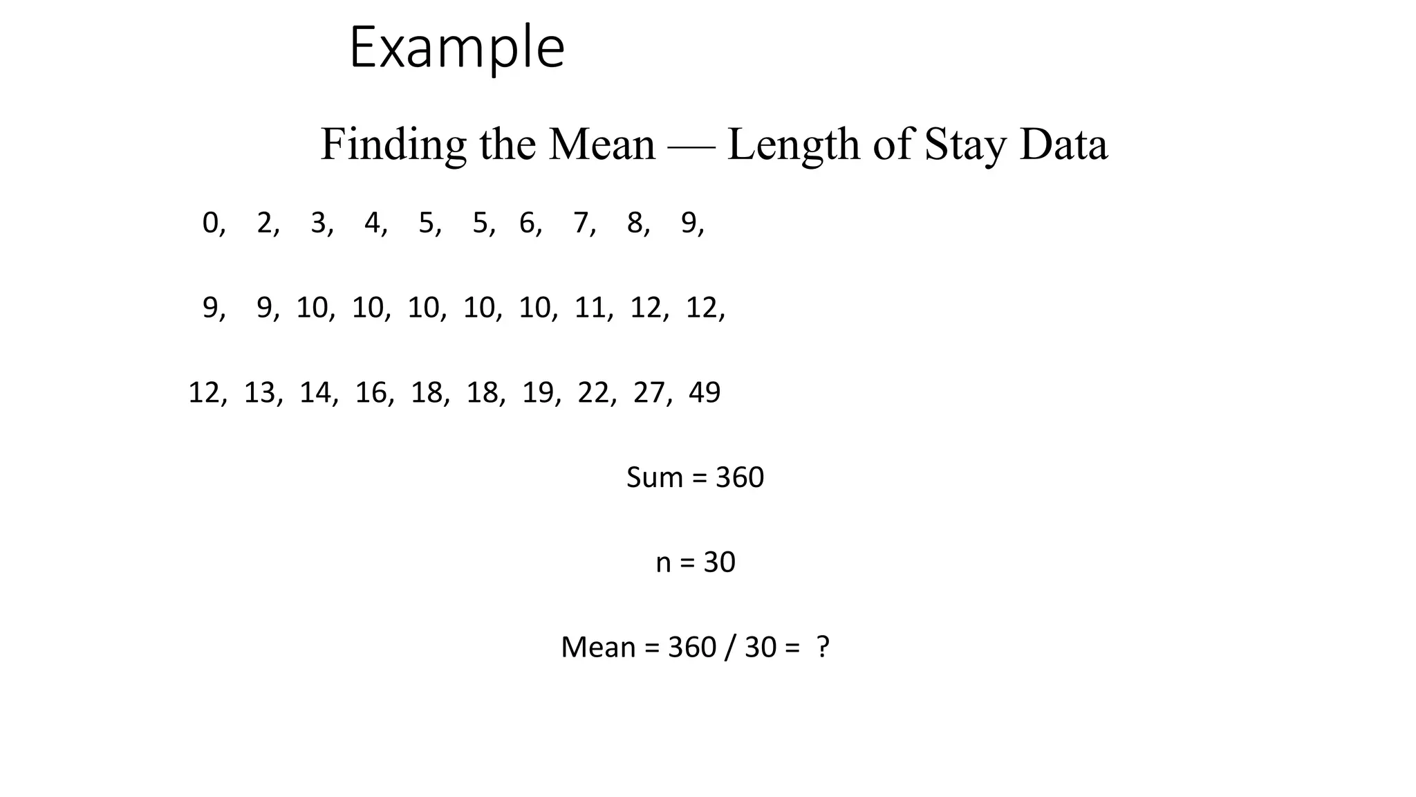
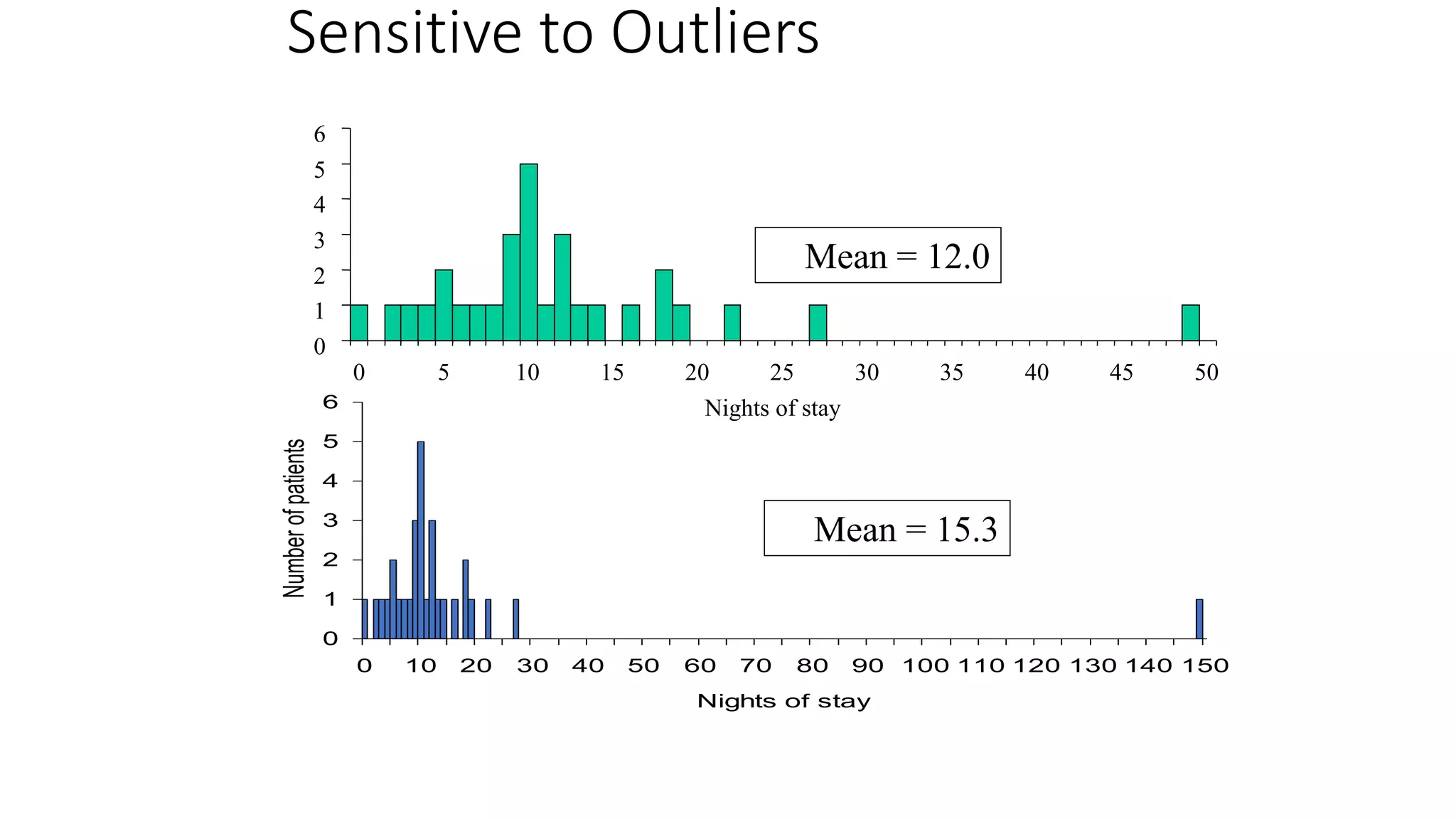
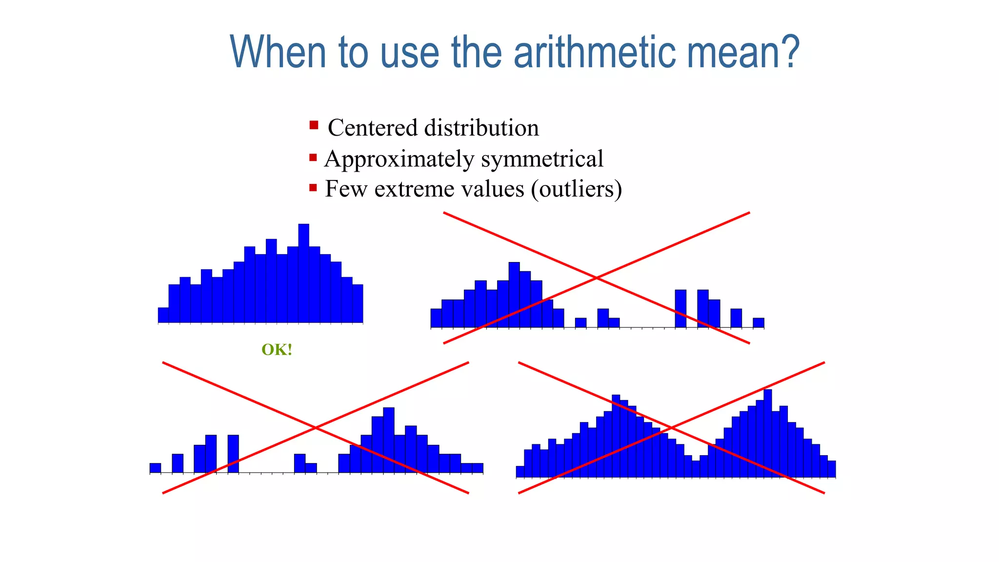
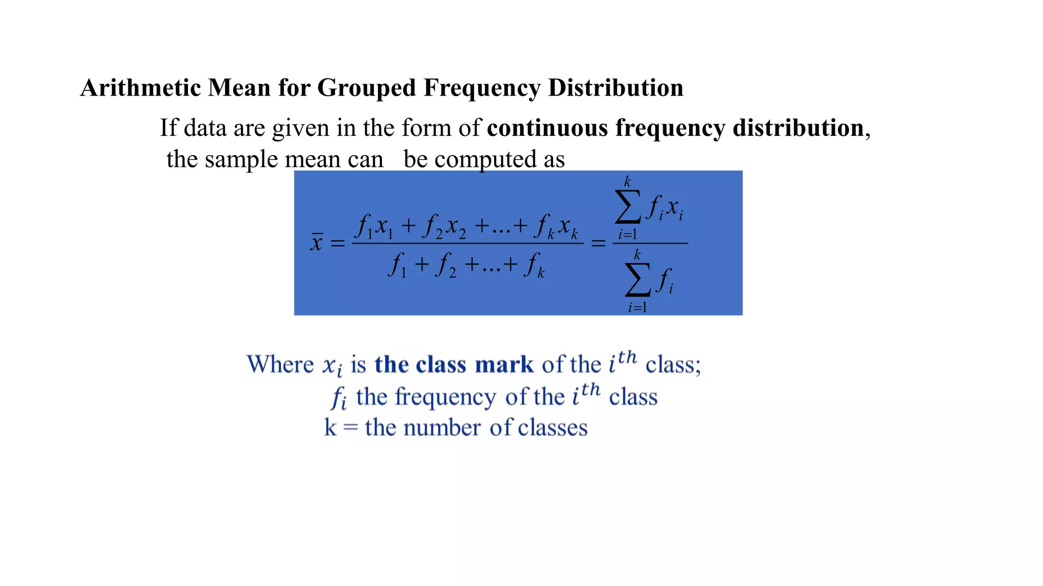
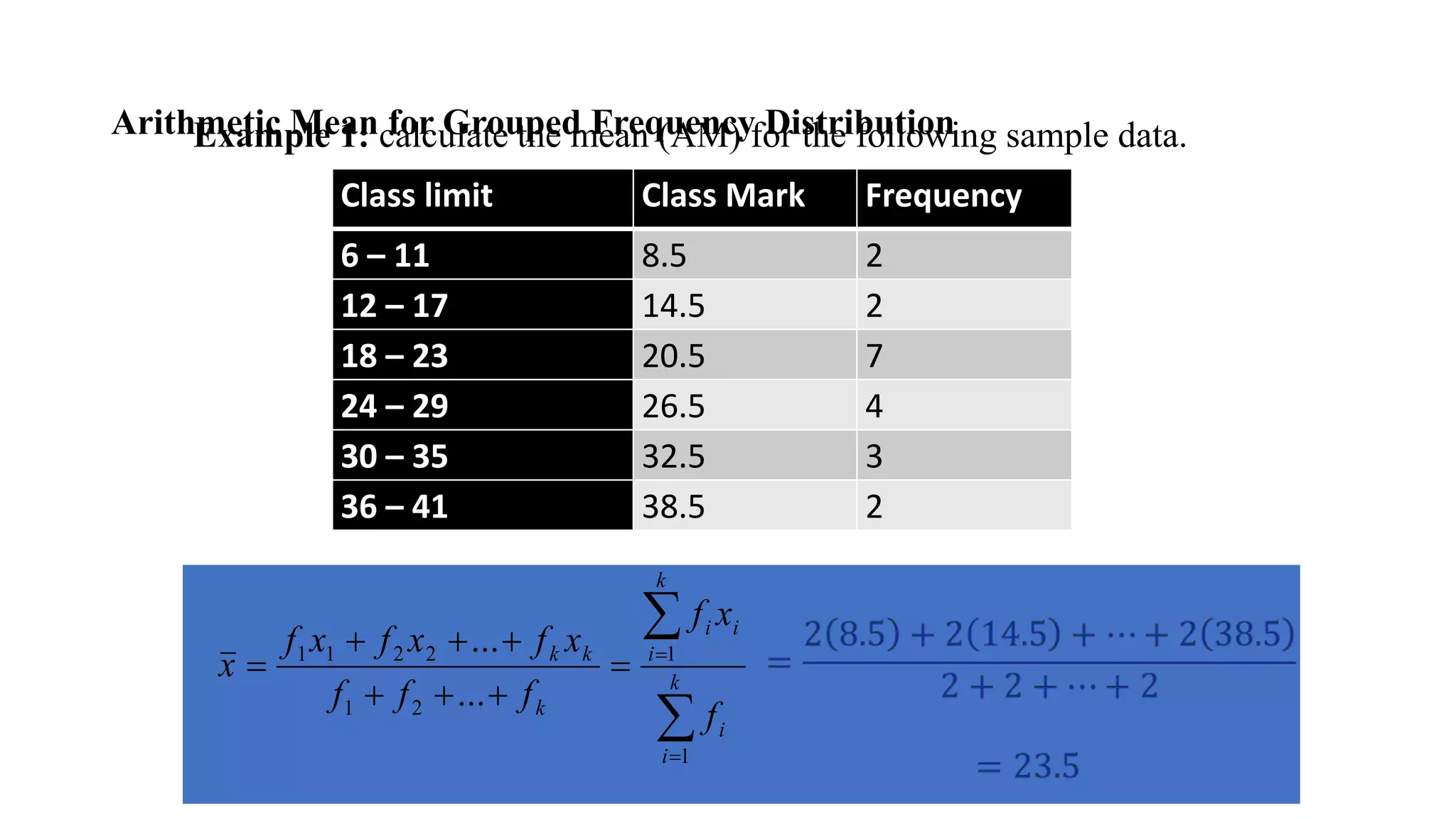
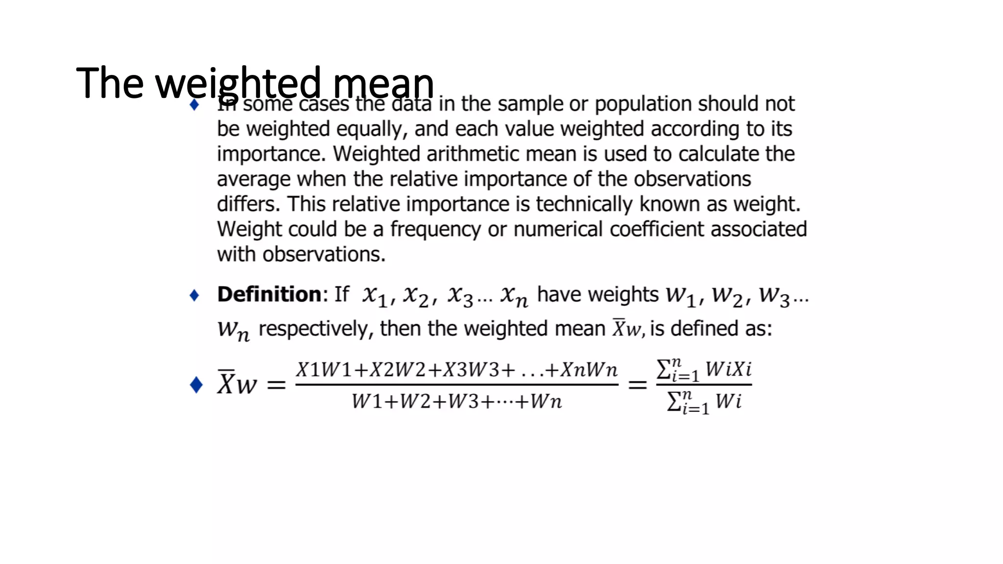
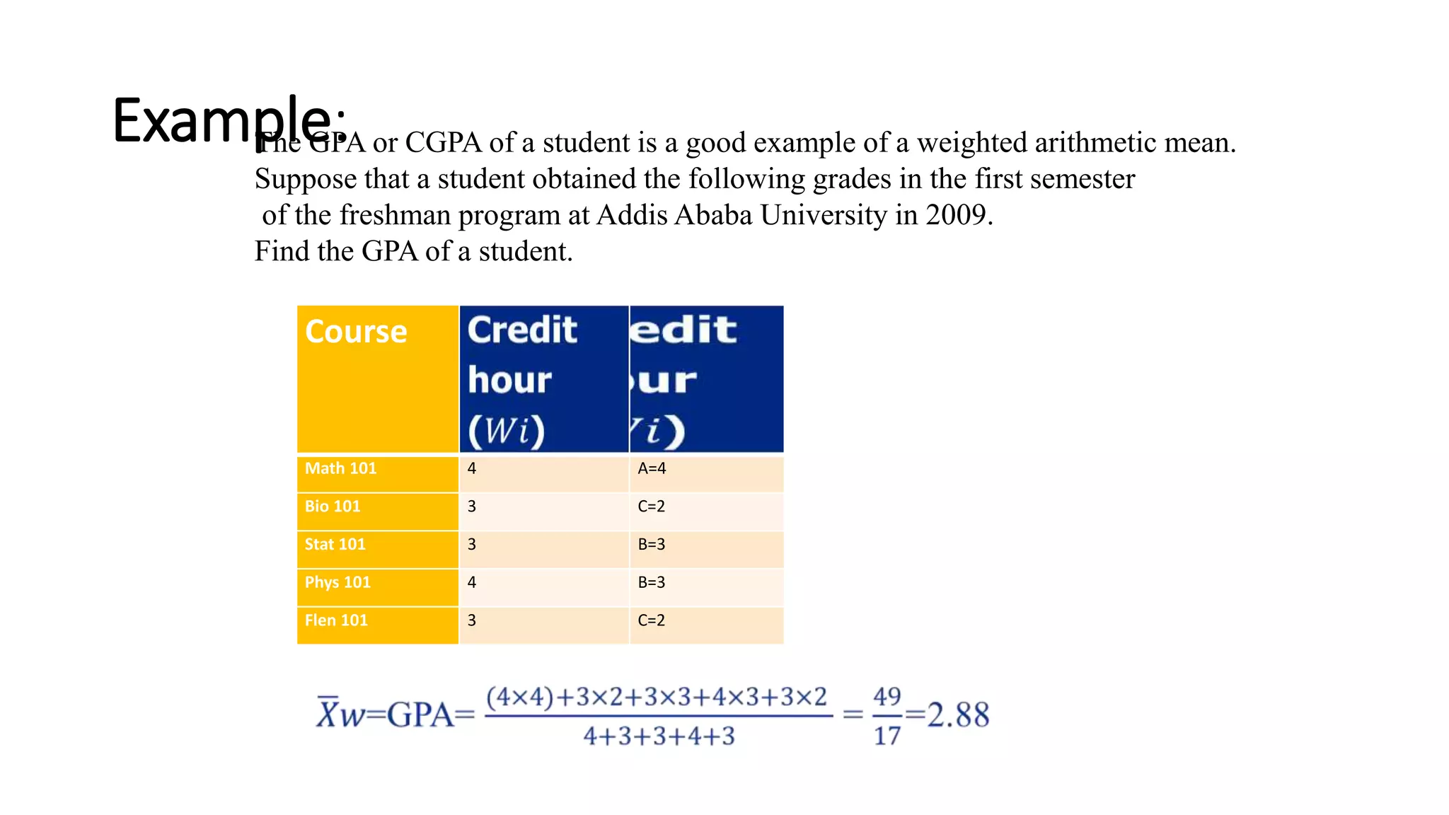
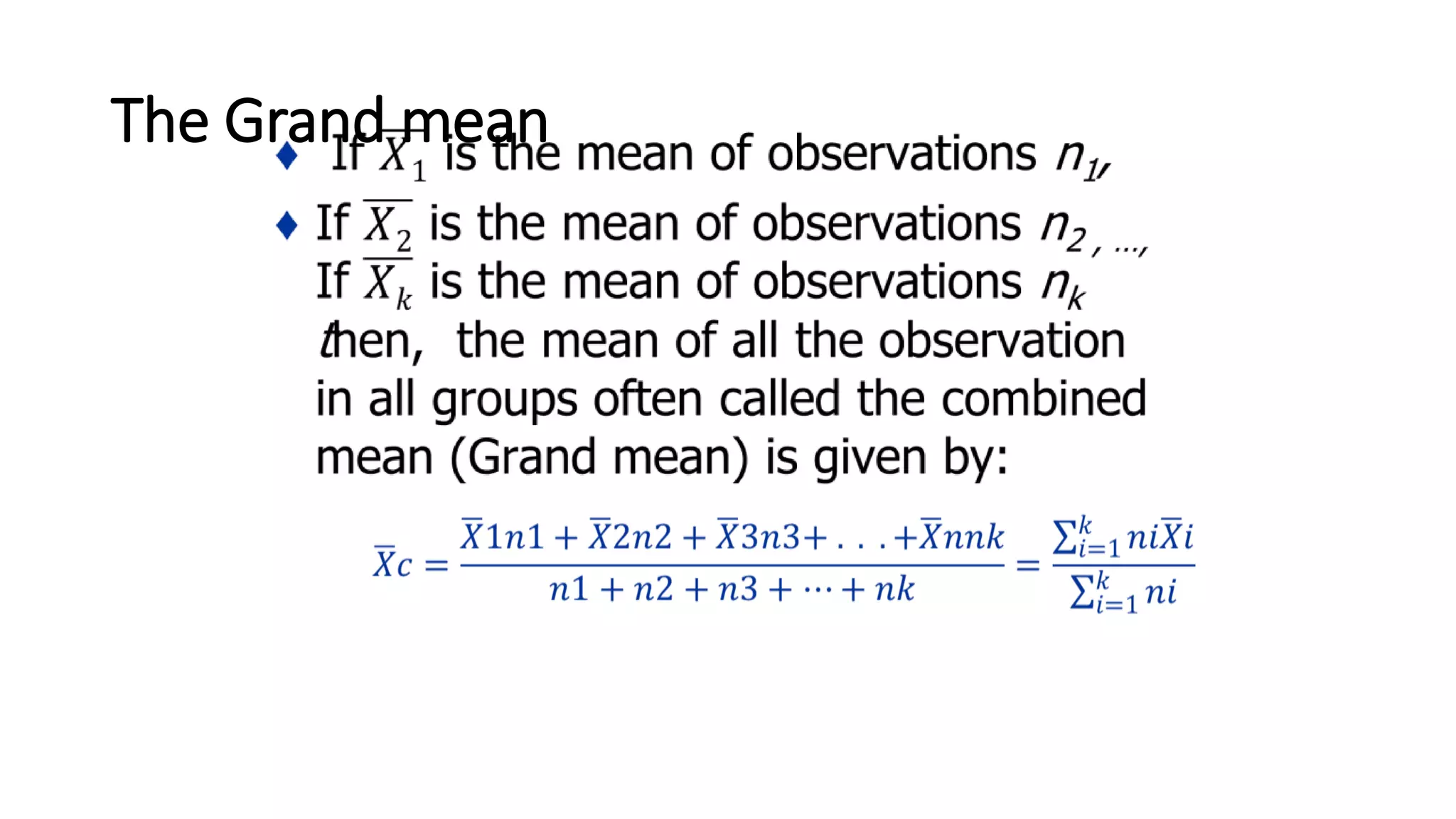
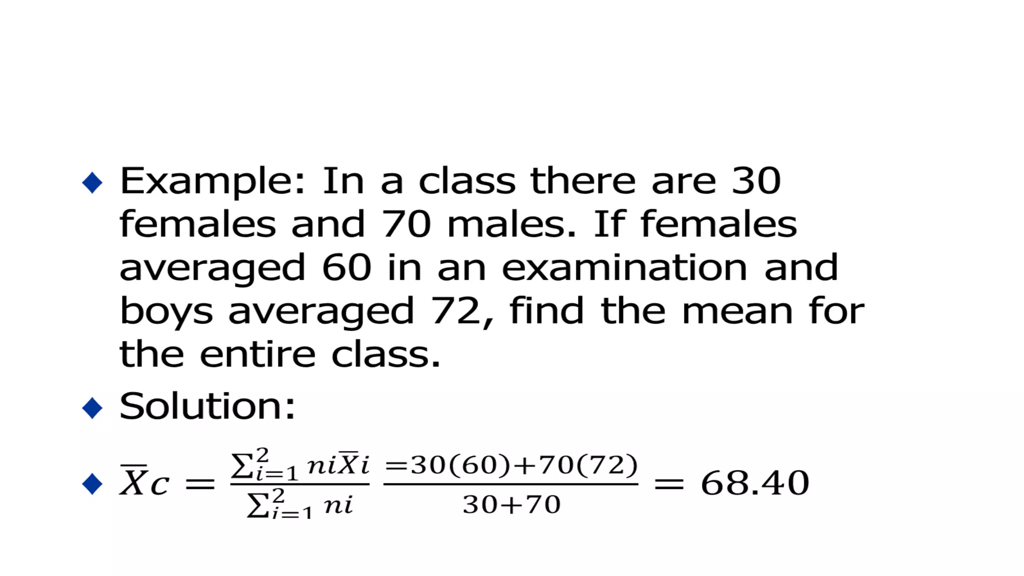
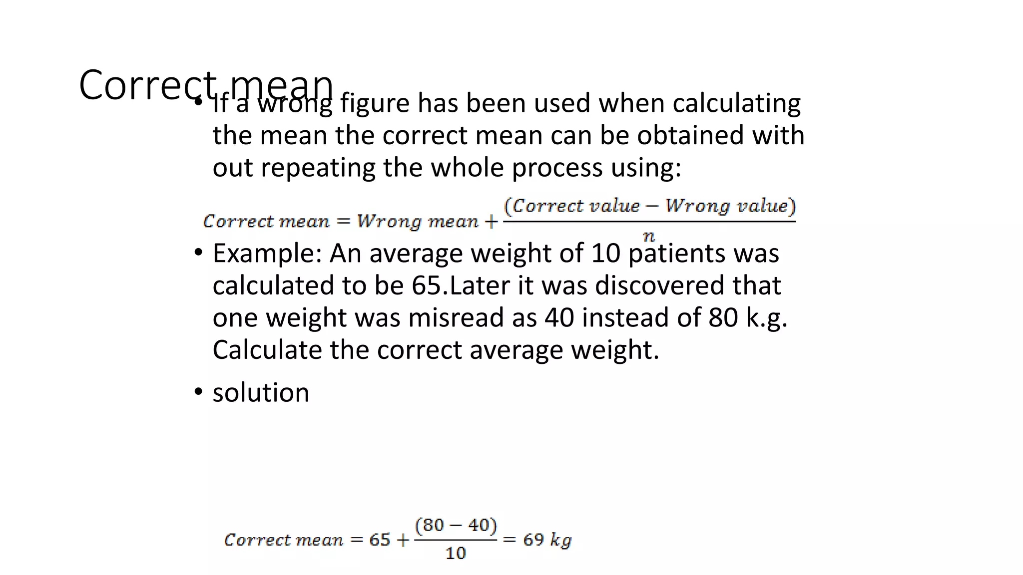
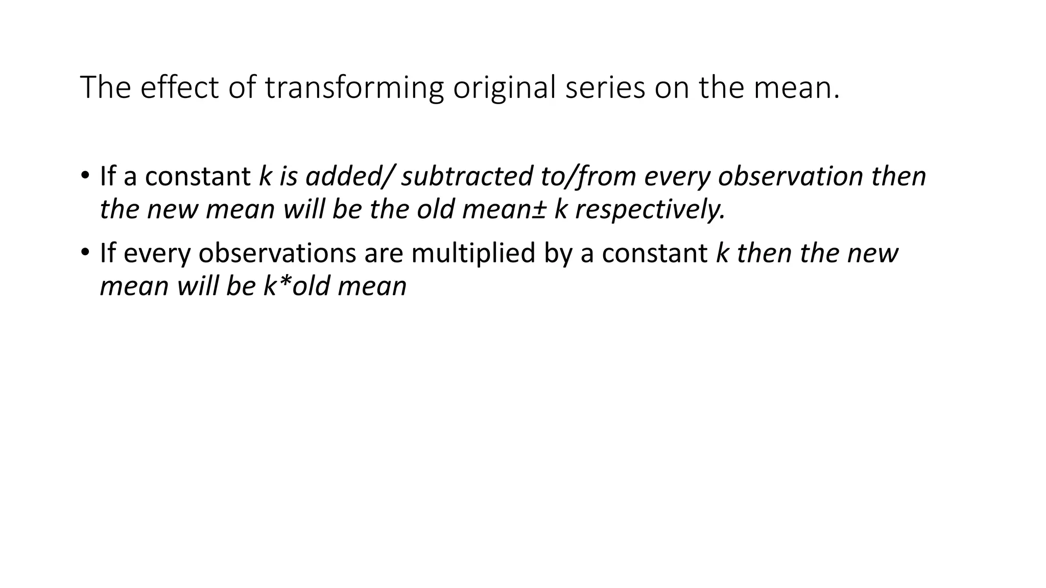
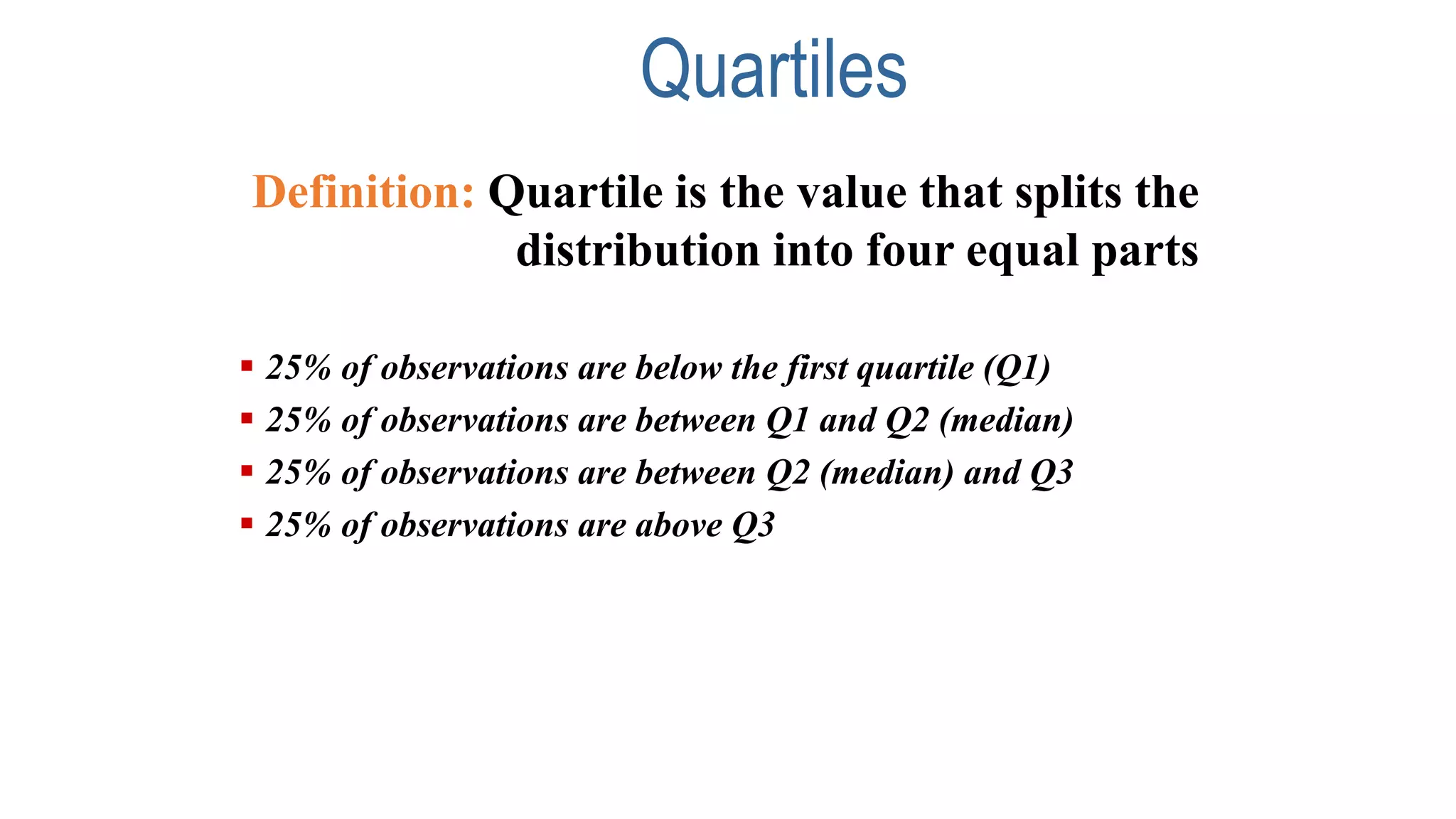
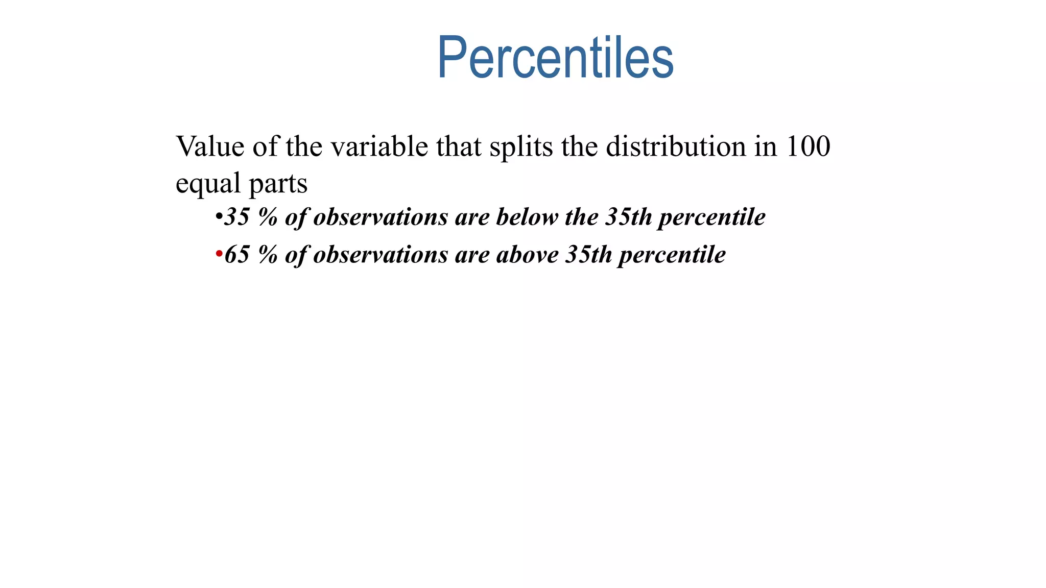
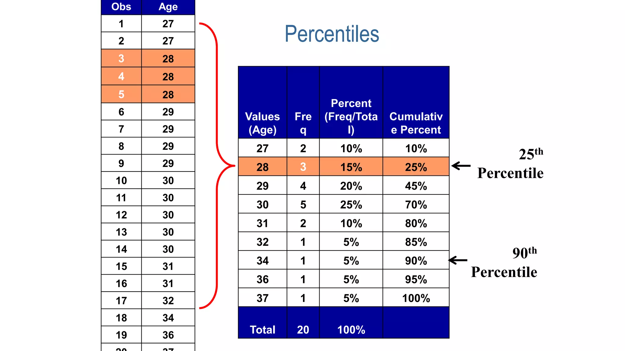
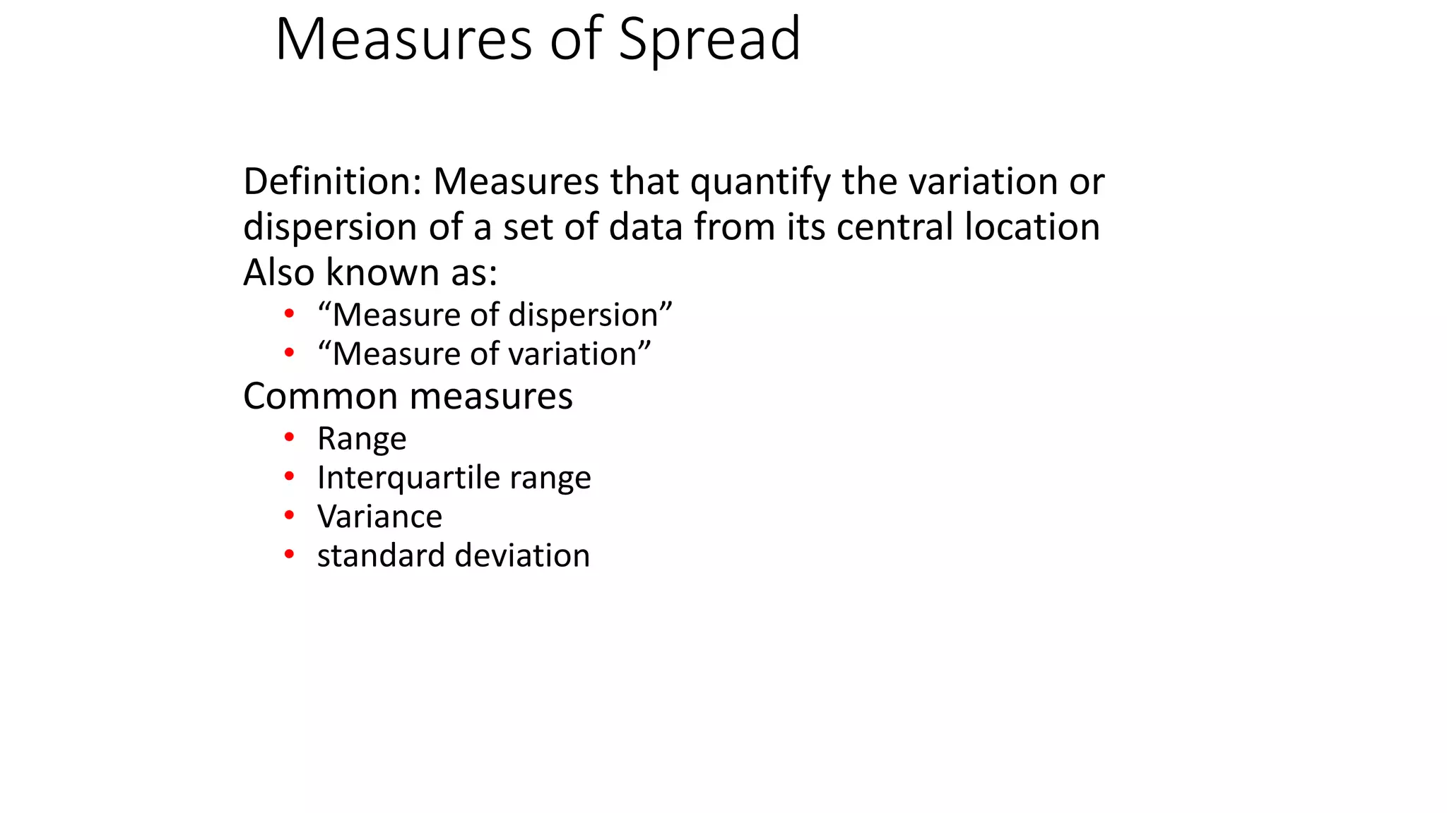
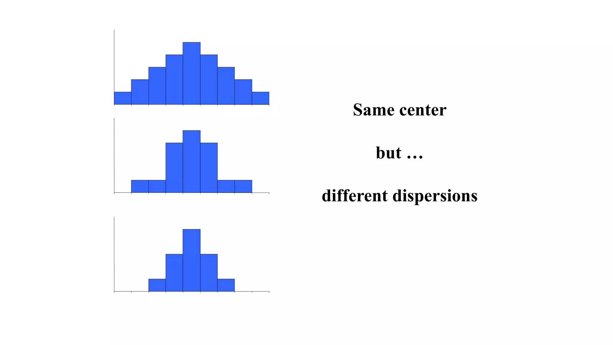
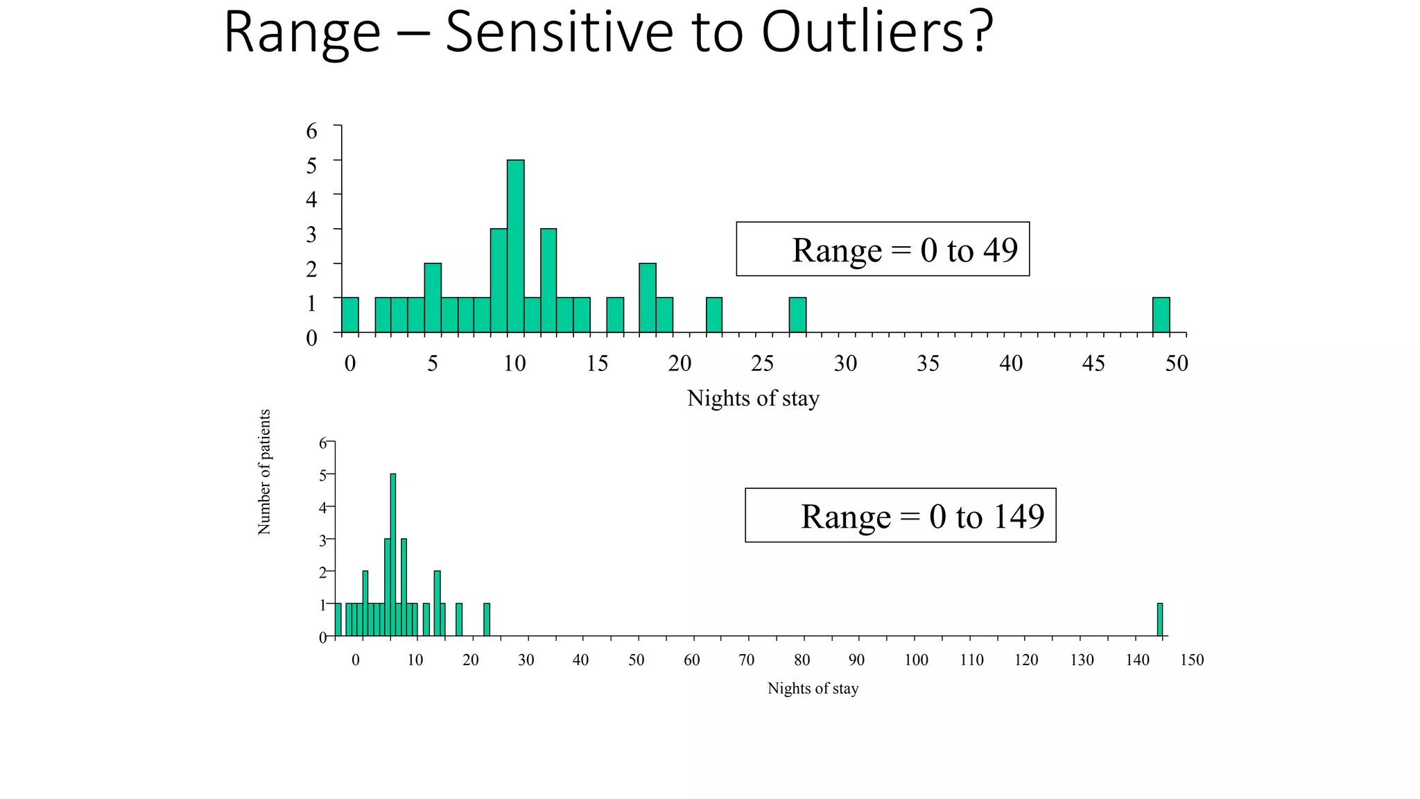
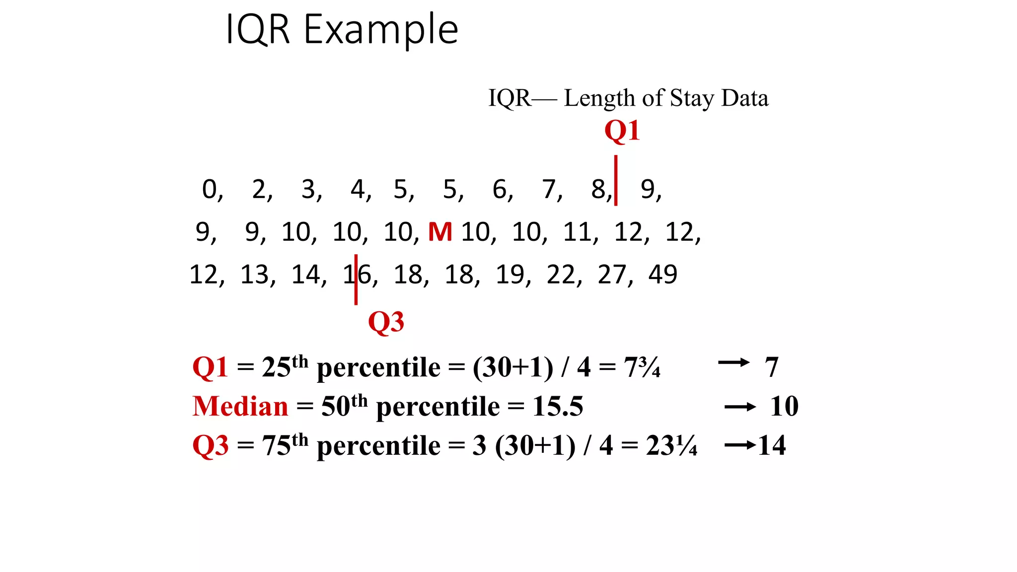
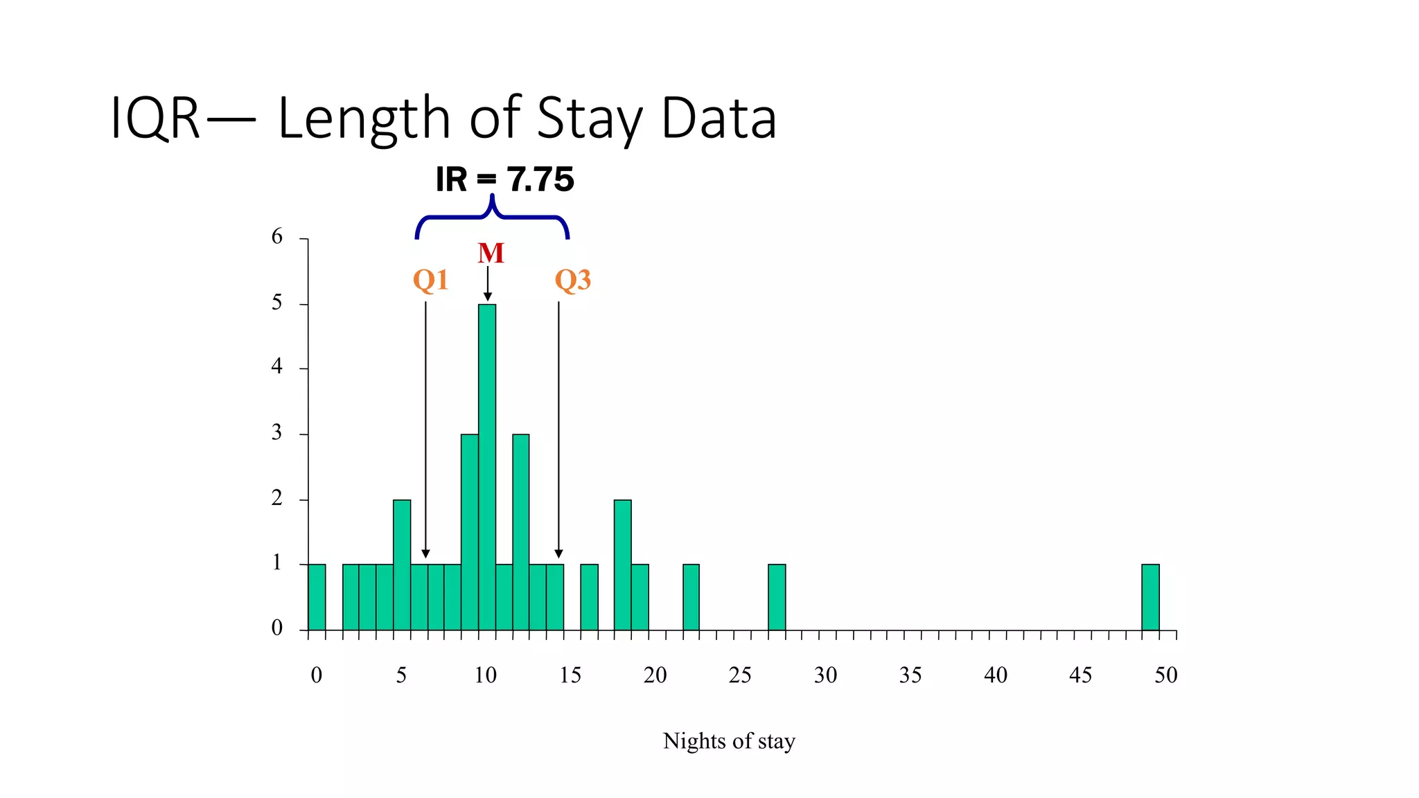
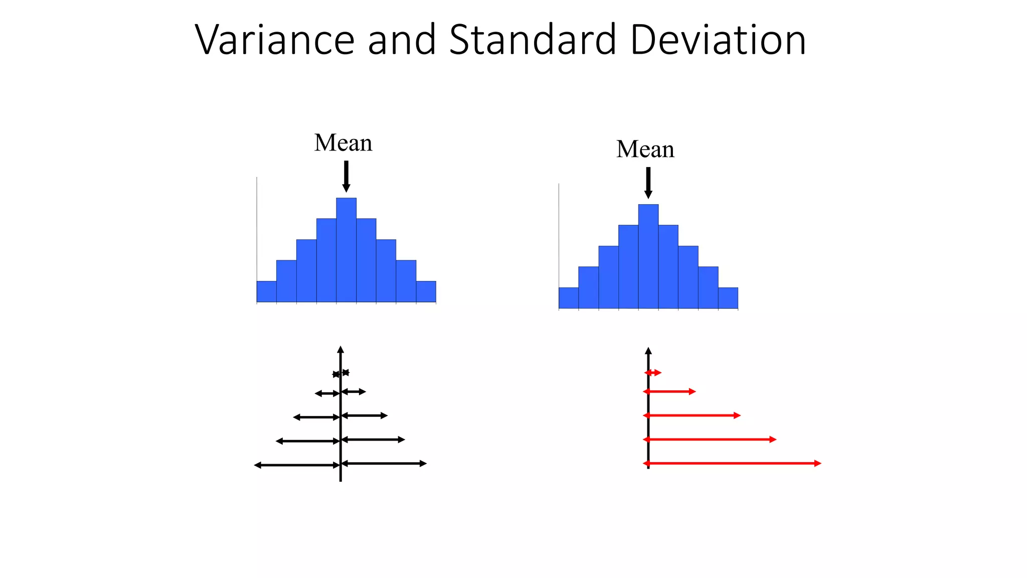
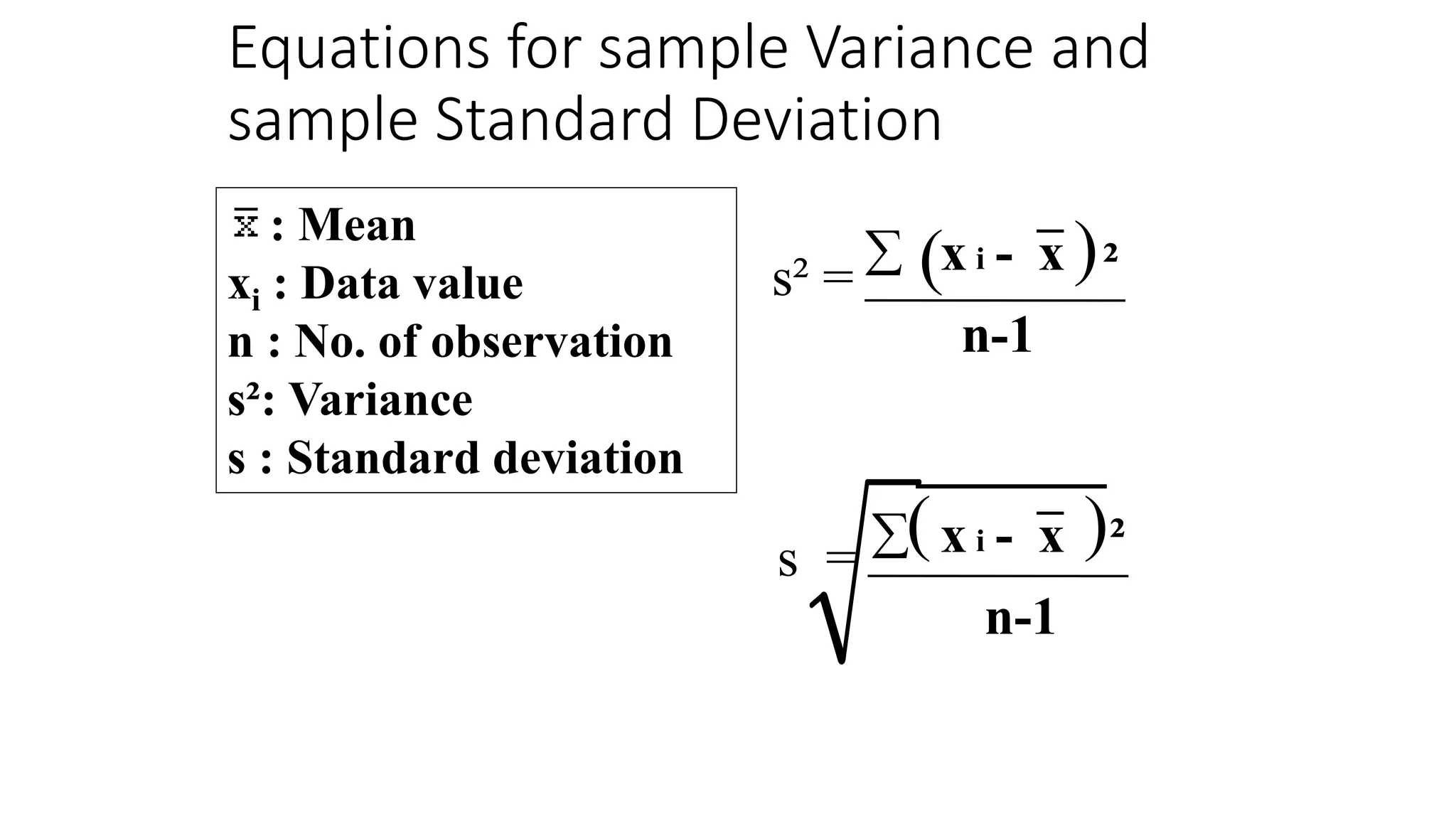
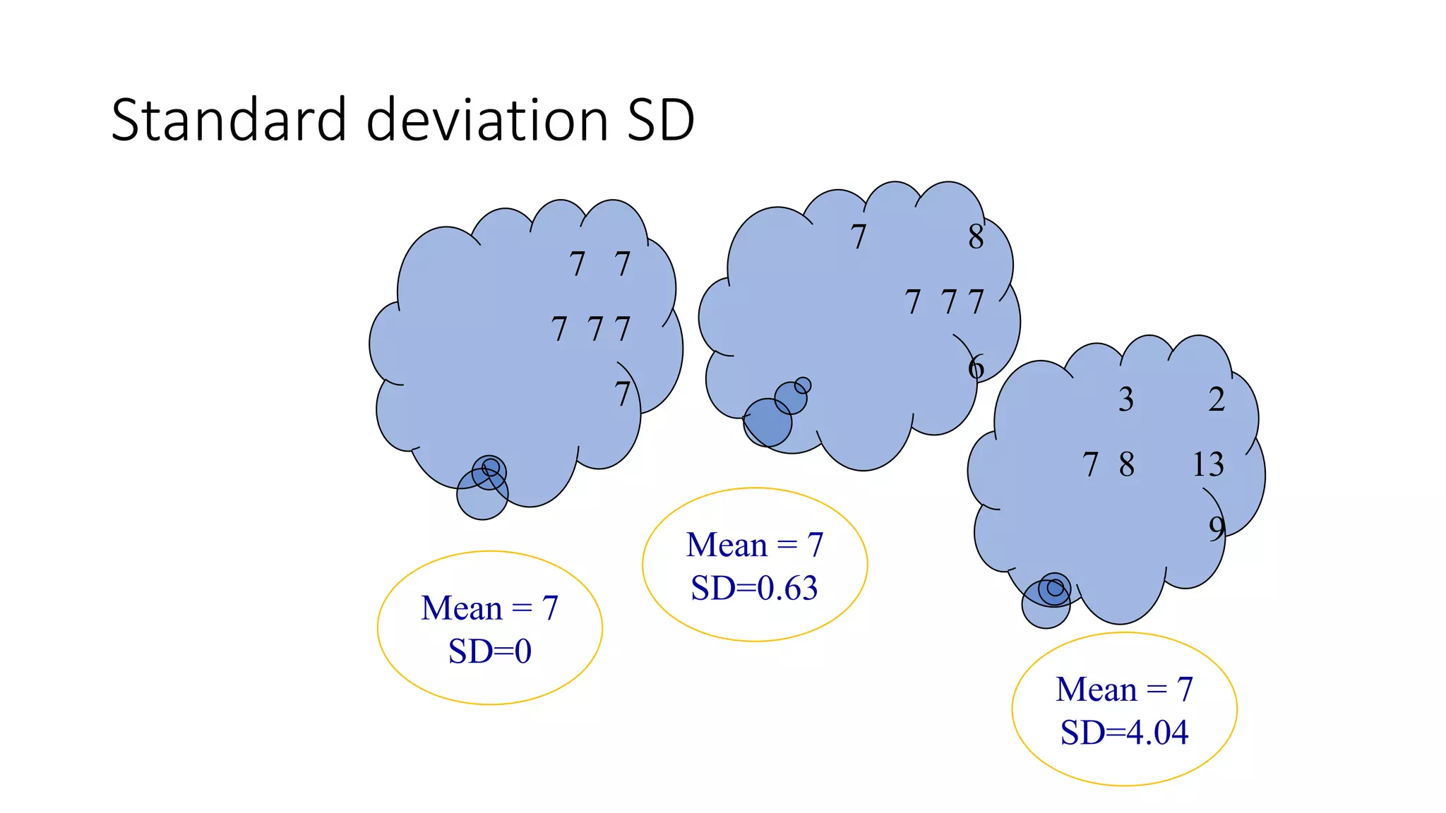
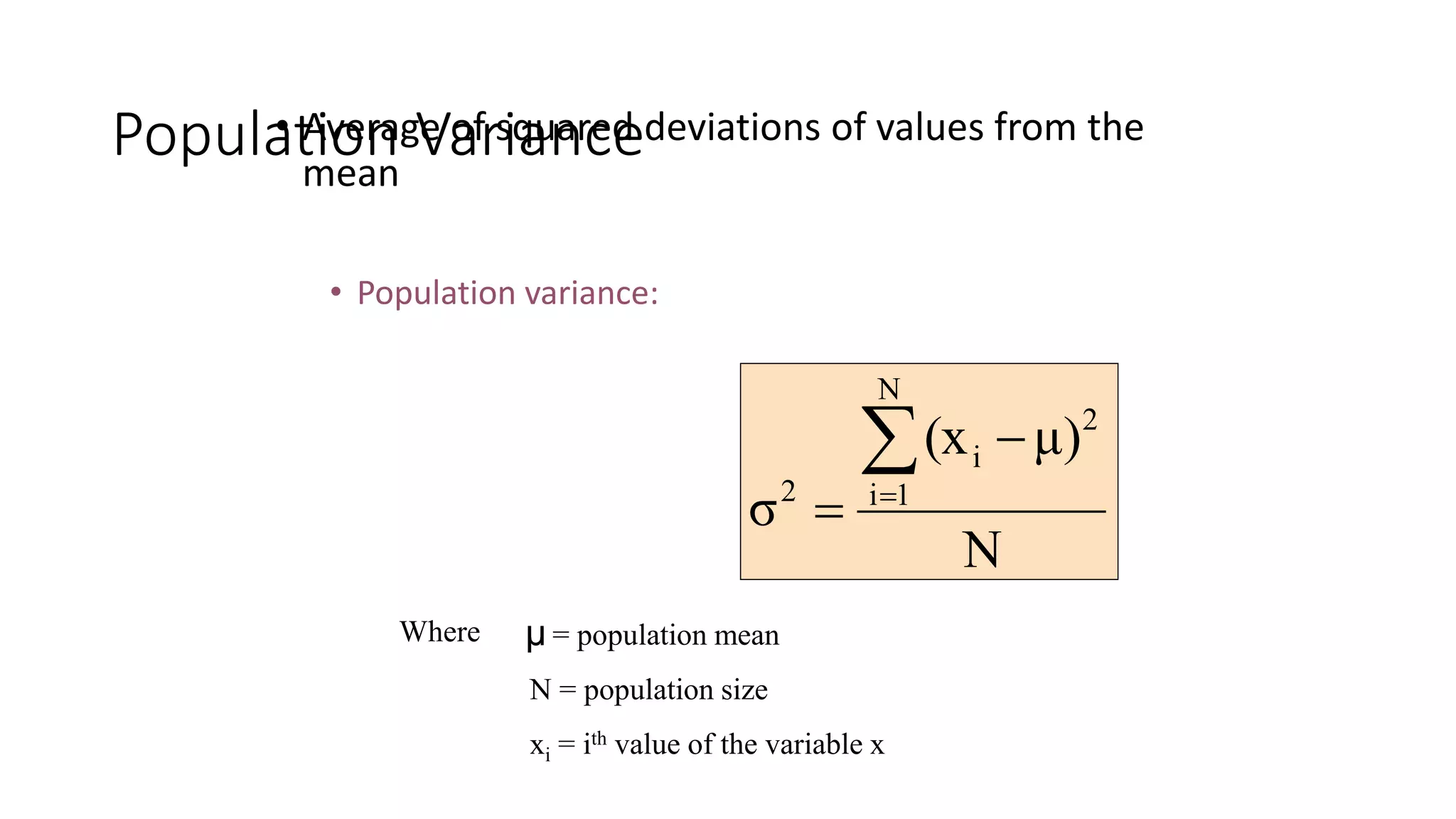
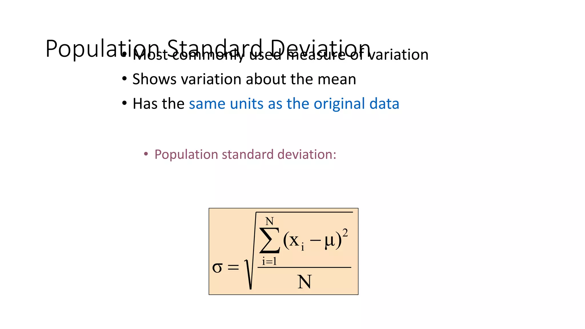
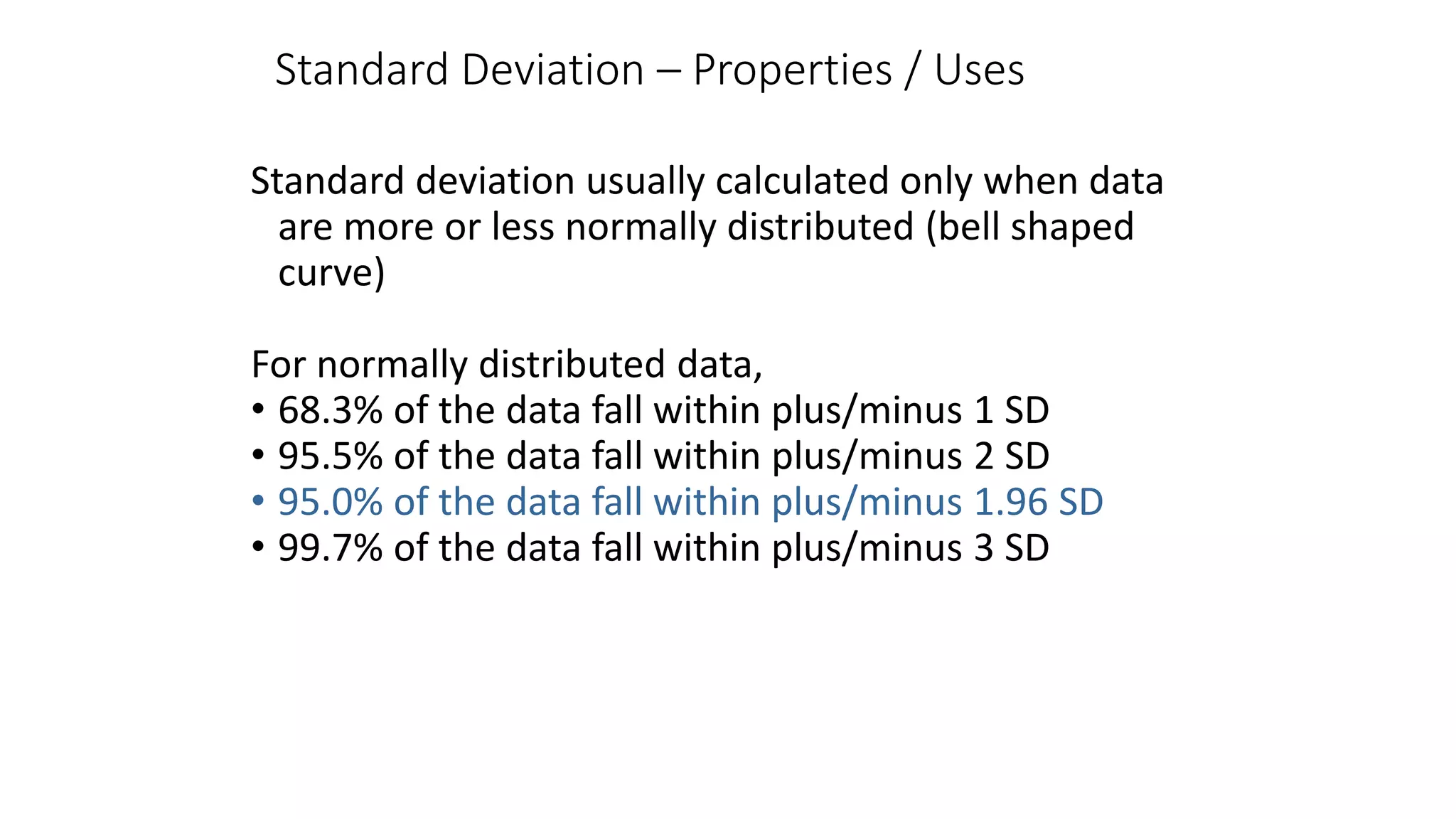
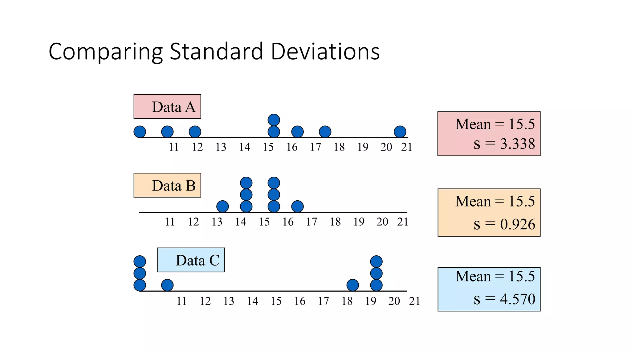
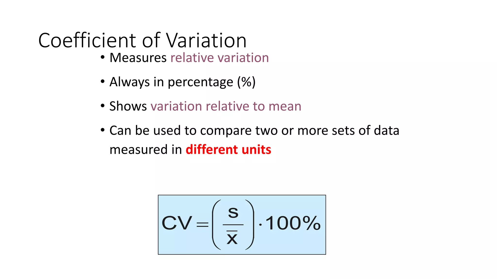
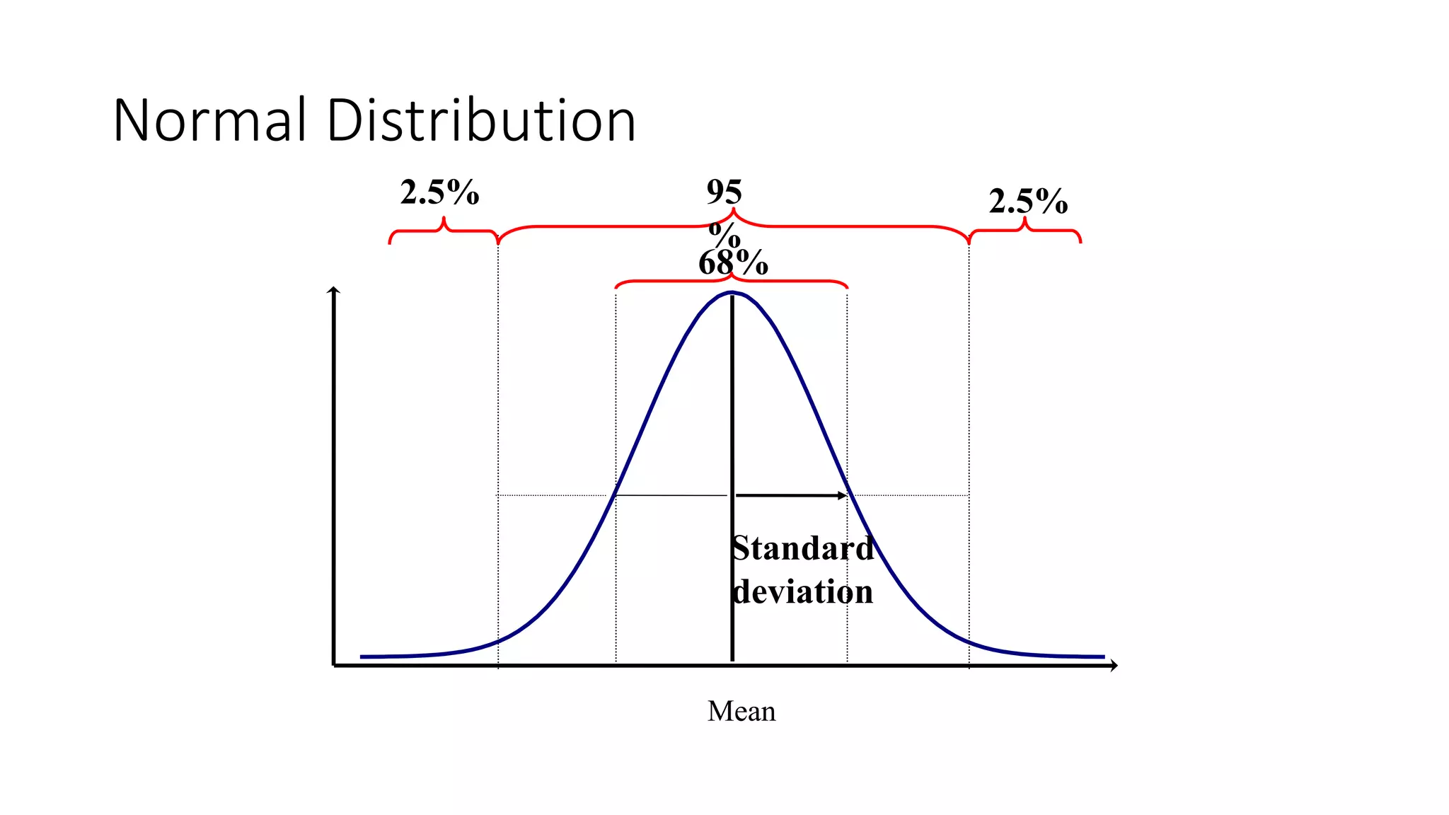
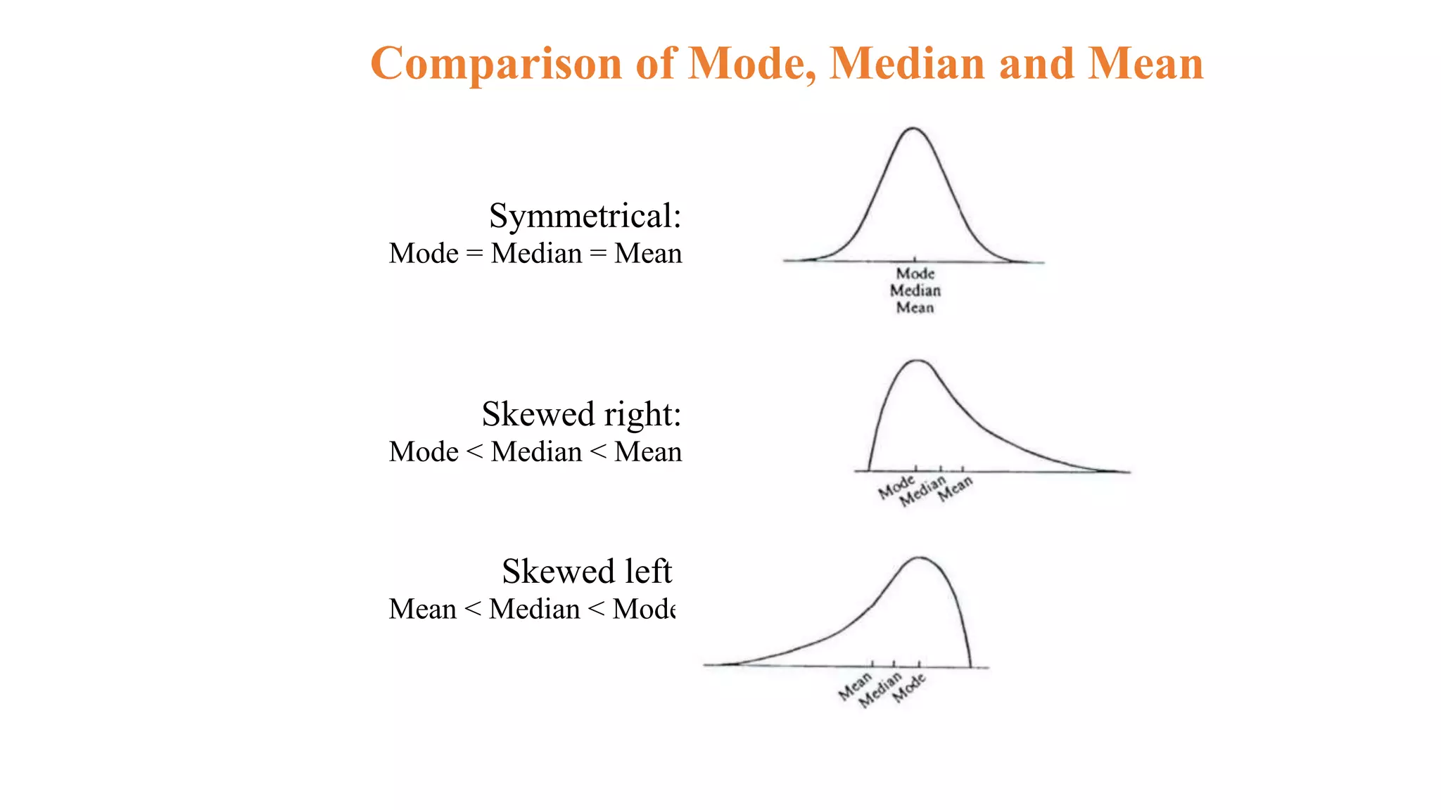
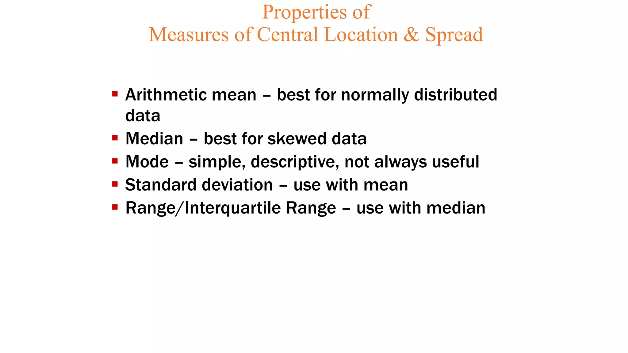
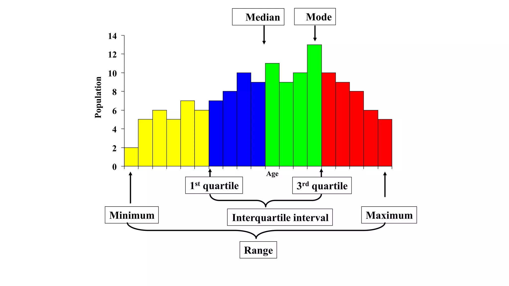
Presenting and summerizing data
Describing variables
• Table of frequency distributions
• Frequency
• Relative frequency
• Cumulative frequencies
• Relative cumulative frequency
• Diagrams and Charts
• Bar charts
• Pie charts
• Pictogram
• Histogram
• Frequency polygon
• Ogive
Table of frequency distributions
Guidelines for constructing tables
• Keep them simple
• All tables should be self-explanatory
• Include clear title telling what, when and where
• Clearly label the rows and columns
• State clearly the unit of measurement used
• Explain codes and abbreviations in the foot-note
• Show totals
• If data is not original, indicate the source in foot-note.
Frequency Distribution: The organization of raw data in table form with classes and
frequencies.
Categorical Frequency distributions
• Simple and effective way of summarizing categorical data
• Done by counting the number of observations falling into each of the categories or levels of the variables.
E.g. birth weight with levels ‘Very low ’, ‘Low’, ‘Normal’ and ‘big’.
• The frequency distribution for newborns is obtained simply by counting the number of newborns in each
birth weight category.
.
Relative Frequency
• It is the proportion or percentages of observations in each category.
• The distribution of proportions is called the relative frequency
distribution of the variable
• Given a total number of observations, the relative frequency distribution
is easily derived from the frequency distribution.
• Conversion in the opposite direction is also possible, but the conversion
is often inaccurate because of rounding
Cumulative frequency
• It is the number of observations in the category plus observations
in all categories smaller or greater than it.
Cumulative relative frequency
• It is the proportion of observations in the category plus
observations in all categories smaller than or greater than it.
• It is obtained by dividing the cumulative frequency by the total
number of observations.
Table 1. Distribution of birth weight of newborns between 1976-
1996 at AA.
BWT Freq. Cum. Freq Rel.Freq(%) Cum.rel.freq.(%)
Very low 43 43 0.4 0.4
Low 793 836 8.0 8.4
Normal 8870 9706 88.9 97.3
Big 268 9974 2.7 100
Total 9974 100
Con…
• Ungrouped frequency Distribution:
It is a table of all the potential raw score values that could possible
occur in the data along with the number of times each actually
occurred. It is often constructed for small set or data on discrete
variable.
• Grouped frequency distribution
When the range of the data is large, the data must be grouped in to
classes
• Grouped Frequency Distribution: A frequency distribution where
several numbers are grouped into one class.
• Select a set of continuous, non-overlapping intervals such that each
value can be placed in one and only one of the intervals.
Example:
Leisure time (hours) per week for 40 college students:
23 24 18 14 20 36 24 26 23 21 16 15 19 20 22 14 13
10 19 27 29 22 37 28 34 32 23 19 21 31 16 28 19 18
12 27 15 21 25 16
• L=37, S=10
• R= 37-10=27
• K = 1 + 3.322 (log40) = 6.32 ≈ 7
• Width = (37-10)/7 =3.9 ≈ 4
Example:
• Let us take the starting point as 10
• the lower class limits will be 10,14,18,22,26,30,34
• The upper class limits are 13,17,21,25,29,33,37
Time
(Hours)
Class
boundary
Mid
point Frequency
Relative
Frequency
Cumulative
Relative
Frequency
10-13
14-17
18-21
22-25
26-29
30-33
34-37
9.5-13.5
13.5-17.5
17.5-21.5
21.5-25.5
25.5-29.5
29.5-33.5
33.5-37.5
11.5
15.5
19.5
23.5
27.5
31.5
35.5
Total 40 1.00
Exercise
• Construct a grouped frequency distribution for the following
data.
11 29 6 33 14 31 22 27 19 20
18 17 22 38 23 21 26 34 39 27
Solution
• Step 1: Find the highest and the lowest value H=39, L=6
• Step 2: Find the range; R=H-L=39-6=33
• Step 3: Select the number of classes’ desired using Sturges formula;
k = 1+ 3.32 log n =1+3.32log (20) =5.32=6(rounding up)
• Step 4: Find the class width; w=R/k=33/6=5.5=6 (rounding up)
• Step 5: Select the starting point, let it be the minimum observation. 6,
12, 18, 24, 30, 36 are the lower class limits.
• Step 6: Find the upper class limit;
e.g. the first upper class=12-U=12-1=11
11, 17, 23, 29, 35, 41 are the upper class limits.
Solution
• So combining step 5 and step 6, one can construct the following
classes.
Class limits
6 – 11
12 – 17
18 – 23
24 – 29
30 – 35
36 – 41
• Step 7: Find the class boundaries;
E.g. for class 1 Lower class boundary=6-U/2=5.5
Upper class boundary =11+U/2=11.5
Then continue adding w on both boundaries to obtain the rest
boundaries. By doing so, one can obtain the following classes.
Solution
Class boundary
5.5 – 11.5
11.5 – 17.5
17.5 – 23.5
23.5 – 29.5
29.5 – 35.5
35.5 – 41.5
• Step 8: tally the data.
• Step 9: Write the numeric values for the tallies in the frequency
column.
• Step 10: Find cumulative frequency.
• Step 11: Find relative frequency or/and relative cumulative frequency.
The complete frequency distribution follows:
Solution
Diagrammatic Representation
Pictorial representations of Statistical data
Importance of diagrammatic and graphic representation
1.Diagrams have greater attraction than mere figures.
2. They give quick overall impression of the data.
3. They have great memorizing value than mere figures.
4. They facilitate comparison
5. Used to understand patterns and trends
Specific types of diagrams include:
• Bar chart
• Pie chart
types of graphs include:
• Histogram
• Frequency polygon
• Cum. Freq. polygon
• Line graph
• Others
Nominal, ordinal,
Quantitative
continuous
data
1. Bar charts
• Categories are listed on the horizontal axis (X-axis)
• Frequencies or relative frequencies are represented on the Y-axis
(ordinate)
• The height of each bar is proportional to the frequency or relative
frequency of observations in that category
• All the bars must have equal width
• The bars are not joined together (leave space between bars)
• The different bars should be separated by equal distances
• All the bars should rest on the same line called the base
• Label both axes clearly
• There are different types of bar graphs.
A. Simple bar chart:
It is a one-dimensional in which the bar represents the whole of
the magnitude.
0
20
40
60
80
100
Not immunized Partially immunized Fully immunized
Immunization status
Number
of
children
Fig. 1. Immunization status of Children in Adami Tulu Woreda, Feb.
1995
Bar charts showing frequency distribution of the
variable ‘BWT’
0
1000
2000
3000
4000
5000
6000
Very low Low Normal Big
BWT
Freq.
0
20
40
60
80
100
Verylow Low Normal Big
BWT
Rel.
Freq.
B. Multiple bar chart :
the component figures are shown as separate bars adjoining each
other. It depicts distributional pattern of more than one variable
0
50
100
150
200
250
300
350
Married Single Divorced Widowed
Marital status
Number
of
women
Immunized Not immunized
Fig. 2 TT Immunization status by marital status of women 15-49 years, Asendabo
town, 1996
Bar charts for comparison
• In order to compare the distribution of a variable for two or more
groups, bars are often drawn along side each other for groups being
compared in a single bar chart
9
88.9
2.1
7.9
89
3.1
0
10
20
30
40
50
60
70
80
90
100
Low Normal Big
BWT
Percent
Yes
No
Bar chart indicating categories of birth weight of 9975 newborns
grouped by antenatal follow-up of the mothers
Bar Chart Example
Hospital Patients by Unit
0
1000
2000
3000
4000
5000
Cardiac
Care
Emergency
Intensive
Care
Maternity
Surgery
Number
of
patients
per
year
Hospital Number
Unit of Patients
Cardiac Care 1,052
Emergency 2,245
Intensive Care 340
Maternity 552
Surgery 4,630
C. Component (sub-divided) bar chart:
Bars are sub-divided into component parts of the figure. These sorts of
graphs are constructed when each total is built up from two or more
component figures.
0
20
40
60
80
100
Married Single Divorced Widow ed
Marital status
Number
of
women
Immunized Not immunized
Fig. 3 TT Immunization status by marital status of women 15-49 years, Asendabo town,
1996
Component bar chart
2. Pie chart
• Shows the relative frequency for each category by dividing a circle
into sectors
• The angles are proportional to the relative frequency.
• Used for a single categorical variable
• Use percentage distributions
Example: Distribution of deaths for females, in England and
Wales, 1989.
Cause of death No. of death
Circulatory system
Neoplasm
Respiratory system
Injury and poisoning
Digestive system
Others
100 000
70 000
30 000
6 000
10 000
20 000
Total 236 000
Distribution fo cause of death for females, in England and Wales, 1989
Circulatory system
42%
Neoplasmas
30%
Respiratory system
13%
Injury and Poisoning
3%
Digestive System
4%
Others
8%
Pictogram
Year 1992 1993 1994 1995
No. of students 2000 3000 5000 7000
1995 
1994  Key: = 1000 patients
1993 
1992 
we represent data by means of some picture symbols. We decide about a
suitable picture to represent a definite number of units in which the variable is
measured.
Example: Draw a pictorial diagram to present the following data (number of
patients in a certain country for four years.)
Let a single picture () represents one thousand patients.
Graphical representation of data
 Histogram
 Frequency polygon
 Ogive (cumulative frequency polygon)
Histograms
• Histograms are frequency distributions with continuous class
interval that have been turned into graphs.
• Given a set of numerical data, we can obtain impression of the
shape of its distribution by constructing a histogram.
• Horizontal axis: Labels of the variable
• Vertical bar: Frequency or the relative frequency
• If this is not the case, the histogram could give a misleading
impression of the shape of the data
Example: Distribution of the age of women at the time of marriage
Age
group
15-19 20-24 25-29 30-34 35-39 40-44 45-49
Number 11 36 28 13 7 3 2
Age of women at the time of marriage
0
5
10
15
20
25
30
35
40
14.5-19.5 19.5-24.5 24.5-29.5 29.5-34.5 34.5-39.5 39.5-44.5 44.5-49.5
Age group
No
of
women
A histogram displaying frequency distribution of birth weight of
newborns at Tikur Anbessa Hospital
Birth weight
5
2
0
0
4
8
0
0
4
4
0
0
4
0
0
0
3
6
0
0
3
2
0
0
2
8
0
0
2
4
0
0
2
0
0
0
1
6
0
0
1
2
0
0
8
0
0
Frequency
2000
1800
1600
1400
1200
1000
800
600
400
200
0
Std. Dev = 502.34
Mean = 3126
N = 9975.00
Frequency polygons
• Instead of drawing bars for each class interval, sometimes a
single point is drawn at the mid point of each class interval and
consecutive points joined by straight line.
• A graph drawn in this way is called frequency polygons (line
graphs).
• Frequency polygons are superior to histograms for comparing
two or more sets of data.
Age of women at the time of marriage
0
5
10
15
20
25
30
35
40
12 17 22 27 32 37 42 47
Age
No
of
women
Frequency polygon of birth weight of 9975 newborns for males and
females
Birth Weight
5000
4500
4000
3500
3000
2500
2000
1500
1000
500
%
50
40
30
20
10
0
SEX
Males
Females
Cumulative frequency polygons (ogive)
• Some times it may be necessary to know the number of items whose
vale are more or less than a certain amount.
• For example we may be interested in knowing the number of
patients whose weight is less than 50kg or more than say 60kg.
• To get this information it is necessary to change the form of
frequency distribution from simple to cumulative distribution.
• Horizontal axis: Labels of the variable
• Vertical bar: cumulative relative frequency.
• The points are then connected by straight lines.
• Like frequency polygons, cumulative frequency polygons may be
used to comparing sets of data.
• Cumulative frequency polygons can also be used to obtain
Table 1. Frequencies of serum cholesterol levels for 1067 US
males of ages 25-34 1976-1980
------------------------------------------------------------------------------------
Cholesterol level
Mg/100ml freq Relative freq Cum freqCum.rel. freq
----------------------------------------------------------------------------------------
80-119 13 1.2 13 1.2
120-159 150 14.1 163 15.3
160-199 442 41.4 605 56.7
200-239 299 28.0 904 84.7
240-279 115 10.8 1019 95.5
280-319 34 3.2 1053 98.7
320-359 9 0.8 1062 99.5
360-399 5 0.5 1067 100
----------------------------------------------------------------------------------------
Total 1067 100
Table 2. Frequencies of serum cholesterol levels for 1227 US
males of ages 55-64 1976-1980
-------------------------------------------------------------------------------------------
Cholesterol level
Mg/100ml freq Relative freq Cum freq Cum.rel. freq
-------------------------------------------------------------------------------------------
80-119 5 0.4 5 0.4
120-159 48 3.9 53 4.3
160-199 265 21.6 318 25.9
200-239 458 37.3 776 63.2
240-279 281 22.9 1057 86.1
280-319 128 10.4 1185 96.5
320-359 35 2.9 1220 99.4
360-399 7 0.5 1227 100
-------------------------------------------------------------------------------------------
Total 1227 100
Frequency polygon and Cumulative frequency polygons of serum cholesterol
levels for 2294 males aged 25-34 and55-64 years, 1976-1980
0
10
20
30
40
50
60
70
80
90
100
80-119 120-159 160-199 200-239 240-279 280-319 320-359 360-399
Serum cholesterol levels (mg/100ml)
Cumulative
relative
frequency
(%)
Ages 25-34
Ages 55-64
0
5
1
0
1
5
20
25
30
35
40
45
80-1
1
9 1
20-1
59 1
60-1
99 200-239 240-279 280-31
9 320-359 360-399
Serum cholesterol levels (mg/100ml)
Relative
frequency
(%)
Ages 25-34
Ages 55-64
Box Plots
• A visual picture called box plot can be used to convey a fair
amount of information about certain location in the distribution
of a set of data.
• The box shows the distance between the first and the third
quartiles,
• The median is marked as a line within the box and
• The end lines show the minimum and maximum values
respectively
Illustration of Box-plot
Numbers
36
34
32
30
28
26
24
22
20
18
A box-plot indicating birth weight of 5092 newborns by gestational age at Tikur
Anbessa Hospital studied
Gest. age
Pre
Term
Post
Birth weight(grams)
5000
4500
4000
3500
3000
2500
2000
1500
1000
500
Line graph
• Useful for assessing the trend of particular situation overtime.
• Helps for monitoring the trend of epidemics.
• The time, in weeks, months or years, is marked along the
horizontal axis, and
• Values of the quantity being studied is marked on the vertical axis.
• Values for each category are connected by continuous line.
• Sometimes two or more graphs are drawn on the same graph
taking the same scale so that the plotted graphs are comparable.
Example: Malaria Parasite Prevalence Rates in Ethiopia, 1967 –
1979 Eth. C.
0.0
0.5
1.0
1.5
2.0
2.5
3.0
3.5
4.0
4.5
5.0
5.5
1967 1969 1971 1973 1975 1977 1979
Year
Rate
(%)
Fig 5: Malaria Parasite Prevalence Rates in Ethiopia, 1967 – 1979 Eth. C.
Describing Quantitative
Variables
•Measures of Central Location
•Mean, Median, Mode
•Measures of Spread
•Range, IQR, Variance, Standard deviation
Measure of Central Location
 Central Location / Position / Tendency –
 A single value that represents (is a good summary of) an
entire distribution of data
 Also known as:
• “Measure of central tendency”
• “Measure of central position”
 Common measures
• Arithmetic mean
• Median
• Mode
0
5
10
15
20
0-9 10-19 20-29 30-39 40-49 50-59 60-69 70-79 80-89 90-99
Central Location
Spread
Number
of
people
Age
? ?
Age
27
30
28
31
28
36
29
37
29
34
30
30
27
30
28
31
32
30
29
29
Raw data set:
Ages of students in a class (years)
O
bs Age
1 27
2 27
3 28
4 28
5 28
6 29
7 29
8 29
9 29
10 30
11 30
12 30
13 30
14 30
15 31
16 31
17 32
18 34
19 36
20 37
Add observation numbers
Order the data set from the lowest
value to the highest value
Method for identification
1. Arrange data into frequency distribution or
histogram, showing the values of the variable and
the frequency with which each value occurs
2. Identify the value that occurs most often
Definition: Mode is the value that occurs most frequently
Mode
Age Frequency
27 2
28 3
29 4
30 5
31 2
32 1
33 0
34 1
35 0
36 1
37 1
Total 20
Mode
Mode
Ob
s Age
1 27
2 27
3 28
4 28
5 28
6 29
7 29
8 29
9 29
10 30
11 30
12 30
13 30
14 30
15 31
16 31
17 32
18 34
19 36
20 37
Ob
s Age
1 27
2 27
3 28
4 28
5 28
6 29
7 29
8 29
9 29
10 30
11 30
12 30
13 30
14 30
15 31
The most frequent value of the variable
7
6
5
4
3
2
1
27
2
8 29 30 31 32 33 34 35 36 37
Mode = 30
Age (years)
Frequency
Mode
Example
0, 2, 3, 4, 5, 5, 6, 7, 8, 9,
9, 9, 10, 10, 10, 10, 10, 11, 12, 12,
12, 13, 14, 16, 18, 18, 19, 22, 27, 49
Finding Mode from Length of Stay Data
Population
0
2
4
6
8
10
12
14
16
18 Bimodal Distribution
Unimodal Distribution
0
2
4
6
8
10
12
14
16
18
20
Population
Mode = 10
Finding Mode from Histogram
0
1
2
3
4
5
6
0 5 10 15 20 25 30 35 40 45 50
Nights of stay
Number
of
patients
Mode – Properties / Uses
• Easiest measure to understand, explain, identify
• Always equals an original value
• Insensitive to extreme values (outliers)
• Good descriptive measure, but poor statistical
properties
• May be more than one mode
• May be no mode
• Does not use all the data
Outliers
0
1
2
3
4
5
6
0 10 20 30 40 50 60 70 80 90 100 110 120 130 140 150
Nights of stay
Number
of
patients
0
1
2
3
4
5
6
0 5 10 15 20 25 30 35 40 45 50
Nights of stay
Number
of
patients
Mode for Grouped data
Example
Age 5- 15 15- 25 25- 35 35- 45 45- 55 55- 65 65- 75
Frequenc 8 12 17 29 31 5 3
Calculate the mode of the distribution.
Median
Definition: Median is the middle value; also, the value
that splits the distribution into two equal parts
• 50% of observations are below the median
• 50% of observations are above the median
Method for identification
1. Arrange observations in order
2. Find middle position as (n + 1) / 2 or (n/2)
3. Identify the value at the middle
Median
Observation
Median:
Odd Number of Values
N = 19
N+1
2
=
19+1
2
=
20
2
=
10
=
Median age = 30 years
Obs Age
1 27
2 27
3 28
4 28
5 28
6 29
7 29
8 29
9 29
10 30
11 30
12 30
13 30
14 30
15 31
16 31
17 32
18 34
19 36
N = 20
Obs Age
1 27
2 27
3 28
4 28
5 28
6 29
7 29
8 29
9 29
10 30
11 30
12 30
13 30
14 30
15 31
16 31
17 32
18 34
19 36
20 37
Median
Observation
N+1
2
=
20+1
2
=
21
2
=
10.5
=
Median age = Average value between
10th and 11th observation
Median:
Even Number of Values
30+30
2
30 years
=
Examples
0, 2, 3, 4, 5, 5, 6, 7, 8, 9,
9, 9, 10, 10, 10, 10, 10, 11, 12, 12,
12, 13, 14, 16, 18, 18, 19, 22, 27, 49
Find Median of Length of Stay Data;
Median at 50%
= 10
Median for grouped data
Example
Class
interval
40-44 45-49 50-54 55-59 60-64 65-69 70-74
Frequency 7 10 22 15 12 6 3
Class
interval
40-44 45-49 50-54 55-59 60-64 65-69 70-74
Frequenc 7 10 22 15 12 6 3
CF 7 17 39 54 66 72 75
Find the median of the following age distribution.
Solutions:
• First find the less than cumulative frequency.
• Identify the median class by dividing n by 2.
• Find median using the formula.
Cont…
Median – Properties / Uses
• Does not use all the data available
• Insensitive to extreme values (outliers)
• Good descriptive measure but poor statistical properties
• Measure of choice for skewed data
• Equals an original value of n is odd
Arithmetic Mean
Method for identification
1. Sum up all of the values
2. Divide the sum by the number of observations (n)
Arithmetic mean = “average” value
Arithmetic Mean
Obs Age
1 27
2 27
3 28
4 28
5 28
6 29
7 29
8 29
9 29
10 30
11 30
12 30
13 30
14 30
15 31
16 31
17 32
18 34
19 36
N = 20
Sxi = 605
30.25
20
605
m =
=
N
x
m
i

=
Example
0, 2, 3, 4, 5, 5, 6, 7, 8, 9,
9, 9, 10, 10, 10, 10, 10, 11, 12, 12,
12, 13, 14, 16, 18, 18, 19, 22, 27, 49
Sum = 360
n = 30
Mean = 360 / 30 = ?
Finding the Mean — Length of Stay Data
Arithmetic Mean – Properties
• Probably best known measure of central location
• Use all of the data
• Affected by extreme values (outliers)
• Best for normally distributed data
• Not usually equal to one of the original values
• Good statistical properties
0
1
2
3
4
5
6
0 5 10 15 20 25 30 35 40 45 50
Nights of stay
Mean = 12.0
Mean = 15.3
Sensitive to Outliers
0
1
2
3
4
5
6
0 10 20 30 40 50 60 70 80 90 100 110 120 130 140 150
Nights of stay
Number
of
patients
 Centered distribution
 Approximately symmetrical
 Few extreme values (outliers)
OK!
When to use the arithmetic mean?
Arithmetic Mean for Grouped Frequency Distribution


=
=
=






= k
i
i
k
i
i
i
k
k
k
f
x
f
f
f
f
x
f
x
f
x
f
x
1
1
2
1
2
2
1
1
.
.
.
.
.
.
If data are given in the form of continuous frequency distribution,
the sample mean can be computed as
Arithmetic Mean for Grouped Frequency Distribution


=
=
=






= k
i
i
k
i
i
i
k
k
k
f
x
f
f
f
f
x
f
x
f
x
f
x
1
1
2
1
2
2
1
1
.
.
.
.
.
.
Class limit Class Mark Frequency
6 – 11 8.5 2
12 – 17 14.5 2
18 – 23 20.5 7
24 – 29 26.5 4
30 – 35 32.5 3
36 – 41 38.5 2
Example 1: calculate the mean (AM) for the following sample data.
The weighted mean
Example:
Course
Math 101 4 A=4
Bio 101 3 C=2
Stat 101 3 B=3
Phys 101 4 B=3
Flen 101 3 C=2
The GPA or CGPA of a student is a good example of a weighted arithmetic mean.
Suppose that a student obtained the following grades in the first semester
of the freshman program at Addis Ababa University in 2009.
Find the GPA of a student.
The Grand mean
Correct mean
• If a wrong figure has been used when calculating
the mean the correct mean can be obtained with
out repeating the whole process using:
• Example: An average weight of 10 patients was
calculated to be 65.Later it was discovered that
one weight was misread as 40 instead of 80 k.g.
Calculate the correct average weight.
• solution
The effect of transforming original series on the mean.
• If a constant k is added/ subtracted to/from every observation then
the new mean will be the old mean± k respectively.
• If every observations are multiplied by a constant k then the new
mean will be k*old mean
Quartiles
Definition: Quartile is the value that splits the
distribution into four equal parts
 25% of observations are below the first quartile (Q1)
 25% of observations are between Q1 and Q2 (median)
 25% of observations are between Q2 (median) and Q3
 25% of observations are above Q3
Quartiles
Obs Age
1 27
2 27
3 28
4 28
5 28
6 29
7 29
8 29
9 29
10 30
11 30
12 30
13 30
14 30
15 31
16 31
17 32
18 34
19 36
Q2 age = 30
Q2
Q1
Q3
= 5.25
N+1
4
Q1 observation = round
20+1
4
=
~ 5th obs
Q1 age = 28
= 15.75
3(N+1)
4
Q3 observation = round
3(20+1)
4
=
~ 16th obs
Q3 age = 31
21
4
=
3(21)
4
=
Q2 observation = 10.5 (median)
Percentiles
Value of the variable that splits the distribution in 100
equal parts
•35 % of observations are below the 35th percentile
•65 % of observations are above 35th percentile
Obs Age
1 27
2 27
3 28
4 28
5 28
6 29
7 29
8 29
9 29
10 30
11 30
12 30
13 30
14 30
15 31
16 31
17 32
18 34
19 36
Values
(Age)
Fre
q
Percent
(Freq/Tota
l)
Cumulativ
e Percent
27 2 10% 10%
28 3 15% 25%
29 4 20% 45%
30 5 25% 70%
31 2 10% 80%
32 1 5% 85%
34 1 5% 90%
36 1 5% 95%
37 1 5% 100%
Total 20 100%
25th
Percentile
90th
Percentile
Percentiles
Summary
 Measure of Central Location – single measure that
represents an entire distribution
 Mode – most common value
 Median – central value
 Arithmetic mean – average value
 Mean uses all data, so sensitive to outliers
 Mean has best statistical properties
 Mean preferred for normally distributed data
 Median preferred for skewed data
 Geometric mean for dilutional titer
Measures of Spread
Definition: Measures that quantify the variation or
dispersion of a set of data from its central location
Also known as:
• “Measure of dispersion”
• “Measure of variation”
Common measures
• Range
• Interquartile range
• Variance
• standard deviation
Same center
but …
different dispersions
Range
Definition: difference between largest and smallest
values
Example: Finding the Range of Length of Stay Data
0, 2, 3, 4, 5, 5, 6, 7, 8, 9,
9, 9, 10, 10, 10, 10, 10, 11, 12, 12,
12, 13, 14, 16, 18, 18, 19, 22, 27, 49
0
1
2
3
4
5
6
0 10 20 30 40 50 60 70 80 90 100 110 120 130 140 150
Nights of stay
Number
of
patients Range = 0 to 49
Range = 0 to 149
Range – Sensitive to Outliers?
0
1
2
3
4
5
6
0 5 10 15 20 25 30 35 40 45 50
Nights of stay
• Ignores the way in which data are distributed
• Sensitive to outliers
7 8 9 10 11 12
Range = 12 - 7 = 5
7 8 9 10 11 12
Range = 12 - 7 = 5
Disadvantages of the Range
1,1,1,1,1,1,1,1,1,1,1,2,2,2,2,2,2,2,2,3,3,3,3,4,5
1,1,1,1,1,1,1,1,1,1,1,2,2,2,2,2,2,2,2,3,3,3,3,4,120
Range = 5 - 1 = 4
Range = 120 - 1 = 119
IQR Example
0, 2, 3, 4, 5, 5, 6, 7, 8, 9,
9, 9, 10, 10, 10, M 10, 10, 11, 12, 12,
12, 13, 14, 16, 18, 18, 19, 22, 27, 49
Q3
Q1
Q1 = 25th percentile = (30+1) / 4 = 7¾ 7
Median = 50th percentile = 15.5 10
Q3 = 75th percentile = 3 (30+1) / 4 = 23¼ 14
IQR— Length of Stay Data
0
1
2
3
4
5
6
0 5 10 15 20 25 30 35 40 45 50
Nights of stay
Q1
M
Q3
IR = 7.75
Sample Variance and sample
Standard Deviation
• Definition: measures of variation that quantifies how closely
clustered the observed values are to the mean
• Sample Variance =average of squared deviations from mean
= Sum (x – mean)2 / n-1
• Sample Standard deviation= square root of variance
Mean Mean
Variance and Standard Deviation
: Mean
xi : Data value
n : No. of observation
s²: Variance
s : Standard deviation
s² =
s =
( )
n-1
²

( )
n-1
²
 - x
x i
- x
x i
Equations for sample Variance and
sample Standard Deviation
Standard deviation SD
7 7
7 7 7
7
7 8
7 7 7
6
3 2
7 8 13
9
Mean = 7
SD=0
Mean = 7
SD=0.63
Mean = 7
SD=4.04
• Average of squared deviations of values from the
mean
• Population variance:
Population Variance
N
μ)
(x
σ
N
1
i
2
i
2

=

=
Where = population mean
N = population size
xi = ith value of the variable x
μ
Population Standard Deviation
• Most commonly used measure of variation
• Shows variation about the mean
• Has the same units as the original data
• Population standard deviation:
N
μ)
(x
σ
N
1
i
2
i

=

=
Standard Deviation – Properties / Uses
Standard deviation usually calculated only when data
are more or less normally distributed (bell shaped
curve)
For normally distributed data,
• 68.3% of the data fall within plus/minus 1 SD
• 95.5% of the data fall within plus/minus 2 SD
• 95.0% of the data fall within plus/minus 1.96 SD
• 99.7% of the data fall within plus/minus 3 SD
Calculation Example:
Sample Standard Deviation
Sample
Data (xi) : 10 12 14 15 17 18 18 24
n = 8 Mean = x = 16
4.2426
7
126
1
8
16)
(24
16)
(14
16)
(12
16)
(10
1
n
)
x
(24
)
x
(14
)
x
(12
)
X
(10
s
2
2
2
2
2
2
2
2
=
=









=









=


A measure of the “average”
scatter around the mean
Measuring variation
Small standard deviation
Large standard deviation
Comparing Standard Deviations
Mean = 15.5
s = 3.338
11 12 13 14 15 16 17 18 19 20 21
11 12 13 14 15 16 17 18 19 20 21
Data B
Data A
Mean = 15.5
s = 0.926
11 12 13 14 15 16 17 18 19 20 21
Mean = 15.5
s = 4.570
Data C
Advantages of Variance and Standard Deviation
• Each value in the data set is used in the
calculation
• Values far from the mean are given extra weight
(because deviations from the mean are squared)
Exercise
• A testing lab wishes to test two experimental brands of outdoor
paint to see how long each will last before fading. The testing lab
makes 6 gallons of each paint to test. Since different chemical
agents are added to each group and only six cans are involved,
these two groups constitute two small populations. The results
(in months) are shown.
• Brand A 4 6 5 3
• Brand B 5 4 3 8
• Compute the following statistics
a) Range for brand A
b) Variance and standard deviation for brand B
Coefficient of Variation
• Measures relative variation
• Always in percentage (%)
• Shows variation relative to mean
• Can be used to compare two or more sets of data
measured in different units
100%
x
s
CV 








=
Comparing Coefficient of Variation
Both cities have the same
standard deviation, but
city B is more variable
relative to its price
Standard
deviation
2.5%
2.5%
68%
Mean
95
%
Normal Distribution
Comparison of Mode, Median and Mean
Symmetrical:
Mode = Median = Mean
Skewed right:
Mode < Median < Mean
Skewed left:
Mean < Median < Mode
Distribution Central Location Spread
Single peak, Mean* Standard
symmetrical deviation
Skewed or Median Range or
Data with outliers Interquartile range
* Median and mode will be similar
Name the Appropriate
Measures of Central Location and Spread
Properties of
Measures of Central Location & Spread
 Arithmetic mean – best for normally distributed
data
 Median – best for skewed data
 Mode – simple, descriptive, not always useful
 Standard deviation – use with mean
 Range/Interquartile Range – use with median
0
2
4
6
8
10
12
14
Population
1st quartile 3rd quartile
Minimum Maximum
Range
Mode
Median
Interquartile interval
Age

day two.pptx

  • 1.
  • 2.
    Describing variables • Tableof frequency distributions • Frequency • Relative frequency • Cumulative frequencies • Relative cumulative frequency • Diagrams and Charts • Bar charts • Pie charts • Pictogram • Histogram • Frequency polygon • Ogive
  • 3.
    Table of frequencydistributions Guidelines for constructing tables • Keep them simple • All tables should be self-explanatory • Include clear title telling what, when and where • Clearly label the rows and columns • State clearly the unit of measurement used • Explain codes and abbreviations in the foot-note • Show totals • If data is not original, indicate the source in foot-note. Frequency Distribution: The organization of raw data in table form with classes and frequencies.
  • 4.
    Categorical Frequency distributions •Simple and effective way of summarizing categorical data • Done by counting the number of observations falling into each of the categories or levels of the variables. E.g. birth weight with levels ‘Very low ’, ‘Low’, ‘Normal’ and ‘big’. • The frequency distribution for newborns is obtained simply by counting the number of newborns in each birth weight category. .
  • 5.
    Relative Frequency • Itis the proportion or percentages of observations in each category. • The distribution of proportions is called the relative frequency distribution of the variable • Given a total number of observations, the relative frequency distribution is easily derived from the frequency distribution. • Conversion in the opposite direction is also possible, but the conversion is often inaccurate because of rounding
  • 6.
    Cumulative frequency • Itis the number of observations in the category plus observations in all categories smaller or greater than it. Cumulative relative frequency • It is the proportion of observations in the category plus observations in all categories smaller than or greater than it. • It is obtained by dividing the cumulative frequency by the total number of observations.
  • 7.
    Table 1. Distributionof birth weight of newborns between 1976- 1996 at AA. BWT Freq. Cum. Freq Rel.Freq(%) Cum.rel.freq.(%) Very low 43 43 0.4 0.4 Low 793 836 8.0 8.4 Normal 8870 9706 88.9 97.3 Big 268 9974 2.7 100 Total 9974 100
  • 8.
    Con… • Ungrouped frequencyDistribution: It is a table of all the potential raw score values that could possible occur in the data along with the number of times each actually occurred. It is often constructed for small set or data on discrete variable. • Grouped frequency distribution When the range of the data is large, the data must be grouped in to classes • Grouped Frequency Distribution: A frequency distribution where several numbers are grouped into one class. • Select a set of continuous, non-overlapping intervals such that each value can be placed in one and only one of the intervals.
  • 9.
    Example: Leisure time (hours)per week for 40 college students: 23 24 18 14 20 36 24 26 23 21 16 15 19 20 22 14 13 10 19 27 29 22 37 28 34 32 23 19 21 31 16 28 19 18 12 27 15 21 25 16 • L=37, S=10 • R= 37-10=27 • K = 1 + 3.322 (log40) = 6.32 ≈ 7 • Width = (37-10)/7 =3.9 ≈ 4
  • 10.
    Example: • Let ustake the starting point as 10 • the lower class limits will be 10,14,18,22,26,30,34 • The upper class limits are 13,17,21,25,29,33,37
  • 11.
  • 12.
    Exercise • Construct agrouped frequency distribution for the following data. 11 29 6 33 14 31 22 27 19 20 18 17 22 38 23 21 26 34 39 27
  • 13.
    Solution • Step 1:Find the highest and the lowest value H=39, L=6 • Step 2: Find the range; R=H-L=39-6=33 • Step 3: Select the number of classes’ desired using Sturges formula; k = 1+ 3.32 log n =1+3.32log (20) =5.32=6(rounding up) • Step 4: Find the class width; w=R/k=33/6=5.5=6 (rounding up) • Step 5: Select the starting point, let it be the minimum observation. 6, 12, 18, 24, 30, 36 are the lower class limits. • Step 6: Find the upper class limit; e.g. the first upper class=12-U=12-1=11 11, 17, 23, 29, 35, 41 are the upper class limits.
  • 14.
    Solution • So combiningstep 5 and step 6, one can construct the following classes. Class limits 6 – 11 12 – 17 18 – 23 24 – 29 30 – 35 36 – 41 • Step 7: Find the class boundaries; E.g. for class 1 Lower class boundary=6-U/2=5.5 Upper class boundary =11+U/2=11.5 Then continue adding w on both boundaries to obtain the rest boundaries. By doing so, one can obtain the following classes.
  • 15.
    Solution Class boundary 5.5 –11.5 11.5 – 17.5 17.5 – 23.5 23.5 – 29.5 29.5 – 35.5 35.5 – 41.5 • Step 8: tally the data. • Step 9: Write the numeric values for the tallies in the frequency column. • Step 10: Find cumulative frequency. • Step 11: Find relative frequency or/and relative cumulative frequency. The complete frequency distribution follows:
  • 16.
  • 17.
    Diagrammatic Representation Pictorial representationsof Statistical data Importance of diagrammatic and graphic representation 1.Diagrams have greater attraction than mere figures. 2. They give quick overall impression of the data. 3. They have great memorizing value than mere figures. 4. They facilitate comparison 5. Used to understand patterns and trends
  • 18.
    Specific types ofdiagrams include: • Bar chart • Pie chart types of graphs include: • Histogram • Frequency polygon • Cum. Freq. polygon • Line graph • Others Nominal, ordinal, Quantitative continuous data
  • 19.
    1. Bar charts •Categories are listed on the horizontal axis (X-axis) • Frequencies or relative frequencies are represented on the Y-axis (ordinate) • The height of each bar is proportional to the frequency or relative frequency of observations in that category • All the bars must have equal width • The bars are not joined together (leave space between bars) • The different bars should be separated by equal distances • All the bars should rest on the same line called the base • Label both axes clearly • There are different types of bar graphs.
  • 20.
    A. Simple barchart: It is a one-dimensional in which the bar represents the whole of the magnitude. 0 20 40 60 80 100 Not immunized Partially immunized Fully immunized Immunization status Number of children Fig. 1. Immunization status of Children in Adami Tulu Woreda, Feb. 1995
  • 21.
    Bar charts showingfrequency distribution of the variable ‘BWT’ 0 1000 2000 3000 4000 5000 6000 Very low Low Normal Big BWT Freq. 0 20 40 60 80 100 Verylow Low Normal Big BWT Rel. Freq.
  • 22.
    B. Multiple barchart : the component figures are shown as separate bars adjoining each other. It depicts distributional pattern of more than one variable 0 50 100 150 200 250 300 350 Married Single Divorced Widowed Marital status Number of women Immunized Not immunized Fig. 2 TT Immunization status by marital status of women 15-49 years, Asendabo town, 1996
  • 23.
    Bar charts forcomparison • In order to compare the distribution of a variable for two or more groups, bars are often drawn along side each other for groups being compared in a single bar chart 9 88.9 2.1 7.9 89 3.1 0 10 20 30 40 50 60 70 80 90 100 Low Normal Big BWT Percent Yes No Bar chart indicating categories of birth weight of 9975 newborns grouped by antenatal follow-up of the mothers
  • 24.
    Bar Chart Example HospitalPatients by Unit 0 1000 2000 3000 4000 5000 Cardiac Care Emergency Intensive Care Maternity Surgery Number of patients per year Hospital Number Unit of Patients Cardiac Care 1,052 Emergency 2,245 Intensive Care 340 Maternity 552 Surgery 4,630
  • 25.
    C. Component (sub-divided)bar chart: Bars are sub-divided into component parts of the figure. These sorts of graphs are constructed when each total is built up from two or more component figures. 0 20 40 60 80 100 Married Single Divorced Widow ed Marital status Number of women Immunized Not immunized Fig. 3 TT Immunization status by marital status of women 15-49 years, Asendabo town, 1996
  • 26.
  • 27.
    2. Pie chart •Shows the relative frequency for each category by dividing a circle into sectors • The angles are proportional to the relative frequency. • Used for a single categorical variable • Use percentage distributions
  • 28.
    Example: Distribution ofdeaths for females, in England and Wales, 1989. Cause of death No. of death Circulatory system Neoplasm Respiratory system Injury and poisoning Digestive system Others 100 000 70 000 30 000 6 000 10 000 20 000 Total 236 000
  • 29.
    Distribution fo causeof death for females, in England and Wales, 1989 Circulatory system 42% Neoplasmas 30% Respiratory system 13% Injury and Poisoning 3% Digestive System 4% Others 8%
  • 30.
    Pictogram Year 1992 19931994 1995 No. of students 2000 3000 5000 7000 1995  1994  Key: = 1000 patients 1993  1992  we represent data by means of some picture symbols. We decide about a suitable picture to represent a definite number of units in which the variable is measured. Example: Draw a pictorial diagram to present the following data (number of patients in a certain country for four years.) Let a single picture () represents one thousand patients.
  • 31.
    Graphical representation ofdata  Histogram  Frequency polygon  Ogive (cumulative frequency polygon)
  • 32.
    Histograms • Histograms arefrequency distributions with continuous class interval that have been turned into graphs. • Given a set of numerical data, we can obtain impression of the shape of its distribution by constructing a histogram. • Horizontal axis: Labels of the variable • Vertical bar: Frequency or the relative frequency • If this is not the case, the histogram could give a misleading impression of the shape of the data
  • 33.
    Example: Distribution ofthe age of women at the time of marriage Age group 15-19 20-24 25-29 30-34 35-39 40-44 45-49 Number 11 36 28 13 7 3 2 Age of women at the time of marriage 0 5 10 15 20 25 30 35 40 14.5-19.5 19.5-24.5 24.5-29.5 29.5-34.5 34.5-39.5 39.5-44.5 44.5-49.5 Age group No of women
  • 34.
    A histogram displayingfrequency distribution of birth weight of newborns at Tikur Anbessa Hospital Birth weight 5 2 0 0 4 8 0 0 4 4 0 0 4 0 0 0 3 6 0 0 3 2 0 0 2 8 0 0 2 4 0 0 2 0 0 0 1 6 0 0 1 2 0 0 8 0 0 Frequency 2000 1800 1600 1400 1200 1000 800 600 400 200 0 Std. Dev = 502.34 Mean = 3126 N = 9975.00
  • 35.
    Frequency polygons • Insteadof drawing bars for each class interval, sometimes a single point is drawn at the mid point of each class interval and consecutive points joined by straight line. • A graph drawn in this way is called frequency polygons (line graphs). • Frequency polygons are superior to histograms for comparing two or more sets of data.
  • 36.
    Age of womenat the time of marriage 0 5 10 15 20 25 30 35 40 12 17 22 27 32 37 42 47 Age No of women
  • 37.
    Frequency polygon ofbirth weight of 9975 newborns for males and females Birth Weight 5000 4500 4000 3500 3000 2500 2000 1500 1000 500 % 50 40 30 20 10 0 SEX Males Females
  • 38.
    Cumulative frequency polygons(ogive) • Some times it may be necessary to know the number of items whose vale are more or less than a certain amount. • For example we may be interested in knowing the number of patients whose weight is less than 50kg or more than say 60kg. • To get this information it is necessary to change the form of frequency distribution from simple to cumulative distribution. • Horizontal axis: Labels of the variable • Vertical bar: cumulative relative frequency. • The points are then connected by straight lines. • Like frequency polygons, cumulative frequency polygons may be used to comparing sets of data. • Cumulative frequency polygons can also be used to obtain
  • 39.
    Table 1. Frequenciesof serum cholesterol levels for 1067 US males of ages 25-34 1976-1980 ------------------------------------------------------------------------------------ Cholesterol level Mg/100ml freq Relative freq Cum freqCum.rel. freq ---------------------------------------------------------------------------------------- 80-119 13 1.2 13 1.2 120-159 150 14.1 163 15.3 160-199 442 41.4 605 56.7 200-239 299 28.0 904 84.7 240-279 115 10.8 1019 95.5 280-319 34 3.2 1053 98.7 320-359 9 0.8 1062 99.5 360-399 5 0.5 1067 100 ---------------------------------------------------------------------------------------- Total 1067 100
  • 40.
    Table 2. Frequenciesof serum cholesterol levels for 1227 US males of ages 55-64 1976-1980 ------------------------------------------------------------------------------------------- Cholesterol level Mg/100ml freq Relative freq Cum freq Cum.rel. freq ------------------------------------------------------------------------------------------- 80-119 5 0.4 5 0.4 120-159 48 3.9 53 4.3 160-199 265 21.6 318 25.9 200-239 458 37.3 776 63.2 240-279 281 22.9 1057 86.1 280-319 128 10.4 1185 96.5 320-359 35 2.9 1220 99.4 360-399 7 0.5 1227 100 ------------------------------------------------------------------------------------------- Total 1227 100
  • 41.
    Frequency polygon andCumulative frequency polygons of serum cholesterol levels for 2294 males aged 25-34 and55-64 years, 1976-1980 0 10 20 30 40 50 60 70 80 90 100 80-119 120-159 160-199 200-239 240-279 280-319 320-359 360-399 Serum cholesterol levels (mg/100ml) Cumulative relative frequency (%) Ages 25-34 Ages 55-64 0 5 1 0 1 5 20 25 30 35 40 45 80-1 1 9 1 20-1 59 1 60-1 99 200-239 240-279 280-31 9 320-359 360-399 Serum cholesterol levels (mg/100ml) Relative frequency (%) Ages 25-34 Ages 55-64
  • 42.
    Box Plots • Avisual picture called box plot can be used to convey a fair amount of information about certain location in the distribution of a set of data. • The box shows the distance between the first and the third quartiles, • The median is marked as a line within the box and • The end lines show the minimum and maximum values respectively
  • 43.
  • 44.
    A box-plot indicatingbirth weight of 5092 newborns by gestational age at Tikur Anbessa Hospital studied Gest. age Pre Term Post Birth weight(grams) 5000 4500 4000 3500 3000 2500 2000 1500 1000 500
  • 45.
    Line graph • Usefulfor assessing the trend of particular situation overtime. • Helps for monitoring the trend of epidemics. • The time, in weeks, months or years, is marked along the horizontal axis, and • Values of the quantity being studied is marked on the vertical axis. • Values for each category are connected by continuous line. • Sometimes two or more graphs are drawn on the same graph taking the same scale so that the plotted graphs are comparable.
  • 46.
    Example: Malaria ParasitePrevalence Rates in Ethiopia, 1967 – 1979 Eth. C. 0.0 0.5 1.0 1.5 2.0 2.5 3.0 3.5 4.0 4.5 5.0 5.5 1967 1969 1971 1973 1975 1977 1979 Year Rate (%) Fig 5: Malaria Parasite Prevalence Rates in Ethiopia, 1967 – 1979 Eth. C.
  • 47.
    Describing Quantitative Variables •Measures ofCentral Location •Mean, Median, Mode •Measures of Spread •Range, IQR, Variance, Standard deviation
  • 48.
    Measure of CentralLocation  Central Location / Position / Tendency –  A single value that represents (is a good summary of) an entire distribution of data  Also known as: • “Measure of central tendency” • “Measure of central position”  Common measures • Arithmetic mean • Median • Mode
  • 49.
    0 5 10 15 20 0-9 10-19 20-2930-39 40-49 50-59 60-69 70-79 80-89 90-99 Central Location Spread Number of people Age ? ?
  • 50.
  • 51.
    O bs Age 1 27 227 3 28 4 28 5 28 6 29 7 29 8 29 9 29 10 30 11 30 12 30 13 30 14 30 15 31 16 31 17 32 18 34 19 36 20 37 Add observation numbers Order the data set from the lowest value to the highest value
  • 52.
    Method for identification 1.Arrange data into frequency distribution or histogram, showing the values of the variable and the frequency with which each value occurs 2. Identify the value that occurs most often Definition: Mode is the value that occurs most frequently Mode
  • 53.
    Age Frequency 27 2 283 29 4 30 5 31 2 32 1 33 0 34 1 35 0 36 1 37 1 Total 20 Mode Mode Ob s Age 1 27 2 27 3 28 4 28 5 28 6 29 7 29 8 29 9 29 10 30 11 30 12 30 13 30 14 30 15 31 16 31 17 32 18 34 19 36 20 37
  • 54.
    Ob s Age 1 27 227 3 28 4 28 5 28 6 29 7 29 8 29 9 29 10 30 11 30 12 30 13 30 14 30 15 31 The most frequent value of the variable 7 6 5 4 3 2 1 27 2 8 29 30 31 32 33 34 35 36 37 Mode = 30 Age (years) Frequency Mode
  • 55.
    Example 0, 2, 3,4, 5, 5, 6, 7, 8, 9, 9, 9, 10, 10, 10, 10, 10, 11, 12, 12, 12, 13, 14, 16, 18, 18, 19, 22, 27, 49 Finding Mode from Length of Stay Data
  • 56.
    Population 0 2 4 6 8 10 12 14 16 18 Bimodal Distribution UnimodalDistribution 0 2 4 6 8 10 12 14 16 18 20 Population
  • 57.
  • 58.
    Finding Mode fromHistogram 0 1 2 3 4 5 6 0 5 10 15 20 25 30 35 40 45 50 Nights of stay Number of patients
  • 59.
    Mode – Properties/ Uses • Easiest measure to understand, explain, identify • Always equals an original value • Insensitive to extreme values (outliers) • Good descriptive measure, but poor statistical properties • May be more than one mode • May be no mode • Does not use all the data
  • 60.
    Outliers 0 1 2 3 4 5 6 0 10 2030 40 50 60 70 80 90 100 110 120 130 140 150 Nights of stay Number of patients 0 1 2 3 4 5 6 0 5 10 15 20 25 30 35 40 45 50 Nights of stay Number of patients
  • 61.
  • 62.
    Example Age 5- 1515- 25 25- 35 35- 45 45- 55 55- 65 65- 75 Frequenc 8 12 17 29 31 5 3 Calculate the mode of the distribution.
  • 63.
    Median Definition: Median isthe middle value; also, the value that splits the distribution into two equal parts • 50% of observations are below the median • 50% of observations are above the median Method for identification 1. Arrange observations in order 2. Find middle position as (n + 1) / 2 or (n/2) 3. Identify the value at the middle
  • 64.
    Median Observation Median: Odd Number ofValues N = 19 N+1 2 = 19+1 2 = 20 2 = 10 = Median age = 30 years Obs Age 1 27 2 27 3 28 4 28 5 28 6 29 7 29 8 29 9 29 10 30 11 30 12 30 13 30 14 30 15 31 16 31 17 32 18 34 19 36
  • 65.
    N = 20 ObsAge 1 27 2 27 3 28 4 28 5 28 6 29 7 29 8 29 9 29 10 30 11 30 12 30 13 30 14 30 15 31 16 31 17 32 18 34 19 36 20 37 Median Observation N+1 2 = 20+1 2 = 21 2 = 10.5 = Median age = Average value between 10th and 11th observation Median: Even Number of Values 30+30 2 30 years =
  • 66.
    Examples 0, 2, 3,4, 5, 5, 6, 7, 8, 9, 9, 9, 10, 10, 10, 10, 10, 11, 12, 12, 12, 13, 14, 16, 18, 18, 19, 22, 27, 49 Find Median of Length of Stay Data;
  • 67.
  • 68.
  • 69.
    Example Class interval 40-44 45-49 50-5455-59 60-64 65-69 70-74 Frequency 7 10 22 15 12 6 3 Class interval 40-44 45-49 50-54 55-59 60-64 65-69 70-74 Frequenc 7 10 22 15 12 6 3 CF 7 17 39 54 66 72 75 Find the median of the following age distribution. Solutions: • First find the less than cumulative frequency. • Identify the median class by dividing n by 2. • Find median using the formula.
  • 70.
  • 71.
    Median – Properties/ Uses • Does not use all the data available • Insensitive to extreme values (outliers) • Good descriptive measure but poor statistical properties • Measure of choice for skewed data • Equals an original value of n is odd
  • 72.
    Arithmetic Mean Method foridentification 1. Sum up all of the values 2. Divide the sum by the number of observations (n) Arithmetic mean = “average” value
  • 73.
    Arithmetic Mean Obs Age 127 2 27 3 28 4 28 5 28 6 29 7 29 8 29 9 29 10 30 11 30 12 30 13 30 14 30 15 31 16 31 17 32 18 34 19 36 N = 20 Sxi = 605 30.25 20 605 m = = N x m i  =
  • 74.
    Example 0, 2, 3,4, 5, 5, 6, 7, 8, 9, 9, 9, 10, 10, 10, 10, 10, 11, 12, 12, 12, 13, 14, 16, 18, 18, 19, 22, 27, 49 Sum = 360 n = 30 Mean = 360 / 30 = ? Finding the Mean — Length of Stay Data
  • 75.
    Arithmetic Mean –Properties • Probably best known measure of central location • Use all of the data • Affected by extreme values (outliers) • Best for normally distributed data • Not usually equal to one of the original values • Good statistical properties
  • 76.
    0 1 2 3 4 5 6 0 5 1015 20 25 30 35 40 45 50 Nights of stay Mean = 12.0 Mean = 15.3 Sensitive to Outliers 0 1 2 3 4 5 6 0 10 20 30 40 50 60 70 80 90 100 110 120 130 140 150 Nights of stay Number of patients
  • 77.
     Centered distribution Approximately symmetrical  Few extreme values (outliers) OK! When to use the arithmetic mean?
  • 78.
    Arithmetic Mean forGrouped Frequency Distribution   = = =       = k i i k i i i k k k f x f f f f x f x f x f x 1 1 2 1 2 2 1 1 . . . . . . If data are given in the form of continuous frequency distribution, the sample mean can be computed as
  • 79.
    Arithmetic Mean forGrouped Frequency Distribution   = = =       = k i i k i i i k k k f x f f f f x f x f x f x 1 1 2 1 2 2 1 1 . . . . . . Class limit Class Mark Frequency 6 – 11 8.5 2 12 – 17 14.5 2 18 – 23 20.5 7 24 – 29 26.5 4 30 – 35 32.5 3 36 – 41 38.5 2 Example 1: calculate the mean (AM) for the following sample data.
  • 80.
  • 81.
    Example: Course Math 101 4A=4 Bio 101 3 C=2 Stat 101 3 B=3 Phys 101 4 B=3 Flen 101 3 C=2 The GPA or CGPA of a student is a good example of a weighted arithmetic mean. Suppose that a student obtained the following grades in the first semester of the freshman program at Addis Ababa University in 2009. Find the GPA of a student.
  • 82.
  • 84.
    Correct mean • Ifa wrong figure has been used when calculating the mean the correct mean can be obtained with out repeating the whole process using: • Example: An average weight of 10 patients was calculated to be 65.Later it was discovered that one weight was misread as 40 instead of 80 k.g. Calculate the correct average weight. • solution
  • 85.
    The effect oftransforming original series on the mean. • If a constant k is added/ subtracted to/from every observation then the new mean will be the old mean± k respectively. • If every observations are multiplied by a constant k then the new mean will be k*old mean
  • 86.
    Quartiles Definition: Quartile isthe value that splits the distribution into four equal parts  25% of observations are below the first quartile (Q1)  25% of observations are between Q1 and Q2 (median)  25% of observations are between Q2 (median) and Q3  25% of observations are above Q3
  • 87.
    Quartiles Obs Age 1 27 227 3 28 4 28 5 28 6 29 7 29 8 29 9 29 10 30 11 30 12 30 13 30 14 30 15 31 16 31 17 32 18 34 19 36 Q2 age = 30 Q2 Q1 Q3 = 5.25 N+1 4 Q1 observation = round 20+1 4 = ~ 5th obs Q1 age = 28 = 15.75 3(N+1) 4 Q3 observation = round 3(20+1) 4 = ~ 16th obs Q3 age = 31 21 4 = 3(21) 4 = Q2 observation = 10.5 (median)
  • 88.
    Percentiles Value of thevariable that splits the distribution in 100 equal parts •35 % of observations are below the 35th percentile •65 % of observations are above 35th percentile
  • 89.
    Obs Age 1 27 227 3 28 4 28 5 28 6 29 7 29 8 29 9 29 10 30 11 30 12 30 13 30 14 30 15 31 16 31 17 32 18 34 19 36 Values (Age) Fre q Percent (Freq/Tota l) Cumulativ e Percent 27 2 10% 10% 28 3 15% 25% 29 4 20% 45% 30 5 25% 70% 31 2 10% 80% 32 1 5% 85% 34 1 5% 90% 36 1 5% 95% 37 1 5% 100% Total 20 100% 25th Percentile 90th Percentile Percentiles
  • 90.
    Summary  Measure ofCentral Location – single measure that represents an entire distribution  Mode – most common value  Median – central value  Arithmetic mean – average value  Mean uses all data, so sensitive to outliers  Mean has best statistical properties  Mean preferred for normally distributed data  Median preferred for skewed data  Geometric mean for dilutional titer
  • 91.
    Measures of Spread Definition:Measures that quantify the variation or dispersion of a set of data from its central location Also known as: • “Measure of dispersion” • “Measure of variation” Common measures • Range • Interquartile range • Variance • standard deviation
  • 92.
  • 93.
    Range Definition: difference betweenlargest and smallest values Example: Finding the Range of Length of Stay Data 0, 2, 3, 4, 5, 5, 6, 7, 8, 9, 9, 9, 10, 10, 10, 10, 10, 11, 12, 12, 12, 13, 14, 16, 18, 18, 19, 22, 27, 49
  • 94.
    0 1 2 3 4 5 6 0 10 2030 40 50 60 70 80 90 100 110 120 130 140 150 Nights of stay Number of patients Range = 0 to 49 Range = 0 to 149 Range – Sensitive to Outliers? 0 1 2 3 4 5 6 0 5 10 15 20 25 30 35 40 45 50 Nights of stay
  • 95.
    • Ignores theway in which data are distributed • Sensitive to outliers 7 8 9 10 11 12 Range = 12 - 7 = 5 7 8 9 10 11 12 Range = 12 - 7 = 5 Disadvantages of the Range 1,1,1,1,1,1,1,1,1,1,1,2,2,2,2,2,2,2,2,3,3,3,3,4,5 1,1,1,1,1,1,1,1,1,1,1,2,2,2,2,2,2,2,2,3,3,3,3,4,120 Range = 5 - 1 = 4 Range = 120 - 1 = 119
  • 96.
    IQR Example 0, 2,3, 4, 5, 5, 6, 7, 8, 9, 9, 9, 10, 10, 10, M 10, 10, 11, 12, 12, 12, 13, 14, 16, 18, 18, 19, 22, 27, 49 Q3 Q1 Q1 = 25th percentile = (30+1) / 4 = 7¾ 7 Median = 50th percentile = 15.5 10 Q3 = 75th percentile = 3 (30+1) / 4 = 23¼ 14 IQR— Length of Stay Data
  • 97.
    IQR— Length ofStay Data 0 1 2 3 4 5 6 0 5 10 15 20 25 30 35 40 45 50 Nights of stay Q1 M Q3 IR = 7.75
  • 98.
    Sample Variance andsample Standard Deviation • Definition: measures of variation that quantifies how closely clustered the observed values are to the mean • Sample Variance =average of squared deviations from mean = Sum (x – mean)2 / n-1 • Sample Standard deviation= square root of variance
  • 99.
    Mean Mean Variance andStandard Deviation
  • 100.
    : Mean xi :Data value n : No. of observation s²: Variance s : Standard deviation s² = s = ( ) n-1 ²  ( ) n-1 ²  - x x i - x x i Equations for sample Variance and sample Standard Deviation
  • 101.
    Standard deviation SD 77 7 7 7 7 7 8 7 7 7 6 3 2 7 8 13 9 Mean = 7 SD=0 Mean = 7 SD=0.63 Mean = 7 SD=4.04
  • 102.
    • Average ofsquared deviations of values from the mean • Population variance: Population Variance N μ) (x σ N 1 i 2 i 2  =  = Where = population mean N = population size xi = ith value of the variable x μ
  • 103.
    Population Standard Deviation •Most commonly used measure of variation • Shows variation about the mean • Has the same units as the original data • Population standard deviation: N μ) (x σ N 1 i 2 i  =  =
  • 104.
    Standard Deviation –Properties / Uses Standard deviation usually calculated only when data are more or less normally distributed (bell shaped curve) For normally distributed data, • 68.3% of the data fall within plus/minus 1 SD • 95.5% of the data fall within plus/minus 2 SD • 95.0% of the data fall within plus/minus 1.96 SD • 99.7% of the data fall within plus/minus 3 SD
  • 105.
    Calculation Example: Sample StandardDeviation Sample Data (xi) : 10 12 14 15 17 18 18 24 n = 8 Mean = x = 16 4.2426 7 126 1 8 16) (24 16) (14 16) (12 16) (10 1 n ) x (24 ) x (14 ) x (12 ) X (10 s 2 2 2 2 2 2 2 2 = =          =          =   A measure of the “average” scatter around the mean
  • 106.
    Measuring variation Small standarddeviation Large standard deviation
  • 107.
    Comparing Standard Deviations Mean= 15.5 s = 3.338 11 12 13 14 15 16 17 18 19 20 21 11 12 13 14 15 16 17 18 19 20 21 Data B Data A Mean = 15.5 s = 0.926 11 12 13 14 15 16 17 18 19 20 21 Mean = 15.5 s = 4.570 Data C
  • 108.
    Advantages of Varianceand Standard Deviation • Each value in the data set is used in the calculation • Values far from the mean are given extra weight (because deviations from the mean are squared)
  • 109.
    Exercise • A testinglab wishes to test two experimental brands of outdoor paint to see how long each will last before fading. The testing lab makes 6 gallons of each paint to test. Since different chemical agents are added to each group and only six cans are involved, these two groups constitute two small populations. The results (in months) are shown. • Brand A 4 6 5 3 • Brand B 5 4 3 8 • Compute the following statistics a) Range for brand A b) Variance and standard deviation for brand B
  • 110.
    Coefficient of Variation •Measures relative variation • Always in percentage (%) • Shows variation relative to mean • Can be used to compare two or more sets of data measured in different units 100% x s CV          =
  • 111.
    Comparing Coefficient ofVariation Both cities have the same standard deviation, but city B is more variable relative to its price
  • 112.
  • 113.
    Comparison of Mode,Median and Mean Symmetrical: Mode = Median = Mean Skewed right: Mode < Median < Mean Skewed left: Mean < Median < Mode
  • 114.
    Distribution Central LocationSpread Single peak, Mean* Standard symmetrical deviation Skewed or Median Range or Data with outliers Interquartile range * Median and mode will be similar Name the Appropriate Measures of Central Location and Spread
  • 115.
    Properties of Measures ofCentral Location & Spread  Arithmetic mean – best for normally distributed data  Median – best for skewed data  Mode – simple, descriptive, not always useful  Standard deviation – use with mean  Range/Interquartile Range – use with median
  • 116.
    0 2 4 6 8 10 12 14 Population 1st quartile 3rdquartile Minimum Maximum Range Mode Median Interquartile interval Age