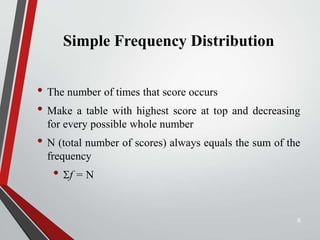
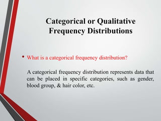
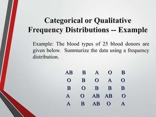
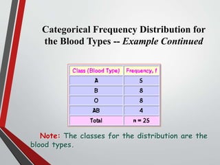
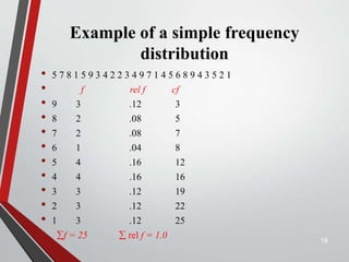
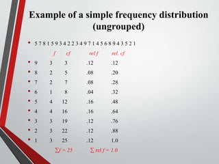
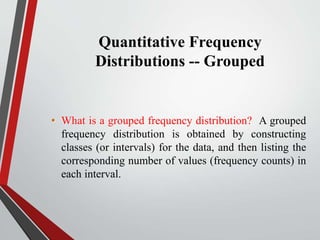
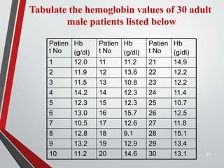
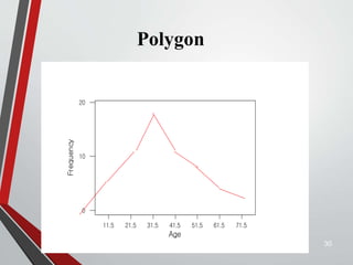
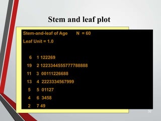
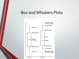
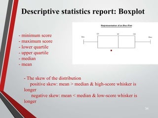
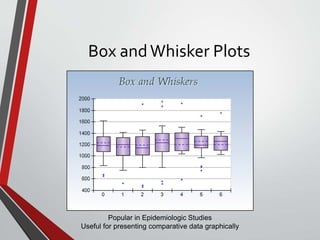
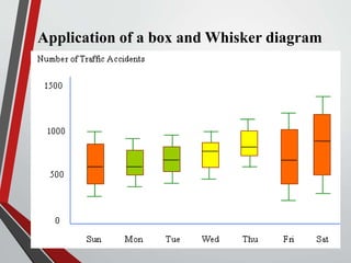
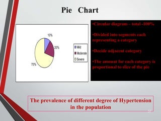
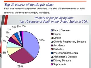
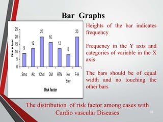
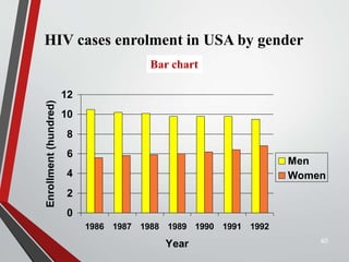
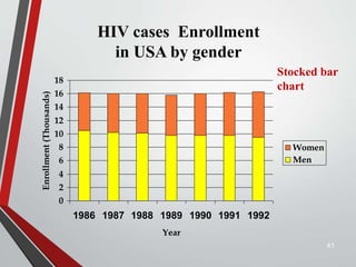
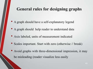
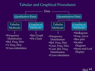
2. Objectives of this session
• To know how to make frequency distributions and its
importance
• To know different terminology in frequency distribution
table
• To learn different graphs/diagrams for graphical
presentation of data.
2
5. Frequency Distributions
• Data distribution – pattern of variability.
• The center of a distribution
• The ranges
• The shapes
• Simple frequency distributions
• Grouped frequency distributions
5
6. Simple Frequency Distribution
• The number of times that score occurs
• Make a table with highest score at top and decreasing
for every possible whole number
• N (total number of scores) always equals the sum of the
frequency
• f = N
6
7. Categorical or Qualitative
Frequency Distributions
• What is a categorical frequency distribution?
A categorical frequency distribution represents data that
can be placed in specific categories, such as gender,
blood group, & hair color, etc.
8. Categorical or Qualitative
Frequency Distributions -- Example
Example: The blood types of 25 blood donors are
given below. Summarize the data using a frequency
distribution.
AB B A O B
O B O A O
B O B B B
A O AB AB O
A B AB O A
10. Quantitative Frequency
Distributions -- Ungrouped
• What is an ungrouped frequency distribution?
An ungrouped frequency distribution simply lists the
data values with the corresponding frequency counts
with which each value occurs.
11. Quantitative Frequency Distributions –
Ungrouped -- Example
• Example: The at-rest pulse rate for 16 athletes at a
meet were 57, 57, 56, 57, 58, 56, 54, 64, 53, 54, 54,
55, 57, 55, 60, and 58. Summarize the information
with an ungrouped frequency distribution.
13. Example of a simple frequency distribution (ungrouped)
• 5 7 8 1 5 9 3 4 2 2 3 4 9 7 1 4 5 6 8 9 4 3 5 2 1 (No. of children in 25
families)
f
• 9 3
• 8 2
• 7 2
• 6 1
• 5 4
• 4 4
• 3 3
• 2 3
• 1 3
f = 25 (No. of families)
14. Relative Frequency Distribution
• Proportion of the total N
• Divide the frequency of each score by N
• Rel. f = f/N
• Sum of relative frequencies should equal 1.0
• Gives us a frame of reference
14
17. Cumulative Frequency
Distributions
• cf = cumulative frequency: number of scores at or below
a particular score
• A score’s standing relative to other scores
• Count from lower scores and add the simple frequencies
for all scores below that score
17
20. Quantitative Frequency
Distributions -- Grouped
• What is a grouped frequency distribution? A grouped
frequency distribution is obtained by constructing
classes (or intervals) for the data, and then listing the
corresponding number of values (frequency counts) in
each interval.
21. 21
Patien
t No
Hb
(g/dl)
Patien
t No
Hb
(g/dl)
Patien
t No
Hb
(g/dl)
1 12.0 11 11.2 21 14.9
2 11.9 12 13.6 22 12.2
3 11.5 13 10.8 23 12.2
4 14.2 14 12.3 24 11.4
5 12.3 15 12.3 25 10.7
6 13.0 16 15.7 26 12.5
7 10.5 17 12.6 27 11.8
8 12.8 18 9.1 28 15.1
9 13.2 19 12.9 29 13.4
10 11.2 20 14.6 30 13.1
Tabulate the hemoglobin values of 30 adult
male patients listed below
22. Steps for making a table
Step1 Find Minimum (9.1) & Maximum (15.7)
Step 2 Calculate difference 15.7 – 9.1 = 6.6
Step 3 Decide the number and width of
the classes (7 c.l) 9.0 -9.9, 10.0-10.9,----
Step 4 Prepare dummy table –
Hb (g/dl), Tally mark, No. patients
22
24. 24
Hb (g/dl) No. of
patients
9.0 – 9.9
10.0 – 10.9
11.0 – 11.9
12.0 – 12.9
13.0 – 13.9
14.0 – 14.9
15.0 – 15.9
1
3
6
10
5
3
2
Total 30
Table Frequency distribution of 30 adult male
patients by Hb
25. 25
Table Frequency distribution of adult patients by
Hb and gender
Hb
(g/dl)
Gender Total
Male Female
<9.0
9.0 – 9.9
10.0 – 10.9
11.0 – 11.9
12.0 – 12.9
13.0 – 13.9
14.0 – 14.9
15.0 – 15.9
0
1
3
6
10
5
3
2
2
3
5
8
6
4
2
0
2
4
8
14
16
9
5
2
Total 30 30 60
26. 26
Elements of a Table
Ideal table should have
Number
Title
Column headings
Foot-notes
Number - Table number for identification in a report
Title, place - Describe the body of the table,
variables,
Time period (What, how classified, where and when)
Column - Variable name, No. , Percentages (%), etc.,
Heading
Foot-note(s) - to describe some column/row
headings, special cells, source, etc.,
27. DIAGRAMS/GRAPHS
Qualitative data (Nominal & Ordinal)
--- Bar charts (one or two groups)
--- Pie charts
Quantitative data (discrete & continuous)
--- Histogram
--- Frequency polygon (curve)
--- Stem-and –leaf plot
--- Box-and-whisker plot
--- Scatter diagram 27
34. Descriptive statistics report: Boxplot
34
- minimum score
- maximum score
- lower quartile
- upper quartile
- median
- mean
- The skew of the distribution
positive skew: mean > median & high-score whisker is
longer
negative skew: mean < median & low-score whisker is
longer
37. 37
10%
20%
70%
Mild
Moderate
Severe
The prevalence of different degree of Hypertension
in the population
Pie Chart
•Circular diagram – total -100%
•Divided into segments each
representing a category
•Decide adjacent category
•The amount for each category is
proportional to slice of the pie
38. Percent of people dying from
top 10 causes of death in the United States in 2001
Top 10 causes of death: pie chart
Each slice represents a piece of one whole. The size of a slice depends on what
percent of the whole this category represents.
39. Bar Graphs
39
9
12
20
16
12
8
20
0
5
10
15
20
25
Smo Alc Chol DM HTN No
Exer
F-H
Riskfactor
Number
The distribution of risk factor among cases with
Cardio vascular Diseases
Heights of the bar indicates
frequency
Frequency in the Y axis and
categories of variable in the X
axis
The bars should be of equal
width and no touching the
other bars
40. HIV cases enrolment in USA by gender
0
2
4
6
8
10
12
1986 1987 1988 1989 1990 1991 1992
Year
Enrollment
(hundred)
Men
Women
40
Bar chart
41. HIV cases Enrollment
in USA by gender
0
2
4
6
8
10
12
14
16
18
1986 1987 1988 1989 1990 1991 1992
Year
Enrollment
(Thousands)
Women
Men
41
Stocked bar
chart
43. General rules for designing graphs
• A graph should have a self-explanatory legend
• A graph should help reader to understand data
• Axis labeled, units of measurement indicated
• Scales important. Start with zero (otherwise // break)
• Avoid graphs with three-dimensional impression, it may
be misleading (reader visualize less easily
43
44. 44
Tabular and Graphical Procedures
Data
Qualitative Data Quantitative Data
Tabular
Methods
Tabular
Methods
Graphical
Methods
Graphical
Methods
•Frequency
Distribution
•Rel. Freq. Dist.
•% Freq. Dist.
•Cross-tabulation
•Bar Graph
•Pie Chart
•Frequency
Distribution
•Rel. Freq. Dist.
•Cum. Freq. Dist.
•Cum. Rel. Freq.
Distribution
•Cross tabulation
•Histogram
•Freq. curve
•Box plot
•Scatter
Diagram
•Stem-and-Leaf
Display