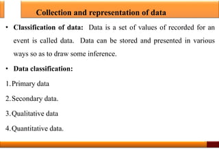
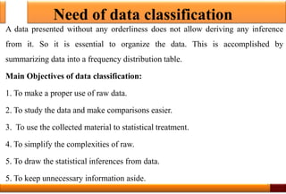
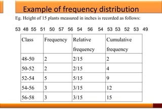
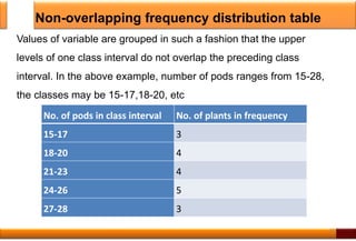
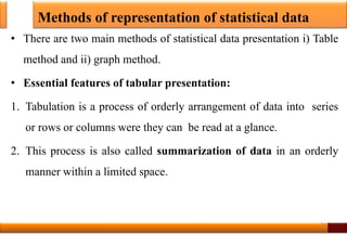
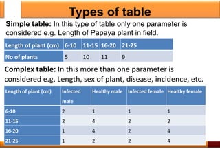
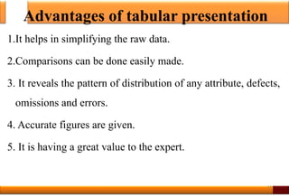
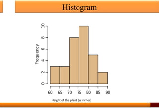
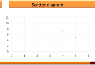
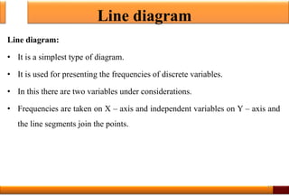
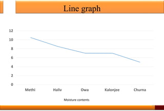
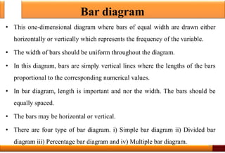
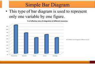
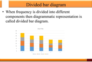
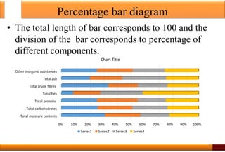
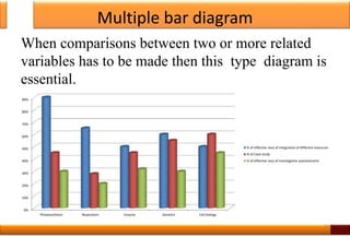
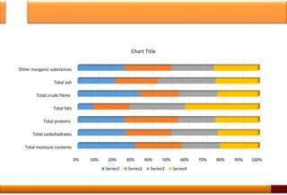
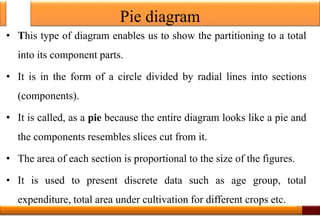
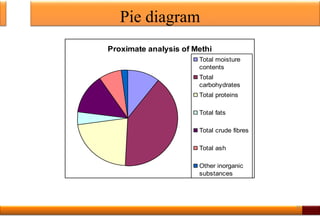
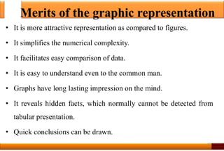
SlideShare a Scribd company logo
1 of 39
Tabular
and
Graphical representation of Data
Dr. A.V. Dusane
Sir Parashurambhau College
Pune, India
anildusane@gmail.com
1
Collection and representation of data
• Classification of data: Data is a set of values of recorded for an
event is called data. Data can be stored and presented in various
ways so as to draw some inference.
• Data classification:
1.Primary data
2.Secondary data.
3.Qualitative data
4.Quantitative data.
2
Need of data classification
A data presented without any orderliness does not allow deriving any inference
from it. So it is essential to organize the data. This is accomplished by
summarizing data into a frequency distribution table.
Main Objectives of data classification:
1. To make a proper use of raw data.
2. To study the data and make comparisons easier.
3. To use the collected material to statistical treatment.
4. To simplify the complexities of raw.
5. To draw the statistical inferences from data.
5. To keep unnecessary information aside.
3
Frequency distribution
• A frequency distribution or frequency table is the tabular
arrangement of data by classes together with the corresponding class
frequencies.
• The main purpose of frequency distribution is to organize the data
into a more compact form without obscuring essential information
contained in the values.
4
Example of frequency distribution
Class Frequency Relative
frequency
Cumulative
frequency
48-50 2 2/15 2
50-52 2 2/15 4
52-54 5 5/15 9
54-56 3 3/15 12
56-58 3 3/15 15
5
Eg. Height of 15 plants measured in inches is recorded as follows:
53 48 55 51 50 57 56 54 56 54 53 53 52 53 49.
Construction grouped frequency distribution table
• Important points to be considered at the time of construction of frequency
distribution table
1. Number of classes:
• The number of classes or range of class interval is an important factor for
preparing frequency table.
• There is no fixed rule for how many classes to be taken. Generally depends on
the observation of available data, minimum 3 classes and maximum 20 classes
are formed.
• The size of class interval also depends on the range of data and the number of
classes, it is equal to the difference between the highest and lowest value divided
by the number of classes.
6
Construction grouped frequency distribution table
Class interval: It depends on the range (The range is the difference in the
highest and the lowest value of the variable) of the data and the number of
classes.
Following formula should be used to estimate class interval.
• i = (L –S ) / C
• i = class interval L = largest value S = smallest value C = number of
classes
• However for simplicity under root of number of observations is taken.
Class limit: These are the lowest and highest values, which are included in the
class e.g. in the class 10-20, lowest value is 10 and the highest is 20.
7
Construction grouped frequency distribution table
Mid value or mid point: The central point of a class interval is mid
point mid value. It can be calculated by adding the upper and lower
limits of a class and dividing the sum by 2.
• Mid point of a class = (L1 +L2)/ 2
• L1 =lower limit of the class, L2 = upper limit of the class.
• I=H-L/K where
I- interval, H= highest value, L= lowest value K= number of classes
8
Types of frequency distribution tables
No. of pods in class interval No. of plants in frequency
15-17 3
17-19 4
19-21 4
21-23 5
9
There are two types:
1. Overlapping frequency distribution table
2. Non-overlapping frequency distribution table
Overlapping frequency distribution table: Values of variables are grouped in
such a fashion that the upper limit of one class interval is represented in next class
interval.
In a table number of pods ranges from 15-25 the classes may be 15-17,17-19, etc.
Non-overlapping frequency distribution table
No. of pods in class interval No. of plants in frequency
15-17 3
18-20 4
21-23 4
24-26 5
27-28 3
10
Values of variable are grouped in such a fashion that the upper
levels of one class interval do not overlap the preceding class
interval. In the above example, number of pods ranges from 15-28,
the classes may be 15-17,18-20, etc
Methods of representation of statistical data
• There are two main methods of statistical data presentation i) Table
method and ii) graph method.
• Essential features of tabular presentation:
1. Tabulation is a process of orderly arrangement of data into series
or rows or columns were they can be read at a glance.
2. This process is also called summarization of data in an orderly
manner within a limited space.
11
Types of table
Length of plant (cm) 6-10 11-15 16-20 21-25
No of plants 5 10 11 9
12
Length of plant (cm) Infected
male
Healthy male Infected female Healthy female
6-10 2 1 1 1
11-15 2 4 2 2
16-20 1 4 2 4
21-25 1 2 2 4
Simple table: In this type of table only one parameter is
considered e.g. Length of Papaya plant in field.
Complex table: In this more than one parameter is
considered e.g. Length, sex of plant, disease, incidence, etc.
Advantages of tabular presentation
1.It helps in simplifying the raw data.
2.Comparisons can be done easily made.
3. It reveals the pattern of distribution of any attribute, defects,
omissions and errors.
4. Accurate figures are given.
5. It is having a great value to the expert.
13
Graphical representation of data
Graph:
• A graph is a pictorial presentation of relationship between variables especially to
express the change in some quantity over a period of time.
• Graph is a visual form of the representation of statistical data.
• Graphical method enables statistician to present quantitative data in a simple,
clear and effective manner.
• Comparisons can be easily made between two or more phenomena with the help
of graph.
• To obtain clearer picture we can represent the frequency table pictorially. Such a
visual pictorial representation can be done through graphs.
14
Purpose of Graphs
1. To compare two or more numbers: The comparison is often by bars of
different lengths.
2. To express the distribution of individual objects of measurements into
different categories: The frequency distribution of numerical categories is
usually represented by histogram.
3. The distribution of individuals into non-numerical categories can be shown
as a bar-diagram. The length of bar represents the number of observations (or
frequency) in each category.
4. If the frequencies are expressed as percentages, totaling 100%, a convenient
way is a pie chart.
15
Types of Graphs
• Types of graphs: Line graph, Bar graph, Pie chart, Histogram, frequency polygon,
frequency curve, are main types of graphs.
Histograms:
• This is one of the most popular methods for displaying the frequency distribution.
• In this type of representation, the given data is plotted in the form of a series of
rectangles.
• The height of rectangle is proportional to the respective frequency and width
represents the class interval.
• The class intervals are marked along the X-axis and the frequencies along the Y-axis.
Any blank spaces between the rectangles would mean that the category is empty and
there are no values in that class interval.
• A histogram is two-dimensional in which both the length and the width are
important. 16
Histogram
17
Height of the plant (in inches)
Histogram
• Merits of histograms:
1.It gives the idea about the amount of variability present in the data.
2.It is useful to find out mode.
• Demerits of histograms:
1. Histogram can not be drawn for frequency distribution with open-
end class.
2.Histogram is not a convenient method for comparisons especially
the super-imposed histograms are usually confusing.
18
Histogram
• Major steps involved in construction of histogram:
1. Arrange the data in ascending order
2. Find out class interval
3. Prepare the frequency distribution diagram
4. Draw the histogram by taking class value on X- axis and
frequency on Y-axis.
19
Frequency polygon
• It is a line chart of frequency distribution in which midpoints of class
intervals are plotted are joined by straight lines.
• It is the variation of histogram in which instead of rectangles erect over the
intervals, the points are plotted at the mid points of the tops of the
corresponding rectangles in a histogram, and the successive points are joined
by straight lines.
• Frequency polygon is used in cases of time series, that is when the
distribution of the variate is given as a function of time
• E.g. Growth of plant over a period of time, trends in food production, etc.
20
Frequency polygon
21
Frequency polygon
• Merits:
1.It can be constructed quickly than histograms.
2.It enables to understand the pattern on the data more clearly than
histogram.
• Demerit:
• It can not give an accurate picture as that given by histogram
because in frequency polygon the areas above the various
intervals are not exactly proportional to the frequencies.
22
Frequency curve
• When the total frequency is large, and the class intervals are narrow
so the frequency polygon or histogram will approach more and more
towards the form of a smooth curve. Such a smooth curve is called
frequency curve.
• Frequency curve is also called as ‘Smoothed frequency polygon’.
• In this, total area under the curve is equal to the area under the
original histogram or polygon.
• This usually has single hump or mode (value with highest frequency)
23
Scatter or Dot diagram
• This is the simplest method for confirming whether there is any relationship
between two variables by plotting values on graph.
• It is nothing but a visual representation of two variables by points (dots) on a
graph.
• In a scatter diagram one variable is taken on the X-axis and other on the Y-axis and
the data is represented in the form of points.
• It is called as a scatter diagram because it indicates scatter of various points
(variables).
• The scatter diagram gives a general idea about existence of correlation between
two variables and type of correlation.
• It does not give correct numerical value of the correlation as given by correlation
coefficient.
24
Scatter diagram
Merits of scatter diagram:
1. It is a simple method to find out the nature of correlation between two variables.
2. It is not influenced by extreme limits
3. It is easy to understand.
Demerits of Scatter diagram:
1. It doesn’t give correct numerical value of correlation.
2. It is unable to give the exact degree of correlation between two variables.
3. It is a subjective method.
4. It cannot be applied to qualitative data.
5. Scatter is the first step in finding out the strength of correlation-ship.
25
Scatter diagram
26
0
2
4
6
8
10
12
0 1 2 3 4 5 6
Line diagram
Line diagram:
• It is a simplest type of diagram.
• It is used for presenting the frequencies of discrete variables.
• In this there are two variables under considerations.
• Frequencies are taken on X – axis and independent variables on Y – axis and
the line segments join the points.
27
Line graph
28
0
2
4
6
8
10
12
Methi Haliv Owa Kalonjee Churna
Moisture contents
Bar diagram
• This one-dimensional diagram where bars of equal width are drawn either
horizontally or vertically which represents the frequency of the variable.
• The width of bars should be uniform throughout the diagram.
• In this diagram, bars are simply vertical lines where the lengths of the bars
proportional to the corresponding numerical values.
• In bar diagram, length is important and nor the width. The bars should be
equally spaced.
• The bars may be horizontal or vertical.
• There are four type of bar diagram. i) Simple bar diagram ii) Divided bar
diagram iii) Percentage bar diagram and iv) Multiple bar diagram.
29
Simple Bar Diagram
• This type of bar diagram is used to represent
only one variable by one figure.
30
0%
10%
20%
30%
40%
50%
60%
70%
80%
90%
Photosynthesis Respiration Enzyme Genetics Cell biology
% of effective ness of integration of different resources
Divided bar diagram
• When frequency is divided into different
components then diagrammatic representation is
called divided bar diagram.
31
0
5
10
15
20
25
30
35
40
1 2 3 4 5
Chart Title
Series1 Series2 Series3 Series4
Percentage bar diagram
• The total length of bar corresponds to 100 and the
division of the bar corresponds to percentage of
different components.
32
0% 10% 20% 30% 40% 50% 60% 70% 80% 90% 100%
Total moisture contents
Total carbohydrates
Total proteins
Total fats
Total crude fibres
Total ash
Other inorganic substances
Chart Title
Series1 Series2 Series3 Series4
Multiple bar diagram
When comparisons between two or more related
variables has to be made then this type diagram is
essential.
33
0%
10%
20%
30%
40%
50%
60%
70%
80%
90%
Photosynthesis Respiration Enzyme Genetics Cell biology
% of effective ness of integration of different resources
% of Case study
% of effective ness of investigative questionnaire
34
0% 10% 20% 30% 40% 50% 60% 70% 80% 90% 100%
Total moisture contents
Total carbohydrates
Total proteins
Total fats
Total crude fibres
Total ash
Other inorganic substances
Chart Title
Series1 Series2 Series3 Series4
Pie diagram
• This type of diagram enables us to show the partitioning to a total
into its component parts.
• It is in the form of a circle divided by radial lines into sections
(components).
• It is called, as a pie because the entire diagram looks like a pie and
the components resembles slices cut from it.
• The area of each section is proportional to the size of the figures.
• It is used to present discrete data such as age group, total
expenditure, total area under cultivation for different crops etc.
35
Pie diagram
36
Proximate analysis of Methi
Total moisture
contents
Total
carbohydrates
Total proteins
Total fats
Total crude fibres
Total ash
Other inorganic
substances
Merits of the graphic representation
• It is more attractive representation as compared to figures.
• It simplifies the numerical complexity.
• It facilitates easy comparison of data.
• It is easy to understand even to the common man.
• Graphs have long lasting impression on the mind.
• It reveals hidden facts, which normally cannot be detected from
tabular presentation.
• Quick conclusions can be drawn.
37
Limitations of Graphic representation
• It can not be used for detailed studies but only for comparative studies.
Tables shows the exact figures while graph shows overall position. The
figures are approximately correct but not exact.
• It can give only a limited amount of information because it shows
approximate values.
• It can not be analyzed further.
• It’s utility to an expert is limited
• A table can be used to give data on three or more characteristics/parameters
but this is not possible in case of graph.
38
Significance of graphs
• In biometry diagrams and graphs have a lot of
significance as these are useful for showing the
comparisons.
• Two or more graphs can be drawn on the same
graph paper (having the same scale) to show the
trend variability occurring in the data.
39

More Related Content

Similar to collectionandrepresentationofdata1-200904192336.pptx

Frequency distribution
Frequency distributionFrequency distribution
Frequency distributionMOHAMMED NASIH
 
Chapter 4 MMW.pdf
Chapter 4 MMW.pdfChapter 4 MMW.pdf
Chapter 4 MMW.pdfRaRaRamirez
 
2 biostatistics presenting data
2  biostatistics presenting data2  biostatistics presenting data
2 biostatistics presenting dataDr. Nazar Jaf
 
DATA GRAPHICS 8th Sem.pdf
DATA GRAPHICS 8th Sem.pdfDATA GRAPHICS 8th Sem.pdf
DATA GRAPHICS 8th Sem.pdfRavinandan A P
 
FREQUENCY DISTRIBUTION.pptx
FREQUENCY DISTRIBUTION.pptxFREQUENCY DISTRIBUTION.pptx
FREQUENCY DISTRIBUTION.pptxSreeLatha98
 
Data presenattaion we can read this document..pptx
Data presenattaion  we can read this document..pptxData presenattaion  we can read this document..pptx
Data presenattaion we can read this document..pptxSajjadali639348
 
lesson-data-presentation-tools-1.pptx
lesson-data-presentation-tools-1.pptxlesson-data-presentation-tools-1.pptx
lesson-data-presentation-tools-1.pptxAnalynPasto
 
Introduction to Inferential Statistics.pptx
Introduction to Inferential  Statistics.pptxIntroduction to Inferential  Statistics.pptx
Introduction to Inferential Statistics.pptxTAVITI NAIDU GONGADA
 
Frequency Distributions
Frequency DistributionsFrequency Distributions
Frequency Distributionsjasondroesch
 
2-L2 Presentation of data.pptx
2-L2 Presentation of data.pptx2-L2 Presentation of data.pptx
2-L2 Presentation of data.pptxssuser03ba7c
 
diagrammatic and graphical representation of data
 diagrammatic and graphical representation of data diagrammatic and graphical representation of data
diagrammatic and graphical representation of dataVarun Prem Varu
 
Frequency Distribution
Frequency DistributionFrequency Distribution
Frequency DistributionTeacherMariza
 
Data Presentation using Descriptive Graphs.pptx
Data Presentation using Descriptive Graphs.pptxData Presentation using Descriptive Graphs.pptx
Data Presentation using Descriptive Graphs.pptxJeanettebagtoc
 

Similar to collectionandrepresentationofdata1-200904192336.pptx (20)

Frequency distribution
Frequency distributionFrequency distribution
Frequency distribution
 
Edited economic statistics note
Edited economic statistics noteEdited economic statistics note
Edited economic statistics note
 
Chapter 4 MMW.pdf
Chapter 4 MMW.pdfChapter 4 MMW.pdf
Chapter 4 MMW.pdf
 
data collection.pptx
data collection.pptxdata collection.pptx
data collection.pptx
 
2 biostatistics presenting data
2  biostatistics presenting data2  biostatistics presenting data
2 biostatistics presenting data
 
DATA GRAPHICS 8th Sem.pdf
DATA GRAPHICS 8th Sem.pdfDATA GRAPHICS 8th Sem.pdf
DATA GRAPHICS 8th Sem.pdf
 
FREQUENCY DISTRIBUTION.pptx
FREQUENCY DISTRIBUTION.pptxFREQUENCY DISTRIBUTION.pptx
FREQUENCY DISTRIBUTION.pptx
 
Data presenattaion we can read this document..pptx
Data presenattaion  we can read this document..pptxData presenattaion  we can read this document..pptx
Data presenattaion we can read this document..pptx
 
Presentation of data ppt
Presentation of data pptPresentation of data ppt
Presentation of data ppt
 
lesson-data-presentation-tools-1.pptx
lesson-data-presentation-tools-1.pptxlesson-data-presentation-tools-1.pptx
lesson-data-presentation-tools-1.pptx
 
Introduction to Inferential Statistics.pptx
Introduction to Inferential  Statistics.pptxIntroduction to Inferential  Statistics.pptx
Introduction to Inferential Statistics.pptx
 
Frequency Distributions
Frequency DistributionsFrequency Distributions
Frequency Distributions
 
Data presentation 2
Data presentation 2Data presentation 2
Data presentation 2
 
Biostatistics Frequency distribution
Biostatistics Frequency distributionBiostatistics Frequency distribution
Biostatistics Frequency distribution
 
2-L2 Presentation of data.pptx
2-L2 Presentation of data.pptx2-L2 Presentation of data.pptx
2-L2 Presentation of data.pptx
 
diagrammatic and graphical representation of data
 diagrammatic and graphical representation of data diagrammatic and graphical representation of data
diagrammatic and graphical representation of data
 
Unit 1 - Statistics (Part 1).pptx
Unit 1 - Statistics (Part 1).pptxUnit 1 - Statistics (Part 1).pptx
Unit 1 - Statistics (Part 1).pptx
 
Frequency Distribution
Frequency DistributionFrequency Distribution
Frequency Distribution
 
Data Presentation using Descriptive Graphs.pptx
Data Presentation using Descriptive Graphs.pptxData Presentation using Descriptive Graphs.pptx
Data Presentation using Descriptive Graphs.pptx
 
Tabulation
Tabulation Tabulation
Tabulation
 

Recently uploaded

Northern New England Tableau User Group (TUG) May 2024
Northern New England Tableau User Group (TUG) May 2024Northern New England Tableau User Group (TUG) May 2024
Northern New England Tableau User Group (TUG) May 2024patrickdtherriault
 
Identify Rules that Predict Patient’s Heart Disease - An Application of Decis...
Identify Rules that Predict Patient’s Heart Disease - An Application of Decis...Identify Rules that Predict Patient’s Heart Disease - An Application of Decis...
Identify Rules that Predict Patient’s Heart Disease - An Application of Decis...ThinkInnovation
 
Displacement, Velocity, Acceleration, and Second Derivatives
Displacement, Velocity, Acceleration, and Second DerivativesDisplacement, Velocity, Acceleration, and Second Derivatives
Displacement, Velocity, Acceleration, and Second Derivatives23050636
 
Credit Card Fraud Detection: Safeguarding Transactions in the Digital Age
Credit Card Fraud Detection: Safeguarding Transactions in the Digital AgeCredit Card Fraud Detection: Safeguarding Transactions in the Digital Age
Credit Card Fraud Detection: Safeguarding Transactions in the Digital AgeBoston Institute of Analytics
 
MATERI MANAJEMEN OF PENYAKIT TETANUS.ppt
MATERI  MANAJEMEN OF PENYAKIT TETANUS.pptMATERI  MANAJEMEN OF PENYAKIT TETANUS.ppt
MATERI MANAJEMEN OF PENYAKIT TETANUS.pptRachmaGhifari
 
NOAM AAUG Adobe Summit 2024: Summit Slam Dunks
NOAM AAUG Adobe Summit 2024: Summit Slam DunksNOAM AAUG Adobe Summit 2024: Summit Slam Dunks
NOAM AAUG Adobe Summit 2024: Summit Slam Dunksgmuir1066
 
原件一样(UWO毕业证书)西安大略大学毕业证成绩单留信学历认证
原件一样(UWO毕业证书)西安大略大学毕业证成绩单留信学历认证原件一样(UWO毕业证书)西安大略大学毕业证成绩单留信学历认证
原件一样(UWO毕业证书)西安大略大学毕业证成绩单留信学历认证pwgnohujw
 
Fuel Efficiency Forecast: Predictive Analytics for a Greener Automotive Future
Fuel Efficiency Forecast: Predictive Analytics for a Greener Automotive FutureFuel Efficiency Forecast: Predictive Analytics for a Greener Automotive Future
Fuel Efficiency Forecast: Predictive Analytics for a Greener Automotive FutureBoston Institute of Analytics
 
Jual obat aborsi Bandung ( 085657271886 ) Cytote pil telat bulan penggugur ka...
Jual obat aborsi Bandung ( 085657271886 ) Cytote pil telat bulan penggugur ka...Jual obat aborsi Bandung ( 085657271886 ) Cytote pil telat bulan penggugur ka...
Jual obat aborsi Bandung ( 085657271886 ) Cytote pil telat bulan penggugur ka...Klinik kandungan
 
NO1 Best Kala Jadu Expert Specialist In Germany Kala Jadu Expert Specialist I...
NO1 Best Kala Jadu Expert Specialist In Germany Kala Jadu Expert Specialist I...NO1 Best Kala Jadu Expert Specialist In Germany Kala Jadu Expert Specialist I...
NO1 Best Kala Jadu Expert Specialist In Germany Kala Jadu Expert Specialist I...Amil baba
 
Las implicancias del memorándum de entendimiento entre Codelco y SQM según la...
Las implicancias del memorándum de entendimiento entre Codelco y SQM según la...Las implicancias del memorándum de entendimiento entre Codelco y SQM según la...
Las implicancias del memorándum de entendimiento entre Codelco y SQM según la...Voces Mineras
 
RESEARCH-FINAL-DEFENSE-PPT-TEMPLATE.pptx
RESEARCH-FINAL-DEFENSE-PPT-TEMPLATE.pptxRESEARCH-FINAL-DEFENSE-PPT-TEMPLATE.pptx
RESEARCH-FINAL-DEFENSE-PPT-TEMPLATE.pptxronsairoathenadugay
 
Seven tools of quality control.slideshare
Seven tools of quality control.slideshareSeven tools of quality control.slideshare
Seven tools of quality control.slideshareraiaryan448
 
一比一原版(曼大毕业证书)曼尼托巴大学毕业证成绩单留信学历认证一手价格
一比一原版(曼大毕业证书)曼尼托巴大学毕业证成绩单留信学历认证一手价格一比一原版(曼大毕业证书)曼尼托巴大学毕业证成绩单留信学历认证一手价格
一比一原版(曼大毕业证书)曼尼托巴大学毕业证成绩单留信学历认证一手价格q6pzkpark
 
Jual Obat Aborsi Bandung (Asli No.1) Wa 082134680322 Klinik Obat Penggugur Ka...
Jual Obat Aborsi Bandung (Asli No.1) Wa 082134680322 Klinik Obat Penggugur Ka...Jual Obat Aborsi Bandung (Asli No.1) Wa 082134680322 Klinik Obat Penggugur Ka...
Jual Obat Aborsi Bandung (Asli No.1) Wa 082134680322 Klinik Obat Penggugur Ka...Klinik Aborsi
 
如何办理(Dalhousie毕业证书)达尔豪斯大学毕业证成绩单留信学历认证
如何办理(Dalhousie毕业证书)达尔豪斯大学毕业证成绩单留信学历认证如何办理(Dalhousie毕业证书)达尔豪斯大学毕业证成绩单留信学历认证
如何办理(Dalhousie毕业证书)达尔豪斯大学毕业证成绩单留信学历认证zifhagzkk
 
原件一样伦敦国王学院毕业证成绩单留信学历认证
原件一样伦敦国王学院毕业证成绩单留信学历认证原件一样伦敦国王学院毕业证成绩单留信学历认证
原件一样伦敦国王学院毕业证成绩单留信学历认证pwgnohujw
 
Simplify hybrid data integration at an enterprise scale. Integrate all your d...
Simplify hybrid data integration at an enterprise scale. Integrate all your d...Simplify hybrid data integration at an enterprise scale. Integrate all your d...
Simplify hybrid data integration at an enterprise scale. Integrate all your d...varanasisatyanvesh
 
Jual Obat Aborsi Lhokseumawe ( Asli No.1 ) 088980685493 Obat Penggugur Kandun...
Jual Obat Aborsi Lhokseumawe ( Asli No.1 ) 088980685493 Obat Penggugur Kandun...Jual Obat Aborsi Lhokseumawe ( Asli No.1 ) 088980685493 Obat Penggugur Kandun...
Jual Obat Aborsi Lhokseumawe ( Asli No.1 ) 088980685493 Obat Penggugur Kandun...Obat Aborsi 088980685493 Jual Obat Aborsi
 
Chapter 1 - Introduction to Data Mining Concepts and Techniques.pptx
Chapter 1 - Introduction to Data Mining Concepts and Techniques.pptxChapter 1 - Introduction to Data Mining Concepts and Techniques.pptx
Chapter 1 - Introduction to Data Mining Concepts and Techniques.pptxkusamee0
 

Recently uploaded (20)

Northern New England Tableau User Group (TUG) May 2024
Northern New England Tableau User Group (TUG) May 2024Northern New England Tableau User Group (TUG) May 2024
Northern New England Tableau User Group (TUG) May 2024
 
Identify Rules that Predict Patient’s Heart Disease - An Application of Decis...
Identify Rules that Predict Patient’s Heart Disease - An Application of Decis...Identify Rules that Predict Patient’s Heart Disease - An Application of Decis...
Identify Rules that Predict Patient’s Heart Disease - An Application of Decis...
 
Displacement, Velocity, Acceleration, and Second Derivatives
Displacement, Velocity, Acceleration, and Second DerivativesDisplacement, Velocity, Acceleration, and Second Derivatives
Displacement, Velocity, Acceleration, and Second Derivatives
 
Credit Card Fraud Detection: Safeguarding Transactions in the Digital Age
Credit Card Fraud Detection: Safeguarding Transactions in the Digital AgeCredit Card Fraud Detection: Safeguarding Transactions in the Digital Age
Credit Card Fraud Detection: Safeguarding Transactions in the Digital Age
 
MATERI MANAJEMEN OF PENYAKIT TETANUS.ppt
MATERI  MANAJEMEN OF PENYAKIT TETANUS.pptMATERI  MANAJEMEN OF PENYAKIT TETANUS.ppt
MATERI MANAJEMEN OF PENYAKIT TETANUS.ppt
 
NOAM AAUG Adobe Summit 2024: Summit Slam Dunks
NOAM AAUG Adobe Summit 2024: Summit Slam DunksNOAM AAUG Adobe Summit 2024: Summit Slam Dunks
NOAM AAUG Adobe Summit 2024: Summit Slam Dunks
 
原件一样(UWO毕业证书)西安大略大学毕业证成绩单留信学历认证
原件一样(UWO毕业证书)西安大略大学毕业证成绩单留信学历认证原件一样(UWO毕业证书)西安大略大学毕业证成绩单留信学历认证
原件一样(UWO毕业证书)西安大略大学毕业证成绩单留信学历认证
 
Fuel Efficiency Forecast: Predictive Analytics for a Greener Automotive Future
Fuel Efficiency Forecast: Predictive Analytics for a Greener Automotive FutureFuel Efficiency Forecast: Predictive Analytics for a Greener Automotive Future
Fuel Efficiency Forecast: Predictive Analytics for a Greener Automotive Future
 
Jual obat aborsi Bandung ( 085657271886 ) Cytote pil telat bulan penggugur ka...
Jual obat aborsi Bandung ( 085657271886 ) Cytote pil telat bulan penggugur ka...Jual obat aborsi Bandung ( 085657271886 ) Cytote pil telat bulan penggugur ka...
Jual obat aborsi Bandung ( 085657271886 ) Cytote pil telat bulan penggugur ka...
 
NO1 Best Kala Jadu Expert Specialist In Germany Kala Jadu Expert Specialist I...
NO1 Best Kala Jadu Expert Specialist In Germany Kala Jadu Expert Specialist I...NO1 Best Kala Jadu Expert Specialist In Germany Kala Jadu Expert Specialist I...
NO1 Best Kala Jadu Expert Specialist In Germany Kala Jadu Expert Specialist I...
 
Las implicancias del memorándum de entendimiento entre Codelco y SQM según la...
Las implicancias del memorándum de entendimiento entre Codelco y SQM según la...Las implicancias del memorándum de entendimiento entre Codelco y SQM según la...
Las implicancias del memorándum de entendimiento entre Codelco y SQM según la...
 
RESEARCH-FINAL-DEFENSE-PPT-TEMPLATE.pptx
RESEARCH-FINAL-DEFENSE-PPT-TEMPLATE.pptxRESEARCH-FINAL-DEFENSE-PPT-TEMPLATE.pptx
RESEARCH-FINAL-DEFENSE-PPT-TEMPLATE.pptx
 
Seven tools of quality control.slideshare
Seven tools of quality control.slideshareSeven tools of quality control.slideshare
Seven tools of quality control.slideshare
 
一比一原版(曼大毕业证书)曼尼托巴大学毕业证成绩单留信学历认证一手价格
一比一原版(曼大毕业证书)曼尼托巴大学毕业证成绩单留信学历认证一手价格一比一原版(曼大毕业证书)曼尼托巴大学毕业证成绩单留信学历认证一手价格
一比一原版(曼大毕业证书)曼尼托巴大学毕业证成绩单留信学历认证一手价格
 
Jual Obat Aborsi Bandung (Asli No.1) Wa 082134680322 Klinik Obat Penggugur Ka...
Jual Obat Aborsi Bandung (Asli No.1) Wa 082134680322 Klinik Obat Penggugur Ka...Jual Obat Aborsi Bandung (Asli No.1) Wa 082134680322 Klinik Obat Penggugur Ka...
Jual Obat Aborsi Bandung (Asli No.1) Wa 082134680322 Klinik Obat Penggugur Ka...
 
如何办理(Dalhousie毕业证书)达尔豪斯大学毕业证成绩单留信学历认证
如何办理(Dalhousie毕业证书)达尔豪斯大学毕业证成绩单留信学历认证如何办理(Dalhousie毕业证书)达尔豪斯大学毕业证成绩单留信学历认证
如何办理(Dalhousie毕业证书)达尔豪斯大学毕业证成绩单留信学历认证
 
原件一样伦敦国王学院毕业证成绩单留信学历认证
原件一样伦敦国王学院毕业证成绩单留信学历认证原件一样伦敦国王学院毕业证成绩单留信学历认证
原件一样伦敦国王学院毕业证成绩单留信学历认证
 
Simplify hybrid data integration at an enterprise scale. Integrate all your d...
Simplify hybrid data integration at an enterprise scale. Integrate all your d...Simplify hybrid data integration at an enterprise scale. Integrate all your d...
Simplify hybrid data integration at an enterprise scale. Integrate all your d...
 
Jual Obat Aborsi Lhokseumawe ( Asli No.1 ) 088980685493 Obat Penggugur Kandun...
Jual Obat Aborsi Lhokseumawe ( Asli No.1 ) 088980685493 Obat Penggugur Kandun...Jual Obat Aborsi Lhokseumawe ( Asli No.1 ) 088980685493 Obat Penggugur Kandun...
Jual Obat Aborsi Lhokseumawe ( Asli No.1 ) 088980685493 Obat Penggugur Kandun...
 
Chapter 1 - Introduction to Data Mining Concepts and Techniques.pptx
Chapter 1 - Introduction to Data Mining Concepts and Techniques.pptxChapter 1 - Introduction to Data Mining Concepts and Techniques.pptx
Chapter 1 - Introduction to Data Mining Concepts and Techniques.pptx
 

collectionandrepresentationofdata1-200904192336.pptx

  • 1. Tabular and Graphical representation of Data Dr. A.V. Dusane Sir Parashurambhau College Pune, India anildusane@gmail.com 1
  • 2. Collection and representation of data • Classification of data: Data is a set of values of recorded for an event is called data. Data can be stored and presented in various ways so as to draw some inference. • Data classification: 1.Primary data 2.Secondary data. 3.Qualitative data 4.Quantitative data. 2
  • 3. Need of data classification A data presented without any orderliness does not allow deriving any inference from it. So it is essential to organize the data. This is accomplished by summarizing data into a frequency distribution table. Main Objectives of data classification: 1. To make a proper use of raw data. 2. To study the data and make comparisons easier. 3. To use the collected material to statistical treatment. 4. To simplify the complexities of raw. 5. To draw the statistical inferences from data. 5. To keep unnecessary information aside. 3
  • 4. Frequency distribution • A frequency distribution or frequency table is the tabular arrangement of data by classes together with the corresponding class frequencies. • The main purpose of frequency distribution is to organize the data into a more compact form without obscuring essential information contained in the values. 4
  • 5. Example of frequency distribution Class Frequency Relative frequency Cumulative frequency 48-50 2 2/15 2 50-52 2 2/15 4 52-54 5 5/15 9 54-56 3 3/15 12 56-58 3 3/15 15 5 Eg. Height of 15 plants measured in inches is recorded as follows: 53 48 55 51 50 57 56 54 56 54 53 53 52 53 49.
  • 6. Construction grouped frequency distribution table • Important points to be considered at the time of construction of frequency distribution table 1. Number of classes: • The number of classes or range of class interval is an important factor for preparing frequency table. • There is no fixed rule for how many classes to be taken. Generally depends on the observation of available data, minimum 3 classes and maximum 20 classes are formed. • The size of class interval also depends on the range of data and the number of classes, it is equal to the difference between the highest and lowest value divided by the number of classes. 6
  • 7. Construction grouped frequency distribution table Class interval: It depends on the range (The range is the difference in the highest and the lowest value of the variable) of the data and the number of classes. Following formula should be used to estimate class interval. • i = (L –S ) / C • i = class interval L = largest value S = smallest value C = number of classes • However for simplicity under root of number of observations is taken. Class limit: These are the lowest and highest values, which are included in the class e.g. in the class 10-20, lowest value is 10 and the highest is 20. 7
  • 8. Construction grouped frequency distribution table Mid value or mid point: The central point of a class interval is mid point mid value. It can be calculated by adding the upper and lower limits of a class and dividing the sum by 2. • Mid point of a class = (L1 +L2)/ 2 • L1 =lower limit of the class, L2 = upper limit of the class. • I=H-L/K where I- interval, H= highest value, L= lowest value K= number of classes 8
  • 9. Types of frequency distribution tables No. of pods in class interval No. of plants in frequency 15-17 3 17-19 4 19-21 4 21-23 5 9 There are two types: 1. Overlapping frequency distribution table 2. Non-overlapping frequency distribution table Overlapping frequency distribution table: Values of variables are grouped in such a fashion that the upper limit of one class interval is represented in next class interval. In a table number of pods ranges from 15-25 the classes may be 15-17,17-19, etc.
  • 10. Non-overlapping frequency distribution table No. of pods in class interval No. of plants in frequency 15-17 3 18-20 4 21-23 4 24-26 5 27-28 3 10 Values of variable are grouped in such a fashion that the upper levels of one class interval do not overlap the preceding class interval. In the above example, number of pods ranges from 15-28, the classes may be 15-17,18-20, etc
  • 11. Methods of representation of statistical data • There are two main methods of statistical data presentation i) Table method and ii) graph method. • Essential features of tabular presentation: 1. Tabulation is a process of orderly arrangement of data into series or rows or columns were they can be read at a glance. 2. This process is also called summarization of data in an orderly manner within a limited space. 11
  • 12. Types of table Length of plant (cm) 6-10 11-15 16-20 21-25 No of plants 5 10 11 9 12 Length of plant (cm) Infected male Healthy male Infected female Healthy female 6-10 2 1 1 1 11-15 2 4 2 2 16-20 1 4 2 4 21-25 1 2 2 4 Simple table: In this type of table only one parameter is considered e.g. Length of Papaya plant in field. Complex table: In this more than one parameter is considered e.g. Length, sex of plant, disease, incidence, etc.
  • 13. Advantages of tabular presentation 1.It helps in simplifying the raw data. 2.Comparisons can be done easily made. 3. It reveals the pattern of distribution of any attribute, defects, omissions and errors. 4. Accurate figures are given. 5. It is having a great value to the expert. 13
  • 14. Graphical representation of data Graph: • A graph is a pictorial presentation of relationship between variables especially to express the change in some quantity over a period of time. • Graph is a visual form of the representation of statistical data. • Graphical method enables statistician to present quantitative data in a simple, clear and effective manner. • Comparisons can be easily made between two or more phenomena with the help of graph. • To obtain clearer picture we can represent the frequency table pictorially. Such a visual pictorial representation can be done through graphs. 14
  • 15. Purpose of Graphs 1. To compare two or more numbers: The comparison is often by bars of different lengths. 2. To express the distribution of individual objects of measurements into different categories: The frequency distribution of numerical categories is usually represented by histogram. 3. The distribution of individuals into non-numerical categories can be shown as a bar-diagram. The length of bar represents the number of observations (or frequency) in each category. 4. If the frequencies are expressed as percentages, totaling 100%, a convenient way is a pie chart. 15
  • 16. Types of Graphs • Types of graphs: Line graph, Bar graph, Pie chart, Histogram, frequency polygon, frequency curve, are main types of graphs. Histograms: • This is one of the most popular methods for displaying the frequency distribution. • In this type of representation, the given data is plotted in the form of a series of rectangles. • The height of rectangle is proportional to the respective frequency and width represents the class interval. • The class intervals are marked along the X-axis and the frequencies along the Y-axis. Any blank spaces between the rectangles would mean that the category is empty and there are no values in that class interval. • A histogram is two-dimensional in which both the length and the width are important. 16
  • 17. Histogram 17 Height of the plant (in inches)
  • 18. Histogram • Merits of histograms: 1.It gives the idea about the amount of variability present in the data. 2.It is useful to find out mode. • Demerits of histograms: 1. Histogram can not be drawn for frequency distribution with open- end class. 2.Histogram is not a convenient method for comparisons especially the super-imposed histograms are usually confusing. 18
  • 19. Histogram • Major steps involved in construction of histogram: 1. Arrange the data in ascending order 2. Find out class interval 3. Prepare the frequency distribution diagram 4. Draw the histogram by taking class value on X- axis and frequency on Y-axis. 19
  • 20. Frequency polygon • It is a line chart of frequency distribution in which midpoints of class intervals are plotted are joined by straight lines. • It is the variation of histogram in which instead of rectangles erect over the intervals, the points are plotted at the mid points of the tops of the corresponding rectangles in a histogram, and the successive points are joined by straight lines. • Frequency polygon is used in cases of time series, that is when the distribution of the variate is given as a function of time • E.g. Growth of plant over a period of time, trends in food production, etc. 20
  • 22. Frequency polygon • Merits: 1.It can be constructed quickly than histograms. 2.It enables to understand the pattern on the data more clearly than histogram. • Demerit: • It can not give an accurate picture as that given by histogram because in frequency polygon the areas above the various intervals are not exactly proportional to the frequencies. 22
  • 23. Frequency curve • When the total frequency is large, and the class intervals are narrow so the frequency polygon or histogram will approach more and more towards the form of a smooth curve. Such a smooth curve is called frequency curve. • Frequency curve is also called as ‘Smoothed frequency polygon’. • In this, total area under the curve is equal to the area under the original histogram or polygon. • This usually has single hump or mode (value with highest frequency) 23
  • 24. Scatter or Dot diagram • This is the simplest method for confirming whether there is any relationship between two variables by plotting values on graph. • It is nothing but a visual representation of two variables by points (dots) on a graph. • In a scatter diagram one variable is taken on the X-axis and other on the Y-axis and the data is represented in the form of points. • It is called as a scatter diagram because it indicates scatter of various points (variables). • The scatter diagram gives a general idea about existence of correlation between two variables and type of correlation. • It does not give correct numerical value of the correlation as given by correlation coefficient. 24
  • 25. Scatter diagram Merits of scatter diagram: 1. It is a simple method to find out the nature of correlation between two variables. 2. It is not influenced by extreme limits 3. It is easy to understand. Demerits of Scatter diagram: 1. It doesn’t give correct numerical value of correlation. 2. It is unable to give the exact degree of correlation between two variables. 3. It is a subjective method. 4. It cannot be applied to qualitative data. 5. Scatter is the first step in finding out the strength of correlation-ship. 25
  • 27. Line diagram Line diagram: • It is a simplest type of diagram. • It is used for presenting the frequencies of discrete variables. • In this there are two variables under considerations. • Frequencies are taken on X – axis and independent variables on Y – axis and the line segments join the points. 27
  • 28. Line graph 28 0 2 4 6 8 10 12 Methi Haliv Owa Kalonjee Churna Moisture contents
  • 29. Bar diagram • This one-dimensional diagram where bars of equal width are drawn either horizontally or vertically which represents the frequency of the variable. • The width of bars should be uniform throughout the diagram. • In this diagram, bars are simply vertical lines where the lengths of the bars proportional to the corresponding numerical values. • In bar diagram, length is important and nor the width. The bars should be equally spaced. • The bars may be horizontal or vertical. • There are four type of bar diagram. i) Simple bar diagram ii) Divided bar diagram iii) Percentage bar diagram and iv) Multiple bar diagram. 29
  • 30. Simple Bar Diagram • This type of bar diagram is used to represent only one variable by one figure. 30 0% 10% 20% 30% 40% 50% 60% 70% 80% 90% Photosynthesis Respiration Enzyme Genetics Cell biology % of effective ness of integration of different resources % of effective ness of integration of different resources
  • 31. Divided bar diagram • When frequency is divided into different components then diagrammatic representation is called divided bar diagram. 31 0 5 10 15 20 25 30 35 40 1 2 3 4 5 Chart Title Series1 Series2 Series3 Series4
  • 32. Percentage bar diagram • The total length of bar corresponds to 100 and the division of the bar corresponds to percentage of different components. 32 0% 10% 20% 30% 40% 50% 60% 70% 80% 90% 100% Total moisture contents Total carbohydrates Total proteins Total fats Total crude fibres Total ash Other inorganic substances Chart Title Series1 Series2 Series3 Series4
  • 33. Multiple bar diagram When comparisons between two or more related variables has to be made then this type diagram is essential. 33 0% 10% 20% 30% 40% 50% 60% 70% 80% 90% Photosynthesis Respiration Enzyme Genetics Cell biology % of effective ness of integration of different resources % of Case study % of effective ness of investigative questionnaire
  • 34. 34 0% 10% 20% 30% 40% 50% 60% 70% 80% 90% 100% Total moisture contents Total carbohydrates Total proteins Total fats Total crude fibres Total ash Other inorganic substances Chart Title Series1 Series2 Series3 Series4
  • 35. Pie diagram • This type of diagram enables us to show the partitioning to a total into its component parts. • It is in the form of a circle divided by radial lines into sections (components). • It is called, as a pie because the entire diagram looks like a pie and the components resembles slices cut from it. • The area of each section is proportional to the size of the figures. • It is used to present discrete data such as age group, total expenditure, total area under cultivation for different crops etc. 35
  • 36. Pie diagram 36 Proximate analysis of Methi Total moisture contents Total carbohydrates Total proteins Total fats Total crude fibres Total ash Other inorganic substances
  • 37. Merits of the graphic representation • It is more attractive representation as compared to figures. • It simplifies the numerical complexity. • It facilitates easy comparison of data. • It is easy to understand even to the common man. • Graphs have long lasting impression on the mind. • It reveals hidden facts, which normally cannot be detected from tabular presentation. • Quick conclusions can be drawn. 37
  • 38. Limitations of Graphic representation • It can not be used for detailed studies but only for comparative studies. Tables shows the exact figures while graph shows overall position. The figures are approximately correct but not exact. • It can give only a limited amount of information because it shows approximate values. • It can not be analyzed further. • It’s utility to an expert is limited • A table can be used to give data on three or more characteristics/parameters but this is not possible in case of graph. 38
  • 39. Significance of graphs • In biometry diagrams and graphs have a lot of significance as these are useful for showing the comparisons. • Two or more graphs can be drawn on the same graph paper (having the same scale) to show the trend variability occurring in the data. 39