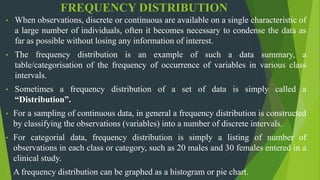
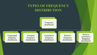
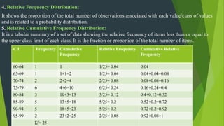
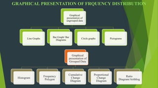
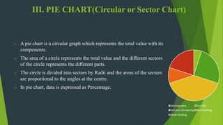
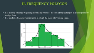
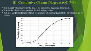
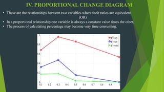
Frequency distribution, types of frequency distribution.
Ungrouped frequency distribution
Grouped frequency distribution
Cumulative frequency distribution
Relative frequency distribution
Relative cumulative frequency distribution
Graphical representation of frequency distribution
I. Representation of Grouped data
1.Line graphs
2.Bar diagrams
a) Simple bar diagram
b)Multiple/Grouped bar diagram
c)Sub-divided bar diagram.
d) % bar diagram
3. Pie charts
4.Pictogram
II. Graphical representation of ungrouped data
1, Histogram
2.Frequency polygon
3.Cumulative change diagram
4. Proportional change diagram
5. Ratio diagram
Topic: Frequency Distribution
Student Name: Abdul Hafeez
Class: B.Ed. (Hons) Elementary
Project Name: “Young Teachers' Professional Development (TPD)"
"Project Founder: Prof. Dr. Amjad Ali Arain
Faculty of Education, University of Sindh, Pakistan
This presentation gives you a brief idea;
-definition of frequency distribution
- types of frequency distribution
-types of charts used in the distribution
-a problem on creating types of distribution
-advantages and limitations of the distribution
Topic: Pie Chart
Student Name: Javeria
Class: B.Ed. 2.5
Project Name: “Young Teachers' Professional Development (TPD)"
"Project Founder: Prof. Dr. Amjad Ali Arain
Faculty of Education, University of Sindh, Pakistan
Today’s overwhelming number of techniques applicable to data analysis makes it extremely difficult to define the most beneficial approach while considering all the significant variables.
The analysis of variance has been studied from several approaches, the most common of which uses a linear model that relates the response to the treatments and blocks. Note that the model is linear in parameters but may be nonlinear across factor levels. Interpretation is easy when data is balanced across factors but much deeper understanding is needed for unbalanced data.
Analysis of variance (ANOVA) is a collection of statistical models and their associated estimation procedures (such as the "variation" among and between groups) used to analyze the differences among means. ANOVA was developed by the statistician Ronald Fisher. ANOVA is based on the law of total variance, where the observed variance in a particular variable is partitioned into components attributable to different sources of variation. In its simplest form, ANOVA provides a statistical test of whether two or more population means are equal, and therefore generalizes the t-test beyond two means. In other words, the ANOVA is used to test the difference between two or more means.Analysis of variance (ANOVA) is an analysis tool used in statistics that splits an observed aggregate variability found inside a data set into two parts: systematic factors and random factors. The systematic factors have a statistical influence on the given data set, while the random factors do not. Analysts use the ANOVA test to determine the influence that independent variables have on the dependent variable in a regression study.
Sir Ronald Fisher pioneered the development of ANOVA for analyzing results of agricultural experiments.1 Today, ANOVA is included in almost every statistical package, which makes it accessible to investigators in all experimental sciences. It is easy to input a data set and run a simple ANOVA, but it is challenging to choose the appropriate ANOVA for different experimental designs, to examine whether data adhere to the modeling assumptions, and to interpret the results correctly. The purpose of this report, together with the next 2 articles in the Statistical Primer for Cardiovascular Research series, is to enhance understanding of ANVOA and to promote its successful use in experimental cardiovascular research. My colleagues and I attempt to accomplish those goals through examples and explanation, while keeping within reason the burden of notation, technical jargon, and mathematical equations.
Prelude
PART (A) TYPES OF GRAPHS
Line graphs
Pie charts
Bar graph
Scatter plot
Stem and plot
Histogram
Frequency polygon
Frequency curve
Cumulative frequency or ogives
PART (B) FLOW CHART
PART (C) LOG AND SEMILOG GRAPH
Graphs(Biostatistics and Research Methodology) B.pharmacy(8th sem.)Pranjal Saxena
This slides contains the description about the Graphs(Histograms, Pie-Chart, Cubic Graph, Response surface Plot, Counter surface plot ) mainly Histograms with advantages, disadvantages and examples, Pie-chart with advantages, disadvantages and examples, Cubic Graph with examples, Response surface plot and Counter plot with examples and uses.
The standard deviation is a measure of the spread of scores within a set of data. Usually, we are interested in the standard deviation of a population.
This slideshow describes about type of data, its tabular and graphical representation by various ways. It is slideshow is useful for bio statisticians and students.
Population in statistics means the whole of the information which comes under the preview of statistical investigation.
In other words, an aggregate of objects animate or in animate under study is the population.
It is also known as “Universe”.
Microsoft Excel is a spreadsheet program used to record and analyse numerical and statistical data. Microsoft Excel provides multiple features to perform various operations like calculations, pivot tables, graph tools, macro programming, etc.
An Excel spreadsheet can be understood as a collection of columns and rows that form a table. Alphabetical letters are usually assigned to columns, and numbers are usually assigned to rows. The point where a column and a row meet is called a cell.
SPSS (Statistical Package for the Social Sciences) is a versatile and responsive program designed to undertake a range of statistical procedures. SPSS software is widely used in a range of disciplines and is available from all computer pools within the University of South Australia.
DOE is an essential tool to ensure products and processes satisfy Quality by Design requirements imposed by regulatory agencies. Using a QbD approach to develop your testing process can help you reduce waste, meet compliance criteria and get to market faster.
DOE helps you create a reliable QbD process for assessing formula robustness, determining critical quality attributes and predicting shelf life by using a few months of historical data.
Minitab is a statistics package developed at the Pennsylvania State University by researchers Barbara F. Ryan, Thomas A. Ryan, Jr., and Brian L. Joiner in conjunction with Triola Statistics Company in 1972.
It began as a light version of OMNITAB 80, a statistical analysis program by NIST, which was conceived by Joseph Hilsenrath in years 1962-1964 as OMNITAB program for IBM 7090. The documentation for OMNITAB 80 was last published 1986, and there has been no significant development since then.
R is a language and environment for statistical computing and graphics."
"R provides a wide variety of statistical (linear and nonlinear modelling, classical statistical tests, time-series analysis, classification, clustering) and graphical techniques, and is highly extensible."
"One of R's strengths is the ease with which well-designed publication-quality plots can be produced, including mathematical symbols and formulae where needed.“
SAMPLE SIZE DETERMINATION
Sample size determination is the essential step of research methodology. It is an act of choosing the number of observers or replicates to include in a statistical sample.
Sample size determination is the act of choosing the number of observations or replicates to include in a statistical sample. The sample size is an important feature of any empirical study in which the goal is to make inferences about a population from a sample.
Precision
A measure of how close an estimate is to the true value of a population parameter. Or it can be thought of as the amount of fluctuation from the population parameter that we can expect by chance alone in sample estimates.
Degree of Precision
This is presented in the form of a confidence interval (Range of values within which confidence lies).
RESEARCH REPORT
A research report is considered a major component of any research study as the research remains incomplete till the report has been presented or written. No matter how good a research study, and how meticulously the research study has been conducted, the findings of the research are of little value unless they are effectively documented and communicated to others.
TYPES OF RESEARCH REPORT
The research report is classified based on 2 things; Nature of research and Target audience.
COHORT STUDIES
A research study that compares a particular outcome in groups of individuals who are alike in many ways but differ by a certain characteristic is called as Cohort study.
Cohort studies are a type of research design that follow groups of people over time. Researchers use data from cohort studies to understand human health and the environmental and social factors that influence it.
CLINICAL TRIALS
A clinical trial, also known as a clinical research study, is a protocol to evaluate the effects and efficacy of experimental medical treatments or behavioral interventions on health outcomes. This type of study gathers data from volunteer human subjects and is typically funded by a medical institution, university or nonprofit group, or by pharmaceutical companies and government agencies.
Clinical trial vs. clinical study
A clinical study is research conducted with the intent of gaining medical knowledge. Observational and interventional are the two main types of clinical studies. A clinical trial is an interventional study.
DESIGN OF EXPERIMENTS (DOE)
DOE is invented by Sir Ronald Fisher in 1920’s and 1930’s.
The following designs of experiments will be usually followed:
Completely randomised design(CRD)
Randomised complete block design(RCBD)
Latin square design(LSD)
Factorial design or experiment
Confounding
Split and strip plot design
FACTORIAL DESIGN
When a several factors are investigated simultaneously in a single experiment such experiments are known as factorial experiments. Though it is not an experimental design, indeed any of the designs may be used for factorial experiments.
For example, the yield of a product depends on the particular type of synthetic substance used and also on the type of chemical used.
ADVANTAGES OF FACTORIAL DESIGN.
Factorial experiments are advantageous to study the combined effect of two or more factors simultaneously and analyze their interrelationships. Such factorial experiments are economic in nature and provide a lot of relevant information about the phenomenon under study. It also increases the efficiency of the experiment.
It is an advantageous because a wide range of factor combination are used. This will give us an idea to predict about what will happen when two or more factors are used in combination.
DISADVANTAGES
It is disadvantageous because the execution of the experiment and the statistical analysis becomes more complex when several treatments combinations or factors are involved simultaneously.
It is also disadvantageous in cases where may not be interested in certain treatment combinations but we are forced to include them in the experiment. This will lead to wastage of time and also the experimental material.
2(square) FACTORIAL EXPERIMENT
A special set of factorial experiment consist of experiments in which all factors have 2 levels such experiments are referred to generally as 2n factorials.
If there are four factors each at two levels the experiment is known as 2x2x2x2 or 24 factorial experiment. On the other hand if there are 2 factors each with 3 levels the experiment is known as 3x3 or 32 factorial experiment. In general if there are n factors each with p levels then it is known as pn factorial experiment.
The calculation of the sum of squares is as follows:
Correction factor (CF) = (𝐺𝑇)2/𝑛
GT = grand total
n = total no of observations
Total sum of squares = ∑▒〖𝑥2−𝐶𝐹〗
Replication sum of squares (RSS) = ((𝑅1)2+(𝑅2)2+…+(𝑅𝑛)2)/𝑛 - CF
Or
1/𝑛 ∑▒𝑅2−𝐶𝐹
2(Cube) FACTORIAL DESIGN
In this type of design, one independent variable has 2 levels, and the other independent variable has 3 levels.
Estimating the effect:
In a factorial design the main effect of an independent variable is its overall effect averaged across all other independent variable.
Effect of a factor A is the average of the runs where A is at the high level minus the average of the runs
NEED FOR RESEARCH
Research is a systemic process of collecting and analyzing information to increase the understanding of the phenomenon under study.
It strengthens pharmacist-provided services, builds the evidence base for developing and commissioning new services, improves patient care and contributes to health service knowledge.
Phase I studies: Are done on healthy volunteers who agree to take the study drug to help the doctors determine how safe the drug is and if there are any side effects. Usually a small number of subjects (20-100) participate in Phase I studies. Approximately 70% of new drugs will pass this phase.
Phase II studies: Measure the effect of the new drug in patients with the disease or disorder to be treated. The main purpose is to determine safety and effectiveness of the new drug. Usually several hundred patients participate. These studies are usually “Double-blinded, randomized and controlled”.
Phase III studies: also use patients with the disorder to be treated by the new drug. These studies are done to gain a more thorough understanding of the effectiveness, benefits and side effects of the study drug.
NEED FOR DESIGN OF EXPERIMENTS
Design of experiments (DOE) is defined as a branch of applied statistics that deals with planning, conducting, analyzing, and interpreting controlled tests to evaluate the factors that control the value of a parameter or group of parameters.
DOE is a powerful data collection and analysis tool that can be used in a variety of experimental situations.
1. PRE-EXPERIMENTAL DESIGN
In pre-experimental research design, either a group or various dependent groups are observed for the effect of the application of an independent variable which is presumed to cause change.
It is the simplest form of experimental research design and is treated with no control group
2. TRUE EXPERIMENTAL DESIGN
The true experimental research design relies on statistical analysis to approve or disprove a hypothesis. It is the most accurate type of experimental design and may be carried out with or without a pretest on at least 2 randomly assigned dependent subjects.
The true experimental research design must contain a control group, a variable that can be manipulated by the researcher, and the distribution must be random.
3. QUASI EXPERIMENTAL DESIGN
The word "quasi" means partial, half, or pseudo. Therefore, the quasi-experimental research bearing a resemblance to the true experimental research, but not the same. In quasi-experiments, the participants are not randomly assigned, and as such, they are used in settings where randomization is difficult or impossible.
This is very common in educational research, where administrators are unwilling to allow the random selection of students for experimental samples.
PLAGIARISM
The word Plagiarism is derived from the Latin word Plagiarius, which means abducting, kidnapping, seducing, or plundering.
Non Parametric Test
1. Wilcoxon Signed Rank Test: (WSRT)
In this test the difference in positive and negative value is taken into consideration without assigning any weightage to the magnitude of the differences as a result, the sign test is often used in practice.
The Wilcoxon Sign Rank test can be used to overcome this limitation.
2. Wilcoxon Rank Sum test: (WRST)
This is also called as Mann- Whitney U test.
WRST is used to compare two independent sample while WSRT compare two related or two dependent samples.
This test is applicable if the data are at least ordinal {i.e. the observation can be ordered}
3. MANN-WHITNEY U-TEST
It is a non-parametric method used to determine whether two independent samples have been drawn from populations with same distribution. This test is also known as U-Test.
This test enables us to test the null hypothesis that both population medians are equal(or that the two samples are drawn from a single population).
4. KRUSKAL WALLIS TEST
This test is employed when more then 2 population are involved where as Man Whitney test is used when there are 2 populations. The use of this test will enable us to determine weather independent samples have been drawn from the sample population (or) different populations have the same distribution.
5. FRIEDMAN TEST
It is a non-parametric test applied to a data i.e. at least ranked and it is in the form of a 2 way ANOVA design. This test which may be applied to ranked or Interval or Ratio type of data is used when more than 2 treatment, group are included in the experiment.
Correlation- If two variables are so inter-related in such a manner that change in one variable brings about change in the other variable, then this type of relation of variable is known as correlation.
Types of Correlation.
1.Based on the direction of change of variables
a. Positive
correlation
b. Negative
correlation
2. Based upon the number of variables studied
a. Simple
correlation
b. Partial correlation
c. Multiple correlation
3. Based upon the constancy of the ratio of change between the variables
a. Linear correlation
b. Non-linear correlation
METHODS OF STUDYING CORRELATION
1) GRAPHIC
METHODS
A) SCATTER DIAGRAM
B) CORRELATION
GRAPH
2). ALGEBRIC METHOD
A) KARL PEARSON COEFFICIENT OF CORRELATION
B) RANK CORRELATION METHOD
C) CONCURRENT DEVIATION METHOD
Uses of Correlation.
Merits of Correlation.
Demerits of Correlation.
Dispersion- It is a statistical term that describes the size of the distribution of values expected for a particular variable and can be measured by several different statistics, such as Range, Variance and standard deviation.
Method of Dispersion-A measure of dispersion indicates the scattering of data. It explains the disparity of data from one another, delivering a precise view of their distribution.
Methods of Dispersion.
1.Relative Dispersion
a. Coefficient of Mean Deviation
b. Coefficient of Quartile Deviation
c. Coefficient of Range
d. Coefficient of Variation
2. Absolute Dispersion
a. Range
b. Quartile range
c. Standard deviation
d. Mean Deviation
Range- It is the difference between smallest & largest values in the dataset. Also the relative measure of range is known as Coefficient of Range.
Advantages and disadvantages of Range.
Calculation of Range by different Methods.
b. Quartile Range- The interquartile range of a group of observations is the interval between the values of upper quartile and the lower quartile for that group.
Advantages and Disadvantages of Quartile Range.
Calculation of Quartile Range by different Methods.
c. Standard Deviation- It measures the absolute dispersion (or) variability of a distribution. A small standard deviation means a high degree of uniformity of the observations as well as homogeneity in the series.
Advantages and Disadvantages of Quartile Range.
Calculation of Standard Deviation using.
i) Direct Method
ii) Short-cut Method
iii) Step Deviation Method.
Mean- Mean is an essential concept in mathematics and statistics. The mean is the average or the most common value in a collection of numbers
Types of Mean
A. Arithmetic Mean
a. Simple Arithmetic Mean
b. Weighted Arithmetic Mean
B. Geometric Mean
C. Harmonic Mean
1.Calculation of Simple Arithmetic Mean
a) Direct Method
b) Shortcut Method
c) Step Deviation Method
2. Calculation of Weighted Arithmetic Mean
a) Direct Method
b) Shortcut Method
Merits and Demerits of Different types of Mean.
Introduction to Mode.
Calculation of modes by different methods.
Merits and Demerits of Mode.
Mode is the value which occurs the maximum number of times in a series of observations and has the highest frequency.
Calculation of Mode
1. Calculation of mode in a series of individual observations (Ungrouped data)
2. Calculation of mode in a discrete series (Grouped data)
3. Calculation of mode in a continuous series (Grouped data)
4. Calculation of mode in a unequal class intervals (Grouped data)
Median
Middle value in a distribution is known as Median.
Calculation of median.
1. Calculation of median in a series of individual observations or Calculation of median for ungrouped data
2. Calculation of median for grouped data
a) Calculation of median in a discrete series.
b) Calculation of median in a continuous series.
c) Calculation of median in unequal class intervals.
d) Calculation of median in open-end classes.
Merits and Demerits of Median.
Introduction to biostatistics and its application in various sectors.
Introduction to variables and variation.
Different types of variables and their introduction.
Use of biostatistics in various fields.
I am Mrs. G. Sreelatha, Assistant Professor, CMR College Of Pharmacy, Hyderabad.
I will be uploading notes on Biostatistics And Research Methodology (BRM) of B.Pharmacy, 4th year II sem based on PCI syllabus - JNTUH.
Topic included in this PPT are Origin and History of Statistics.
Hope it will be useful for your studies and will clear your all the doubts.
The French Revolution, which began in 1789, was a period of radical social and political upheaval in France. It marked the decline of absolute monarchies, the rise of secular and democratic republics, and the eventual rise of Napoleon Bonaparte. This revolutionary period is crucial in understanding the transition from feudalism to modernity in Europe.
For more information, visit-www.vavaclasses.com
Instructions for Submissions thorugh G- Classroom.pptxJheel Barad
This presentation provides a briefing on how to upload submissions and documents in Google Classroom. It was prepared as part of an orientation for new Sainik School in-service teacher trainees. As a training officer, my goal is to ensure that you are comfortable and proficient with this essential tool for managing assignments and fostering student engagement.
The Roman Empire A Historical Colossus.pdfkaushalkr1407
The Roman Empire, a vast and enduring power, stands as one of history's most remarkable civilizations, leaving an indelible imprint on the world. It emerged from the Roman Republic, transitioning into an imperial powerhouse under the leadership of Augustus Caesar in 27 BCE. This transformation marked the beginning of an era defined by unprecedented territorial expansion, architectural marvels, and profound cultural influence.
The empire's roots lie in the city of Rome, founded, according to legend, by Romulus in 753 BCE. Over centuries, Rome evolved from a small settlement to a formidable republic, characterized by a complex political system with elected officials and checks on power. However, internal strife, class conflicts, and military ambitions paved the way for the end of the Republic. Julius Caesar’s dictatorship and subsequent assassination in 44 BCE created a power vacuum, leading to a civil war. Octavian, later Augustus, emerged victorious, heralding the Roman Empire’s birth.
Under Augustus, the empire experienced the Pax Romana, a 200-year period of relative peace and stability. Augustus reformed the military, established efficient administrative systems, and initiated grand construction projects. The empire's borders expanded, encompassing territories from Britain to Egypt and from Spain to the Euphrates. Roman legions, renowned for their discipline and engineering prowess, secured and maintained these vast territories, building roads, fortifications, and cities that facilitated control and integration.
The Roman Empire’s society was hierarchical, with a rigid class system. At the top were the patricians, wealthy elites who held significant political power. Below them were the plebeians, free citizens with limited political influence, and the vast numbers of slaves who formed the backbone of the economy. The family unit was central, governed by the paterfamilias, the male head who held absolute authority.
Culturally, the Romans were eclectic, absorbing and adapting elements from the civilizations they encountered, particularly the Greeks. Roman art, literature, and philosophy reflected this synthesis, creating a rich cultural tapestry. Latin, the Roman language, became the lingua franca of the Western world, influencing numerous modern languages.
Roman architecture and engineering achievements were monumental. They perfected the arch, vault, and dome, constructing enduring structures like the Colosseum, Pantheon, and aqueducts. These engineering marvels not only showcased Roman ingenuity but also served practical purposes, from public entertainment to water supply.
2024.06.01 Introducing a competency framework for languag learning materials ...Sandy Millin
http://sandymillin.wordpress.com/iateflwebinar2024
Published classroom materials form the basis of syllabuses, drive teacher professional development, and have a potentially huge influence on learners, teachers and education systems. All teachers also create their own materials, whether a few sentences on a blackboard, a highly-structured fully-realised online course, or anything in between. Despite this, the knowledge and skills needed to create effective language learning materials are rarely part of teacher training, and are mostly learnt by trial and error.
Knowledge and skills frameworks, generally called competency frameworks, for ELT teachers, trainers and managers have existed for a few years now. However, until I created one for my MA dissertation, there wasn’t one drawing together what we need to know and do to be able to effectively produce language learning materials.
This webinar will introduce you to my framework, highlighting the key competencies I identified from my research. It will also show how anybody involved in language teaching (any language, not just English!), teacher training, managing schools or developing language learning materials can benefit from using the framework.
Read| The latest issue of The Challenger is here! We are thrilled to announce that our school paper has qualified for the NATIONAL SCHOOLS PRESS CONFERENCE (NSPC) 2024. Thank you for your unwavering support and trust. Dive into the stories that made us stand out!
Students, digital devices and success - Andreas Schleicher - 27 May 2024..pptxEduSkills OECD
Andreas Schleicher presents at the OECD webinar ‘Digital devices in schools: detrimental distraction or secret to success?’ on 27 May 2024. The presentation was based on findings from PISA 2022 results and the webinar helped launch the PISA in Focus ‘Managing screen time: How to protect and equip students against distraction’ https://www.oecd-ilibrary.org/education/managing-screen-time_7c225af4-en and the OECD Education Policy Perspective ‘Students, digital devices and success’ can be found here - https://oe.cd/il/5yV
1. BIOSTATISTICS AND RESEARCH METHODOLOGY
Unit-1: frequency distribution
PRESENTED BY
Himanshu Rasyara
B. Pharmacy IV Year
UNDER THE GUIDANCE OF
Gangu Sreelatha M.Pharm., (Ph.D)
Assistant Professor
CMR College of Pharmacy, Hyderabad.
email: sreelatha1801@gmail.com
2. FREQUENCY DISTRIBUTION
• When observations, discrete or continuous are available on a single characteristic of
a large number of individuals, often it becomes necessary to condense the data as
far as possible without losing any information of interest.
• The frequency distribution is an example of such a data summary, a
table/categorisation of the frequency of occurrence of variables in various class
intervals.
• Sometimes a frequency distribution of a set of data is simply called a
“Distribution”.
• For a sampling of continuous data, in general a frequency distribution is constructed
by classifying the observations (variables) into a number of discrete intervals.
• For categorial data, frequency distribution is simply a listing of number of
observations in each class or category, such as 20 males and 30 females entered in a
clinical study.
• A frequency distribution can be graphed as a histogram or pie chart.
4. 1. Ungrouped Frequency Distribution:
o Used for discrete variables.
o Also called “RAW DATA”.
o Includes data that has not been organised into
groups like gender, martial status, types of family.
DATA FREQUENCY
2 8
3 4
5 6
7 7
8 2
9 5
2. Grouped Frequency Distribution:
o They have class intervals.
o It includes data that has been organised into groups(into a frequency
distribution)
o It is used if variables are continuous such as age, salary, body temperature, etc.
DATA FREQUENCY
2-4 5
5-7 6
8-10 10
11-13 8
14-16 4
17-19 3
3. Cumulative Frequency Distribution:
o These are used to determine the number of observations that lie above/below a particular value in a
data set.
o It also helps us to observe and understand how the values within a particular data set changes.
5. 4. Relative Frequency Distribution:
It shows the proportion of the total number of observations associated with each value/class of values
and is related to a probability distribution.
5. Relative Cumulative Frequency Distribution:
It is a tabular summary of a set of data showing the relative frequency of items less than or equal to
the upper class limit of each class. It is the fraction or proportion of the total number of items.
C.I Frequency Cumulative
Frequency
Relative Frequency Cumulative Relative
Frequency
60-64 1 1 1/25= 0.04 0.04
65-69 1 1+1=2 1/25= 0.04 0.04+0.04=0.08
70-74 2 2+2=4 2/25= 0.08 0.08+0.08=0.16
75-79 6 4+6=10 6/25= 0.24 0.16+0.24=0.4
80-84 3 10+3=13 3/25= 0.12 0.4+0.12=0.52
85-89 5 13+5=18 5/25= 0.2 0.52+0.2=0.72
90-94 5 18+5=23 5/25= 0.2 0.72+0.2=0.92
95-99 2 23+2=25 2/25= 0.08 0.92+0.08=1
Σf= 25
6. GRAPHICAL PRESENTATION OF FRQUENCY DISTRIBUTION
Graphical
presentation of
Grouped Data
Histogram
Frequency
Polygon
Cumulative
Change
Diagram
Proportional
Change
Diagram
Ratio
Diagram/Arithlog
Graphical
presentation of
ungrouped data
Line Graphs
Bar Graph/ Bar
Diagrams
Circle graphs Pictograms
7. I. LINE GRAPHS
102
104
106
108
110
112
Column2 Series 2 Column1
• Line graphs are simple mathematical graphs that are drawn on the graph paper by plotting the data
concerning one variable on the horizontal x- axis and other variable of data on the vertical y- axis.
8. II. BAR DIAGRAM
o Used for comparison of Quantitative data.
% Subdivided Bar
Diagram Simple Bar Diagram
Subdivided/Component
Bar Diagram
Multiple /Grouped Bar
Diagram
Bar Diagram
Types of Bar diagram
9. 1. Simple Bar Diagram
30
35
25
45
10
40
0
5
10
15
20
25
30
35
40
45
50
%
of
patients
with
given
response
Response
• It is used to compare two or more items related to a
variable.
• The data is presented with the help of bars.
• The length of bar is determine by the value or amount of
variables.
• A limitation of simple bar diagram is that only one
variable can be represented on it.
10. 2. Multiple/Grouped Bar Diagram
42
40
20
25
35
45
0 5 10 15 20 25 30 35 40 45 50
Poor
Fair
Good
% of patients in Category
• It is use when a number of items are to be compared in respect of two, three or more values.
• In this case the numerical values of major categories are arranged in ascending or descending order so
that the categories can be readily distinguished.
• Different shades/colours are used for each categories.
11. 3. Sub Divided/Component Bar Diagram
0
100
200
300
400
500
600
700
800
900
X Y Z
People’s
response/Side
effects
Drugs
• It is formed by dividing a single bar into several component parts. A single bar represents the
aggregate value whereas the component parts represent the component values of the aggregate
value.
12. 4. % Sub Divided Bar Diagram
36.88 31
56.74
39
6.38
3.5
0
20
40
60
80
100
120
2020 2021
Percentage
Years
Series 1 Series 2 Series 3
A sub-divided bar is drawn on a percentage basis. To draw a sub-divided bar chart on a percentage
basis, we express each component as the percentage of its respective total. The diagram so obtained is
called a percentage component bar chart or percentage stacked bar chart.
13. III. PIE CHART(Circular or Sector Chart)
o A pie chart is a circular graph which represents the total value with its
components.
o The area of a circle represents the total value and the different sectors
of the circle represents the different parts.
o The circle is divided into sectors by Radii and the areas of the sectors
are proportional to the angles at the centre.
o In pie chart, data is expressed as Percentage.
photography 2nd Qtr
Kitchen Gardening Dool Making
Book binding
14. IV. PICTOGRAM
• It is a way of representing statistical data in pictures.
• In this a number of pictures of same size and equal in value are drawn. Each pictures represents a
number of units.
• The chief advantage of this method is it presents data in a very attractive way.
15. I. HISTOGRAM
o A histogram is a graph containing a set of rectangles, each being constructed to represent the size of
the class interval by its width and the frequency in each class interval by its height.
16. II. FREQUENCY POLYGON
• It is a curve obtained by joining the middle points of the tops of the rectangles in a histograms by
straight lines.
• It is used in a frequency distribution in which the class intervals are equal.
17. III. Cumulative Change Diagram (OGIVE)
• It is a graph which represent the data of the cumulative frequency distribution.
• It is used to find median, quartites, deciles, and percentiles.
• It is also used to find the number of observations which are expected to lie between two given
values.
18. IV. PROPORTIONAL CHANGE DIAGRAM
• These are the relationships between two variables where their ratios are equivalent.
(OR)
• In a proportional relationship one variable is always a constant value times the other.
• The process of calculating percentage may become very time consuming.
19. V. RATIO DIAGRAM
• This diagram has the added advantage that both relative and absolute changes can be determined
from it.
• The bases of the construction is the use of a special paper known as “Arithlog or Ratio Paper”. It
is provided in various sizes.
• It can not be easily understood by an untrained person.