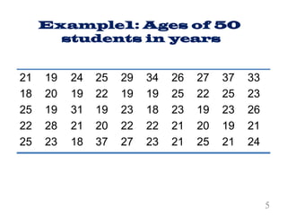
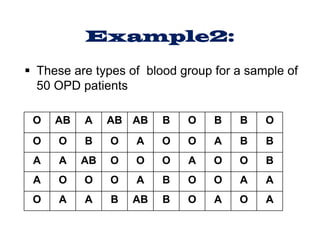
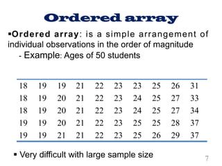
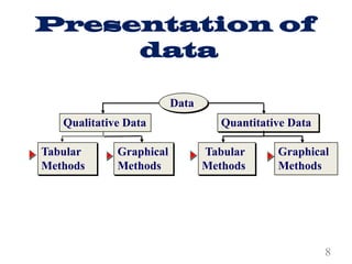
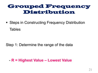
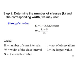
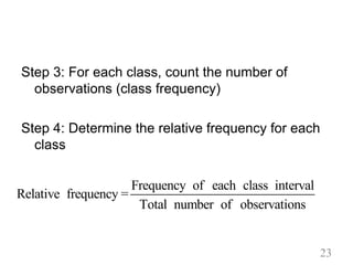
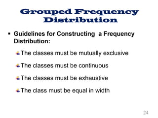
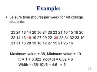
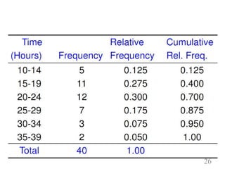
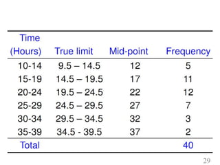
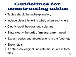
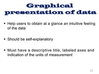
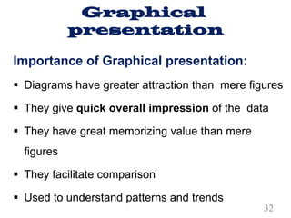
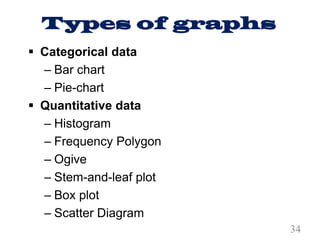
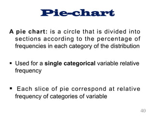
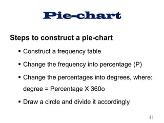
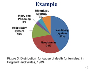
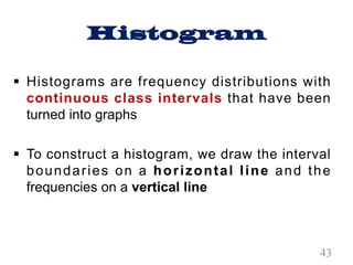
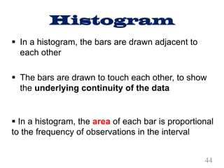
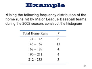
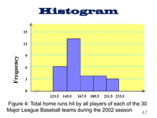
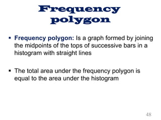
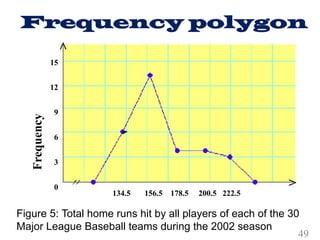
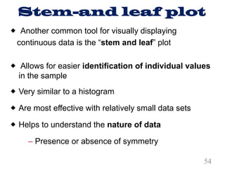
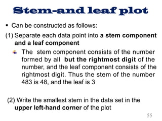
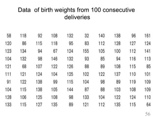
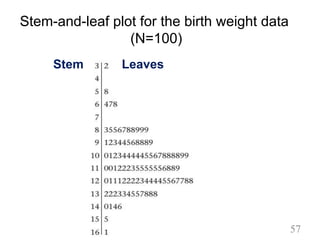
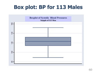
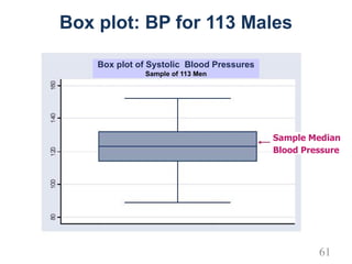
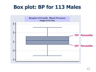
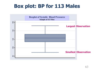
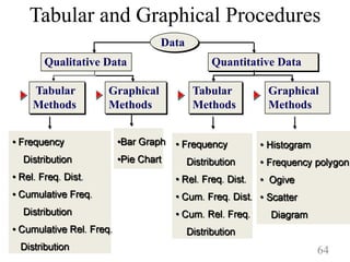
This document provides an overview of descriptive statistics and methods for presenting qualitative and quantitative data. It discusses organizing raw data using frequency distributions and summarization techniques like tabular and graphical methods. Specific graphical methods covered include bar charts, pie charts, histograms, frequency polygons, ogives, stem-and-leaf plots, and box plots. Guidelines are provided for constructing tables and graphs to effectively communicate data patterns and trends.
This slideshow describes about type of data, its tabular and graphical representation by various ways. It is slideshow is useful for bio statisticians and students.
To arrange the data in such a way that it should create interest in the reader’s mind at the first sight.
To present the information in a compact and concise form without losing important details.
Frequency distribution, types of frequency distribution.
Ungrouped frequency distribution
Grouped frequency distribution
Cumulative frequency distribution
Relative frequency distribution
Relative cumulative frequency distribution
Graphical representation of frequency distribution
I. Representation of Grouped data
1.Line graphs
2.Bar diagrams
a) Simple bar diagram
b)Multiple/Grouped bar diagram
c)Sub-divided bar diagram.
d) % bar diagram
3. Pie charts
4.Pictogram
II. Graphical representation of ungrouped data
1, Histogram
2.Frequency polygon
3.Cumulative change diagram
4. Proportional change diagram
5. Ratio diagram
In this lesson we enrich what the students have already learned from Grade 1 to 10 about presenting data. Additional concepts could help the students to appropriately describe further the data set.
This ppt comprises of the the topics of research which tells you about how the data is presented, what are the types of tables, what is simple table, complex table, frequency distribution table, Rules for construction of frequency table, Charts and diagram, Pie chart
Simple bar diagram
Multiple bar diagram
Component bar diagram or subdivided bar diagram
Histogram
Frequency polygon
Frequency curve
Stacked chart
Scatter diagram
Line diagram
Pictogram
Statistical maps
These simplified slides by Dr. Sidra Arshad present an overview of the non-respiratory functions of the respiratory tract.
Learning objectives:
1. Enlist the non-respiratory functions of the respiratory tract
2. Briefly explain how these functions are carried out
3. Discuss the significance of dead space
4. Differentiate between minute ventilation and alveolar ventilation
5. Describe the cough and sneeze reflexes
Study Resources:
1. Chapter 39, Guyton and Hall Textbook of Medical Physiology, 14th edition
2. Chapter 34, Ganong’s Review of Medical Physiology, 26th edition
3. Chapter 17, Human Physiology by Lauralee Sherwood, 9th edition
4. Non-respiratory functions of the lungs https://academic.oup.com/bjaed/article/13/3/98/278874
Prix Galien International 2024 Forum ProgramLevi Shapiro
June 20, 2024, Prix Galien International and Jerusalem Ethics Forum in ROME. Detailed agenda including panels:
- ADVANCES IN CARDIOLOGY: A NEW PARADIGM IS COMING
- WOMEN’S HEALTH: FERTILITY PRESERVATION
- WHAT’S NEW IN THE TREATMENT OF INFECTIOUS,
ONCOLOGICAL AND INFLAMMATORY SKIN DISEASES?
- ARTIFICIAL INTELLIGENCE AND ETHICS
- GENE THERAPY
- BEYOND BORDERS: GLOBAL INITIATIVES FOR DEMOCRATIZING LIFE SCIENCE TECHNOLOGIES AND PROMOTING ACCESS TO HEALTHCARE
- ETHICAL CHALLENGES IN LIFE SCIENCES
- Prix Galien International Awards Ceremony
Factory Supply Best Quality Pmk Oil CAS 28578–16–7 PMK Powder in Stockrebeccabio
Factory Supply Best Quality Pmk Oil CAS 28578–16–7 PMK Powder in Stock
Telegram: bmksupplier
signal: +85264872720
threema: TUD4A6YC
You can contact me on Telegram or Threema
Communicate promptly and reply
Free of customs clearance, Double Clearance 100% pass delivery to USA, Canada, Spain, Germany, Netherland, Poland, Italy, Sweden, UK, Czech Republic, Australia, Mexico, Russia, Ukraine, Kazakhstan.Door to door service
Hot Selling Organic intermediates
Ethanol (CH3CH2OH), or beverage alcohol, is a two-carbon alcohol
that is rapidly distributed in the body and brain. Ethanol alters many
neurochemical systems and has rewarding and addictive properties. It
is the oldest recreational drug and likely contributes to more morbidity,
mortality, and public health costs than all illicit drugs combined. The
5th edition of the Diagnostic and Statistical Manual of Mental Disorders
(DSM-5) integrates alcohol abuse and alcohol dependence into a single
disorder called alcohol use disorder (AUD), with mild, moderate,
and severe subclassifications (American Psychiatric Association, 2013).
In the DSM-5, all types of substance abuse and dependence have been
combined into a single substance use disorder (SUD) on a continuum
from mild to severe. A diagnosis of AUD requires that at least two of
the 11 DSM-5 behaviors be present within a 12-month period (mild
AUD: 2–3 criteria; moderate AUD: 4–5 criteria; severe AUD: 6–11 criteria).
The four main behavioral effects of AUD are impaired control over
drinking, negative social consequences, risky use, and altered physiological
effects (tolerance, withdrawal). This chapter presents an overview
of the prevalence and harmful consequences of AUD in the U.S.,
the systemic nature of the disease, neurocircuitry and stages of AUD,
comorbidities, fetal alcohol spectrum disorders, genetic risk factors, and
pharmacotherapies for AUD.
Lung Cancer: Artificial Intelligence, Synergetics, Complex System Analysis, S...Oleg Kshivets
RESULTS: Overall life span (LS) was 2252.1±1742.5 days and cumulative 5-year survival (5YS) reached 73.2%, 10 years – 64.8%, 20 years – 42.5%. 513 LCP lived more than 5 years (LS=3124.6±1525.6 days), 148 LCP – more than 10 years (LS=5054.4±1504.1 days).199 LCP died because of LC (LS=562.7±374.5 days). 5YS of LCP after bi/lobectomies was significantly superior in comparison with LCP after pneumonectomies (78.1% vs.63.7%, P=0.00001 by log-rank test). AT significantly improved 5YS (66.3% vs. 34.8%) (P=0.00000 by log-rank test) only for LCP with N1-2. Cox modeling displayed that 5YS of LCP significantly depended on: phase transition (PT) early-invasive LC in terms of synergetics, PT N0—N12, cell ratio factors (ratio between cancer cells- CC and blood cells subpopulations), G1-3, histology, glucose, AT, blood cell circuit, prothrombin index, heparin tolerance, recalcification time (P=0.000-0.038). Neural networks, genetic algorithm selection and bootstrap simulation revealed relationships between 5YS and PT early-invasive LC (rank=1), PT N0—N12 (rank=2), thrombocytes/CC (3), erythrocytes/CC (4), eosinophils/CC (5), healthy cells/CC (6), lymphocytes/CC (7), segmented neutrophils/CC (8), stick neutrophils/CC (9), monocytes/CC (10); leucocytes/CC (11). Correct prediction of 5YS was 100% by neural networks computing (area under ROC curve=1.0; error=0.0).
CONCLUSIONS: 5YS of LCP after radical procedures significantly depended on: 1) PT early-invasive cancer; 2) PT N0--N12; 3) cell ratio factors; 4) blood cell circuit; 5) biochemical factors; 6) hemostasis system; 7) AT; 8) LC characteristics; 9) LC cell dynamics; 10) surgery type: lobectomy/pneumonectomy; 11) anthropometric data. Optimal diagnosis and treatment strategies for LC are: 1) screening and early detection of LC; 2) availability of experienced thoracic surgeons because of complexity of radical procedures; 3) aggressive en block surgery and adequate lymph node dissection for completeness; 4) precise prediction; 5) adjuvant chemoimmunoradiotherapy for LCP with unfavorable prognosis.
Title: Sense of Taste
Presenter: Dr. Faiza, Assistant Professor of Physiology
Qualifications:
MBBS (Best Graduate, AIMC Lahore)
FCPS Physiology
ICMT, CHPE, DHPE (STMU)
MPH (GC University, Faisalabad)
MBA (Virtual University of Pakistan)
Learning Objectives:
Describe the structure and function of taste buds.
Describe the relationship between the taste threshold and taste index of common substances.
Explain the chemical basis and signal transduction of taste perception for each type of primary taste sensation.
Recognize different abnormalities of taste perception and their causes.
Key Topics:
Significance of Taste Sensation:
Differentiation between pleasant and harmful food
Influence on behavior
Selection of food based on metabolic needs
Receptors of Taste:
Taste buds on the tongue
Influence of sense of smell, texture of food, and pain stimulation (e.g., by pepper)
Primary and Secondary Taste Sensations:
Primary taste sensations: Sweet, Sour, Salty, Bitter, Umami
Chemical basis and signal transduction mechanisms for each taste
Taste Threshold and Index:
Taste threshold values for Sweet (sucrose), Salty (NaCl), Sour (HCl), and Bitter (Quinine)
Taste index relationship: Inversely proportional to taste threshold
Taste Blindness:
Inability to taste certain substances, particularly thiourea compounds
Example: Phenylthiocarbamide
Structure and Function of Taste Buds:
Composition: Epithelial cells, Sustentacular/Supporting cells, Taste cells, Basal cells
Features: Taste pores, Taste hairs/microvilli, and Taste nerve fibers
Location of Taste Buds:
Found in papillae of the tongue (Fungiform, Circumvallate, Foliate)
Also present on the palate, tonsillar pillars, epiglottis, and proximal esophagus
Mechanism of Taste Stimulation:
Interaction of taste substances with receptors on microvilli
Signal transduction pathways for Umami, Sweet, Bitter, Sour, and Salty tastes
Taste Sensitivity and Adaptation:
Decrease in sensitivity with age
Rapid adaptation of taste sensation
Role of Saliva in Taste:
Dissolution of tastants to reach receptors
Washing away the stimulus
Taste Preferences and Aversions:
Mechanisms behind taste preference and aversion
Influence of receptors and neural pathways
Impact of Sensory Nerve Damage:
Degeneration of taste buds if the sensory nerve fiber is cut
Abnormalities of Taste Detection:
Conditions: Ageusia, Hypogeusia, Dysgeusia (parageusia)
Causes: Nerve damage, neurological disorders, infections, poor oral hygiene, adverse drug effects, deficiencies, aging, tobacco use, altered neurotransmitter levels
Neurotransmitters and Taste Threshold:
Effects of serotonin (5-HT) and norepinephrine (NE) on taste sensitivity
Supertasters:
25% of the population with heightened sensitivity to taste, especially bitterness
Increased number of fungiform papillae
Anti ulcer drugs and their Advance pharmacology ||
Anti-ulcer drugs are medications used to prevent and treat ulcers in the stomach and upper part of the small intestine (duodenal ulcers). These ulcers are often caused by an imbalance between stomach acid and the mucosal lining, which protects the stomach lining.
||Scope: Overview of various classes of anti-ulcer drugs, their mechanisms of action, indications, side effects, and clinical considerations.
Couples presenting to the infertility clinic- Do they really have infertility...Sujoy Dasgupta
Dr Sujoy Dasgupta presented the study on "Couples presenting to the infertility clinic- Do they really have infertility? – The unexplored stories of non-consummation" in the 13th Congress of the Asia Pacific Initiative on Reproduction (ASPIRE 2024) at Manila on 24 May, 2024.
Pulmonary Thromboembolism - etilogy, types, medical- Surgical and nursing man...VarunMahajani
Disruption of blood supply to lung alveoli due to blockage of one or more pulmonary blood vessels is called as Pulmonary thromboembolism. In this presentation we will discuss its causes, types and its management in depth.
Title: Sense of Smell
Presenter: Dr. Faiza, Assistant Professor of Physiology
Qualifications:
MBBS (Best Graduate, AIMC Lahore)
FCPS Physiology
ICMT, CHPE, DHPE (STMU)
MPH (GC University, Faisalabad)
MBA (Virtual University of Pakistan)
Learning Objectives:
Describe the primary categories of smells and the concept of odor blindness.
Explain the structure and location of the olfactory membrane and mucosa, including the types and roles of cells involved in olfaction.
Describe the pathway and mechanisms of olfactory signal transmission from the olfactory receptors to the brain.
Illustrate the biochemical cascade triggered by odorant binding to olfactory receptors, including the role of G-proteins and second messengers in generating an action potential.
Identify different types of olfactory disorders such as anosmia, hyposmia, hyperosmia, and dysosmia, including their potential causes.
Key Topics:
Olfactory Genes:
3% of the human genome accounts for olfactory genes.
400 genes for odorant receptors.
Olfactory Membrane:
Located in the superior part of the nasal cavity.
Medially: Folds downward along the superior septum.
Laterally: Folds over the superior turbinate and upper surface of the middle turbinate.
Total surface area: 5-10 square centimeters.
Olfactory Mucosa:
Olfactory Cells: Bipolar nerve cells derived from the CNS (100 million), with 4-25 olfactory cilia per cell.
Sustentacular Cells: Produce mucus and maintain ionic and molecular environment.
Basal Cells: Replace worn-out olfactory cells with an average lifespan of 1-2 months.
Bowman’s Gland: Secretes mucus.
Stimulation of Olfactory Cells:
Odorant dissolves in mucus and attaches to receptors on olfactory cilia.
Involves a cascade effect through G-proteins and second messengers, leading to depolarization and action potential generation in the olfactory nerve.
Quality of a Good Odorant:
Small (3-20 Carbon atoms), volatile, water-soluble, and lipid-soluble.
Facilitated by odorant-binding proteins in mucus.
Membrane Potential and Action Potential:
Resting membrane potential: -55mV.
Action potential frequency in the olfactory nerve increases with odorant strength.
Adaptation Towards the Sense of Smell:
Rapid adaptation within the first second, with further slow adaptation.
Psychological adaptation greater than receptor adaptation, involving feedback inhibition from the central nervous system.
Primary Sensations of Smell:
Camphoraceous, Musky, Floral, Pepperminty, Ethereal, Pungent, Putrid.
Odor Detection Threshold:
Examples: Hydrogen sulfide (0.0005 ppm), Methyl-mercaptan (0.002 ppm).
Some toxic substances are odorless at lethal concentrations.
Characteristics of Smell:
Odor blindness for single substances due to lack of appropriate receptor protein.
Behavioral and emotional influences of smell.
Transmission of Olfactory Signals:
From olfactory cells to glomeruli in the olfactory bulb, involving lateral inhibition.
Primitive, less old, and new olfactory systems with different path
2. Learning
objectives
§ At the end of this session you will be able to:
• Present qualitative data using tabular methods
• Present qualitative data using graphical methods
• Present quantitative data using tabular methods
• Present quantitative data using graphical
methods
2
3. Descriptive
summary statistics
§ Descriptive statistics: Techniques used to
organize and summarize a set of data in more
comprehensible and meaningful way
– Organization of data
– Summarization of data
– Presentation of data
§ Numbers that have not been summarized and
organized are called raw data
3
4. Raw data
Definition
§ Data that have been collected or recorded but
have not been arranged or processed yet are
called raw data
4
6. Example2:
§ These are types of blood group for a sample of
50 OPD patients
O AB A AB AB B O B B O
O O B O A O O A B B
A A AB O O O A O O B
A O O O A B O O A A
O A A B AB B O A O A
9. Frequency
Distribution
§ Frequency distribution: is a table that summarizes
a raw data into non-overlapping classes or categories
along with their corresponding class frequency
§ Class frequency: The number of observations that
fall into the class
§ The objective is to provide insights about the data
that cannot be quickly obtained by looking only at the
original data
9
10. Frequency
Distribution
§ The actual summarization and organization of
data starts from frequency distribution
§ The distribution condenses the raw data into a
more useful form and allows for a quick visual
interpretation of the data
10
11. Frequency Distribution
for categorical variables
§ Count the number of observations (frequency) in
each category and present as relative
frequencies
§ Often presented in the form of Table, Bar and
Pie charts
11
12. Frequency Distribution for
categorical variables
§ Relative frequency: value for any category
obtained by dividing the number of observations in
that category by the total number of observations
- Class relative frequency = Class frequency/
Total number of observations
§ This can be reported as a percentage by
multiplying the resulting fraction by 100
12
13. Frequency Distribution
for categorical variables
§ A relative frequency distribution: Shows the proportion
of counts that fall into each class or category
§ For nominal and ordinal data, frequency distributions
are often used as a summary
§ The % of times that each value occurs, or the relative
frequency, is often listed
§ Tables make it easier to see how the data are
distributed
13
14. Example 1: Nominal data
Table 1: Type of hospitals owned by MOH in Ethiopia
in 2006/07
Source: Health and health related indicator
14
15. Example 2: Ordinal data
Table 2: Level of satisfaction, with nursing care by
475 psychiatric in-patients, 1991
15
16. Frequency Distribution
for numerical variables
§ A frequency distribution can also show the number
of observations at different values or within
certain ranges
§ There are two types of frequency distribution:
– Single value (ungrouped frequency)
– Interval type (classes) – grouped frequency
16
17. Ungrouped Frequency
Distribution
§ Ungrouped frequency distribution: Consists
of a single data with their respective frequency
§ Can be used when the range of values in the
data set is not large
§ Classes are one unit in width
17
18. Example:
§ Leisure time in hours per week for 40 college
students:
23 24 18 14 20 36 24 26 23 21 16 15 19 20
22 14 13 10 19 27 29 22 38 28 34 32 23 19
21 31 16 28 19 18 12 27 15 21 25 16
Construct a frequency distribution table?
18
20. Grouped Frequency
Distribution
§ Can be used when the range of values in the
data set is large
§ The data must be grouped into classes that are
more than one unit in width
20
21. Grouped Frequency
Distribution
§ Steps in Constructing Frequency Distribution
Tables
Step 1: Determine the range of the data
- R = Highest Value – Lowest Value
21
22. Step 2: Determine the number of classes (k) and
the corresponding width, we may use:
Where;
K = number of class intervals n = no. of observations
W = width of the class interval L = the largest value
S = the smallest value
22
23. Step 3: For each class, count the number of
observations (class frequency)
Step 4: Determine the relative frequency for each
class
Frequency of each class interval
Relative frequency =
Total number of observations
23
27. § Cumulative frequencies: When frequencies of
two or more classes are added
§ Cumulative relative frequency: The proportion of
the total number of observations that have a value
less than or equal to the upper limit of the interval
§ Mid-point: The value of the interval which lies
midway between the lower and the upper limits of
a class
27
28. § True limits: Are those limits that make an
interval of a continuous variable continuous in
both directions
§ Used for smoothening of the class intervals
§ Subtract 0.5 from the lower and add it to the
upper limit
28
30. Guidelines for
constructing tables
§ Tables should be self-explanatory
§ Include clear title telling what, when and where
§ Clearly label the rows and columns
§ State clearly the unit of measurement used
§ Explain codes and abbreviations in the foot-note
§ Show totals
§ If data is not original, indicate the source in foot-
note
30
31. Graphical
presentation of data
§ Help users to obtain at a glance an intuitive feeling
of the data
§ Should be self-explanatory
§ Must have a descriptive title, labeled axes and
indication of the units of measurement
31
32. Graphical
presentation
Importance of Graphical presentation:
§ Diagrams have greater attraction than mere figures
§ They give quick overall impression of the data
§ They have great memorizing value than mere
figures
§ They facilitate comparison
§ Used to understand patterns and trends
32
33. Graphical
presentation
§ Well designed graphs can be powerful means of
communicating a great deal of information
§ When graphs are poorly designed, they not only
ineffectively convey message, but they are often
misleading
33
34. Types of graphs
§ Categorical data
– Bar chart
– Pie-chart
§ Quantitative data
– Histogram
– Frequency Polygon
– Ogive
– Stem-and-leaf plot
– Box plot
– Scatter Diagram
34
35. Bar chart
Definition:
§ A graph made of bars whose heights represent
the frequencies of respective categories is called
a bar graph.
35
36. Bar chart
§ Used to display frequency contained in the
frequency distribution of categorical variable
§ It is used with categorical data
§ Each bar represent one category and its height is
the frequency or relative frequency
o y – axis: Frequency or the relative
frequency or percentage
o x – axis: Category
36
37. Bar chart
Rules
o Bars should be separated
o The gap between each bar is uniform
o All bars should be of the same width
o All the bars should rest on the same line called the
base
o It is very important that Y axis begin with 0
o Label both axes clearly
37
38. Simple bar chart
38
40.6
53.9
5.5
0
10
20
30
40
50
60
First trimester Second trimester Third trimester
Percentage
Series1
Figure 1 : First ANC booking time among pregnant women in X
Town, Ethiopia, 2017
§The simple bar chart is appropriate if only one
variable is to be shown
39. Clustered bar chart
39
Urban Rural
0
5
10
15
20
25
30
35
40
45
50
55
60
65
70
75
80
85
90
95
Percent
Residence
First day
Second and subsquent days
25.7
74.3
10.0
90
Figure 2 : Timing of health care seeking reported by place of
residence, X District, Ethiopia, 2011.
40. Pie-chart
A pie chart: is a circle that is divided into
sections according to the percentage of
frequencies in each category of the distribution
§ Used for a single categorical variable relative
frequency
§ Each slice of pie correspond at relative
frequency of categories of variable
40
41. Pie-chart
Steps to construct a pie-chart
§ Construct a frequency table
§ Change the frequency into percentage (P)
§ Change the percentages into degrees, where:
degree = Percentage X 360o
§ Draw a circle and divide it accordingly
41
43. Histogram
§ Histograms are frequency distributions with
continuous class intervals that have been
turned into graphs
§ To construct a histogram, we draw the interval
boundaries on a horizontal line and the
frequencies on a vertical line
43
44. Histogram
§ In a histogram, the bars are drawn adjacent to
each other
§ The bars are drawn to touch each other, to show
the underlying continuity of the data
§ In a histogram, the area of each bar is proportional
to the frequency of observations in the interval
44
45. Example
Total Home Runs f
124 – 145
146 – 167
168 – 189
190 – 211
212 - 233
6
13
4
4
3
§Using the following frequency distribution of the
home runs hit by Major League Baseball teams
during the 2002 season, construct the histogram
45
46. Total Home
Runs
Class Boundaries Frequency
Cumulative
frequency
124 – 145
146 – 167
168 – 189
190 – 211
212 - 233
123.5 - 145.5
145.5 - 167.5
167.5 - 189.5
189.5 - 211.5
211.5 - 233.5
6
13
4
4
3
6
19
23
27
30
Total 30
§ Class boundaries and their Frequency and
cumulative frequency distributions
46
48. Frequency
polygon
§ Frequency polygon: Is a graph formed by joining
the midpoints of the tops of successive bars in a
histogram with straight lines
§ The total area under the frequency polygon is
equal to the area under the histogram
48
50. Ogive
§ Ogive: Is a curve drawn for the cumulative
frequency distribution by joining with straight lines
the dots marked above the upper boundaries of
classes at heights equal to the cumulative
frequencies of respective classes
50
51. Ogive
§ It is obtained as follows:
On a vertical axis we mark cumulative frequency
On a horizontal axis we mark the upper
boundaries of all classes. However, the lower
boundary of the first class will be the starting
point
Then, a smooth curve is drawn joining all these
points
51
52. Total Home
Runs
Class Boundaries Frequency
Cumulative
frequency
124 – 145
146 – 167
168 – 189
190 – 211
212 - 233
123.5 - 145.5
145.5 - 167.5
167.5 - 189.5
189.5 - 211.5
211.5 - 233.5
6
13
4
4
3
6
19
23
27
30
Total 30
§ Class boundaries and their Frequency and
cumulative frequency distributions
52
53. Ogive
123.5 145.5 167.5 189.5 211.5 233.5
30
25
20
15
10
5
Figure 6: Total home runs hit by all players of each of the 30
Major League Baseball teams during the 2002 season
Cumulative
frequency
53
54. Stem-and leaf plot
® Another common tool for visually displaying
continuous data is the “stem and leaf” plot
® Allows for easier identification of individual values
in the sample
® Very similar to a histogram
® Are most effective with relatively small data sets
® Helps to understand the nature of data
– Presence or absence of symmetry
54
55. Stem-and leaf plot
§ Can be constructed as follows:
(1) Separate each data point into a stem component
and a leaf component
The stem component consists of the number
formed by all but the rightmost digit of the
number, and the leaf component consists of the
rightmost digit. Thus the stem of the number
483 is 48, and the leaf is 3
(2) Write the smallest stem in the data set in the
upper left-hand corner of the plot
55
56. Data of birth weights from 100 consecutive
deliveries
56
58. Stem-and-leaf plot can be constructed as
follows:
(3) Write the second stem, which equals the fist stem
+ 1, below the fist stem
(4) Continue with step until you reach the largest stem
in the data set
(5) Draw a vertical bar to the right of the column of
stems
(6) For each number in the data set, find the
appropriate stem and write the leaf to the right of
the vertical bar
58
59. § One way to give a nice profile of a data set is the
box plot
§ Gives good insight into distribution shape in terms
of skewness and outlying values
§ Very nice tool for easily comparing distribution of
continuous data in multiple groups—can be plotted
side by side
Box plot
59
60. Box plot: BP for 113 Males
Boxplot of Systolic Blood Pressures
Sample of 113 Men
60
61. Box plot: BP for 113 Males
Sample Median
Blood Pressure
Box plot of Systolic Blood Pressures
Sample of 113 Men
61
62. Box plot: BP for 113 Males
75th Percentile
25th Percentile
Boxplot of Systolic Blood Pressures
Sample of 113 Men
62
63. Box plot: BP for 113 Males
Largest Observation
Smallest Observation
Boxplot of Systolic Blood Pressures
Sample of 113 Men
63
64. Tabular and Graphical Procedures
Qualitative Data Quantitative Data
Tabular
Methods
Tabular
Methods
Graphical
Methods
Graphical
Methods
Data
64