Downloaded 749 times


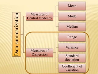
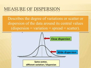
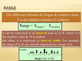
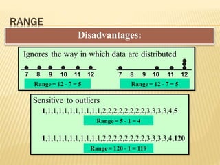


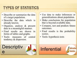


The document focuses on the role and applications of statistics in community medicine, emphasizing data collection, analysis, and presentation to inform health care programs and epidemiological research. It outlines the types of statistical data, methodologies for summarization like measures of central tendency and dispersion, and the importance of graphical representations such as tables and graphs. Additionally, it discusses inferential statistics and hypothesis testing as methods to make generalizations about populations based on sample data.


