Downloaded 2,720 times

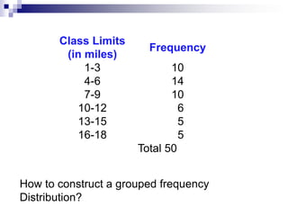
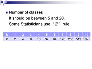
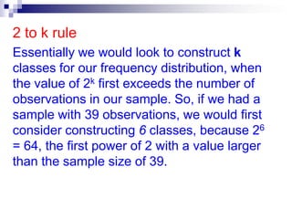

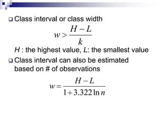

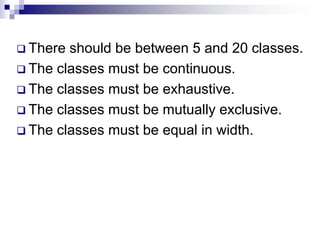


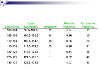
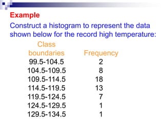

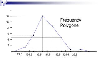


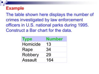
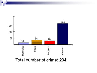


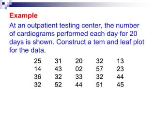

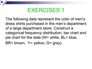
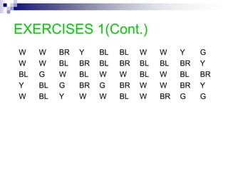


This document discusses different types of graphs and charts that can be used to represent frequency distributions of data, including histograms, frequency polygons, ogives, bar charts, pie charts, and stem-and-leaf plots. It provides examples of how to construct each graph or chart using sample data sets and discusses key aspects of each type such as class intervals, relative frequencies, and ordering of data. Guidelines are given for determining the optimal number of classes and class widths for grouped data. Exercises at the end provide practice applying these techniques to additional data sets.