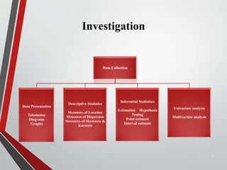
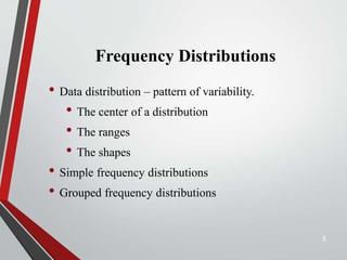
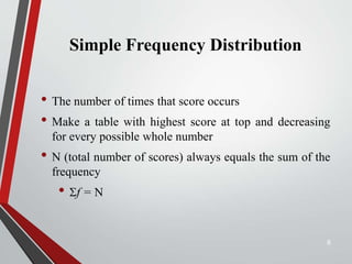
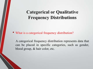
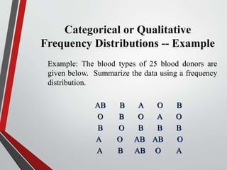
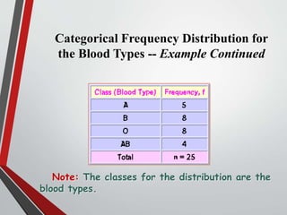
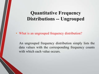
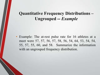
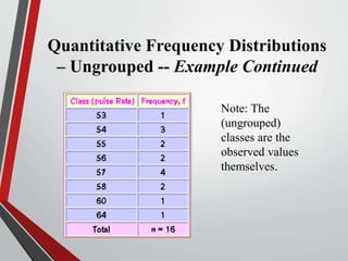
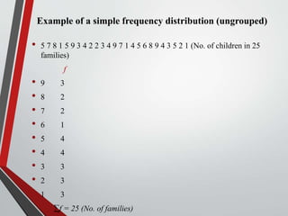
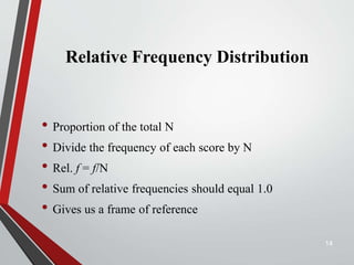
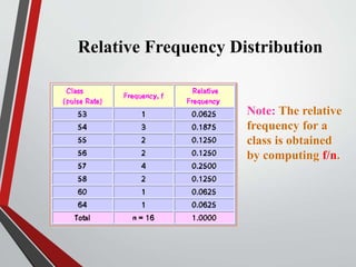
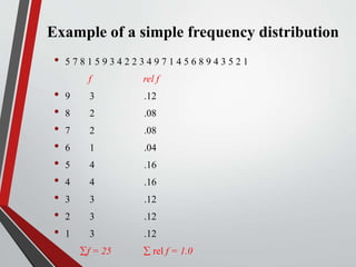
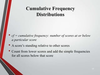
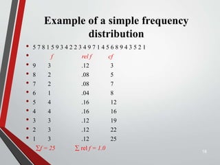
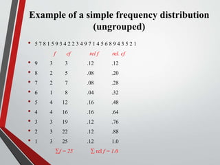
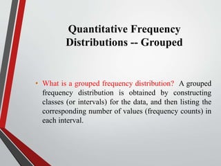
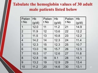
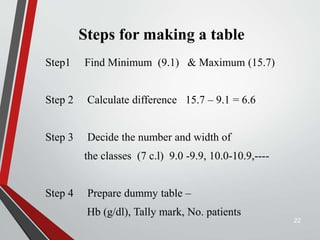
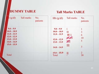
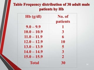
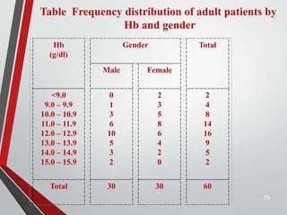
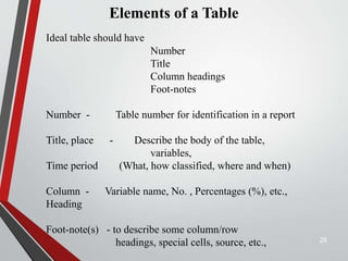
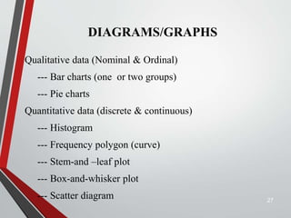
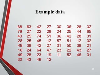
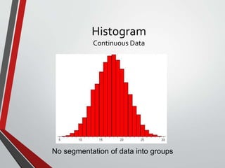
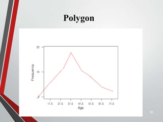
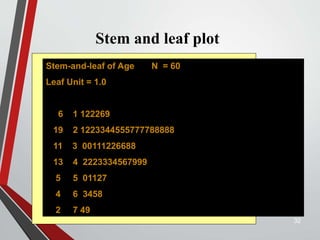
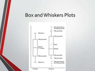
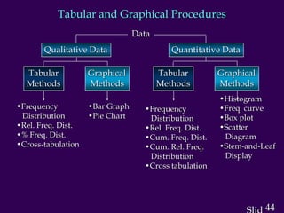
Tabular & Graphical
Presentation of data
Dr. Shaik Shaffi Ahamed
Associate Professor
Department of Family & Community
Medicine
1
Objectives of this session
• To know how to make frequency distributions and its
importance
• To know different terminology in frequency distribution
table
• To learn different graphs/diagrams for graphical
presentation of data.
2
Investigation
Data Collection
Data Presentation
Tabulation
Diagrams
Graphs
Descriptive Statistics
Measures of Location
Measures of Dispersion
Measures of Skewness &
Kurtosis
Inferential Statistiscs
Estimation Hypothesis
Testing
Point estimate
Interval estimate
Univariate analysis
Multivariate analysis
3
Frequency Distributions
“A Picture is Worth a Thousand Words”
4
Frequency Distributions
• Data distribution – pattern of variability.
• The center of a distribution
• The ranges
• The shapes
• Simple frequency distributions
• Grouped frequency distributions
5
Simple Frequency Distribution
• The number of times that score occurs
• Make a table with highest score at top and decreasing
for every possible whole number
• N (total number of scores) always equals the sum of the
frequency
• f = N
6
Categorical or Qualitative
Frequency Distributions
• What is a categorical frequency distribution?
A categorical frequency distribution represents data that
can be placed in specific categories, such as gender,
blood group, & hair color, etc.
Categorical or Qualitative
Frequency Distributions -- Example
Example: The blood types of 25 blood donors are
given below. Summarize the data using a frequency
distribution.
AB B A O B
O B O A O
B O B B B
A O AB AB O
A B AB O A
Categorical Frequency Distribution for
the Blood Types -- Example Continued
Note: The classes for the distribution are the
blood types.
Quantitative Frequency
Distributions -- Ungrouped
• What is an ungrouped frequency distribution?
An ungrouped frequency distribution simply lists the
data values with the corresponding frequency counts
with which each value occurs.
Quantitative Frequency Distributions –
Ungrouped -- Example
• Example: The at-rest pulse rate for 16 athletes at a
meet were 57, 57, 56, 57, 58, 56, 54, 64, 53, 54, 54,
55, 57, 55, 60, and 58. Summarize the information
with an ungrouped frequency distribution.
Quantitative Frequency Distributions
– Ungrouped -- Example Continued
Note: The
(ungrouped)
classes are the
observed values
themselves.
Example of a simple frequency distribution (ungrouped)
• 5 7 8 1 5 9 3 4 2 2 3 4 9 7 1 4 5 6 8 9 4 3 5 2 1 (No. of children in 25
families)
f
• 9 3
• 8 2
• 7 2
• 6 1
• 5 4
• 4 4
• 3 3
• 2 3
• 1 3
f = 25 (No. of families)
Relative Frequency Distribution
• Proportion of the total N
• Divide the frequency of each score by N
• Rel. f = f/N
• Sum of relative frequencies should equal 1.0
• Gives us a frame of reference
14
Relative Frequency Distribution
Note: The relative
frequency for a
class is obtained
by computing f/n.
Example of a simple frequency distribution
• 5 7 8 1 5 9 3 4 2 2 3 4 9 7 1 4 5 6 8 9 4 3 5 2 1
f rel f
• 9 3 .12
• 8 2 .08
• 7 2 .08
• 6 1 .04
• 5 4 .16
• 4 4 .16
• 3 3 .12
• 2 3 .12
• 1 3 .12
• f = 25  rel f = 1.0
Cumulative Frequency
Distributions
• cf = cumulative frequency: number of scores at or below
a particular score
• A score’s standing relative to other scores
• Count from lower scores and add the simple frequencies
for all scores below that score
17
Example of a simple frequency
distribution
• 5 7 8 1 5 9 3 4 2 2 3 4 9 7 1 4 5 6 8 9 4 3 5 2 1
• f rel f cf
• 9 3 .12 3
• 8 2 .08 5
• 7 2 .08 7
• 6 1 .04 8
• 5 4 .16 12
• 4 4 .16 16
• 3 3 .12 19
• 2 3 .12 22
• 1 3 .12 25
• f = 25  rel f = 1.0 18
Example of a simple frequency distribution
(ungrouped)
• 5 7 8 1 5 9 3 4 2 2 3 4 9 7 1 4 5 6 8 9 4 3 5 2 1
f cf rel f rel. cf
• 9 3 3 .12 .12
• 8 2 5 .08 .20
• 7 2 7 .08 .28
• 6 1 8 .04 .32
• 5 4 12 .16 .48
• 4 4 16 .16 .64
• 3 3 19 .12 .76
• 2 3 22 .12 .88
• 1 3 25 .12 1.0
• f = 25  rel f = 1.0
Quantitative Frequency
Distributions -- Grouped
• What is a grouped frequency distribution? A grouped
frequency distribution is obtained by constructing
classes (or intervals) for the data, and then listing the
corresponding number of values (frequency counts) in
each interval.
21
Patien
t No
Hb
(g/dl)
Patien
t No
Hb
(g/dl)
Patien
t No
Hb
(g/dl)
1 12.0 11 11.2 21 14.9
2 11.9 12 13.6 22 12.2
3 11.5 13 10.8 23 12.2
4 14.2 14 12.3 24 11.4
5 12.3 15 12.3 25 10.7
6 13.0 16 15.7 26 12.5
7 10.5 17 12.6 27 11.8
8 12.8 18 9.1 28 15.1
9 13.2 19 12.9 29 13.4
10 11.2 20 14.6 30 13.1
Tabulate the hemoglobin values of 30 adult
male patients listed below
Steps for making a table
Step1 Find Minimum (9.1) & Maximum (15.7)
Step 2 Calculate difference 15.7 – 9.1 = 6.6
Step 3 Decide the number and width of
the classes (7 c.l) 9.0 -9.9, 10.0-10.9,----
Step 4 Prepare dummy table –
Hb (g/dl), Tally mark, No. patients
22
23
Hb (g/dl) Tall marks No.
patients
9.0 – 9.9
10.0 – 10.9
11.0 – 11.9
12.0 – 12.9
13.0 – 13.9
14.0 – 14.9
15.0 – 15.9
Total
Hb (g/dl) Tall marks No.
patients
9.0 – 9.9
10.0 – 10.9
11.0 – 11.9
12.0 – 12.9
13.0 – 13.9
14.0 – 14.9
15.0 – 15.9
l
lll
llll 1
llll llll
llll
lll
ll
1
3
6
10
5
3
2
Total - 30
DUMMY TABLE Tall Marks TABLE
24
Hb (g/dl) No. of
patients
9.0 – 9.9
10.0 – 10.9
11.0 – 11.9
12.0 – 12.9
13.0 – 13.9
14.0 – 14.9
15.0 – 15.9
1
3
6
10
5
3
2
Total 30
Table Frequency distribution of 30 adult male
patients by Hb
25
Table Frequency distribution of adult patients by
Hb and gender
Hb
(g/dl)
Gender Total
Male Female
<9.0
9.0 – 9.9
10.0 – 10.9
11.0 – 11.9
12.0 – 12.9
13.0 – 13.9
14.0 – 14.9
15.0 – 15.9
0
1
3
6
10
5
3
2
2
3
5
8
6
4
2
0
2
4
8
14
16
9
5
2
Total 30 30 60
26
Elements of a Table
Ideal table should have
Number
Title
Column headings
Foot-notes
Number - Table number for identification in a report
Title, place - Describe the body of the table,
variables,
Time period (What, how classified, where and when)
Column - Variable name, No. , Percentages (%), etc.,
Heading
Foot-note(s) - to describe some column/row
headings, special cells, source, etc.,
DIAGRAMS/GRAPHS
Qualitative data (Nominal & Ordinal)
--- Bar charts (one or two groups)
--- Pie charts
Quantitative data (discrete & continuous)
--- Histogram
--- Frequency polygon (curve)
--- Stem-and –leaf plot
--- Box-and-whisker plot
--- Scatter diagram 27
Example data
28
68 63 42 27 30 36 28 32
79 27 22 28 24 25 44 65
43 25 74 51 36 42 28 31
28 25 45 12 57 51 12 32
49 38 42 27 31 50 38 21
16 24 64 47 23 22 43 27
49 28 23 19 11 52 46 31
30 43 49 12
Histogram
Continuous Data
No segmentation of data into groups
Polygon
30
71.5
61.5
51.5
41.5
31.5
21.5
11.5
20
10
0
Age
Frequency
Example data
31
68 63 42 27 30 36 28 32
79 27 22 28 24 25 44 65
43 25 74 51 36 42 28 31
28 25 45 12 57 51 12 32
49 38 42 27 31 50 38 21
16 24 64 47 23 22 43 27
49 28 23 19 11 52 46 31
30 43 49 12
Stem and leaf plot
32
Stem-and-leaf of Age N = 60
Leaf Unit = 1.0
6 1 122269
19 2 1223344555777788888
11 3 00111226688
13 4 2223334567999
5 5 01127
4 6 3458
2 7 49
Box andWhiskers Plots
Descriptive statistics report: Boxplot
34
- minimum score
- maximum score
- lower quartile
- upper quartile
- median
- mean
- The skew of the distribution
positive skew: mean > median & high-score whisker is
longer
negative skew: mean < median & low-score whisker is
longer
Box andWhisker Plots
Popular in Epidemiologic Studies
Useful for presenting comparative data graphically
36
Application of a box and Whisker diagram
37
10%
20%
70%
Mild
Moderate
Severe
The prevalence of different degree of Hypertension
in the population
Pie Chart
•Circular diagram – total -100%
•Divided into segments each
representing a category
•Decide adjacent category
•The amount for each category is
proportional to slice of the pie
Percent of people dying from
top 10 causes of death in the United States in 2001
Top 10 causes of death: pie chart
Each slice represents a piece of one whole. The size of a slice depends on what
percent of the whole this category represents.
Bar Graphs
39
9
12
20
16
12
8
20
0
5
10
15
20
25
Smo Alc Chol DM HTN No
Exer
F-H
Riskfactor
Number
The distribution of risk factor among cases with
Cardio vascular Diseases
Heights of the bar indicates
frequency
Frequency in the Y axis and
categories of variable in the X
axis
The bars should be of equal
width and no touching the
other bars
HIV cases enrolment in USA by gender
0
2
4
6
8
10
12
1986 1987 1988 1989 1990 1991 1992
Year
Enrollment
(hundred)
Men
Women
40
Bar chart
HIV cases Enrollment
in USA by gender
0
2
4
6
8
10
12
14
16
18
1986 1987 1988 1989 1990 1991 1992
Year
Enrollment
(Thousands)
Women
Men
41
Stocked bar
chart
42
General rules for designing graphs
• A graph should have a self-explanatory legend
• A graph should help reader to understand data
• Axis labeled, units of measurement indicated
• Scales important. Start with zero (otherwise // break)
• Avoid graphs with three-dimensional impression, it may
be misleading (reader visualize less easily
43
44
Tabular and Graphical Procedures
Data
Qualitative Data Quantitative Data
Tabular
Methods
Tabular
Methods
Graphical
Methods
Graphical
Methods
•Frequency
Distribution
•Rel. Freq. Dist.
•% Freq. Dist.
•Cross-tabulation
•Bar Graph
•Pie Chart
•Frequency
Distribution
•Rel. Freq. Dist.
•Cum. Freq. Dist.
•Cum. Rel. Freq.
Distribution
•Cross tabulation
•Histogram
•Freq. curve
•Box plot
•Scatter
Diagram
•Stem-and-Leaf
Display
Any Questions?
45

20- Tabular & Graphical Presentation of data(UG2017-18).ppt

  • 1.
    Tabular & Graphical Presentationof data Dr. Shaik Shaffi Ahamed Associate Professor Department of Family & Community Medicine 1
  • 2.
    Objectives of thissession • To know how to make frequency distributions and its importance • To know different terminology in frequency distribution table • To learn different graphs/diagrams for graphical presentation of data. 2
  • 3.
    Investigation Data Collection Data Presentation Tabulation Diagrams Graphs DescriptiveStatistics Measures of Location Measures of Dispersion Measures of Skewness & Kurtosis Inferential Statistiscs Estimation Hypothesis Testing Point estimate Interval estimate Univariate analysis Multivariate analysis 3
  • 4.
    Frequency Distributions “A Pictureis Worth a Thousand Words” 4
  • 5.
    Frequency Distributions • Datadistribution – pattern of variability. • The center of a distribution • The ranges • The shapes • Simple frequency distributions • Grouped frequency distributions 5
  • 6.
    Simple Frequency Distribution •The number of times that score occurs • Make a table with highest score at top and decreasing for every possible whole number • N (total number of scores) always equals the sum of the frequency • f = N 6
  • 7.
    Categorical or Qualitative FrequencyDistributions • What is a categorical frequency distribution? A categorical frequency distribution represents data that can be placed in specific categories, such as gender, blood group, & hair color, etc.
  • 8.
    Categorical or Qualitative FrequencyDistributions -- Example Example: The blood types of 25 blood donors are given below. Summarize the data using a frequency distribution. AB B A O B O B O A O B O B B B A O AB AB O A B AB O A
  • 9.
    Categorical Frequency Distributionfor the Blood Types -- Example Continued Note: The classes for the distribution are the blood types.
  • 10.
    Quantitative Frequency Distributions --Ungrouped • What is an ungrouped frequency distribution? An ungrouped frequency distribution simply lists the data values with the corresponding frequency counts with which each value occurs.
  • 11.
    Quantitative Frequency Distributions– Ungrouped -- Example • Example: The at-rest pulse rate for 16 athletes at a meet were 57, 57, 56, 57, 58, 56, 54, 64, 53, 54, 54, 55, 57, 55, 60, and 58. Summarize the information with an ungrouped frequency distribution.
  • 12.
    Quantitative Frequency Distributions –Ungrouped -- Example Continued Note: The (ungrouped) classes are the observed values themselves.
  • 13.
    Example of asimple frequency distribution (ungrouped) • 5 7 8 1 5 9 3 4 2 2 3 4 9 7 1 4 5 6 8 9 4 3 5 2 1 (No. of children in 25 families) f • 9 3 • 8 2 • 7 2 • 6 1 • 5 4 • 4 4 • 3 3 • 2 3 • 1 3 f = 25 (No. of families)
  • 14.
    Relative Frequency Distribution •Proportion of the total N • Divide the frequency of each score by N • Rel. f = f/N • Sum of relative frequencies should equal 1.0 • Gives us a frame of reference 14
  • 15.
    Relative Frequency Distribution Note:The relative frequency for a class is obtained by computing f/n.
  • 16.
    Example of asimple frequency distribution • 5 7 8 1 5 9 3 4 2 2 3 4 9 7 1 4 5 6 8 9 4 3 5 2 1 f rel f • 9 3 .12 • 8 2 .08 • 7 2 .08 • 6 1 .04 • 5 4 .16 • 4 4 .16 • 3 3 .12 • 2 3 .12 • 1 3 .12 • f = 25  rel f = 1.0
  • 17.
    Cumulative Frequency Distributions • cf= cumulative frequency: number of scores at or below a particular score • A score’s standing relative to other scores • Count from lower scores and add the simple frequencies for all scores below that score 17
  • 18.
    Example of asimple frequency distribution • 5 7 8 1 5 9 3 4 2 2 3 4 9 7 1 4 5 6 8 9 4 3 5 2 1 • f rel f cf • 9 3 .12 3 • 8 2 .08 5 • 7 2 .08 7 • 6 1 .04 8 • 5 4 .16 12 • 4 4 .16 16 • 3 3 .12 19 • 2 3 .12 22 • 1 3 .12 25 • f = 25  rel f = 1.0 18
  • 19.
    Example of asimple frequency distribution (ungrouped) • 5 7 8 1 5 9 3 4 2 2 3 4 9 7 1 4 5 6 8 9 4 3 5 2 1 f cf rel f rel. cf • 9 3 3 .12 .12 • 8 2 5 .08 .20 • 7 2 7 .08 .28 • 6 1 8 .04 .32 • 5 4 12 .16 .48 • 4 4 16 .16 .64 • 3 3 19 .12 .76 • 2 3 22 .12 .88 • 1 3 25 .12 1.0 • f = 25  rel f = 1.0
  • 20.
    Quantitative Frequency Distributions --Grouped • What is a grouped frequency distribution? A grouped frequency distribution is obtained by constructing classes (or intervals) for the data, and then listing the corresponding number of values (frequency counts) in each interval.
  • 21.
    21 Patien t No Hb (g/dl) Patien t No Hb (g/dl) Patien tNo Hb (g/dl) 1 12.0 11 11.2 21 14.9 2 11.9 12 13.6 22 12.2 3 11.5 13 10.8 23 12.2 4 14.2 14 12.3 24 11.4 5 12.3 15 12.3 25 10.7 6 13.0 16 15.7 26 12.5 7 10.5 17 12.6 27 11.8 8 12.8 18 9.1 28 15.1 9 13.2 19 12.9 29 13.4 10 11.2 20 14.6 30 13.1 Tabulate the hemoglobin values of 30 adult male patients listed below
  • 22.
    Steps for makinga table Step1 Find Minimum (9.1) & Maximum (15.7) Step 2 Calculate difference 15.7 – 9.1 = 6.6 Step 3 Decide the number and width of the classes (7 c.l) 9.0 -9.9, 10.0-10.9,---- Step 4 Prepare dummy table – Hb (g/dl), Tally mark, No. patients 22
  • 23.
    23 Hb (g/dl) Tallmarks No. patients 9.0 – 9.9 10.0 – 10.9 11.0 – 11.9 12.0 – 12.9 13.0 – 13.9 14.0 – 14.9 15.0 – 15.9 Total Hb (g/dl) Tall marks No. patients 9.0 – 9.9 10.0 – 10.9 11.0 – 11.9 12.0 – 12.9 13.0 – 13.9 14.0 – 14.9 15.0 – 15.9 l lll llll 1 llll llll llll lll ll 1 3 6 10 5 3 2 Total - 30 DUMMY TABLE Tall Marks TABLE
  • 24.
    24 Hb (g/dl) No.of patients 9.0 – 9.9 10.0 – 10.9 11.0 – 11.9 12.0 – 12.9 13.0 – 13.9 14.0 – 14.9 15.0 – 15.9 1 3 6 10 5 3 2 Total 30 Table Frequency distribution of 30 adult male patients by Hb
  • 25.
    25 Table Frequency distributionof adult patients by Hb and gender Hb (g/dl) Gender Total Male Female <9.0 9.0 – 9.9 10.0 – 10.9 11.0 – 11.9 12.0 – 12.9 13.0 – 13.9 14.0 – 14.9 15.0 – 15.9 0 1 3 6 10 5 3 2 2 3 5 8 6 4 2 0 2 4 8 14 16 9 5 2 Total 30 30 60
  • 26.
    26 Elements of aTable Ideal table should have Number Title Column headings Foot-notes Number - Table number for identification in a report Title, place - Describe the body of the table, variables, Time period (What, how classified, where and when) Column - Variable name, No. , Percentages (%), etc., Heading Foot-note(s) - to describe some column/row headings, special cells, source, etc.,
  • 27.
    DIAGRAMS/GRAPHS Qualitative data (Nominal& Ordinal) --- Bar charts (one or two groups) --- Pie charts Quantitative data (discrete & continuous) --- Histogram --- Frequency polygon (curve) --- Stem-and –leaf plot --- Box-and-whisker plot --- Scatter diagram 27
  • 28.
    Example data 28 68 6342 27 30 36 28 32 79 27 22 28 24 25 44 65 43 25 74 51 36 42 28 31 28 25 45 12 57 51 12 32 49 38 42 27 31 50 38 21 16 24 64 47 23 22 43 27 49 28 23 19 11 52 46 31 30 43 49 12
  • 29.
  • 30.
  • 31.
    Example data 31 68 6342 27 30 36 28 32 79 27 22 28 24 25 44 65 43 25 74 51 36 42 28 31 28 25 45 12 57 51 12 32 49 38 42 27 31 50 38 21 16 24 64 47 23 22 43 27 49 28 23 19 11 52 46 31 30 43 49 12
  • 32.
    Stem and leafplot 32 Stem-and-leaf of Age N = 60 Leaf Unit = 1.0 6 1 122269 19 2 1223344555777788888 11 3 00111226688 13 4 2223334567999 5 5 01127 4 6 3458 2 7 49
  • 33.
  • 34.
    Descriptive statistics report:Boxplot 34 - minimum score - maximum score - lower quartile - upper quartile - median - mean - The skew of the distribution positive skew: mean > median & high-score whisker is longer negative skew: mean < median & low-score whisker is longer
  • 35.
    Box andWhisker Plots Popularin Epidemiologic Studies Useful for presenting comparative data graphically
  • 36.
    36 Application of abox and Whisker diagram
  • 37.
    37 10% 20% 70% Mild Moderate Severe The prevalence ofdifferent degree of Hypertension in the population Pie Chart •Circular diagram – total -100% •Divided into segments each representing a category •Decide adjacent category •The amount for each category is proportional to slice of the pie
  • 38.
    Percent of peopledying from top 10 causes of death in the United States in 2001 Top 10 causes of death: pie chart Each slice represents a piece of one whole. The size of a slice depends on what percent of the whole this category represents.
  • 39.
    Bar Graphs 39 9 12 20 16 12 8 20 0 5 10 15 20 25 Smo AlcChol DM HTN No Exer F-H Riskfactor Number The distribution of risk factor among cases with Cardio vascular Diseases Heights of the bar indicates frequency Frequency in the Y axis and categories of variable in the X axis The bars should be of equal width and no touching the other bars
  • 40.
    HIV cases enrolmentin USA by gender 0 2 4 6 8 10 12 1986 1987 1988 1989 1990 1991 1992 Year Enrollment (hundred) Men Women 40 Bar chart
  • 41.
    HIV cases Enrollment inUSA by gender 0 2 4 6 8 10 12 14 16 18 1986 1987 1988 1989 1990 1991 1992 Year Enrollment (Thousands) Women Men 41 Stocked bar chart
  • 42.
  • 43.
    General rules fordesigning graphs • A graph should have a self-explanatory legend • A graph should help reader to understand data • Axis labeled, units of measurement indicated • Scales important. Start with zero (otherwise // break) • Avoid graphs with three-dimensional impression, it may be misleading (reader visualize less easily 43
  • 44.
    44 Tabular and GraphicalProcedures Data Qualitative Data Quantitative Data Tabular Methods Tabular Methods Graphical Methods Graphical Methods •Frequency Distribution •Rel. Freq. Dist. •% Freq. Dist. •Cross-tabulation •Bar Graph •Pie Chart •Frequency Distribution •Rel. Freq. Dist. •Cum. Freq. Dist. •Cum. Rel. Freq. Distribution •Cross tabulation •Histogram •Freq. curve •Box plot •Scatter Diagram •Stem-and-Leaf Display
  • 45.