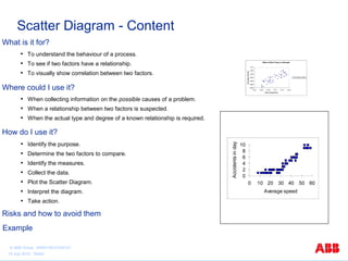
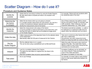
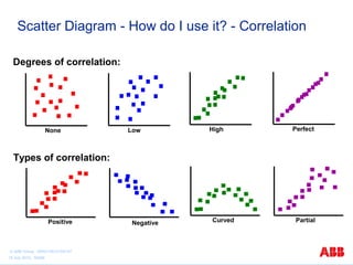
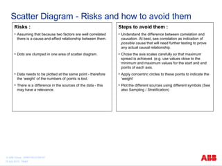
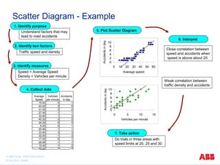
ABB Basic Quality Tools Series 
Scatter Diagram 
Graphical presentation of the data to identify patterns 
or relationship 
© ABB Group 9AKK105151D0107 
15 July 2010, Slide1
Scatter Diagram - Content 
What is it for? 
• To understand the behaviour of a process. 
• To see if two factors have a relationship. 
• To visually show correlation between two factors. 
Where could I use it? 
• When collecting information on the possible causes of a problem. 
• When a relationship between two factors is suspected. 
• When the actual type and degree of a known relationship is required. 
How do I use it? 
• Identify the purpose. 
• Determine the two factors to compare. 
• Identify the measures. 
• Collect the data. 
• Plot the Scatter Diagram. 
• Interpret the diagram. 
• Take action. 
Risks and how to avoid them 
Effect of Wort Temp on Strength 
1.010 
1.005 
1.000 
0.995 
0.990 
0.985 
0.980 
9.95 10.00 10.05 10.10 10.15 10.20 
Wort Temperature 
Final Spec Gravity 
Final Spec Gravity 
10 
0 2 4 6 8 
0 10 20 30 40 50 60 
Average speed 
Accidents in day 
Example 
© ABB Group 9AKK105151D0107 
15 July 2010, Slide2
Scatter Diagram - What is it for? 
Uses of this tool: 
• To understand the behaviour of a process. 
• To determine if there is a relationship between two factors. 
• To visually demonstrate the correlation between two related factors. 
• To determine where there may be a cause and effect relationship. 
Expected Benefits: 
• Verification that there is or is not a relationship between 2 factors. 
• Identifying an independent controlling factor for a dependent factor. 
© ABB Group 9AKK105151D0107 
15 July 2010, Slide3
Scatter Diagram - Where could I use it? 
Background: 
• Sometimes two separate things appear to change 
together and there may be suspicion that they are 
related somehow. The Scatter Diagram visually 
shows how well correlated they are. 
• The Japanese guru Kaoru Ishikawa included Scatter 
Diagrams as one of his 7 basic tools. 
Uses: 
• Use it during the analysis phase to understand the 
behaviour of a process and how a pair of variables 
change relative to one another (correlation). 
• Use it to provide an input to cause and effect analysis. 
• After improvement, to find out how much the behaviour of 
the process has changed. 
© ABB Group 9AKK105151D0107 
15 July 2010, Slide4
Scatter Diagram - How do I use it? 
Procedure and Guidance Notes 
Determine the 
two factors 
to compare 
• Select the two factors which you are going to compare. 
• In a complex situation where there are many factors, you may do a 
number of comparisons between separate pairs of variables. 
• Identify the measurement units for the factors. 
One of these measures may well be a factor 
that you are trying to change, for example ‘road 
traffic accidents’. Other measures may have 
suspected relationships, e.g. ‘traffic speed’. 
Identify the 
measures 
• Select the measurement units values of the factors 
• It must be possible to measure both factors at the same time, such 
that they form pairs of values that can be plotted as single points 
on the Scatter Diagram. 
The factors must both be variables - i.e. able to 
be measured on a continuous scale (such as 
speed) rather than attributes (such as colour). 
CCoolllleecctt tthhee ddaattaa 
• Collect measurements of the dependent factor for the selected values 
of the independent. 
• Alternatively collect 50-100 pairs of measures for the 2 factors. 
Take care to control any other factors that could 
also have a relationship. 
Pay particular care when measuring human 
factors as measuring itself can cause an effect. 
Plot the 
Scatter Diagram 
• Plot the collected data on an x y graph. 
• This can be done using a spreadsheet such as Microsoft Excel. 
Select the scale of the axes to give maximum 
spread of the data. This could mean having 
different scales for each and/or having the axis 
commence at a non-zero point. 
IInntteerrpprreett 
• Look for a correlation between the 2 factors. 
• The tighter the dots follow an imagined line, the closer is the 
correlation. 
• Note that correlation does not prove cause-and-effect. 
Correlation Coefficient can be calculated, as 
can a line of best fit. These are beyond the 
scope of this toolkit description. 
See types of correlation on next slide. 
Identify the 
purpose 
• Clarify what you are trying to achieve by using the Scatter Diagram. 
• Be clear about what is included and what is not included in the 
analysis. 
For example, ‘Reduce all road accidents within 
the residential areas of the town.’ 
TTaakkee aaccttiioonn 
• Act on your findings. For example, do further trials to verify whether 
there is a real causal relationship between the 
two factors. 
© ABB Group 9AKK105151D0107 
15 July 2010, Slide5
Scatter Diagram - How do I use it? - Correlation 
Degrees of correlation: 
None Low High Perfect 
Types of correlation: 
Positive Negative Curved Partial 
© ABB Group 9AKK105151D0107 
15 July 2010, Slide6
Scatter Diagram - Risks and how to avoid them 
Risks : 
• Assuming that because two factors are well correlated 
there is a cause-and-effect relationship between them. 
• Dots are clumped in one area of scatter diagram. 
• Data needs to be plotted at the same point - therefore 
the ‘weight’ of the numbers of points is lost. 
• There is a difference in the sources of the data - this 
may have a relevance. 
Steps to avoid them : 
• Understand the difference between correlation and 
causation. At best, see correlation as indication of 
possible cause that will need further testing to prove 
any actual causal relationship. 
• Chose the axis scales carefully so that maximum 
spread is achieved. (e.g. use values close to the 
minimum and maximum values for the start and end 
points of each axis. 
• Apply concentric circles to these points to indicate the 
’weight’ 
• Plot the different sources using different symbols (See 
also Sampling / Stratification) 
© ABB Group 9AKK105151D0107 
15 July 2010, Slide7
Scatter Diagram - Example 
Do trials in three areas with 
speed limits at 20, 25 and 30. 
10 
10 
0 2 4 6 8 
0 5 10 15 
Vehicles per minute 
Accidents in day 
1. Identify purpose 
Understand factors that may 
lead to road accidents 
5. Plot Scatter Diagram 
6. Interpret 
2. Identify two factors 
3. Identify measures 
Speed = Average Speed 
Density = Vehicles per minute 
0 2 4 6 8 
0 10 20 30 40 50 60 
Average speed 
Accidents in day 
4. Collect data 
Average 
Speed 
Vehicles 
per minute 
Accidents 
in day 
15.40 0 1 
43.40 3 6 
31.00 2 2 
27.40 1 1 
32.80 1 3 
40.20 3 5 
34.20 6 4 
8.40 0 1 
20.80 1 1 
33.40 3 3 
32.00 1 2 
17.00 0 1 
26.60 1 1 
15.40 1 2 
29.40 2 2 
Close correlation between 
speed and accidents when 
speed is above about 25 
Weak correlation between 
traffic density and accidents 
7. Take action 
Traffic speed and density 
© ABB Group 9AKK105151D0107 
15 July 2010, Slide8

scatter diagram

  • 1.
    ABB Basic QualityTools Series Scatter Diagram Graphical presentation of the data to identify patterns or relationship © ABB Group 9AKK105151D0107 15 July 2010, Slide1
  • 2.
    Scatter Diagram -Content What is it for? • To understand the behaviour of a process. • To see if two factors have a relationship. • To visually show correlation between two factors. Where could I use it? • When collecting information on the possible causes of a problem. • When a relationship between two factors is suspected. • When the actual type and degree of a known relationship is required. How do I use it? • Identify the purpose. • Determine the two factors to compare. • Identify the measures. • Collect the data. • Plot the Scatter Diagram. • Interpret the diagram. • Take action. Risks and how to avoid them Effect of Wort Temp on Strength 1.010 1.005 1.000 0.995 0.990 0.985 0.980 9.95 10.00 10.05 10.10 10.15 10.20 Wort Temperature Final Spec Gravity Final Spec Gravity 10 0 2 4 6 8 0 10 20 30 40 50 60 Average speed Accidents in day Example © ABB Group 9AKK105151D0107 15 July 2010, Slide2
  • 3.
    Scatter Diagram -What is it for? Uses of this tool: • To understand the behaviour of a process. • To determine if there is a relationship between two factors. • To visually demonstrate the correlation between two related factors. • To determine where there may be a cause and effect relationship. Expected Benefits: • Verification that there is or is not a relationship between 2 factors. • Identifying an independent controlling factor for a dependent factor. © ABB Group 9AKK105151D0107 15 July 2010, Slide3
  • 4.
    Scatter Diagram -Where could I use it? Background: • Sometimes two separate things appear to change together and there may be suspicion that they are related somehow. The Scatter Diagram visually shows how well correlated they are. • The Japanese guru Kaoru Ishikawa included Scatter Diagrams as one of his 7 basic tools. Uses: • Use it during the analysis phase to understand the behaviour of a process and how a pair of variables change relative to one another (correlation). • Use it to provide an input to cause and effect analysis. • After improvement, to find out how much the behaviour of the process has changed. © ABB Group 9AKK105151D0107 15 July 2010, Slide4
  • 5.
    Scatter Diagram -How do I use it? Procedure and Guidance Notes Determine the two factors to compare • Select the two factors which you are going to compare. • In a complex situation where there are many factors, you may do a number of comparisons between separate pairs of variables. • Identify the measurement units for the factors. One of these measures may well be a factor that you are trying to change, for example ‘road traffic accidents’. Other measures may have suspected relationships, e.g. ‘traffic speed’. Identify the measures • Select the measurement units values of the factors • It must be possible to measure both factors at the same time, such that they form pairs of values that can be plotted as single points on the Scatter Diagram. The factors must both be variables - i.e. able to be measured on a continuous scale (such as speed) rather than attributes (such as colour). CCoolllleecctt tthhee ddaattaa • Collect measurements of the dependent factor for the selected values of the independent. • Alternatively collect 50-100 pairs of measures for the 2 factors. Take care to control any other factors that could also have a relationship. Pay particular care when measuring human factors as measuring itself can cause an effect. Plot the Scatter Diagram • Plot the collected data on an x y graph. • This can be done using a spreadsheet such as Microsoft Excel. Select the scale of the axes to give maximum spread of the data. This could mean having different scales for each and/or having the axis commence at a non-zero point. IInntteerrpprreett • Look for a correlation between the 2 factors. • The tighter the dots follow an imagined line, the closer is the correlation. • Note that correlation does not prove cause-and-effect. Correlation Coefficient can be calculated, as can a line of best fit. These are beyond the scope of this toolkit description. See types of correlation on next slide. Identify the purpose • Clarify what you are trying to achieve by using the Scatter Diagram. • Be clear about what is included and what is not included in the analysis. For example, ‘Reduce all road accidents within the residential areas of the town.’ TTaakkee aaccttiioonn • Act on your findings. For example, do further trials to verify whether there is a real causal relationship between the two factors. © ABB Group 9AKK105151D0107 15 July 2010, Slide5
  • 6.
    Scatter Diagram -How do I use it? - Correlation Degrees of correlation: None Low High Perfect Types of correlation: Positive Negative Curved Partial © ABB Group 9AKK105151D0107 15 July 2010, Slide6
  • 7.
    Scatter Diagram -Risks and how to avoid them Risks : • Assuming that because two factors are well correlated there is a cause-and-effect relationship between them. • Dots are clumped in one area of scatter diagram. • Data needs to be plotted at the same point - therefore the ‘weight’ of the numbers of points is lost. • There is a difference in the sources of the data - this may have a relevance. Steps to avoid them : • Understand the difference between correlation and causation. At best, see correlation as indication of possible cause that will need further testing to prove any actual causal relationship. • Chose the axis scales carefully so that maximum spread is achieved. (e.g. use values close to the minimum and maximum values for the start and end points of each axis. • Apply concentric circles to these points to indicate the ’weight’ • Plot the different sources using different symbols (See also Sampling / Stratification) © ABB Group 9AKK105151D0107 15 July 2010, Slide7
  • 8.
    Scatter Diagram -Example Do trials in three areas with speed limits at 20, 25 and 30. 10 10 0 2 4 6 8 0 5 10 15 Vehicles per minute Accidents in day 1. Identify purpose Understand factors that may lead to road accidents 5. Plot Scatter Diagram 6. Interpret 2. Identify two factors 3. Identify measures Speed = Average Speed Density = Vehicles per minute 0 2 4 6 8 0 10 20 30 40 50 60 Average speed Accidents in day 4. Collect data Average Speed Vehicles per minute Accidents in day 15.40 0 1 43.40 3 6 31.00 2 2 27.40 1 1 32.80 1 3 40.20 3 5 34.20 6 4 8.40 0 1 20.80 1 1 33.40 3 3 32.00 1 2 17.00 0 1 26.60 1 1 15.40 1 2 29.40 2 2 Close correlation between speed and accidents when speed is above about 25 Weak correlation between traffic density and accidents 7. Take action Traffic speed and density © ABB Group 9AKK105151D0107 15 July 2010, Slide8