Downloaded 38 times

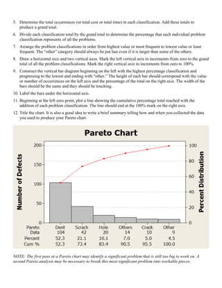
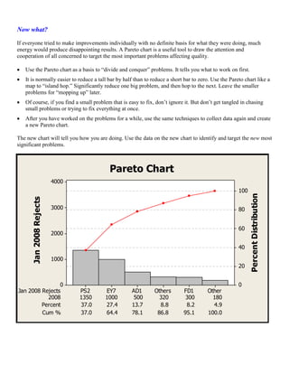

Pareto charts are a tool used to identify the most significant problems in a process. They graphically display problem categories from highest to lowest value to show which few problems make up the majority of issues. To create a Pareto chart, problems are classified and tallied, then categories are arranged from highest to lowest occurrence and displayed as bars on a chart. The chart is used to target addressing the biggest issues first to produce the greatest improvements.


