
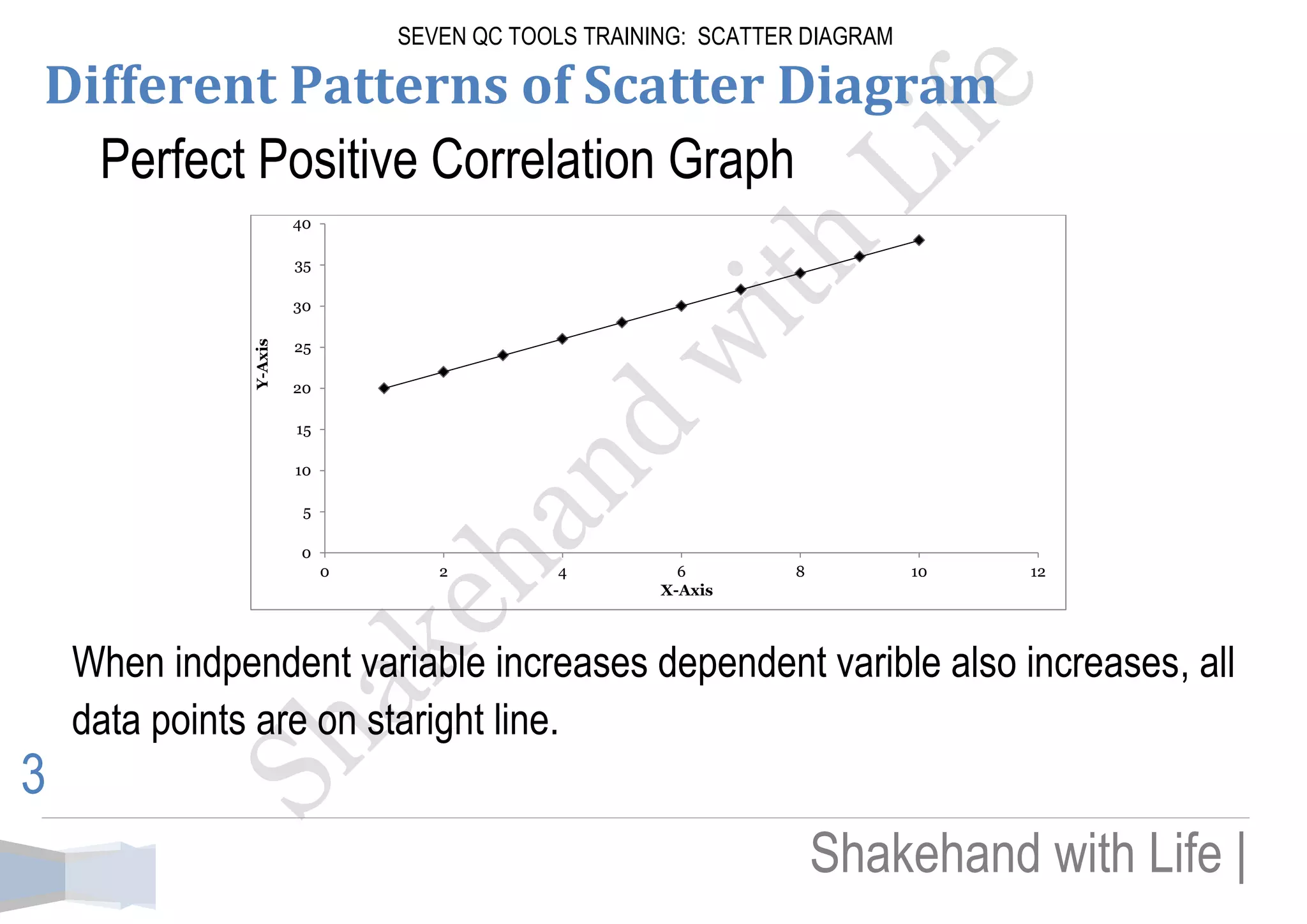
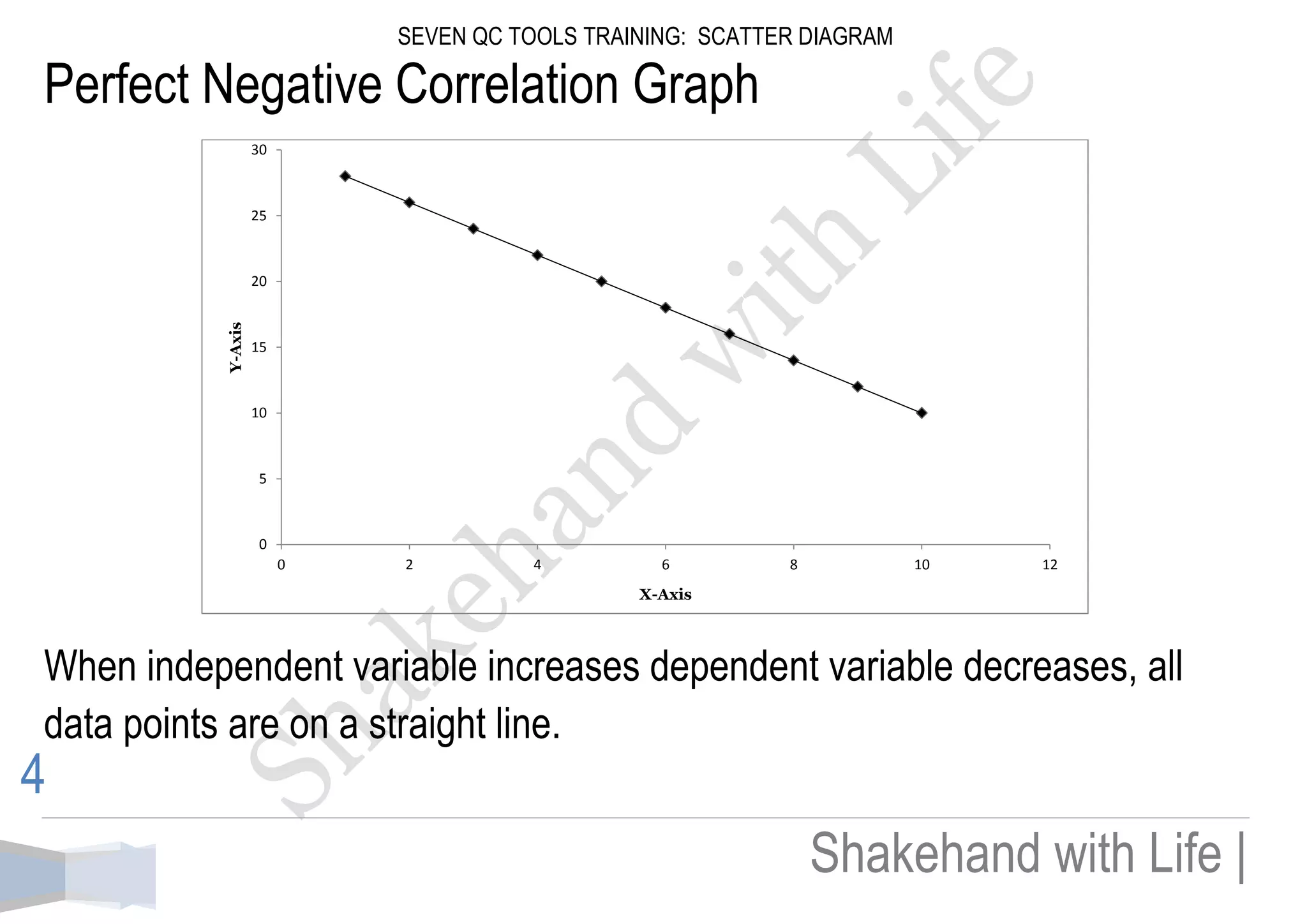
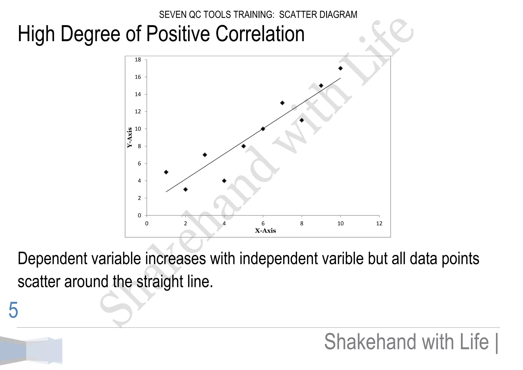
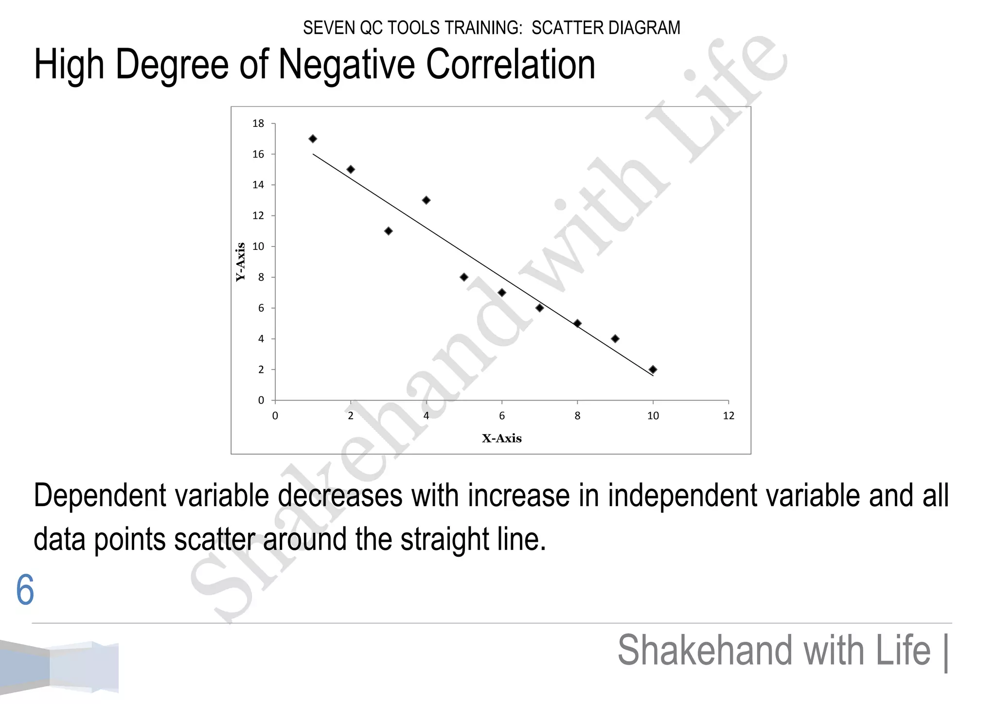
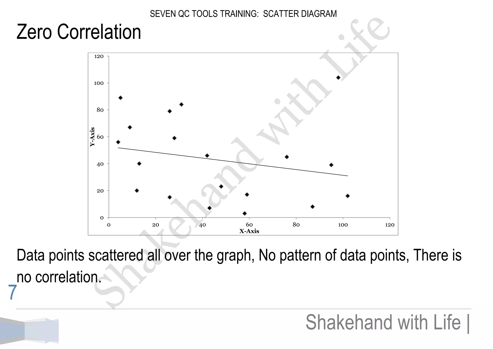
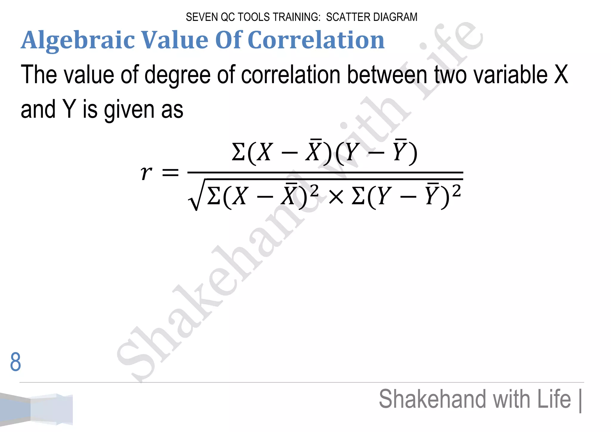
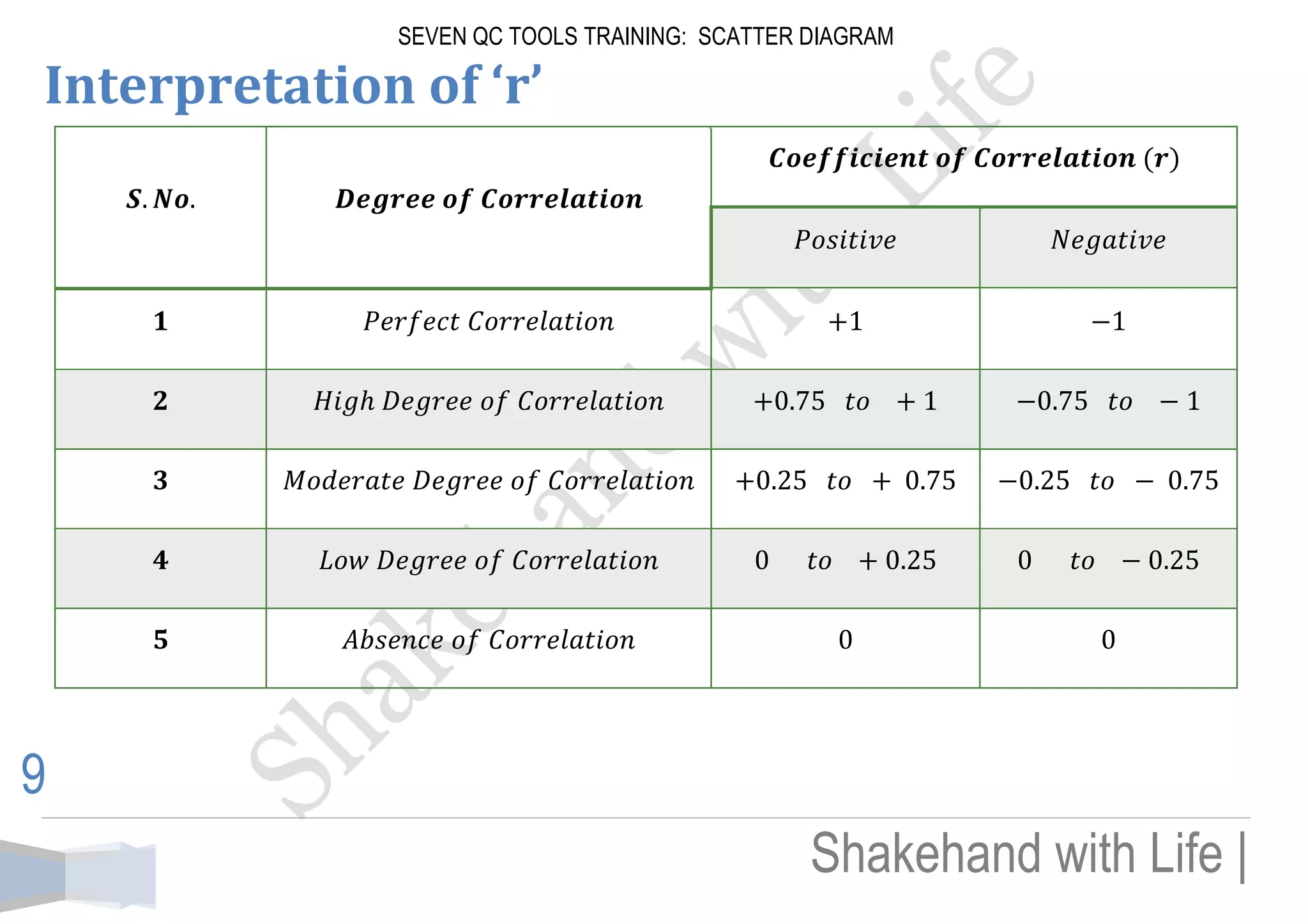
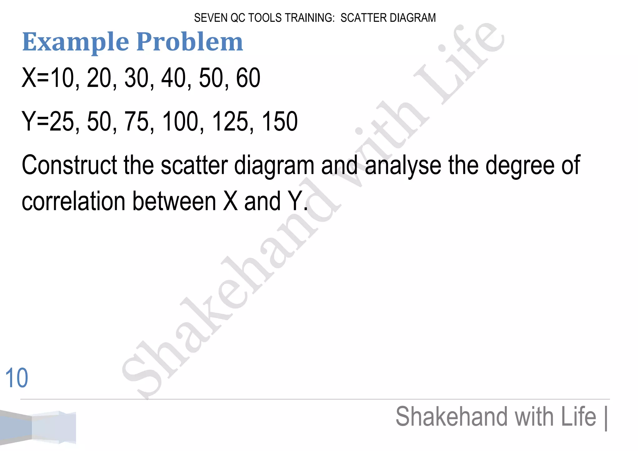
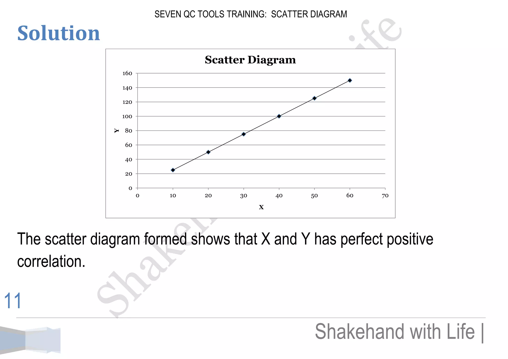


The document provides an overview of scatter diagrams, which visually represent the cause-and-effect relationship between independent (x-axis) and dependent variables (y-axis). It discusses various correlation patterns, including perfect positive, perfect negative, high positive, high negative, and zero correlation, along with the interpretation of correlation values. Additionally, an example shows how to construct a scatter diagram and analyze the correlation between two sets of data.


![7 qc tools training material[1]](https://cdn.slidesharecdn.com/ss_thumbnails/7qctoolstrainingmaterial1-120925054558-phpapp02-thumbnail.jpg?width=640&height=640&fit=bounds)