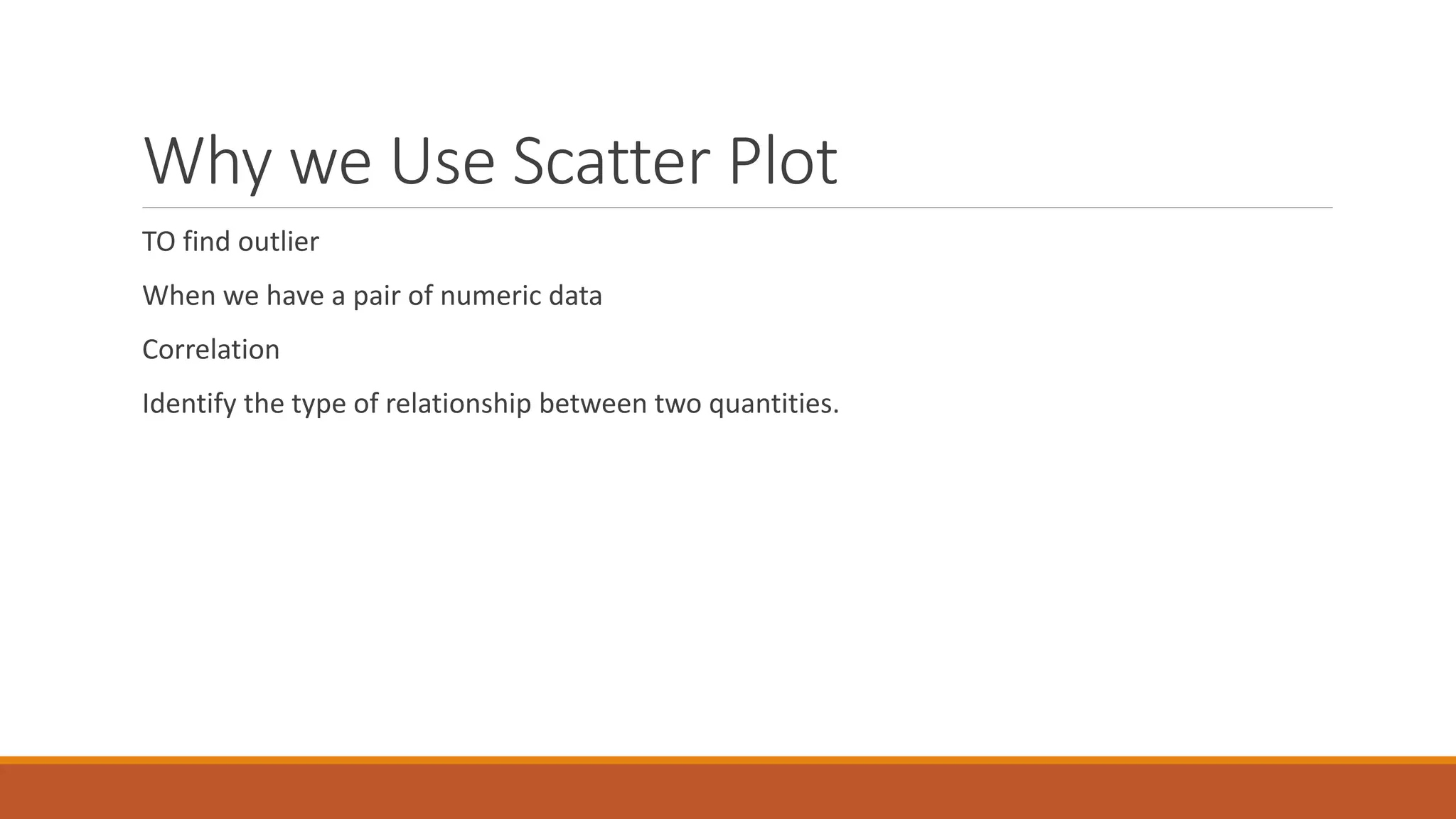
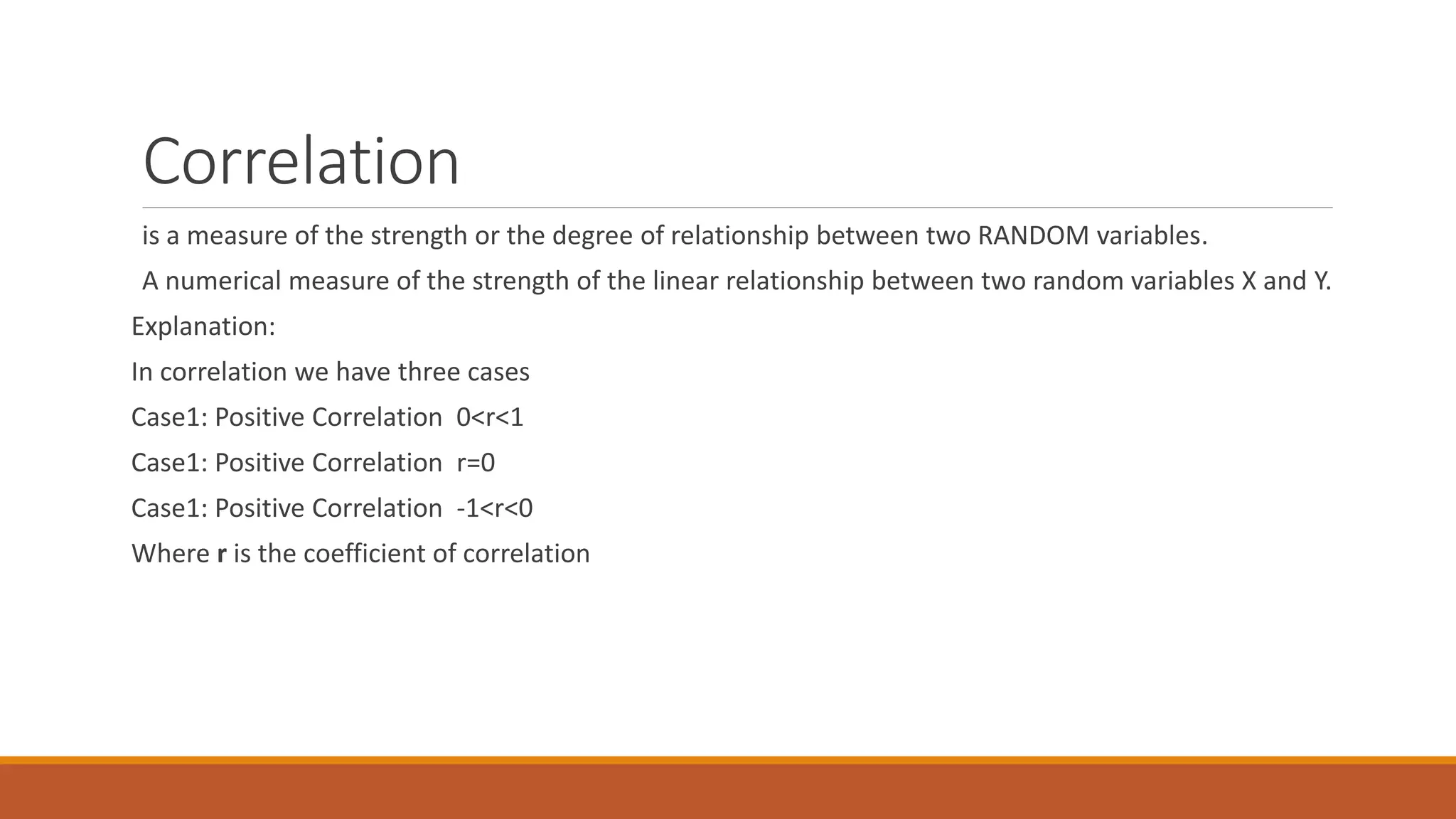
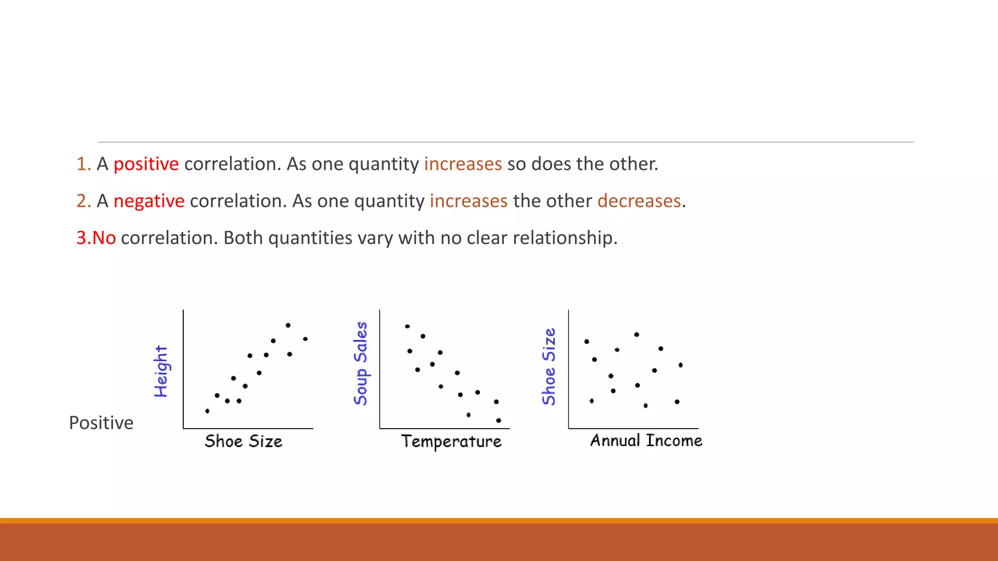
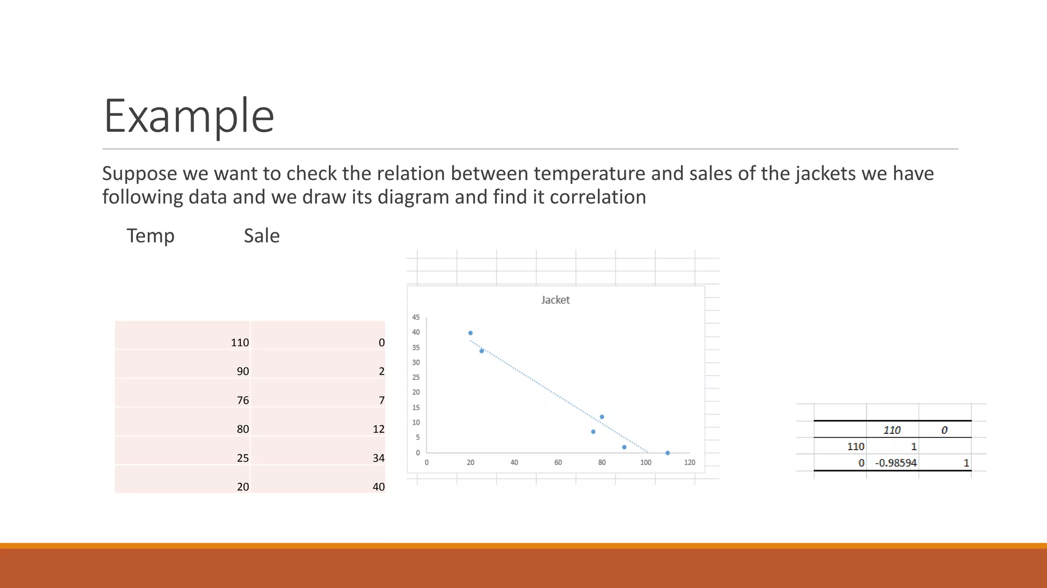
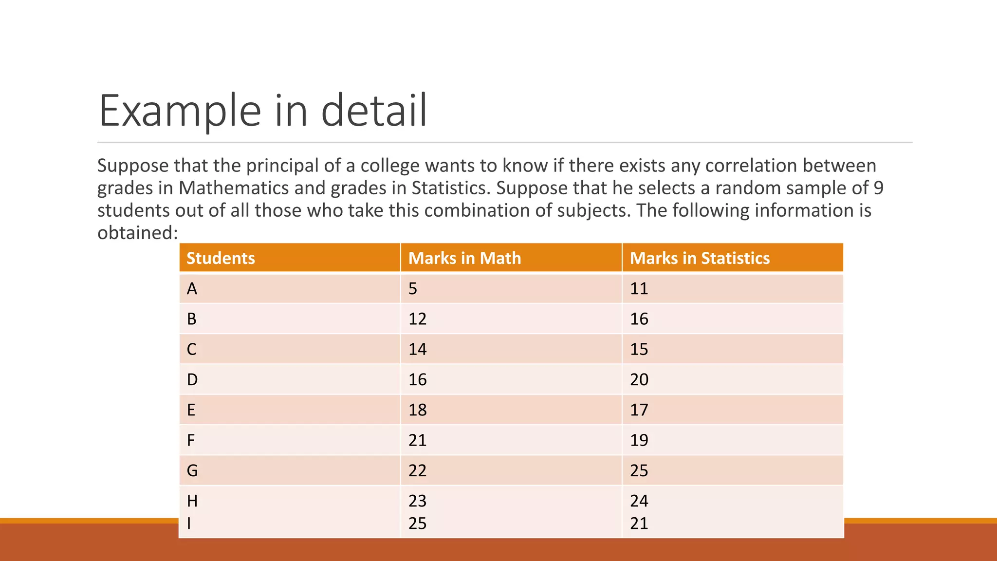
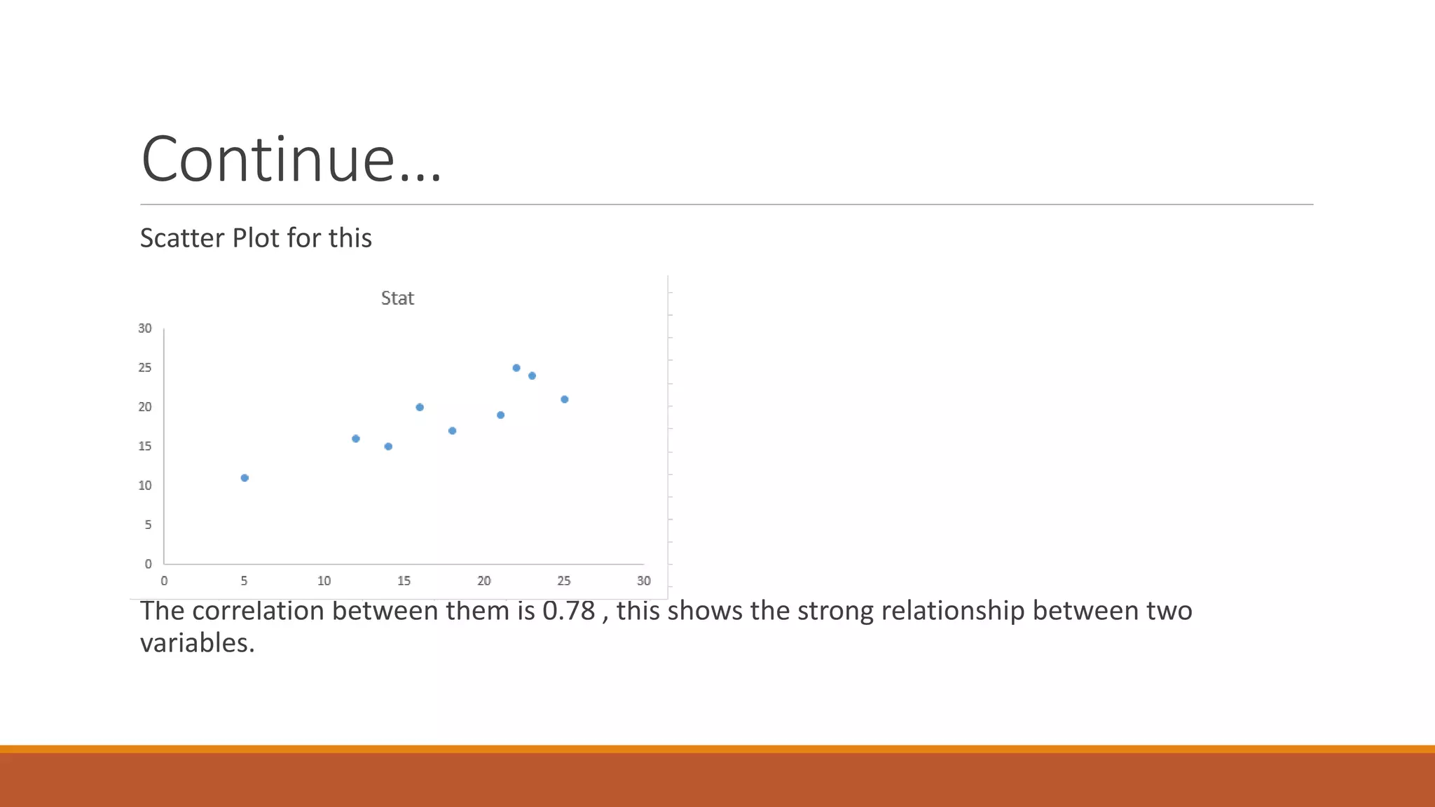
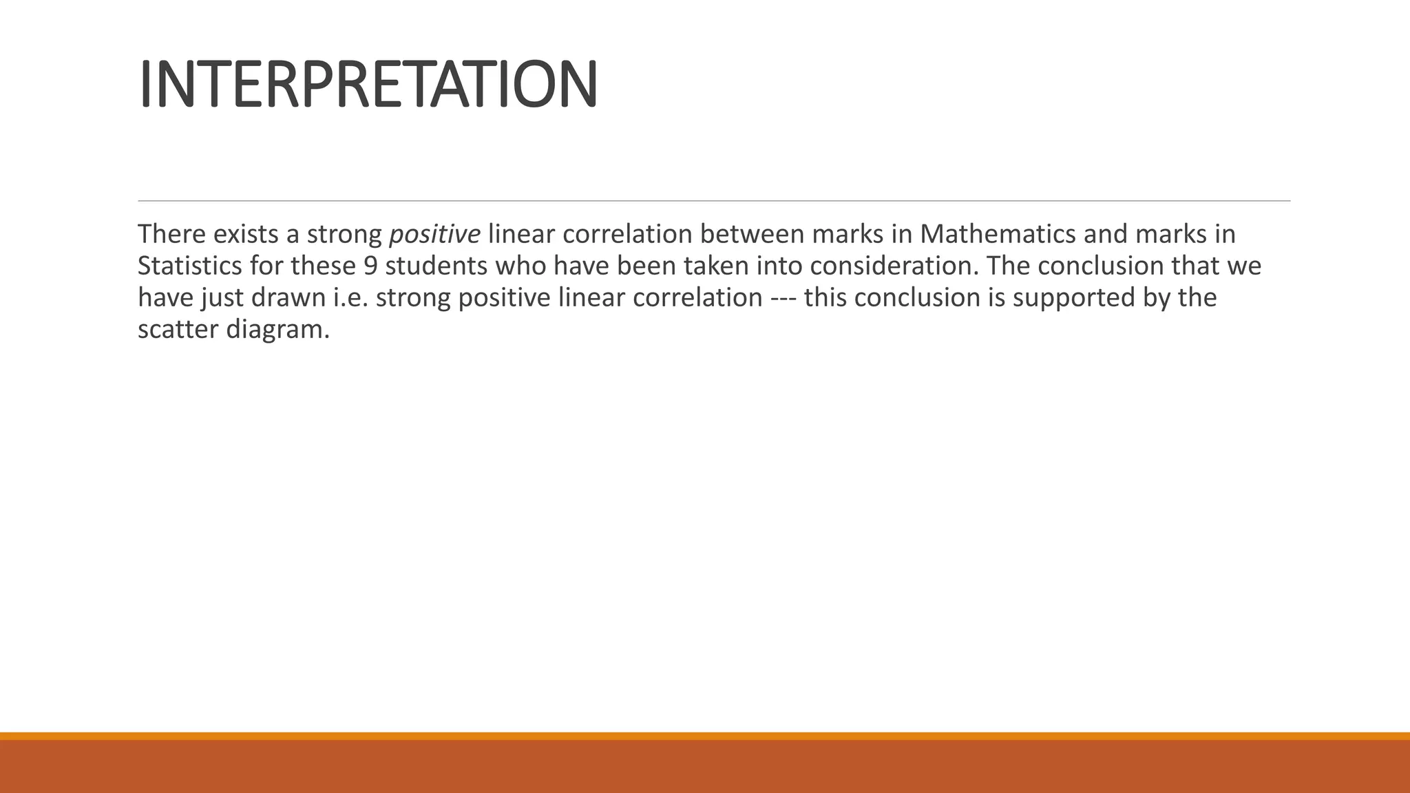
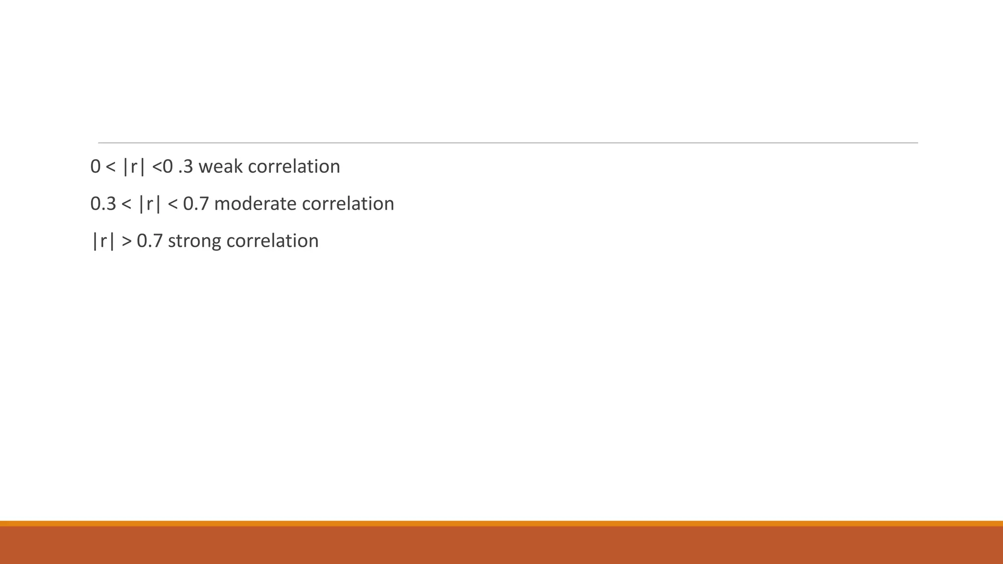
What is path analysis?
What are general assumptions?
What is input path diagram?
What is output path diagram?
How unexplained variance is shown in path diagram?
Multiple regression analysis is a powerful technique used for predicting the unknown value of a variable from the known value of two or more variables.
Regression analysis is a powerful statistical method that allows you to examine the relationship between two or more variables of interest. Regression analysis is a reliable method of identifying which variables have impact on a topic of interest. The process of performing a regression allows you to confidently determine which factors matter most, which factors can be ignored, and how these factors influence each other.In this presentation a brief introduction about SLR and MLR and their codes in R are described
Illustrate the nature of bivariate data;
Construct a scatter plot;
Describe shapes (form), trend (direction), and variation (strength) based on the scatter plot; and
Estimate strength of association between the variables based on a scatter plot.
Visit the website for other Services: https://cristinamontenegro92.wixsite.com/onevs
The future is uncertain. Some events do have a very small probabil.docxoreo10
The future is uncertain. Some events do have a very small probability of happening, like an asteroid destroying the earth. So we accept that tomorrow will come as a certain event. But future demand for a business’s goods and services is very uncertain. Yet, the management of a company wants to have some idea of the survival (or growth) of the company in the future. Should they expect to hire more people or let some go? Should they plan to increase capacity? How much investment is needed for future assets, or should they down size?
Forecasting provides some ideas about the future, but how this is accomplished can vary from company to company. And one key factor is how accurate the forecast is. Generally, the further into the future one looks, the more uncertain the information is. How do forecasters reduce their forecasting errors? How much error is tolerable?
Another key factor in forecasting is data availability. Data processing and storage capability have become extremely available and inexpensive. Software and computing power is also very cheap. Collecting real-time sales data via point-of-sales systems is now common at most retail establishments. But couple this with a situation in companies that have a large number of products, such as a retail store or a large manufacturing company with hundreds or thousands of product numbers and/or product lines, forecasting becomes complicated.
Forecasting Methods
There are two main types or genres of forecasting methods, qualitative and quantitative. The former consists of judgment and analysis of qualitative factors, such as scenario building and scenario analysis. The latter is obviously based on numerical analysis. This genre of forecasting includes such methods as linear regression, time series analysis, and data mining algorithms like CHAID and CART, which are useful especially in the growing world of artificial intelligence and machine learning in business. This module will look at the linear regression and time series analysis using exponential smoothing.
Linear Growth
When using any mathematical model, we have to consider which inputs are reasonable to use. Whenever we extrapolate, or make predictions into the future, we are assuming the model will continue to be valid. There are different types of mathematical model, one of which is linear growth model or algebraic growth model and another is exponential growth model, or geometric growth model. The constant change is the defining characteristic of linear growth. Plotting the values, we can see the values form a straight line, the shape of linear growth.
If a quantity starts at size P0 and grows by d every time period, then the quantity after n time periods can be determined using either of these relations:
Recursive form:
Pn = Pn-1 + d
Explicit form:
Pn = P0 + d n
In this equation, d represents the common difference – the amount that the population changes each time n increases by 1. Calculating values using the explicit form and plot ...
Please Subscribe to this Channel for more solutions and lectures
http://www.youtube.com/onlineteaching
Chapter 10: Correlation and Regression
10.1: Correlation
To get a copy of the slides for free Email me at: japhethmuthama@gmail.com
You can also support my PhD studies by donating a 1 dollar to my PayPal.
PayPal ID is japhethmuthama@gmail.com
16 USING LINEAR REGRESSION PREDICTING THE FUTURE16 MEDIA LIBRAR.docxhyacinthshackley2629
16 USING LINEAR REGRESSION PREDICTING THE FUTURE
16: MEDIA LIBRARY
Premium Videos
Core Concepts in Stats Video
· Linear Regression
Lightboard Lecture Video
· Multiple Regression
Time to Practice Video
· Chapter 16: Problem 2
Difficulty Scale
(as hard as they get!)
WHAT YOU WILL LEARN IN THIS CHAPTER
· Understanding how prediction works and how it can be used in the social and behavioral sciences
· Understanding how and why linear regression works when predicting one variable on the basis of another
· Judging the accuracy of predictions
· Understanding how multiple regression works and why it is useful
INTRODUCTION TO LINEAR REGRESSION
You’ve seen it all over the news—concern about obesity and how it affects work and daily life. A set of researchers in Sweden was interested in looking at how well mobility disability and/or obesity predicted job strain and whether social support at work can modify this association. The study included more than 35,000 participants, and differences in job strain mean scores were estimated using linear regression, the exact focus of what we are discussing in this chapter. The results found that level of mobile disability did predict job strain and that social support at work significantly modified the association among job strain, mobile disability, and obesity.
Want to know more? Go to the library or go online …
Norrback, M., De Munter, J., Tynelius, P., Ahlstrom, G., & Rasmussen, F. (2016). The association of mobility disability, weight status and job strain: A cross-sectional study. Scandinavian Journal of Public Health, 44, 311–319.
WHAT IS PREDICTION ALL ABOUT?
Here’s the scoop. Not only can you compute the degree to which two variables are related to one another (by computing a correlation coefficient as we did in Chapter 5), but you can also use these correlations to predict the value of one variable based on the value of another. This is a very special case of how correlations can be used, and it is a very powerful tool for social and behavioral sciences researchers.
The basic idea is to use a set of previously collected data (such as data on variables X and Y), calculate how correlated these variables are with one another, and then use that correlation and the knowledge of X to predict Y. Sound difficult? It’s not really, especially once you see it illustrated.
For example, a researcher collects data on total high school grade point average (GPA) and first-year college GPA for 400 students in their freshman year at the state university. He computes the correlation between the two variables. Then, he uses the techniques you’ll learn about later in this chapter to take a new set of high school GPAs and (knowing the relationship between high school GPA and first-year college GPA from the previous set of students) predict what first-year GPA should be for a new student who is just starting out. Pretty nifty, huh?
Here’s another example. A group of kindergarten teachers is interested in finding out how well ex.
16 USING LINEAR REGRESSION PREDICTING THE FUTURE16 MEDIA LIBRAR.docxnovabroom
16 USING LINEAR REGRESSION PREDICTING THE FUTURE
16: MEDIA LIBRARY
Premium Videos
Core Concepts in Stats Video
· Linear Regression
Lightboard Lecture Video
· Multiple Regression
Time to Practice Video
· Chapter 16: Problem 2
Difficulty Scale
(as hard as they get!)
WHAT YOU WILL LEARN IN THIS CHAPTER
· Understanding how prediction works and how it can be used in the social and behavioral sciences
· Understanding how and why linear regression works when predicting one variable on the basis of another
· Judging the accuracy of predictions
· Understanding how multiple regression works and why it is useful
INTRODUCTION TO LINEAR REGRESSION
You’ve seen it all over the news—concern about obesity and how it affects work and daily life. A set of researchers in Sweden was interested in looking at how well mobility disability and/or obesity predicted job strain and whether social support at work can modify this association. The study included more than 35,000 participants, and differences in job strain mean scores were estimated using linear regression, the exact focus of what we are discussing in this chapter. The results found that level of mobile disability did predict job strain and that social support at work significantly modified the association among job strain, mobile disability, and obesity.
Want to know more? Go to the library or go online …
Norrback, M., De Munter, J., Tynelius, P., Ahlstrom, G., & Rasmussen, F. (2016). The association of mobility disability, weight status and job strain: A cross-sectional study. Scandinavian Journal of Public Health, 44, 311–319.
WHAT IS PREDICTION ALL ABOUT?
Here’s the scoop. Not only can you compute the degree to which two variables are related to one another (by computing a correlation coefficient as we did in Chapter 5), but you can also use these correlations to predict the value of one variable based on the value of another. This is a very special case of how correlations can be used, and it is a very powerful tool for social and behavioral sciences researchers.
The basic idea is to use a set of previously collected data (such as data on variables X and Y), calculate how correlated these variables are with one another, and then use that correlation and the knowledge of X to predict Y. Sound difficult? It’s not really, especially once you see it illustrated.
For example, a researcher collects data on total high school grade point average (GPA) and first-year college GPA for 400 students in their freshman year at the state university. He computes the correlation between the two variables. Then, he uses the techniques you’ll learn about later in this chapter to take a new set of high school GPAs and (knowing the relationship between high school GPA and first-year college GPA from the previous set of students) predict what first-year GPA should be for a new student who is just starting out. Pretty nifty, huh?
Here’s another example. A group of kindergarten teachers is interested in finding out how well ex.
Instructions for Submissions thorugh G- Classroom.pptxJheel Barad
This presentation provides a briefing on how to upload submissions and documents in Google Classroom. It was prepared as part of an orientation for new Sainik School in-service teacher trainees. As a training officer, my goal is to ensure that you are comfortable and proficient with this essential tool for managing assignments and fostering student engagement.
2024.06.01 Introducing a competency framework for languag learning materials ...Sandy Millin
http://sandymillin.wordpress.com/iateflwebinar2024
Published classroom materials form the basis of syllabuses, drive teacher professional development, and have a potentially huge influence on learners, teachers and education systems. All teachers also create their own materials, whether a few sentences on a blackboard, a highly-structured fully-realised online course, or anything in between. Despite this, the knowledge and skills needed to create effective language learning materials are rarely part of teacher training, and are mostly learnt by trial and error.
Knowledge and skills frameworks, generally called competency frameworks, for ELT teachers, trainers and managers have existed for a few years now. However, until I created one for my MA dissertation, there wasn’t one drawing together what we need to know and do to be able to effectively produce language learning materials.
This webinar will introduce you to my framework, highlighting the key competencies I identified from my research. It will also show how anybody involved in language teaching (any language, not just English!), teacher training, managing schools or developing language learning materials can benefit from using the framework.
Synthetic Fiber Construction in lab .pptxPavel ( NSTU)
Synthetic fiber production is a fascinating and complex field that blends chemistry, engineering, and environmental science. By understanding these aspects, students can gain a comprehensive view of synthetic fiber production, its impact on society and the environment, and the potential for future innovations. Synthetic fibers play a crucial role in modern society, impacting various aspects of daily life, industry, and the environment. ynthetic fibers are integral to modern life, offering a range of benefits from cost-effectiveness and versatility to innovative applications and performance characteristics. While they pose environmental challenges, ongoing research and development aim to create more sustainable and eco-friendly alternatives. Understanding the importance of synthetic fibers helps in appreciating their role in the economy, industry, and daily life, while also emphasizing the need for sustainable practices and innovation.
Embracing GenAI - A Strategic ImperativePeter Windle
Artificial Intelligence (AI) technologies such as Generative AI, Image Generators and Large Language Models have had a dramatic impact on teaching, learning and assessment over the past 18 months. The most immediate threat AI posed was to Academic Integrity with Higher Education Institutes (HEIs) focusing their efforts on combating the use of GenAI in assessment. Guidelines were developed for staff and students, policies put in place too. Innovative educators have forged paths in the use of Generative AI for teaching, learning and assessments leading to pockets of transformation springing up across HEIs, often with little or no top-down guidance, support or direction.
This Gasta posits a strategic approach to integrating AI into HEIs to prepare staff, students and the curriculum for an evolving world and workplace. We will highlight the advantages of working with these technologies beyond the realm of teaching, learning and assessment by considering prompt engineering skills, industry impact, curriculum changes, and the need for staff upskilling. In contrast, not engaging strategically with Generative AI poses risks, including falling behind peers, missed opportunities and failing to ensure our graduates remain employable. The rapid evolution of AI technologies necessitates a proactive and strategic approach if we are to remain relevant.
Palestine last event orientationfvgnh .pptxRaedMohamed3
An EFL lesson about the current events in Palestine. It is intended to be for intermediate students who wish to increase their listening skills through a short lesson in power point.
Welcome to TechSoup New Member Orientation and Q&A (May 2024).pdfTechSoup
In this webinar you will learn how your organization can access TechSoup's wide variety of product discount and donation programs. From hardware to software, we'll give you a tour of the tools available to help your nonprofit with productivity, collaboration, financial management, donor tracking, security, and more.
Model Attribute Check Company Auto PropertyCeline George
In Odoo, the multi-company feature allows you to manage multiple companies within a single Odoo database instance. Each company can have its own configurations while still sharing common resources such as products, customers, and suppliers.
Operation “Blue Star” is the only event in the history of Independent India where the state went into war with its own people. Even after about 40 years it is not clear if it was culmination of states anger over people of the region, a political game of power or start of dictatorial chapter in the democratic setup.
The people of Punjab felt alienated from main stream due to denial of their just demands during a long democratic struggle since independence. As it happen all over the word, it led to militant struggle with great loss of lives of military, police and civilian personnel. Killing of Indira Gandhi and massacre of innocent Sikhs in Delhi and other India cities was also associated with this movement.
Francesca Gottschalk - How can education support child empowerment.pptxEduSkills OECD
Francesca Gottschalk from the OECD’s Centre for Educational Research and Innovation presents at the Ask an Expert Webinar: How can education support child empowerment?
The French Revolution, which began in 1789, was a period of radical social and political upheaval in France. It marked the decline of absolute monarchies, the rise of secular and democratic republics, and the eventual rise of Napoleon Bonaparte. This revolutionary period is crucial in understanding the transition from feudalism to modernity in Europe.
For more information, visit-www.vavaclasses.com
3. Learning Objectives
At the End of this presentation We will get brief ideas about
Scatter Plot
create a scatterplot to graphically depict the relationship between 2 quantitative variables
describe the information that a scatterplot conveys about the relationship between 2
quantitative variables: form, direction, strength etc.
4. Continue..
calculate the correlation coefficient between 2 quantitative variables using technology.
interpret the value of the correlation coefficient
How to draw in Excel 2013
5. Scatter Plot
Background…
On numerous occasions, our interest lies not in just one single variable but in two, three, four or
more variables. For example, if we talk about the yield of a crop, we realize that the yield of any
crop depends on a variety of factors --- the fertility of the soil, the type of fertilizer used, the
amount of rainfall, and so on. Now we discuss about bivariate variable.
6. Scatter Plot
A scatter plot is a graph of a collection of ordered pairs (x,y).
The graph looks like a bunch of dots, but some of the graphs are a general shape or move in a
general direction.
7. Example
An important concern for any pharmaceutical company producing drugs is to determine how a
particular drug will
affect one’s perception or general awareness. Suppose one such company wants to establish a
relationship between the
PERCENTAGE of a drug in the blood-stream and the LENGTH OF TIME it takes to respond to a
stimulus.
Suppose the company administers this drug on 5 subjects and obtains the following information:
9. Example Continue…
In this example, the reaction time to the stimulus will DEPEND on the amount of drug in the
blood-stream
So we draw the Scatter Plot for this and it will be like this.
10. Why we Use Scatter Plot
TO find outlier
When we have a pair of numeric data
Correlation
Identify the type of relationship between two quantities.
11. Correlation
is a measure of the strength or the degree of relationship between two RANDOM variables.
A numerical measure of the strength of the linear relationship between two random variables X and Y.
Explanation:
In correlation we have three cases
Case1: Positive Correlation 0<r<1
Case1: Positive Correlation r=0
Case1: Positive Correlation -1<r<0
Where r is the coefficient of correlation
12. 1. A positive correlation. As one quantity increases so does the other.
2. A negative correlation. As one quantity increases the other decreases.
3.No correlation. Both quantities vary with no clear relationship.
Positive Correlation Negative Correlation No Correlation
13. Example
Suppose we want to check the relation between temperature and sales of the jackets we have
following data and we draw its diagram and find it correlation
Temp Sale
Correlation
110 0
90 2
76 7
80 12
25 34
20 40
14. Example in detail
Suppose that the principal of a college wants to know if there exists any correlation between
grades in Mathematics and grades in Statistics. Suppose that he selects a random sample of 9
students out of all those who take this combination of subjects. The following information is
obtained:
Students Marks in Math Marks in Statistics
A 5 11
B 12 16
C 14 15
D 16 20
E 18 17
F 21 19
G 22 25
H
I
23
25
24
21
15. Continue…
Scatter Plot for this
The correlation between them is 0.78 , this shows the strong relationship between two
variables.
16. INTERPRETATION
There exists a strong positive linear correlation between marks in Mathematics and marks in
Statistics for these 9 students who have been taken into consideration. The conclusion that we
have just drawn i.e. strong positive linear correlation --- this conclusion is supported by the
scatter diagram.
18. Tool Used
We have number of tools to draw scatter plot , but in this case we use a very simple tool
Microsoft Excel, because this tool is approachable to every one and easy to use as well.
You can use SPSS scatter plot as well.
19. How to draw Scatter plot on Excel 2013
Open excel 2013 from window explorer
Click on empty workbook
Add your data on the workbook
After adding select your data
Go to INSERT tab in the bar menu
There is an image for Scatter plot
Click on it and it will create a scatter plot
20. Continue…
You can set the trend line by right click on the diagram , it will show you the format plot area and
you can easily draw a trend line on the relationship.
Now to find the correlation click on the Data on the Menu Bar.
You can see the an option of Data analysis on the top right.
Click on data analysis and find correlation option draw your input and output range and
correlation will be calculated.