Downloaded 30 times
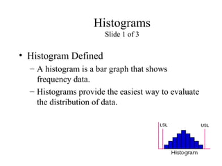


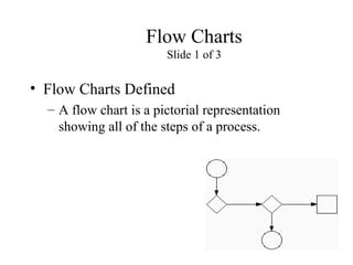


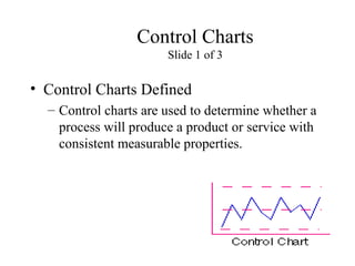


This presentation provided learning material on Ishikawa's seven basic quality tools: histograms, Pareto charts, cause-and-effect diagrams, run charts, scatter diagrams, flow charts, and control charts. Each tool was defined and explained with examples of how it is constructed and how it can be used. The tools are simple and effective ways to analyze data, identify problems and prioritize solutions, discover causes of problems, study relationships between variables, map processes, and monitor quality control.
![7 qc tools training material[1]](https://cdn.slidesharecdn.com/ss_thumbnails/7qctoolstrainingmaterial1-120925054558-phpapp02-thumbnail.jpg?width=640&height=640&fit=bounds)


![7 qc tools[1] to print](https://cdn.slidesharecdn.com/ss_thumbnails/7qctools1toprint-191017092858-thumbnail.jpg?width=640&height=640&fit=bounds)


