Downloaded 30 times

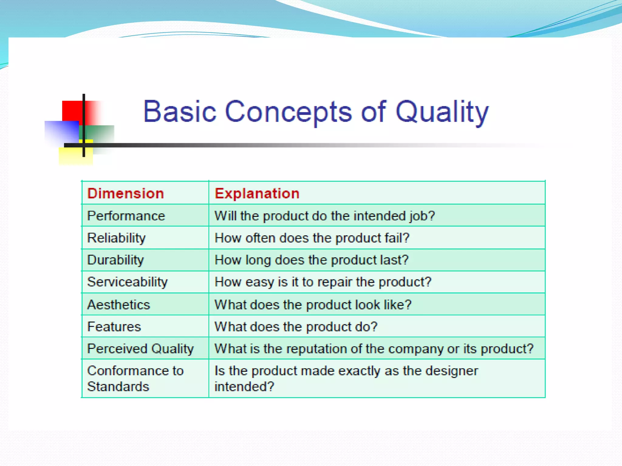
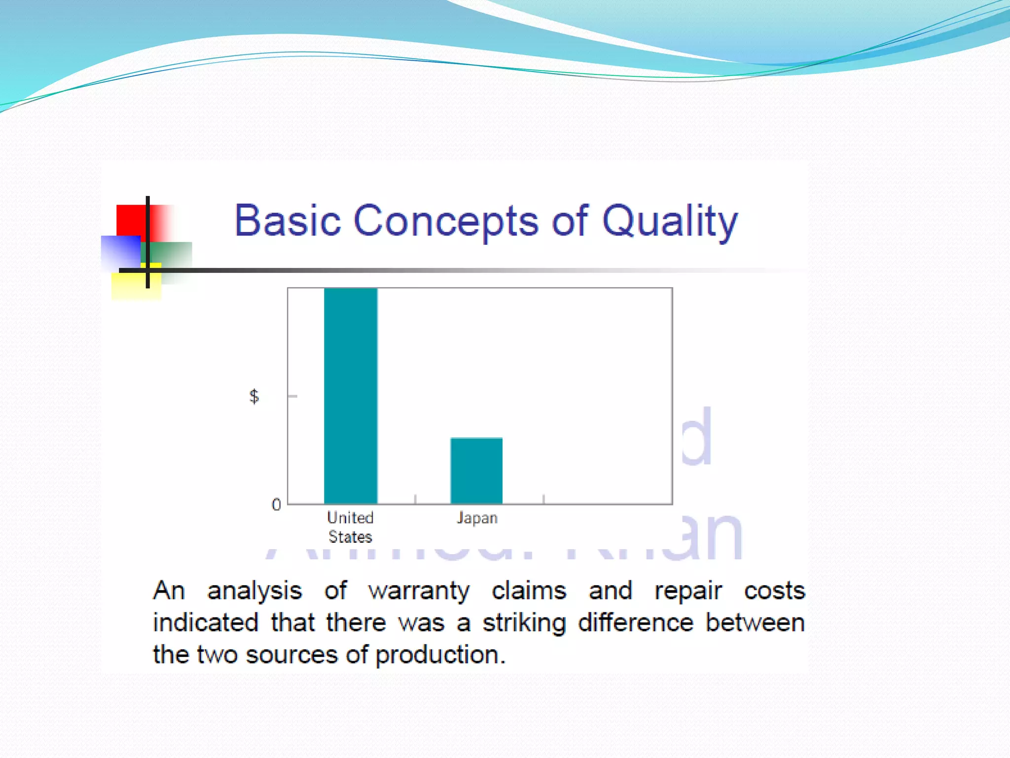
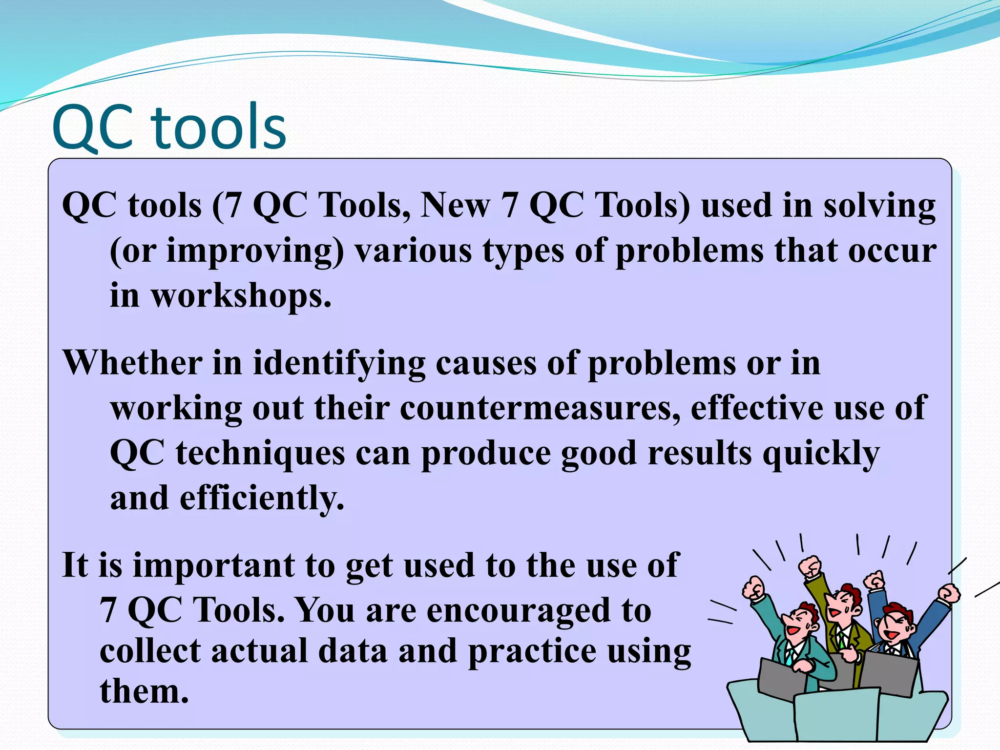
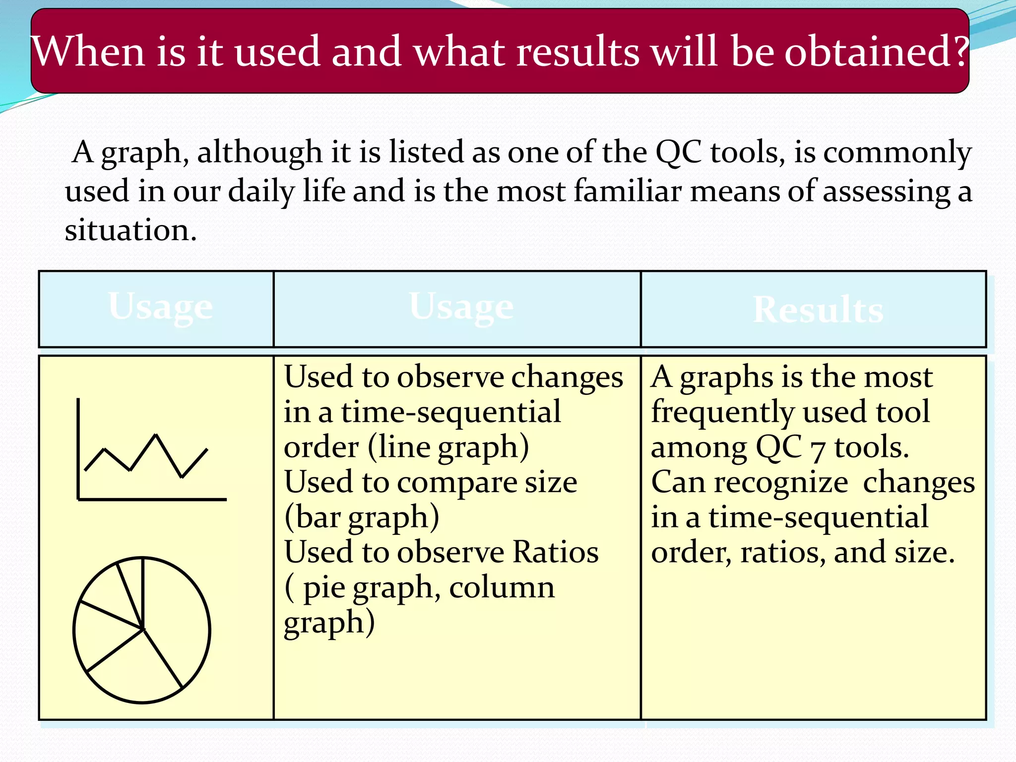
![When is it used and what results will be obtained?
Which is the most serious problem among many problems? It is mainly
used to prioritize action.
Usage Results
•Used to identify a problem.
•Used to identify the cause of a
problem.
•Used to review the effects of an
action to be taken.
•Used to prioritize actions.
[Used during phases to monitor
the situation, analyze causes, and
review effectiveness of an action.]
•Allows clarification of
important tasks.
•Allows identification of a
starting point (which task
to start with).
•Allows projection of the
effects of a measure to be
taken.](https://image.slidesharecdn.com/statisticalqualitycontrolsampling-160806150546/75/Statistical-quality-control-sampling-16-2048.jpg)
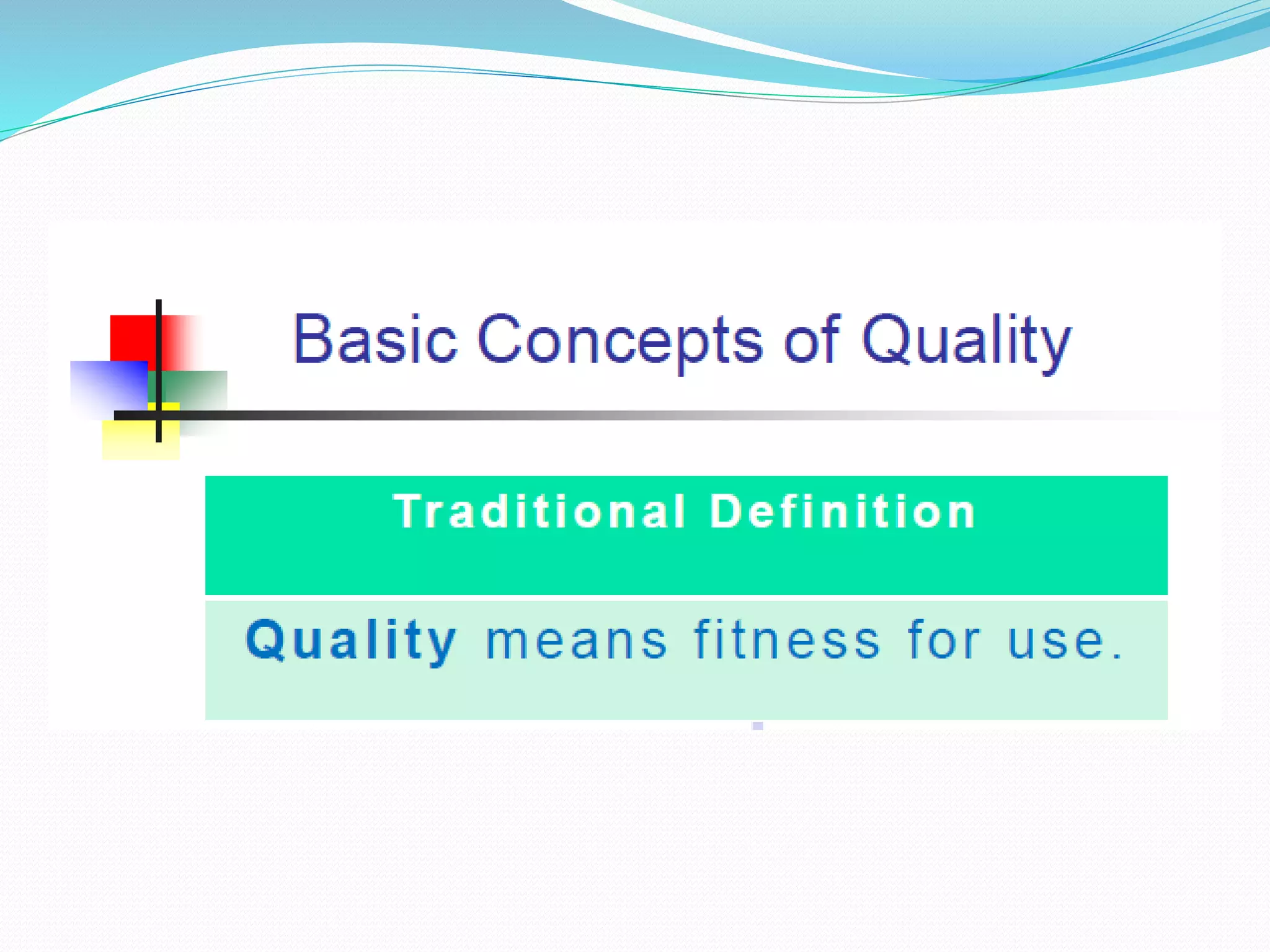
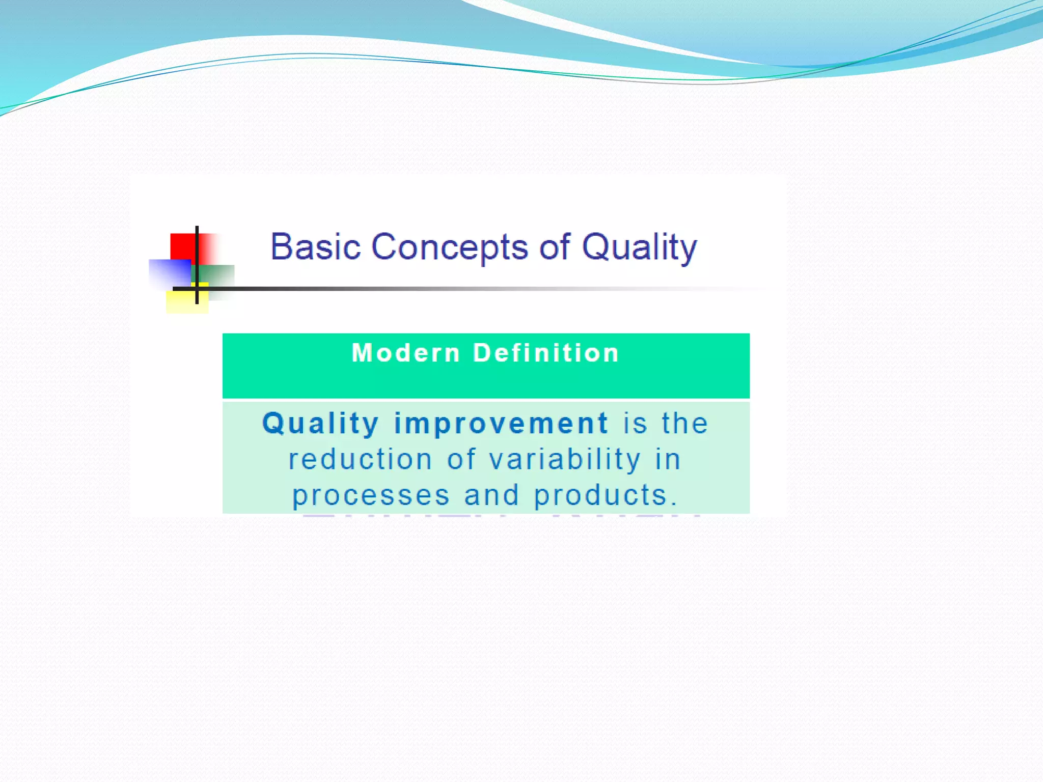
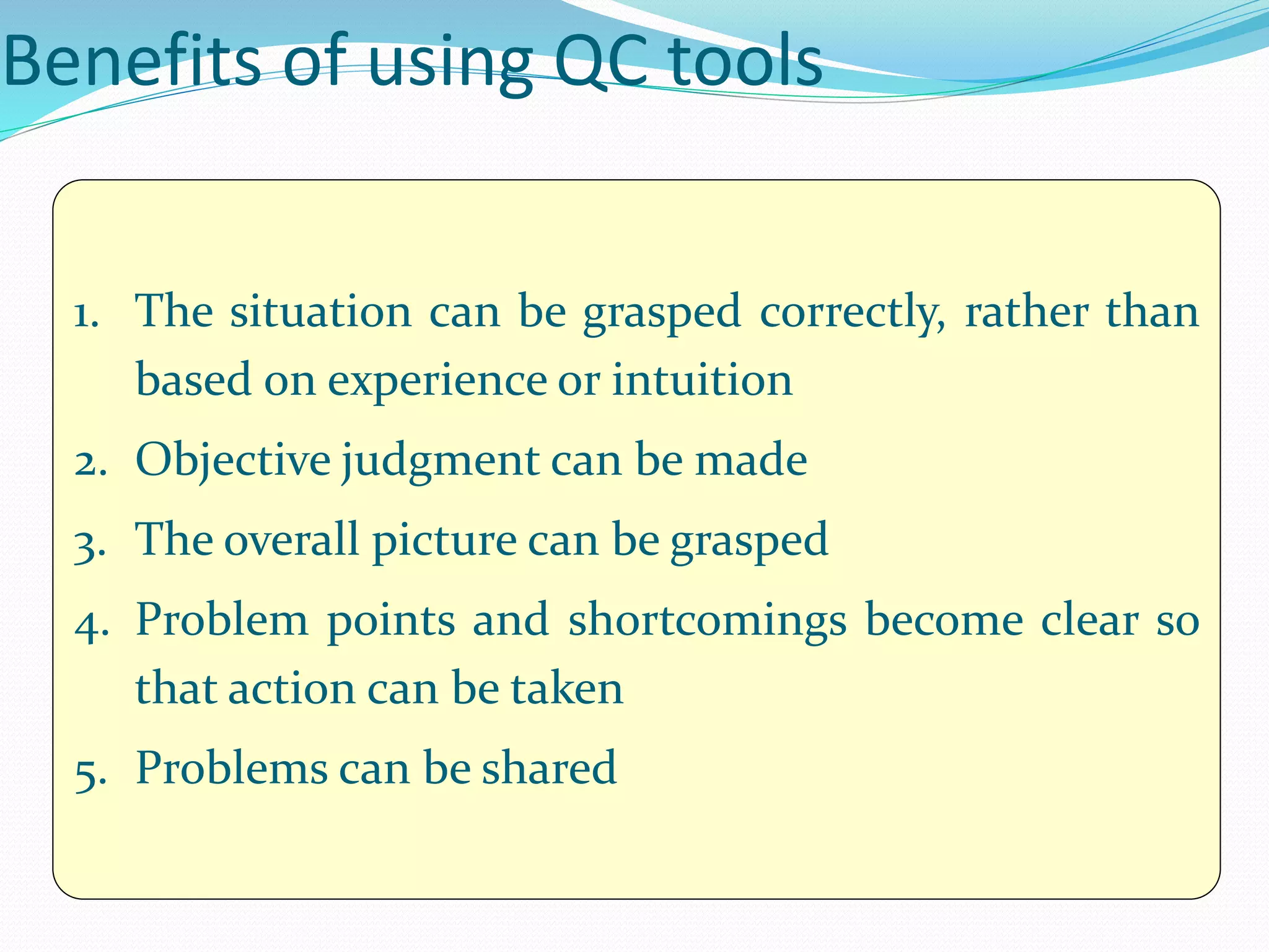
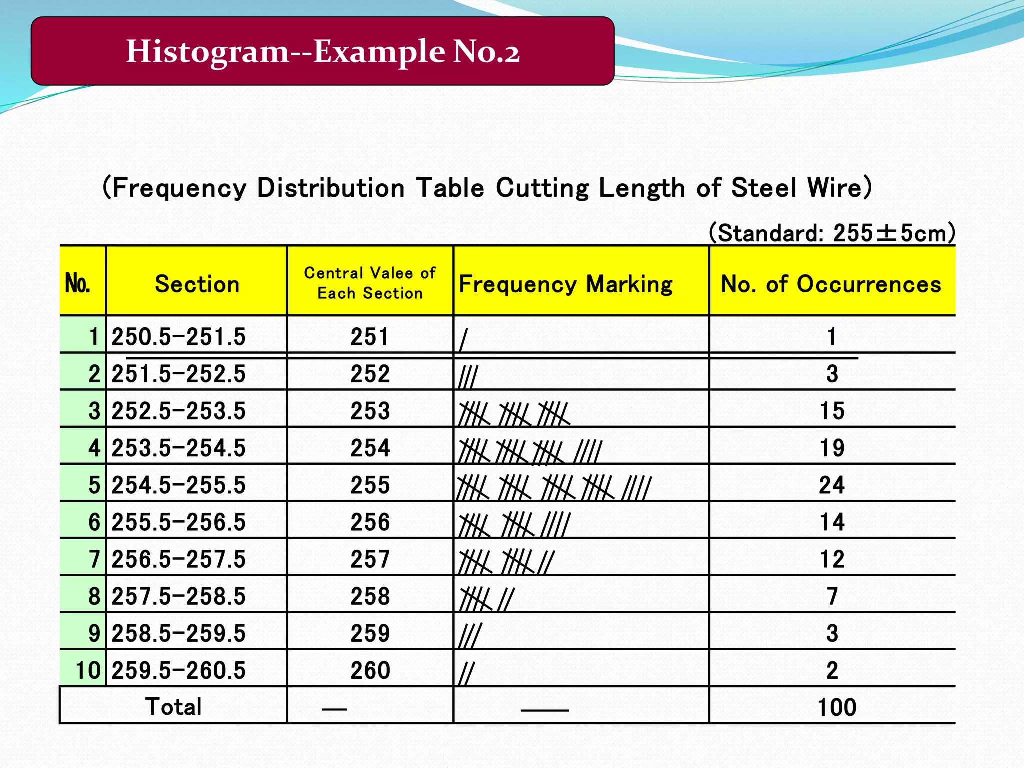
![(Unit;cm)
№ 1 2 3 4 5 6 7 8 9 10
1 255 259 257 254 253 254 253 257 258 252
2 253 256 255 255 256 255 257 255 256 258
3 257 255 256 251 255 253 255 256 254 256
4 257 255 257 254 254 260 258 253 260 255
5 255 252 255 253 253 258 253 259 255 257
6 253 257 258 256 253 254 255 254 257 253
7 255 254 253 255 257 252 254 256 255 255
8 254 254 254 254 255 255 257 255 253 254
9 258 256 253 256 255 254 255 256 256 256
10 256 254 255 257 254 254 259 253 258 254
S 253 252 253 251 253 252 253 253 253 252
L 258 259 258 257 257 260 259 259 260 258
Data sheet of lengths of cut steel wire [Specification: 255±5cm] (n=100)
Histogram--Example No. 1](https://image.slidesharecdn.com/statisticalqualitycontrolsampling-160806150546/75/Statistical-quality-control-sampling-20-2048.jpg)
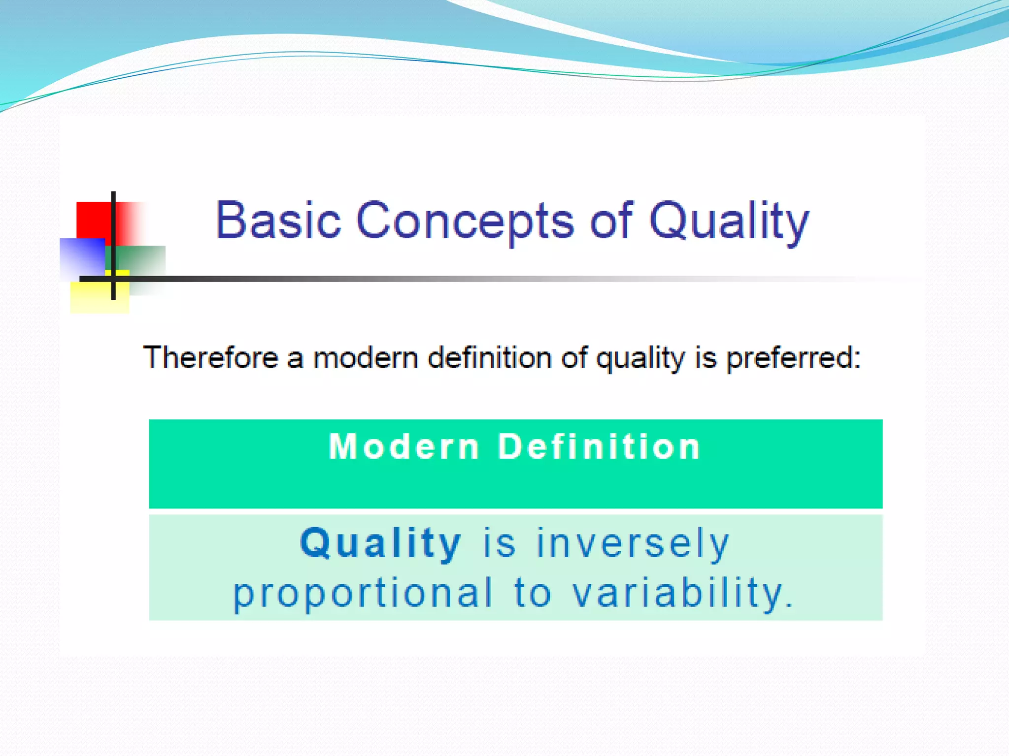
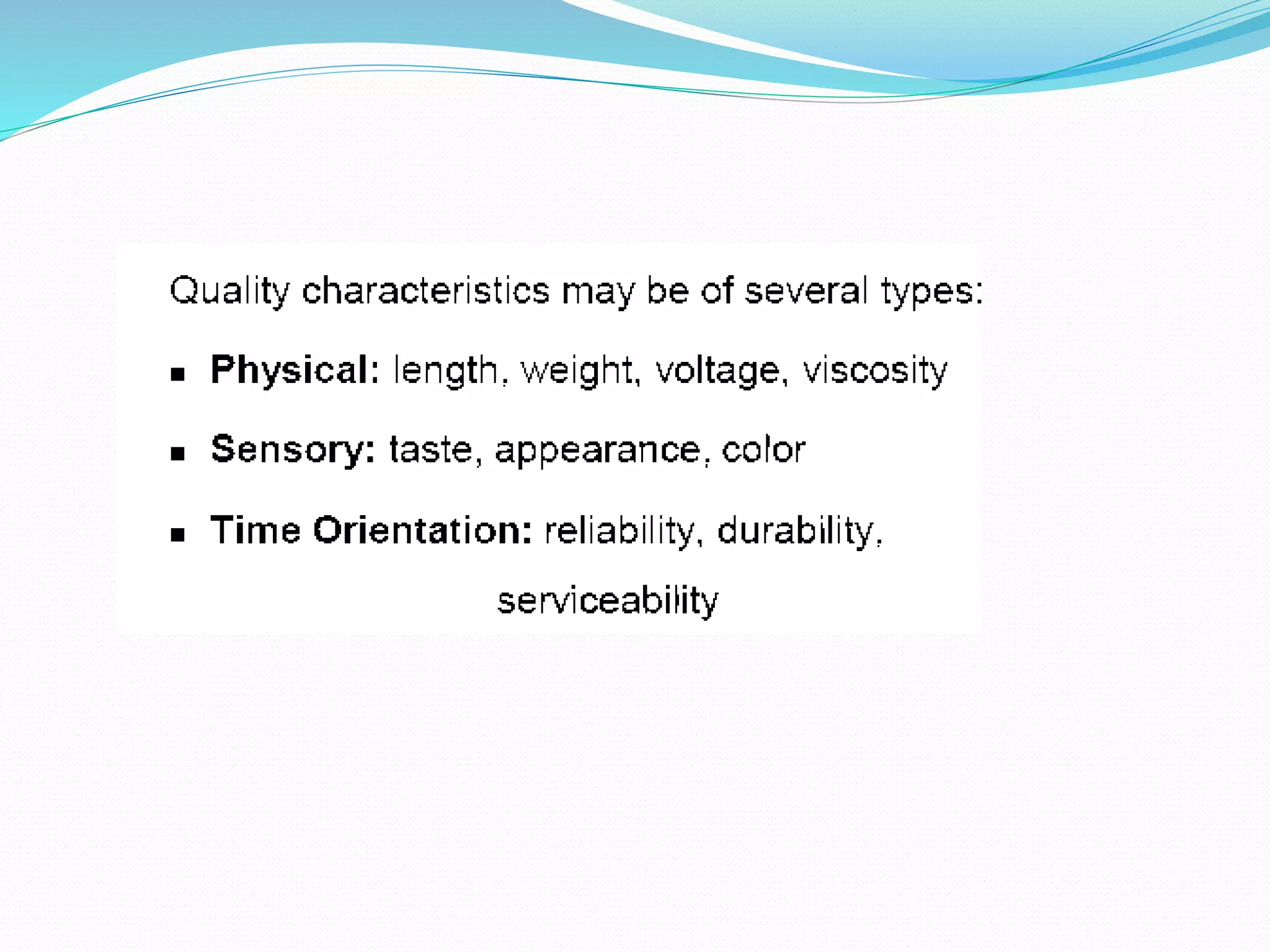
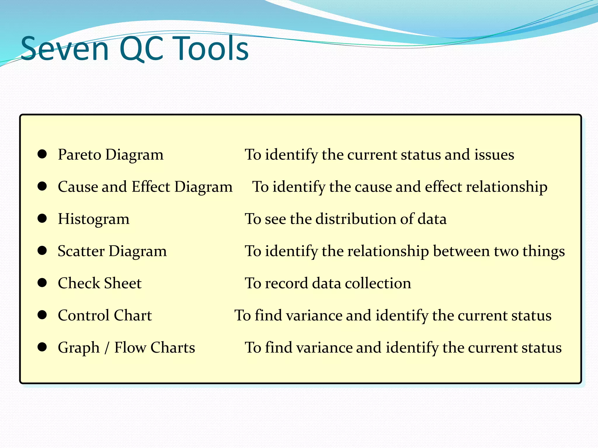
![0
5
10
15
20
25
250 252 254 256 258 260
X
Standard
Lower Limit
Standard
Upper Limit
N=100
[Histogram of Cutting Length of Steel Wire]
Standard Central
=255.19
Products
Standard Value
Histogram--Example No.3](https://image.slidesharecdn.com/statisticalqualitycontrolsampling-160806150546/75/Statistical-quality-control-sampling-22-2048.jpg)
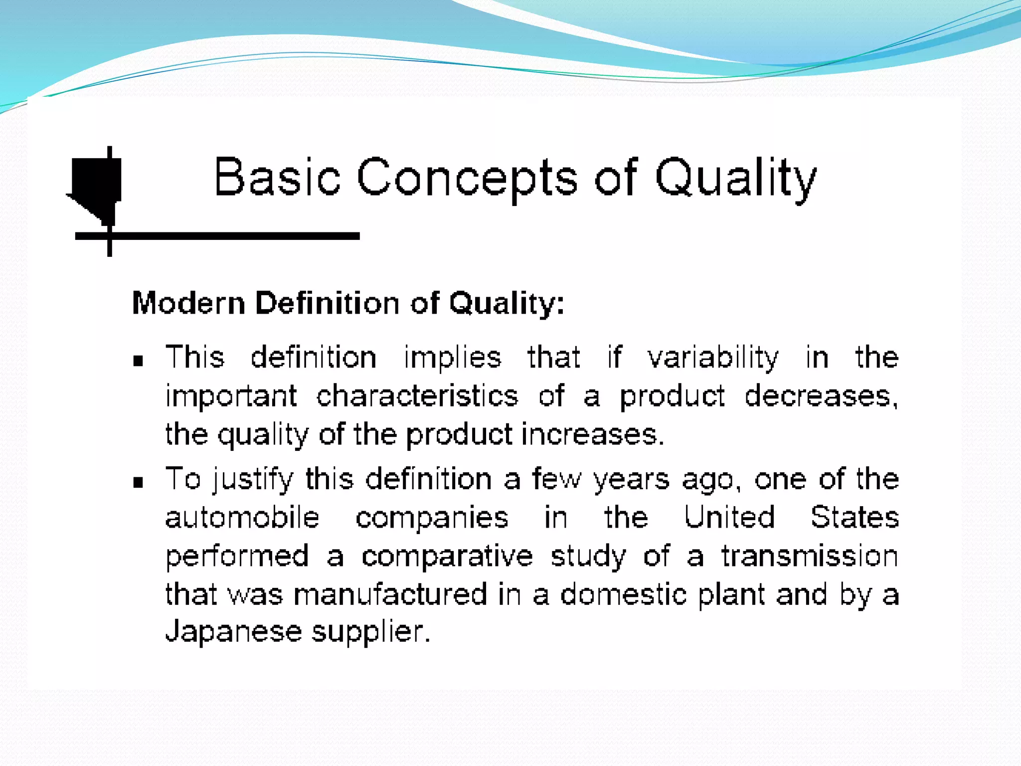
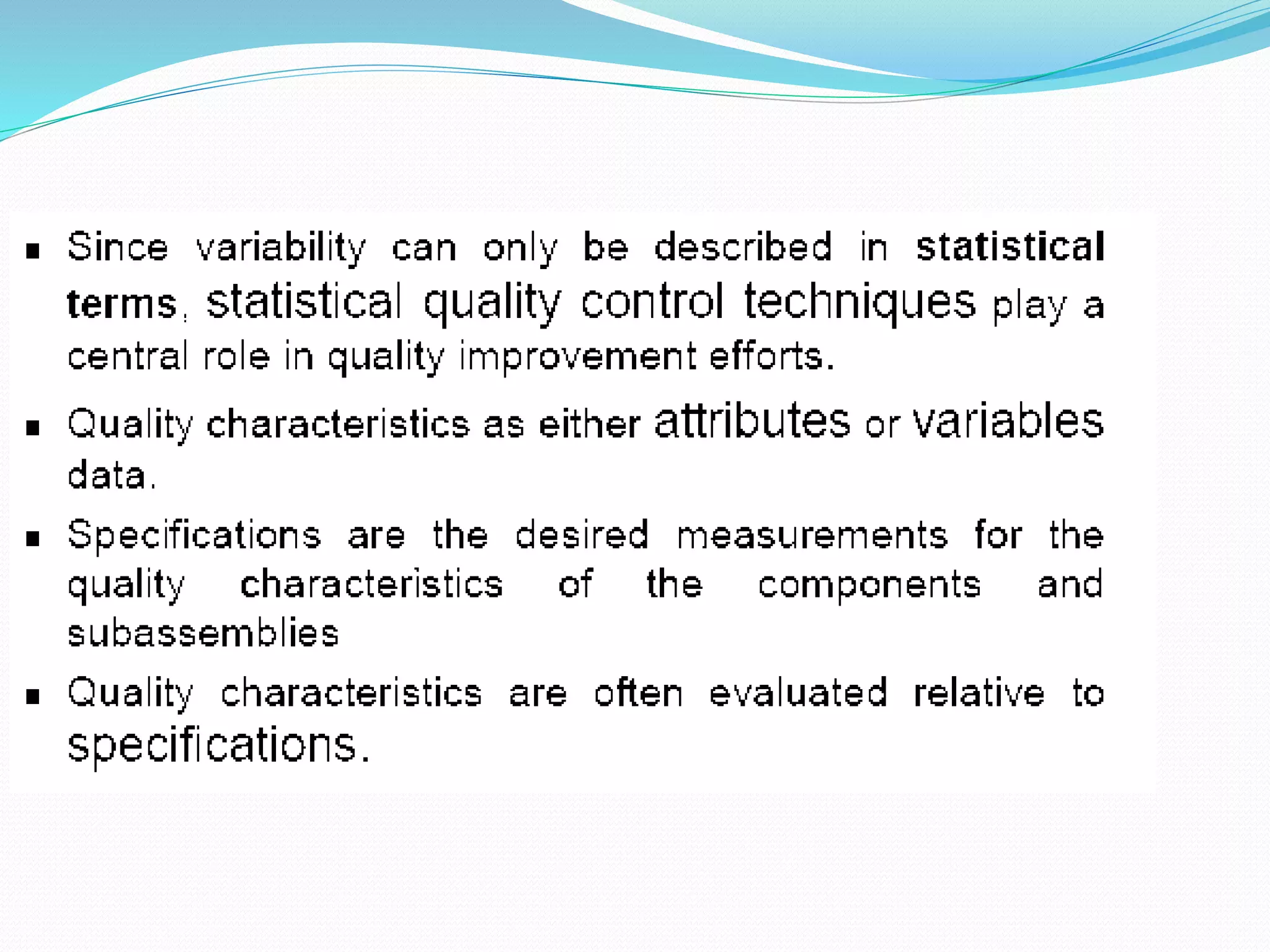
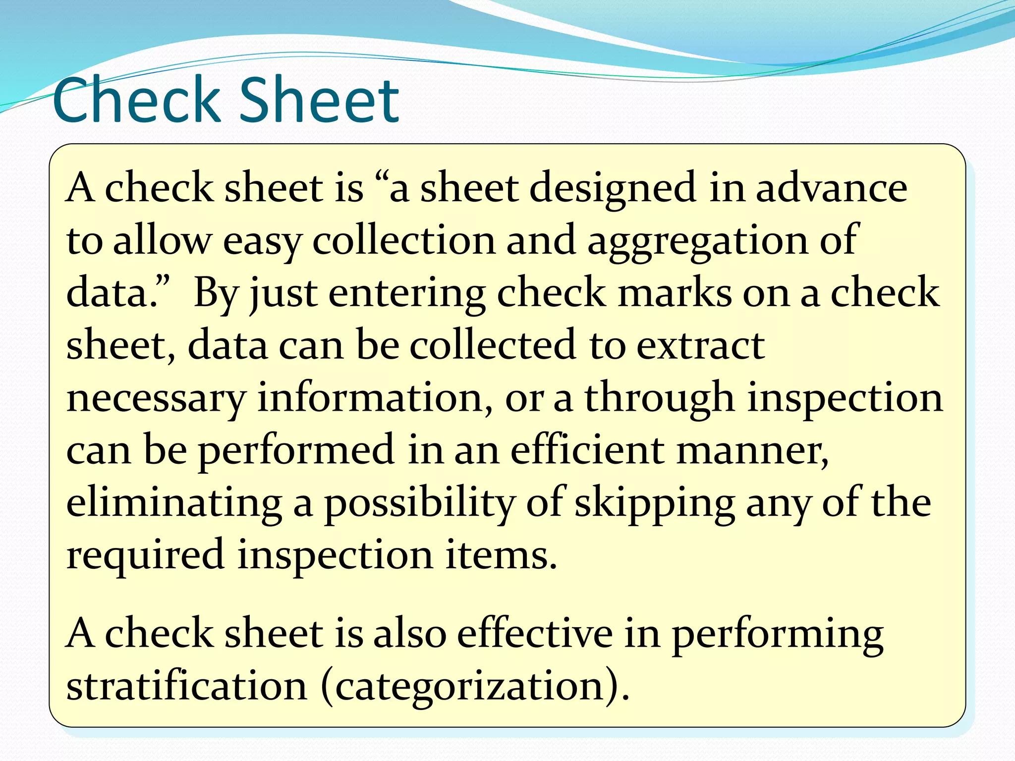
![A histogram is mainly used to analyze a process by
examining the location of the mean value in the graph or
degree of variations, to find a problem point that needs to
be improved. Its other applications are listed in the table
below. Usage Results
[Used during phases to monitor the
situation, analyze causes, and review
effectiveness of an action.]
Used to assess the actual conditions.
Used to analyze a process to identify a
problem point that needs to be improved
by finding the location of the mean value
or degree of variations in the graph.
Used to examine that the target quality is
maintained throughout the process.
Can identify the location of the
mean (central) value or degree of
variations.
Can find out the scope of a defect by
inserting standard values.
Can identify the condition of
distribution (e.g., whether there is an
isolated, extreme value).
When is it used and what results will be
obtained?](https://image.slidesharecdn.com/statisticalqualitycontrolsampling-160806150546/75/Statistical-quality-control-sampling-23-2048.jpg)


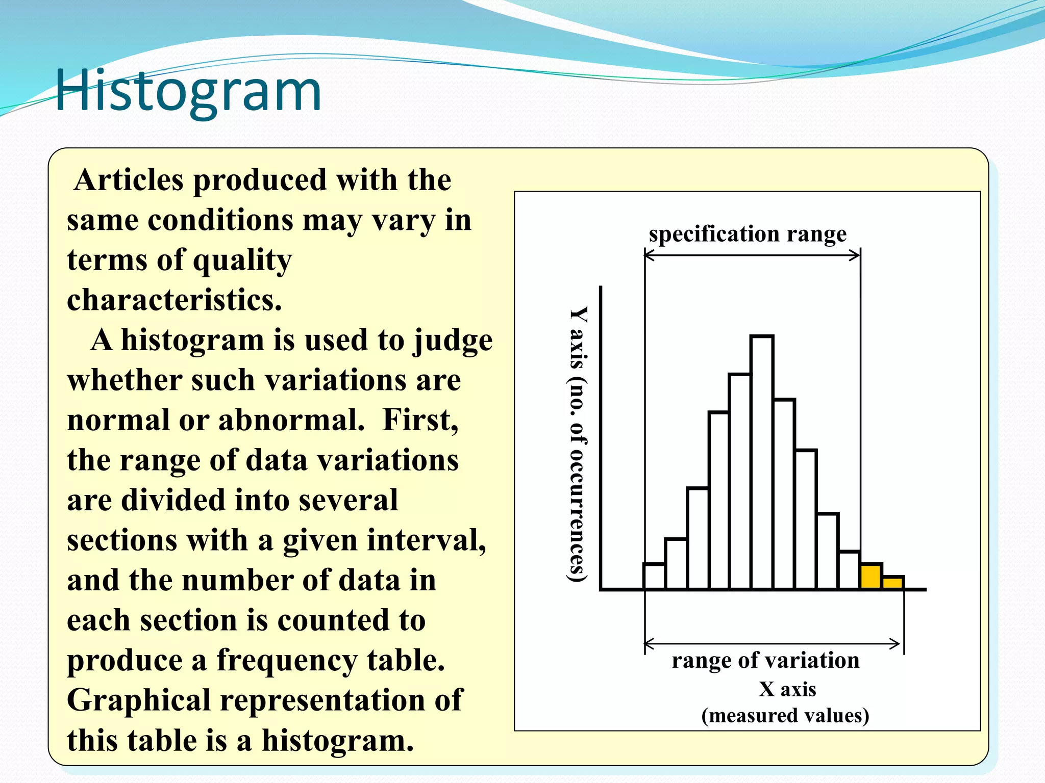
The document discusses various quality control tools used to identify issues, analyze causes, and monitor processes. It provides descriptions and examples of seven key QC tools: Pareto diagram, cause-and-effect diagram, histogram, scatter diagram, check sheet, control chart, and graph/flow chart. These tools can help objectively assess situations, identify problem areas, determine relationships between factors, and maintain process stability. The document emphasizes that collecting data and practicing the use of these tools is important for effectively solving problems and improving processes.


