Downloaded 1,624 times

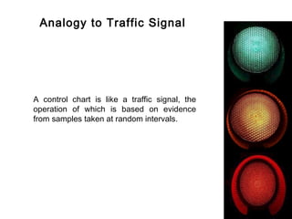
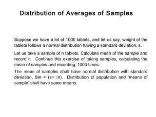
![Distribution - Population Vs Sample Means
Distribution of
means of samples
[standard deviation = (s÷ n)]
Distribution of population
(standard deviation = s
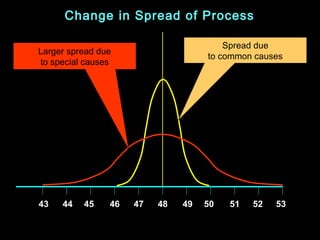
43 44 45 46 47 48 49 50 51 52 53
Quality Characteristics](https://image.slidesharecdn.com/controlcharts-130117234544-phpapp02/85/Control-charts-49-320.jpg)
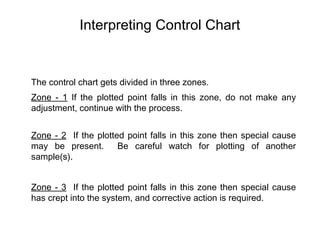
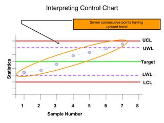
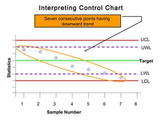


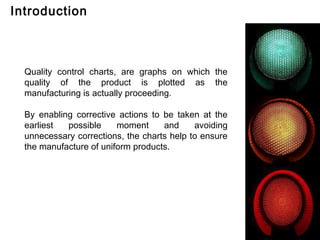
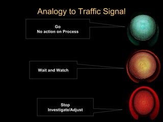
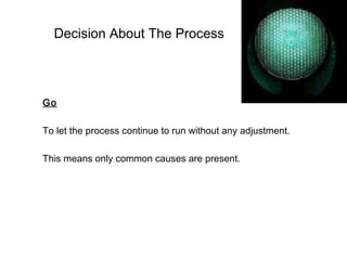
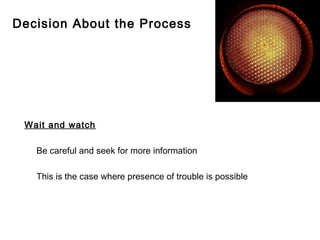
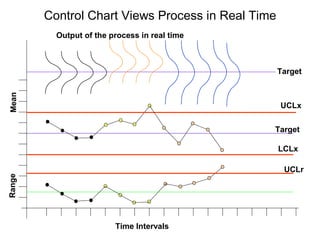
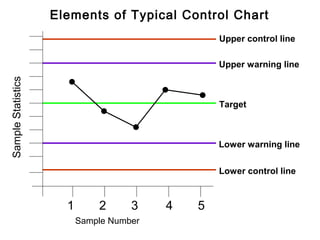
Control charts are graphs used to monitor quality during manufacturing. They allow issues to be identified and addressed early to maintain consistent product quality. Key aspects of control charts include: - Plotting statistics like the mean or range of sample measurements over time - Using statistical limits to identify processes that are in or out of control - Interpreting patterns in the charts to determine if corrective action is needed Control charts enable manufacturers to efficiently produce uniform products by catching problems early and avoiding unnecessary adjustments to processes that are performing normally.


![Control Charts[1]](https://cdn.slidesharecdn.com/ss_thumbnails/controlcharts1-1226081330857138-9-thumbnail.jpg?width=640&height=640&fit=bounds)


