Download to read offline
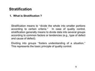
![11
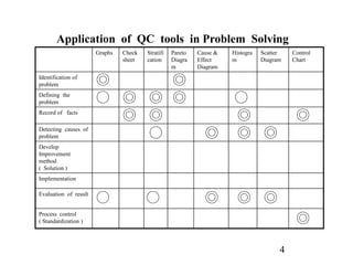
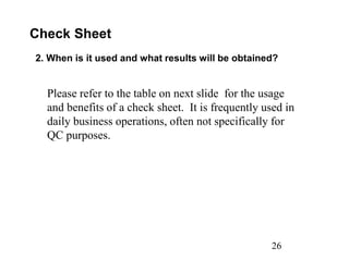
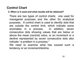
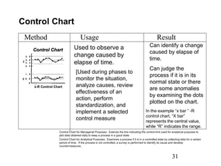
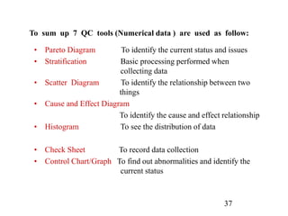
Method Usage Result
Stratification
Grouping by day,
time, place,
worker, or
process
X
Y
Z
Number of Units
★★★★★★★
△△△△
○○○
•Used to observe variations
among strata.
•Used to identify the
relationship between cause
and effect.
•Used to identify a purpose
and means to serve the
purpose
[Used during phases to monitor
the situation, analyze causes,
review effectiveness of an action,
perform standardization, and
implement a selected control
measure.]
•Allows observation
of variations among
strata.
•By performing a
cause analysis using
the stratified data,
the following can be
accomplished.
1.Identification and control of a
problem
2.“Division of data (obtained by
using each QC tool) into several
groups”](https://image.slidesharecdn.com/7qctools-230213095004-4f05d8d3/85/7-QC-Tools-ppt-11-320.jpg)
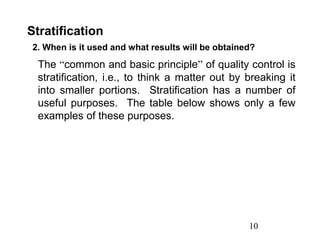
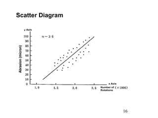
![15
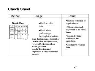
Method Usage Result
Scatter Diagram
•Used to identify a relationship
between two matters.
•Used to identify a relationship
between two matters and establish
countermeasures based on their
cause and effect relation.
Example Usage
1.Relationship between thermal
treatment temperature of a steel
material and its tensile strengths
2.Relationship between visit made
by a salesman and volume of sales
3.Relationship between the number
of persons visiting a department
store and volume of sales
4 Others
Scatter Diagram
Scatter Diagram
y Axis
x Axis
Abrasion
Number of
Rotations
Scatter Diagram
Scatter Diagram
y Axis
x Axis
Abrasion
Number of
Rotations
[Used during phases to monitor the
situation, analyze causes, and review
effectiveness of an action.]
•Can identify cause
and effect relation.
•Can understand the
relationship
between two
results.](https://image.slidesharecdn.com/7qctools-230213095004-4f05d8d3/85/7-QC-Tools-ppt-15-320.jpg)
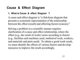
![19
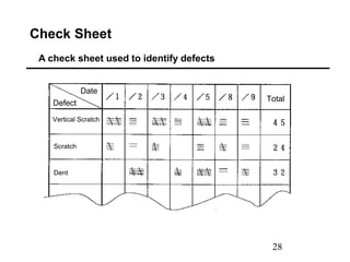
Can obtain a clear
overall picture of causal
relation. (A change in
the cause triggers a
variation in the
result.)○ Can clarify
the cause and effect
relationship.
Can list up all causes
to identify important
causes.
Can determine the
direction of action
(countermeasure).
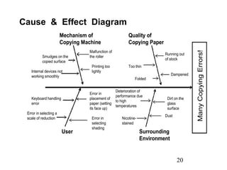
Method Usage Result
Cause & Effect Diagram
Used when
clarifying a cause
and effect
relationship.[Used
during a phase to
analyze causes.]
Used to develop
countermeasures.
[Used during a phase to plan
countermeasures.]
Material Method
Man
Machine
Cause (4M’s) Result
(Controlled State)
Effect
Cause and Effect
Cause and Effect
Diagram
Diagram
Material Method
Man
Machine
Cause (4M’s) Result
(Controlled State)
Effect
Cause and Effect
Cause and Effect
Diagram
Diagram](https://image.slidesharecdn.com/7qctools-230213095004-4f05d8d3/85/7-QC-Tools-ppt-19-320.jpg)
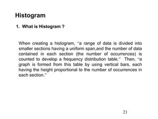
![23
Method Usage Result
Histogram
Histogram
Histogram
Standard
Range
Range of
Variations
X Axis (Values
Actually
Measured)
Histogram
Histogram
Standard
Range
Range of
Variations
X Axis (Values
Actually
Measured)
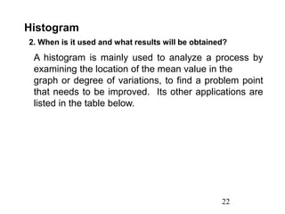
•Used to assess the actual
conditions.
•Used to analyze a process to
identify a problem point that needs
to be improved by finding the
location of the mean value or
degree of variations in the graph.
•Used to examine that the target
quality is maintained throughout
the process.
•Others
[Used during phases to
monitor the situation, analyze
causes, and review
effectiveness of an action.]
•Can identify the
location of the mean
(central) value or
degree of variations.
•Can find out the scope
of a defect by inserting
standard values.
•Can identify the
condition of
distribution (e.g.,
whether there is an
isolated, extreme
value).](https://image.slidesharecdn.com/7qctools-230213095004-4f05d8d3/85/7-QC-Tools-ppt-23-320.jpg)
![24
Histogram
Frequency Distribution Table
Cutting Length of Steel Wire]
Standard
Lower Limit Upper Limit
Standard
Standard Value
Product
[Histogram of Cutting Length of Steel
Wire]
(Standard: 255 5 mm)
±
Section
Frequency Marking Occurrences
Mean](https://image.slidesharecdn.com/7qctools-230213095004-4f05d8d3/85/7-QC-Tools-ppt-24-320.jpg)
![36
Graph
Sales
(¥million)
Sales
Office
Iwate Tokyo Osaka Shizuoka
[Bar Graph of Sales]
・ Survey Period: Dec. 1999
・ Prepared by: M/T
[Band Chart of Expenses]
(¥million)
Before
Taking
Actions
After
Taking
Actions
Chemicals
Chemicals
(430)
(430)
Chemicals
Chemicals
(240)
(240)
Oils
Oils
(200)
(200)
Oils
Oils
(150)
(150)
Electricity
Electricity
(170)
(170)
Electricity
Electricity
(108)
(108)
(Total: ¥8 million)
(Total: ¥4.95 million)
Sales
(¥million)
Sales
Office
Iwate Tokyo Osaka Shizuoka
[Bar Graph of Sales]
・ Survey Period: Dec. 1999
・ Prepared by: M/T
[Band Chart of Expenses]
(¥million)
Before
Taking
Actions
After
Taking
Actions
Chemicals
Chemicals
(430)
(430)
Chemicals
Chemicals
(240)
(240)
Oils
Oils
(200)
(200)
Oils
Oils
(150)
(150)
Electricity
Electricity
(170)
(170)
Electricity
Electricity
(108)
(108)
(Total: ¥8 million)
(Total: ¥4.95 million)](https://image.slidesharecdn.com/7qctools-230213095004-4f05d8d3/85/7-QC-Tools-ppt-36-320.jpg)

This document provides an overview of 7 quality control tools: Pareto diagram, stratification, scatter diagram, cause and effect diagram, histogram, check sheet, and control chart. For each tool, a definition is given followed by a description of when and how it is used and the typical results obtained. The tools can be used at different stages of problem solving including monitoring situations, analyzing causes, reviewing effectiveness of actions, and implementing improvements. Overall, the tools help collect and visualize data to identify problems, find root causes, and measure results as part of a quality control process.


![7 qc tools training material[1]](https://cdn.slidesharecdn.com/ss_thumbnails/7qctoolstrainingmaterial1-120925054558-phpapp02-thumbnail.jpg?width=640&height=640&fit=bounds)


