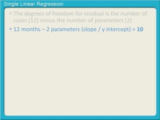
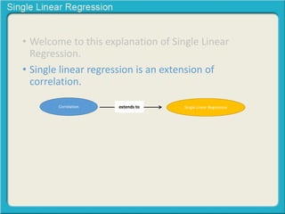
This document provides an overview of single linear regression. It explains that single linear regression extends the concept of correlation by using one variable to predict the value of another variable. It discusses using scatter plots to visualize the relationship between two variables and determine if the relationship is strong or weak, and whether it is positive or negative. Examples are provided to illustrate single linear regression concepts and how to interpret different types of relationships between variables.
Multiple Regression and Logistic RegressionKaushik Rajan
1) Multiple Regression to predict Life Expectancy using independent variables Lifeexpectancymale, Lifeexpectancyfemale, Adultswhosmoke, Bingedrinkingadults, Healthyeatingadults and Physicallyactiveadults.
2) Binomial Logistic Regression to predict the Gender (0 - Male, 1 - Female) with the help of independent variables such as LifeExpectancy, Smokingadults, DrinkingAdults, Physicallyactiveadults and Healthyeatingadults.
Tools used:
> RStudio for Data pre-processing and exploratory data analysis
> SPSS for building the models
> LATEX for documentation
Introduces and explains the use of multiple linear regression, a multivariate correlational statistical technique. For more info, see the lecture page at http://goo.gl/CeBsv. See also the slides for the MLR II lecture http://www.slideshare.net/jtneill/multiple-linear-regression-ii
Statistics For Data Science | Statistics Using R Programming Language | Hypot...Edureka!
( ** Data Science Certification Using R: https://www.edureka.co/data-science ** )
This Edureka tutorial on "Statistics for Data Science" talks about the basic concepts of Statistics, which is primarily an applied branch of mathematics, that attempts to make sense of observations in the real world. Statistics is generally regarded as one of the most crucial aspects of data science.
Introduction to statistics
Basic Terminology
Categories in Statistics
Descriptive Statistics
Reasons for moving to R
Descriptive Statistics in R Studio
Inferential Statistics
Inferential Statistics using R Studio
Check out our Data Science Tutorial blog series: http://bit.ly/data-science-blogs
Check out our complete Youtube playlist here: http://bit.ly/data-science-playlist
Residuals represent variation in the data that cannot be explained by the model.
Residual plots useful for discovering patterns, outliers or misspecifications of the model. Systematic patterns discovered may suggest how to reformulate the model.
If the residuals exhibit no pattern, then this is a good indication that the model is appropriate for the particular data.
Abstract: This PDSG workshop introduces basic concepts of multiple linear regression in machine learning. Concepts covered are Feature Elimination and Backward Elimination, with examples in Python.
Level: Fundamental
Requirements: Should have some experience with Python programming.
Data Science - Part XII - Ridge Regression, LASSO, and Elastic NetsDerek Kane
This lecture provides an overview of some modern regression techniques including a discussion of the bias variance tradeoff for regression errors and the topic of shrinkage estimators. This leads into an overview of ridge regression, LASSO, and elastic nets. These topics will be discussed in detail and we will go through the calibration/diagnostics and then conclude with a practical example highlighting the techniques.
A Probability Distribution is a way to shape the sample data to make predictions and draw conclusions about an entire population. It refers to the frequency at which some events or experiments occur. It helps finding all the possible values a random variable can take between the minimum and maximum statistically possible values.
The term regression was originally employed by Francis Galton while describing the laws of inheritance. Galton believed that these laws caused population extremes to “regress
toward the mean.” By this he meant that children of individuals having extreme values of a certain characteristic would tend to have less extreme values of this characteristic
than their parent.
1. A small accounting firm pays each of its five clerks $35,000, t.docxSONU61709
1. A small accounting firm pays each of its five clerks $35,000, two junior accountants $80,000 each, and the firm's owner $350,000. What is the mean salary paid at this firm? (Round your answer to the nearest whole number.)
$
How many of the employees earn less than the mean?
employees
What is the median salary?
$
2. A small accounting firm pays each of its five clerks $35000, two junior accountants $90000 each, and the firm's owner $256000.
What is the mean salary paid at this firm?
How many of the employees earn less than the mean?
What is the median salary?
If this firm gives no raises to the clerks and junior accountants, but the owner now has a salary of $435000.
How does this change affect the mean?
The mean increases by $ .
How does it affect the median?
The median increases by $ .
3. A study of diet and weight gain deliberately overfed 16 volunteers for eight weeks. The mean increase in fat was x = 2.63 kilograms and the standard deviation was s = 1.21 kilograms. What are x and s in pounds? (A kilogram is 2.2 pounds.)
x
=
s
=
4.Every few years, the National Assessment of Educational Progress asks a national sample of eighth-graders to perform the same math tasks. The goal is to get an honest picture of progress in math. Suppose these are the last few national mean scores, on a scale of 0 to 500.
Year
1990
1992
1996
2000
2003
2005
2008
Score
265
266
270
271
278
279
281
(a) Make a time plot of the mean scores, by hand. This is just a scatterplot of score against year. There is a slow linear increasing trend. (Do this on your own.)
(b) Find the regression line of mean score on time step-by-step. First calculate the mean and standard deviation of each variable and their correlation (use a calculator with these functions). Then find the equation of the least-squares line from these. (Round your answers to two decimal places.)
= + x
Draw the line on your scatterplot. What percent of the year-to-year variation in scores is explained by the linear trend? (Round your answer to one decimal place.)
%
(c) Now use software or the regression function on your calculator to verify your regression line. (Do this on your own.
5. A student wonders if tall women tend to date taller men than do short women. She measures herself, her dormitory roommate, and the women in the adjoining rooms; then she measures the next man each woman dates. The data (heights in inches) are listed below.
Women (x)
65
63
63
64
69
64
Men (y)
72
67
69
69
69
68
(a) Make a scatterplot of these data. (Do this on paper. Your instructor may ask you to turn this in.) Based on the scatterplot, do you expect the correlation to be positive or negative? Near ± 1 or not?
The correlation should be positive. It should be near 1.The correlation should be negative. It should be near -1. The correlation should be positive. It should not be near 1.The correlation should be negative. It should not be near -1.
(b) Find the correlation r between the heigh ...
Safalta Digital marketing institute in Noida, provide complete applications that encompass a huge range of virtual advertising and marketing additives, which includes search engine optimization, virtual communication advertising, pay-per-click on marketing, content material advertising, internet analytics, and greater. These university courses are designed for students who possess a comprehensive understanding of virtual marketing strategies and attributes.Safalta Digital Marketing Institute in Noida is a first choice for young individuals or students who are looking to start their careers in the field of digital advertising. The institute gives specialized courses designed and certification.
for beginners, providing thorough training in areas such as SEO, digital communication marketing, and PPC training in Noida. After finishing the program, students receive the certifications recognised by top different universitie, setting a strong foundation for a successful career in digital marketing.
A workshop hosted by the South African Journal of Science aimed at postgraduate students and early career researchers with little or no experience in writing and publishing journal articles.
2024.06.01 Introducing a competency framework for languag learning materials ...Sandy Millin
http://sandymillin.wordpress.com/iateflwebinar2024
Published classroom materials form the basis of syllabuses, drive teacher professional development, and have a potentially huge influence on learners, teachers and education systems. All teachers also create their own materials, whether a few sentences on a blackboard, a highly-structured fully-realised online course, or anything in between. Despite this, the knowledge and skills needed to create effective language learning materials are rarely part of teacher training, and are mostly learnt by trial and error.
Knowledge and skills frameworks, generally called competency frameworks, for ELT teachers, trainers and managers have existed for a few years now. However, until I created one for my MA dissertation, there wasn’t one drawing together what we need to know and do to be able to effectively produce language learning materials.
This webinar will introduce you to my framework, highlighting the key competencies I identified from my research. It will also show how anybody involved in language teaching (any language, not just English!), teacher training, managing schools or developing language learning materials can benefit from using the framework.
Biological screening of herbal drugs: Introduction and Need for
Phyto-Pharmacological Screening, New Strategies for evaluating
Natural Products, In vitro evaluation techniques for Antioxidants, Antimicrobial and Anticancer drugs. In vivo evaluation techniques
for Anti-inflammatory, Antiulcer, Anticancer, Wound healing, Antidiabetic, Hepatoprotective, Cardio protective, Diuretics and
Antifertility, Toxicity studies as per OECD guidelines
A Strategic Approach: GenAI in EducationPeter Windle
Artificial Intelligence (AI) technologies such as Generative AI, Image Generators and Large Language Models have had a dramatic impact on teaching, learning and assessment over the past 18 months. The most immediate threat AI posed was to Academic Integrity with Higher Education Institutes (HEIs) focusing their efforts on combating the use of GenAI in assessment. Guidelines were developed for staff and students, policies put in place too. Innovative educators have forged paths in the use of Generative AI for teaching, learning and assessments leading to pockets of transformation springing up across HEIs, often with little or no top-down guidance, support or direction.
This Gasta posits a strategic approach to integrating AI into HEIs to prepare staff, students and the curriculum for an evolving world and workplace. We will highlight the advantages of working with these technologies beyond the realm of teaching, learning and assessment by considering prompt engineering skills, industry impact, curriculum changes, and the need for staff upskilling. In contrast, not engaging strategically with Generative AI poses risks, including falling behind peers, missed opportunities and failing to ensure our graduates remain employable. The rapid evolution of AI technologies necessitates a proactive and strategic approach if we are to remain relevant.
A review of the growth of the Israel Genealogy Research Association Database Collection for the last 12 months. Our collection is now passed the 3 million mark and still growing. See which archives have contributed the most. See the different types of records we have, and which years have had records added. You can also see what we have for the future.
How to Build a Module in Odoo 17 Using the Scaffold MethodCeline George
Odoo provides an option for creating a module by using a single line command. By using this command the user can make a whole structure of a module. It is very easy for a beginner to make a module. There is no need to make each file manually. This slide will show how to create a module using the scaffold method.
Delivering Micro-Credentials in Technical and Vocational Education and TrainingAG2 Design
Explore how micro-credentials are transforming Technical and Vocational Education and Training (TVET) with this comprehensive slide deck. Discover what micro-credentials are, their importance in TVET, the advantages they offer, and the insights from industry experts. Additionally, learn about the top software applications available for creating and managing micro-credentials. This presentation also includes valuable resources and a discussion on the future of these specialised certifications.
For more detailed information on delivering micro-credentials in TVET, visit this https://tvettrainer.com/delivering-micro-credentials-in-tvet/
Acetabularia Information For Class 9 .docxvaibhavrinwa19
Acetabularia acetabulum is a single-celled green alga that in its vegetative state is morphologically differentiated into a basal rhizoid and an axially elongated stalk, which bears whorls of branching hairs. The single diploid nucleus resides in the rhizoid.
2. • Welcome to this explanation of Single Linear
Regression.
3. • Welcome to this explanation of Single Linear
Regression.
• Single linear regression is an extension of
correlation.
4. • Welcome to this explanation of Single Linear
Regression.
• Single linear regression is an extension of
correlation.
Correlation extends to Single Linear Regression
5. • Correlation is designed to render a single
coefficient that represents the degree of coherence
between two variables
6. • Correlation is designed to render a single
coefficient that represents the degree of coherence
between two variables
7. • Correlation is designed to render a single
coefficient that represents the degree of coherence
between two variables
8. • Correlation is designed to render a single
coefficient that represents the degree of coherence
between two variables
As one
variable
increases the
other
increases
+.99
9. • Correlation is designed to render a single
coefficient that represents the degree of coherence
between two variables
As one
variable
increases the
other
increases
+.99
This coefficient represents an
almost perfect positive
correlation or relationship
between these two variables.
10. • Correlation is designed to render a single
coefficient that represents the degree of coherence
between two variables
Ave Daily Temp
500
600
700
800
900
11. • Correlation is designed to render a single
coefficient that represents the degree of coherence
between two variables
Ave Daily Temp
500
600
700
800
900
As one
variable
decreases the
other
increases
12. • Correlation is designed to render a single
coefficient that represents the degree of coherence
between two variables
Ave Daily Temp
500
600
700
800
900
As one
variable
decreases the
other
increases
-.99
13. • Correlation is designed to render a single
coefficient that represents the degree of coherence
between two variables
Ave Daily Temp
500
600
700
800
900
As one
variable
decreases the
other
increases
-.99
Almost a perfect negative
correlation or relationship
between these two variables.
14. • Single linear regression uses that information to
predict the value of one variable based on the
given value of the other variable.
15. • Single linear regression uses that information to
predict the value of one variable based on the
given value of the other variable.
16. • Single linear regression uses that information to
predict the value of one variable based on the
given value of the other variable.
• For example:
17. • For example:
If the following data set were real, what would you
predict ice cream sales would be when the
temperature reaches 1000?
18. • For example:
If the following data set were real, what would you
predict ice cream sales would be when the
temperature reaches 1000?
Ave Daily Ice Cream Sales
?
560
480
350
320
230
Ave Daily Temp
1000
900
800
700
600
500
19. • Single linear regression uses that information to
predict the value of one variable (ice cream) based
on the given value of the other variable
(temperature).
20. • Single linear regression uses that information to
predict the value of one variable (ice cream) based
on the given value of the other variable
(temperature).
21. If the following data set were real, what would you
predict ice cream sales would be when the temperature
reaches 1000?
Ave Daily Ice Cream Sales
630?
560
480
350
320
230
Ave Daily Temp
1000
900
800
700
600
500
• Rather than simply examining the relationship between
the variables (as is the case with the Pearson Product
Moment Correlation), one variable will be used as the
predictor (temperature) and the other value will be
used as the outcome or predicted (ice cream sales).
22. If the following data set were real, what would you
predict ice cream sales would be when the temperature
reaches 1000?
Ave Daily Ice Cream Sales
630?
560
480
350
320
230
Ave Daily Temp
1000
900
800
700
600
500
• Rather than simply examining the relationship between
the variables (as is the case with the Pearson Product
Moment Correlation), one variable will be used as the
predictor (temperature) and the other value will be
used as the outcome or predicted (ice cream sales).
• Linear Regression makes it possible to estimate a value
like 630
23. • In some cases which variable is considered
predictor or outcome is arbitrary.
24. • In some cases which variable is considered
predictor or outcome is arbitrary.
• Like measures of depression and anxiety
25. • In some cases which variable is considered
predictor or outcome is arbitrary.
• Like measures of depression and anxiety
Composite
Depression Score
33
26
22
14
12
6
Composite
Anxiety Score
103
100
92
74
52
26
26. • In some cases which variable is considered
predictor or outcome is arbitrary.
• Like measures of depression and anxiety
Composite
Depression Score
33
26
22
14
12
6
Composite
Anxiety Score
103
100
92
74
52
26
• It’s not clear which influences which. Most likely
depression and anxiety mutually influence one
another.
27. • In some cases, either by theory or by the nature of
the research design, one variable will be rationally
defined as the predictor and the other as the
outcome.
28. • In some cases, either by theory or by the nature of
the research design, one variable will be rationally
defined as the predictor and the other as the
outcome.
Ave Daily
Exposure to Sunlight
3.3 hrs
2.6 hrs
2.2 hrs
1.4 hrs
1.2 hrs
0.6 hrs
29. • In some cases, either by theory or by the nature of
the research design, one variable will be rationally
defined as the predictor and the other as the
outcome.
Ave Daily
Exposure to Sunlight
3.3 hrs
2.6 hrs
2.2 hrs
1.4 hrs
1.2 hrs
0.6 hrs
Levels of Vitamin E
after two months
10.3 units
8.1 units
7.3 units
7.0 units
6.8 units
5.7 units
30. • In some cases, either by theory or by the nature of
the research design, one variable will be rationally
defined as the predictor and the other as the
outcome.
Ave Daily
Exposure to Sunlight
3.3 hrs
2.6 hrs
2.2 hrs
1.4 hrs
1.2 hrs
0.6 hrs
Levels of Vitamin E
after two months
10.3 units
8.1 units
7.3 units
7.0 units
6.8 units
5.7 units
In this example,
exposure to sunlight
may impact levels of
Vitamin E.
But, levels of Vitamin E
would not impact the
amount of sunlight
one gets.
31. • An easy way to conceptualize single linear
regression is to create a scatterplot in Cartesian
space.
32. • An easy way to conceptualize single linear
regression is to create a scatterplot in Cartesian
space.
Let’s plot the following data set:
33. • An easy way to conceptualize single linear
regression is to create a scatterplot in Cartesian
space.
Let’s plot the following data set:
Composite
Depression Score
33
26
22
14
12
6
Composite
Anxiety Score
103
100
92
74
52
26
34. • First, we assign the predictor variable along the X
axis, which in this case we’ll arbitrarily say is
depression.
35. • First, we assign the predictor variable along the X
axis, which in this case we’ll arbitrarily say is
depression.
120
100
80
60
40
20
0
Relationship between
Depression & Anxiety
0 10 20 30 40
Anxiety
Depression
36. • ... and the outcome variable along the Y axis we’ll
arbitrarily say is Anxiety.
37. • ... and the outcome variable along the Y axis we’ll
arbitrarily say is Anxiety.
120
100
80
60
40
20
0
Relationship between
Depression & Anxiety
0 10 20 30 40
Anxiety
Depression
39. • Now, let’s identify or plot each point or dot
Depression
33
26
22
14
12
6
Anxiety
103
100
92
74
52
26
40. • Now, let’s identify or plot each point or dot
Depression
33
26
22
14
12
6
Anxiety
103
100
92
74
52
26
120
100
80
60
40
20
0
Relationship between
Depression & Anxiety
0 10 20 30 40
Anxiety
Depression
41. • Now, let’s identify or plot each point or dot
Depression
33
26
22
14
12
6
Anxiety
103
100
92
74
52
26
120
100
80
60
40
20
0
Relationship between
Depression & Anxiety (33, 103)
0 10 20 30 40
Anxiety
Depression
42. • Now, let’s identify or plot each point or dot
Depression
33
26
22
14
12
6
Anxiety
103
100
92
74
52
26
43. • Now, let’s identify or plot each point or dot
Depression
33
26
22
14
12
6
Anxiety
103
100
92
74
52
26
120
100
80
60
40
20
0
Relationship between
Depression & Anx(i2e6ty, 100)
0 10 20 30 40
Anxiety
Depression
44. • Now, let’s identify or plot each point or dot
Depression
33
26
22
14
12
6
Anxiety
103
100
92
74
52
26
45. • Now, let’s identify or plot each point or dot
Depression
33
26
22
14
12
6
Anxiety
103
100
92
74
52
26
120
100
80
60
40
20
0
Relationship between
Depression &( 2A2n,x 9ie2t)y
0 10 20 30 40
Anxiety
Depression
46. • Now, let’s identify or plot each point or dot
Depression
33
26
22
14
12
6
Anxiety
103
100
92
74
52
26
47. • Now, let’s identify or plot each point or dot
Depression
33
26
22
14
12
6
Anxiety
103
100
92
74
52
26
120
100
80
60
40
20
0
Relationship between
Dep(r1e4s,s i7o4n) & Anxiety
0 10 20 30 40
Anxiety
Depression
48. • Now, let’s identify or plot each point or dot
Depression
33
26
22
14
12
6
Anxiety
103
100
92
74
52
26
49. • Now, let’s identify or plot each point or dot
Depression
33
26
22
14
12
6
Anxiety
103
100
92
74
52
26
120
100
80
60
40
20
0
Relationship between
Depression & Anxiety
(12, 52)
0 10 20 30 40
Anxiety
Depression
50. • Now, let’s identify or plot each point or dot
Depression
33
26
22
14
12
6
Anxiety
103
100
92
74
52
26
51. • Now, let’s identify or plot each point or dot
Depression
33
26
22
14
12
6
Anxiety
103
100
92
74
52
26
120
100
80
60
40
20
0
Relationship between
Depression & Anxiety
(6, 26)
0 10 20 30 40
Anxiety
Depression
52. • Visually, one can see in the plotted space whether
there is a tendency for the variables to be related
and in what direction they are related.
53. • Visually, one can see in the plotted space whether
there is a tendency for the variables to be related
and in what direction they are related.
120
100
80
60
40
20
0
Relationship between
Depression & Anxiety
0 10 20 30 40
Anxiety
Depression
54. • Visually, one can see in the plotted space whether
there is a tendency for the variables to be related
and in what direction they are related.
120
100
80
60
40
20
0
Relationship between
Depression & Anxiety
0 10 20 30 40
Anxiety
Depression
In this case there is a
strong tendency
to relate and the
relationship is
positive
55. • With this data set the tendency for the variables to
relate is strong and the direction is negative:
56. • With this data set the tendency for the variables to
relate is strong and the direction is negative:
Depression
6
12
14
22
26
33
Anxiety
103
100
92
74
52
26
57. • With this data set the tendency for the variables to
relate is strong and the direction is negative:
Depression
6
12
14
22
26
33
Anxiety
103
100
92
74
52
26
120
100
80
60
40
20
0
Relationship between
Depression & Anxiety
0 10 20 30 40
Anxiety
Depression
58. • With this data set the tendency for the variables to
relate is strong and the direction is negative:
Depression
6
12
14
22
26
33
Anxiety
103
100
92
74
52
26
120
100
80
60
40
20
0
Relationship between
Depression & Anxiety
0 10 20 30 40
Anxiety
Depression
Strong and Negative
59. • When no relationship exists the scatter plot tends
to look like a big circle.
60. • When no relationship exists the scatter plot tends
to look like a big circle.
Depression
22
33
12
6
14
26
Anxiety
103
100
92
74
52
26
61. • When no relationship exists the scatter plot tends
to look like a big circle.
Depression
22
33
12
6
14
26
Anxiety
103
100
92
74
52
26
120
100
80
60
40
20
0
Relationship between
Depression & Anxiety
0 10 20 30 40
Anxiety
Depression
62. • When no relationship exists the scatter plot tends
to look like a big circle.
Depression
22
33
12
6
14
26
Anxiety
103
100
92
74
52
26
120
100
80
60
40
20
0
Relationship between
Depression & Anxiety
0 10 20 30 40
Anxiety
Depression
63. • When no relationship exists the scatter plot tends
to look like a big circle.
Depression
22
6
33
26
14
12
Anxiety
103
100
92
74
52
26
64. • When no relationship exists the scatter plot tends
to look like a big circle.
120
100
80
60
40
20
0
Relationship between
Depression & Anxiety
0 10 20 30 40
Anxiety
Depression
Depression
22
6
33
26
14
12
Anxiety
103
100
92
74
52
26
65. • When no relationship exists the scatter plot tends
to look like a big circle.
120
100
80
60
40
20
0
Relationship between
Depression & Anxiety
0 10 20 30 40
Anxiety
Depression
Depression
22
6
33
26
14
12
Anxiety
103
100
92
74
52
26
Weak and Positive
66. • When no relationship exists the scatter plot tends
to look like a big circle.
Depression
6
14
33
26
12
22
Anxiety
103
100
74
92
52
26
67. • When no relationship exists the scatter plot tends
to look like a big circle.
120
100
80
60
40
20
0
Relationship between
Depression & Anxiety
0 10 20 30 40
Anxiety
Depression
Depression
6
14
33
26
12
22
Anxiety
103
100
74
92
52
26
68. • When no relationship exists the scatter plot tends
to look like a big circle.
120
100
80
60
40
20
0
Relationship between
Depression & Anxiety
0 10 20 30 40
Anxiety
Depression
Depression
6
14
33
26
12
22
Anxiety
103
100
74
92
52
26
Weak and Negative
69. • You might have noticed that as the variables are related
either positively or negatively, the plot looks more like an
oval tilted one way or the other.
70. • You might have noticed that as the variables are related
either positively or negatively, the plot looks more like an
oval tilted one way or the other.
120
100
80
60
40
20
0
Relationship between
Depression & Anxiety
0 10 20 30 40
Anxiety
Depression
120
100
80
60
40
20
0
Relationship between
Depression & Anxiety
0 10 20 30 40
Anxiety
Depression
71. • You might have noticed that as the variables are related
either positively or negatively, the plot looks more like an
oval tilted one way or the other.
Relationship between
Depression & Anxiety
Weak and Negative
120
100
80
60
40
20
0
Relationship between
Depression & Anxiety
0 10 20 30 40
Anxiety
Depression
120
100
80
60
40
20
0
0 10 20 30 40
Anxiety
Depression
Weak and Positive
72. • As mentioned before, Linear Regression is used to predict
one variable (ice cream sales) from another related variable
(temperature).
73. • As mentioned before, Linear Regression is used to predict
one variable (ice cream sales) from another related variable
(temperature).
• The stronger the relationship (e.g., +.99 or -.99) the more
accurate the prediction.
74. • As mentioned before, Linear Regression is used to predict
one variable (ice cream sales) from another related variable
(temperature).
• The stronger the relationship (e.g., +.99 or -.99) the more
accurate the prediction.
• The weaker the relationship (e.g., +.14 or -.03) the less
accurate the prediction.
75. • As mentioned before, Linear Regression is used to predict
one variable (ice cream sales) from another related variable
(temperature).
• The stronger the relationship (e.g., +.99 or -.99) the more
accurate the prediction.
• The weaker the relationship (e.g., +.14 or -.03) the less
accurate the prediction.
76. • As mentioned before, Linear Regression is used to predict
one variable (ice cream sales) from another related variable
(temperature).
• The stronger the relationship (e.g., +.99 or -.99) the more
accurate the prediction.
• The weaker the relationship (e.g., +.14 or -.03) the less
accurate the prediction.
• One of the ways to represent those relationships is of
course with the coefficients (e.g., +.99, +.14, -.03, -.99).
77. • As mentioned before, Linear Regression is used to predict
one variable (ice cream sales) from another related variable
(temperature).
• The stronger the relationship (e.g., +.99 or -.99) the more
accurate the prediction.
• The weaker the relationship (e.g., +.14 or -.03) the less
accurate the prediction.
• One of the ways to represent those relationships is of
course with the coefficients (e.g., +.99, +.14, -.03, -.99).
• Another way to represent it is by graphing the relationship.
78. • Recall that a line in Cartesian space is defined by its
slope and its Y intercept (the value of Y when X
equals 0).
79. • Recall that a line in Cartesian space is defined by its
slope and its Y intercept (the value of Y when X
equals 0).
[Y= intercept + (slope ∙ X)]
80. • Recall that a line in Cartesian space is defined by its
slope and its Y intercept (the value of Y when X
equals 0).
[Y= intercept + (slope ∙ X)]
6
5
4
3
2
1
0
0 1 2 3 4 5 6
81. • In this case the slope would be 1. You may
remember that this value is derived by taking what
is called the “rise” over the “run”.
82. • In this case the slope would be 1. You may
remember that this value is derived by taking what
is called the “rise” over the “run”.
6
5
4
3
2
1
0
rise
1
run
1
0 1 2 3 4 5 6
83. • In this case the slope would be 1. You may
remember that this value is derived by taking what
is called the “rise” over the “run”.
6
5
4
3
2
1
0
rise
1
run
1
0 1 2 3 4 5 6
• So the equation for this line so far would look like this:
84. • In this case the slope would be 1. You may
remember that this value is derived by taking what
is called the “rise” over the “run”.
6
5
4
3
2
1
0
rise
1
run
1
0 1 2 3 4 5 6
• So the equation for this line so far would look like this:
풚 = 0 +
1
1
풙
86. 6
5
4
3
2
1
0
rise
1
run
1
0 1 2 3 4 5 6
풚 = 0 +
1
1
풙
This is where the
line crosses the
Y axis.
87. 6
5
4
3
2
1
0
rise
1
run
1
0 1 2 3 4 5 6
풚 = 0 +
1
1
풙
This is the slope
which is the rise
over the run.
88. • A line represents the functional relationship
between variable X and variable Y, therefore, that
line can be used to predict a Y value from any given
X value.
89. • A line represents the functional relationship
between variable X and variable Y, therefore, that
line can be used to predict a Y value from any given
X value.
Feb
Mar
Apr
May
Jun
Ave Monthly
Temperature
500
600
700
800
900
Ave Monthly Ice
Cream Sales
239
320
400
480
560
90. • In this case the two variables (temperature and ice
cream sales) have a perfect linear relationship. This
is rarely ever seen among variables such as these in
the real world, but for illustrative purposes we have
created a perfect relationship.
91. • In this case the two variables (temperature and ice
cream sales) have a perfect linear relationship. This
is rarely ever seen among variables such as these in
the real world, but for illustrative purposes we have
created a perfect relationship.
700
600
500
400
300
200
100
0
0 20 40 60 80 100 120
Ave Monthly Temperature
Average Monthly Ice Cream Sales
92. • Now let’s say we have data for the average temperature
during the month of July. But, we don’t have the data for
the average ice cream sales for July
93. • Now let’s say we have data for the average temperature
during the month of July. But, we don’t have the data for
the average ice cream sales for July
Feb
Mar
Apr
May
Jun
JUL
Ave Monthly
Temperature
500
600
700
800
900
1000
Ave Monthly Ice
Cream Sales
239
320
400
480
560
?
94. • Now let’s say we have data for the average temperature
during the month of July. But, we don’t have the data for
the average ice cream sales for July
Feb
Mar
Apr
May
Jun
JUL
Ave Monthly
Temperature
500
600
700
800
900
1000
Ave Monthly Ice
Cream Sales
239
320
400
480
560
?
• Using single linear regression we can predict the average ice
cream sales for July. Here is the formula we will use for the
prediction:
95. • Now let’s say we have data for the average temperature
during the month of July. But, we don’t have the data for
the average ice cream sales for July
Feb
Mar
Apr
May
Jun
JUL
Ave Monthly
Temperature
500
600
700
800
900
1000
Ave Monthly Ice
Cream Sales
239
320
400
480
560
?
• Using single linear regression we can predict the average ice
cream sales for July. Here is the formula we will use for the
prediction:
푦 = 풚 풊풏풕풆풓풄풆풑풕 + 풔풍풐풑풆(푥
96. • Now let’s say we have data for the average temperature
during the month of July. But, we don’t have the data for
the average ice cream sales for July
Feb
Mar
Apr
May
Jun
JUL
Ave Monthly
Temperature
500
600
700
800
900
1000
Ave Monthly Ice
Cream Sales
239
320
400
480
560
?
• Using single linear regression we can predict the average ice
cream sales for July. Here is the formula we will use for the
prediction:
푦 = 풚 풊풏풕풆풓풄풆풑풕 + 풔풍풐풑풆(푥
• There are many ways to write this equation. Here is one
way:
97. • Now let’s say we have data for the average temperature
during the month of July. But, we don’t have the data for
the average ice cream sales for July
Feb
Mar
Apr
May
Jun
JUL
Ave Monthly
Temperature
500
600
700
800
900
1000
Ave Monthly Ice
Cream Sales
239
320
400
480
560
?
• Using single linear regression we can predict the average ice
cream sales for July. Here is the formula we will use for the
prediction:
푦 = 풚 풊풏풕풆풓풄풆풑풕 + 풔풍풐풑풆(푥
• There are many ways to write this equation. Here is one
way:
푦 = 풃 +풎(푥
98. • Using this data set we can create a formula for a straight line
that represents that relationship:
99. • Using this data set we can create a formula for a straight line
that represents that relationship:
Feb
Mar
Apr
May
Jun
Ave Monthly
Temperature
500
600
700
800
900
Ave Monthly Ice
Cream Sales
239
320
400
480
560
100. • Using this data set we can create a formula for a straight line
that represents that relationship:
Feb
Mar
Apr
May
Jun
Ave Monthly
Temperature
500
600
700
800
900
Ave Monthly Ice
Cream Sales
239
320
400
480
560
700
600
500
400
300
200
100
0
푦= -162+8(푥)
0 20 40 60 80 100 120
Ave Monthly Temperature
Average Monthly Ice Cream Sales
101. • With this equation we can now plug in the average
temperature for July (1000) and see what the predicted
average ice cream sales would be:
102. • With this equation we can now plug in the average
temperature for July (1000) and see what the predicted
average ice cream sales would be:
Feb
Mar
Apr
May
Jun
Jul
Ave Monthly
Temperature
500
600
700
800
900
1000
Ave Monthly Ice
Cream Sales
239
320
400
480
560
푦
103. • With this equation we can now plug in the average
temperature for July (1000) and see what the predicted
average ice cream sales would be:
Feb
Mar
Apr
May
Jun
Jul
Ave Monthly
Temperature
500
600
700
800
900
1000
Ave Monthly Ice
Cream Sales
239
320
400
480
560
푦
700
600
500
400
300
200
100
0
푦̂ = -162 + 8(100)
0 20 40 60 80 100 120
Ave Monthly Temperature
Average Monthly Ice Cream Sales
104. • With this equation we can now plug in the average
temperature for July (1000) and see what the predicted
average ice cream sales would be:
Feb
Mar
Apr
May
Jun
Jul
Ave Monthly
Temperature
500
600
700
800
900
1000
Ave Monthly Ice
Cream Sales
239
320
400
480
560
푦
700
600
500
400
300
200
100
0
푦̂ = -162 + 8(100)
0 20 40 60 80 100 120
Ave Monthly Temperature
Average Monthly Ice Cream Sales
105. • With this equation we can now plug in the average
temperature for July (1000) and see what the predicted
average ice cream sales would be:
Feb
Mar
Apr
May
Jun
Jul
Ave Monthly
Temperature
500
600
700
800
900
1000
Ave Monthly Ice
Cream Sales
239
320
400
480
560
푦
700
600
500
400
300
200
100
0
푦̂ = -162 + 800
0 20 40 60 80 100 120
Ave Monthly Temperature
Average Monthly Ice Cream Sales
106. • With this equation we can now plug in the average
temperature for July (1000) and see what the predicted
average ice cream sales would be:
Feb
Mar
Apr
May
Jun
Jul
Ave Monthly
Temperature
500
600
700
800
900
1000
Ave Monthly Ice
Cream Sales
239
320
400
480
560
푦
700
600
500
400
300
200
100
0
푦̂ = 638
0 20 40 60 80 100 120
Ave Monthly Temperature
Average Monthly Ice Cream Sales
107. • With this equation we can now plug in the average
temperature for July (1000) and see what the predicted
average ice cream sales would be:
Feb
Mar
Apr
May
Jun
Jul
Ave Monthly
Temperature
500
600
700
800
900
1000
Ave Monthly Ice
Cream Sales
239
320
400
480
560
638
700
600
500
400
300
200
100
0
푦̂ = 638
0 20 40 60 80 100 120
Ave Monthly Temperature
Average Monthly Ice Cream Sales
108. • So, based on our single linear regression analysis we would
predict that in the month of July that the average monthly
ice cream sales will be 638.
Feb
Mar
Apr
May
Jun
Jul
Ave Monthly
Temperature
500
600
700
800
900
1000
Ave Monthly Ice
Cream Sales
239
320
400
480
560
638
700
600
500
400
300
200
100
0
푦̂ = 638
0 20 40 60 80 100 120
Ave Monthly Temperature
Average Monthly Ice Cream Sales
109. • So, based on our single linear regression analysis we would
predict that in the month of July that the average monthly
ice cream sales will be 638.
Feb
Mar
Apr
May
Jun
Jul
Ave Monthly
Temperature
500
600
700
800
900
1000
Ave Monthly Ice
Cream Sales
239
320
400
480
560
638
700
600
500
400
300
200
100
0
푦̂ = 638
0 20 40 60 80 100 120
Ave Monthly Temperature
Average Monthly Ice Cream Sales
• This is a simple demonstration of how regression works.
110. • So, based on our single linear regression analysis we would
predict that in the month of July that the average monthly
ice cream sales will be 638.
Feb
Mar
Apr
May
Jun
Jul
Ave Monthly
Temperature
500
600
700
800
900
1000
Ave Monthly Ice
Cream Sales
239
320
400
480
560
638
700
600
500
400
300
200
100
0
푦̂ = 638
0 20 40 60 80 100 120
Ave Monthly Temperature
Average Monthly Ice Cream Sales
• This is a simple demonstration of how regression works.
• In reality, however, most variables will not correlate so
perfectly like this did:
113. • Most will look like this:
• This line is called the best fitting line because it minimizes
the distance between the line and all of the points. You will
notice again that we have a linear equation for that line:
114. • Most will look like this:
• This line is called the best fitting line because it minimizes
the distance between the line and all of the points. You will
notice again that we have a linear equation for that line:
푦= -50.93+7.21(x)
115. • Most will look like this:
• This equation is calculated by using the standard
deviations and means of the two variables. For brevity
sake we will not go into this here.
푦= -50.93+7.21(x)
116. • Given the infinite number of positive linear fitting through a
scatterplot, the one closer to represent the functional
relationship between X and Y is the line that results in the
cumulative least squared error between the predicted values
of Y and the true observed values of Y for each given X.
117. • Given the infinite number of positive linear fitting through a
scatterplot, the one closer to represent the functional
relationship between X and Y is the line that results in the
cumulative least squared error between the predicted values
of Y and the true observed values of Y for each given X.
118. • Given the infinite number of positive linear fitting through a
scatterplot, the one closer to represent the functional
relationship between X and Y is the line that results in the
cumulative least squared error between the predicted values
of Y and the true observed values of Y for each given X.
This line is the
predicted values of Y
calculated from the
equation
푦 = 푏 + 푚푥
119. • Given the infinite number of positive linear fitting through a
scatterplot, the one closer to represent the functional
relationship between X and Y is the line that results in the
cumulative least squared error between the predicted values
of Y and the true observed values of Y for each given X.
This line is the
predicted values of Y
calculated from the
equation
푦 = 푏 + 푚푥
These dots represent the
actual data
120. • We don’t have to actually plot the coordinates and lines. We
can operate solely on the equations to generate predicted
values and errors in prediction. In this way we can
determine if temperature is a statistically significant
predictor of ice cream sales.
121. • So here are the actual data we plotted the data from:
122. • So here are the actual data we plotted the data from:
(X) Ave
Monthly
Temp
(y) Actual Ave
Monthly Ice
Cream Sales
Jan 40 300
Feb 50 320
Mar 60 370
Apr 70 480
May 80 560
Jun 90 640
Jul 100 720
Aug 90 600
Sep 80 400
Oct 60 300
Nov 40 200
Dec 20 122
123. • So here are the actual data we plotted the data from:
(X) Ave
Monthly
Temp
(y) Actual Ave
Monthly Ice
Cream Sales
Jan 40 300
Feb 50 320
Mar 60 370
Apr 70 480
May 80 560
Jun 90 640
Jul 100 720
Aug 90 600
Sep 80 400
Oct 60 300
Nov 40 200
Dec 20 122
124. • So here are the actual data we plotted the data from:
(X) Ave
Monthly
Temp
(y) Actual Ave
Monthly Ice
Cream Sales
Jan 40 300
Feb 50 320
Mar 60 370
Apr 70 480
May 80 560
Jun 90 640
Jul 100 720
Aug 90 600
Sep 80 400
Oct 60 300
Nov 40 200
Dec 20 122
• We can now plot the predicted Y using the
equation:
125. • So here are the actual data we plotted the data from:
(X) Ave
Monthly
Temp
(y) Actual Ave
Monthly Ice
Cream Sales
Jan 40 300
Feb 50 320
Mar 60 370
Apr 70 480
May 80 560
Jun 90 640
Jul 100 720
Aug 90 600
Sep 80 400
Oct 60 300
Nov 40 200
Dec 20 122
• We can now plot the predicted Y using the
equation: 푦 = -50.93+7.21(x)
126. • So here are the actual data we plotted the data from:
(X) Ave
Monthly
Temp
(y) Actual Ave
Monthly Ice
Cream Sales
Jan 40 300
Feb 50 320
Mar 60 370
Apr 70 480
May 80 560
Jun 90 640
Jul 100 720
Aug 90 600
Sep 80 400
Oct 60 300
Nov 40 200
Dec 20 122
• We can now plot the predicted Y using the
equation:
푦 = -50.93+7.21(x)
• Which is the equation for the best fitting line
between these two variables:
127. • We can now plot the predicted Y using the equation:
128. • We can now plot the predicted Y using the equation:
푦 = -50.93+7.21(x)
129. • We can now plot the predicted Y using the equation:
(X) Ave
Monthly
Temp
(y) Actual Ave
Monthly Ice
Cream Sales
Jan 40 300
Feb 50 320
Mar 60 370
Apr 70 480
May 80 560
Jun 90 640
Jul 100 720
Aug 90 600
Sep 80 400
Oct 60 300
Nov 40 200
Dec 20 122
푦 = -50.93+7.21(x)
130. • We can now plot the predicted Y using the equation:
(X) Ave
Monthly
Temp
(y) Actual Ave
Monthly Ice
Cream Sales
Jan 40 300
Feb 50 320
Mar 60 370
Apr 70 480
May 80 560
Jun 90 640
Jul 100 720
Aug 90 600
Sep 80 400
Oct 60 300
Nov 40 200
Dec 20 122
푦 = -50.93+7.21(x)
푦 = -50.93+7.21(300) =
푦 = -50.93+7.21(320) =
푦 = -50.93+7.21(370) =
푦 = -50.93+7.21(480) =
푦 = -50.93+7.21(560) =
푦 = -50.93+7.21(640) =
푦 = -50.93+7.21(720) =
푦 = -50.93+7.21(600) =
푦 = -50.93+7.21(400) =
푦 = -50.93+7.21(300) =
푦 = -50.93+7.21(200) =
푦 = -50.93+7.21(122) =
131. • We can now plot the predicted Y using the equation:
(X) Ave
Monthly
Temp
(y) Actual Ave
Monthly Ice
Cream Sales
Jan 40 300
Feb 50 320
Mar 60 370
Apr 70 480
May 80 560
Jun 90 640
Jul 100 720
Aug 90 600
Sep 80 400
Oct 60 300
Nov 40 200
Dec 20 122
푦 = -50.93+7.21(x)
푦 = -50.93+7.21(300) =
푦 = -50.93+7.21(320) =
푦 = -50.93+7.21(370) =
푦 = -50.93+7.21(480) =
푦 = -50.93+7.21(560) =
푦 = -50.93+7.21(640) =
푦 = -50.93+7.21(720) =
푦 = -50.93+7.21(600) =
푦 = -50.93+7.21(400) =
푦 = -50.93+7.21(300) =
푦 = -50.93+7.21(200) =
푦 = -50.93+7.21(122) =
(푦 Predicted Ave
Monthly Ice Cream
Sales
237.47
309.57
381.67
453.77
525.87
597.97
670.07
597.97
525.87
381.67
237.47
93.27
132. • We can now plot the predicted Y using the equation:
(X) Ave
Monthly
Temp
푦 = -50.93+7.21(x)
(y) Actual Ave
Monthly Ice
Cream Sales
Jan 40 300
Feb 50 320
Mar 60 370
Apr 70 480
May 80 560
Jun 90 640
Jul 100 720
Aug 90 600
Sep 80 400
Oct 60 300
Nov 40 200
Dec 20 122
푦 = -50.93+7.21(300) =
푦 = -50.93+7.21(320) =
푦 = -50.93+7.21(370) =
푦 = -50.93+7.21(480) =
푦 = -50.93+7.21(560) =
푦 = -50.93+7.21(640) =
푦 = -50.93+7.21(720) =
푦 = -50.93+7.21(600) =
푦 = -50.93+7.21(400) =
푦 = -50.93+7.21(300) =
푦 = -50.93+7.21(200) =
푦 = -50.93+7.21(122) =
(푦 Predicted Ave
Monthly Ice Cream
Sales
237.47
309.57
381.67
453.77
525.87
597.97
670.07
597.97
525.87
381.67
237.47
93.27
• With this information we can now determine if x (temperature) is a
statistically significant predictor of “y” (ice cream sales).
133. • To begin we need to determine the total sum of squares just
like we would do with analysis of variance.
134. • To begin we need to determine the total sum of squares just
like we would do with analysis of variance.
• This is done by subtracting the actual “Y” (ice cream sales)
values from the average or mean ice cream sales for the
whole year.
135. • To begin we need to determine the total sum of squares just
like we would do with analysis of variance.
• This is done by subtracting the actual “Y” (ice cream sales)
values from the average or mean ice cream sales for the
whole year.
• The mean is calculated by adding up the values and divided
them by how many there are.
136. • To begin we need to determine the total sum of squares just
like we would do with analysis of variance.
• This is done by subtracting the actual “Y” (ice cream sales)
values from the average or mean ice cream sales for the
whole year.
• The mean is calculated by adding up the values and divided
them by how many there are.
• (300+320+370+480+560+640+720+600+400+300+200+122)
/ 12 = 417 average ice cream sales
137. • We then subtract each y value from the mean
138. • We then subtract each y value from the mean
(y) Actual Ave
Monthly Ice
Cream Sales
300
320
370
480
560
640
720
600
400
300
200
122
(푦 Predicted Ave
Monthly Ice Cream
Sales
237.47
309.57
381.67
453.77
525.87
597.97
670.07
597.97
525.87
381.67
237.47
93.27
Difference
-117
-97
-47
63
143
223
303
183
-17
-117
-217
-295
-
-
-
-
-
-
-
-
-
-
-
-
=
=
=
=
=
=
=
=
=
=
=
=
139. • We then subtract each y value from the mean
(y) Actual Ave
Monthly Ice
Cream Sales
300
320
370
480
560
640
720
600
400
300
200
122
(푦 Predicted Ave
Monthly Ice Cream
Sales
237.47
309.57
381.67
453.77
525.87
597.97
670.07
597.97
525.87
381.67
237.47
93.27
Difference
-117
-97
-47
63
143
223
303
183
-17
-117
-217
-295
-
-
-
-
-
-
-
-
-
-
-
-
=
=
=
=
=
=
=
=
=
=
=
=
• Note - if we did not know the functional relationship
between X and Y, our best prediction of any one person’s Y
value would be the mean of Y.
140. • Because we are calculating the total sum of squares we will
need to square the results and then take the average of the
sum of squares. This is the same as the variance of all of the
scores.
141. • Because we are calculating the total sum of squares we will
need to square the results and then take the average of the
sum of squares. This is the same as the variance of all of the
scores.
(y) Actual Ave
Monthly Ice
Cream Sales
300
320
370
480
560
640
720
600
400
300
200
122
(푦 Predicted Ave
Monthly Ice Cream
Sales
237.47
309.57
381.67
453.77
525.87
597.97
670.07
597.97
525.87
381.67
237.47
93.27
Difference
-117
-97
-47
63
143
223
303
183
-17
-117
-217
-295
-
-
-
-
-
-
-
-
-
-
-
-
=
=
=
=
=
=
=
=
=
=
=
=
Squared
13689
9409
2209
3969
20449
49729
91809
33489
289
13689
47089
87025
142. • Because we are calculating the total sum of squares we will
need to square the results and then sum up the results
143. • Because we are calculating the total sum of squares we will
need to square the results and then sum up the result
(y) Actual Ave
Monthly Ice
Cream Sales
300
320
370
480
560
640
720
600
400
300
200
122
(푦 Predicted Ave
Monthly Ice Cream
Sales
237.47
309.57
381.67
453.77
525.87
597.97
670.07
597.97
525.87
381.67
237.47
93.27
Difference
-117
-97
-47
63
143
223
303
183
-17
-117
-217
-295
-
-
-
-
-
-
-
-
-
-
-
-
=
=
=
=
=
=
=
=
=
=
=
=
Squared
13689
9409
2209
3969
20449
49729
91809
33489
289
13689
47089
87025
Sum up
SUM 372844
144. • Now we find regression (good) and residual (bad). To have
better prediction power we want the regression sums of
squares to be large and the residual or error sums of squares
to be small.
145. • Now we find regression (good) and residual (bad). To have
better prediction power we want the regression sums of
squares to be large and the residual or error sums of squares
to be small.
• Let’s see if the residual or the regression is greater.
146. • Now we find regression (good) and residual (bad). To have
better prediction power we want the regression sums of
squares to be large and the residual or error sums of squares
to be small.
• Let’s see if the residual or the regression is greater.
• We know that the total sums of squares is 31,070.
147. • Now we find regression (good) and residual (bad). To have
better prediction power we want the regression sums of
squares to be large and the residual or error sums of squares
to be small.
• Let’s see if the residual or the regression is greater.
• We know that the total sums of squares is 31,070.
Sum of Squares df Mean Square F-ratio Significance
Total 372,844
148. • Now we find regression (good) and residual (bad). To have
better prediction power we want the regression sums of
squares to be large and the residual or error sums of squares
to be small.
• Let’s see if the residual or the regression is greater.
• We know that the total sums of squares is 31,070.
• Now we will calculate the residual (error) and the
regression sums of squares which will add up to 372,844.
Sum of Squares df Mean Square F-ratio Significance
Total 372,844
149. • Now we find regression (good) and residual (bad). To have
better prediction power we want the regression sums of
squares to be large and the residual or error sums of squares
to be small.
• Let’s see if the residual or the regression is greater.
• We know that the total sums of squares is 31,070.
• Now we will calculate the residual (error) and the
regression sums of squares which will add up to 372,844.
Sum of Squares df Mean Square F-ratio Significance
Regression ?
Residual (error) ?
Total 372,844
150. • Before we calculate residual and regression let’s see
visually how we calculated the total sums of squares -
372,844.
151. • Before we calculate residual and regression let’s see
visually how we calculated the total sums of squares -
372,844.
• Once again we subtract the actual Y values from the mean
of the actual Y values
152. • Before we calculate residual and regression let’s see
visually how we calculated the total sums of squares -
372,844.
• Once again we subtract the actual Y values from the mean
of the actual Y values
(y) Actual Ave
Monthly Ice
Cream Sales
300
320
370
480
560
640
720
600
400
300
200
122
(푦 Predicted Ave
Monthly Ice Cream
Sales
417
417
417
417
417
417
417
417
417
417
417
417
-
-
-
-
-
-
-
-
-
-
-
-
153. • Before we calculate residual and regression let’s see
visually how we calculated the total sums of squares -
372,844.
• Once again we subtract the actual Y values from the mean
of the actual Y values
(y) Actual Ave
Monthly Ice
Cream Sales
300
320
370
480
560
640
720
600
400
300
200
122
(푦 Predicted Ave
Monthly Ice Cream
Sales
417
417
417
417
417
417
417
417
417
417
417
417
-
-
-
-
-
-
-
-
-
-
-
-
800
700
600
500
400
300
200
100
0
0 20 40 60 80 100 120
Midterm Exam
Final Exam
154. • Before we calculate residual and regression let’s see
visually how we calculated the total sums of squares -
372,844.
• Once again we subtract the actual Y values from the mean
of the actual Y values
(y) Actual Ave
Monthly Ice
Cream Sales
300
320
370
480
560
640
720
600
400
300
200
122
(푦 Predicted Ave
Monthly Ice Cream
Sales
417
417
417
417
417
417
417
417
417
417
417
417
-
-
-
-
-
-
-
-
-
-
-
-
800
700
600
500
400
300
200
100
0
0 20 40 60 80 100 120
Midterm Exam
Final Exam
155. • Before we calculate residual and regression let’s see
visually how we calculated the total sums of squares -
372,844.
• Once again we subtract the actual Y values from the mean
of the actual Y values
(y) Actual Ave
Monthly Ice
Cream Sales
300
320
370
480
560
640
720
600
400
300
200
122
(푦 Predicted Ave
Monthly Ice Cream
Sales
417
417
417
417
417
417
417
417
417
417
417
417
-
-
-
-
-
-
-
-
-
-
-
-
800
700
600
500
400
300
200
100
0
0 20 40 60 80 100 120
Midterm Exam
Final Exam
156. • Before we calculate residual and regression let’s see
visually how we calculated the total sums of squares -
372,844.
• Once again we subtract the actual Y values from the mean
of the actual Y values
(y) Actual Ave
Monthly Ice
Cream Sales
300
320
370
480
560
640
720
600
400
300
200
122
(푦 Predicted Ave
Monthly Ice Cream
Sales
417
417
417
417
417
417
417
417
417
417
417
417
-
-
-
-
-
-
-
-
-
-
-
-
800
700
600
500
400
300
200
100
0
0 20 40 60 80 100 120
Midterm Exam
Final Exam
157. • The first data set are the actual Y values. We subtract them
from the mean (417) which would be our best prediction if
we did not know the relationship between X (temperature)
and Y (ice cream sales)
158. • The first data set are the actual Y values. We subtract them
from the mean (417) which would be our best prediction if
we did not know the relationship between X (temperature)
and Y (ice cream sales)
(y) Actual Ave
Monthly Ice
Cream Sales
300
320
370
480
560
640
720
600
400
300
200
122
(푦 Predicted Ave
Monthly Ice Cream
Sales
417
417
417
417
417
417
417
417
417
417
417
417
-
-
-
-
-
-
-
-
-
-
-
-
800
700
600
500
400
300
200
100
0
0 20 40 60 80 100 120
Midterm Exam
Final Exam
159. • Here is the graphic depiction of our subtracting each data
point from the mean (417):
160. • Here is the graphic depiction of our subtracting each data
point from the mean (417):
122
800
700
600
500
400
300
200
100
0
0 20 40 60 80 100 120
Midterm Exam
Final Exam
122
-417
= -295
417
161. • Here is the graphic depiction of our subtracting each data
point from the mean (417):
122
800
700
600
500
400
300
200
100
0
0 20 40 60 80 100 120
Midterm Exam
Final Exam
122
-417
= -295
417
(y) Actual Ave
Monthly Ice
Cream Sales
300
320
370
480
560
640
720
600
400
300
200
122
(푦 Predicted Ave
Monthly Ice Cream
Sales
417
417
417
417
417
417
417
417
417
417
417
417
Difference
-117
-97
-47
63
143
223
303
183
-17
-117
-217
-295
-
-
-
-
-
-
-
-
-
-
-
-
=
=
=
=
=
=
=
=
=
=
=
=
162. • Here is the graphic depiction of our subtracting each data
point from the mean (417):
122
800
700
600
500
400
300
200
100
0
0 20 40 60 80 100 120
Midterm Exam
Final Exam
122
-417
= -295
417
(y) Actual Ave
Monthly Ice
Cream Sales
300
320
370
480
560
640
720
600
400
300
200
122
(푦 Predicted Ave
Monthly Ice Cream
Sales
417
417
417
417
417
417
417
417
417
417
417
417
Difference
-117
-97
-47
63
143
223
303
183
-17
-117
-217
-295
-
-
-
-
-
-
-
-
-
-
-
-
=
=
=
=
=
=
=
=
=
=
=
=
163. • Here is the graphic depiction of our subtracting each data
point from the mean (417):
200
800
700
600
500
400
300
200
100
0
0 20 40 60 80 100 120
Midterm Exam
Final Exam
200
-417
= -217
417
(y) Actual Ave
Monthly Ice
Cream Sales
300
320
370
480
560
640
720
600
400
300
200
122
(푦 Predicted Ave
Monthly Ice Cream
Sales
417
417
417
417
417
417
417
417
417
417
417
417
Difference
-117
-97
-47
63
143
223
303
183
-17
-117
-217
-295
-
-
-
-
-
-
-
-
-
-
-
-
=
=
=
=
=
=
=
=
=
=
=
=
164. • Here is the graphic depiction of our subtracting each data
point from the mean (417):
200
800
700
600
500
400
300
200
100
0
0 20 40 60 80 100 120
Midterm Exam
Final Exam
200
-417
= -217
417
(y) Actual Ave
Monthly Ice
Cream Sales
300
320
370
480
560
640
720
600
400
300
200
122
(푦 Predicted Ave
Monthly Ice Cream
Sales
417
417
417
417
417
417
417
417
417
417
417
417
Difference
-117
-97
-47
63
143
223
303
183
-17
-117
-217
-295
-
-
-
-
-
-
-
-
-
-
-
-
=
=
=
=
=
=
=
=
=
=
=
=
165. • Here is the graphic depiction of our subtracting each data
point from the mean (417):
800
700
600
500
400
300
200
100
0
0 20 40 60 80 100 120
Midterm Exam
Final Exam
200
-417
= +303
417
(y) Actual Ave
Monthly Ice
Cream Sales
300
320
370
480
560
640
720
600
400
300
200
122
(푦 Predicted Ave
Monthly Ice Cream
Sales
417
417
417
417
417
417
417
417
417
417
417
417
Difference
-117
-97
-47
63
143
223
303
183
-17
-117
-217
-295
-
-
-
-
-
-
-
-
-
-
-
-
=
=
=
=
=
=
=
=
=
=
=
=
166. • Here is the graphic depiction of our subtracting each data
point from the mean (417):
800
700
600
500
400
300
200
100
0
0 20 40 60 80 100 120
Midterm Exam
Final Exam
200
-417
= +303
417
(y) Actual Ave
Monthly Ice
Cream Sales
300
320
370
480
560
640
720
600
400
300
200
122
(푦 Predicted Ave
Monthly Ice Cream
Sales
417
417
417
417
417
417
417
417
417
417
417
417
Difference
-117
-97
-47
63
143
223
303
183
-17
-117
-217
-295
-
-
-
-
-
-
-
-
-
-
-
-
=
=
=
=
=
=
=
=
=
=
=
=
167. • Now we have the difference between the actual values for
Y (ice cream sales) and the mean of the values for Y (417)
800
700
600
500
400
300
200
100
0
0 20 40 60 80 100 120
Midterm Exam
Final Exam
(y) Actual Ave
Monthly Ice
Cream Sales
300
320
370
480
560
640
720
600
400
300
200
122
(푦 Predicted Ave
Monthly Ice Cream
Sales
417
417
417
417
417
417
417
417
417
417
417
417
Difference
-117
-97
-47
63
143
223
303
183
-17
-117
-217
-295
-
-
-
-
-
-
-
-
-
-
-
-
=
=
=
=
=
=
=
=
=
=
=
=
168. • Now we have the difference between the actual values for
Y (ice cream sales) and the mean of the values for Y (417)
800
700
600
500
400
300
200
100
0
0 20 40 60 80 100 120
Midterm Exam
Final Exam
(y) Actual Ave
Monthly Ice
Cream Sales
300
320
370
480
560
640
720
600
400
300
200
122
(푦 Predicted Ave
Monthly Ice Cream
Sales
417
417
417
417
417
417
417
417
417
417
417
417
Difference
-117
-97
-47
63
143
223
303
183
-17
-117
-217
-295
-
-
-
-
-
-
-
-
-
-
-
-
=
=
=
=
=
=
=
=
=
=
=
=
169. • As we showed previously we have to square this value
because if we don’t when we sum the differences they will
come to zero.
170. • As we showed previously we have to square this value
because if we don’t when we sum the differences they will
come to zero.
Difference
-117
-97
-47
63
143
223
303
183
-17
-117
-217
-295
Squared
13689
9409
2209
3969
20449
49729
91809
33489
289
13689
47089
87025
SUM
= 0
SUM
= 372,844
171. • As we showed previously we have to square this value
because if we don’t when we sum the differences they will
come to zero.
Difference
-117
-97
-47
63
143
223
303
183
-17
-117
-217
-295
Squared
13689
9409
2209
3969
20449
49729
91809
33489
289
13689
47089
87025
SUM
= 0
SUM
= 372,844
• We are doing all this once again to show a
visual depiction of what the total sums of
squares are:
172. • As we showed previously we have to square this value
because if we don’t when we sum the differences they will
come to zero.
Difference
-117
-97
-47
63
143
223
303
183
-17
-117
-217
-295
Squared
13689
9409
2209
3969
20449
49729
91809
33489
289
13689
47089
87025
SUM
= 0
SUM
= 372,844
• We are doing all this once again to show a
visual depiction of what the total sums of
squares are:
Sum of
Squares
df Mean Square F-ratio Significance
Total 372,844
173. • Now that we’ve seen a visual depiction of how we
calculated total sums of squares we compare the sums of
squares that are associated with error (residual) and those
associated with regression.
174. • Now that we’ve seen a visual depiction of how we
calculated total sums of squares we compare the sums of
squares that are associated with error (residual) and those
associated with regression.
Sum of
Squares
df Mean Square F-ratio Significance
Regression
Residual
Total 372,844
175. • Now that we’ve seen a visual depiction of how we
calculated total sums of squares we compare the sums of
squares that are associated with error (residual) and those
associated with regression.
Sum of
Squares
df Mean Square F-ratio Significance
Regression
Residual
Total 372,844
• Let’s calculate the error or residual sums of squares now.
176. • The error or residual sums of squares are
computed by subtracting each actual Y value from
each Y predicted value.
177. • The error or residual sums of squares are
computed by subtracting each actual Y value from
each Y predicted value.
• Here are the actual Y values
178. • The error or residual sums of squares are
computed by subtracting each actual Y value from
each Y predicted value.
• Here are the actual Y values
800
700
600
500
400
300
200
100
0
These are the actual
Y values or average
ice cream sales
0 20 40 60 80 100 120
Midterm Exam
Final Exam
average ice cream sales
179. • The error or residual sums of squares are
computed by subtracting each actual Y value from
each Y predicted value.
• Here are the actual Y values
800
700
600
500
400
300
200
100
0
These are the actual
Y values or average
ice cream sales
0 20 40 60 80 100 120
Midterm Exam
Final Exam
average ice cream sales
(y) Actual Ave
Monthly Ice
Cream Sales
300
320
370
480
560
640
720
600
400
300
200
122
180. • Here are the predicted values using the linear
regression formula:
181. • Here are the predicted values using the linear
regression formula:
800
700
600
500
400
300
200
100
0
These are the
actual Y values or
average ice
cream sales
0 20 40 60 80 100 120
Midterm Exam
Final Exam
average ice cream sales
(y) Actual Ave
Monthly Ice
Cream Sales
300
320
370
480
560
640
720
600
400
300
200
122
푦 = -50.93+7.21(300) =
푦 = -50.93+7.21(320) =
푦 = -50.93+7.21(370) =
푦 = -50.93+7.21(480) =
푦 = -50.93+7.21(560) =
푦 = -50.93+7.21(640) =
푦 = -50.93+7.21(720) =
푦 = -50.93+7.21(600) =
푦 = -50.93+7.21(400) =
푦 = -50.93+7.21(300) =
푦 = -50.93+7.21(200) =
푦 = -50.93+7.21(122) =
(푦 Predicted Ave
Monthly Ice Cream
Sales
237.47
309.57
381.67
453.77
525.87
597.97
670.07
597.97
525.87
381.67
237.47
93.27
184. • From these points and the linear regression formula
a line can be drawn
185. • From these points and the linear regression formula
a line can be drawn
800
700
600
500
400
300
200
100
0
0 20 40 60 80 100 120
Midterm Exam
Final Exam
average ice cream sales
186. • From these points and the linear regression formula
a line can be drawn
800
700
600
500
400
300
200
100
0
0 20 40 60 80 100 120
Midterm Exam
Final Exam
average ice cream sales
187. • The difference between each actual value (orange) and the
predicted value (green line) is what is called error or
residual. The closer these two values are to each other the
smaller the error. The farther these two values are from
each other the larger the error and the weaker the
predictive power of the regression line.
188. • The difference between each actual value (orange) and the
predicted value (green line) is what is called error or
residual. The closer these two values are to each other the
smaller the error. The farther these two values are from
each other the larger the error and the weaker the
predictive power of the regression line.
800
700
600
500
400
300
200
100
0
0 20 40 60 80 100 120
Midterm Exam
Final Exam
average ice cream sales
Difference
Difference
189. • Let’s subtract the orange actual values and the green line
predicted values:
196. Sum of
Squares
df Mean Square F-ratio Significance
Regression
Residual 35,014
Total 372,844
197. • We will now calculate the regression sums of
squares.
198. • We will now calculate the regression sums of
squares.
Sum of
Squares
df Mean Square F-ratio Significance
Regression
Residual 35,014
Total 372,844
• Our hope is that this value will be much bigger than
the residual (35,014).
199. • The regression sums of squares is calculated by subtracting
the predicted values from the mean.
200. • The regression sums of squares is calculated by subtracting
the predicted values from the mean.
• Let’s see what this looks like visually. The green line is the
predicted values for Y or the regression line.
201. • The regression sums of squares is calculated by subtracting
the predicted values from the mean.
• Let’s see what this looks like visually. The green line is the
predicted values for Y or the regression line.
800
700
600
500
400
300
200
100
0
0 20 40 60 80 100 120
Midterm Exam
Final Exam
average ice cream sales
202. • The regression sums of squares is calculated by subtracting
the predicted values from the mean.
• Let’s see what this looks like visually. The green line is the
predicted values for Y or the regression line.
800
700
600
500
400
300
200
100
0
0 20 40 60 80 100 120
Midterm Exam
Final Exam
average ice cream sales
203. • The regression sums of squares is calculated by subtracting
the predicted values from the mean.
• Let’s see what this looks like visually. The green line is the
predicted values for Y or the regression line.
800
700
600
500
400
300
200
100
0
0 20 40 60 80 100 120
Midterm Exam
Final Exam
average ice cream sales
The blue line is
the mean (417)
which is the best
predictor absent
anything else.
204. • You can probably already tell that it will be bigger because a
simple way to calculate it is to subtract the residual (35,014)
from the total (372,844).
800
700
600
500
400
300
200
100
0
0 20 40 60 80 100 120
Midterm Exam
Final Exam
average ice cream sales
205. • You can probably already tell that it will be bigger because a
simple way to calculate it is to subtract the residual (35,014)
from the total (372,844).
• However, we will calculate it the long way so you can see what
is happening.
800
700
600
500
400
300
200
100
0
0 20 40 60 80 100 120
Midterm Exam
Final Exam
average ice cream sales
206. • We subtract each predicted value from the mean of
the actual Y values
207. • We subtract each predicted value from the mean of
the actual Y values
(y) Actual Ave
Monthly Ice
Cream Sales
237.47
309.57
381.67
453.77
525.87
597.97
670.07
597.97
525.87
381.67
237.47
93.27
Mean Monthly Ice
Cream Sales
417.7
417.7
417.7
417.7
417.7
417.7
417.7
417.7
417.7
417.7
417.7
417.7
Difference
-180.2
-108.1
-36.0
36.1
108.2
180.3
252.4
180.3
108.2
-36.0
-180.2
-324.4
-
-
-
-
-
-
-
-
-
-
-
-
=
=
=
=
=
=
=
=
=
=
=
=
800
700
600
500
400
300
200
100
0
0 20 40 60 80 100 120
Midterm Exam
Final Exam
average ice cream sales
208. • We subtract each predicted value from the mean of
the actual Y values
800
700
600
500
400
300
200
100
0
0 20 40 60 80 100 120
Midterm Exam
Final Exam
average ice cream sales
(y) Actual Ave
Monthly Ice
Cream Sales
237.47
309.57
381.67
453.77
525.87
597.97
670.07
597.97
525.87
381.67
237.47
93.27
Mean Monthly Ice
Cream Sales
417.7
417.7
417.7
417.7
417.7
417.7
417.7
417.7
417.7
417.7
417.7
417.7
Difference
-180.2
-108.1
-36.0
36.1
108.2
180.3
252.4
180.3
108.2
-36.0
-180.2
-324.4
-
-
-
-
-
-
-
-
-
-
-
-
=
=
=
=
=
=
=
=
=
=
=
=
93
- 417
- 324
209. • We subtract each predicted value from the mean of
the actual Y values
800
700
600
500
400
300
200
100
0
0 20 40 60 80 100 120
Midterm Exam
Final Exam
average ice cream sales
(y) Actual Ave
Monthly Ice
Cream Sales
237.47
309.57
381.67
453.77
525.87
597.97
670.07
597.97
525.87
381.67
237.47
93.27
Mean Monthly Ice
Cream Sales
417.7
417.7
417.7
417.7
417.7
417.7
417.7
417.7
417.7
417.7
417.7
417.7
Difference
-180.2
-108.1
-36.0
36.1
108.2
180.3
252.4
180.3
108.2
-36.0
-180.2
-324.4
-
-
-
-
-
-
-
-
-
-
-
-
=
=
=
=
=
=
=
=
=
=
=
=
670
- 417
+252
210. • Then we square the differences (or deviations)
212. • Then we square the differences (or deviations) and
sum them up
(y) Actual Ave
Monthly Ice
Cream Sales
237.47
309.57
381.67
453.77
525.87
597.97
670.07
597.97
525.87
381.67
237.47
93.27
Mean Monthly Ice
Cream Sales
417.7
417.7
417.7
417.7
417.7
417.7
417.7
417.7
417.7
417.7
417.7
417.7
Difference
-180.2
-108.1
-36.0
36.1
108.2
180.3
252.4
180.3
108.2
-36.0
-180.2
-324.4
-
-
-
-
-
-
-
-
-
-
-
-
=
=
=
=
=
=
=
=
=
=
=
=
Squared
32470.8
11684.9
1295.76
1303.45
11708
32509.3
63707.4
32509.3
11708
1295.76
32470.8
105233
Sum up
= 337,830
213. • Then we square the differences (or deviations) and
sum them up
Sum of
Squares
df Mean Square F-ratio Significance
Regression 337,830
Residual 35,014
Total 372,844
214. • Now we have all of the information to test for
significance
215. • Now we have all of the information to test for
significance
Sum of
Squares
df Mean Square F-ratio Significance
Regression 337,830
Residual 35,014
Total 372,844
216. • The degrees of freedom (df) for the regression are the
number of parameters that are being estimated which
in this case is the Y intercept and the slope in this
equation minus
217. • The degrees of freedom (df) for the regression are the
number of parameters that are being estimated which
in this case is the Y intercept and the slope in this
equation minus
• 2 parameters -1 = 1
Sum of
Squares
df Mean Square F-ratio Significance
Regression 337,830 1
Residual 35,014
Total 372,844
218. • The degrees of freedom for residual is the number of
cases (12) minus the number of parameters (2)
219. • The degrees of freedom for residual is the number of
cases (12) minus the number of parameters (2)
• 12 months – 2 parameters (slope / y intercept) = 10
220. • The degrees of freedom for residual is the number of
cases (12) minus the number of parameters (2)
• 12 months – 2 parameters (slope / y intercept) = 10
Sum of
Squares
df Mean Square F-ratio Significance
Regression 337,830 1
Residual 35,014 10
Total 372,844
221. • We now have the information we need to calculate
the Mean Square values. They are calculated by
dividing the sums of squares by the degrees of
freedom.
222. • We now have the information we need to calculate
the Mean Square values. They are calculated by
dividing the sums of squares by the degrees of
freedom.
Sum of
Squares
df Mean Square F-ratio Significance
Regression 337,830 1 =337,830
Residual 35,014 10 =3,501
Total 372,844
223. • The F-ratio is computed by dividing the Regression
Mean Square by the Residual Mean Square
224. • The F-ratio is computed by dividing the Regression
Mean Square by the Residual Mean Square
• 337,830 / 3,501 = 96.5
225. • The F-ratio is computed by dividing the Regression
Mean Square by the Residual Mean Square
• 337,830 / 3,501 = 96.5
Sum of
Squares
df Mean Square F-ratio Significance
Regression 337,830 1 337,830 96.5
Residual 35,014 10 3,501
Total 372,844
226. • With this information we can turn to the F-distribution
table to determine the significance value.
227. • With this information we can turn to the F-distribution
table to determine the significance value.
Sum of
Squares
df Mean Square F-ratio Significance
Regression 337,830 1 337,830 96.5
Residual 35,014 10 3,501
Total 372,844
228. Sum of
Squares
df Mean Square F-ratio Significance
Regression 337,830 1 337,830 96.5
Residual 35,014 10 3,501
Total 372,844
229. Sum of
Squares
df Mean Square F-ratio Significance
Regression 337,830 1 337,830 96.5
Residual 35,014 10 3,501
Total 372,844
• The regression degrees of freedom (1) is represented by the
columns below:
230. Sum of
Squares
df Mean Square F-ratio Significance
Regression 337,830 1 337,830 96.5
Residual 35,014 10 3,501
Total 372,844
• The regression degrees of freedom (1) is represented by the
columns below:
231. Sum of
Squares
df Mean Square F-ratio Significance
Regression 337,830 1 337,830 96.5
Residual 35,014 10 3,501
Total 372,844
232. Sum of
Squares
df Mean Square F-ratio Significance
Regression 337,830 1 337,830 96.5
Residual 35,014 10 3,501
Total 372,844
• The residual degrees of freedom (10) is represented by the
rows below:
233. Sum of
Squares
df Mean Square F-ratio Significance
Regression 337,830 1 337,830 96.5
Residual 35,014 10 3,501
Total 372,844
• The residual degrees of freedom (10) is represented by the
rows below:
234. Sum of
Squares
df Mean Square F-ratio Significance
Regression 337,830 1 337,830 96.5
Residual 35,014 10 3,501
Total 372,844
235. Sum of
Squares
df Mean Square F-ratio Significance
Regression 337,830 1 337,830 96.5
Residual 35,014 10 3,501
Total 372,844
• Put them together and we have found the critical F value at the
.05 alpha level to be 4.96.
236. Sum of
Squares
df Mean Square F-ratio Significance
Regression 337,830 1 337,830 96.5
Residual 35,014 10 3,501
Total 372,844
• Put them together and we have found the critical F value at the
.05 alpha level to be 4.96.
237. • Because the F-ratio (96.5) exceeds the F-critical (4.96)
we will reject the null hypothesis and indicate that
temperature is a statistically significant predictor of ice
cream sales
239. In Summary
• The whole point of this demonstration was to
240. In Summary
• The whole point of this demonstration was to
(1) explain that linear regression is used to predict the
value of one variable (ice cream sales) based on another
variable (temperature)
241. In Summary
• The whole point of this demonstration was to
(1) explain that linear regression is used to predict the
value of one variable (ice cream sales) based on another
variable (temperature)
(2) show that the total variance in Y can be partitioned
into regression (prediction power) and residual (error)
242. In Summary
• The whole point of this demonstration was to
(1) explain that linear regression is used to predict the
value of one variable (ice cream sales) based on another
variable (temperature)
(2) show that the total variance in Y can be partitioned
into regression (prediction power) and residual (error)
(3) show how this can be used to test whether the
prediction is better than by chance.