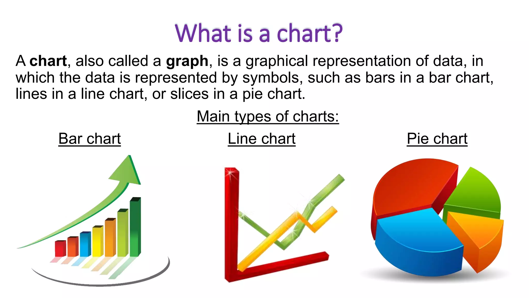
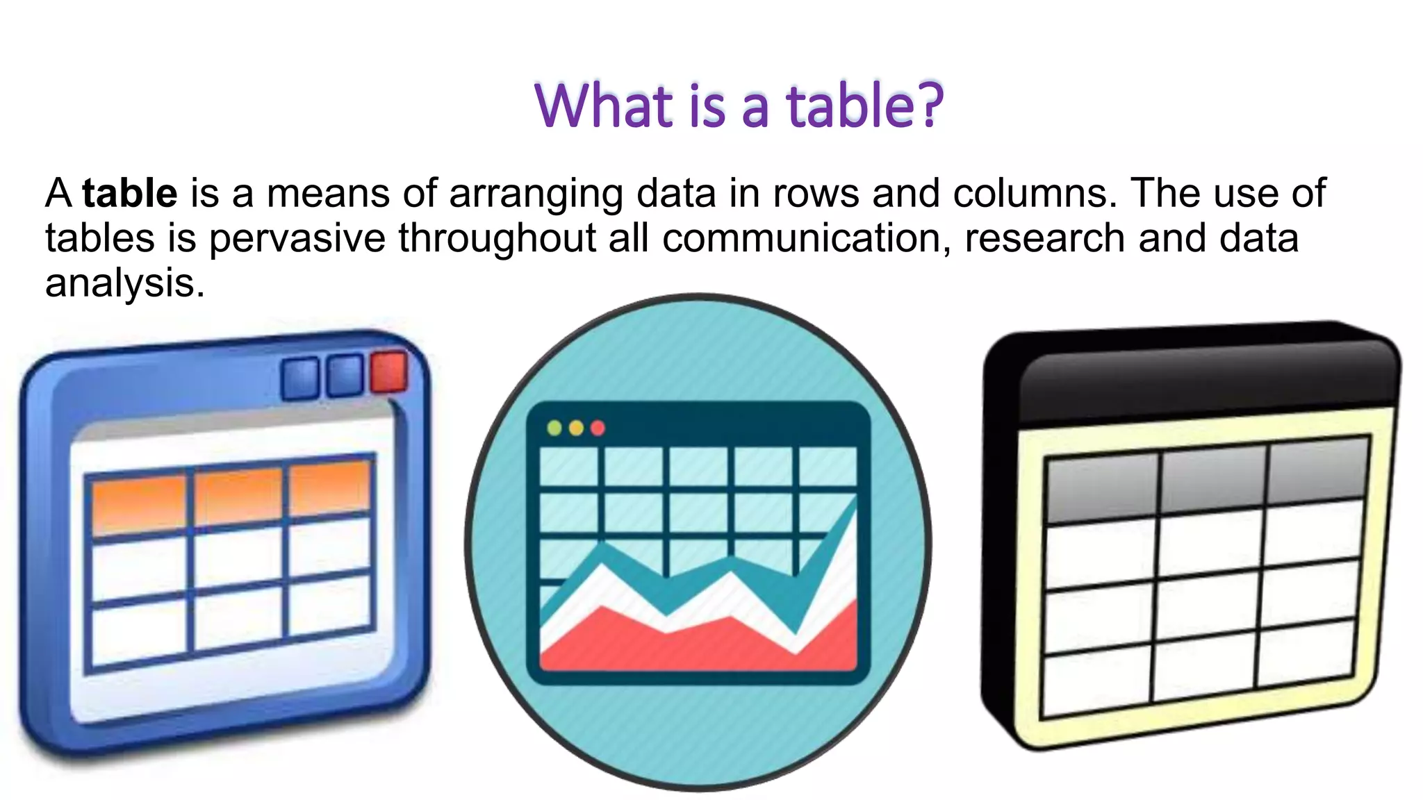
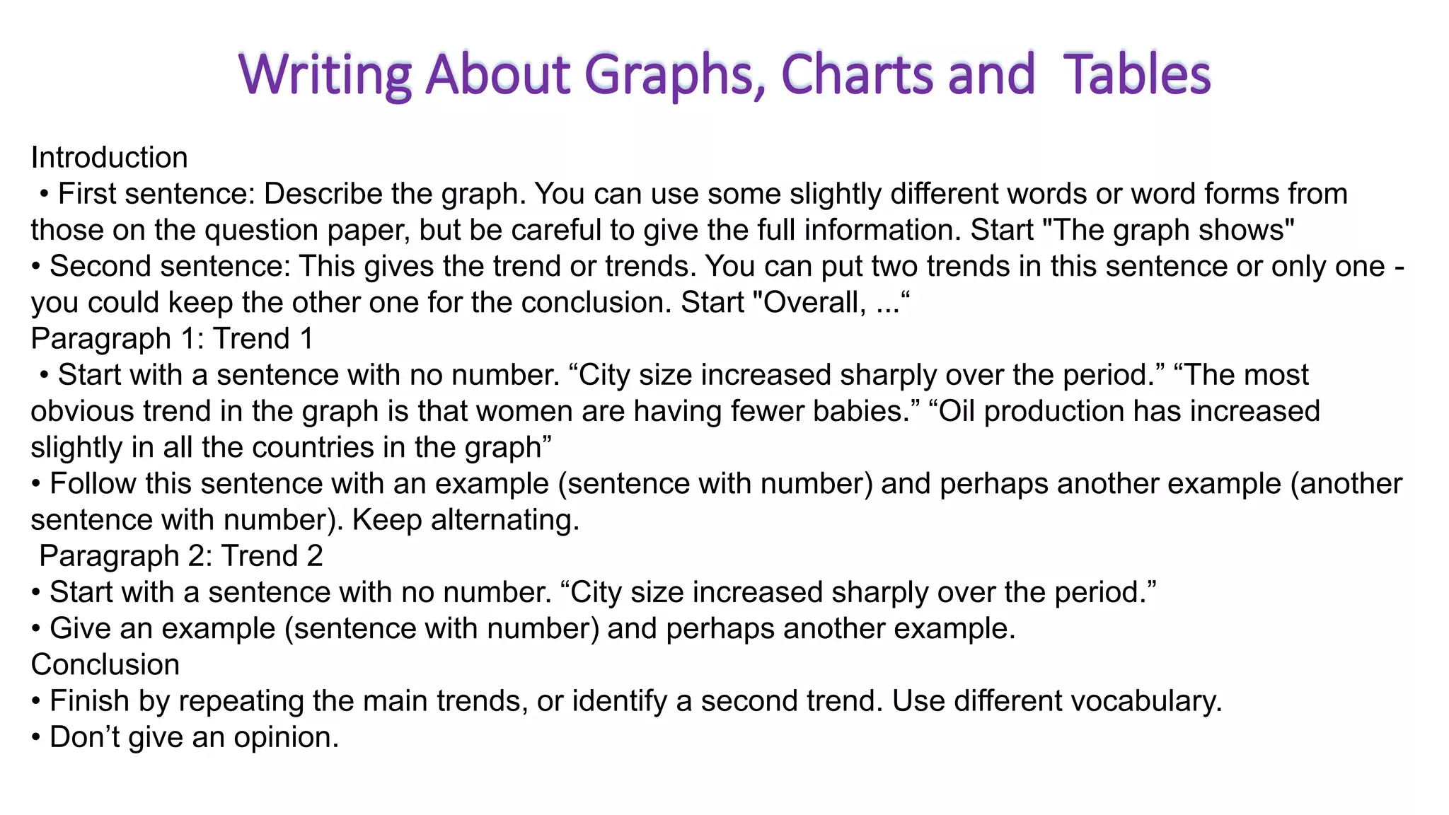
This document provides information about different types of charts and graphs used to represent data visually, including pie charts, line graphs, bar charts, and tables. It explains what each of these graphical representations are through definitions and examples. Pie charts show percentages, line graphs show changes over time, bar charts show comparisons of discrete categories, and tables arrange data into rows and columns. The document is intended to teach about various ways to visually display quantitative information through graphical formats.