Embed presentation
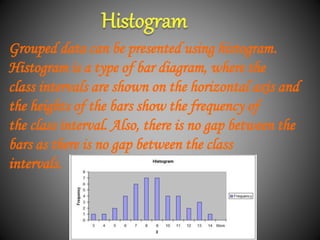
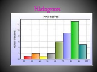
Downloaded 1,102 times


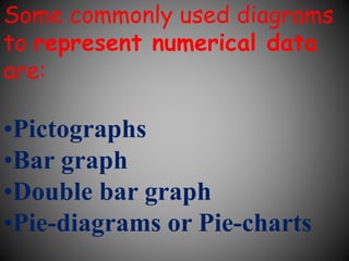
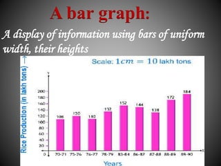
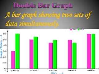
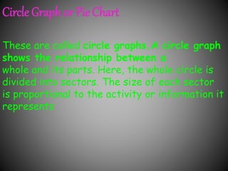
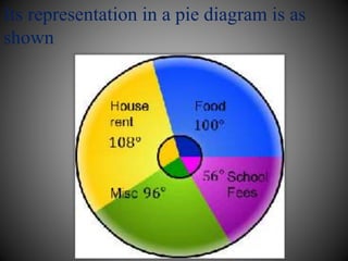
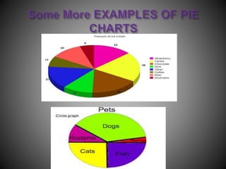
There are several commonly used diagrams to represent numerical data, including pictographs, bar graphs, double bar graphs, and pie charts. Pictographs use symbols or pictures to represent data, with each symbol representing a certain value. Bar graphs display data using uniformly wide bars of varying heights. Double bar graphs show two sets of data simultaneously. Pie charts, also called circle graphs, show the relationship between a whole and its parts by dividing a circle into sectors proportional to the parts.


An introduction to mathematics focused on data representation methods.
Common diagrams for numerical data: Pictographs, Bar graphs, Double bar graphs, and Pie charts.
Data is defined as the collected information used in various diagrams for analysis.
Pictographs use symbols to represent data, with specific values assigned to each symbol.
Bar graphs display data using bars of uniform width, where height represents data values.
Double bar graphs illustrate two sets of data side by side for comparison.
Histograms present grouped data without gaps between bars, showing frequency across intervals.
A specific overview of histogram structure emphasizing its bar representation.
Details about data on subject choices highlighting frequency occurrences.
Circle graphs show proportions of a whole, divided into sectors representing parts of data.
An illustration of how information is represented in a pie chart format.