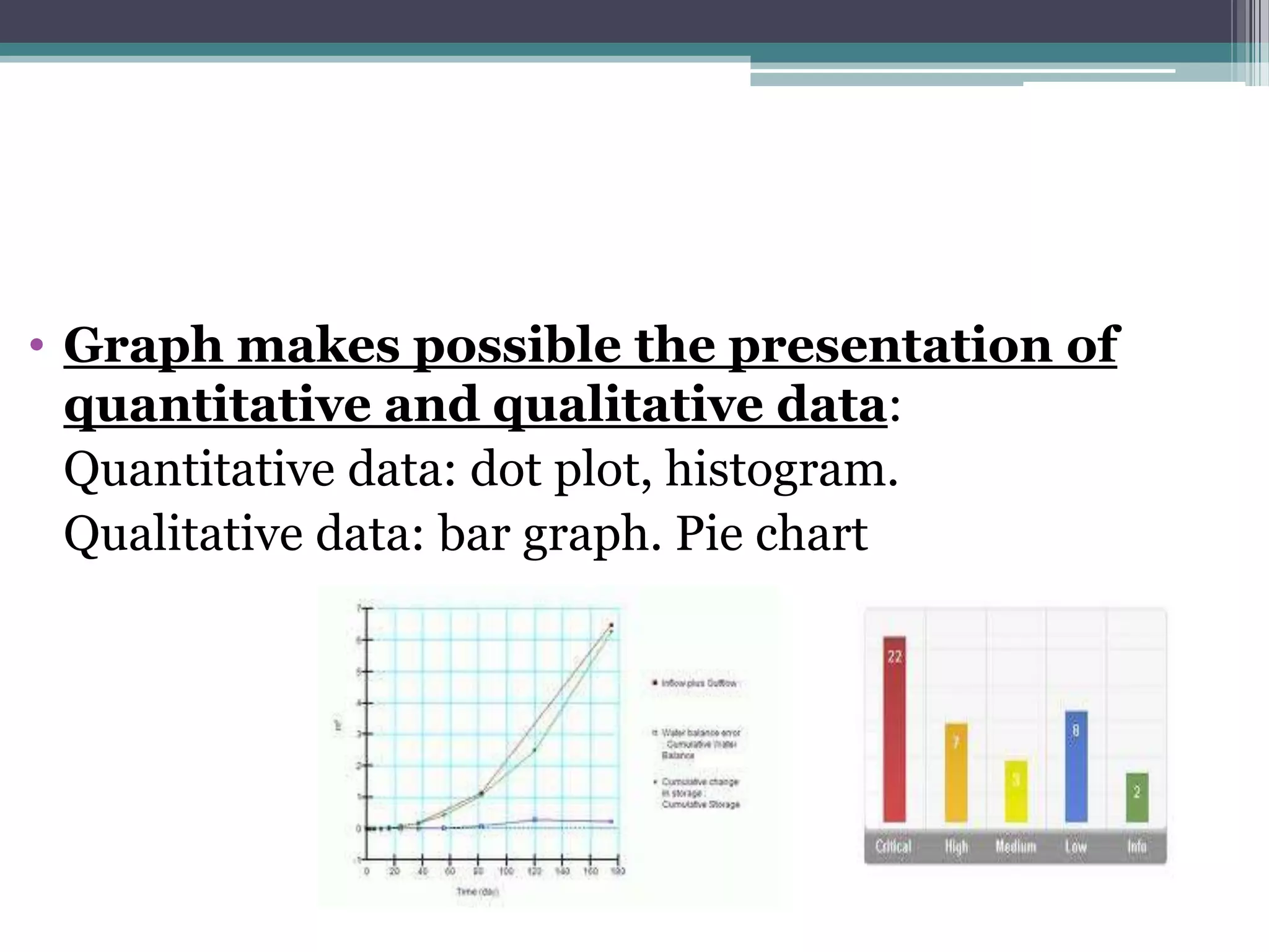
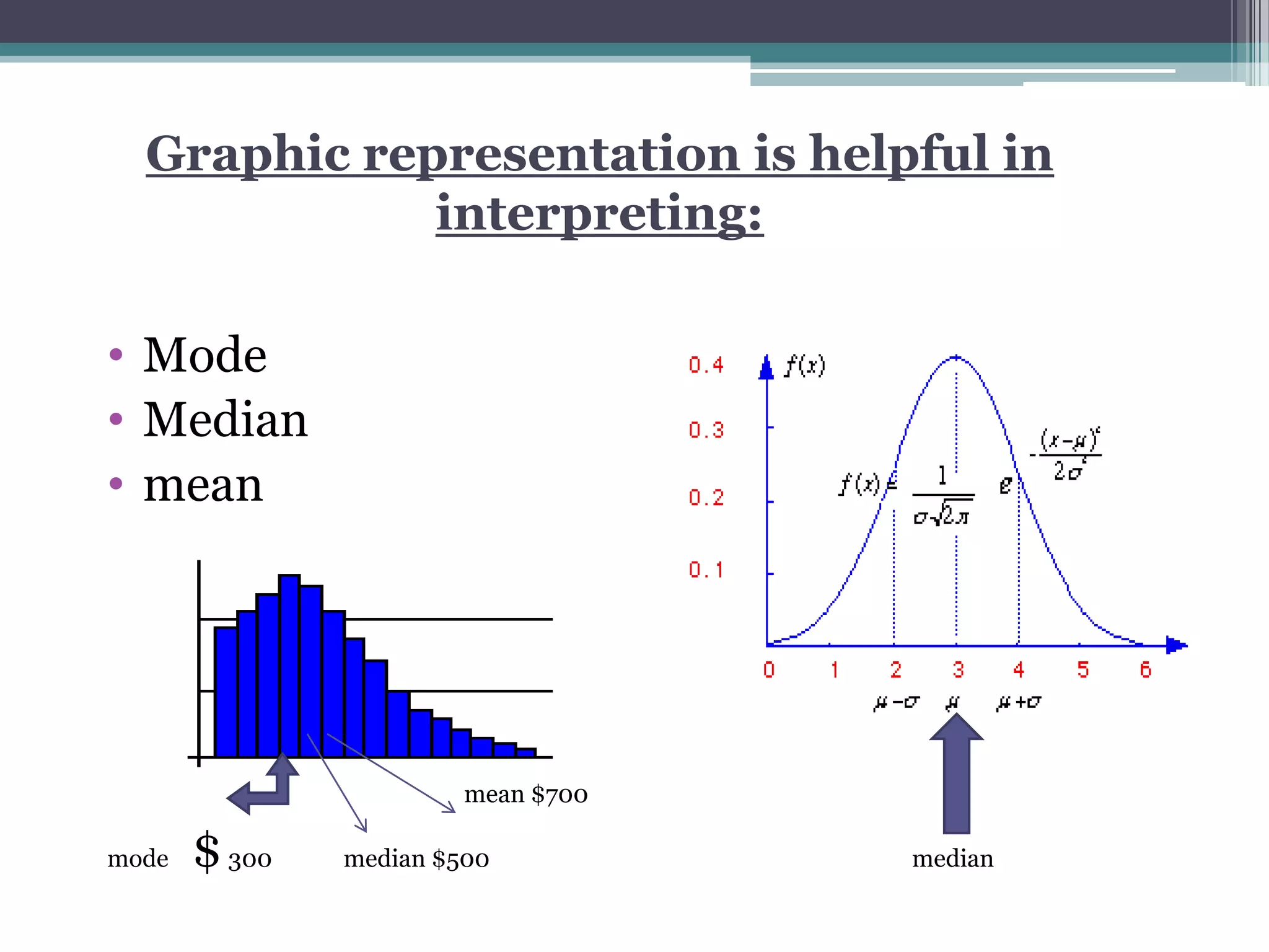
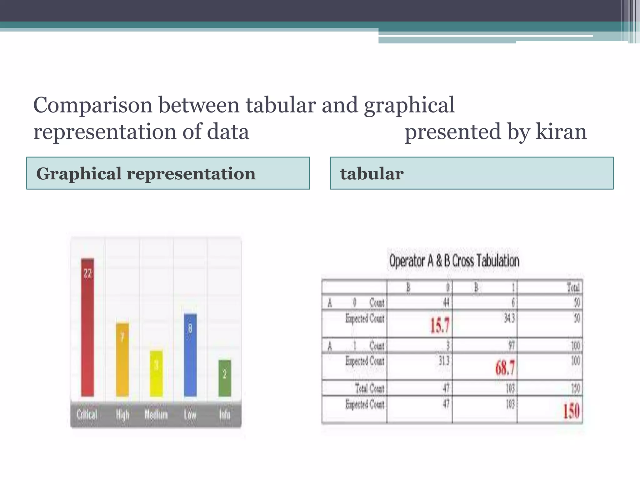
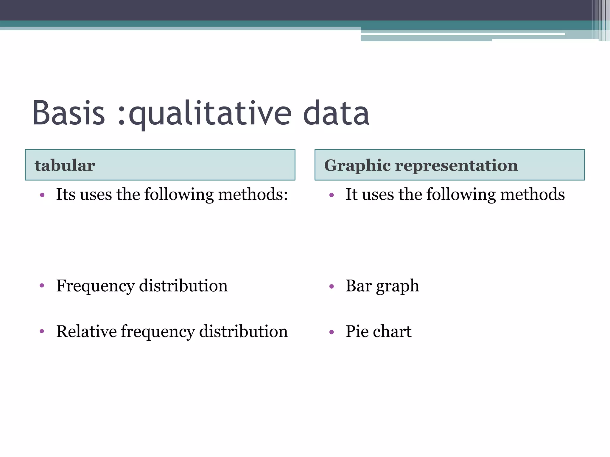
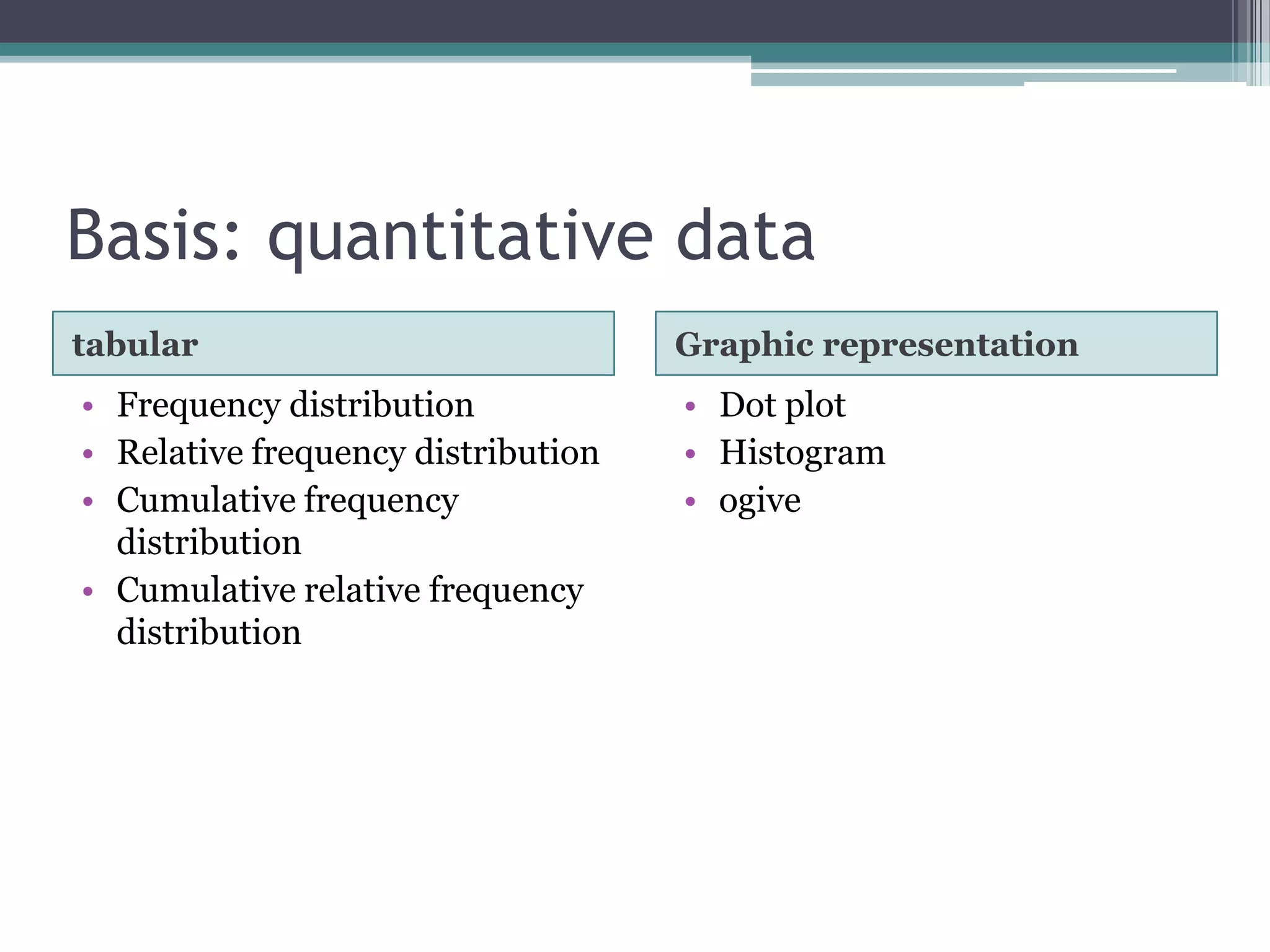
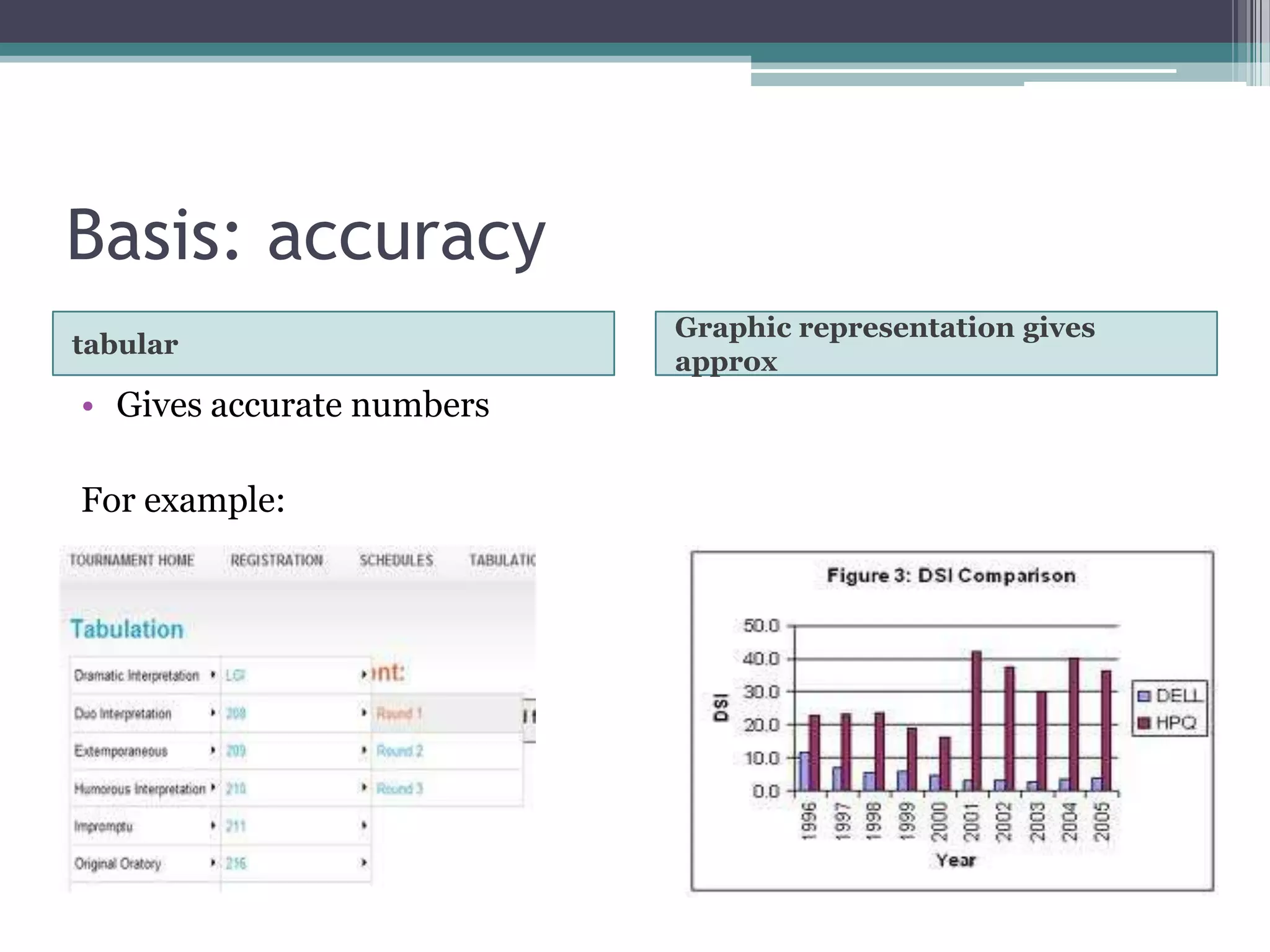
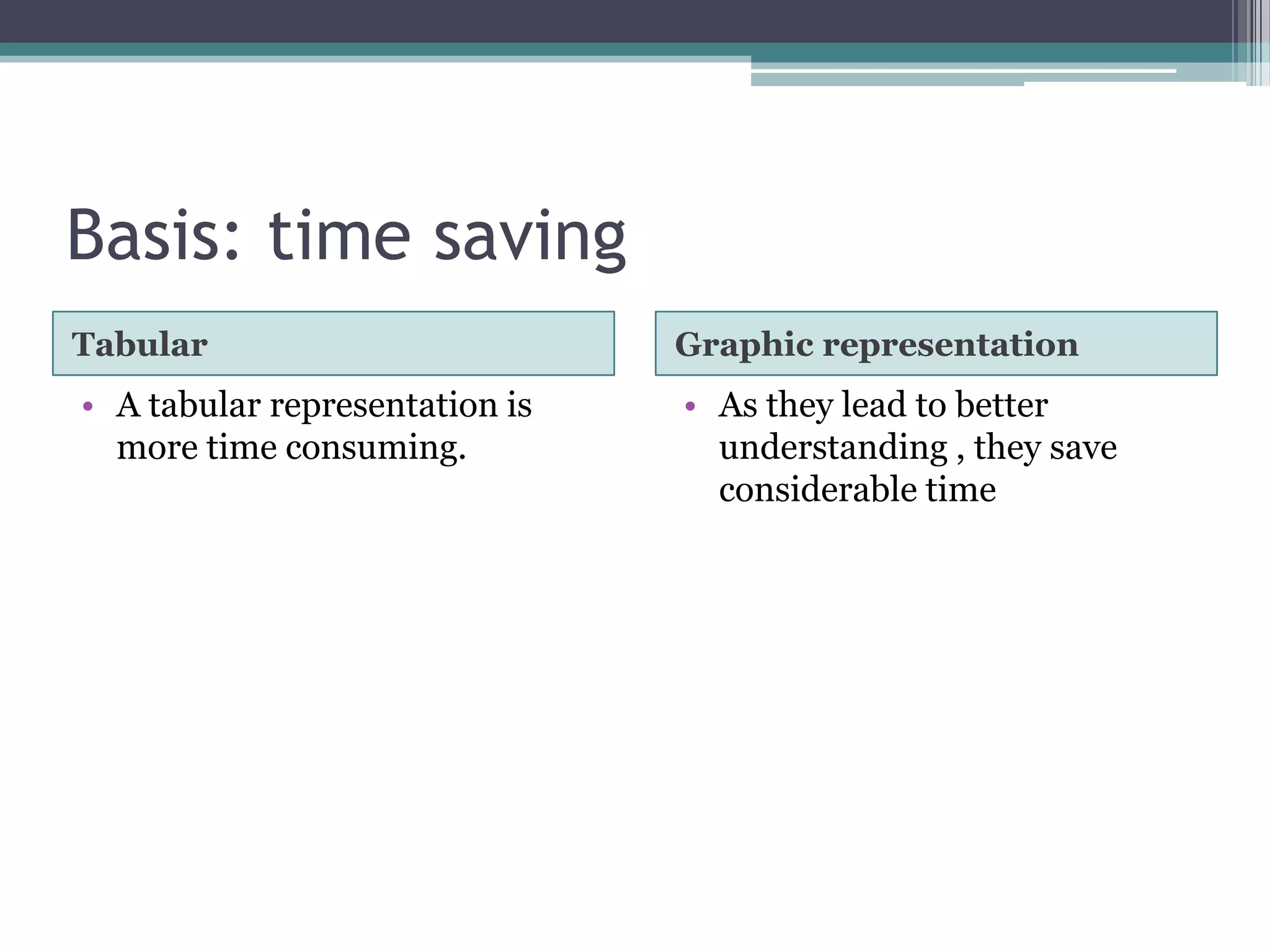
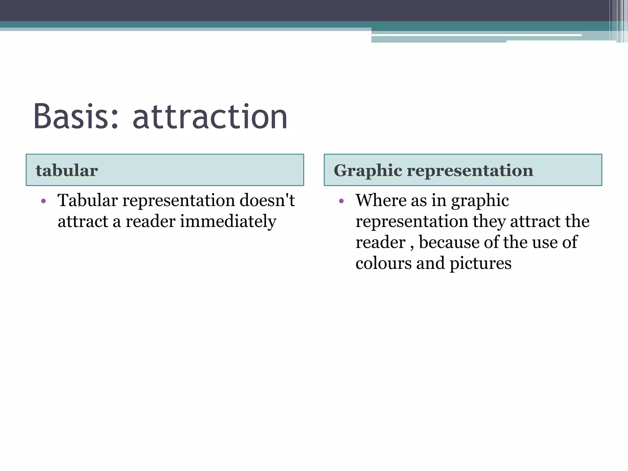
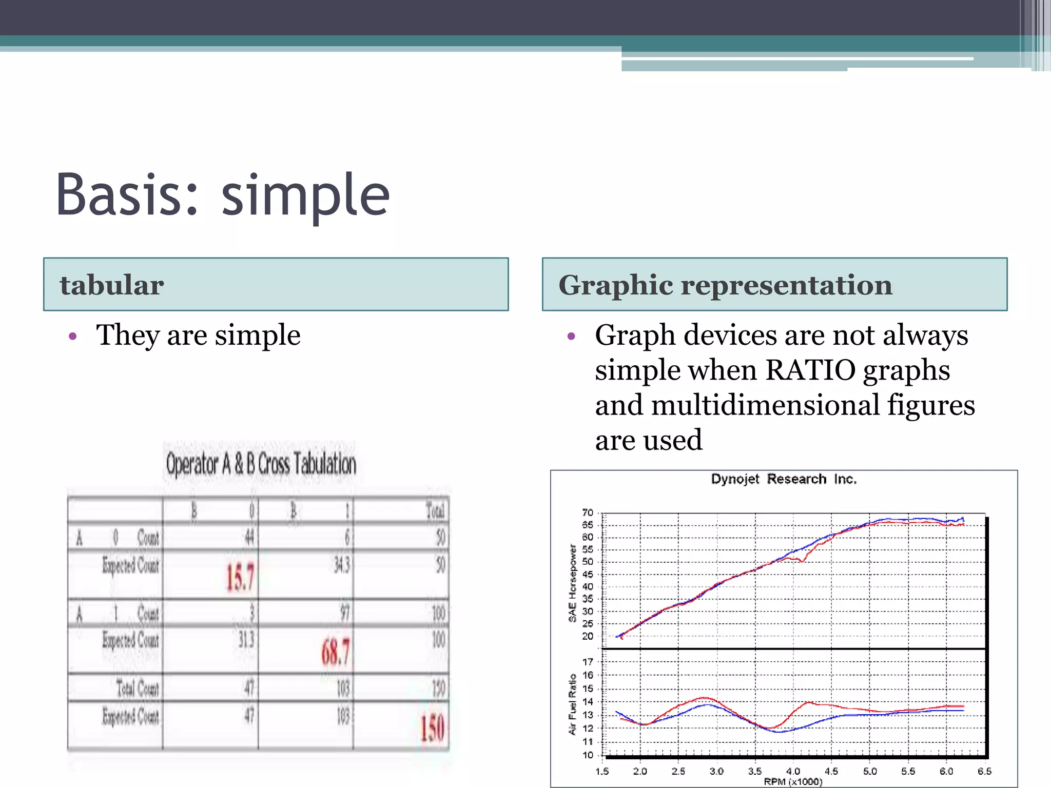
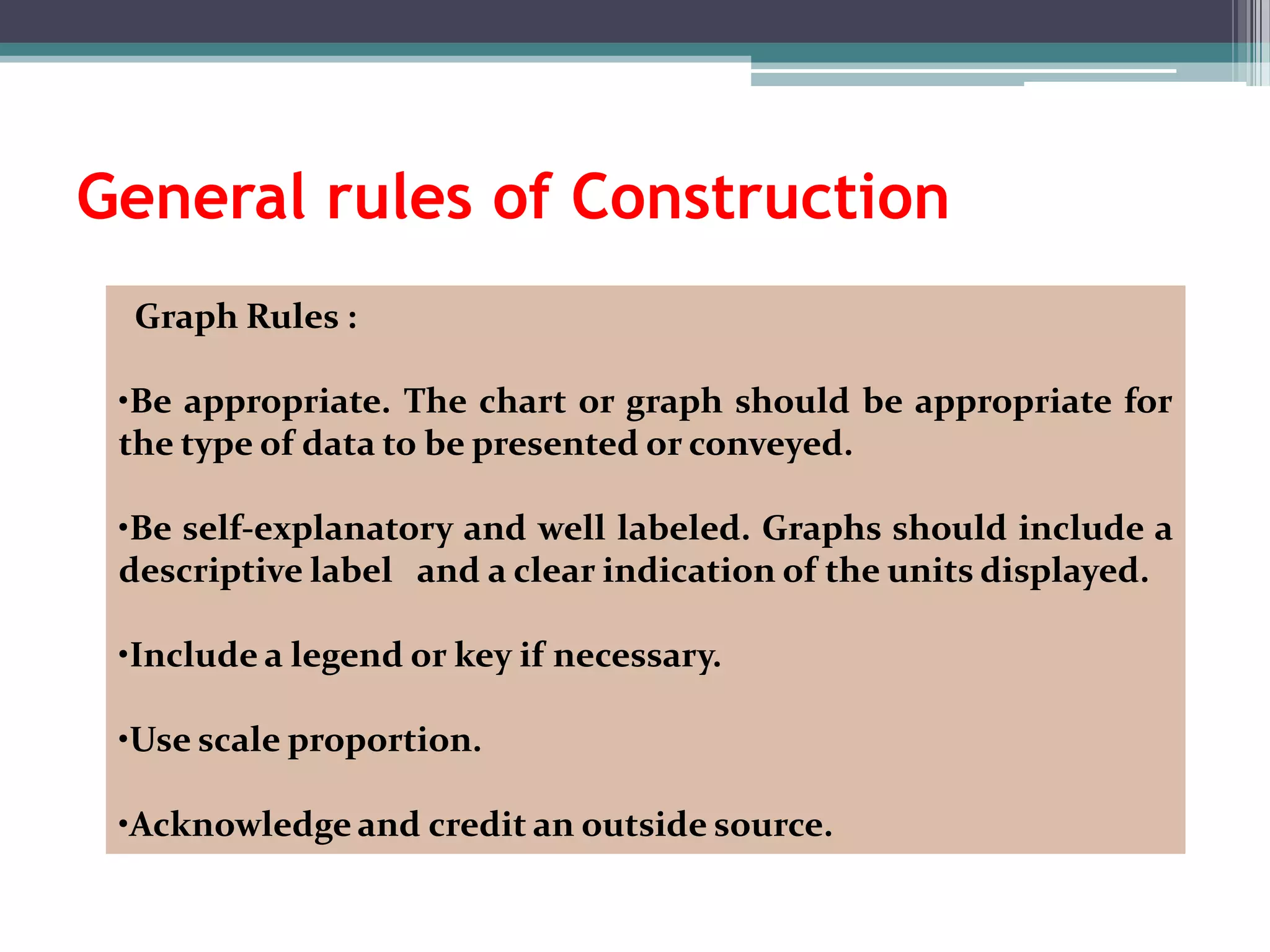
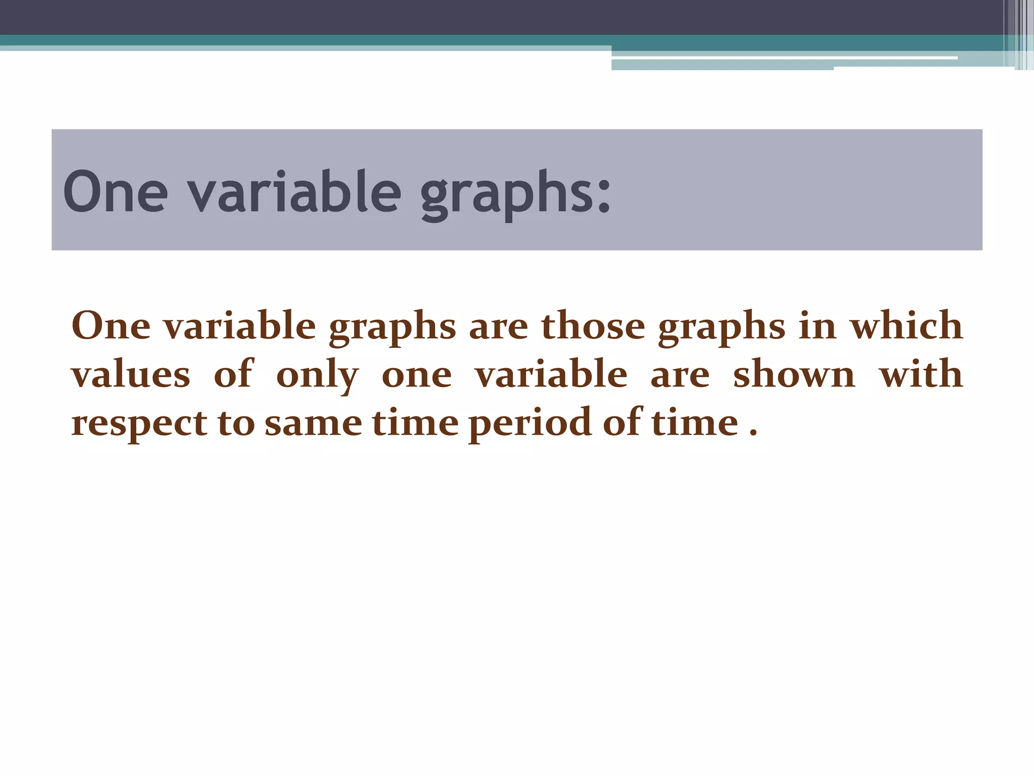
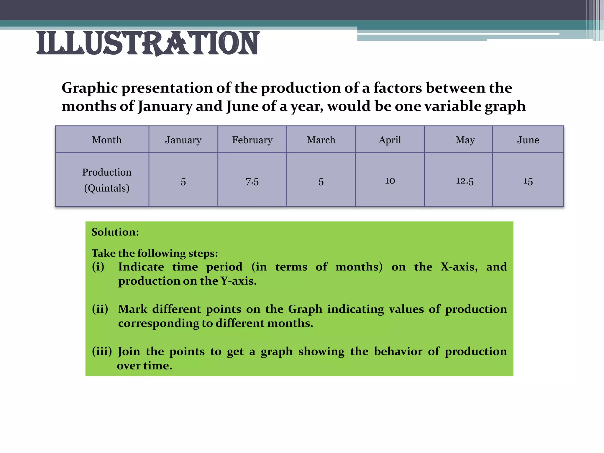
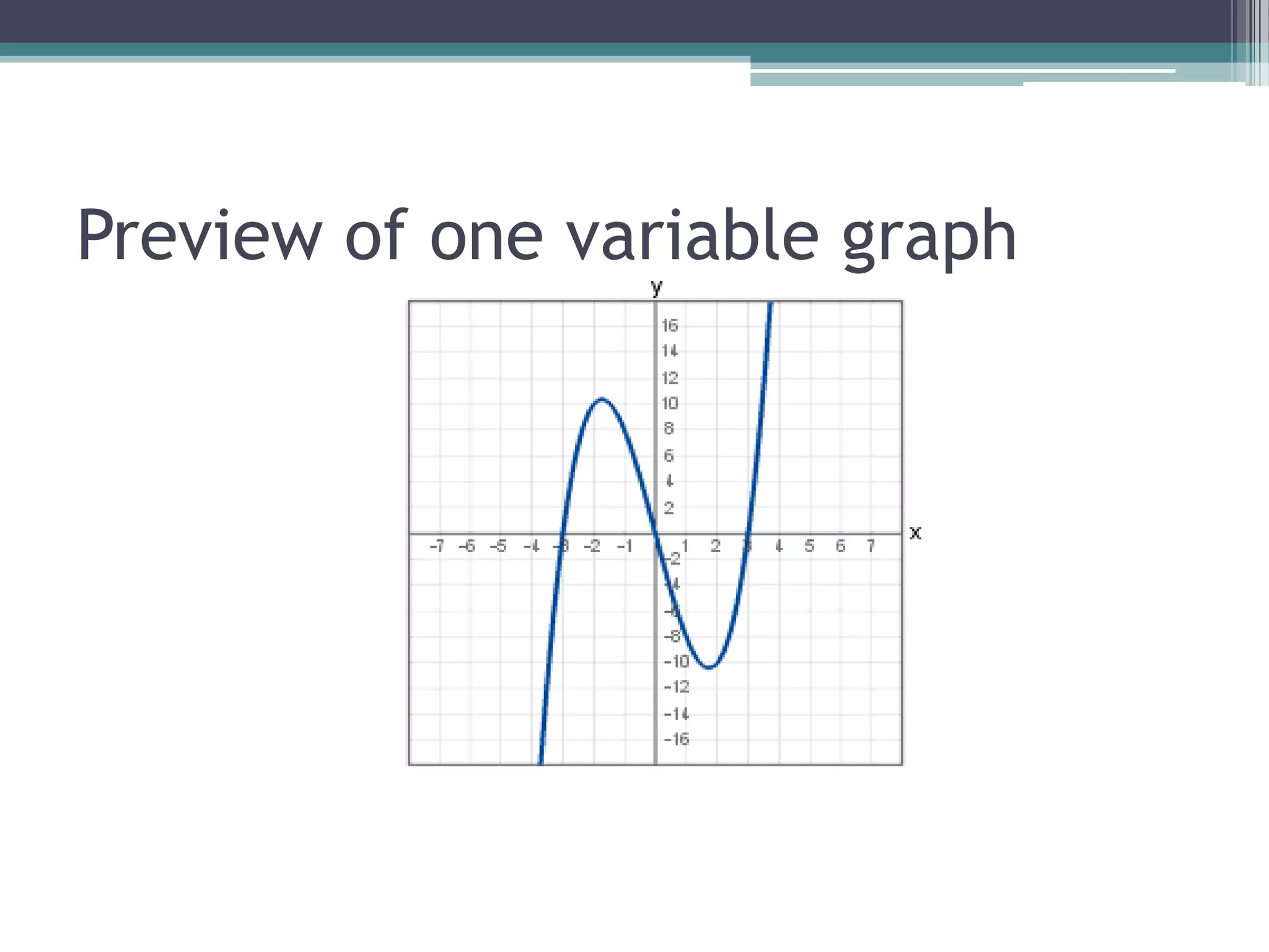
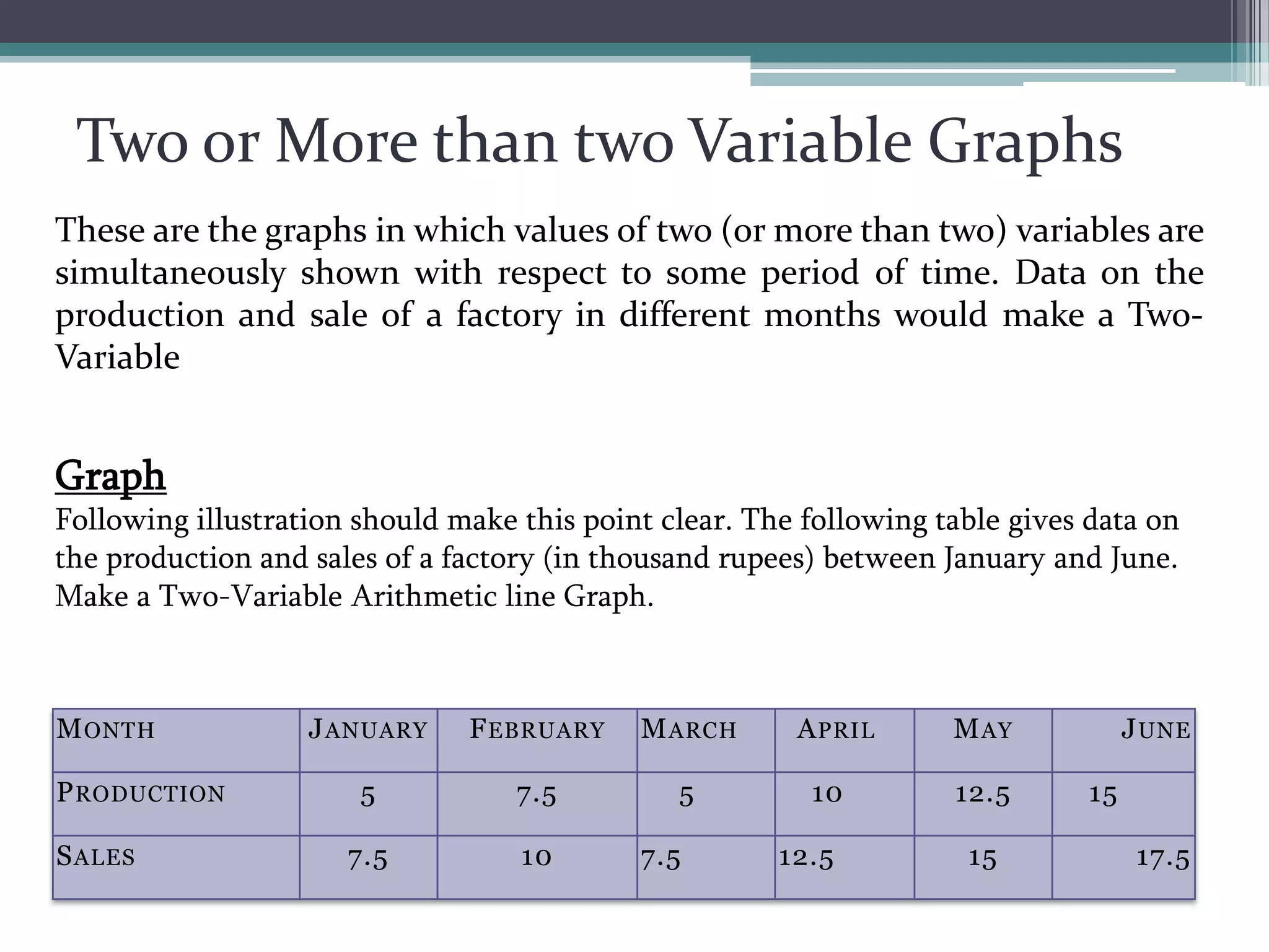
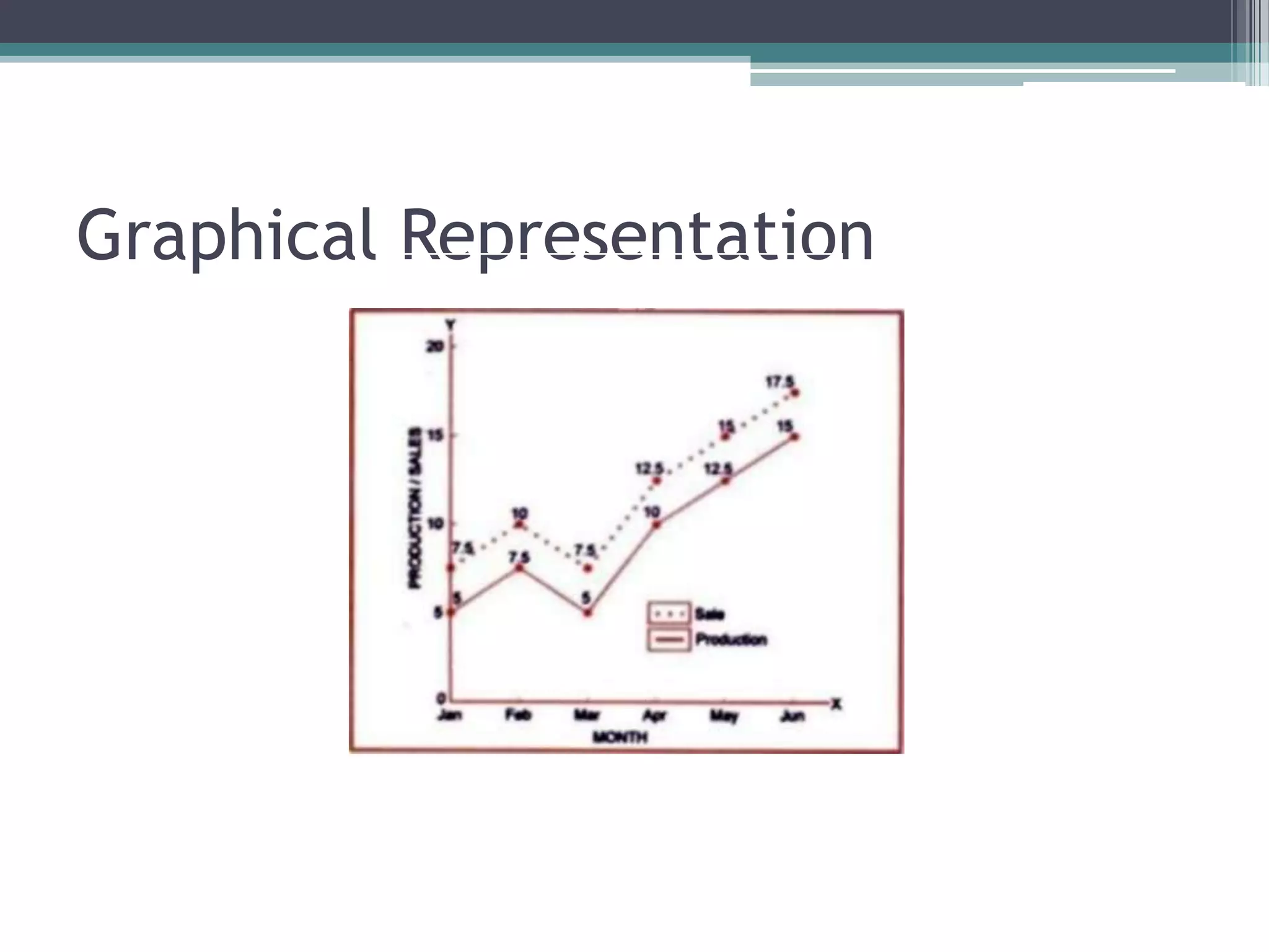
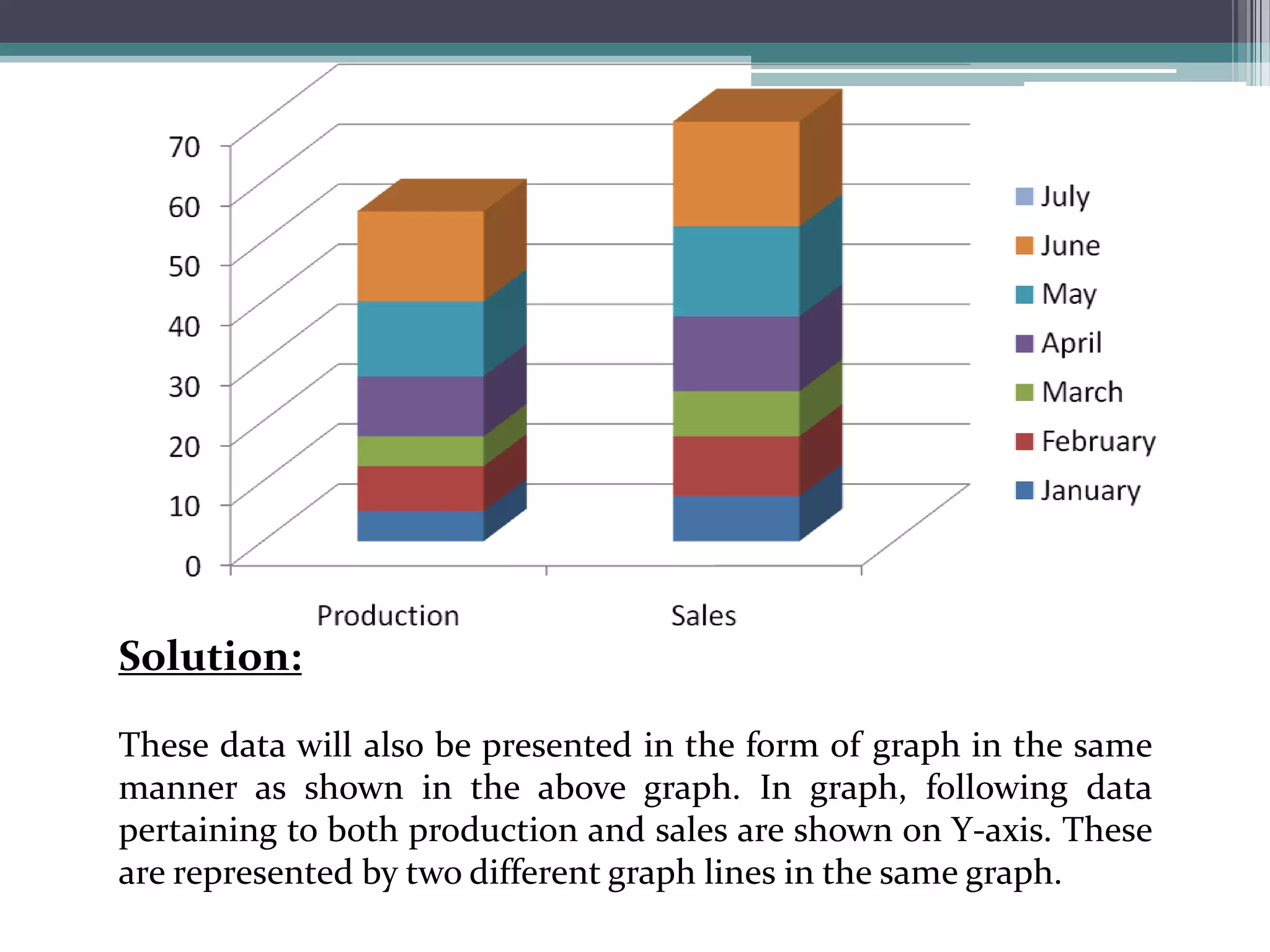
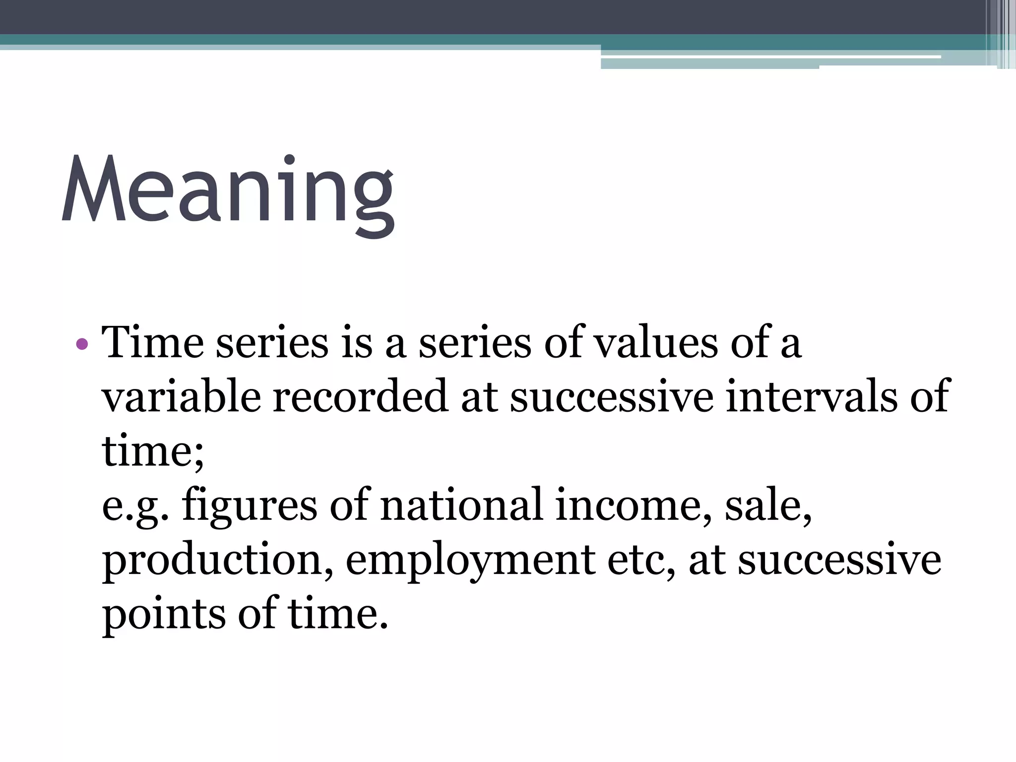
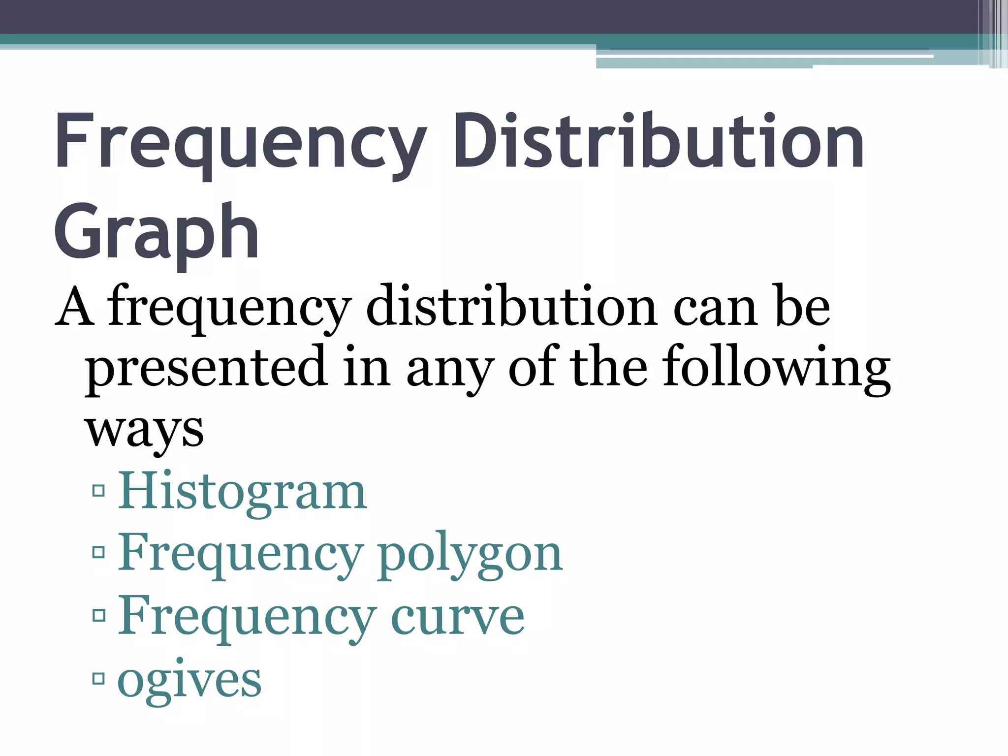
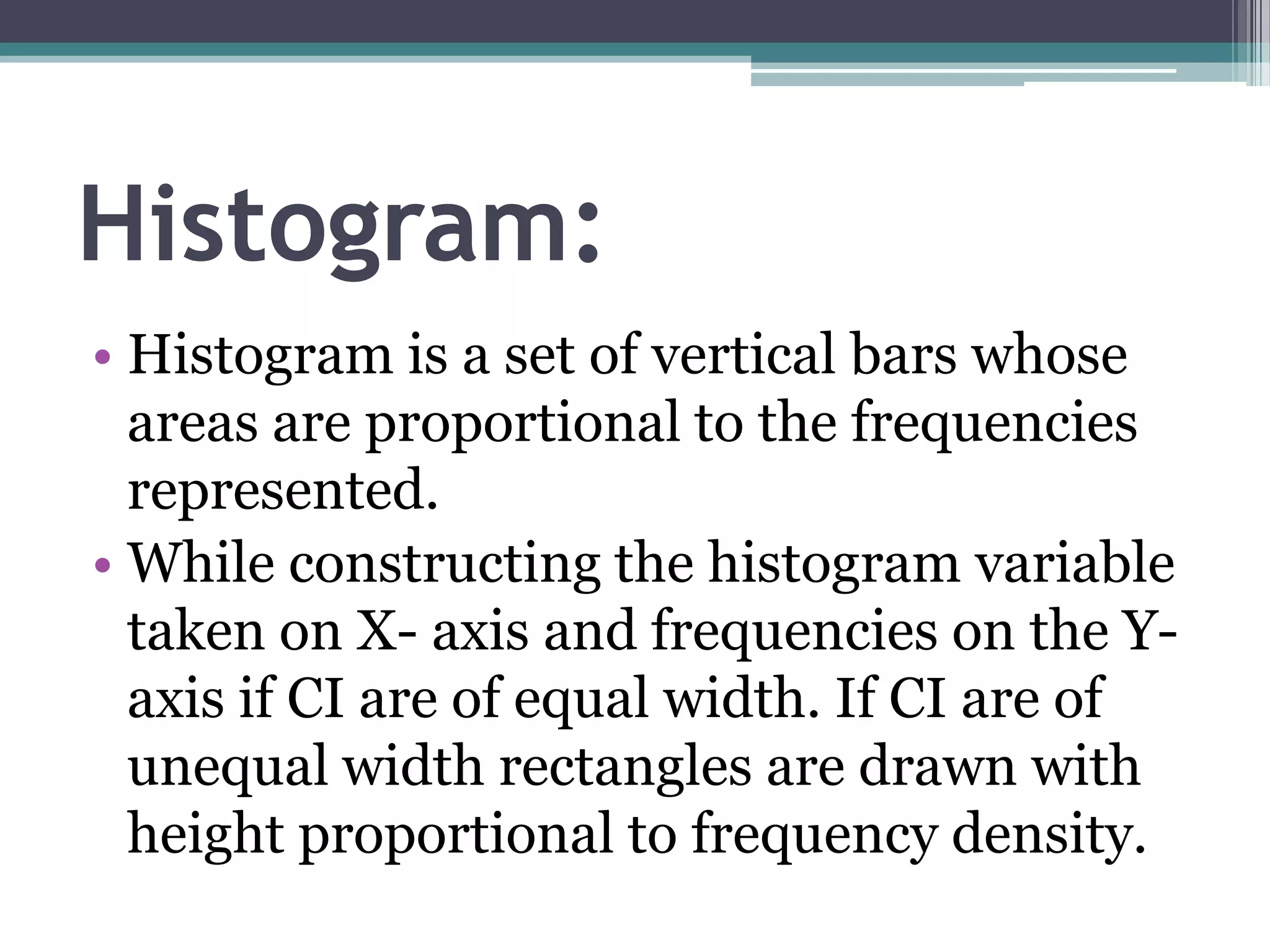
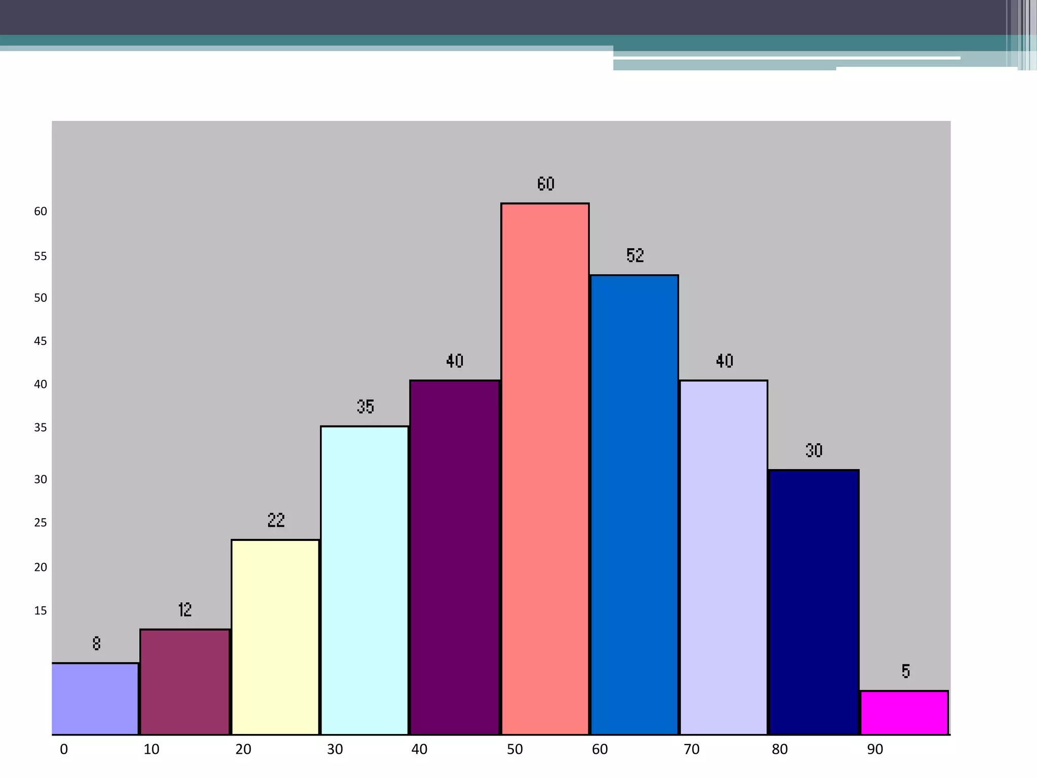
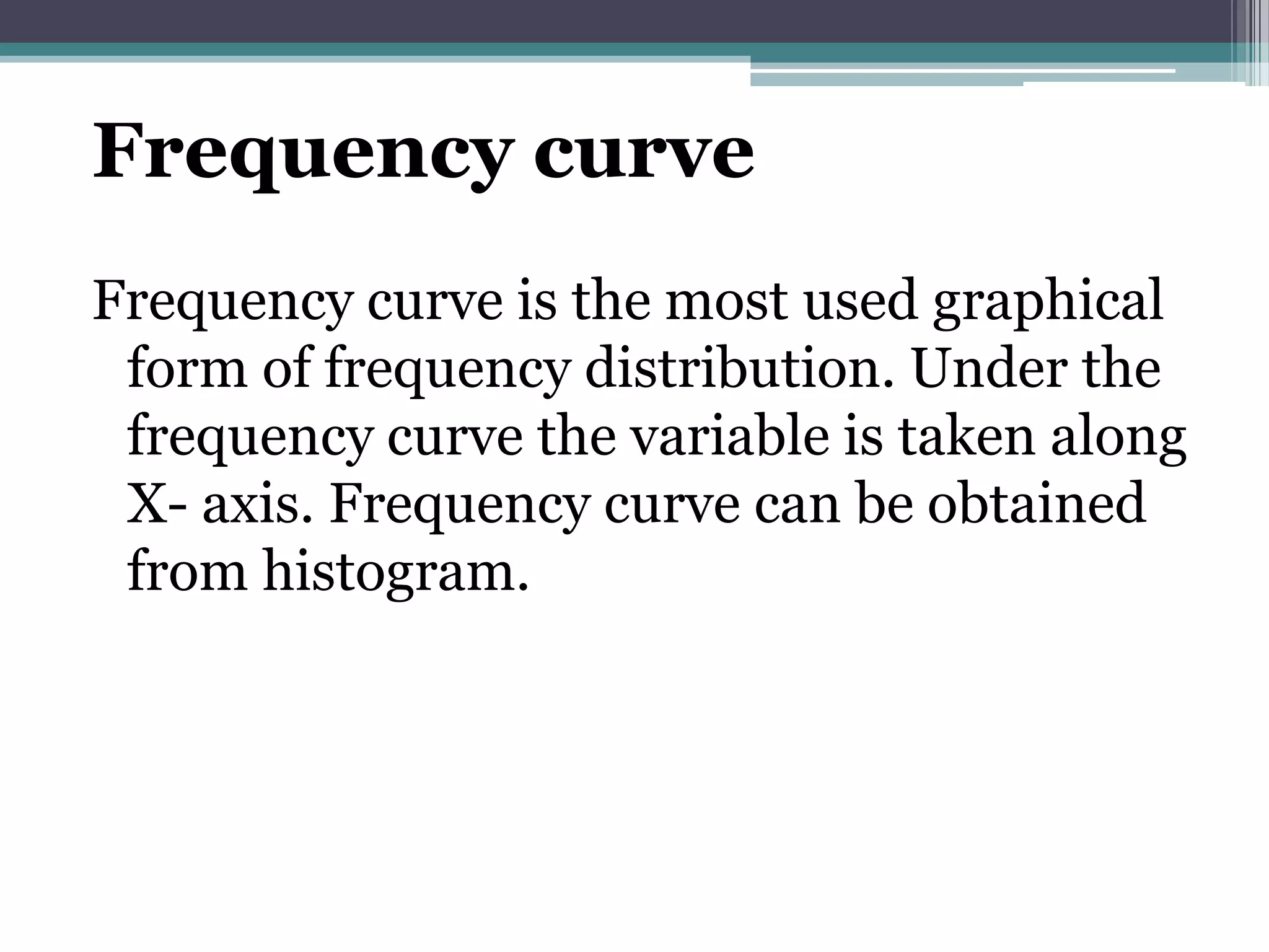
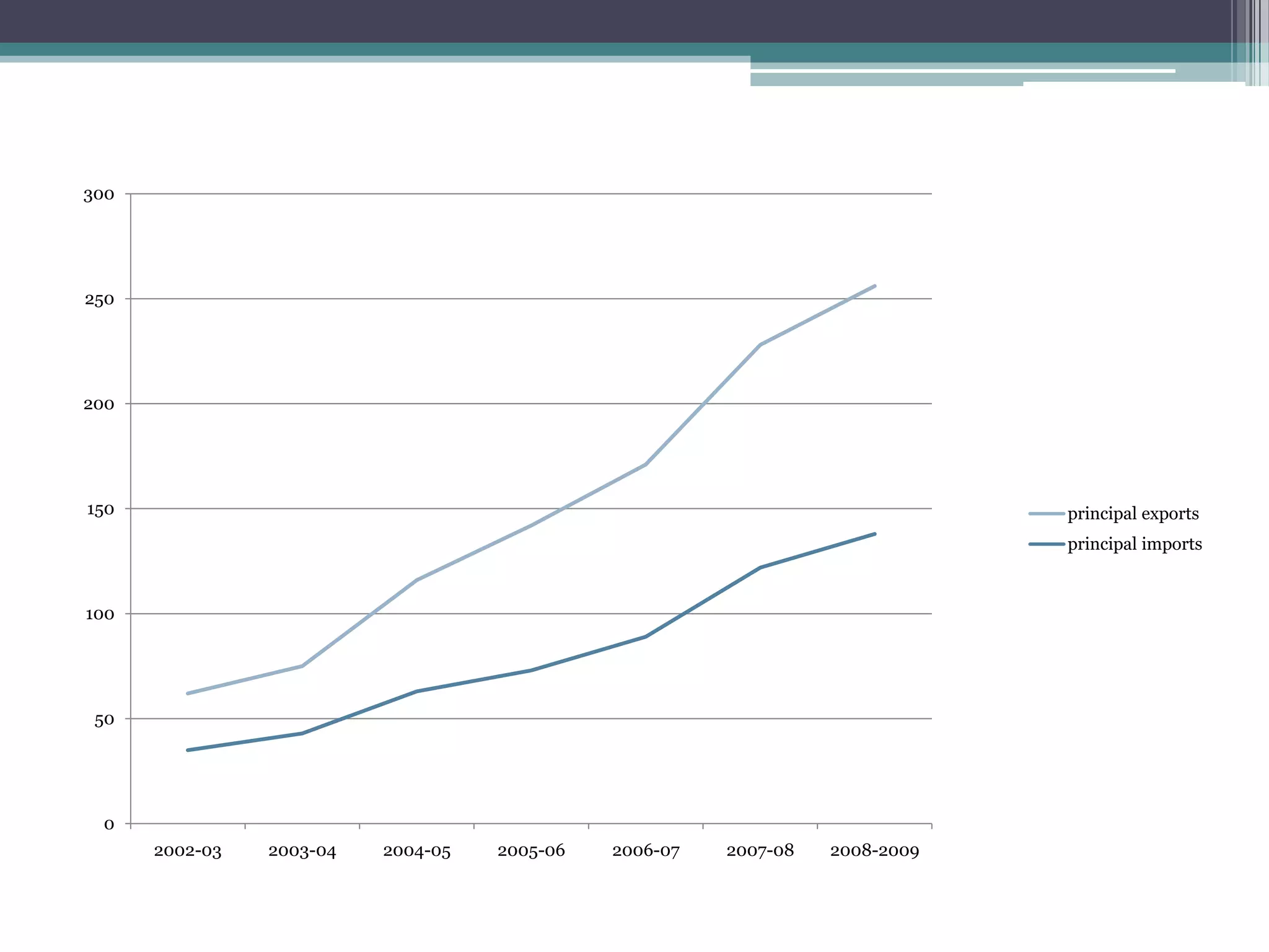
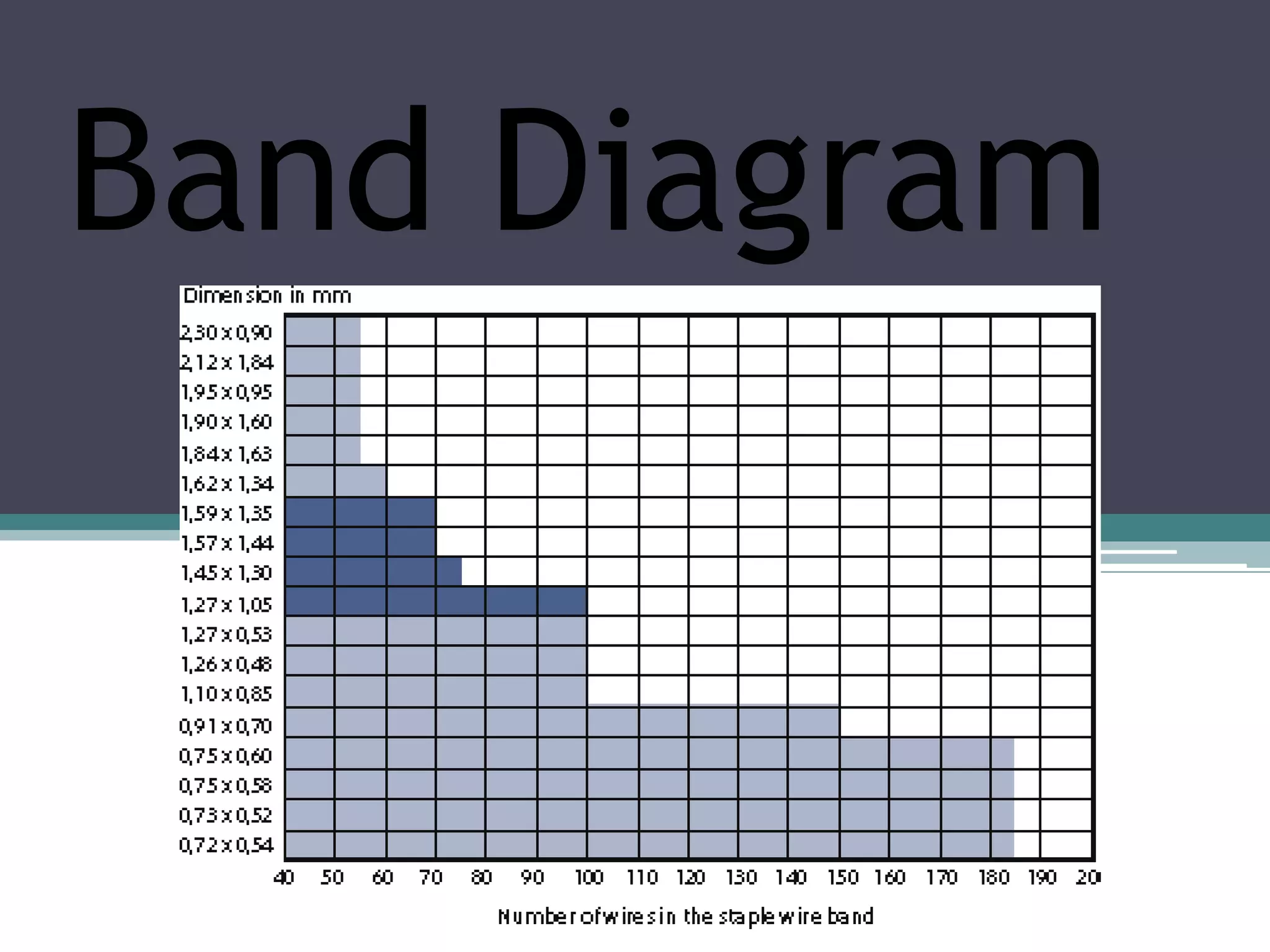
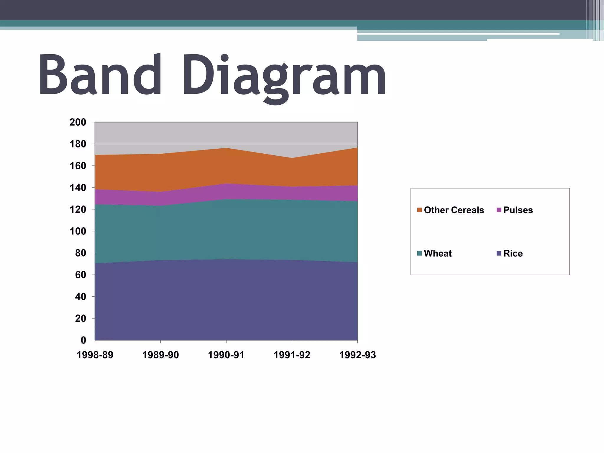
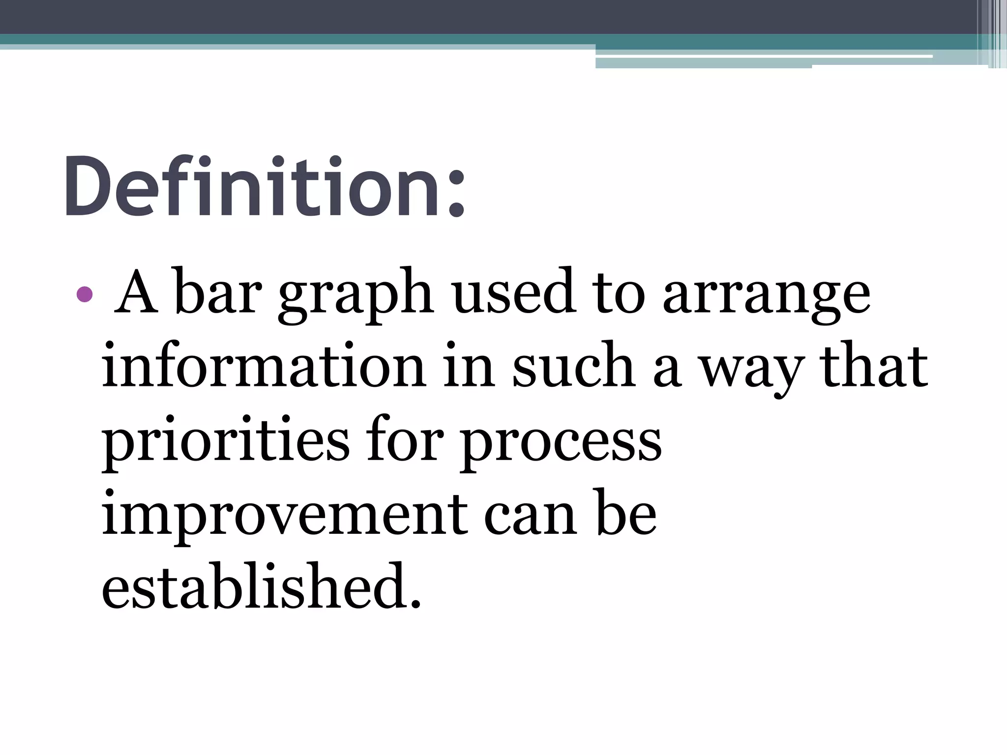
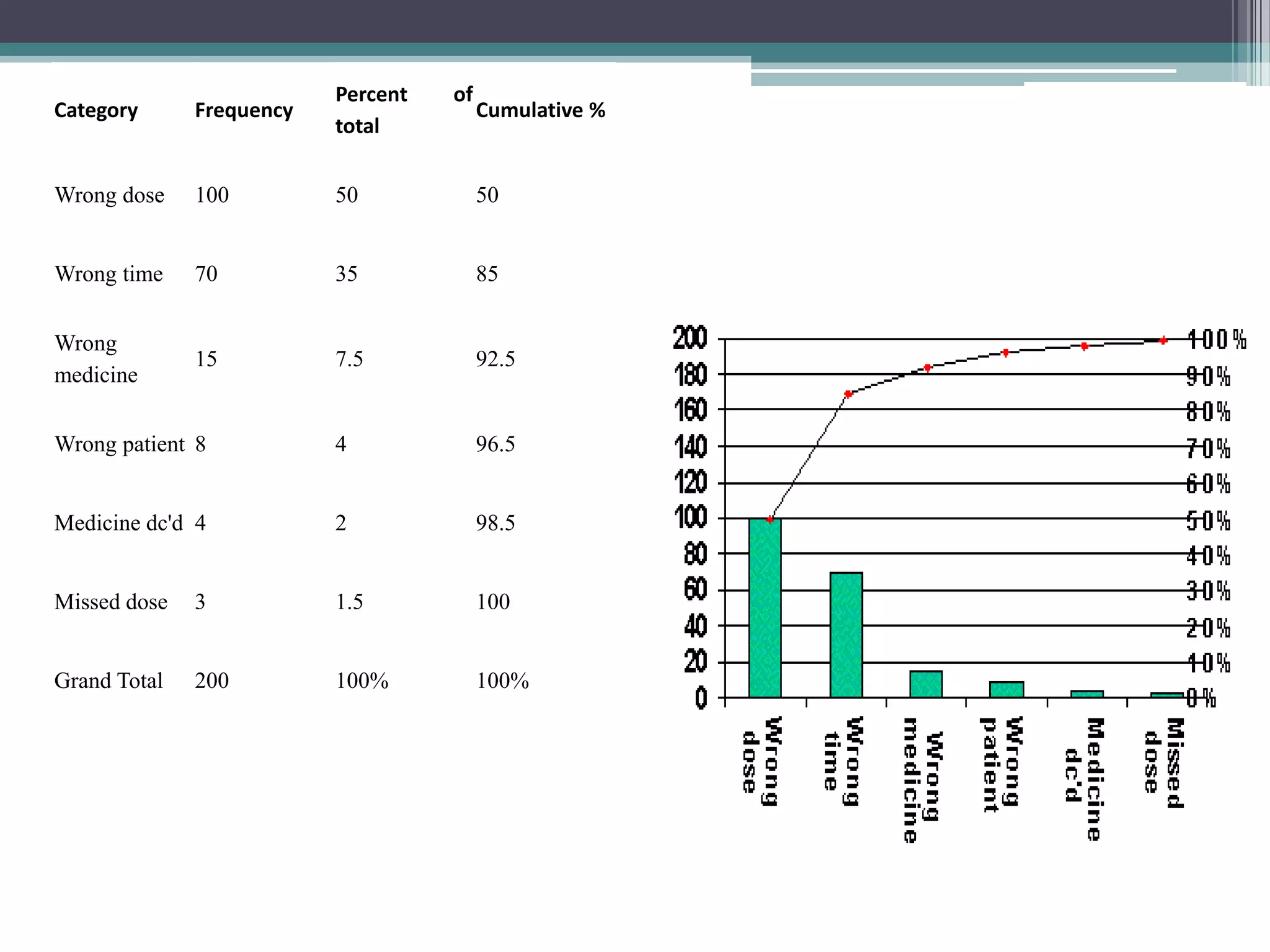
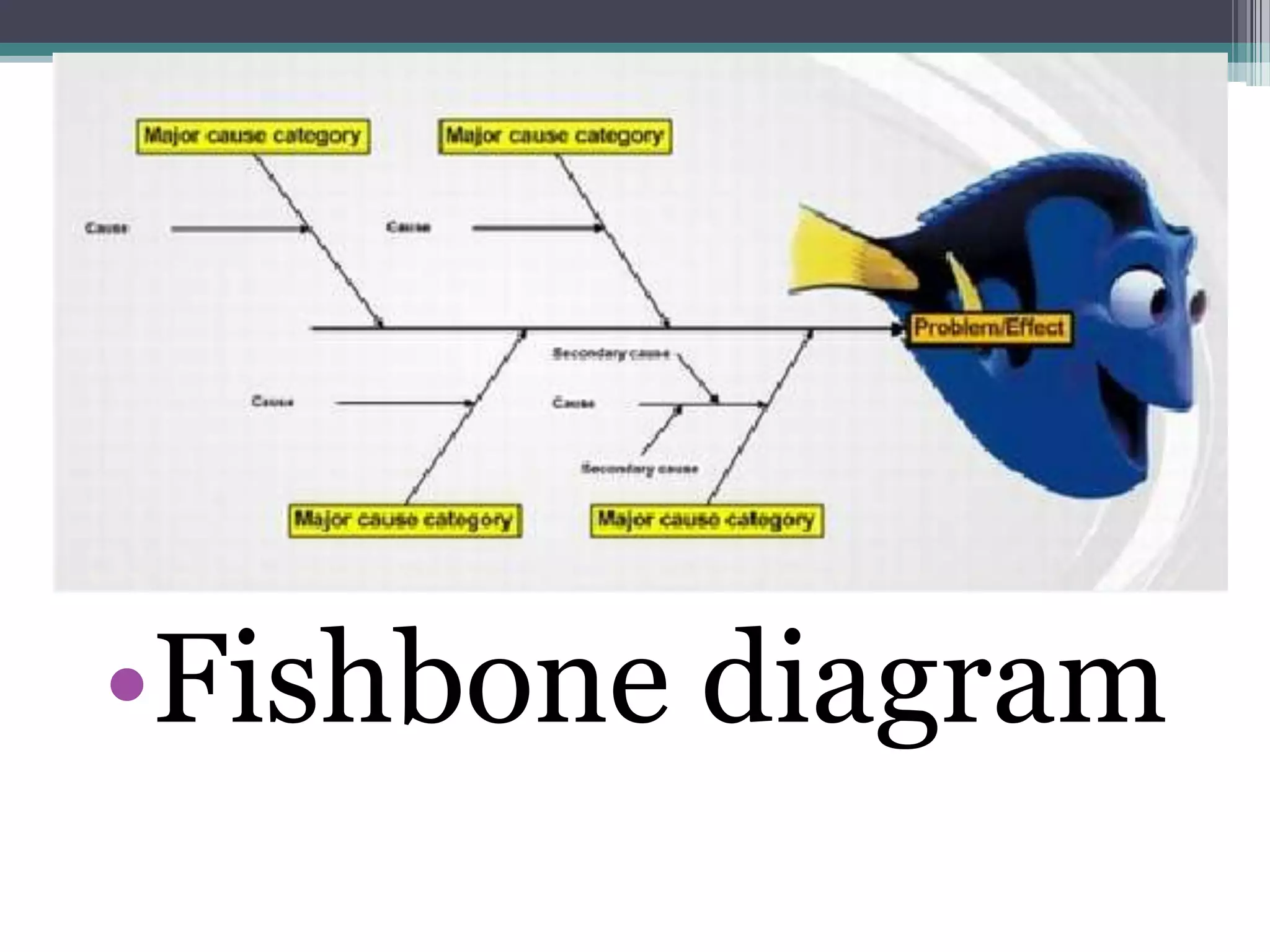
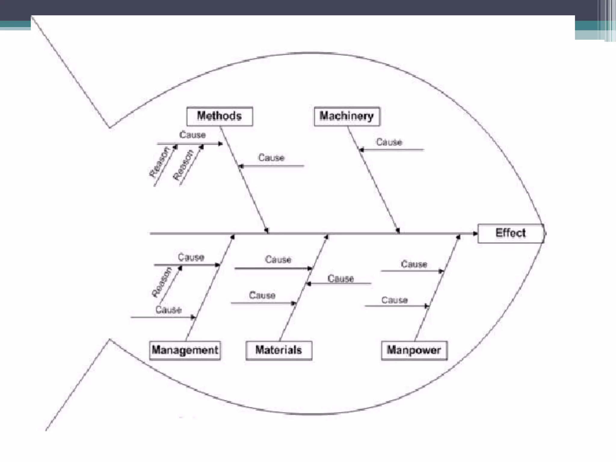
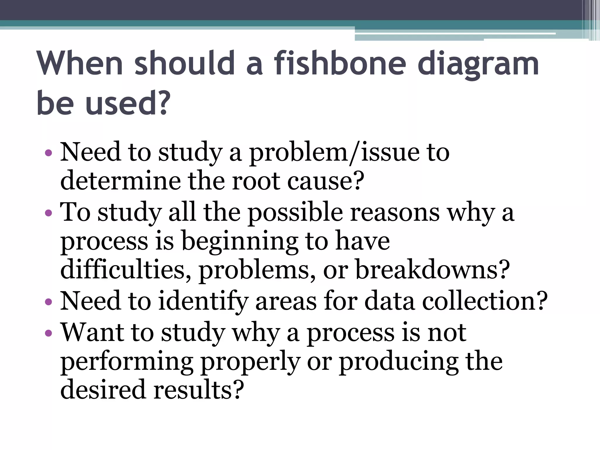
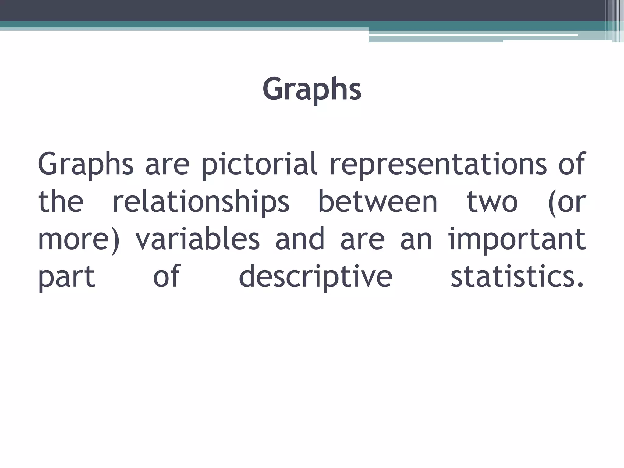
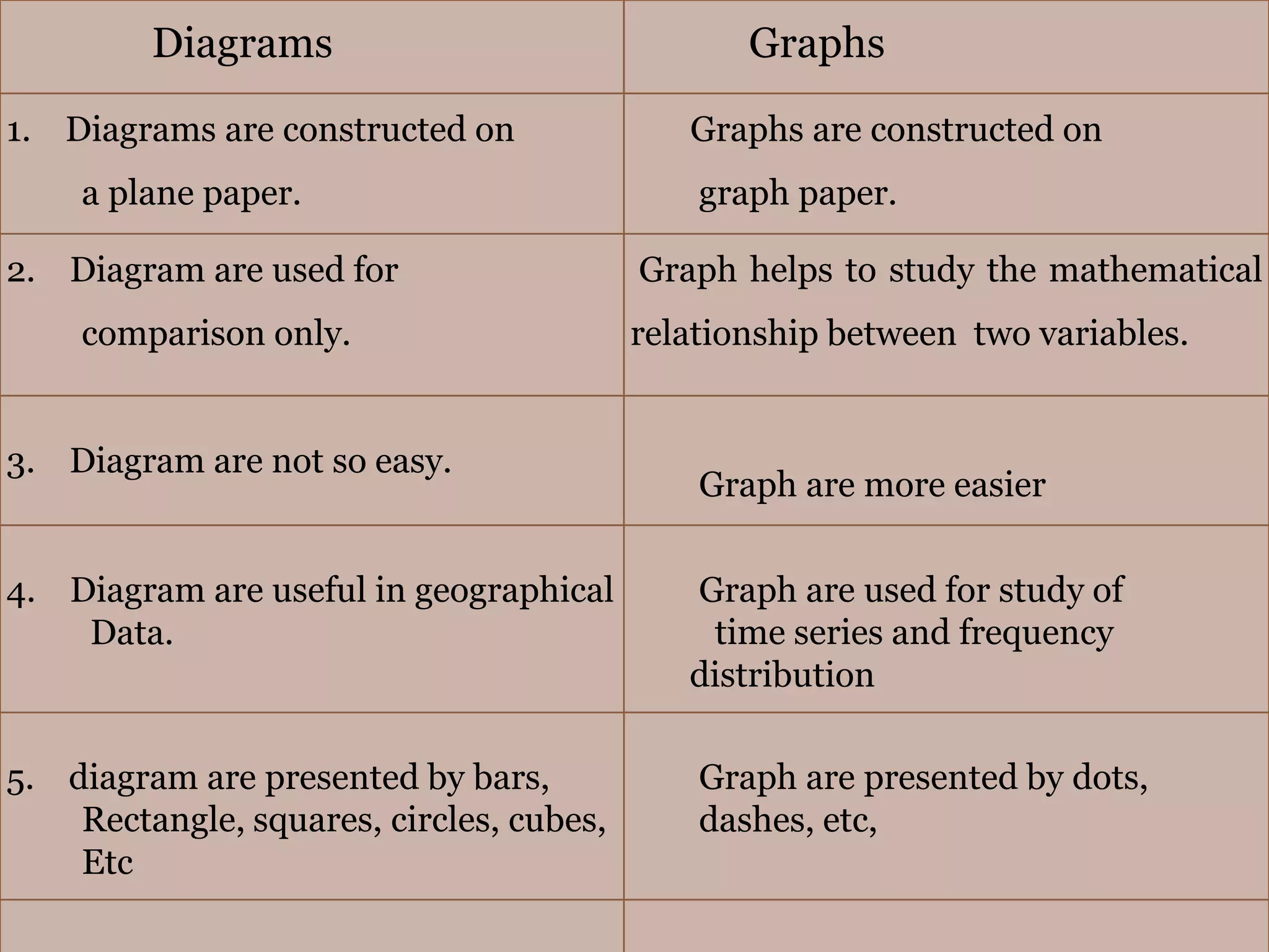
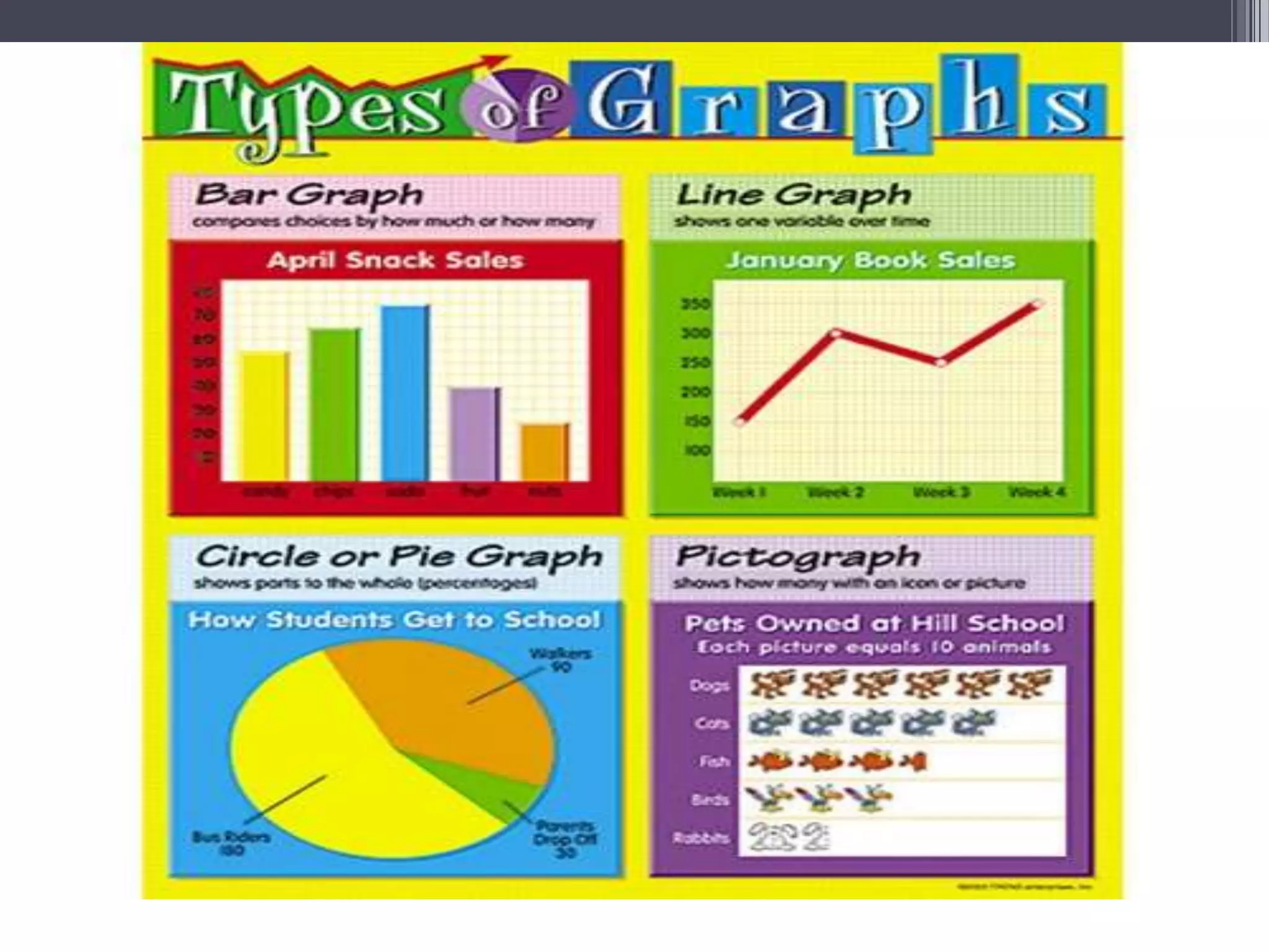
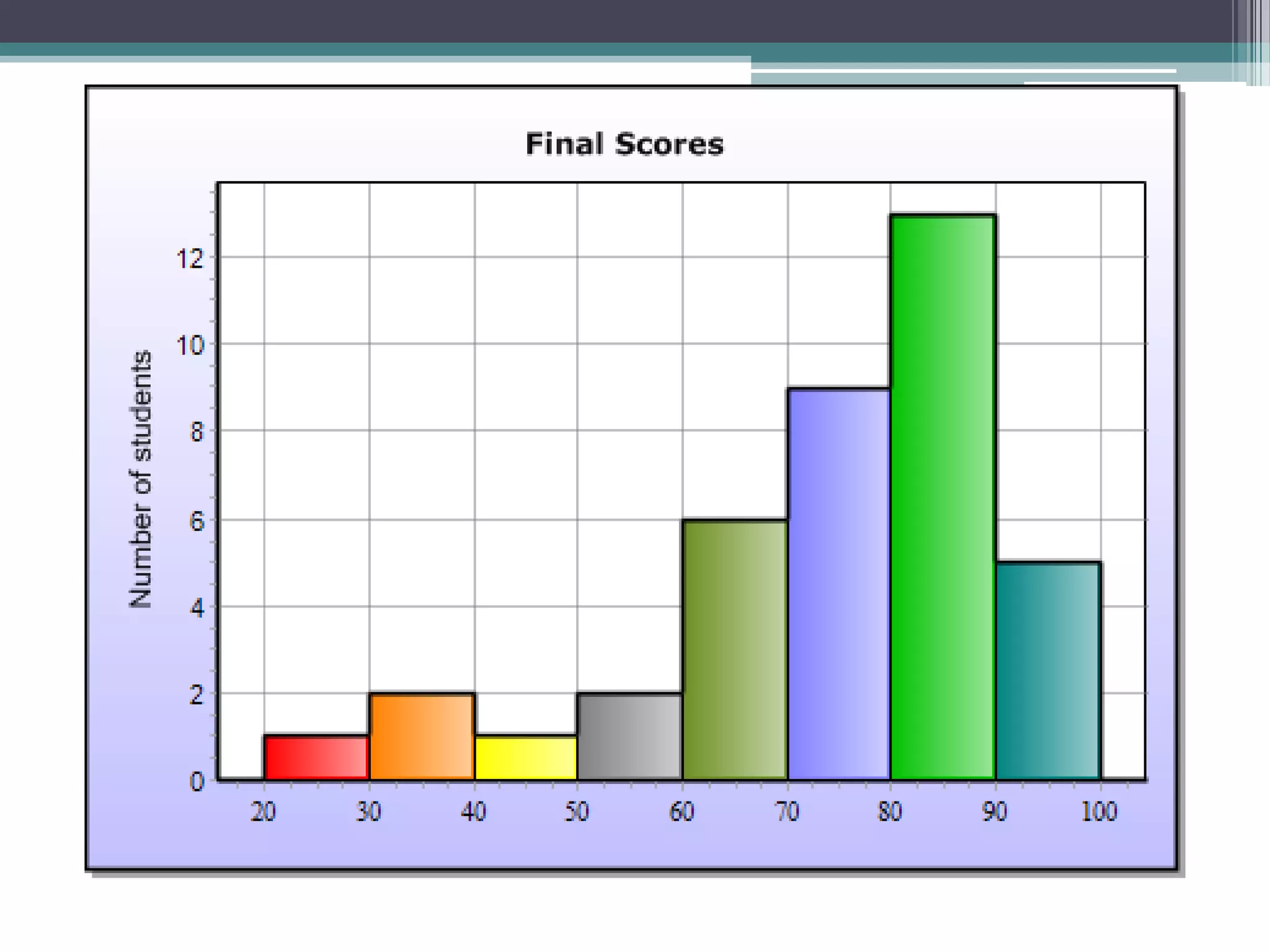
Graphic representation of dataJOEL M PAIS AND GROUPMBA – 2011ALOYSIUS INSTITUTE OF MANEGEMENT AND IFOAMTION TECHNOLOGY (AIMIT)
Graphic representation of datacontentName of the personMeaning and significanceComparison between tabular and graphic representation of dataGeneral rules in constructing graphsGraphs of one variable and two variableTime series graphs, frequency distribution , range chart, band graphBox plots,pareto  chart, fish bone diagrammerits/demerits/limitation of graphs.Kiran.sKiran sBineeshBineeshSamsagar, joel joel bineesh
Graphic representation of datacontentnameDifference between diagrams and graphsraghavendra
Meaning and significance of graphs                           presenter- kiran. s
INTRODUCTION The word graph was originated in the year 1875-80Tabulation is one way of Pictorial presentation of dataAnother way of pictorial Presentation is in the form Of graphs and diagrams
MEANING OF GRAPHSIn simple, it is pictorial presentation of data in the Form of lines, bars dots etc.They are commonly used for Presentation of time series  and Frequency distributionBut in statistics it is defined as :A graph or diagrams representing a system of collection or interrelations among two or more things by a number of distinctive lines and bars is known as graphs.
Significance of graphsGraph gives an attractive and elegant presentation: graphs have greater attraction power ,when they are presented in the form of bar graphs, histogram etc.they have greater memorizing value.Graph gives a complete bird eyeview:                                                      they give complete picture of                Interpretation of data.
Graphs facilitate comparison:   They provide comparison ,    When There are two or more     numbers.Graphs save time:when the data is presented in the form of graphs rather than Tabulation , it saves time.
Graph makes possible the presentation of quantitative and qualitative data:   Quantitative data: dot plot, histogram.   Qualitative data: bar graph. Pie chart
Graphic representation is helpful in interpreting:Mode
Median
meanmean $700mode  $ 300median $500                                                                       median
Comparison between tabular and graphical representation of data                             presented by kiranGraphical representationtabular
Basis :qualitative datatabularGraphic representationIts uses the following methods:Frequency distribution
Relative frequency distributionIt uses the following methodsBar graphPie chart
Basis: quantitative datatabularGraphic representationFrequency distributionRelative frequency distributionCumulative frequency distributionCumulative relative frequency distributionDot plotHistogramogive
Basis: accuracytabularGraphic representation gives approxGives accurate numbers                                                                           For example:
Basis: time savingTabular Graphic representationA tabular representation is more time consuming. As they lead to better understanding , they save considerable time
Basis: attractiontabularGraphic representationTabular representation doesn't attract a reader immediatelyWhere as in graphic representation they attract the reader , because of the use of colours and pictures
Basis: substitutestabularGraphic representationA table has the complete data that can be interpreted Graphs cannot be the complete substitutes for tables, they are another way of pictorial representation of data.
Basis: too many numberstabularGraphic representationIn tables too many numbers can be interpreted example:334,444, 567, 765, 566, 66778,……………….These devices fail to represent when too many details are presented
Basis: arrangementtabularGraphic representationData is arranged in rows and column in tablesData is interpreted in the form of bars , dots in graphs
Basis: simpletabularGraphic representationThey are simpleGraph devices are not always simple when RATIO graphs and multidimensional figures are used
General Rules of Graphs, One Variable Graph, Two Variable Graphs
General rules of ConstructionGraph Rules :Be appropriate. The chart or graph should be appropriate forthe type of data to be presented or conveyed.
Be self-explanatory and well labeled. Graphs should include a descriptive label   and a clear indication of the units displayed.
Include a legend or key if necessary.
Use scale proportion.
Acknowledge and credit an outside source.One variable graphs:One variable graphs are those graphs in which values of only one variable are shown with respect to same time period of time .
IllustrationGraphic presentation of the production of a factors between the months of January and June of a year, would be one variable graphSolution:Take the following steps:Indicate time period (in terms of months) on the X-axis, and production on the Y-axis.Mark different points on the Graph indicating values of productioncorresponding to different months.(iii) Join the points to get a graph showing the behavior of production         over time.
Preview of one variable graph
These are the graphs in which values of two (or more than two) variables are simultaneously shown with respect to some period of time. Data on the production and sale of a factory in different months would make a Two-VariableGraphFollowing illustration should make this point clear. The following table gives data on the production and sales of a factory (in thousand rupees) between January and June. Make a Two-Variable Arithmetic line Graph.Two or More than two Variable Graphs
Graphical Representation
Solution:These data will also be presented in the form of graph in the same manner as shown in the above graph. In graph, following data pertaining to both production and sales are shown on Y-axis. These are represented by two different graph lines in the same graph.
Preview of 3D two variable graph
TIME SERIES OR HISTORIGRAMS
MeaningTime series is a series of values of a variable recorded at successive intervals of time; e.g. figures of national income, sale, production, employment etc, at successive points of time.
UTILITY   OF TIME SERIES ANALYSISIt helps in understanding past behaviourIt helps in planning future operationsIt helps in evaluating current accomplishmentsIt facilitates comparison
Frequency Distribution GraphA frequency distribution can be presented in any of the following ways HistogramFrequency polygonFrequency curveogives
Histogram: Histogram is a set of vertical bars whose areas are proportional to the frequencies represented.While constructing the histogram variable taken on X- axis and frequencies on the Y- axis if CI are of equal width. If CI are of unequal width rectangles are drawn with height proportional to frequency density.
605550454035302520150                     10                     20                     30                   40                      50                   60                     70                    80                      90
Frequency PolygonA frequency polygon is a graph with frequency density plotted against the values of the variable. Frequency polygon can be easily obtained easily from histogram.
Frequency curveFrequency curve is the most used graphical form of frequency distribution. Under the frequency curve the variable is taken along X- axis. Frequency curve can be obtained from histogram.
‘Ogives’ or Cumulative Frequency CurvesLess- than ogiveMore- than ogive
Less than OgiveCumulative class frequency are plotted against the respective upper class limits. Variable taken along X- axis and less than cumulative frequency is taken along Y- axis.     In the ‘less than’ method we start with the upper limits of the classes and go on adding the frequencies. When these frequencies are plotted we get a rising curve.
More than OgiveCumulative class frequency are plotted against the respective lower class limits,these points are joined by a smooth curve and the resulting graph is more than ogive.                                   In the ‘more than’ method we start with the lower limits of the classes and from the frequencies we subtract the frequency of each class. When these frequencies are plotted we get a declining curve.
RANGE CHARTA range chart type displays a set of data points that are each defined by multiple values for the same category. The plain range chart fills in the area between the top and bottom value for each data point. It is a very good method of showing the method of variation i.e. the minimum and maximum values of variable.
Band Diagram
   A band graph is used to arrange information in such a way that priorities for process improvement can be established.Definition:
Band Diagram
Pareto Diagram
 A bar graph used to arrange information in such a way that priorities for process improvement can be established.Definition:
To display the relative importance of data. To direct efforts to the biggest improvement opportunity by highlighting the vital few in contrasts to the useful many.Purposes:
Fishbone diagram
When should a fishbone diagram be used?Need to study a problem/issue to determine the root cause?To study all the possible reasons why a process is beginning to have difficulties, problems, or breakdowns?Need to identify areas for data collection?Want to study why a process is not performing properly or producing the desired results?
To successfully build a cause and effect diagram:Be sure everyone agrees on the effect or problem statement before beginning.Be succinct.For each node, think what could be its causes. Add them to the tree.Pursue each line of causality back to its root cause.Consider grafting relatively empty branches onto others.Consider splitting up overcrowded branches.Consider which root causes are most likely to merit further investigation.
Merits and Demerits of Graphs
GraphsGraphs are pictorial representations of the relationships between two (or more) variables and are an important part of descriptive statistics.
When to use Graphs?    Graphs can be used any time one wants to visually summarize the relationships between variables, especially if the data set is large or unmanageable. They are routinely used in reports to underscore a particular statement about a data set and to enhance readability
Graphs can appeal to visual memory in ways that mere tallies, tables, or frequency distributions cannot. However, if not used carefully, graphs can misrepresent relationships between variables or encourage inaccurate conclusions.
MERITS OF GRAPHS1. Production of graphs          Production of graphs is an art which can be acquired through practice. There are number of simple rules, adoption of which leads to the effectiveness of the graphs. We can make use of graph papers to do graphs.2. Rules for graphs        There is no hard and fast rule can be laid down about the ratio of the scale on the abscissa (point) and on the ordinate because much would depend upon the given data and size of the paper 3. Data Analysis Excellent, for data, comparison from various sources to derive conclusions
4. Simplicity         Graphs are most widely used in practice. They are the simplest to understand, easiest to make and most adoptable to many uses.5. Least technical skill          Graphs are required the least technical skill and at the same time enable one to present more information of a complex nature in a perfectly understandable form than any other kind of chart.6. Comparison between variables   Many variables can be shown on the same graph they should be distinguished by the use of thick, thin, dotted lines, etc or different colors be used and a comparison will be done between different variables.7. Better visual communication    It gives bird’s eye- view of the entire data. The impressions created by graphs are long lasting. Graphs are useful for better understanding of theories and statistics results
DEMERITS OF GRAPH1. Graphs is not an alternative           Although graphs are a powerful and effective media for presenting statistical data, they are not under all circumstances and for all purposes complete substitute for tabular and other forms of presentation. 2. They can present only approximate values            Graphs can give rough values or statistical data. The values given in graphs are not exact in all the times. It may give wrong values.3. They can approximately present only limited amount of information             In Graphs we can represent limited number of information. We can not impose much information in one graph. If we show more information in one graph it may create confusion about the data.  
5. Create wrong impression           They can be easily misinterpreted and, therefore can be used for grinding one’s axe during advertisement, propaganda and electioneering. As such graphs should never be accepted without a close inspection of confides because things are very often not what they appear to be.6. Wrong conclusion         Interpretation of graphs needs highly specialized knowledge in the absence of which one may draw entirely wrong confusion. This factor alone restricts the scope of mass popularity of such a useful device.7. Many variables          When number of variables is very large (say, exceeding five or six) and they are all shown on the same graph, the graph becomes quit confusing because different lines may cut each other and make it difficult to understand the behavior of the variables
LIMITATIONS OF GRAPHS“Graphic statistics has a role to play of its own: it is not the servant of numerical statistics, but it cannot pretend, on the other hand, to precede or displace the latter”.     by UNKNOWN
They can present only approximate values: The graphs can present only approximate numbers and it does not contain anything beyond the given numbers. If anyone wants to have or want to put some more data to the given data it is not possible for him to add it because it changes the whole graph and it is difficult to explain the data collected and the graph prepared. They can approximately represent only limited amount of information: One of the major drawback of the graph is only the limited amount of data can be included. If the data collected are the larger one it’s not possible to show in the graphical method.
They are intended mostly to explain quantitative facts to the general public: From the point of view of the statistician, they are not of much helpful in analyzing the data. In graphs the qualitative data cannot be included means the data which cannot be expressed in terms of numbers and only the data which can be able to expressed in terms of the numbers can be included. They can be easily misinterpreted: The data which collected can be easily misinterpreted by the user and can prepare the graphs.
Significance of diagramsDiagrammatic presentation has good visual impactDiagrams have the merit of rendering any idea readily. The impression created by a diagram is likely to last longer in the minds of people than the effect treated In figures. Thus diagrams have greater memorizing value than figures. Diagrams facilitate comparison:With the help of diagrams, comparisons of groups and series of figures can be made easily. While comparing absolute figures, the significance is not clear but when these are presented by diagrams, the comparison is easy. The technique of diagrammatic representation should not be used when comparison is either not possible or is not necessary. Diagrams save time:Diagrams present the set of data in such a way that their significance is known without loss of much time. Moreover, diagrams save time and effort which are otherwise needed in drawing inferences from a set of figures. 

Qt graphical representation of data

  • 1.
    Graphic representation ofdataJOEL M PAIS AND GROUPMBA – 2011ALOYSIUS INSTITUTE OF MANEGEMENT AND IFOAMTION TECHNOLOGY (AIMIT)
  • 2.
    Graphic representation ofdatacontentName of the personMeaning and significanceComparison between tabular and graphic representation of dataGeneral rules in constructing graphsGraphs of one variable and two variableTime series graphs, frequency distribution , range chart, band graphBox plots,pareto chart, fish bone diagrammerits/demerits/limitation of graphs.Kiran.sKiran sBineeshBineeshSamsagar, joel joel bineesh
  • 3.
    Graphic representation ofdatacontentnameDifference between diagrams and graphsraghavendra
  • 4.
    Meaning and significanceof graphs presenter- kiran. s
  • 5.
    INTRODUCTION The wordgraph was originated in the year 1875-80Tabulation is one way of Pictorial presentation of dataAnother way of pictorial Presentation is in the form Of graphs and diagrams
  • 6.
    MEANING OF GRAPHSInsimple, it is pictorial presentation of data in the Form of lines, bars dots etc.They are commonly used for Presentation of time series and Frequency distributionBut in statistics it is defined as :A graph or diagrams representing a system of collection or interrelations among two or more things by a number of distinctive lines and bars is known as graphs.
  • 7.
    Significance of graphsGraphgives an attractive and elegant presentation: graphs have greater attraction power ,when they are presented in the form of bar graphs, histogram etc.they have greater memorizing value.Graph gives a complete bird eyeview: they give complete picture of Interpretation of data.
  • 8.
    Graphs facilitate comparison: They provide comparison , When There are two or more numbers.Graphs save time:when the data is presented in the form of graphs rather than Tabulation , it saves time.
  • 9.
    Graph makes possiblethe presentation of quantitative and qualitative data: Quantitative data: dot plot, histogram. Qualitative data: bar graph. Pie chart
  • 10.
    Graphic representation ishelpful in interpreting:Mode
  • 11.
  • 12.
    meanmean $700mode $ 300median $500 median
  • 13.
    Comparison between tabularand graphical representation of data presented by kiranGraphical representationtabular
  • 14.
    Basis :qualitative datatabularGraphicrepresentationIts uses the following methods:Frequency distribution
  • 15.
    Relative frequency distributionItuses the following methodsBar graphPie chart
  • 16.
    Basis: quantitative datatabularGraphicrepresentationFrequency distributionRelative frequency distributionCumulative frequency distributionCumulative relative frequency distributionDot plotHistogramogive
  • 17.
    Basis: accuracytabularGraphic representationgives approxGives accurate numbers For example:
  • 18.
    Basis: time savingTabularGraphic representationA tabular representation is more time consuming. As they lead to better understanding , they save considerable time
  • 19.
    Basis: attractiontabularGraphic representationTabularrepresentation doesn't attract a reader immediatelyWhere as in graphic representation they attract the reader , because of the use of colours and pictures
  • 20.
    Basis: substitutestabularGraphic representationAtable has the complete data that can be interpreted Graphs cannot be the complete substitutes for tables, they are another way of pictorial representation of data.
  • 21.
    Basis: too manynumberstabularGraphic representationIn tables too many numbers can be interpreted example:334,444, 567, 765, 566, 66778,……………….These devices fail to represent when too many details are presented
  • 22.
    Basis: arrangementtabularGraphic representationDatais arranged in rows and column in tablesData is interpreted in the form of bars , dots in graphs
  • 23.
    Basis: simpletabularGraphic representationTheyare simpleGraph devices are not always simple when RATIO graphs and multidimensional figures are used
  • 24.
    General Rules ofGraphs, One Variable Graph, Two Variable Graphs
  • 25.
    General rules ofConstructionGraph Rules :Be appropriate. The chart or graph should be appropriate forthe type of data to be presented or conveyed.
  • 26.
    Be self-explanatory andwell labeled. Graphs should include a descriptive label and a clear indication of the units displayed.
  • 27.
    Include a legendor key if necessary.
  • 28.
  • 29.
    Acknowledge and creditan outside source.One variable graphs:One variable graphs are those graphs in which values of only one variable are shown with respect to same time period of time .
  • 30.
    IllustrationGraphic presentation ofthe production of a factors between the months of January and June of a year, would be one variable graphSolution:Take the following steps:Indicate time period (in terms of months) on the X-axis, and production on the Y-axis.Mark different points on the Graph indicating values of productioncorresponding to different months.(iii) Join the points to get a graph showing the behavior of production over time.
  • 31.
    Preview of onevariable graph
  • 32.
    These are thegraphs in which values of two (or more than two) variables are simultaneously shown with respect to some period of time. Data on the production and sale of a factory in different months would make a Two-VariableGraphFollowing illustration should make this point clear. The following table gives data on the production and sales of a factory (in thousand rupees) between January and June. Make a Two-Variable Arithmetic line Graph.Two or More than two Variable Graphs
  • 33.
  • 34.
    Solution:These data willalso be presented in the form of graph in the same manner as shown in the above graph. In graph, following data pertaining to both production and sales are shown on Y-axis. These are represented by two different graph lines in the same graph.
  • 35.
    Preview of 3Dtwo variable graph
  • 36.
    TIME SERIES ORHISTORIGRAMS
  • 37.
    MeaningTime series isa series of values of a variable recorded at successive intervals of time; e.g. figures of national income, sale, production, employment etc, at successive points of time.
  • 38.
    UTILITY OF TIME SERIES ANALYSISIt helps in understanding past behaviourIt helps in planning future operationsIt helps in evaluating current accomplishmentsIt facilitates comparison
  • 39.
    Frequency Distribution GraphAfrequency distribution can be presented in any of the following ways HistogramFrequency polygonFrequency curveogives
  • 40.
    Histogram: Histogram isa set of vertical bars whose areas are proportional to the frequencies represented.While constructing the histogram variable taken on X- axis and frequencies on the Y- axis if CI are of equal width. If CI are of unequal width rectangles are drawn with height proportional to frequency density.
  • 41.
    605550454035302520150 10 20 30 40 50 60 70 80 90
  • 42.
    Frequency PolygonA frequencypolygon is a graph with frequency density plotted against the values of the variable. Frequency polygon can be easily obtained easily from histogram.
  • 43.
    Frequency curveFrequency curveis the most used graphical form of frequency distribution. Under the frequency curve the variable is taken along X- axis. Frequency curve can be obtained from histogram.
  • 44.
    ‘Ogives’ or CumulativeFrequency CurvesLess- than ogiveMore- than ogive
  • 45.
    Less than OgiveCumulativeclass frequency are plotted against the respective upper class limits. Variable taken along X- axis and less than cumulative frequency is taken along Y- axis. In the ‘less than’ method we start with the upper limits of the classes and go on adding the frequencies. When these frequencies are plotted we get a rising curve.
  • 46.
    More than OgiveCumulativeclass frequency are plotted against the respective lower class limits,these points are joined by a smooth curve and the resulting graph is more than ogive. In the ‘more than’ method we start with the lower limits of the classes and from the frequencies we subtract the frequency of each class. When these frequencies are plotted we get a declining curve.
  • 47.
    RANGE CHARTA rangechart type displays a set of data points that are each defined by multiple values for the same category. The plain range chart fills in the area between the top and bottom value for each data point. It is a very good method of showing the method of variation i.e. the minimum and maximum values of variable.
  • 49.
  • 50.
    A band graph is used to arrange information in such a way that priorities for process improvement can be established.Definition:
  • 51.
  • 52.
  • 53.
     A bar graphused to arrange information in such a way that priorities for process improvement can be established.Definition:
  • 54.
    To display therelative importance of data. To direct efforts to the biggest improvement opportunity by highlighting the vital few in contrasts to the useful many.Purposes:
  • 56.
  • 58.
    When should afishbone diagram be used?Need to study a problem/issue to determine the root cause?To study all the possible reasons why a process is beginning to have difficulties, problems, or breakdowns?Need to identify areas for data collection?Want to study why a process is not performing properly or producing the desired results?
  • 59.
    To successfully builda cause and effect diagram:Be sure everyone agrees on the effect or problem statement before beginning.Be succinct.For each node, think what could be its causes. Add them to the tree.Pursue each line of causality back to its root cause.Consider grafting relatively empty branches onto others.Consider splitting up overcrowded branches.Consider which root causes are most likely to merit further investigation.
  • 60.
  • 61.
    GraphsGraphs are pictorialrepresentations of the relationships between two (or more) variables and are an important part of descriptive statistics.
  • 62.
    When to useGraphs? Graphs can be used any time one wants to visually summarize the relationships between variables, especially if the data set is large or unmanageable. They are routinely used in reports to underscore a particular statement about a data set and to enhance readability
  • 63.
    Graphs can appealto visual memory in ways that mere tallies, tables, or frequency distributions cannot. However, if not used carefully, graphs can misrepresent relationships between variables or encourage inaccurate conclusions.
  • 64.
    MERITS OF GRAPHS1.Production of graphs Production of graphs is an art which can be acquired through practice. There are number of simple rules, adoption of which leads to the effectiveness of the graphs. We can make use of graph papers to do graphs.2. Rules for graphs There is no hard and fast rule can be laid down about the ratio of the scale on the abscissa (point) and on the ordinate because much would depend upon the given data and size of the paper 3. Data Analysis Excellent, for data, comparison from various sources to derive conclusions
  • 65.
    4. Simplicity Graphs are most widely used in practice. They are the simplest to understand, easiest to make and most adoptable to many uses.5. Least technical skill Graphs are required the least technical skill and at the same time enable one to present more information of a complex nature in a perfectly understandable form than any other kind of chart.6. Comparison between variables Many variables can be shown on the same graph they should be distinguished by the use of thick, thin, dotted lines, etc or different colors be used and a comparison will be done between different variables.7. Better visual communication It gives bird’s eye- view of the entire data. The impressions created by graphs are long lasting. Graphs are useful for better understanding of theories and statistics results
  • 66.
    DEMERITS OF GRAPH1.Graphs is not an alternative Although graphs are a powerful and effective media for presenting statistical data, they are not under all circumstances and for all purposes complete substitute for tabular and other forms of presentation. 2. They can present only approximate values Graphs can give rough values or statistical data. The values given in graphs are not exact in all the times. It may give wrong values.3. They can approximately present only limited amount of information In Graphs we can represent limited number of information. We can not impose much information in one graph. If we show more information in one graph it may create confusion about the data.  
  • 67.
    5. Create wrongimpression They can be easily misinterpreted and, therefore can be used for grinding one’s axe during advertisement, propaganda and electioneering. As such graphs should never be accepted without a close inspection of confides because things are very often not what they appear to be.6. Wrong conclusion Interpretation of graphs needs highly specialized knowledge in the absence of which one may draw entirely wrong confusion. This factor alone restricts the scope of mass popularity of such a useful device.7. Many variables When number of variables is very large (say, exceeding five or six) and they are all shown on the same graph, the graph becomes quit confusing because different lines may cut each other and make it difficult to understand the behavior of the variables
  • 68.
    LIMITATIONS OF GRAPHS“Graphicstatistics has a role to play of its own: it is not the servant of numerical statistics, but it cannot pretend, on the other hand, to precede or displace the latter”. by UNKNOWN
  • 69.
    They can presentonly approximate values: The graphs can present only approximate numbers and it does not contain anything beyond the given numbers. If anyone wants to have or want to put some more data to the given data it is not possible for him to add it because it changes the whole graph and it is difficult to explain the data collected and the graph prepared. They can approximately represent only limited amount of information: One of the major drawback of the graph is only the limited amount of data can be included. If the data collected are the larger one it’s not possible to show in the graphical method.
  • 70.
    They are intendedmostly to explain quantitative facts to the general public: From the point of view of the statistician, they are not of much helpful in analyzing the data. In graphs the qualitative data cannot be included means the data which cannot be expressed in terms of numbers and only the data which can be able to expressed in terms of the numbers can be included. They can be easily misinterpreted: The data which collected can be easily misinterpreted by the user and can prepare the graphs.
  • 71.
    Significance of diagramsDiagrammaticpresentation has good visual impactDiagrams have the merit of rendering any idea readily. The impression created by a diagram is likely to last longer in the minds of people than the effect treated In figures. Thus diagrams have greater memorizing value than figures. Diagrams facilitate comparison:With the help of diagrams, comparisons of groups and series of figures can be made easily. While comparing absolute figures, the significance is not clear but when these are presented by diagrams, the comparison is easy. The technique of diagrammatic representation should not be used when comparison is either not possible or is not necessary. Diagrams save time:Diagrams present the set of data in such a way that their significance is known without loss of much time. Moreover, diagrams save time and effort which are otherwise needed in drawing inferences from a set of figures. 
  • 72.
    Diagrams give abird’s eye of the entire data. This means that the entire data can be put in a diagrammatic form and be presented and the diagram will give you the overall analysis of the data.Diagrams give an attractiveand elegant presentation:Diagrams have greater attraction and effective impression. People, in general. avoid figures, bin are always impressed by diagrams. Since people set: pictures carefully, their effect on the mind is more stable. thus. diagrams give delight to the eve and add the spark of interest.Diagram simplify complexity and depict the characteristics of the data :Diagrams, beside being attractive and interesting, also highlight the characteristics of the data. Large data can easily be represented by diagrams and thus, without straining one’s mind, the basic features of the data can l>e understood and inferences can be drawn in a very short time.
  • 73.
    Why use graphswhen presenting data?are quick and direct.
  • 74.
    highlight the mostimportant facts.
  • 75.
  • 76.
  • 77.
    can be easilyremembered.
  • 80.