Downloaded 100 times
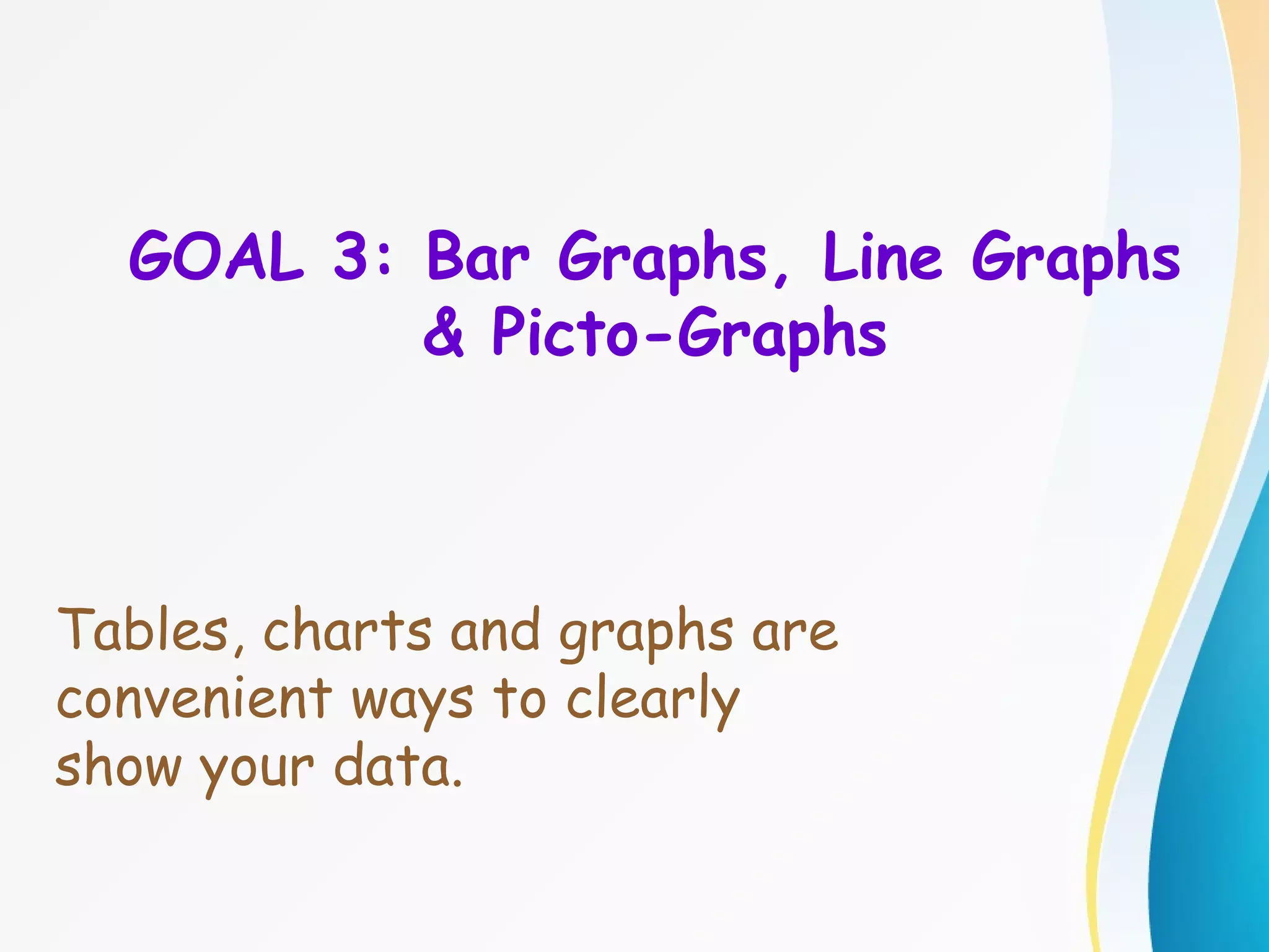
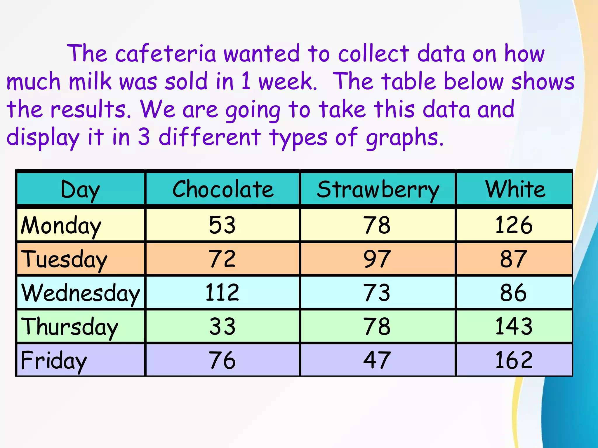
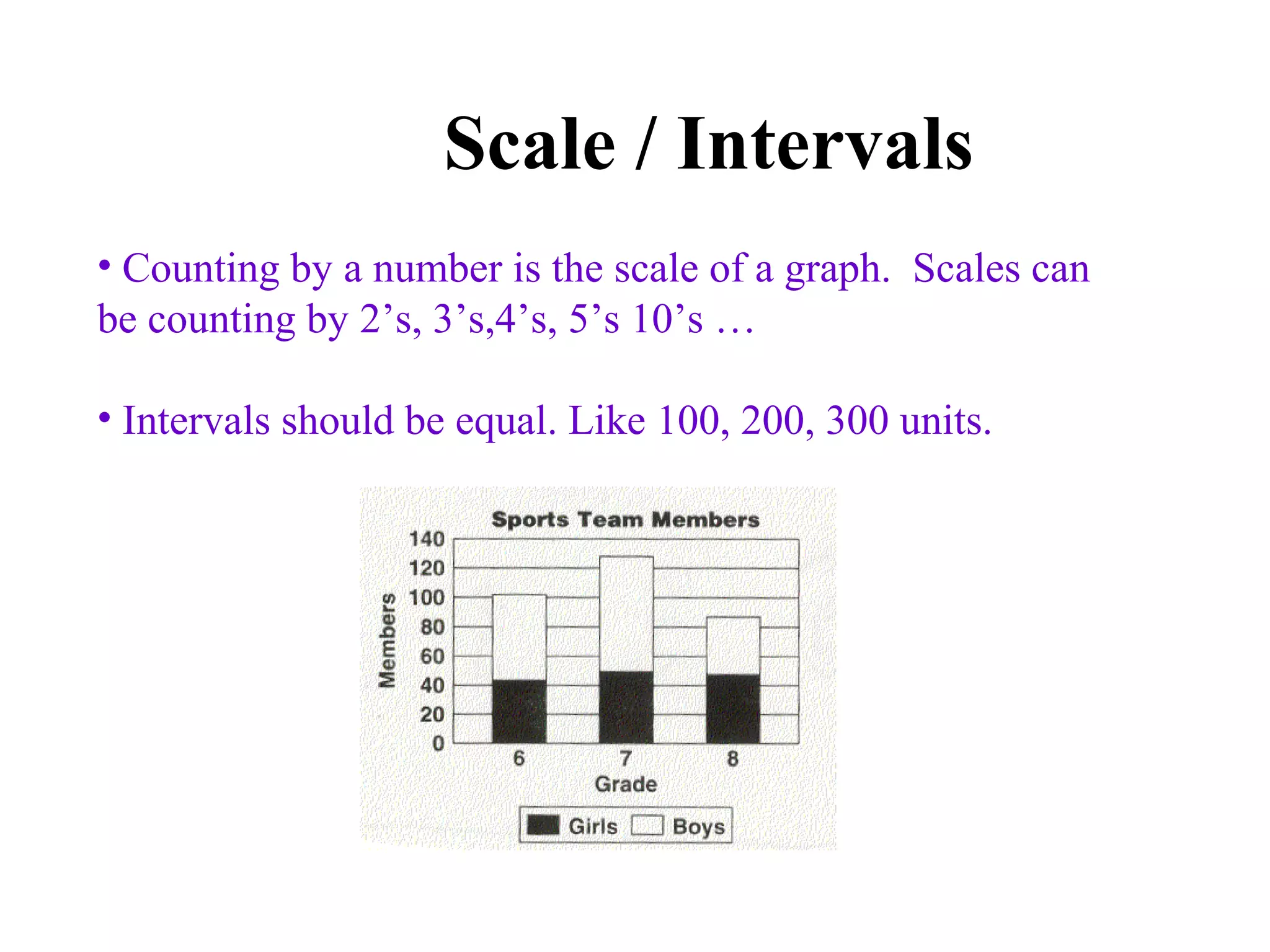


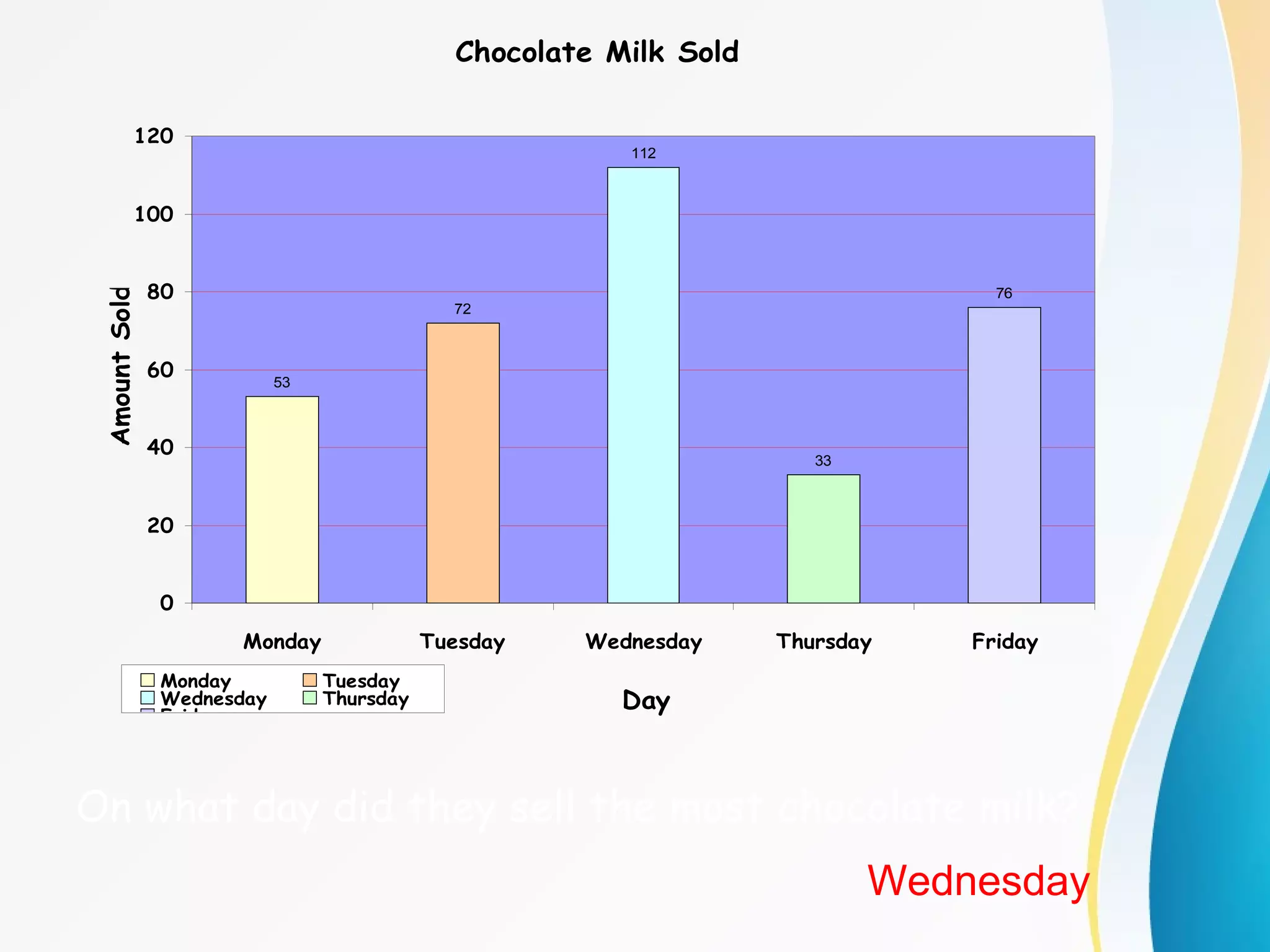
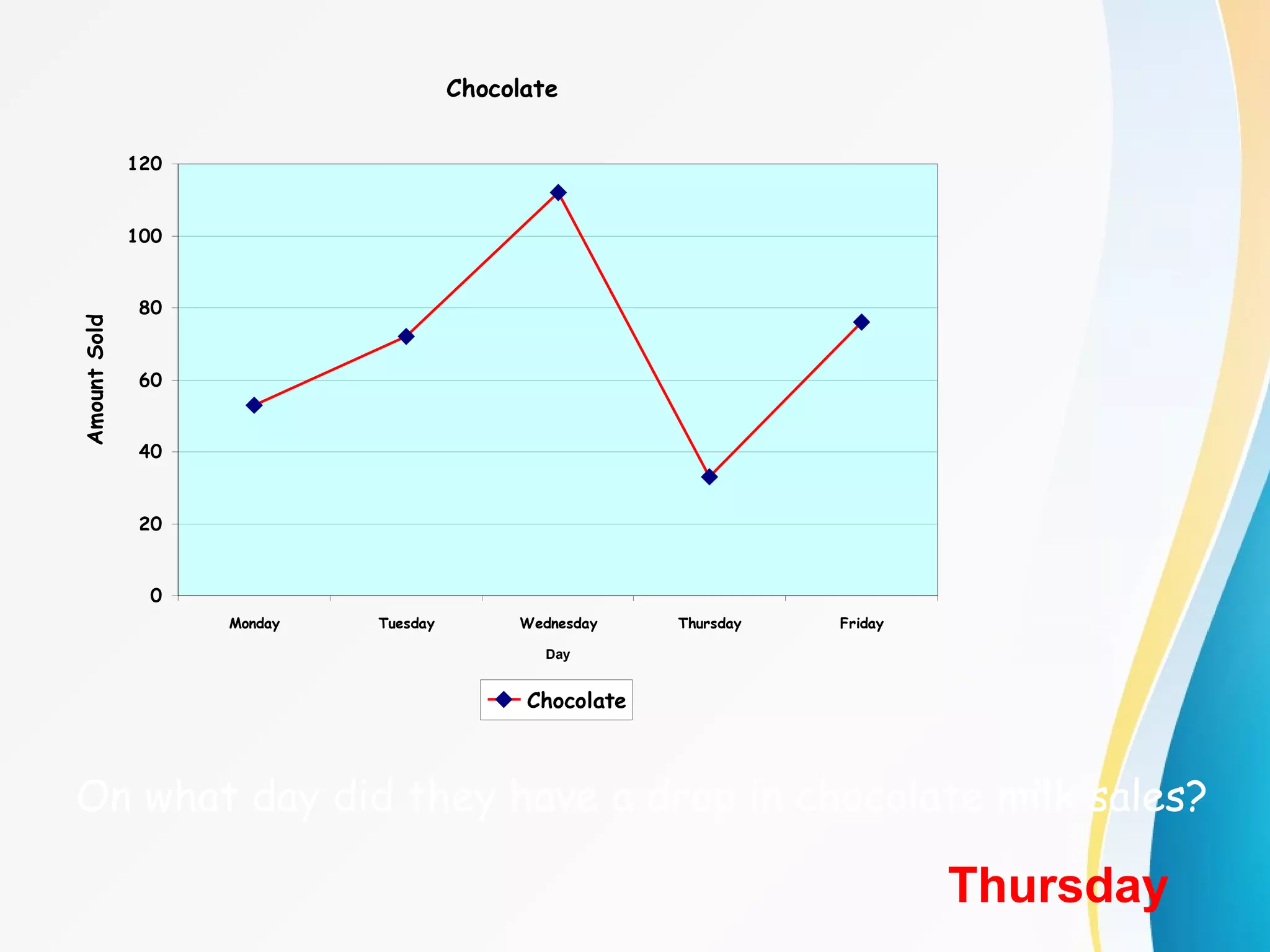
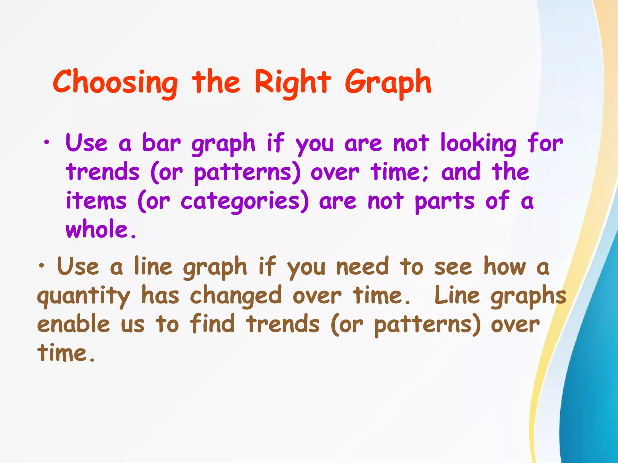
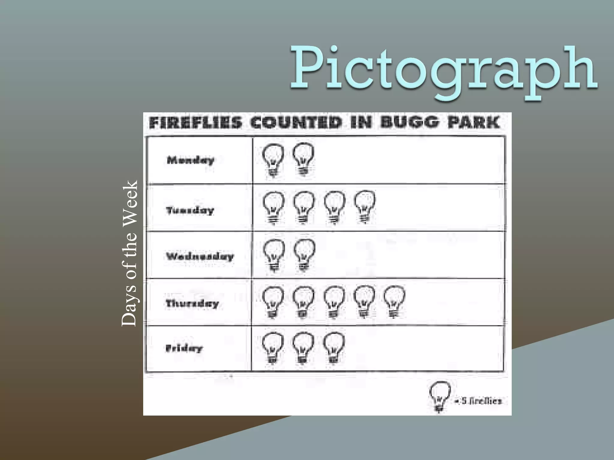


The document discusses different types of graphs - bar graphs, line graphs, and pictographs - to display data collected by a school cafeteria on milk sales over the course of a week. It provides examples of each graph type using the milk sales data and explains the key elements and purposes of each graph. It also discusses choosing the appropriate graph based on whether the data shows relationships between groups or trends over time.