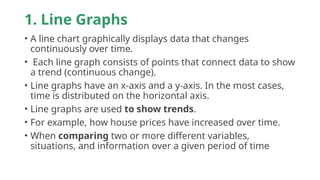
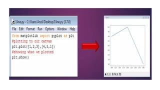
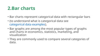
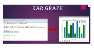
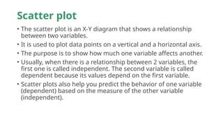
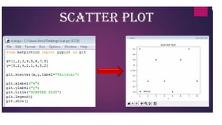
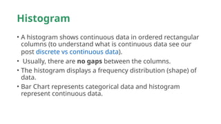
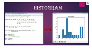
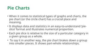
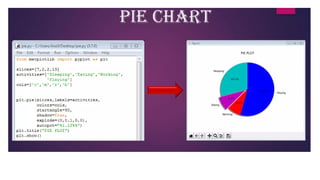
• Pyplot is a Matplotlib module that provides a MATLAB-like
interface. Matplotlib is designed to be as usable as MATLAB,
with the ability to use Python and the advantage of being
free and open-source.
1. Line Graphs
• A line chart graphically displays data that changes
continuously over time.
• Each line graph consists of points that connect data to show
a trend (continuous change).
• Line graphs have an x-axis and a y-axis. In the most cases,
time is distributed on the horizontal axis.
• Line graphs are used to show trends.
• For example, how house prices have increased over time.
• When comparing two or more different variables,
situations, and information over a given period of time
2.Bar charts
• Bar charts represent categorical data with rectangular bars
• (to understand what is categorical data see
categorical data examples).
• Bar graphs are among the most popular types of graphs
and charts in economics, statistics, marketing, and
visualization
• They are commonly used to compare several categories of
data.
Scatter plot
• The scatter plot is an X-Y diagram that shows a relationship
between two variables.
• It is used to plot data points on a vertical and a horizontal axis.
• The purpose is to show how much one variable affects another.
• Usually, when there is a relationship between 2 variables, the
first one is called independent. The second variable is called
dependent because its values depend on the first variable.
• Scatter plots also help you predict the behavior of one variable
(dependent) based on the measure of the other variable
(independent).
Histogram
• A histogram shows continuous data in ordered rectangular
columns (to understand what is continuous data see our
post discrete vs continuous data).
• Usually, there are no gaps between the columns.
• The histogram displays a frequency distribution (shape) of
data.
• Bar Chart represents categorical data and histogram
represent continuous data.
Pie Charts
• When it comes to statistical types of graphs and charts, the
pie chart (or the circle chart) has a crucial place and
meaning.
• It displays data and statistics in an easy-to-understand ‘pie-
slice’ format and illustrates numerical proportion.
• Each pie slice is relative to the size of a particular category in
a given group as a whole.
• To say it in another way, the pie chart brakes down a group
into smaller pieces. It shows part-whole relationships.
matplotlib library - visualization .pptx

matplotlib library - visualization .pptx

  • 4.
    • Pyplot isa Matplotlib module that provides a MATLAB-like interface. Matplotlib is designed to be as usable as MATLAB, with the ability to use Python and the advantage of being free and open-source.
  • 5.
    1. Line Graphs •A line chart graphically displays data that changes continuously over time. • Each line graph consists of points that connect data to show a trend (continuous change). • Line graphs have an x-axis and a y-axis. In the most cases, time is distributed on the horizontal axis. • Line graphs are used to show trends. • For example, how house prices have increased over time. • When comparing two or more different variables, situations, and information over a given period of time
  • 7.
    2.Bar charts • Barcharts represent categorical data with rectangular bars • (to understand what is categorical data see categorical data examples). • Bar graphs are among the most popular types of graphs and charts in economics, statistics, marketing, and visualization • They are commonly used to compare several categories of data.
  • 9.
    Scatter plot • Thescatter plot is an X-Y diagram that shows a relationship between two variables. • It is used to plot data points on a vertical and a horizontal axis. • The purpose is to show how much one variable affects another. • Usually, when there is a relationship between 2 variables, the first one is called independent. The second variable is called dependent because its values depend on the first variable. • Scatter plots also help you predict the behavior of one variable (dependent) based on the measure of the other variable (independent).
  • 11.
    Histogram • A histogramshows continuous data in ordered rectangular columns (to understand what is continuous data see our post discrete vs continuous data). • Usually, there are no gaps between the columns. • The histogram displays a frequency distribution (shape) of data. • Bar Chart represents categorical data and histogram represent continuous data.
  • 13.
    Pie Charts • Whenit comes to statistical types of graphs and charts, the pie chart (or the circle chart) has a crucial place and meaning. • It displays data and statistics in an easy-to-understand ‘pie- slice’ format and illustrates numerical proportion. • Each pie slice is relative to the size of a particular category in a given group as a whole. • To say it in another way, the pie chart brakes down a group into smaller pieces. It shows part-whole relationships.