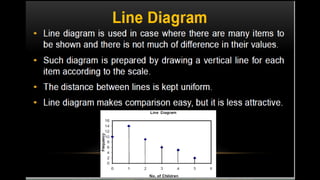
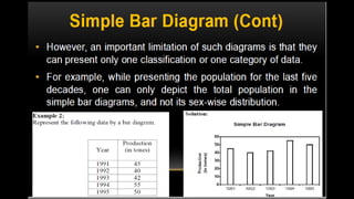
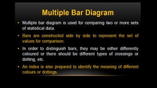
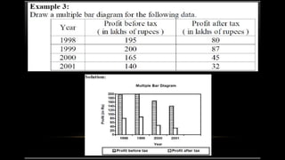
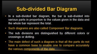
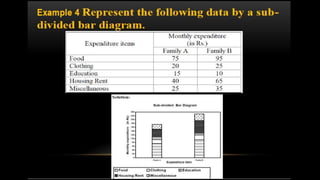
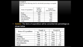
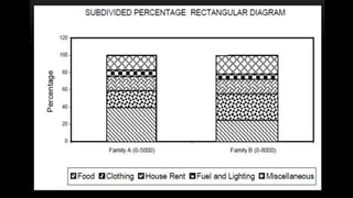
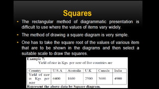
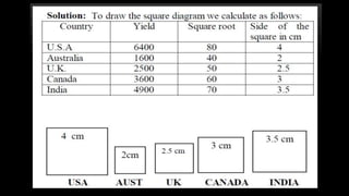
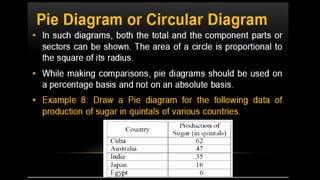
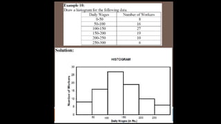
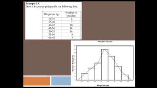
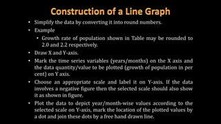
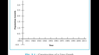
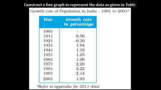
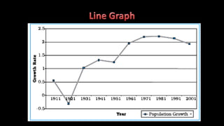
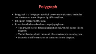
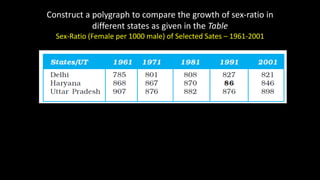
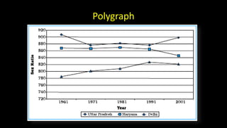
Dr. V. Vadivel
Assistant Professor
PG & Research Department of Botany
V.O. Chidambaram College
Tuticorin – 628 008
drvvadivel@gmail.com
 The line graphs are usually drawn to represent the time series data
 Example:
 Temperature,
 Rainfall,
 Population growth,
 Birth rates and
 the death rates.
• Simplify the data by converting it into round numbers.
• Example
• Growth rate of population shown in Table may be rounded to
2.0 and 2.2 respectively.
• Draw X and Y-axis.
• Mark the time series variables (years/months) on the X axis and
the data quantity/value to be plotted (growth of population in per
cent) on Y axis.
• Choose an appropriate scale and label it on Y-axis. If the data
involves a negative figure then the selected scale should also show
it as shown in figure.
• Plot the data to depict year/month-wise values according to the
selected scale on Y-axis, mark the location of the plotted values by
a dot and join these dots by a free hand drawn line.
Construct a line graph to represent the data as given in Table
• Polygraph is a line graph in which two or more than two variables
are shown on a same diagram by different lines.
• It helps in comparing the data.
• Examples which can be shown as polygraph are:
• The growth rate of different crops like rice, wheat, pulses in one
diagram.
• The birth rates, death rates and life expectancy in one diagram.
• Sex ratio in different states or countries in one diagram.
Construct a polygraph to compare the growth of sex-ratio in
different states as given in the Table
Sex-Ratio (Female per 1000 male) of Selected Sates – 1961-2001
Polygraph

Graphical representation of data

  • 1.
    Dr. V. Vadivel AssistantProfessor PG & Research Department of Botany V.O. Chidambaram College Tuticorin – 628 008 drvvadivel@gmail.com
  • 43.
     The linegraphs are usually drawn to represent the time series data  Example:  Temperature,  Rainfall,  Population growth,  Birth rates and  the death rates.
  • 44.
    • Simplify thedata by converting it into round numbers. • Example • Growth rate of population shown in Table may be rounded to 2.0 and 2.2 respectively. • Draw X and Y-axis. • Mark the time series variables (years/months) on the X axis and the data quantity/value to be plotted (growth of population in per cent) on Y axis. • Choose an appropriate scale and label it on Y-axis. If the data involves a negative figure then the selected scale should also show it as shown in figure. • Plot the data to depict year/month-wise values according to the selected scale on Y-axis, mark the location of the plotted values by a dot and join these dots by a free hand drawn line.
  • 46.
    Construct a linegraph to represent the data as given in Table
  • 48.
    • Polygraph isa line graph in which two or more than two variables are shown on a same diagram by different lines. • It helps in comparing the data. • Examples which can be shown as polygraph are: • The growth rate of different crops like rice, wheat, pulses in one diagram. • The birth rates, death rates and life expectancy in one diagram. • Sex ratio in different states or countries in one diagram.
  • 49.
    Construct a polygraphto compare the growth of sex-ratio in different states as given in the Table Sex-Ratio (Female per 1000 male) of Selected Sates – 1961-2001
  • 50.