Downloaded 22 times

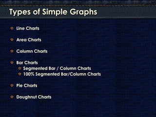


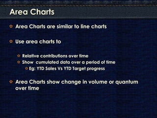

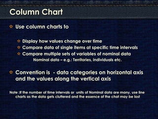

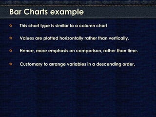
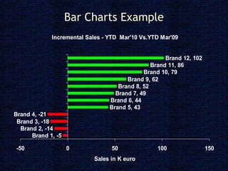


The document discusses different types of simple graphs that can be used to represent data, including: - Line charts to show change over time or compare variables. - Area charts to show cumulative data or relative contributions over time. - Column/bar charts to compare values or data categories. - Pie/doughnut charts to compare parts to a whole. - Segmented charts to show proportional relationships or part-whole changes over time. The document provides examples and guidelines for when each type of chart is most appropriate based on the nature of the data.