Download to read offline
![INTERPRETATION
Initially there was a negative correlation between the two variables but later on
the correlation is constant.
We can conclude that people of weight between 50-80 has height between
170-160 whereas weight more than 100 kg results in less height.
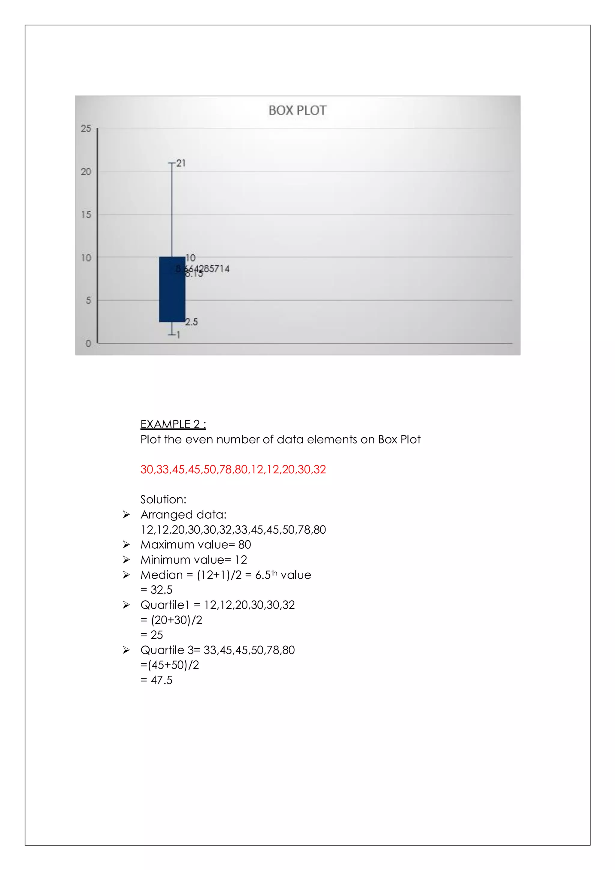
BOX PLOT
A box plot gives a graphic presentation of data using 5 measure:
The median (centre element of the data set)
The first and third quartile (middle values of the first half and second half of the
data set after finding median)
The smallest and the largest values.
It is also called BOX-AND-WISHKER PLOT.
EXAMPLE 1:
Plot the following numbers on Box plot –
22,2,3,4,9,10,2,7,20,8,8,10,1
Steps to plot:
First write the numbers in order – 1,2,2,3,4,7,8,8,9,10,10,20,22
Find the minimum and maximum value.
Minimum value= 1
Maximum value= 22
Find the median- since there are odd number of elements => [(N+1)/2]th
value = 7th value of data array.
Median = 8
1,2,2,3,4,7,8,8,9,10,10,20,22
Find the first quartile.
1,2,2,3,4,7
Q1= [(N+1)/2]th value = 3.5th value
Q1= 2.5
Find the third quartile.
8,9,10,10,20,22
Q3= [(N+1)/2]th value = 3.5th value
Q3= 10
PLOT THE FOLLOWING VALUES IN THIS SEQUENCE ON EXCEL SHEET
MINIMUM VALUE= 1
QUARTILE 1= 2.5
MEDIAN = 8
QUARTILE 3= 10
MAXIMUM VALUE= 22](https://image.slidesharecdn.com/rollno-46diagrammaticandgraphicalrepresentationofdata-201006163719/75/Diagrammatic-and-graphical-representation-of-data-10-2048.jpg)

This document provides information on various methods of diagrammatic and graphical representation of data. It discusses different types of charts and graphs like bar charts, pie charts, scatter plots, histograms and box plots. Examples are given for each type of graph to demonstrate how to plot the graph from given data and interpret the results. Key points covered include how to determine class intervals for histograms, calculate quartiles for box plots, and understand correlations from scatter plots.
Introduction and assignment details about Managerial Statistics from Goa Institute of Management.
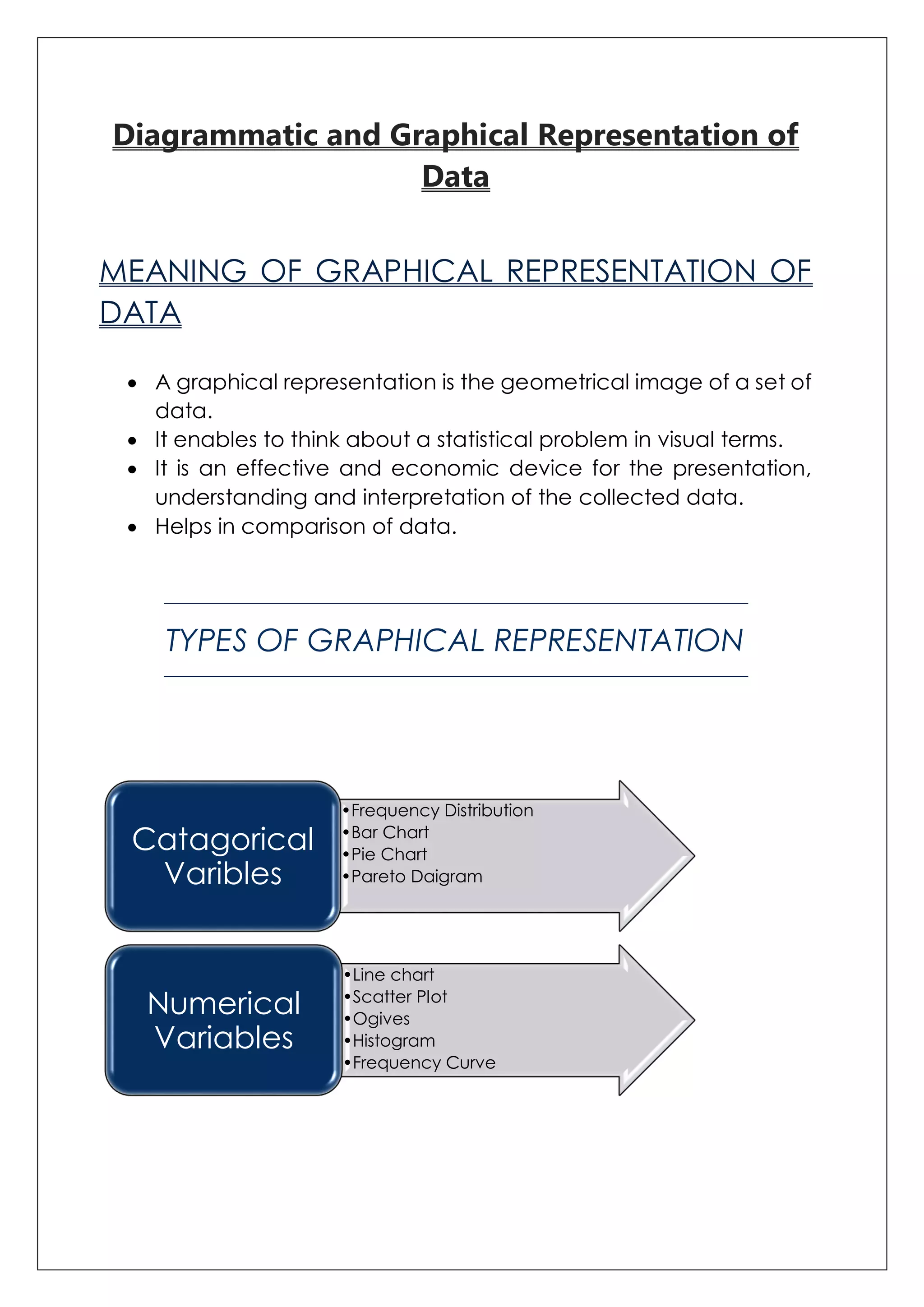
Defines graphical representation of data, its benefits, and types including bar charts and pie charts.
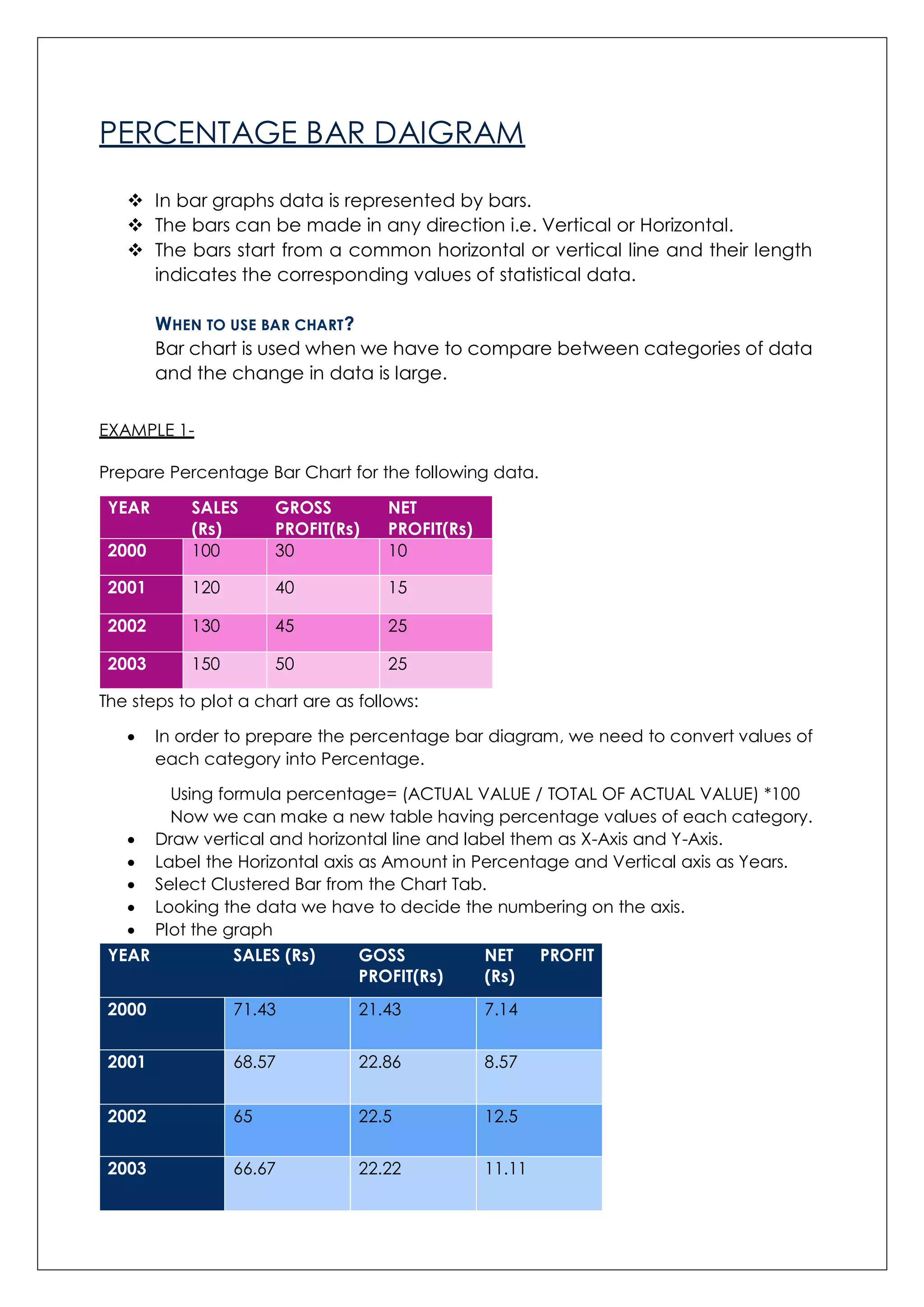
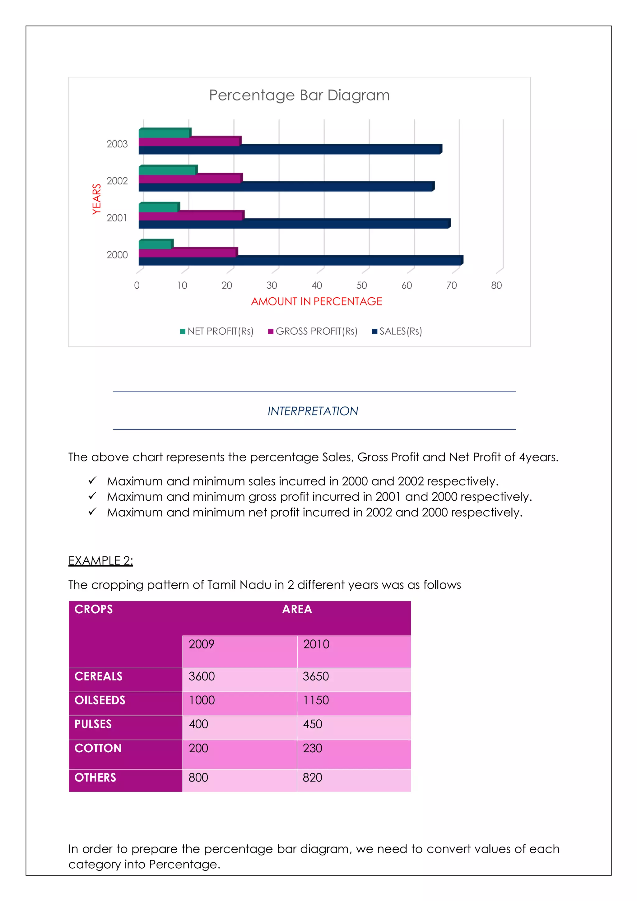
Describes percentage bar chart, usage for category comparison, and interpretation of sales and profits over years.
Showcases percentage crop area in Tamil Nadu (2009-2010), with interpretations of trends.
Explains multiple bar charts for comparing datasets via vegetable sales and interpretations for sales management.
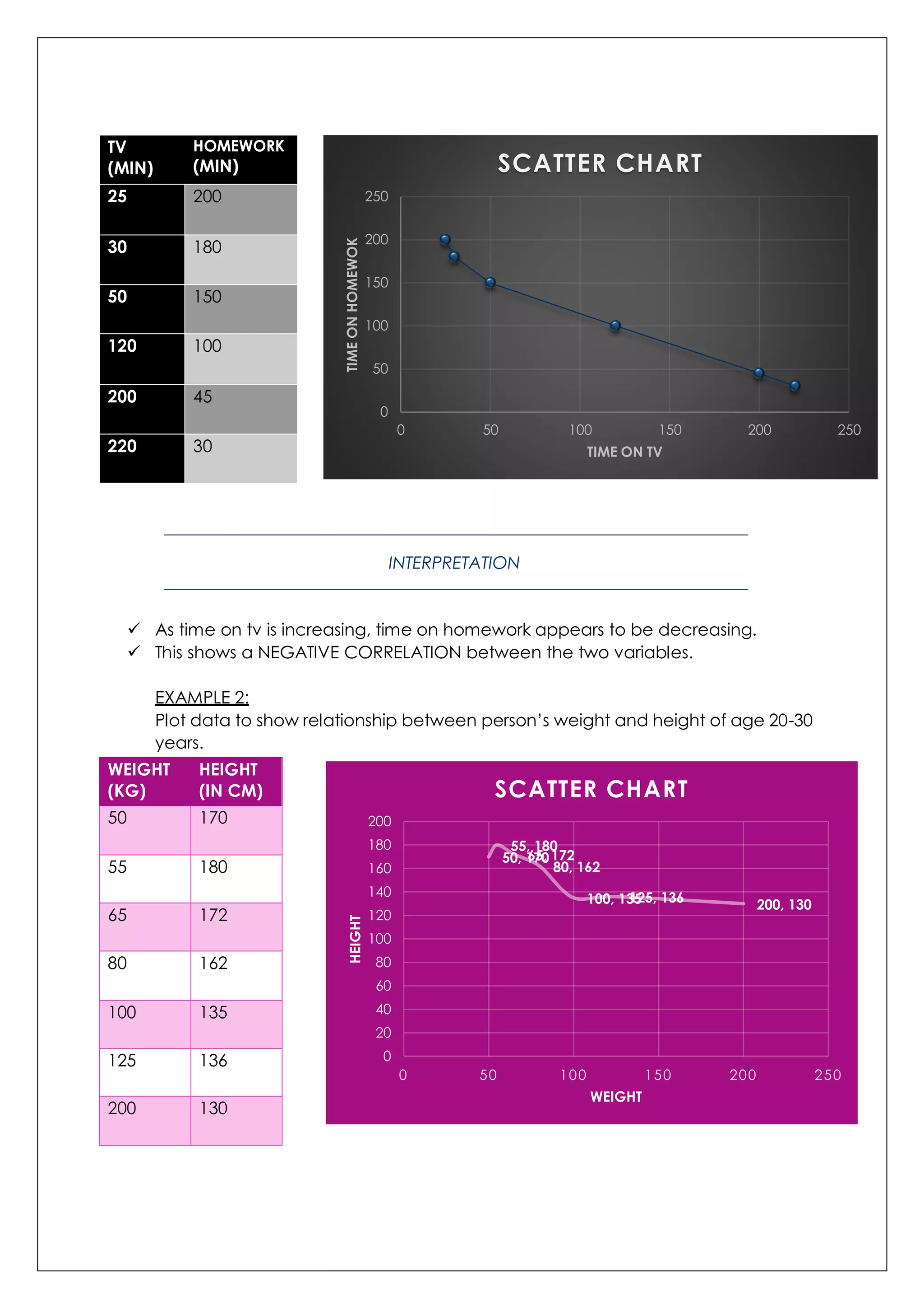
Introduces scatter plots for correlation studies and presents examples for time spent studying vs. homework.
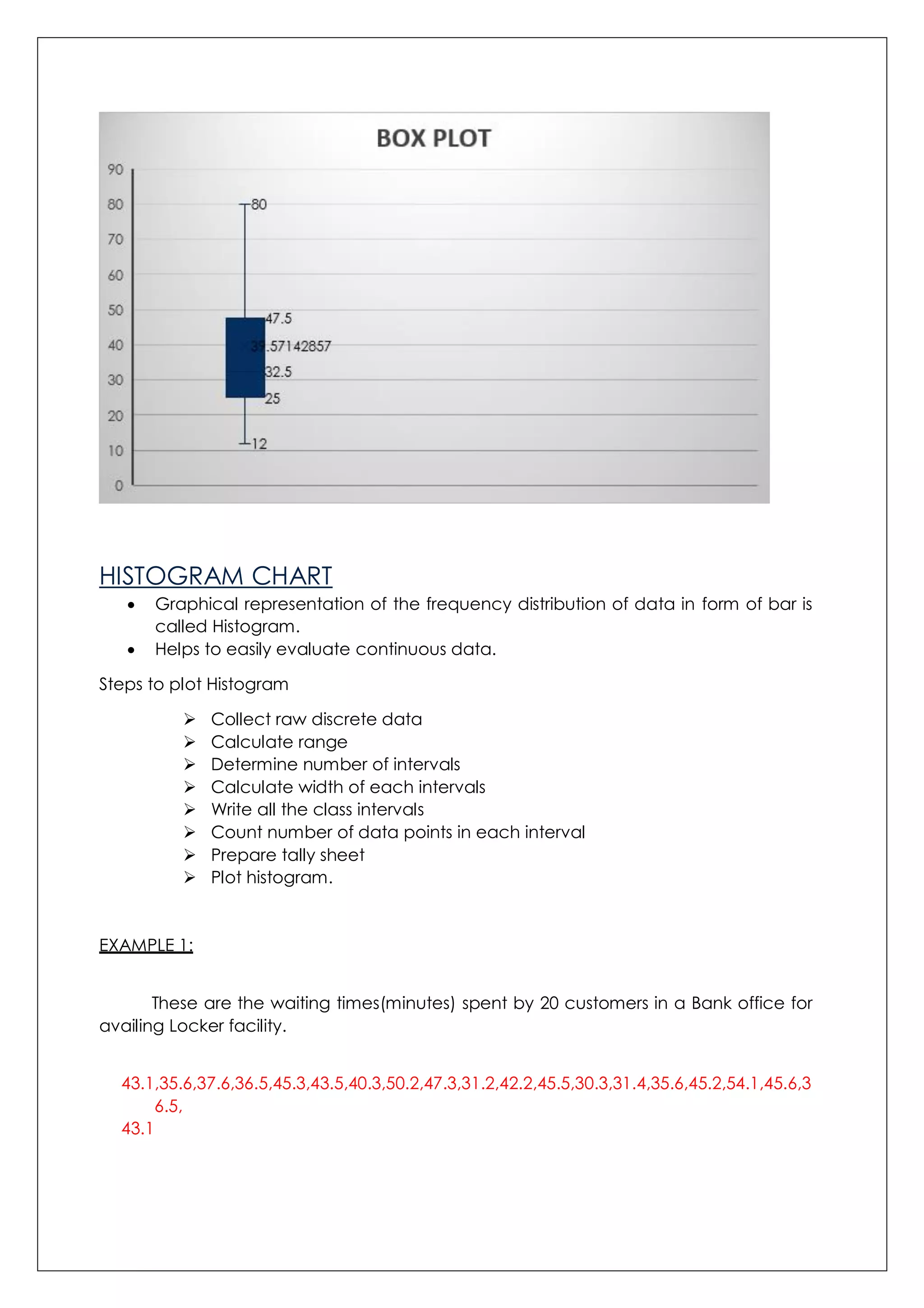
Details on box plots including median and quartiles with practical examples illustrating data distribution.
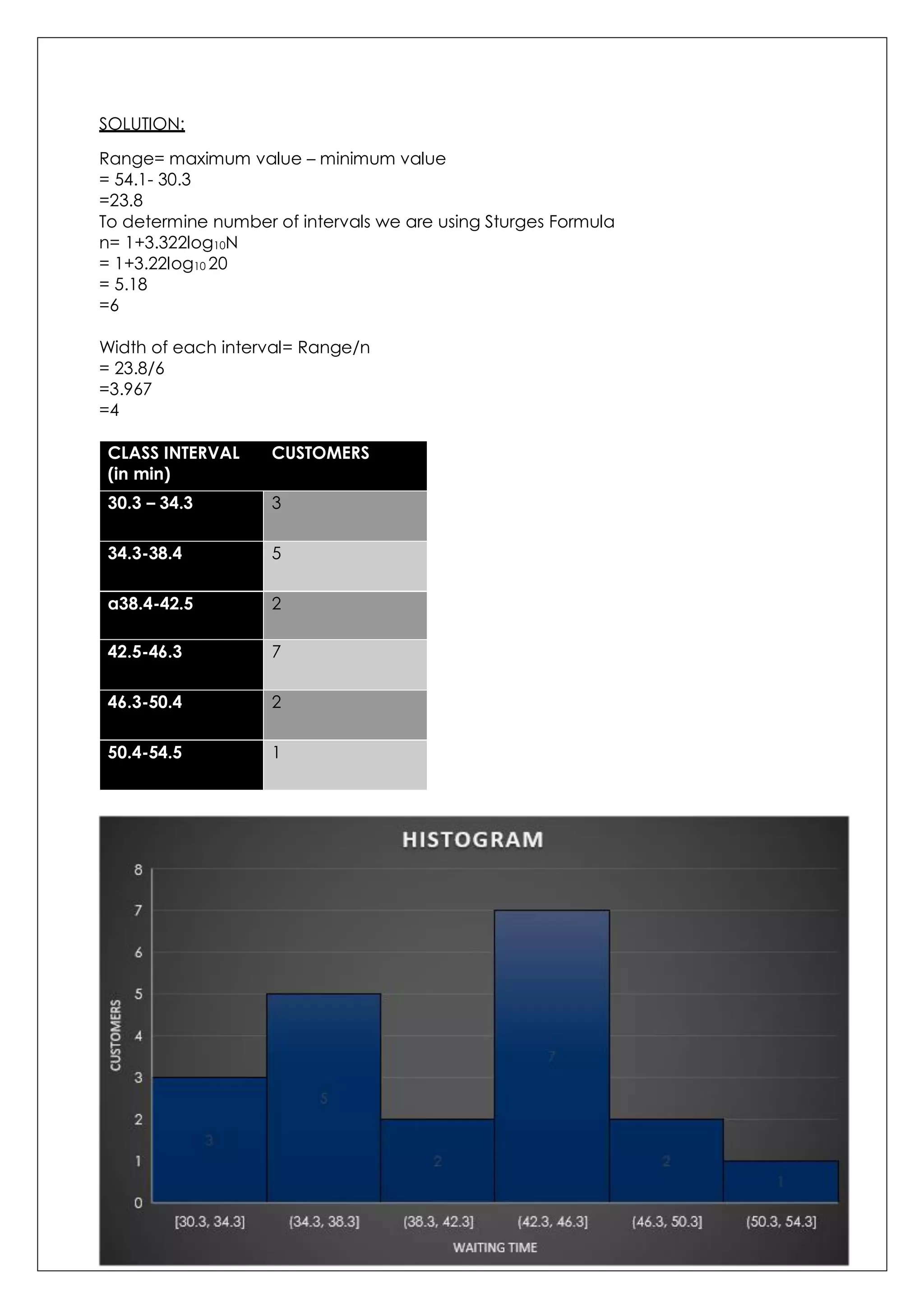
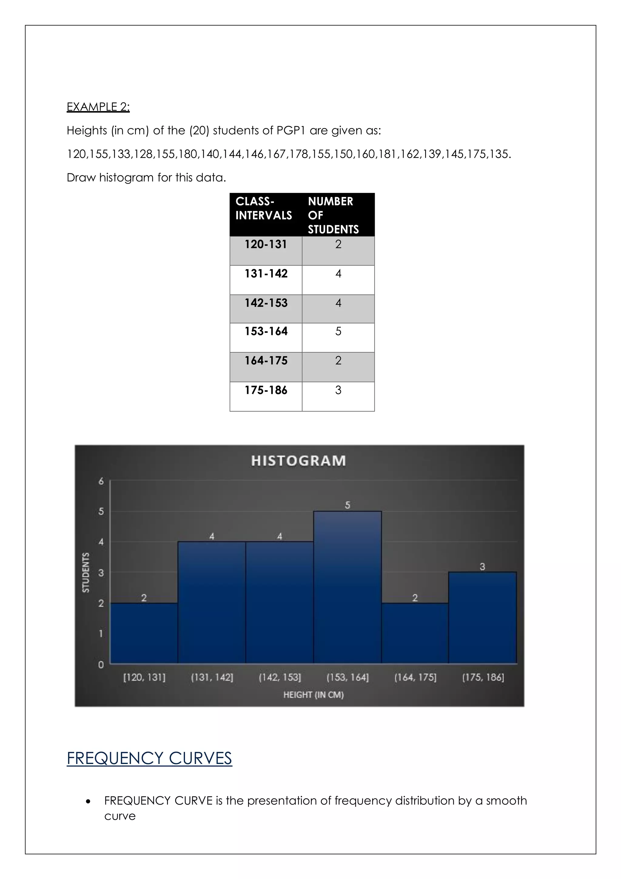
Defines histogram for frequency distribution, methods to plot it with customer wait times and student heights.
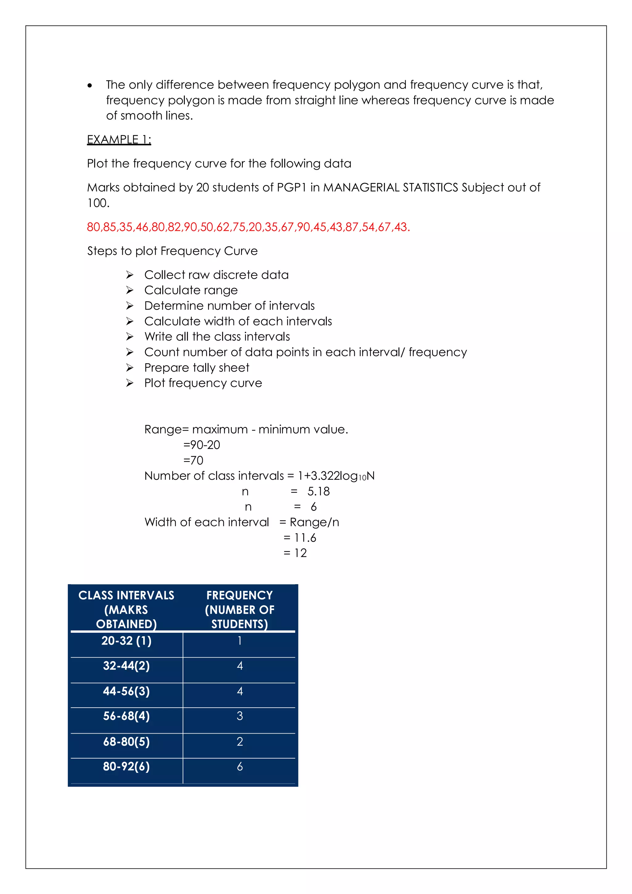
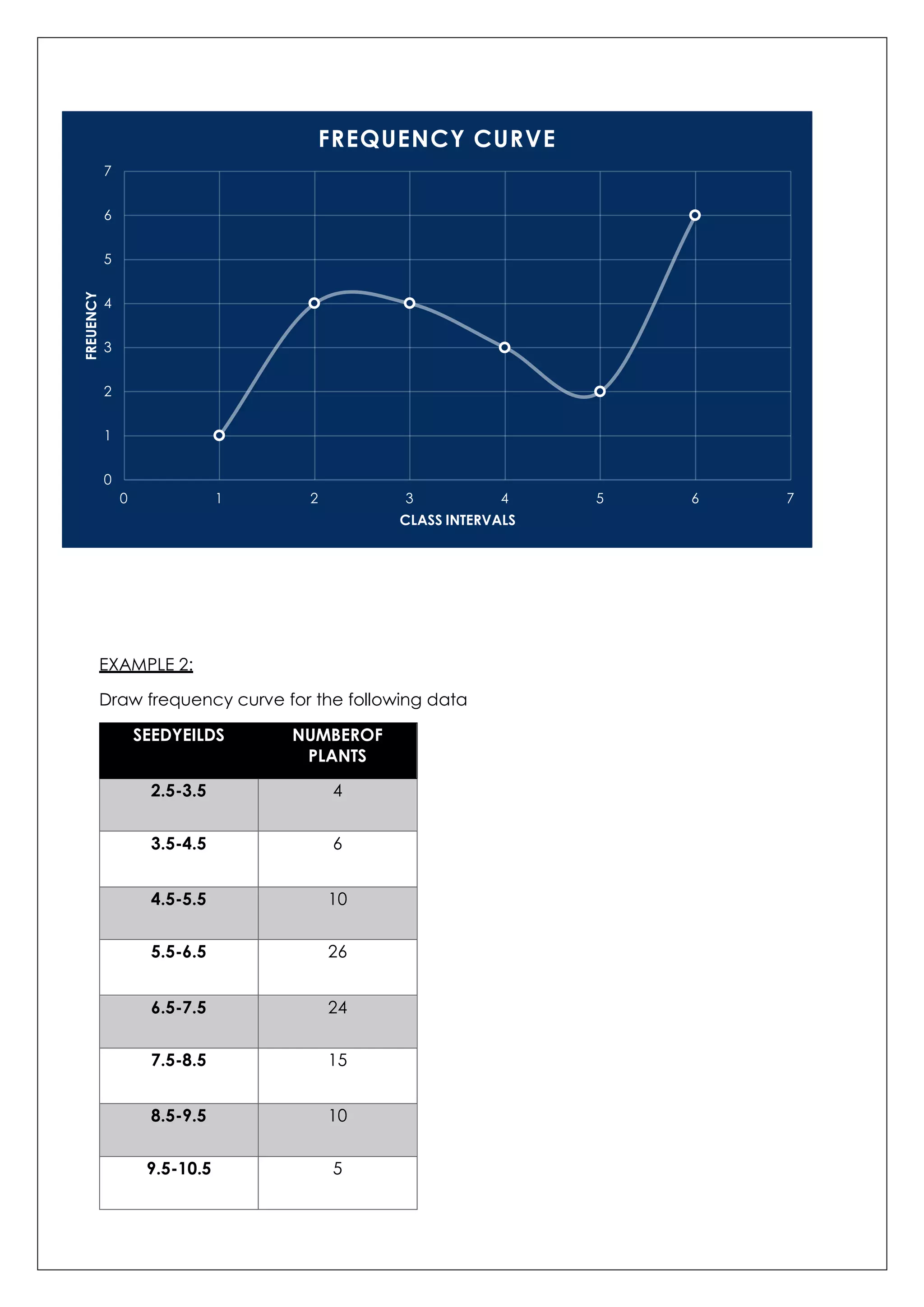
Explains frequency curves, compares with frequency polygons, and presents plotting methodologies.
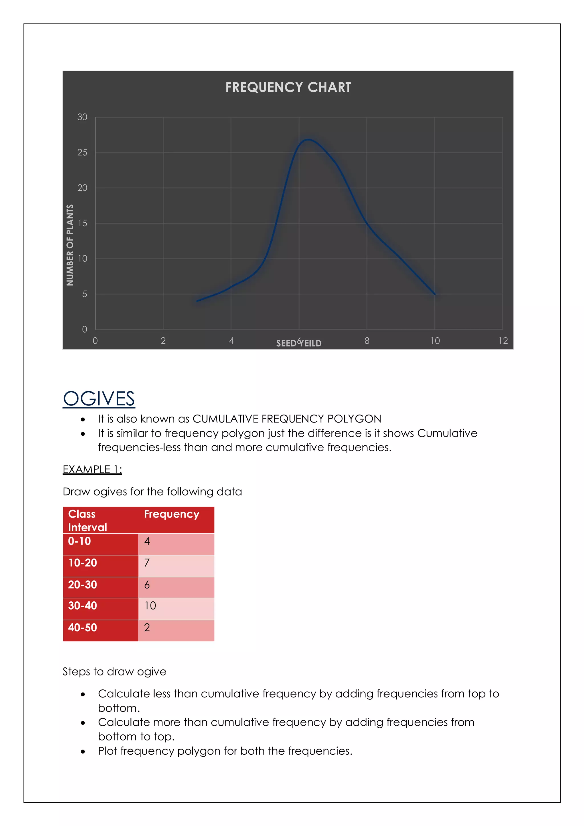
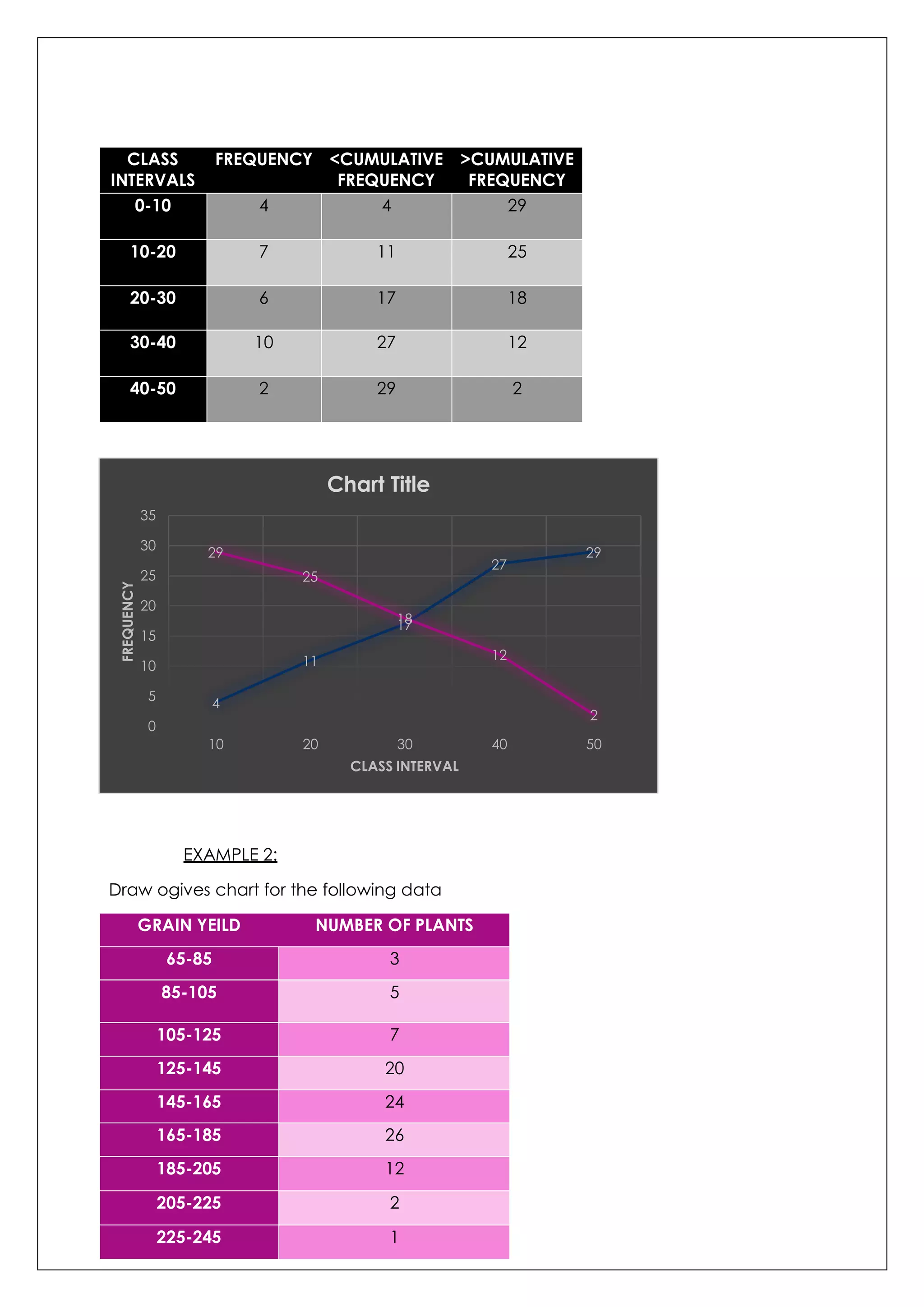
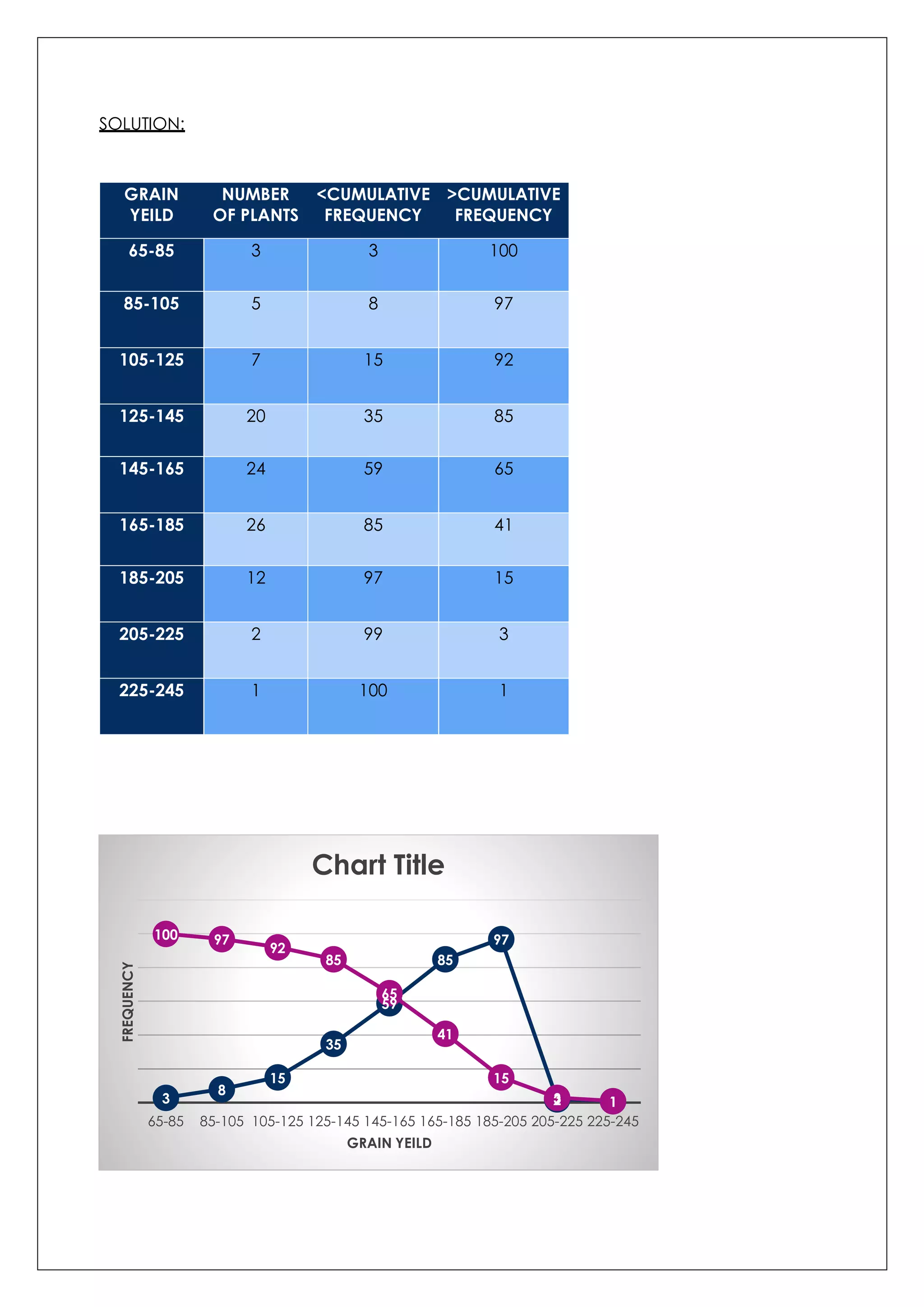
Defines ogives, including methods for drawing cumulative frequency diagrams with practical examples.


![[DSC Europe 25] Boris Perkovic - Lost in performance.pptx](https://cdn.slidesharecdn.com/ss_thumbnails/uq5hrp7vsuahqkxzifux-1-251204082258-fd2ee09d-thumbnail.jpg?width=640&height=640&fit=bounds)
![[DSC Europe 25] Jim Sterne - Adopting Generative AI Capabilities Into the Ent...](https://cdn.slidesharecdn.com/ss_thumbnails/sxhpofuorcagxsaulkmt-3-251204082258-7e66bc48-thumbnail.jpg?width=640&height=640&fit=bounds)


![[DSC Europe 25] Vid Stimac - Policy Parsimony: Between Oversimplifying and Ov...](https://cdn.slidesharecdn.com/ss_thumbnails/eqlepagzqp2rhg3gbluh-dsc-stimac-251120-251205090438-059e7f54-thumbnail.jpg?width=640&height=640&fit=bounds)
![[DSC Europe 25] Petar Zivanov - AI meets documents From chatbots to AI-powere...](https://cdn.slidesharecdn.com/ss_thumbnails/xer2bb6nrdc8pdpev0pc-8-251204082258-7c2fa4a1-thumbnail.jpg?width=640&height=640&fit=bounds)
![[DSC Europe 25] Bogdan Daniel Maruneac - AI - It starts with you.pptx](https://cdn.slidesharecdn.com/ss_thumbnails/odov3snhrcqs9hx5ny2n-4-251205085715-f1daacfe-thumbnail.jpg?width=640&height=640&fit=bounds)