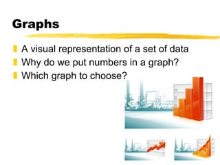
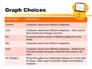
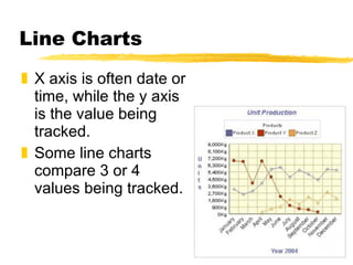
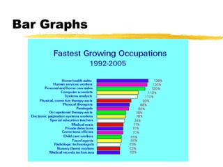
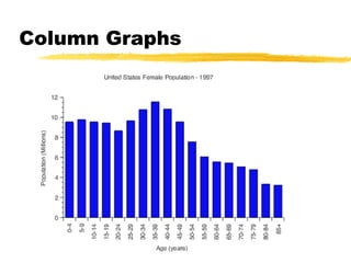
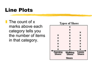
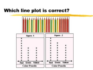
Line & Bar Graphs Objectives: To understand when to use line & bar graphs To understand how to create line & bar graphs Frameworks:  10.D.1
Graphs A visual representation of a set of data Why do we put numbers in a graph? Which graph to choose?
Graph Choices Chart Type Description Column Compares values from different categories. Line Compares values from different categories.  Often used to show trends and changes over time. Pie Compares relative values of different categories to the whole. Bar Compares values from different categories. Area Compares values from different categories.  Similar to the line chart except that areas under the lines contain a fill color. XY (Scatter) Shows the patterns or relationship between 2 or more sets of values.  Often used in scientific studies and statistical analyses.
Line Charts X axis is often date or time, while the y axis is the value being tracked. Some line charts compare 3 or 4 values being tracked.
Bar Graphs
Column Graphs
Line Plots The count of x marks above each category tells you the number of items in that category.
Which line plot is correct?
Do Worksheets Homework:  more worksheets

Line & Bar Graphs 97

  • 1.
    Line & BarGraphs Objectives: To understand when to use line & bar graphs To understand how to create line & bar graphs Frameworks: 10.D.1
  • 2.
    Graphs A visualrepresentation of a set of data Why do we put numbers in a graph? Which graph to choose?
  • 3.
    Graph Choices ChartType Description Column Compares values from different categories. Line Compares values from different categories. Often used to show trends and changes over time. Pie Compares relative values of different categories to the whole. Bar Compares values from different categories. Area Compares values from different categories. Similar to the line chart except that areas under the lines contain a fill color. XY (Scatter) Shows the patterns or relationship between 2 or more sets of values. Often used in scientific studies and statistical analyses.
  • 4.
    Line Charts Xaxis is often date or time, while the y axis is the value being tracked. Some line charts compare 3 or 4 values being tracked.
  • 5.
  • 6.
  • 7.
    Line Plots Thecount of x marks above each category tells you the number of items in that category.
  • 8.
    Which line plotis correct?
  • 9.
    Do Worksheets Homework: more worksheets