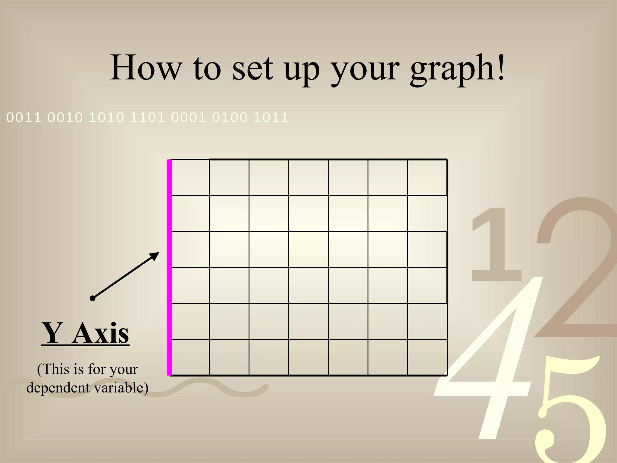
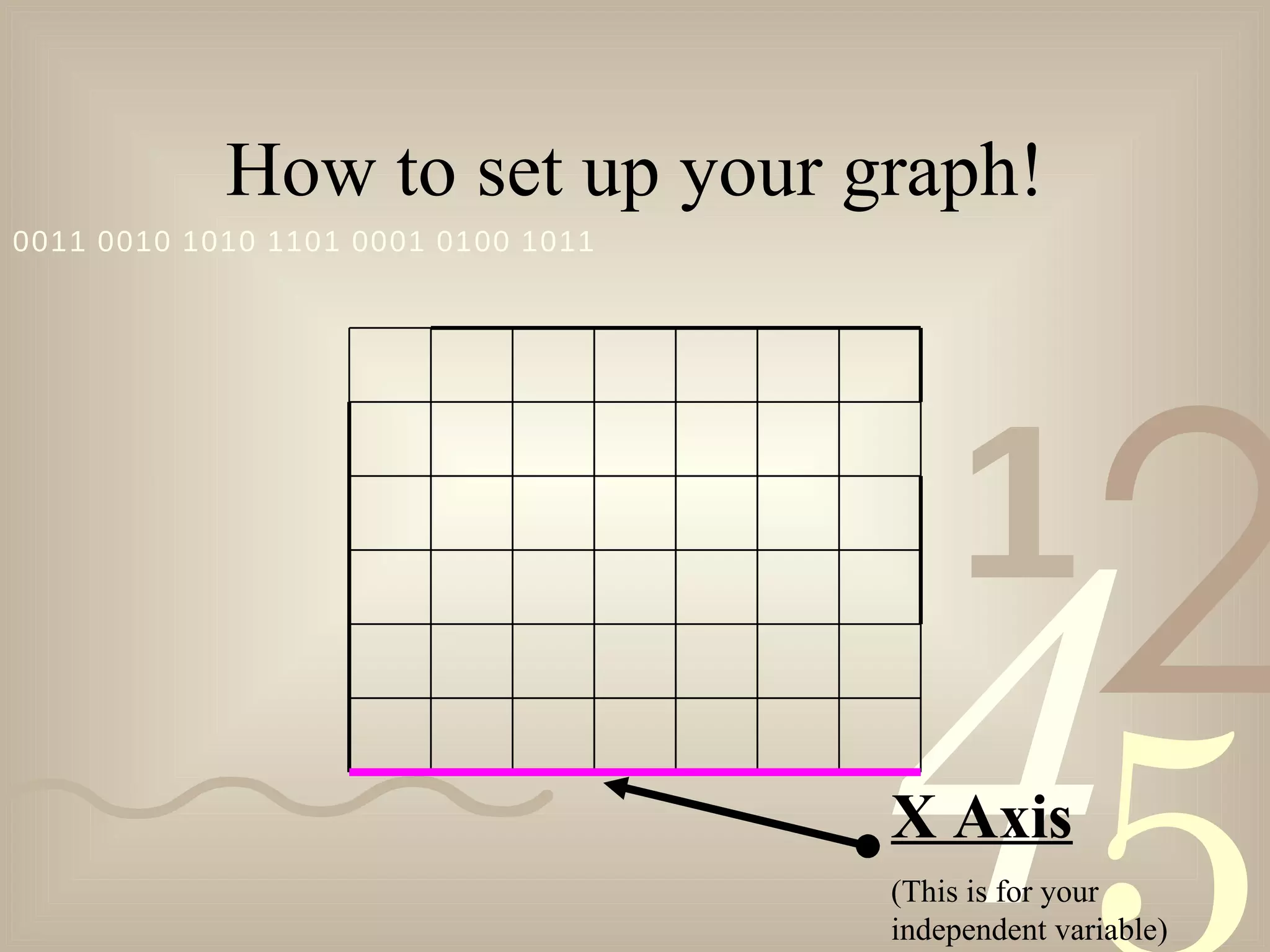
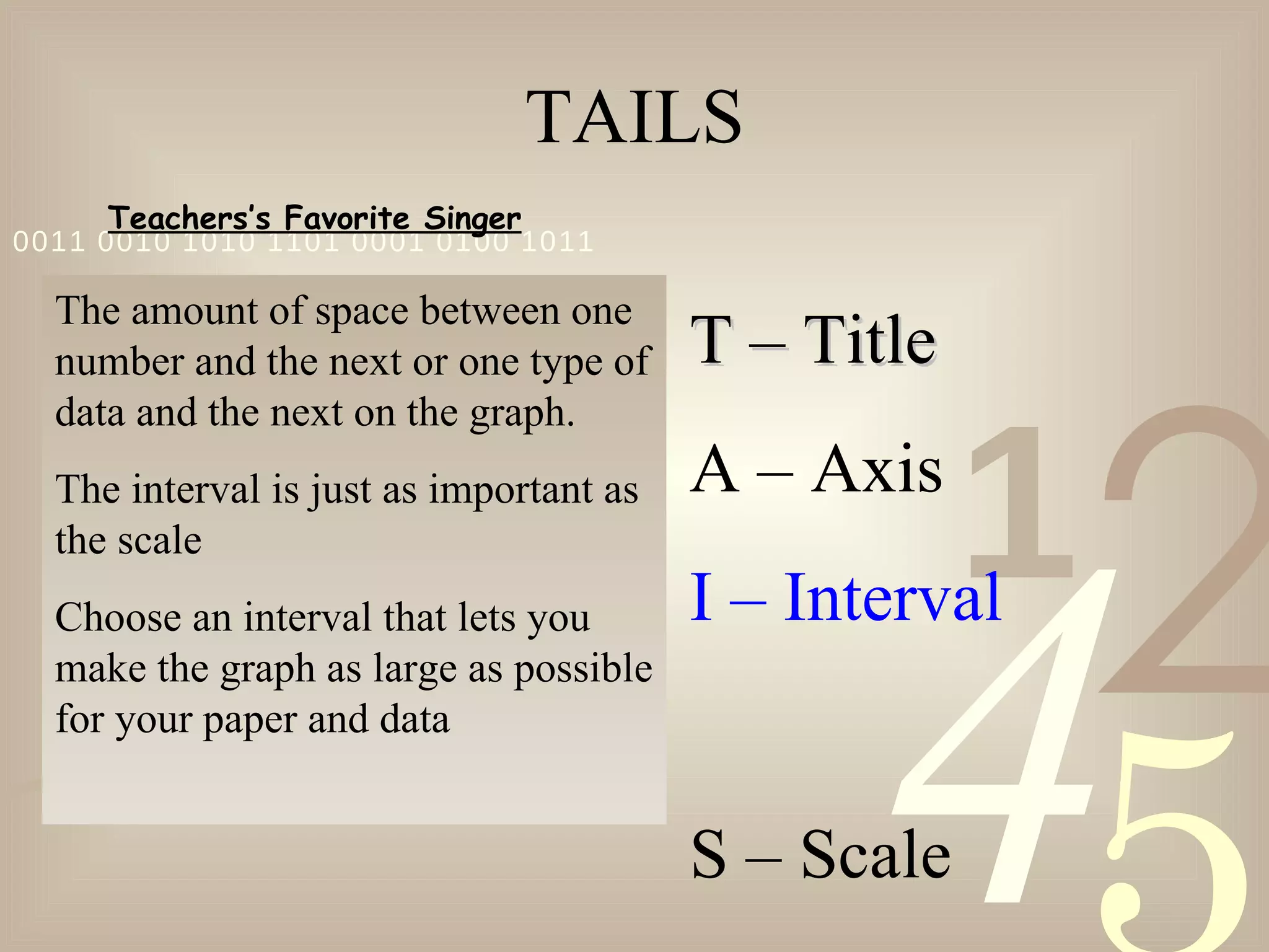
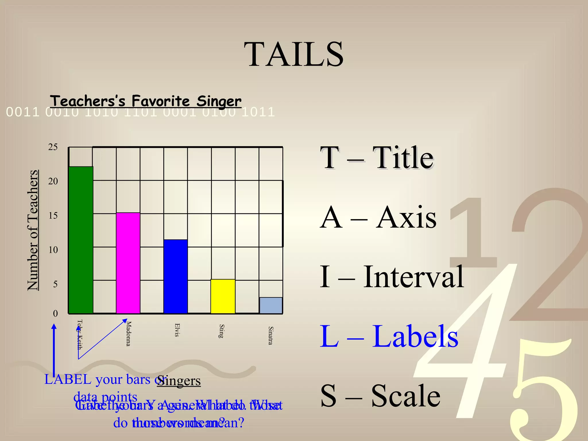
The document provides instructions for setting up a bar graph, including:
1) Labeling the x-axis (independent variable) and y-axis (dependent variable) with appropriate titles and scales.
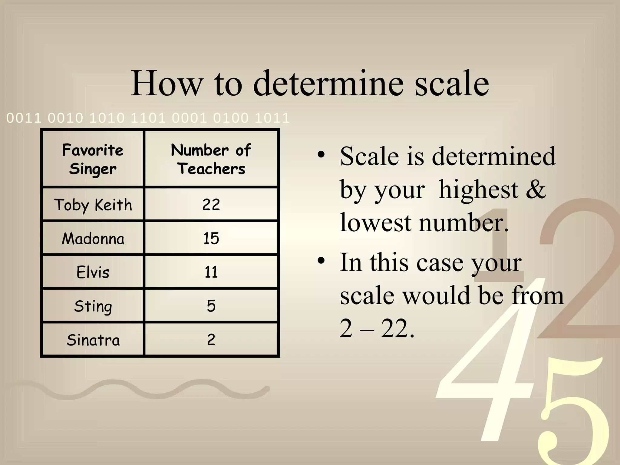
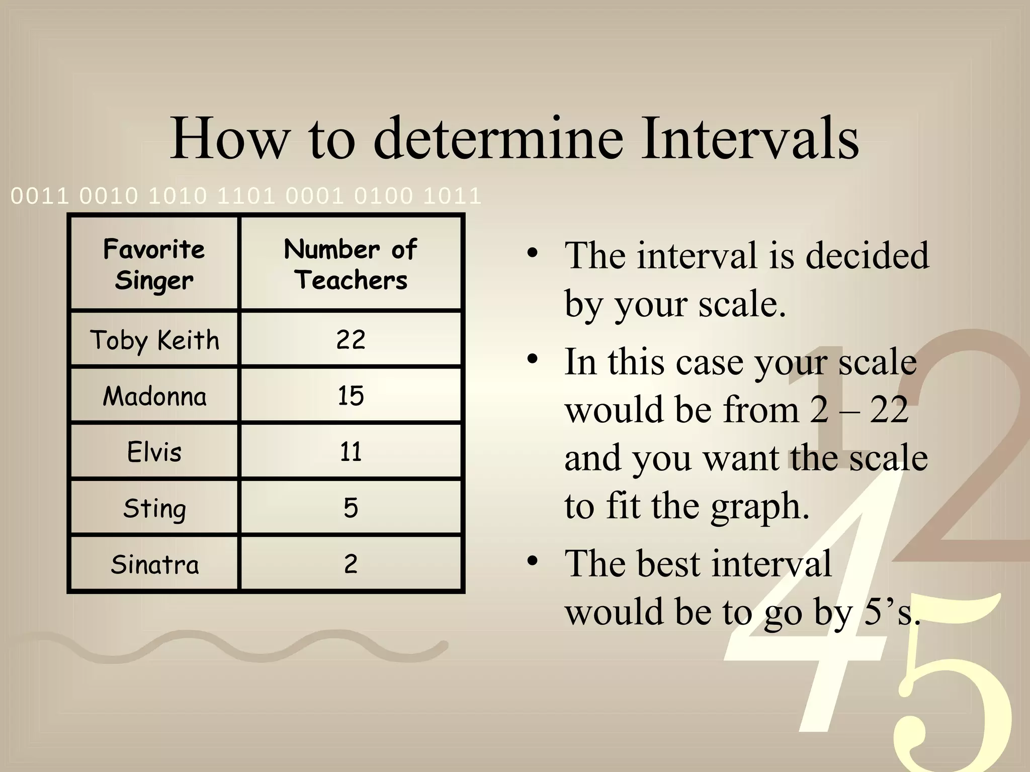
2) Choosing an appropriate scale and interval for accurate representation of the data.
3) Properly labeling bars, data points, and axes to clearly convey the meaning and units of measurement for readers.