Downloaded 830 times
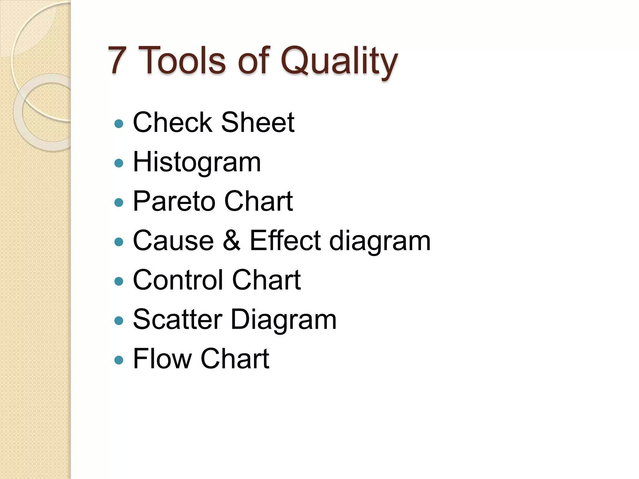
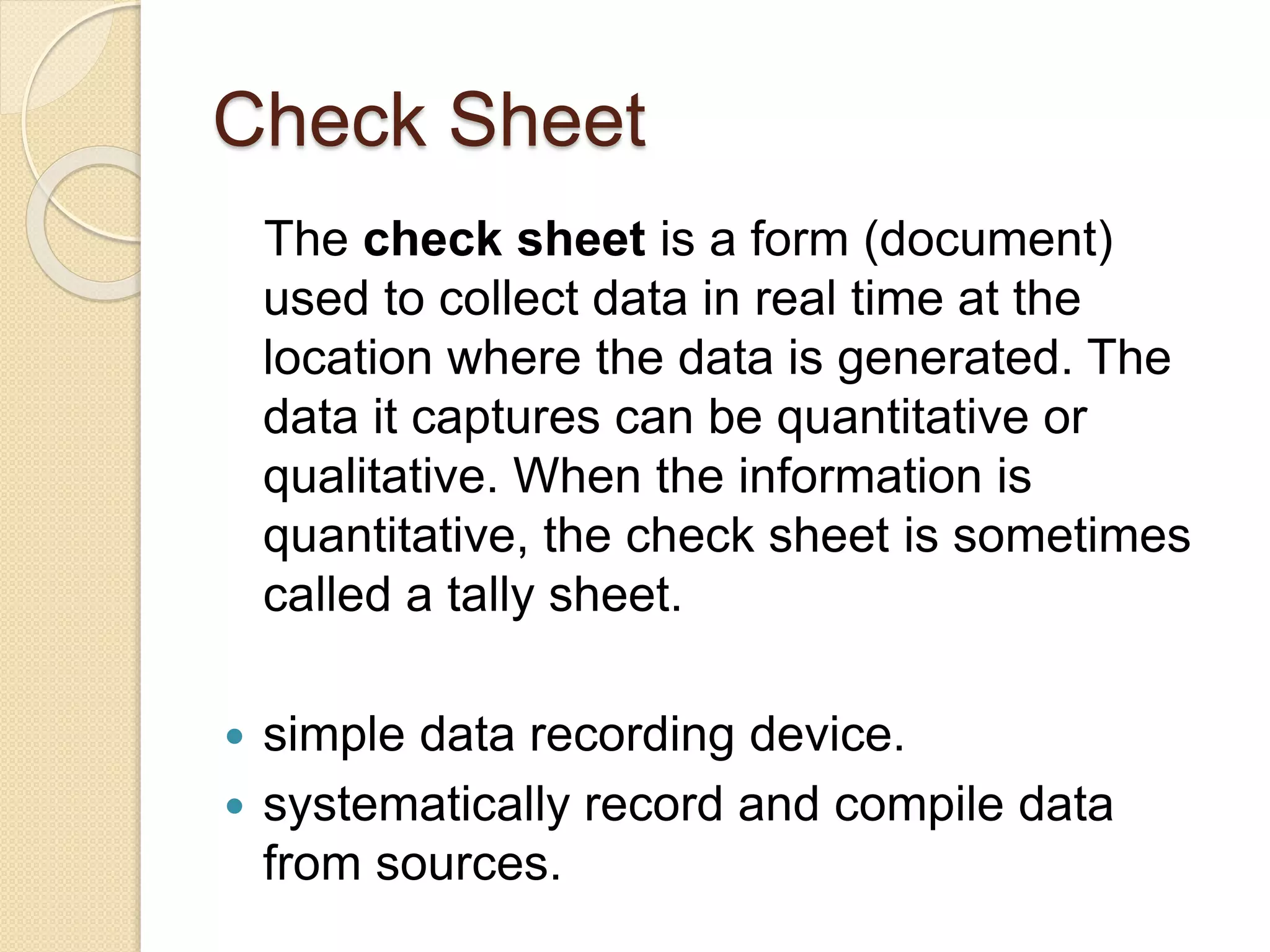
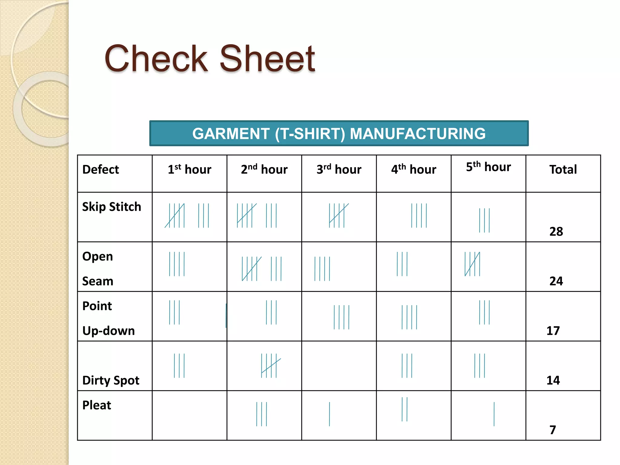
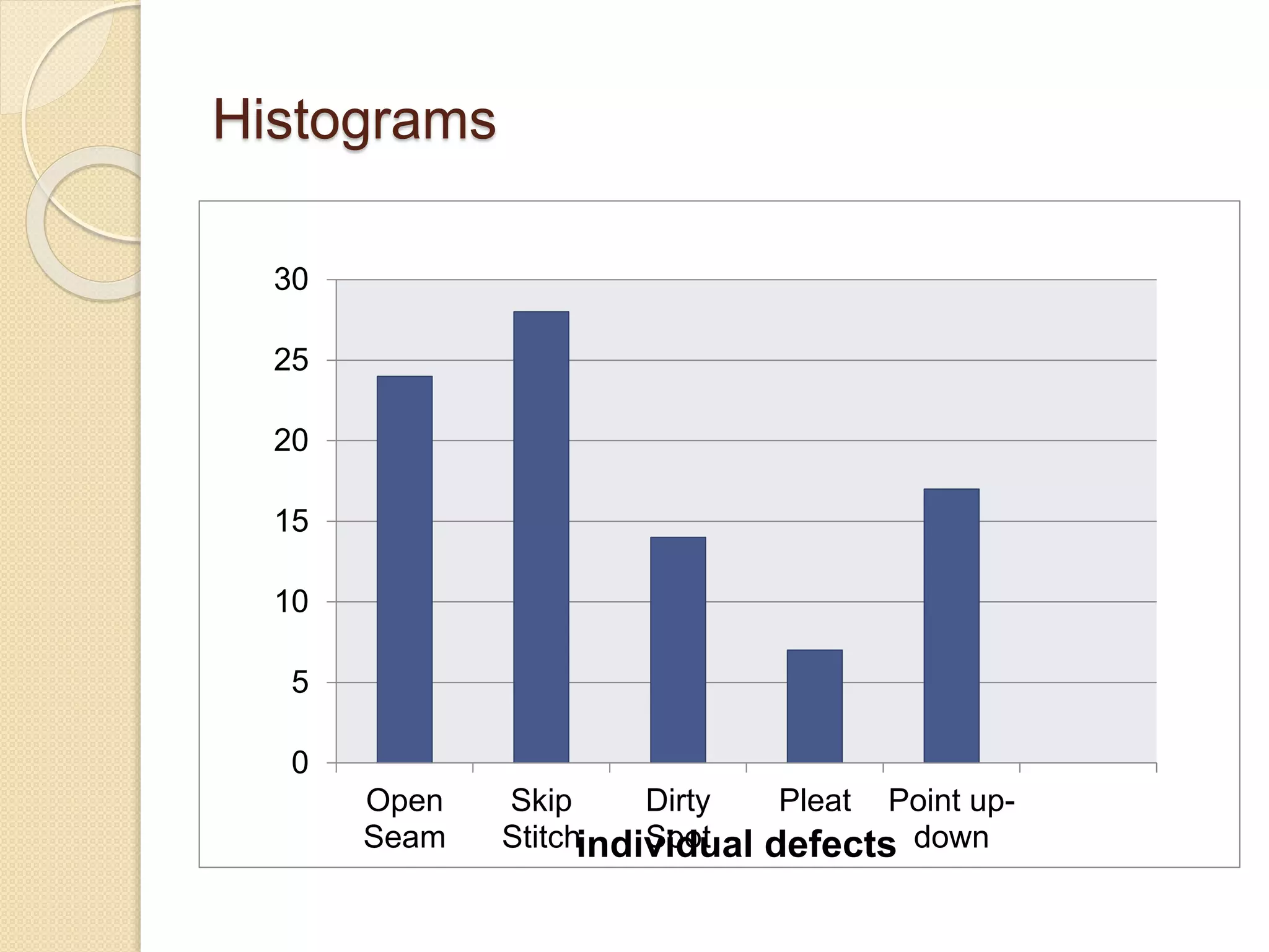
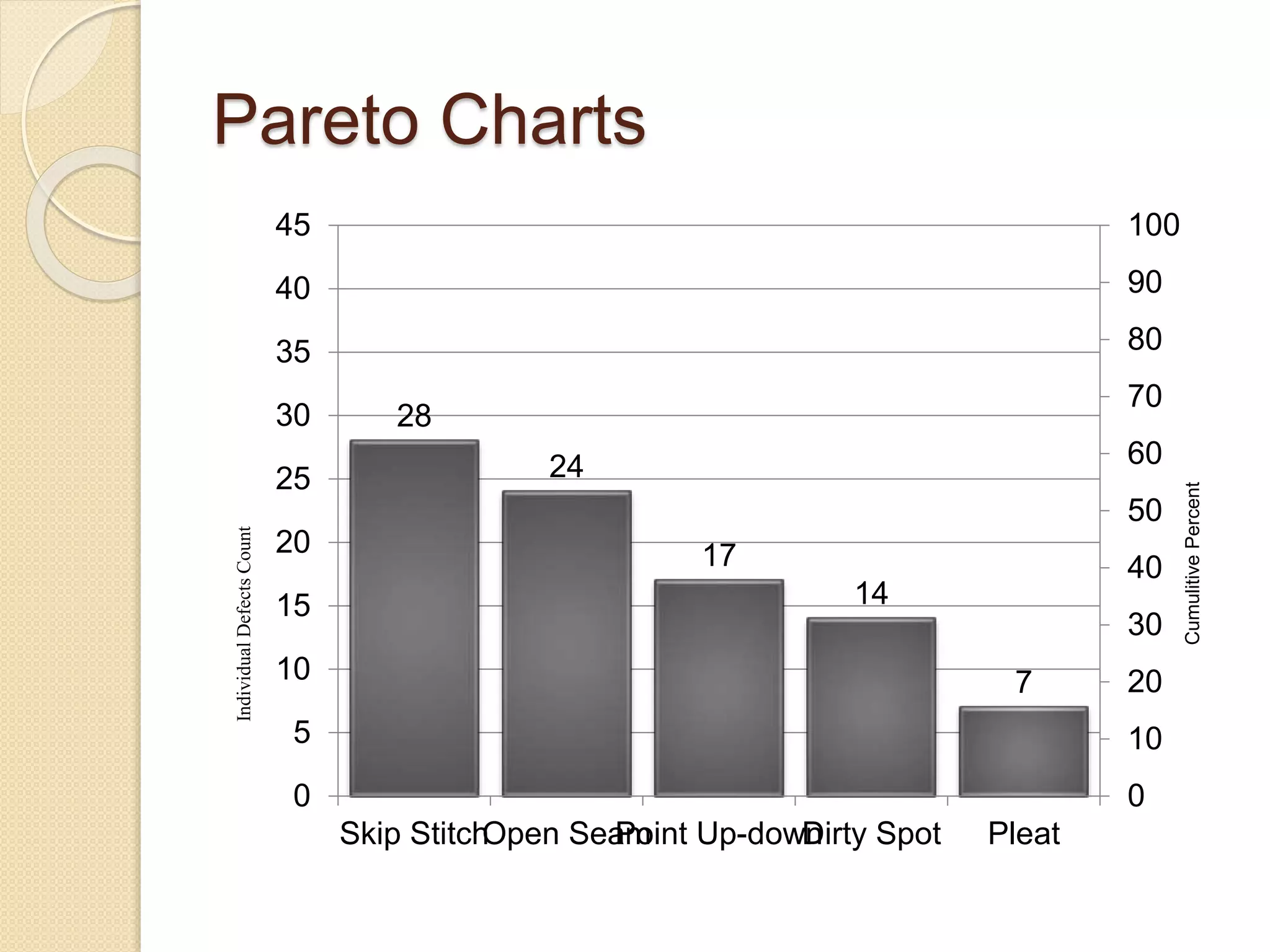
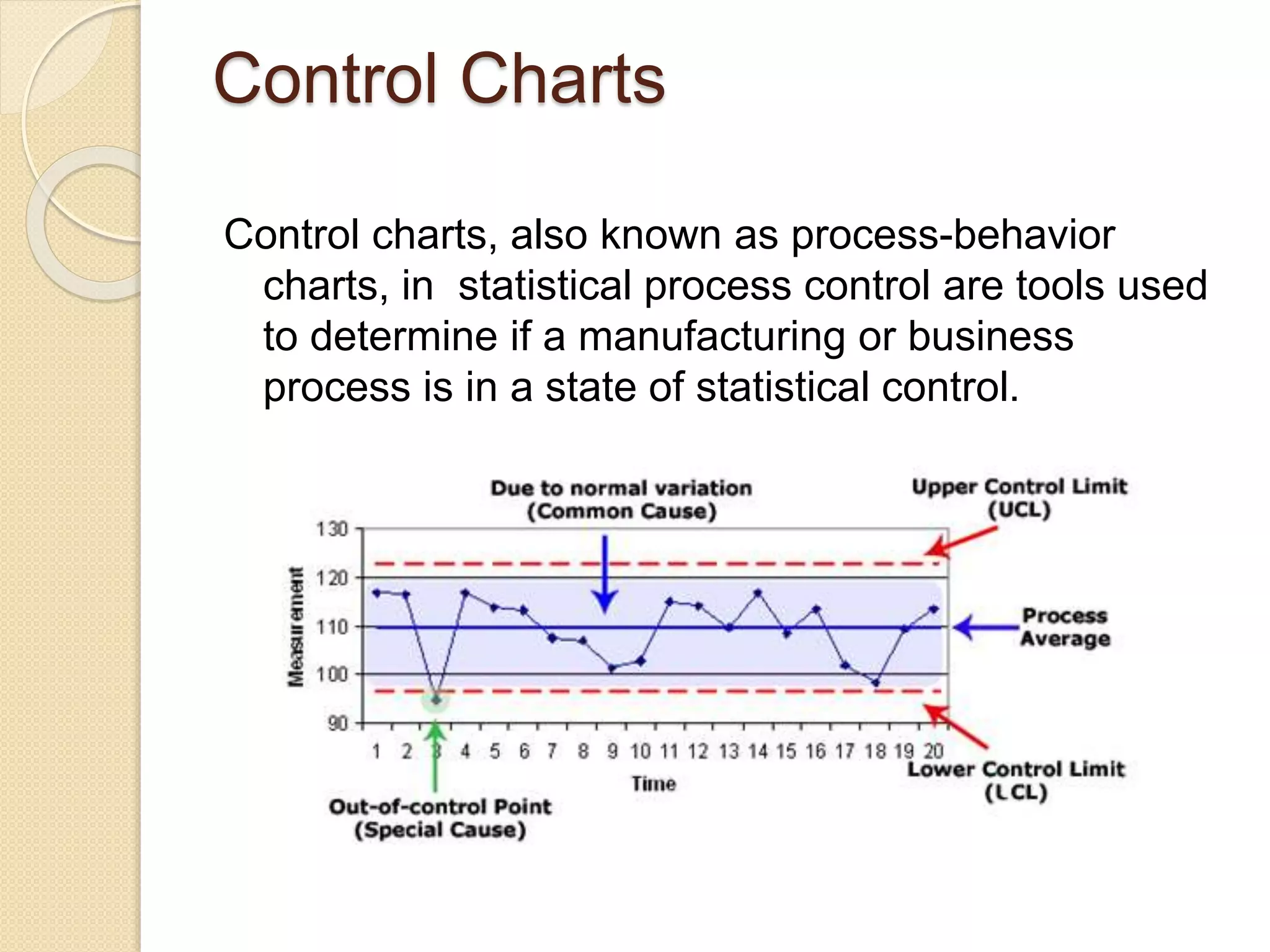
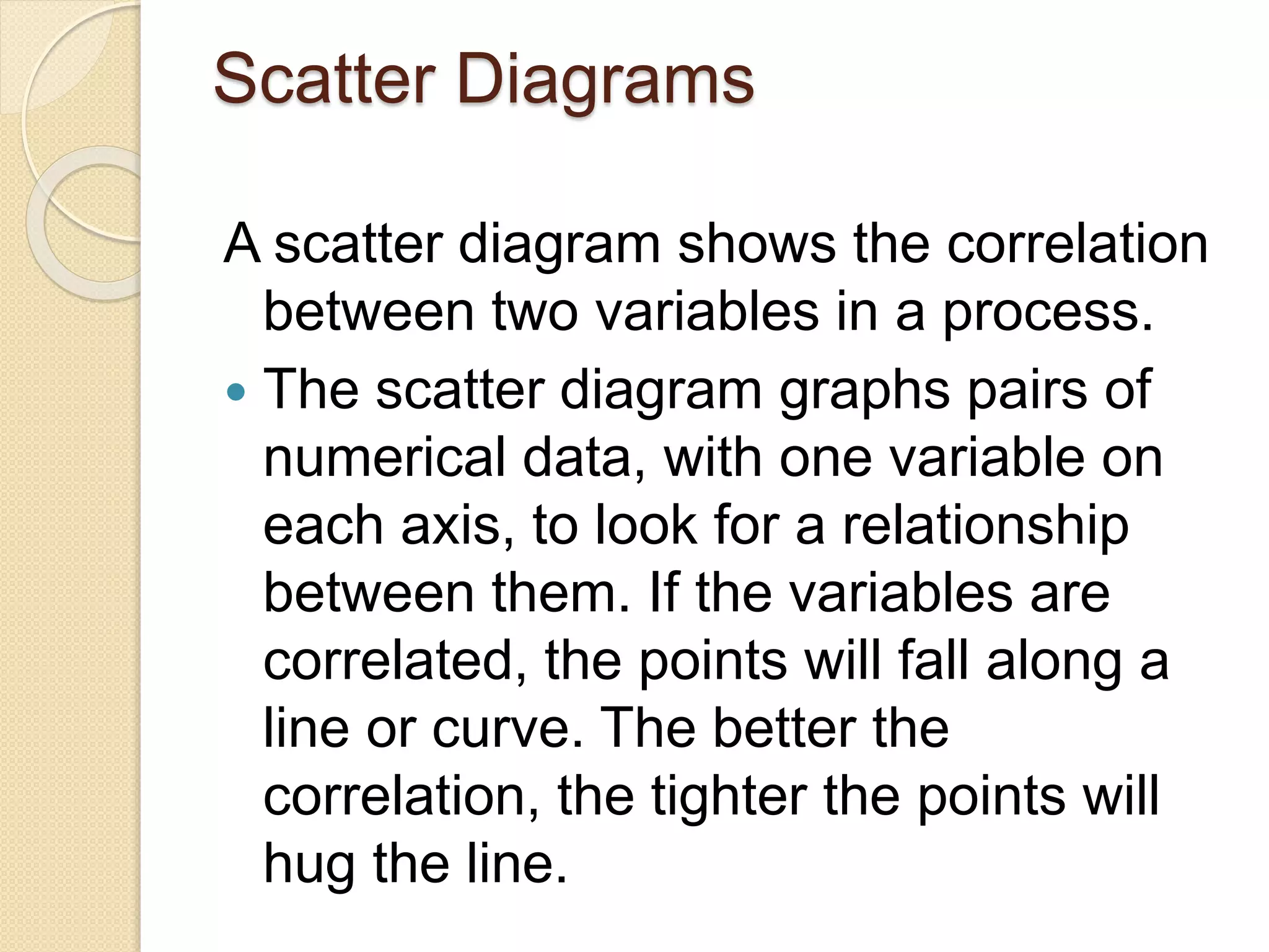
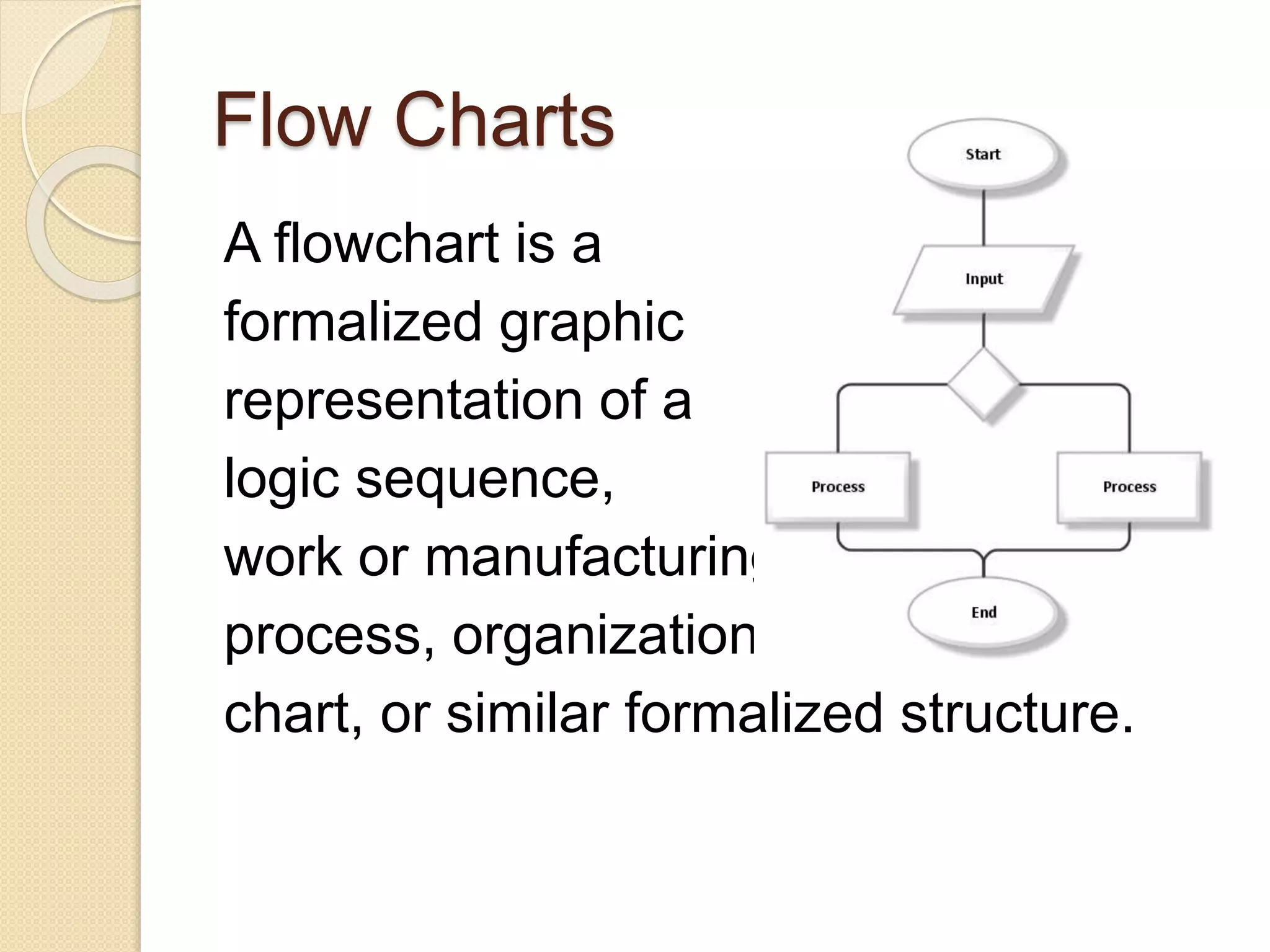

This document discusses various quality tools including check sheets, histograms, Pareto charts, cause and effect diagrams, control charts, scatter diagrams, and flow charts. It provides examples and definitions of each tool. Check sheets are used to systematically record data and a sample check sheet on garment defects is shown. Histograms and Pareto charts are used to analyze and prioritize defects found. Cause and effect diagrams help determine the root causes of problems. Control charts monitor process control and scatter diagrams show the relationship between variables. Flow charts map out process sequences.


![7 qc tools training material[1]](https://cdn.slidesharecdn.com/ss_thumbnails/7qctoolstrainingmaterial1-120925054558-phpapp02-thumbnail.jpg?width=640&height=640&fit=bounds)


![7 Quality Control Tools (SQC Model) [MARCH 2009]](https://cdn.slidesharecdn.com/ss_thumbnails/cfakepath7qctools-100630225608-phpapp01-thumbnail.jpg?width=640&height=640&fit=bounds)


![7 qc tools[1] to print](https://cdn.slidesharecdn.com/ss_thumbnails/7qctools1toprint-191017092858-thumbnail.jpg?width=640&height=640&fit=bounds)


