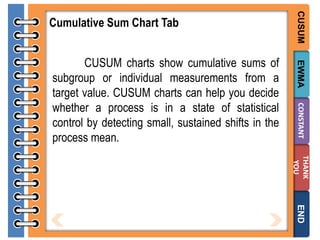
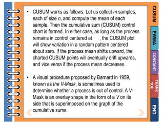
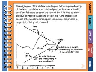
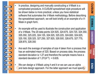
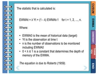
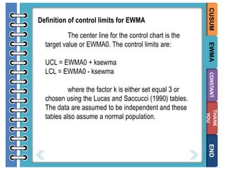
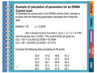
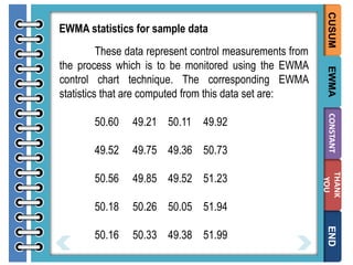
Downloaded 907 times

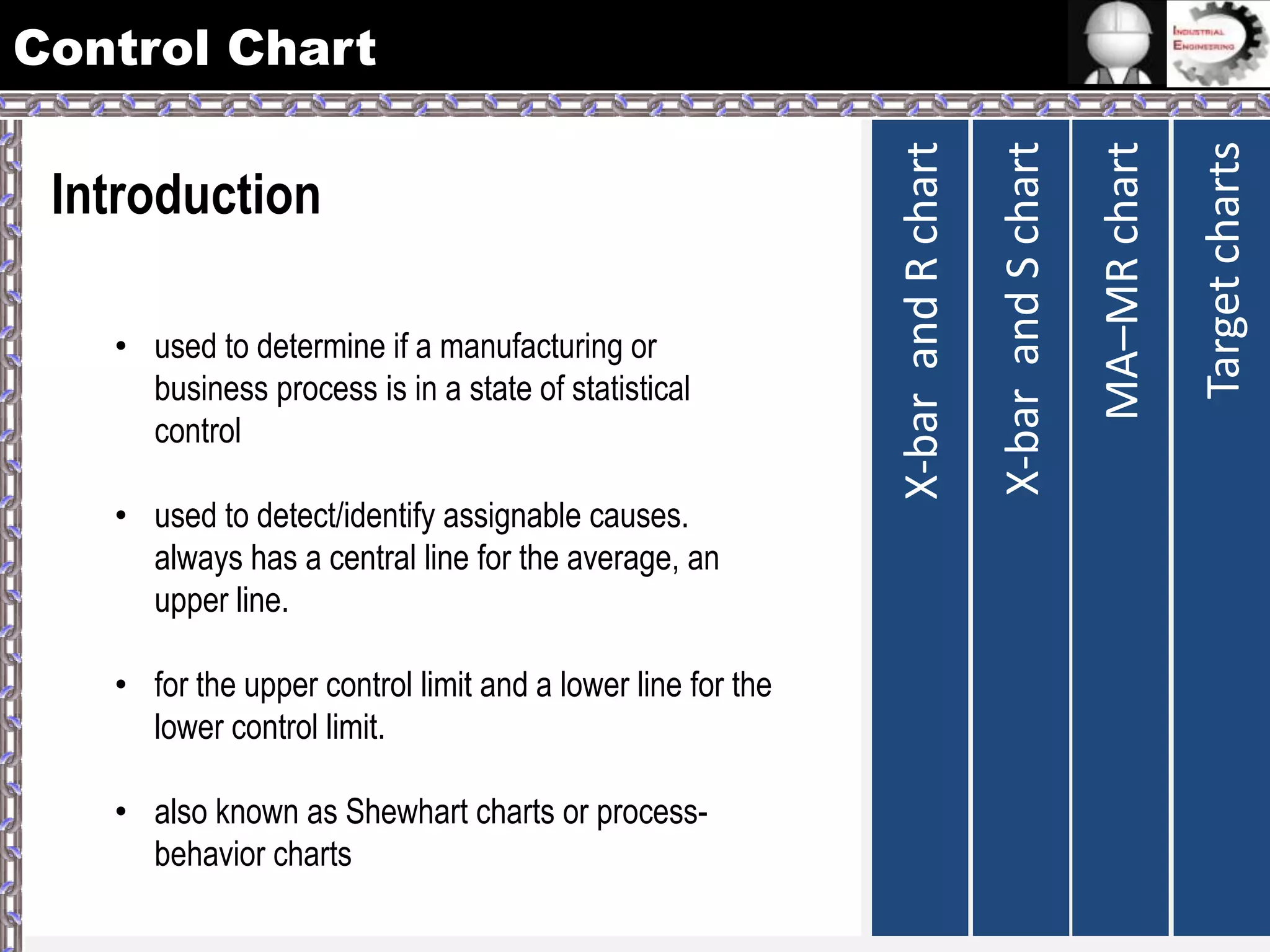
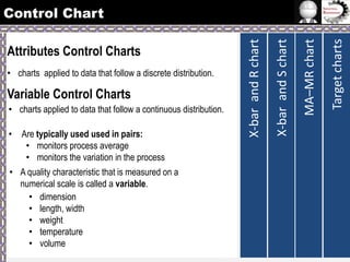
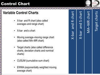
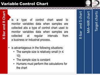
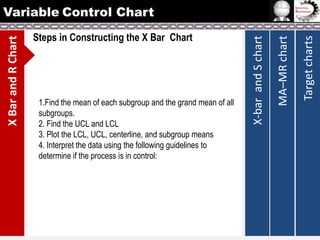
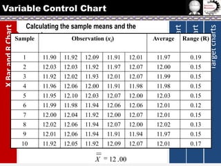
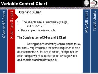
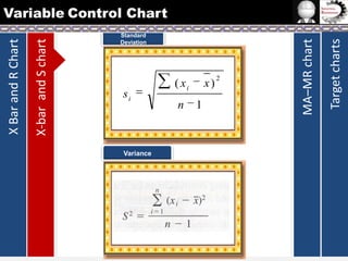
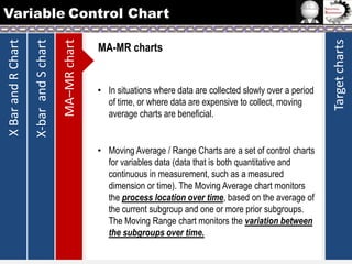
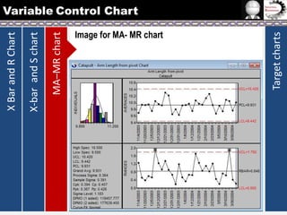
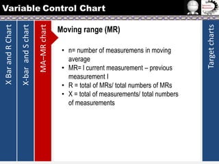
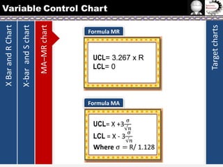
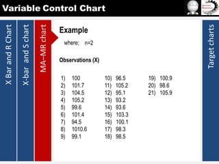
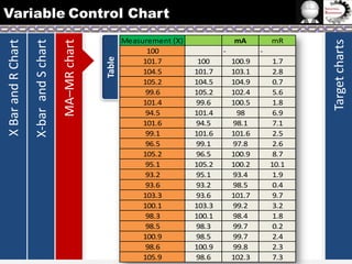
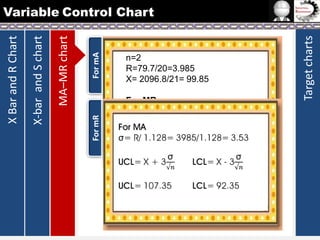
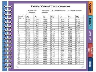


The document provides information on different types of control charts used for statistical process control, including X-bar and R charts, X-bar and S charts, and moving average-moving range (MA-MR) charts. X-bar and R charts monitor both the average value and variation in a process over time using subgroup means and ranges. The construction process, chart interpretation, and an example are described. X-bar and S charts are similar but use standard deviation instead of range. MA-MR charts are beneficial when data is collected slowly over time using moving averages and ranges to monitor process location and variation.


![Control Charts[1]](https://cdn.slidesharecdn.com/ss_thumbnails/controlcharts1-1226081330857138-9-thumbnail.jpg?width=640&height=640&fit=bounds)


![Control Charts[1]](https://cdn.slidesharecdn.com/ss_thumbnails/controlcharts1-1226961283054520-8-thumbnail.jpg?width=640&height=640&fit=bounds)
![Control charts[1]](https://cdn.slidesharecdn.com/ss_thumbnails/controlcharts1-100924110931-phpapp01-thumbnail.jpg?width=640&height=640&fit=bounds)


