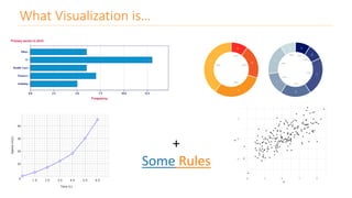
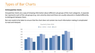
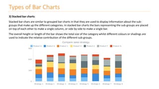
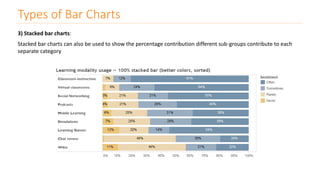
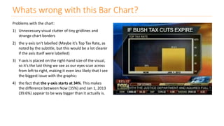
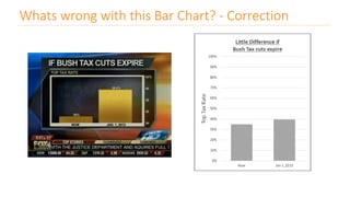
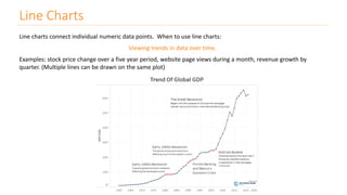
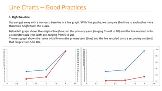
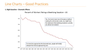
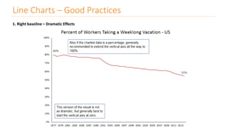
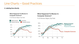
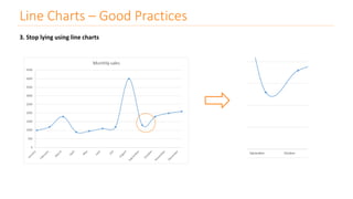
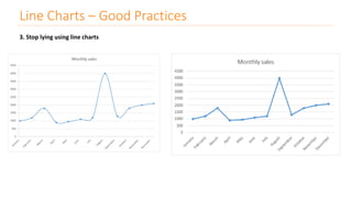
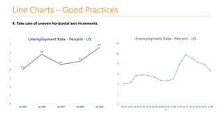
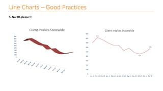
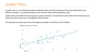
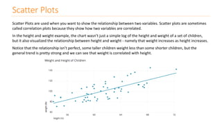
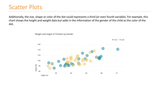
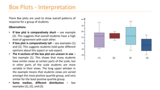
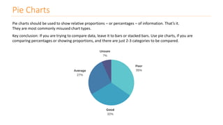
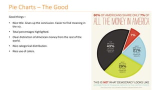
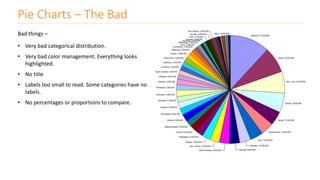
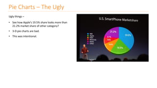
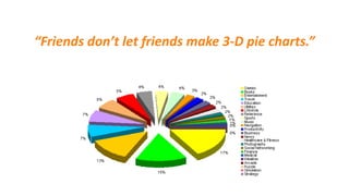
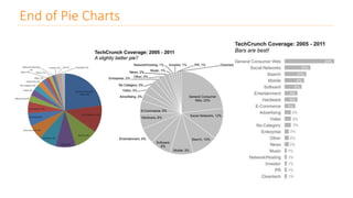
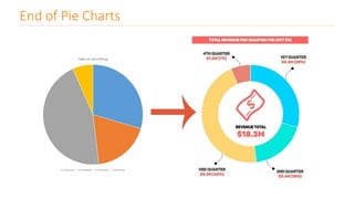
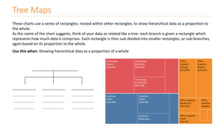
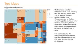
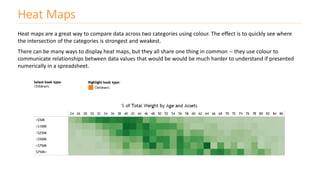
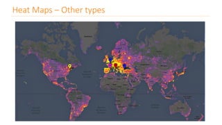
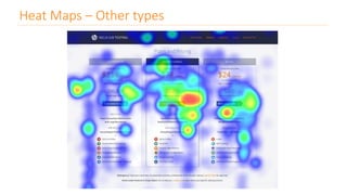
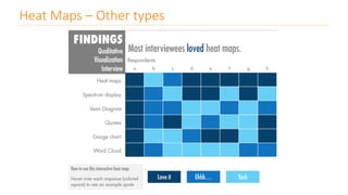
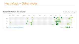
Lesson 8
Visualizations - I Kush Kulshrestha
“Most of us need to listen to the
music to understand how
beautiful it is. But often that’s
how we present statistics: we just
show the notes, we don’t play the
music.”
- Hans Rosling
“You can have piles of facts and
still fail to resonate. Its not the
information itself that is
important but the emotional part
of that information.”
- Nancy Duarte
What people think Visualization is…
What Visualization is…
+
Some Rules
data visualization
a primary goal of data visualization is to communicate information clearly and efficiently to
users via the statistical graphics, plots, information graphics, tables, and charts selected
the visual representation of data
the purpose of visualization is insight, not pictures
Type of Charts
Bar Charts
Bar Charts
- One of the most common ways to visualize data.
- It’s quick to compare information, revealing highs and lows at a glance.
Bar charts are especially effective when you have numerical data that splits nicely into different categories so you
can quickly see trends within your data.
When to use bar charts: Comparing data across categories.
Examples: Volume of shirts in different sizes, website traffic by origination site, percent of spending by department.
What types of data can be displayed using a bar chart? - Nominal or Ordinal categories.
- Nominal data are categorised according to descriptive or qualitative information such as county of birth, or
subject studied at university.
- Ordinal data are similar but the different categories can also be ranked, for example in a survey people may be
asked to say whether they thought something was very poor, poor, fair, good or very good.
Types of Bar Charts
1) Simple bar charts:
The chart is constructed such that the lengths of the different bars are proportional to the size of the category they
represent. The x-axis represents the different categories and so has no scale. In order to emphasise the fact that the
categories are discrete, a gap is left between the bars on the x-axis.
Types of Bar Charts
2) Horizontal bar charts:
The chart is constructed so that the bars are horizontal which means that the longer the bar, the larger the category.
This is a particularly effective way of presenting data when the different categories have long titles that would be
difficult to include below a vertical bar, or when there are a large number of different categories and there is
insufficient space to fit all the columns required for a vertical bar chart across the page.
Types of Bar Charts
3) Grouped bar charts:
Grouped bar charts are a way of showing information about different sub-groups of the main categories. A separate
bar represents each of the sub-groups (e.g. civic amenity sites) and these are usually coloured or shaded differently
to distinguish between them.
But care needs to be taken to ensure that the chart does not contain too much information making it complicated
to read and interpret.
Types of Bar Charts
3) Stacked bar charts:
Stacked bar chars are similar to grouped bar charts in that they are used to display information about the sub-
groups that make up the different categories. In stacked bar charts the bars representing the sub-groups are placed
on top of each other to make a single column, or side by side to make a single bar.
The overall height or length of the bar shows the total size of the category whilst different colours or shadings are
used to indicate the relative contribution of the different sub-groups.
Types of Bar Charts
3) Stacked bar charts:
Stacked bar charts can also be used to show the percentage contribution different sub-groups contribute to each
separate category
Whats wrong with this Bar Chart?
One rule of data visualization that is broken too often: when it comes to bar charts, the y-axis must begin at zero.
When our eyes interpret bar charts, we are comparing the relative heights of the bars. When we cut the height off
at something greater than zero, it skews this visual comparison, over-emphasizing the difference between the bars
in a way that simply isn't honest.
Whats wrong with this Bar Chart?
Problems with the chart:
1) Unnecessary visual clutter of tiny gridlines and
strange chart borders
2) the y-axis isn't labelled (Maybe it's Top Tax Rate, as
noted by the subtitle, but this would be a lot clearer
if the axis itself were labelled)
3) Y-axis is placed on the right-hand size of the visual,
so it's the last thing we see as our eyes scan across
from left to right, making it even less likely that I see
the biggest issue with the graphic:
4) the fact that the y-axis starts at 34%. This makes
the difference between Now (35%) and Jan 1, 2013
(39.6%) appear to be way bigger than it actually is.
Whats wrong with this Bar Chart? - Correction
Type of Charts
Line Charts
Line Charts
Line charts connect individual numeric data points. When to use line charts:
Viewing trends in data over time.
Examples: stock price change over a five year period, website page views during a month, revenue growth by
quarter. (Multiple lines can be drawn on the same plot)
Line Charts
S.S. Stevens mentioned, we can consider that line graphs can be used only with those categorical variables that:
1. Have an intrinsic order,
2. The change (difference) between consecutive items makes sense, and
3. All the changes between consecutive items have a similar meaning.
A short list of examples of categories that can or cannot be used with a line chart:
- January, February, March (it works, intrinsic order, difference between any two consecutive items is 1 month)
- January, February, September (it doesn’t work, intrinsic order is there, yet the difference between February and
January is 1 month, but between September and February the difference is 7 months)
- Monday, Tuesday, Wednesday (it works, intrinsic order, difference between any two consecutive items is 1 day)
- 1, 2, 3 (it works)
- 2, 1, 3 (it doesn’t work, not ordered)
- 1, 2, 4 (it does not work, order exists, but the difference between consecutive elements is different)
- 3, 2, 1 (it still works, descending order, the difference between consecutive elements is -1)
- Apple, Oranges, Pineapples (doesn’t work, no intrinsic order)
- 1st Oranges, 2nd Apples, 3rd Pineapples (it works, the rank is actually the categorical variable)
- 1, 10, 100, 1000 (it works, logarithmic scale, but does not fit into S.S. Stevens' classification)
- 1, 1/2, 1/3, 1/4 (it also works, fractional scale, but does not fit into S.S. Stevens' classification)
Line Charts – Good Practices
1. Right baseline
You can get away with a non-zero baseline in a line graph. With line graphs, we compare the lines to each other more
than their height from the x-axis.
Below left graph shows the original line (blue) on the primary y-axis (ranging from 0 to 20) and the line rescaled onto
a secondary axis (red; with axis ranging from 5 to 20).
The next graph shows the same initial line on the primary axis (blue) and the line rescaled onto a secondary axis (red)
that ranges from 5 to 105.
Line Charts – Good Practices
1. Right baseline – Dramatic Effects
Line Charts – Good Practices
1. Right baseline – Dramatic Effects
2. Labeling lines directly
Line Charts – Good Practices
3. Stop lying using line charts
Line Charts – Good Practices
3. Stop lying using line charts
Line Charts – Good Practices
4. Take care of uneven horizontal axis increments.
Line Charts – Good Practices
5. No 3D please !!
Line Charts – Good Practices
Type of Charts
Scatter Plots
Scatter Plots
A scatter plot is a two-dimensional data visualization that uses dots to represent the values obtained for two
different variables - one plotted along the x-axis and the other plotted along the y-axis.
Scatter plots are an effective way to give you a sense of trends, concentrations and outliers that will direct you to
where you want to focus your investigation efforts further.
For example this scatter plot shows the height and weight of a fictitious set of children.
Scatter Plots
Scatter Plots are used when you want to show the relationship between two variables. Scatter plots are sometimes
called correlation plots because they show how two variables are correlated.
In the height and weight example, the chart wasn’t just a simple log of the height and weight of a set of children,
but it also visualized the relationship between height and weight - namely that weight increases as height increases.
Notice that the relationship isn’t perfect, some taller children weight less than some shorter children, but the
general trend is pretty strong and we can see that weight is correlated with height.
Scatter Plots
Additionally, the size, shape or color of the dot could represents a third (or even fourth variable). For example, this
chart shows the height and weight data but adds in the information of the gender of the child as the color of the
dot.
Type of Charts
Box Plots
Box Plots
Sometimes also called Box and Whisker plot are an important way to show distributions of data.
The name refers to the two parts of the
plot:
the box,
which contains the median of the data
along with the 1st and 3rd quartiles
(25% greater and less than the median),
and the whiskers,
which typically represents data within
1.5 times the Inter-quartile Range (the
difference between the 1st and 3rd
quartiles).
Box Plots - Interpretation
There Box plots are used to show overall patterns of
response for a group of students.
Observations:
• If box plot is comparatively short – see example
(2). This suggests that overall students have a high
level of agreement with each other.
• If box plot is comparatively tall – see examples (1)
and (3). This suggests students hold quite different
opinions about this aspect or sub-aspect.
• The 4 sections of the box plot are uneven in size –
See example (1). This shows that many students
have similar views at certain parts of the scale, but
in other parts of the scale students are more
variable in their views. The long upper whisker in
the example means that students views are varied
amongst the most positive quartile group, and very
similar for the least positive quartile group.
• Same median, different distribution – See
examples (1), (2), and (3).
Type of Charts
Pie Charts
Pie Charts
Pie charts should be used to show relative proportions – or percentages – of information. That’s it.
They are most commonly misused chart types.
Key conclusion: If you are trying to compare data, leave it to bars or stacked bars. Use pie charts, if you are
comparing percentages or showing proportions, and there are just 2-3 categories to be compared.
Pie Charts – The Good
Good things –
• Nice title. Gives up the conclusion. Easier to find meaning in
the viz.
• Total percentages highlighted.
• Clear distinction of American money from the rest of the
world.
• Nice categorical distribution.
• Nice use of colors.
Pie Charts – The Bad
Bad things –
• Very bad categorical distribution.
• Very bad color management. Everything looks
highlighted.
• No title
• Labels too small to read. Some categories have no
labels.
• No percentages or proportions to compare.
Pie Charts – The Ugly
Ugly things –
• See how Apple’s 19.5% share looks more than
21.2% market share of other category?
• 3-D pie charts are bad.
• This was intentional.
“Friends don’t let friends make 3-D pie charts.”
End of Pie Charts
End of Pie Charts
Type of Charts
Tree Maps
Tree Maps
These charts use a series of rectangles, nested within other rectangles, to show hierarchical data as a proportion to
the whole.
As the name of the chart suggests, think of your data as related like a tree: each branch is given a rectangle which
represents how much data it comprises. Each rectangle is then sub-divided into smaller rectangles, or sub-branches,
again based on its proportion to the whole.
Use this when: Showing hierarchical data as a proportion of a whole
Tree Maps
This treemap shows all of a
company’s support cases, broken by
case type, and also priority level.
You can see that Document,
Feedback, Support and
Maintenance make up the lion
share of support cases. However, in
Feedback and Support, P1 cases
make up the most number of cases,
whereas most other categories are
dominated by relatively mild P4
cases.
Here we are colouring the
rectangles by a category different
from how they are hierarchically
structured, different from the
previous case.
Type of Charts
Heat Maps
Heat Maps
Heat maps are a great way to compare data across two categories using colour. The effect is to quickly see where
the intersection of the categories is strongest and weakest.
There can be many ways to display heat maps, but they all share one thing in common -- they use colour to
communicate relationships between data values that would be would be much harder to understand if presented
numerically in a spreadsheet.
Heat Maps – Other types
Thank You
Visualization-1

Visualization-1

  • 1.
    Lesson 8 Visualizations -I Kush Kulshrestha
  • 2.
    “Most of usneed to listen to the music to understand how beautiful it is. But often that’s how we present statistics: we just show the notes, we don’t play the music.” - Hans Rosling “You can have piles of facts and still fail to resonate. Its not the information itself that is important but the emotional part of that information.” - Nancy Duarte
  • 3.
    What people thinkVisualization is…
  • 4.
  • 5.
    data visualization a primarygoal of data visualization is to communicate information clearly and efficiently to users via the statistical graphics, plots, information graphics, tables, and charts selected the visual representation of data the purpose of visualization is insight, not pictures
  • 6.
  • 7.
    Bar Charts - Oneof the most common ways to visualize data. - It’s quick to compare information, revealing highs and lows at a glance. Bar charts are especially effective when you have numerical data that splits nicely into different categories so you can quickly see trends within your data. When to use bar charts: Comparing data across categories. Examples: Volume of shirts in different sizes, website traffic by origination site, percent of spending by department. What types of data can be displayed using a bar chart? - Nominal or Ordinal categories. - Nominal data are categorised according to descriptive or qualitative information such as county of birth, or subject studied at university. - Ordinal data are similar but the different categories can also be ranked, for example in a survey people may be asked to say whether they thought something was very poor, poor, fair, good or very good.
  • 8.
    Types of BarCharts 1) Simple bar charts: The chart is constructed such that the lengths of the different bars are proportional to the size of the category they represent. The x-axis represents the different categories and so has no scale. In order to emphasise the fact that the categories are discrete, a gap is left between the bars on the x-axis.
  • 9.
    Types of BarCharts 2) Horizontal bar charts: The chart is constructed so that the bars are horizontal which means that the longer the bar, the larger the category. This is a particularly effective way of presenting data when the different categories have long titles that would be difficult to include below a vertical bar, or when there are a large number of different categories and there is insufficient space to fit all the columns required for a vertical bar chart across the page.
  • 10.
    Types of BarCharts 3) Grouped bar charts: Grouped bar charts are a way of showing information about different sub-groups of the main categories. A separate bar represents each of the sub-groups (e.g. civic amenity sites) and these are usually coloured or shaded differently to distinguish between them. But care needs to be taken to ensure that the chart does not contain too much information making it complicated to read and interpret.
  • 11.
    Types of BarCharts 3) Stacked bar charts: Stacked bar chars are similar to grouped bar charts in that they are used to display information about the sub- groups that make up the different categories. In stacked bar charts the bars representing the sub-groups are placed on top of each other to make a single column, or side by side to make a single bar. The overall height or length of the bar shows the total size of the category whilst different colours or shadings are used to indicate the relative contribution of the different sub-groups.
  • 12.
    Types of BarCharts 3) Stacked bar charts: Stacked bar charts can also be used to show the percentage contribution different sub-groups contribute to each separate category
  • 13.
    Whats wrong withthis Bar Chart? One rule of data visualization that is broken too often: when it comes to bar charts, the y-axis must begin at zero. When our eyes interpret bar charts, we are comparing the relative heights of the bars. When we cut the height off at something greater than zero, it skews this visual comparison, over-emphasizing the difference between the bars in a way that simply isn't honest.
  • 14.
    Whats wrong withthis Bar Chart? Problems with the chart: 1) Unnecessary visual clutter of tiny gridlines and strange chart borders 2) the y-axis isn't labelled (Maybe it's Top Tax Rate, as noted by the subtitle, but this would be a lot clearer if the axis itself were labelled) 3) Y-axis is placed on the right-hand size of the visual, so it's the last thing we see as our eyes scan across from left to right, making it even less likely that I see the biggest issue with the graphic: 4) the fact that the y-axis starts at 34%. This makes the difference between Now (35%) and Jan 1, 2013 (39.6%) appear to be way bigger than it actually is.
  • 15.
    Whats wrong withthis Bar Chart? - Correction
  • 16.
  • 17.
    Line Charts Line chartsconnect individual numeric data points. When to use line charts: Viewing trends in data over time. Examples: stock price change over a five year period, website page views during a month, revenue growth by quarter. (Multiple lines can be drawn on the same plot)
  • 18.
    Line Charts S.S. Stevensmentioned, we can consider that line graphs can be used only with those categorical variables that: 1. Have an intrinsic order, 2. The change (difference) between consecutive items makes sense, and 3. All the changes between consecutive items have a similar meaning. A short list of examples of categories that can or cannot be used with a line chart: - January, February, March (it works, intrinsic order, difference between any two consecutive items is 1 month) - January, February, September (it doesn’t work, intrinsic order is there, yet the difference between February and January is 1 month, but between September and February the difference is 7 months) - Monday, Tuesday, Wednesday (it works, intrinsic order, difference between any two consecutive items is 1 day) - 1, 2, 3 (it works) - 2, 1, 3 (it doesn’t work, not ordered) - 1, 2, 4 (it does not work, order exists, but the difference between consecutive elements is different) - 3, 2, 1 (it still works, descending order, the difference between consecutive elements is -1) - Apple, Oranges, Pineapples (doesn’t work, no intrinsic order) - 1st Oranges, 2nd Apples, 3rd Pineapples (it works, the rank is actually the categorical variable) - 1, 10, 100, 1000 (it works, logarithmic scale, but does not fit into S.S. Stevens' classification) - 1, 1/2, 1/3, 1/4 (it also works, fractional scale, but does not fit into S.S. Stevens' classification)
  • 19.
    Line Charts –Good Practices 1. Right baseline You can get away with a non-zero baseline in a line graph. With line graphs, we compare the lines to each other more than their height from the x-axis. Below left graph shows the original line (blue) on the primary y-axis (ranging from 0 to 20) and the line rescaled onto a secondary axis (red; with axis ranging from 5 to 20). The next graph shows the same initial line on the primary axis (blue) and the line rescaled onto a secondary axis (red) that ranges from 5 to 105.
  • 20.
    Line Charts –Good Practices 1. Right baseline – Dramatic Effects
  • 21.
    Line Charts –Good Practices 1. Right baseline – Dramatic Effects
  • 22.
    2. Labeling linesdirectly Line Charts – Good Practices
  • 23.
    3. Stop lyingusing line charts Line Charts – Good Practices
  • 24.
    3. Stop lyingusing line charts Line Charts – Good Practices
  • 25.
    4. Take careof uneven horizontal axis increments. Line Charts – Good Practices
  • 26.
    5. No 3Dplease !! Line Charts – Good Practices
  • 27.
  • 28.
    Scatter Plots A scatterplot is a two-dimensional data visualization that uses dots to represent the values obtained for two different variables - one plotted along the x-axis and the other plotted along the y-axis. Scatter plots are an effective way to give you a sense of trends, concentrations and outliers that will direct you to where you want to focus your investigation efforts further. For example this scatter plot shows the height and weight of a fictitious set of children.
  • 29.
    Scatter Plots Scatter Plotsare used when you want to show the relationship between two variables. Scatter plots are sometimes called correlation plots because they show how two variables are correlated. In the height and weight example, the chart wasn’t just a simple log of the height and weight of a set of children, but it also visualized the relationship between height and weight - namely that weight increases as height increases. Notice that the relationship isn’t perfect, some taller children weight less than some shorter children, but the general trend is pretty strong and we can see that weight is correlated with height.
  • 30.
    Scatter Plots Additionally, thesize, shape or color of the dot could represents a third (or even fourth variable). For example, this chart shows the height and weight data but adds in the information of the gender of the child as the color of the dot.
  • 31.
  • 32.
    Box Plots Sometimes alsocalled Box and Whisker plot are an important way to show distributions of data. The name refers to the two parts of the plot: the box, which contains the median of the data along with the 1st and 3rd quartiles (25% greater and less than the median), and the whiskers, which typically represents data within 1.5 times the Inter-quartile Range (the difference between the 1st and 3rd quartiles).
  • 33.
    Box Plots -Interpretation
  • 34.
    Box Plots -Interpretation There Box plots are used to show overall patterns of response for a group of students. Observations: • If box plot is comparatively short – see example (2). This suggests that overall students have a high level of agreement with each other. • If box plot is comparatively tall – see examples (1) and (3). This suggests students hold quite different opinions about this aspect or sub-aspect. • The 4 sections of the box plot are uneven in size – See example (1). This shows that many students have similar views at certain parts of the scale, but in other parts of the scale students are more variable in their views. The long upper whisker in the example means that students views are varied amongst the most positive quartile group, and very similar for the least positive quartile group. • Same median, different distribution – See examples (1), (2), and (3).
  • 35.
  • 36.
    Pie Charts Pie chartsshould be used to show relative proportions – or percentages – of information. That’s it. They are most commonly misused chart types. Key conclusion: If you are trying to compare data, leave it to bars or stacked bars. Use pie charts, if you are comparing percentages or showing proportions, and there are just 2-3 categories to be compared.
  • 37.
    Pie Charts –The Good Good things – • Nice title. Gives up the conclusion. Easier to find meaning in the viz. • Total percentages highlighted. • Clear distinction of American money from the rest of the world. • Nice categorical distribution. • Nice use of colors.
  • 38.
    Pie Charts –The Bad Bad things – • Very bad categorical distribution. • Very bad color management. Everything looks highlighted. • No title • Labels too small to read. Some categories have no labels. • No percentages or proportions to compare.
  • 39.
    Pie Charts –The Ugly Ugly things – • See how Apple’s 19.5% share looks more than 21.2% market share of other category? • 3-D pie charts are bad. • This was intentional.
  • 40.
    “Friends don’t letfriends make 3-D pie charts.”
  • 41.
    End of PieCharts
  • 42.
    End of PieCharts
  • 43.
  • 44.
    Tree Maps These chartsuse a series of rectangles, nested within other rectangles, to show hierarchical data as a proportion to the whole. As the name of the chart suggests, think of your data as related like a tree: each branch is given a rectangle which represents how much data it comprises. Each rectangle is then sub-divided into smaller rectangles, or sub-branches, again based on its proportion to the whole. Use this when: Showing hierarchical data as a proportion of a whole
  • 45.
    Tree Maps This treemapshows all of a company’s support cases, broken by case type, and also priority level. You can see that Document, Feedback, Support and Maintenance make up the lion share of support cases. However, in Feedback and Support, P1 cases make up the most number of cases, whereas most other categories are dominated by relatively mild P4 cases. Here we are colouring the rectangles by a category different from how they are hierarchically structured, different from the previous case.
  • 46.
  • 47.
    Heat Maps Heat mapsare a great way to compare data across two categories using colour. The effect is to quickly see where the intersection of the categories is strongest and weakest. There can be many ways to display heat maps, but they all share one thing in common -- they use colour to communicate relationships between data values that would be would be much harder to understand if presented numerically in a spreadsheet.
  • 48.
    Heat Maps –Other types
  • 49.
    Heat Maps –Other types
  • 50.
    Heat Maps –Other types
  • 51.
    Heat Maps –Other types
  • 52.