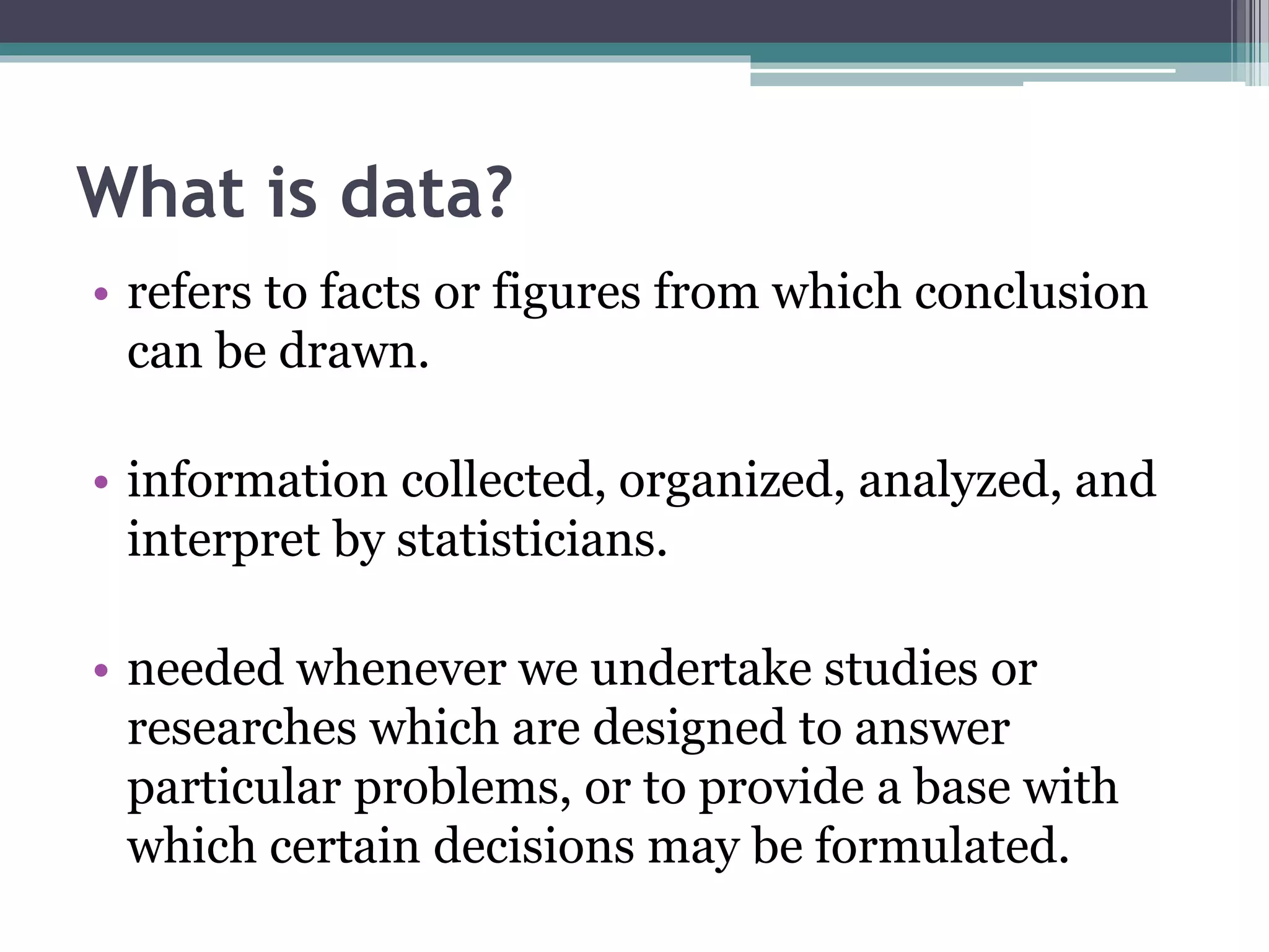
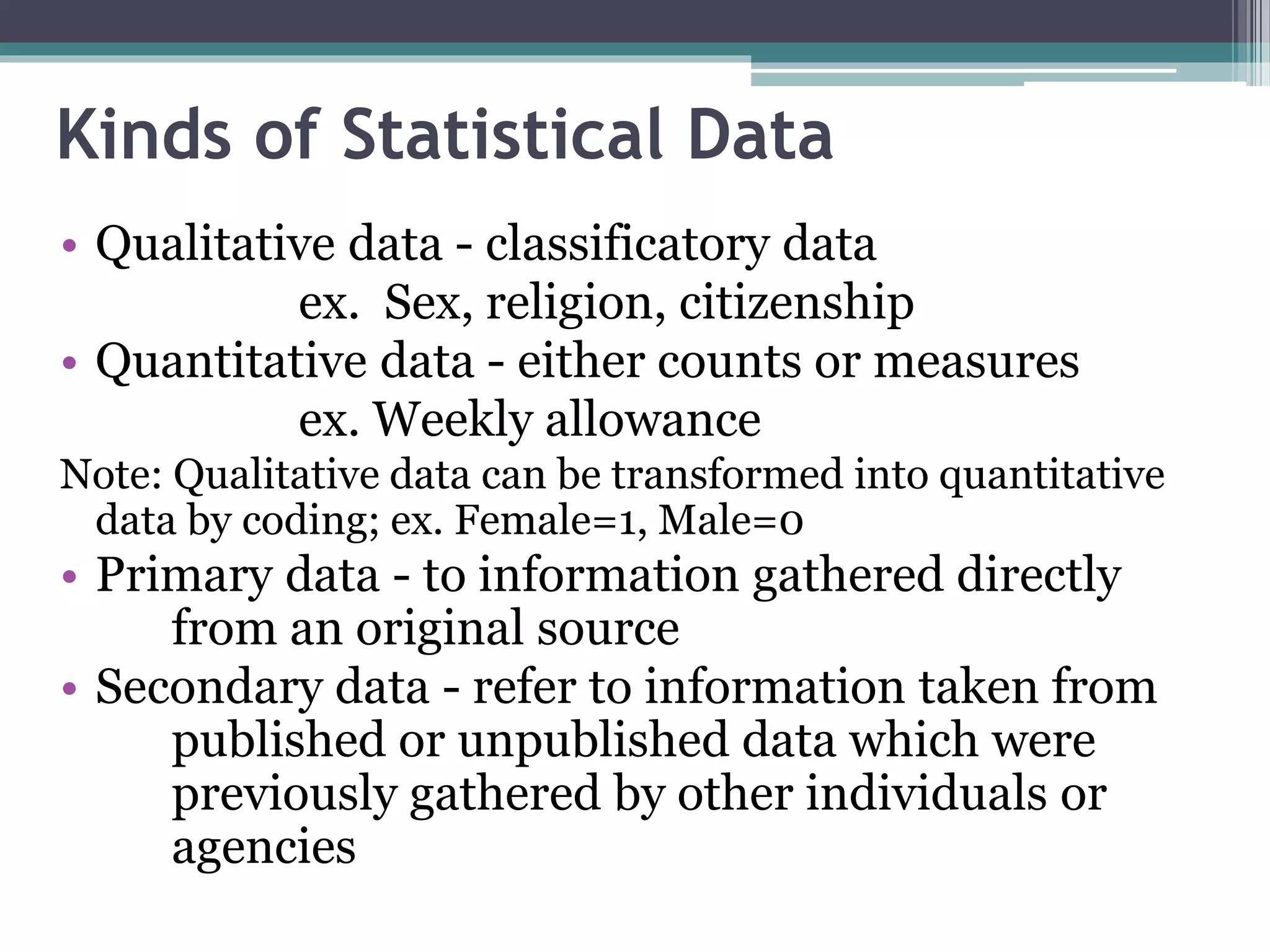
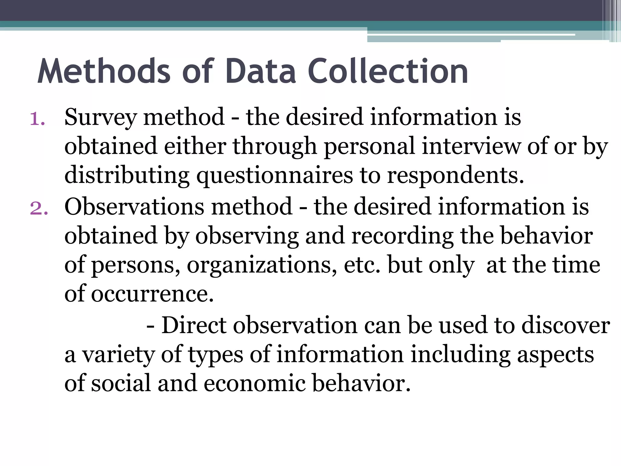
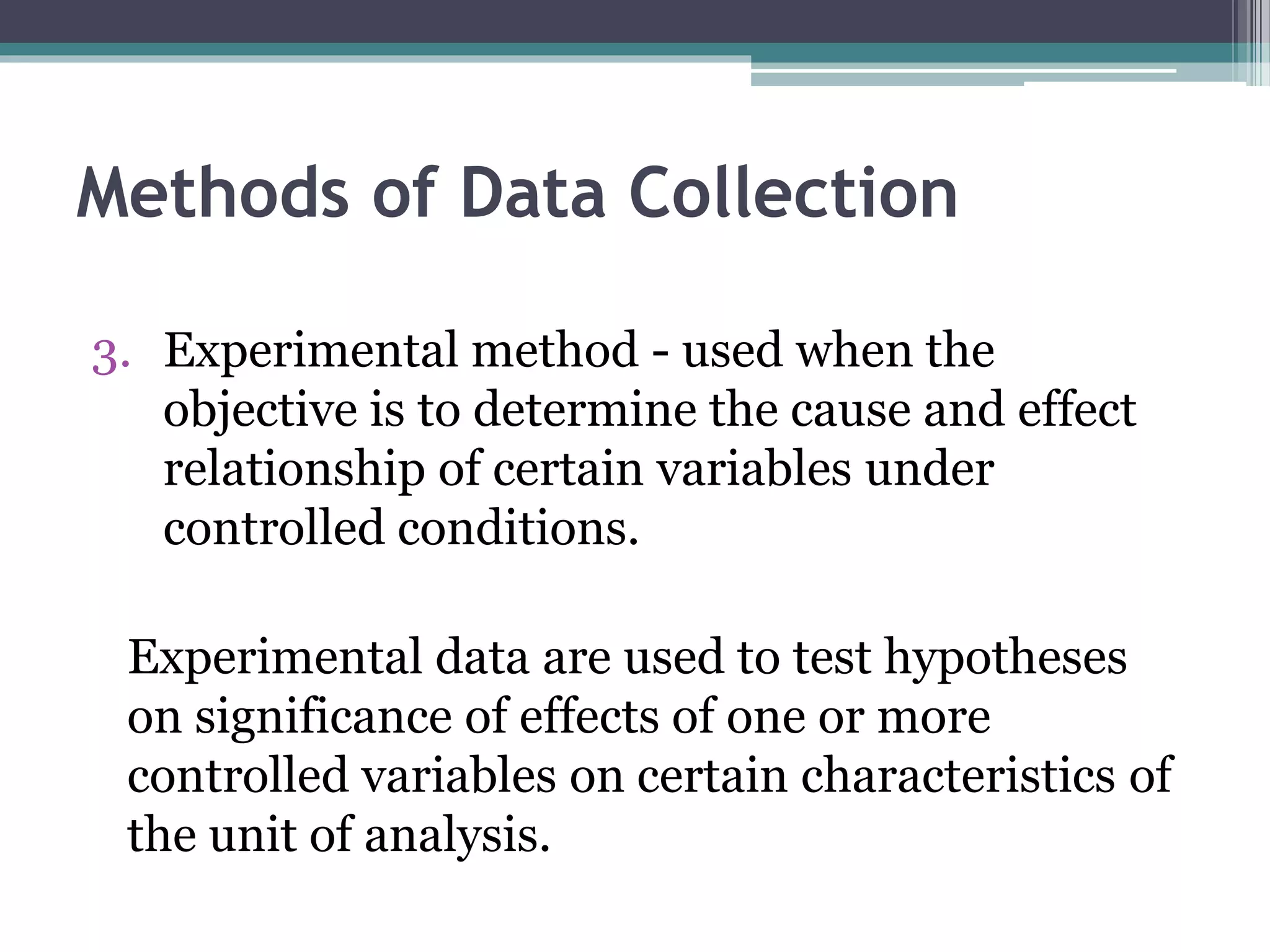
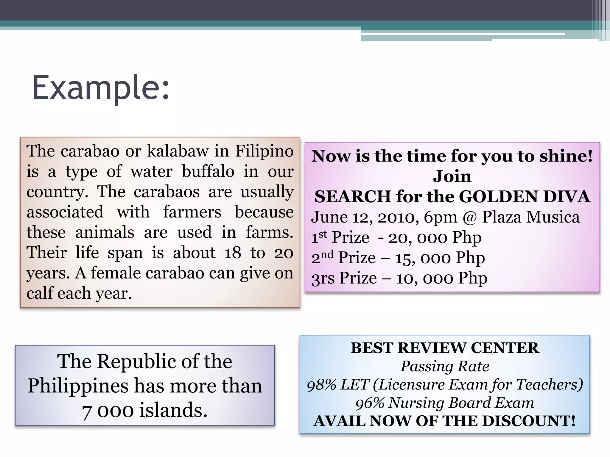
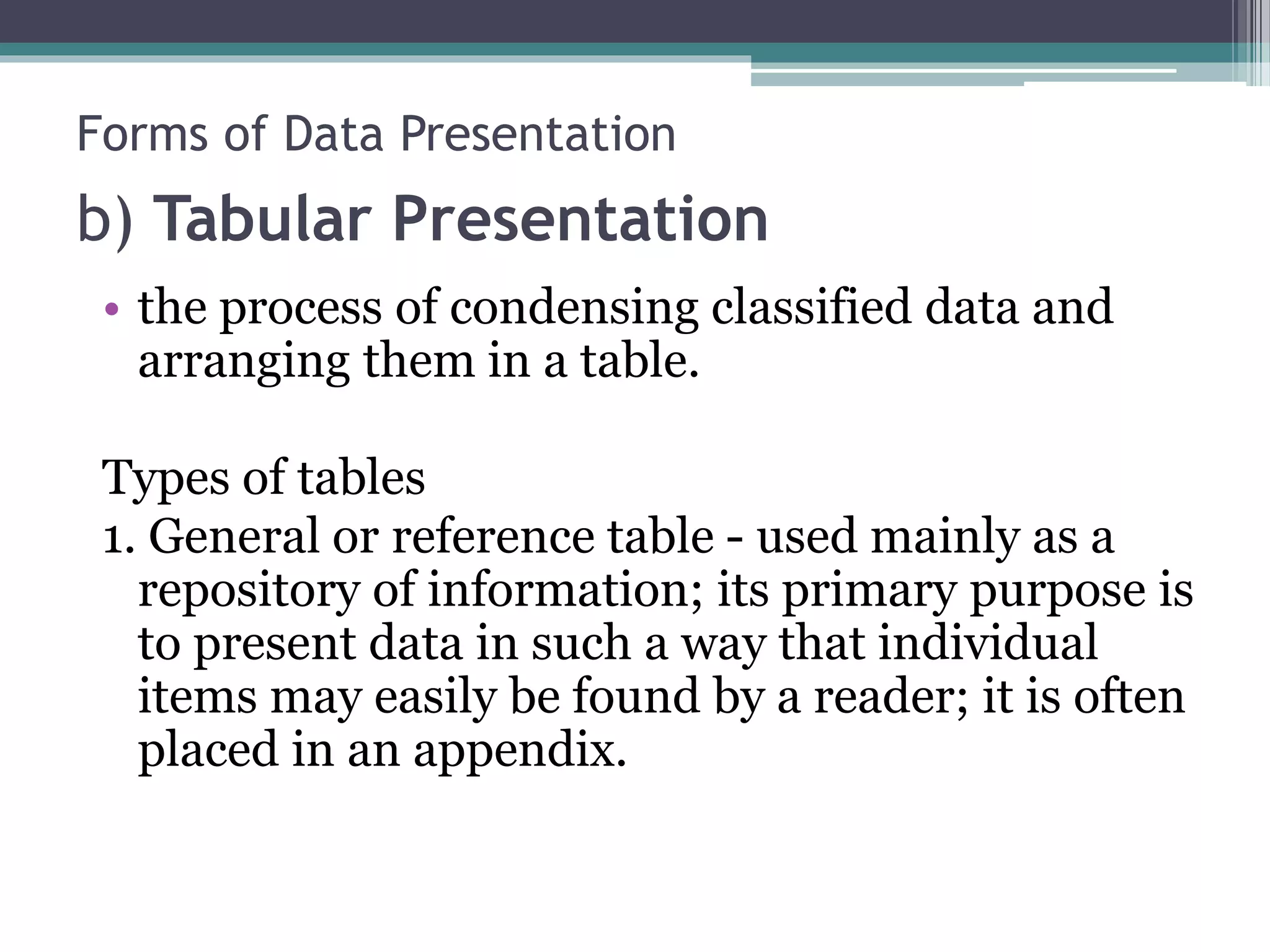
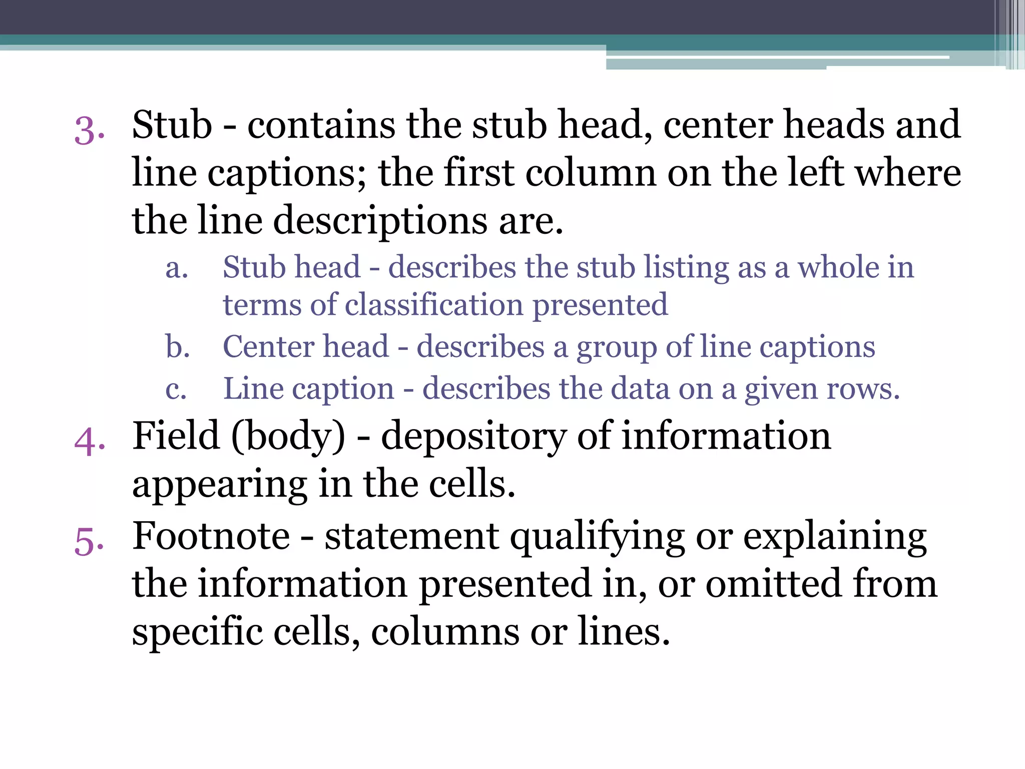
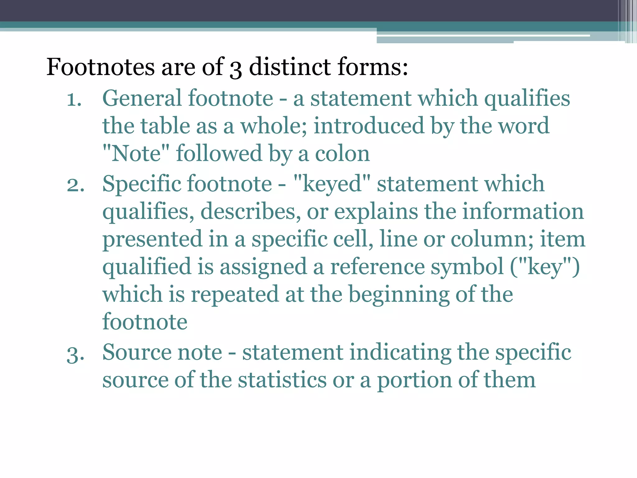
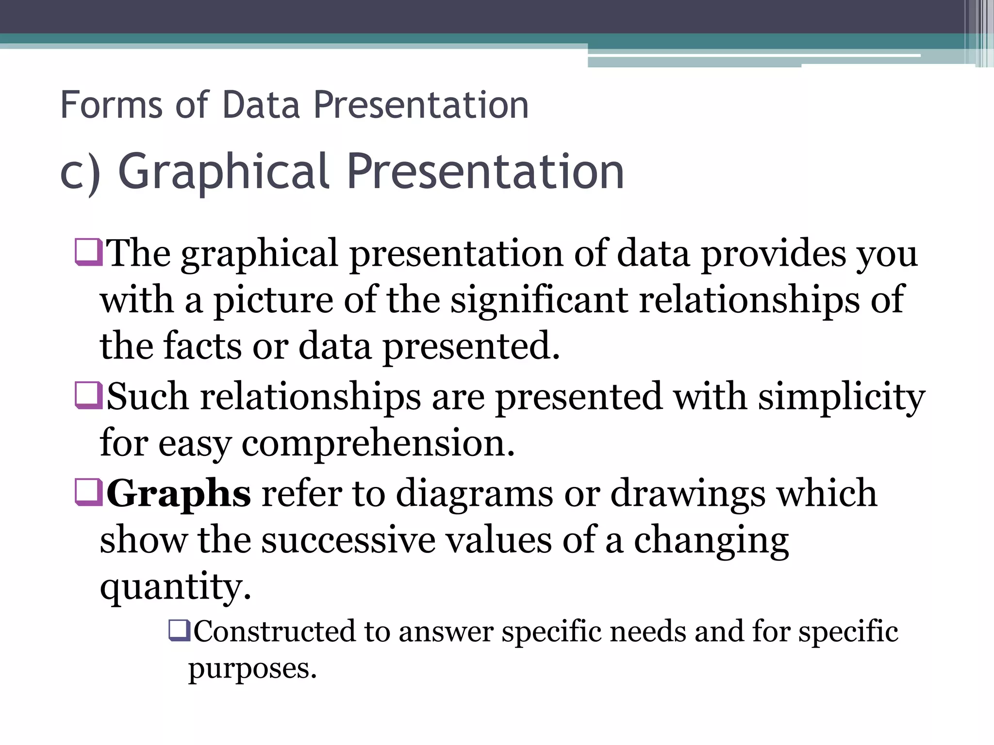
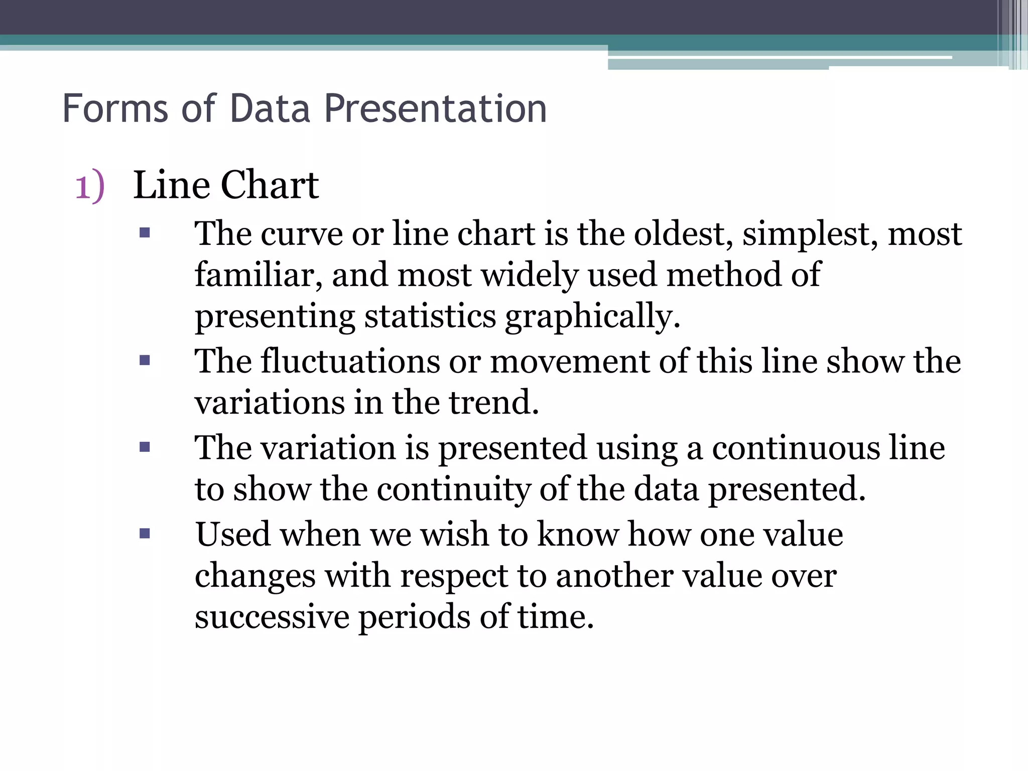
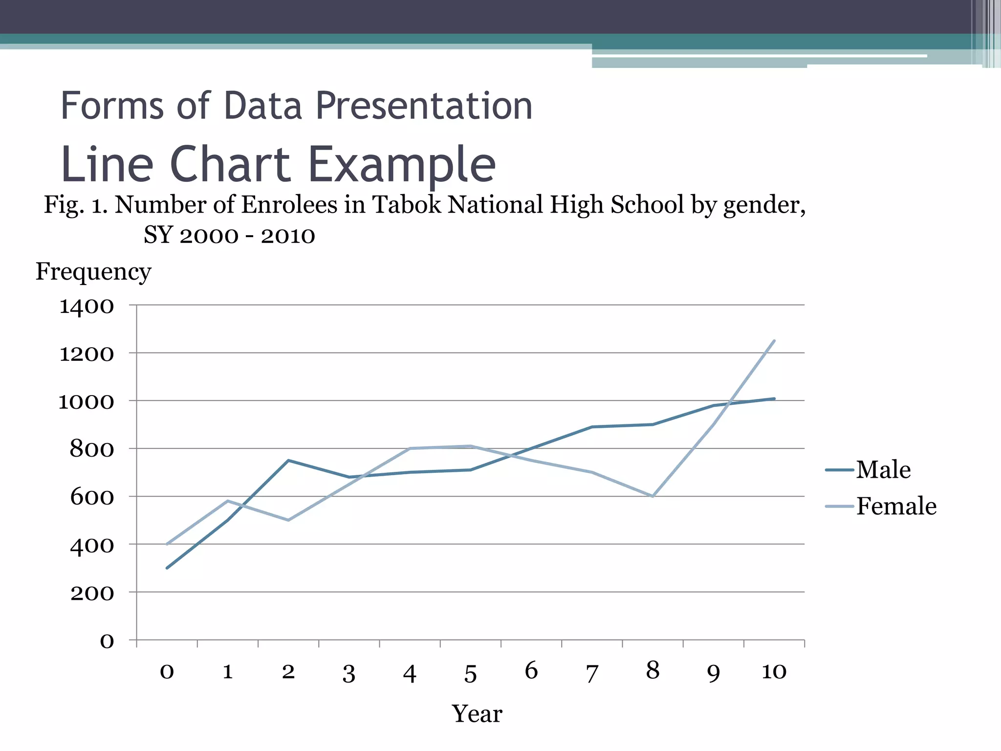
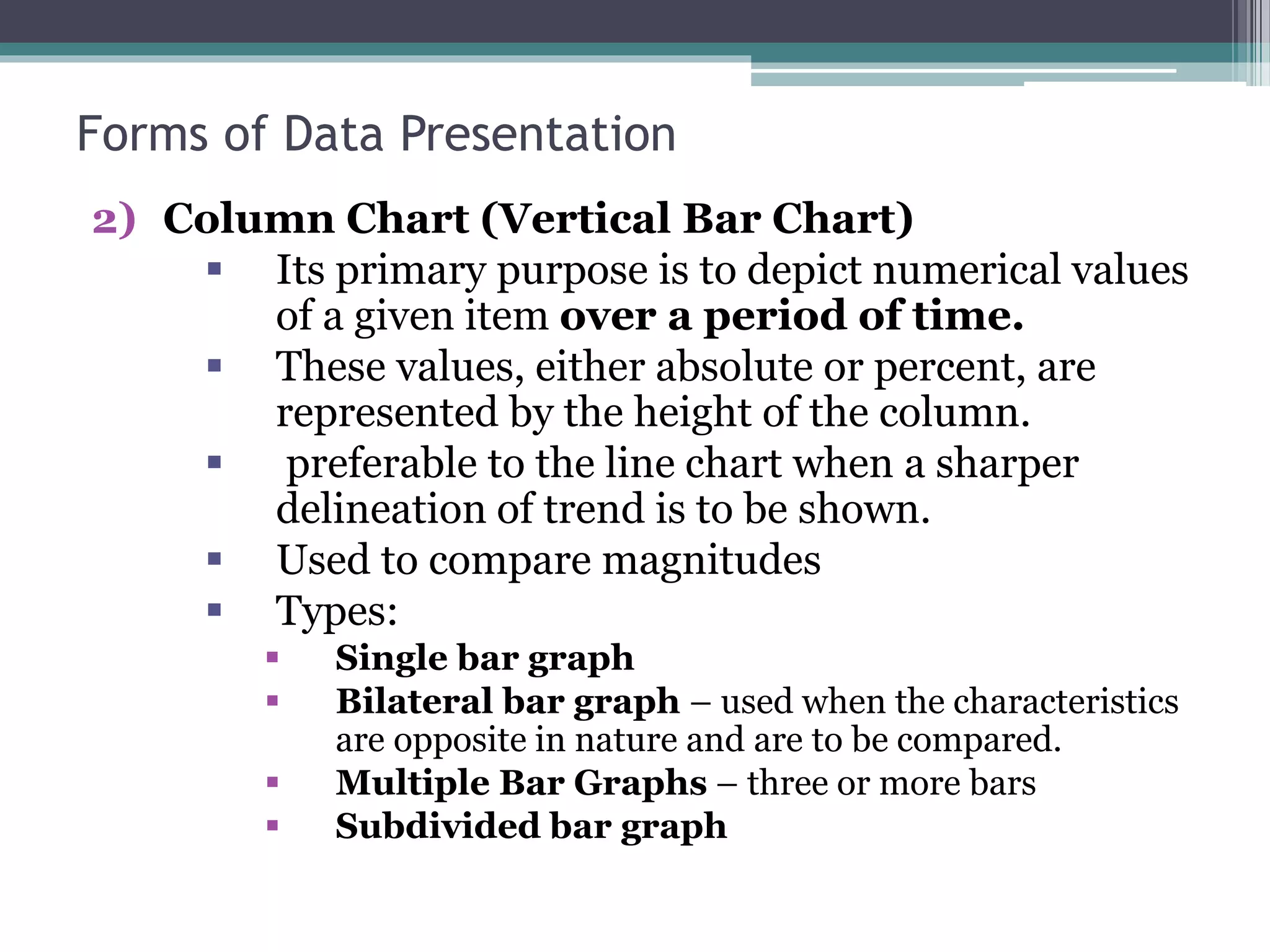
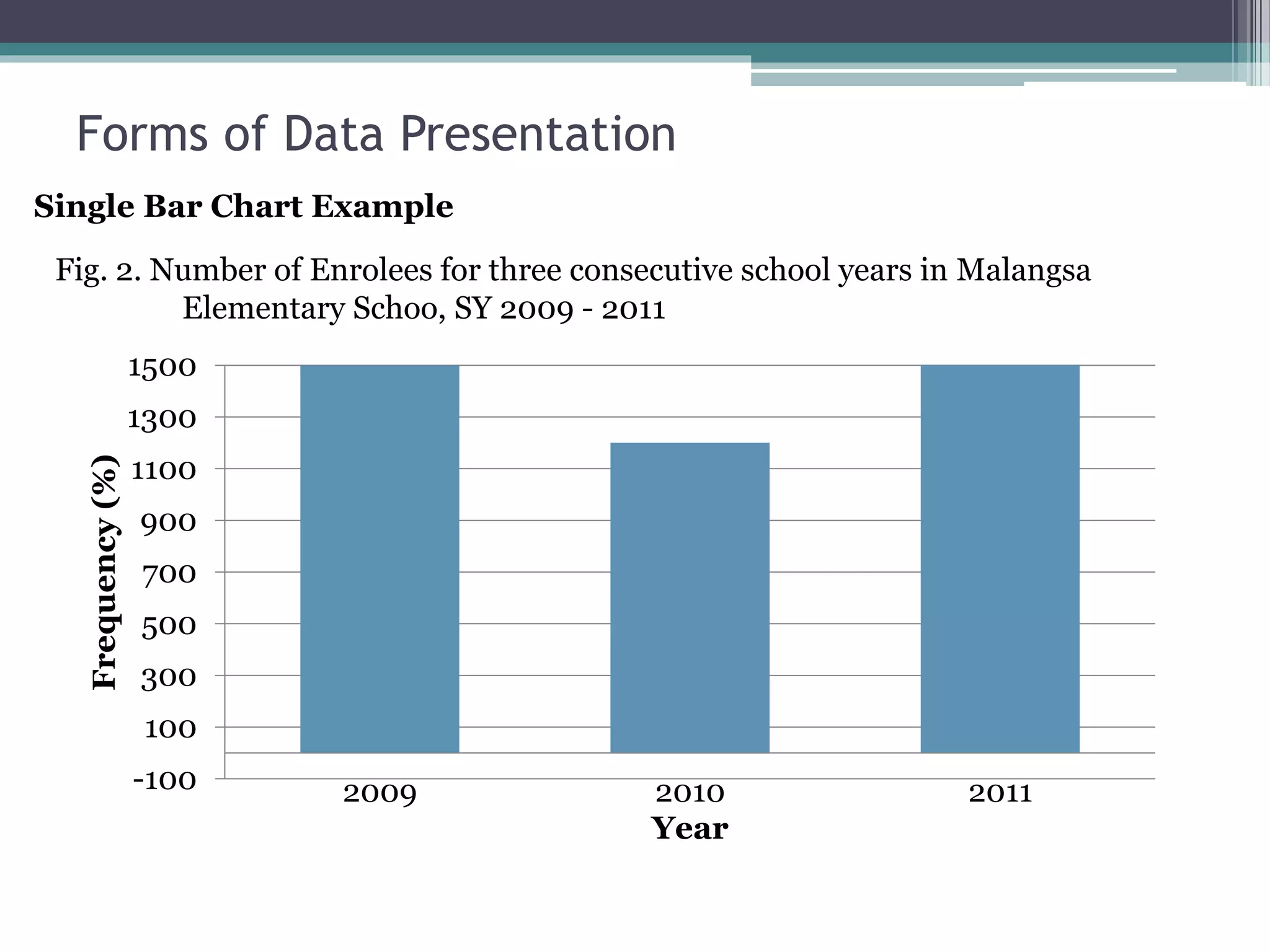
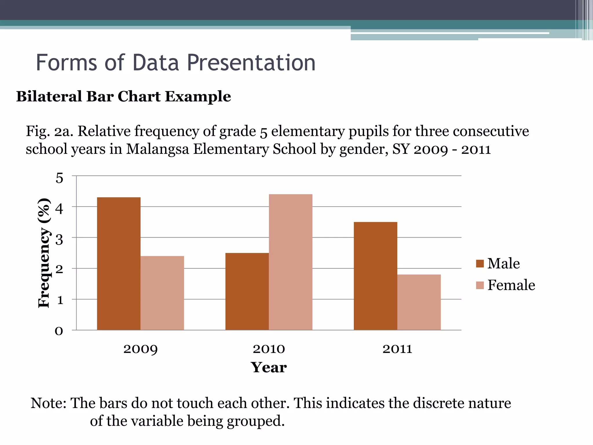
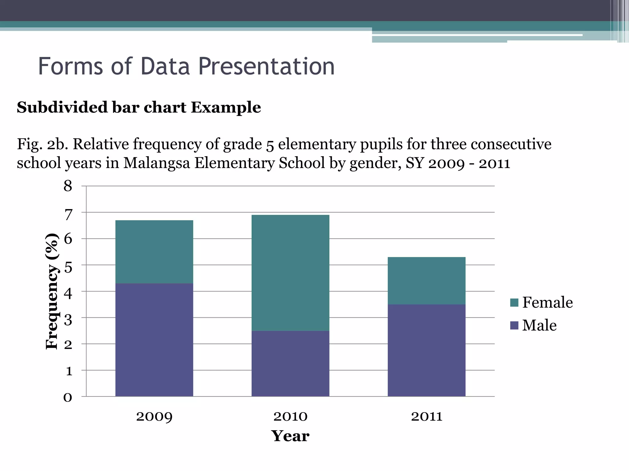
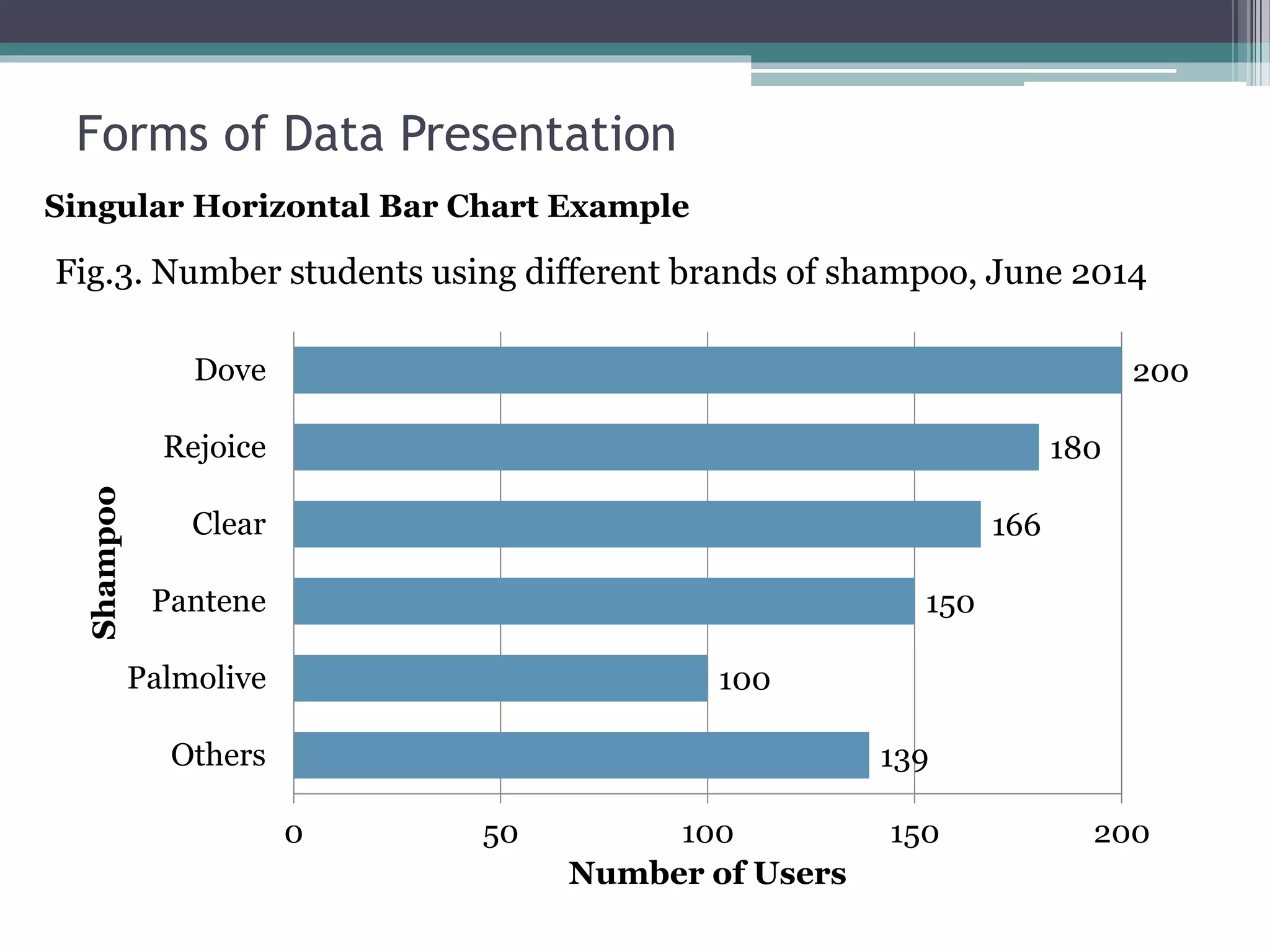
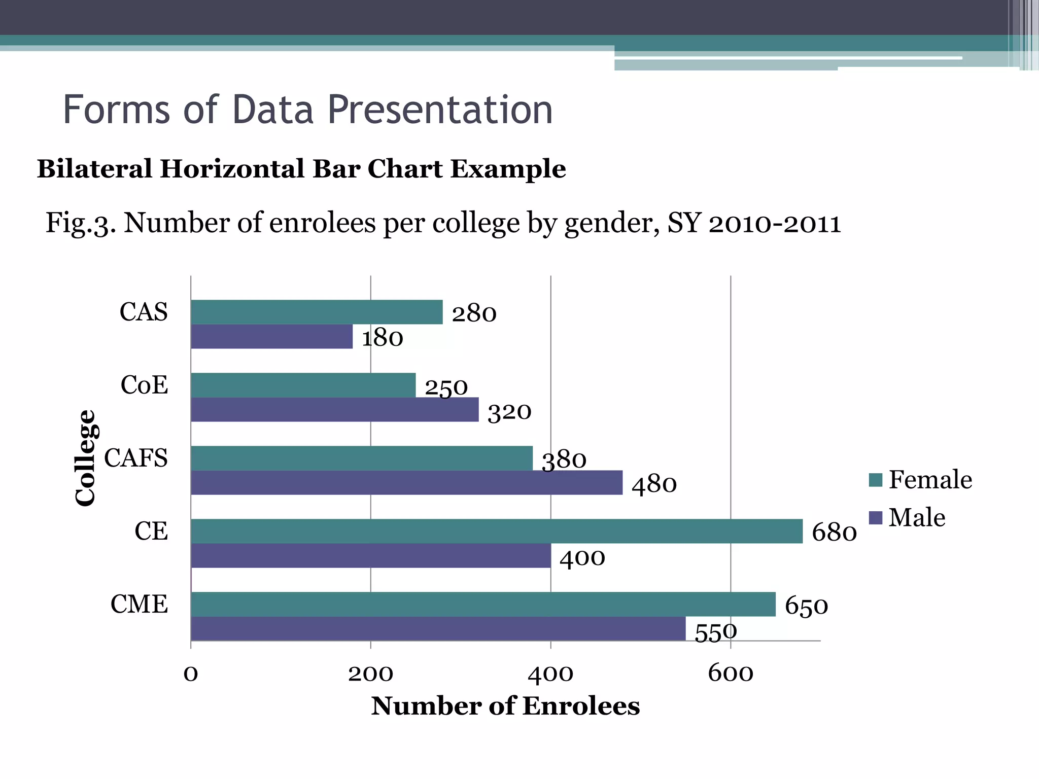
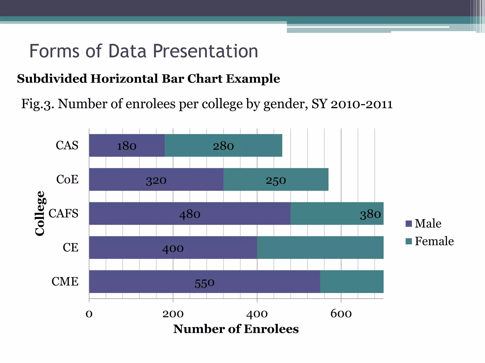
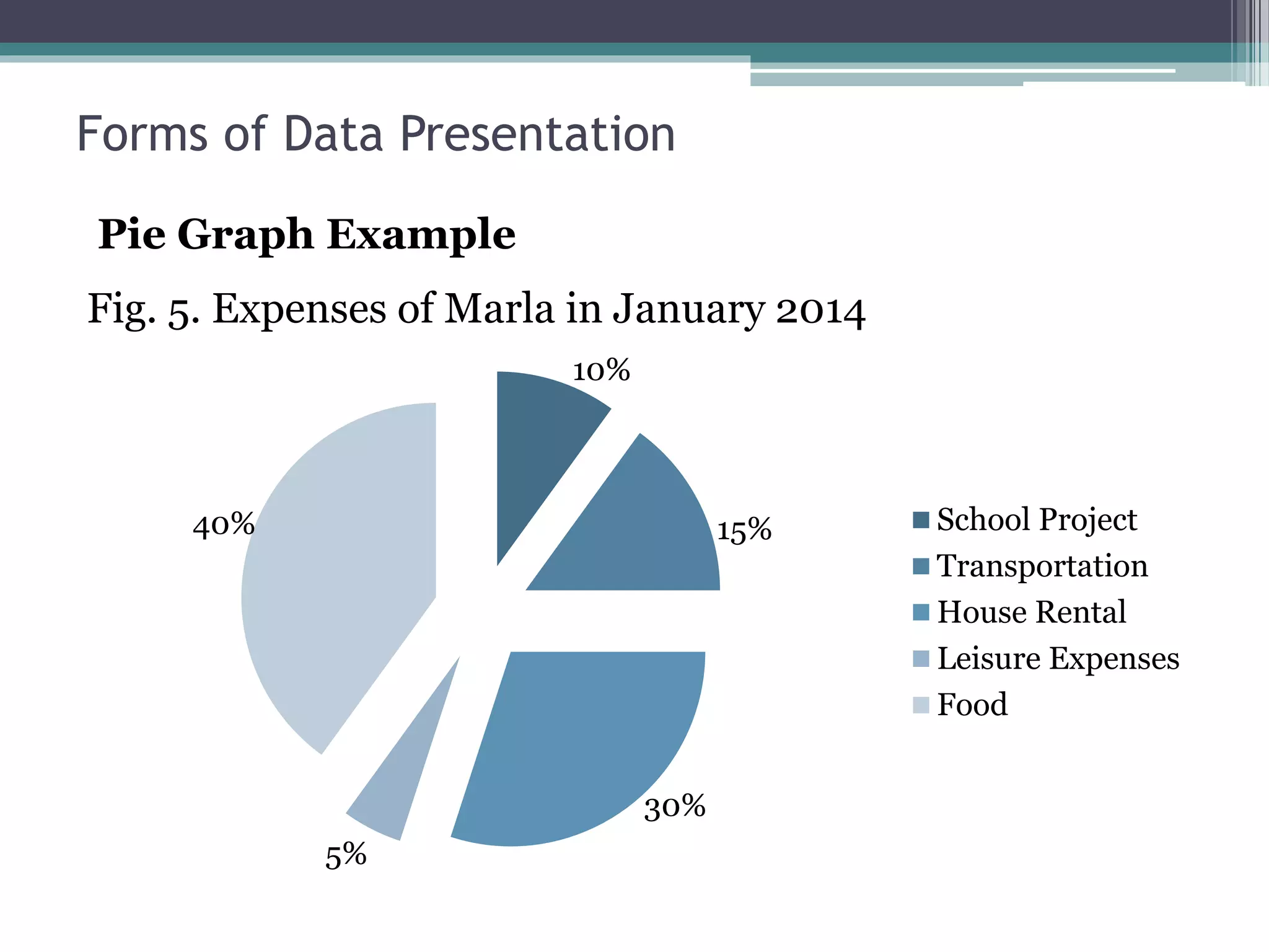
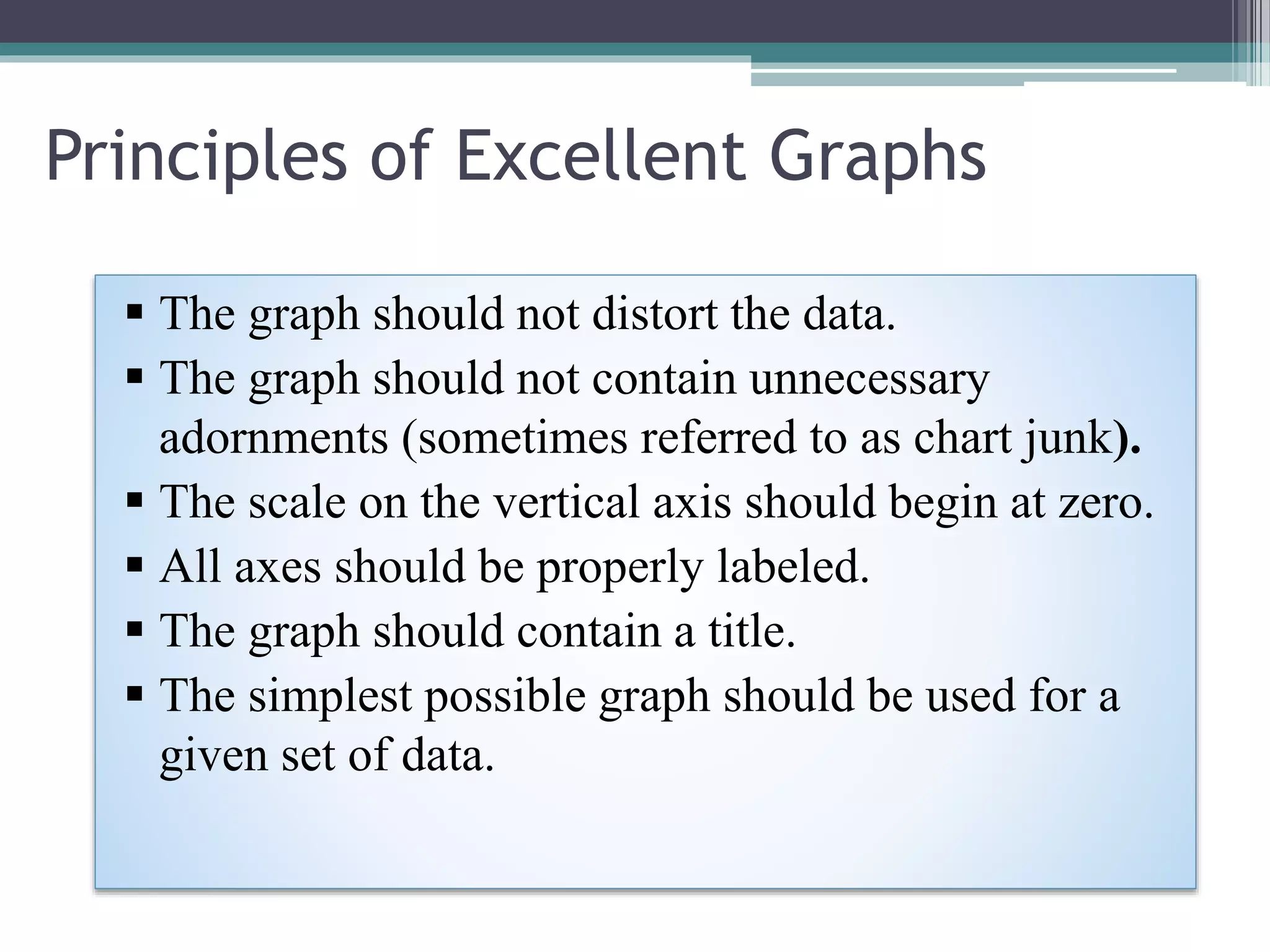
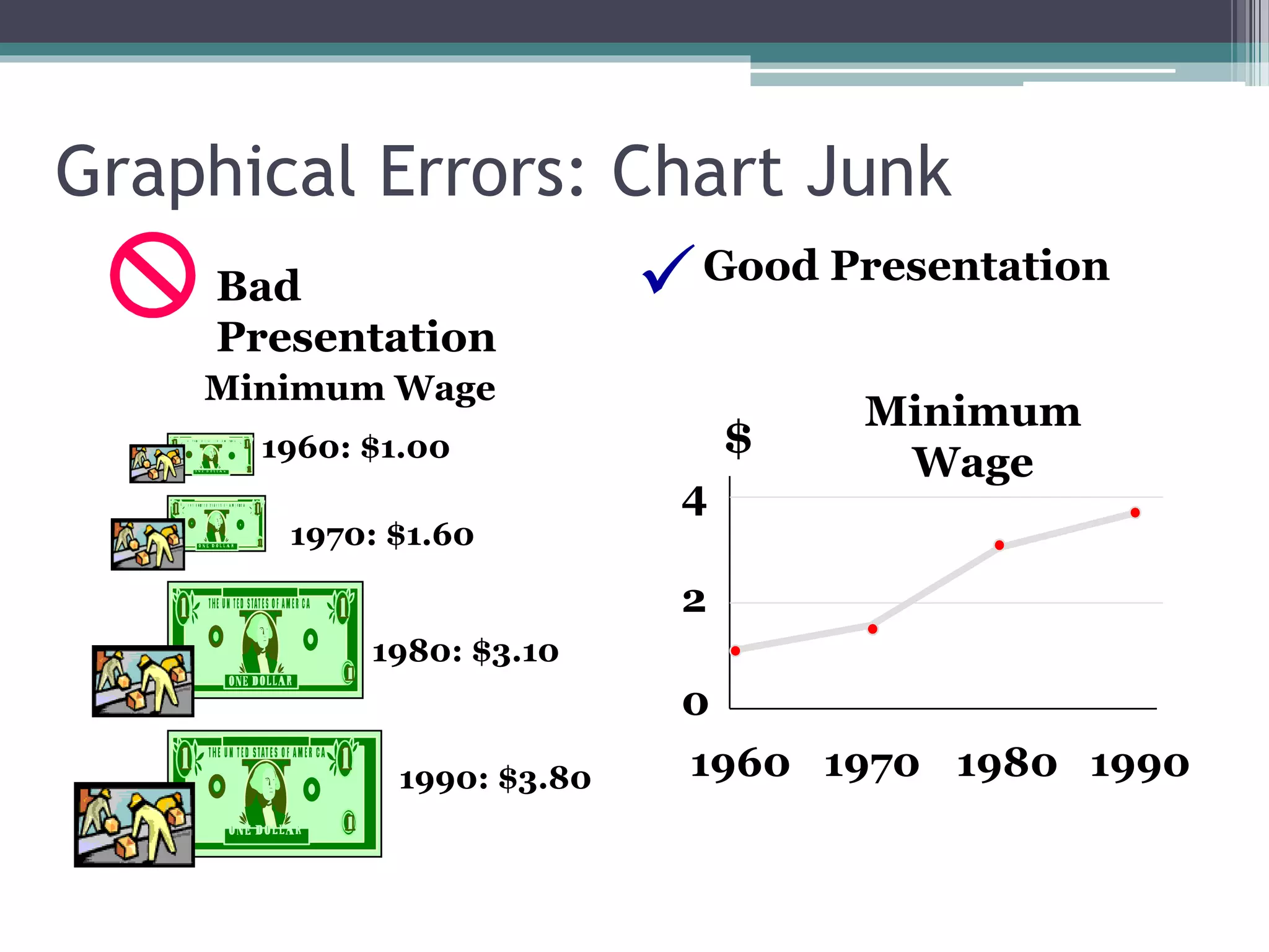
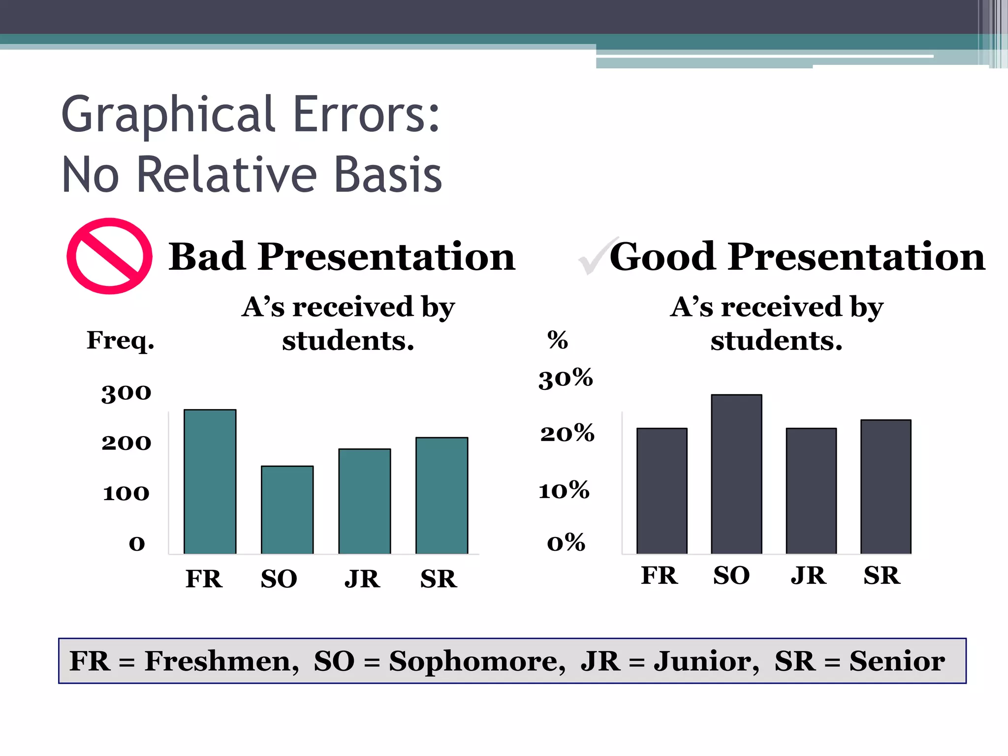
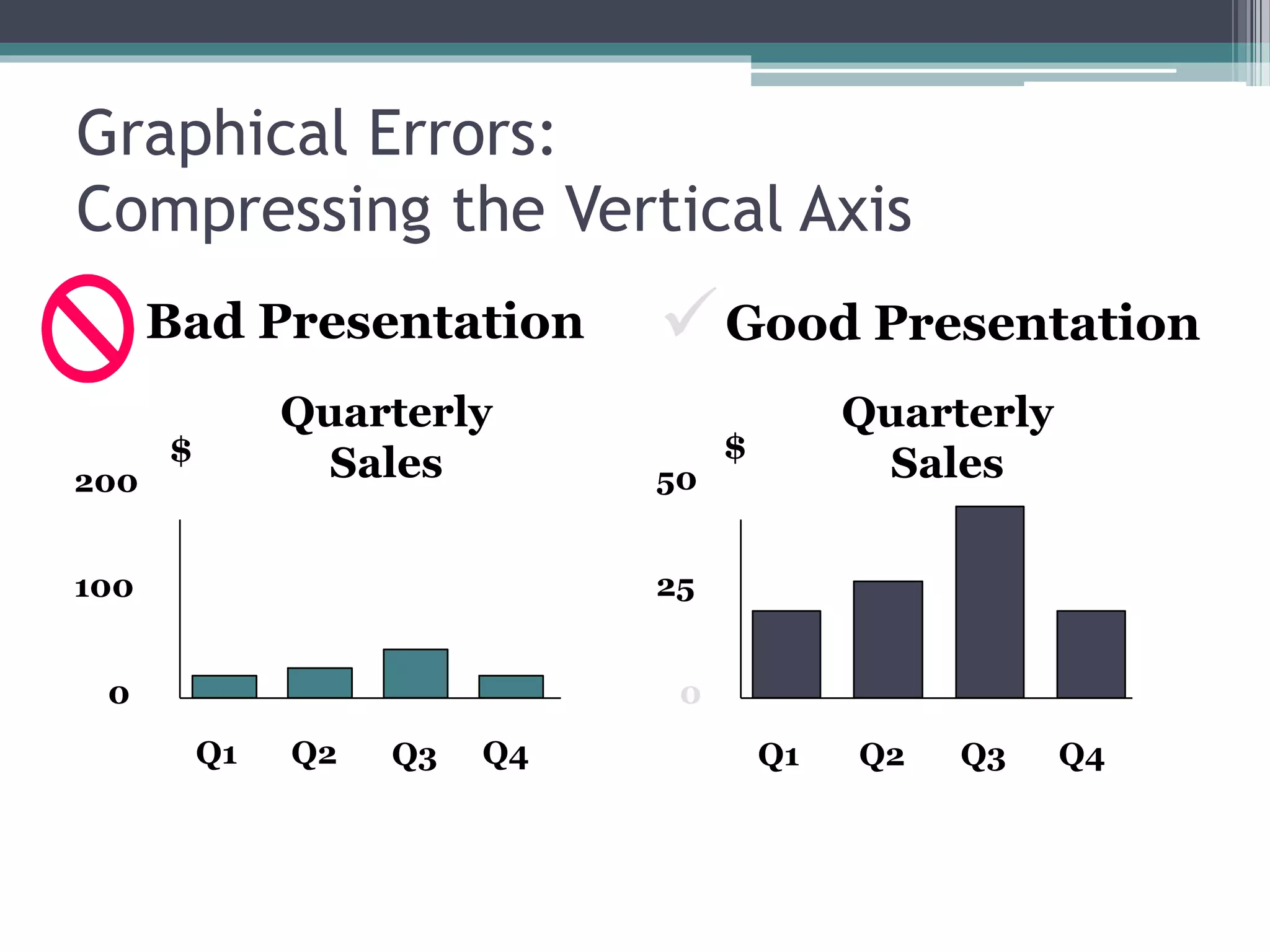
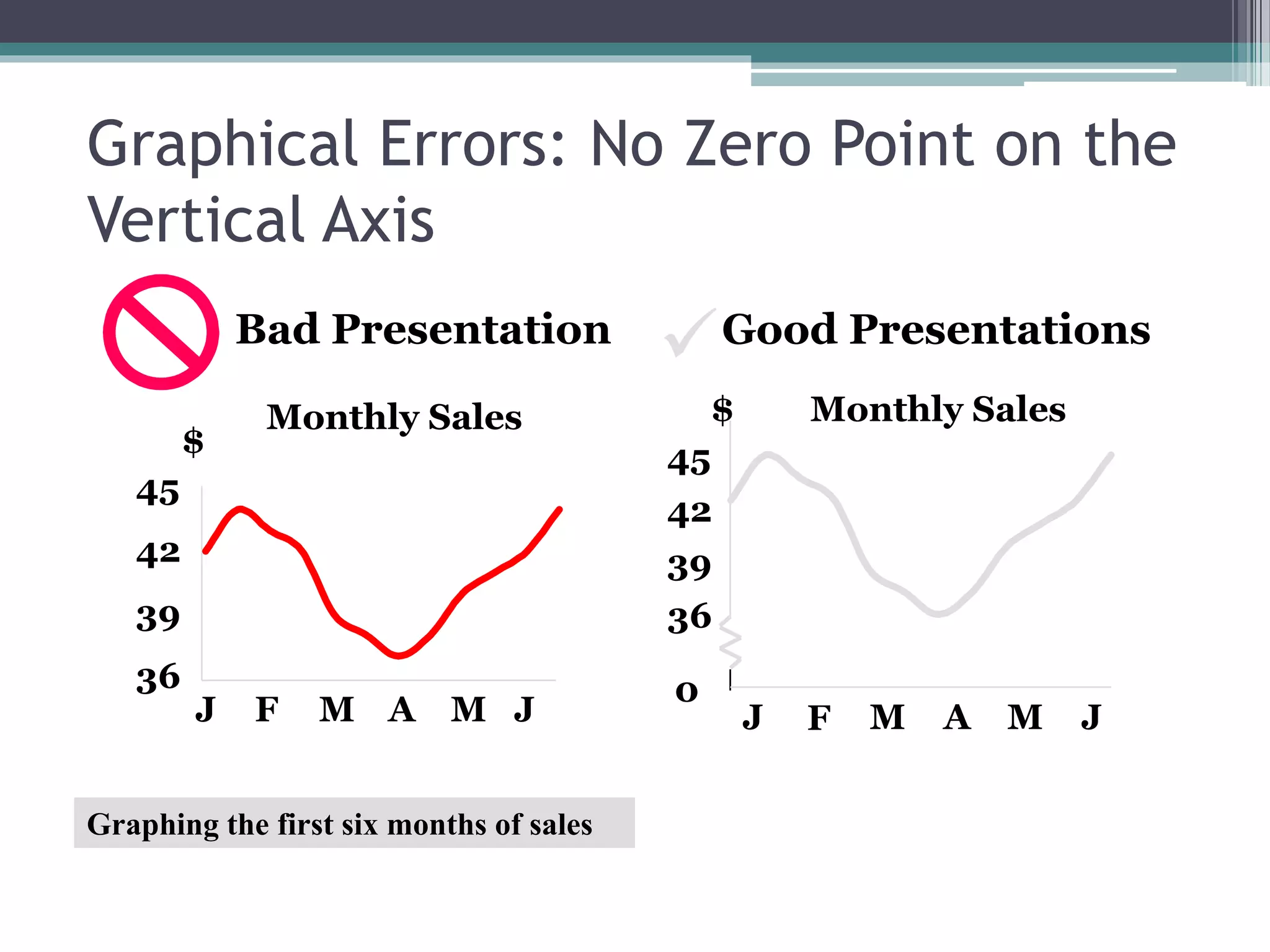
This document discusses methods of data collection and presentation. It describes what data is and the different types, including qualitative and quantitative data. The main methods of collecting data are through surveys, observations, and experiments. Data can be presented in textual, tabular, and graphical forms. Textual presentation involves writing out descriptions. Tabular presentation involves organizing data into tables that include headings, columns, rows, and footnotes. Graphical presentation uses visual forms like line charts, bar charts, pie charts, and maps to depict relationships in the data.
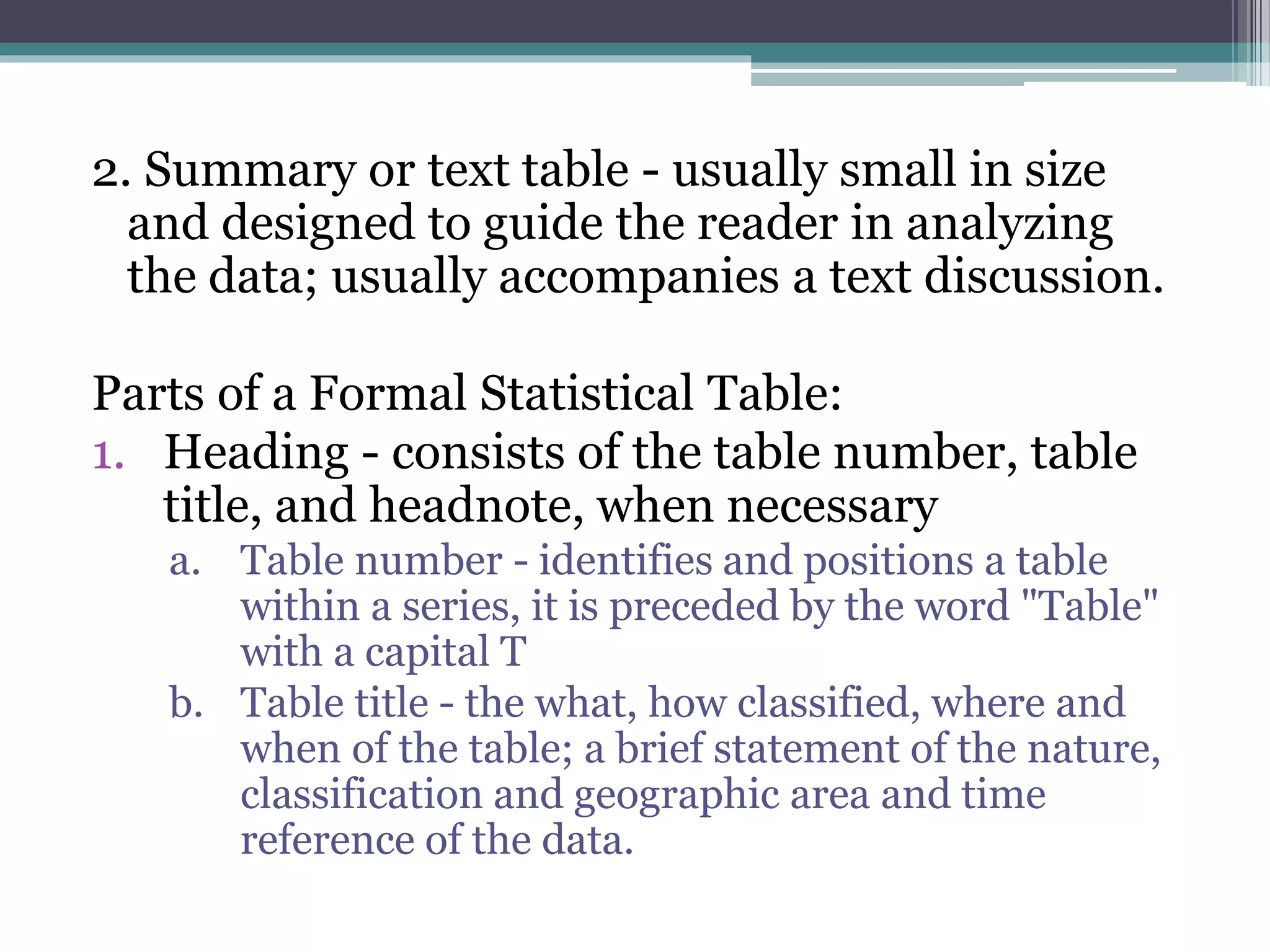
![c. Headnote - not a necessary part; statement is
enclosed in brackets [ ] or in parentheses and
appearing between the table title and the top rule
of the table; or after the title
2. Boxhead - portion of the table which consists
of the spanner and column heads or captions
describing the data in each column
a. Column head - basic unit of the boxhead;
descriptive title placed directly above the column
to which it refers
b. Spanner head - title under which column heads are
further classified](https://image.slidesharecdn.com/chapter2-150623144117-lva1-app6891/75/Chapter-2-11-2048.jpg)


![FBS 719 and FBS 819 BIOSTATISTICS [Autosaved].pptx](https://cdn.slidesharecdn.com/ss_thumbnails/fbs719andfbs819biostatisticsautosaved-240713084256-92f19157-thumbnail.jpg?width=640&height=640&fit=bounds)


![[DSC Europe 25] Katherine Forrest - AI NOW: Understanding the Velocity of Cha...](https://cdn.slidesharecdn.com/ss_thumbnails/wvvbruqfrci0sfq9xwgb-4-251212104007-e5ad1987-thumbnail.jpg?width=640&height=640&fit=bounds)


![[DSC Europe 25] Branko Dzakula - From Defense to Attack: How AI Redefines Cyb...](https://cdn.slidesharecdn.com/ss_thumbnails/80bdzdxpr3ky2g0qvyk9-8-251211083048-ce5fc1ee-thumbnail.jpg?width=640&height=640&fit=bounds)
![[DSC Europe 25] Hans Kleinsman - The Compliance Gearbox: How Tax Tech Mediate...](https://cdn.slidesharecdn.com/ss_thumbnails/dxdytie1toel0hr90bjs-2-251212103250-174fdbe7-thumbnail.jpg?width=640&height=640&fit=bounds)
![[DSC Europe 25] Marko Krstic - Understanding the AI Threat Landscape - Risks,...](https://cdn.slidesharecdn.com/ss_thumbnails/tiyim1ins5jvbrvzpzla-2-251209104645-c69d3553-thumbnail.jpg?width=640&height=640&fit=bounds)
![[DSC Europe 25] Behzad Hosseini - AI Agents in the Wild: Deploying Models tha...](https://cdn.slidesharecdn.com/ss_thumbnails/3qtejajvsjqrzwfept2c-10-251212103250-7f2b1068-thumbnail.jpg?width=640&height=640&fit=bounds)
![[DSC Europe 25] Kaja Kandare - LLM as a judge.pptx](https://cdn.slidesharecdn.com/ss_thumbnails/arxyccaxsdsd1ba99wjw-7-251212104007-2b4e3f64-thumbnail.jpg?width=640&height=640&fit=bounds)
![[DSC Europe 25] Jovan Bogicevic - Legacy to AI-Driven Defense: Transforming D...](https://cdn.slidesharecdn.com/ss_thumbnails/rsarluadt563hntyfc8q-3-251211083849-3e7bc4c0-thumbnail.jpg?width=640&height=640&fit=bounds)