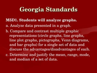
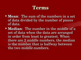
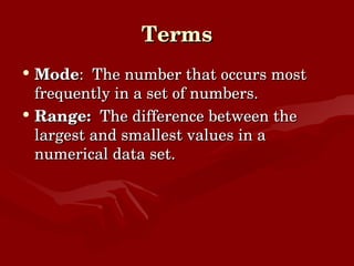
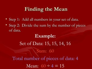
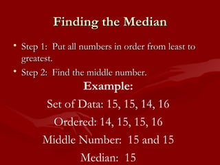
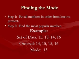
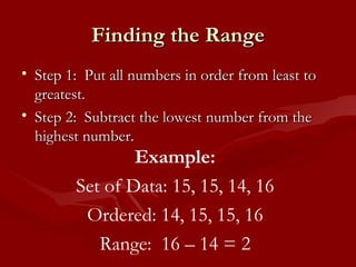
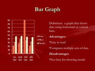
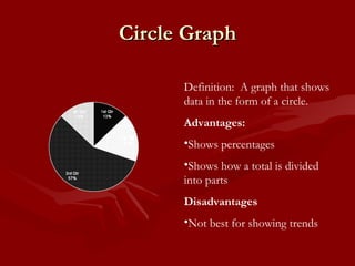
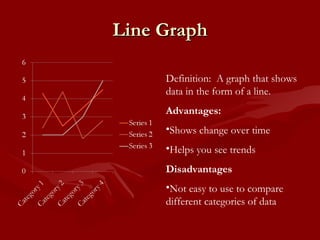
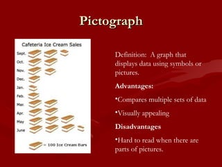
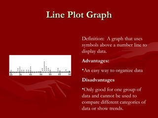
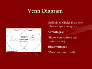
Data Analysis S. Hallum Jordye Bacon Elementary School 5 th  Grade
Georgia Standards M5D1. Students will analyze graphs. a. Analyze data presented in a graph. b. Compare and contrast multiple graphic representations (circle graphs, line graphs, line plot graphs, pictographs, Venn diagrams, and bar graphs) for a single set of data and discuss the advantages/disadvantages of each. c. Determine and justify the mean, range, mode, and median of a set of data.
Terms Mean :  The sum of the numbers in a set of data divided by the number of pieces of data. Median :  The number in the middle of a set of data when the data are arranged in order from least to greatest. When there are 2 middle numbers, the median is the number that is halfway between the two middle numbers.
Terms Mode :  The number that occurs most frequently in a set of numbers. Range:  The difference between the largest and smallest values in a numerical data set.
Finding the Mean Step 1:  Add all numbers in your set of data. Step 2:  Divide the sum by the number of pieces of data. Example: Set of Data: 15, 15, 14, 16 Sum:  60 Total number of pieces of data: 4 Mean:  60  ÷  4  = 15
Finding the Median Step 1:  Put all numbers in order from least to greatest. Step 2:  Find the middle number. Example: Set of Data: 15, 15, 14, 16 Ordered: 14, 15, 15, 16 Middle Number:  15 and 15 Median:  15
Finding the Mode Step 1:  Put all numbers in order from least to greatest. Step 2:  Find the most popular number. Example: Set of Data: 15, 15, 14, 16 Ordered: 14, 15, 15, 16 Mode:  15
Finding the Range Step 1:  Put all numbers in order from least to greatest. Step 2:  Subtract the lowest number from the highest number. Example: Set of Data: 15, 15, 14, 16 Ordered: 14, 15, 15, 16 Range:  16 – 14 = 2
Practice http://www.quia.com/rr/51667.html http://www.purplemath.com/modules/meanmode.htm http://www.mathgoodies.com/lessons/toc_vol8.html
Types of Graphs Bar Graph Circle Graph Line Graph Line Plot Graph Venn Diagram Pictograph
Bar Graph Definition:  a graph that shows data using horizontal or vertical bars. Advantages:  Easy to read Compares multiple sets of data Disadvantages Not best for showing trends
Circle Graph Definition:  A graph that shows data in the form of a circle. Advantages:  Shows percentages Shows how a total is divided into parts Disadvantages Not best for showing trends
Line Graph Definition:  A graph that shows data in the form of a line. Advantages:  Shows change over time Helps you see trends Disadvantages Not easy to use to compare different categories of data
Pictograph Definition:  A graph that displays data using symbols or pictures. Advantages:  Compares multiple sets of data Visually appealing Disadvantages Hard to read when there are parts of pictures.
Line Plot Graph Definition:  A graph that uses symbols above a number line to display data. Advantages:  An easy way to organize data Disadvantages Only good for one group of data and cannot be used to compare different categories of data or show trends.
Venn Diagram Definition:  Circles that show relationships among sets. Advantages:  Shows comparisons and contrasts easily. Disadvantages Does not show trends
Interpreting Data Practice sites: http://www.bbc.co.uk/schools/ks2bitesize/maths/data/interpreting_data/play.shtml http://www.mercer.kyschools.us/mysites/jbest/?page_id=64 http://www.internet4classrooms.com/grade_level_help/skills_fifth_5th_math_data_analysis_and_probability.htm

Data analysis powerpoint

  • 1.
    Data Analysis S.Hallum Jordye Bacon Elementary School 5 th Grade
  • 2.
    Georgia Standards M5D1.Students will analyze graphs. a. Analyze data presented in a graph. b. Compare and contrast multiple graphic representations (circle graphs, line graphs, line plot graphs, pictographs, Venn diagrams, and bar graphs) for a single set of data and discuss the advantages/disadvantages of each. c. Determine and justify the mean, range, mode, and median of a set of data.
  • 3.
    Terms Mean : The sum of the numbers in a set of data divided by the number of pieces of data. Median : The number in the middle of a set of data when the data are arranged in order from least to greatest. When there are 2 middle numbers, the median is the number that is halfway between the two middle numbers.
  • 4.
    Terms Mode : The number that occurs most frequently in a set of numbers. Range: The difference between the largest and smallest values in a numerical data set.
  • 5.
    Finding the MeanStep 1: Add all numbers in your set of data. Step 2: Divide the sum by the number of pieces of data. Example: Set of Data: 15, 15, 14, 16 Sum: 60 Total number of pieces of data: 4 Mean: 60 ÷ 4 = 15
  • 6.
    Finding the MedianStep 1: Put all numbers in order from least to greatest. Step 2: Find the middle number. Example: Set of Data: 15, 15, 14, 16 Ordered: 14, 15, 15, 16 Middle Number: 15 and 15 Median: 15
  • 7.
    Finding the ModeStep 1: Put all numbers in order from least to greatest. Step 2: Find the most popular number. Example: Set of Data: 15, 15, 14, 16 Ordered: 14, 15, 15, 16 Mode: 15
  • 8.
    Finding the RangeStep 1: Put all numbers in order from least to greatest. Step 2: Subtract the lowest number from the highest number. Example: Set of Data: 15, 15, 14, 16 Ordered: 14, 15, 15, 16 Range: 16 – 14 = 2
  • 9.
  • 10.
    Types of GraphsBar Graph Circle Graph Line Graph Line Plot Graph Venn Diagram Pictograph
  • 11.
    Bar Graph Definition: a graph that shows data using horizontal or vertical bars. Advantages: Easy to read Compares multiple sets of data Disadvantages Not best for showing trends
  • 12.
    Circle Graph Definition: A graph that shows data in the form of a circle. Advantages: Shows percentages Shows how a total is divided into parts Disadvantages Not best for showing trends
  • 13.
    Line Graph Definition: A graph that shows data in the form of a line. Advantages: Shows change over time Helps you see trends Disadvantages Not easy to use to compare different categories of data
  • 14.
    Pictograph Definition: A graph that displays data using symbols or pictures. Advantages: Compares multiple sets of data Visually appealing Disadvantages Hard to read when there are parts of pictures.
  • 15.
    Line Plot GraphDefinition: A graph that uses symbols above a number line to display data. Advantages: An easy way to organize data Disadvantages Only good for one group of data and cannot be used to compare different categories of data or show trends.
  • 16.
    Venn Diagram Definition: Circles that show relationships among sets. Advantages: Shows comparisons and contrasts easily. Disadvantages Does not show trends
  • 17.
    Interpreting Data Practicesites: http://www.bbc.co.uk/schools/ks2bitesize/maths/data/interpreting_data/play.shtml http://www.mercer.kyschools.us/mysites/jbest/?page_id=64 http://www.internet4classrooms.com/grade_level_help/skills_fifth_5th_math_data_analysis_and_probability.htm