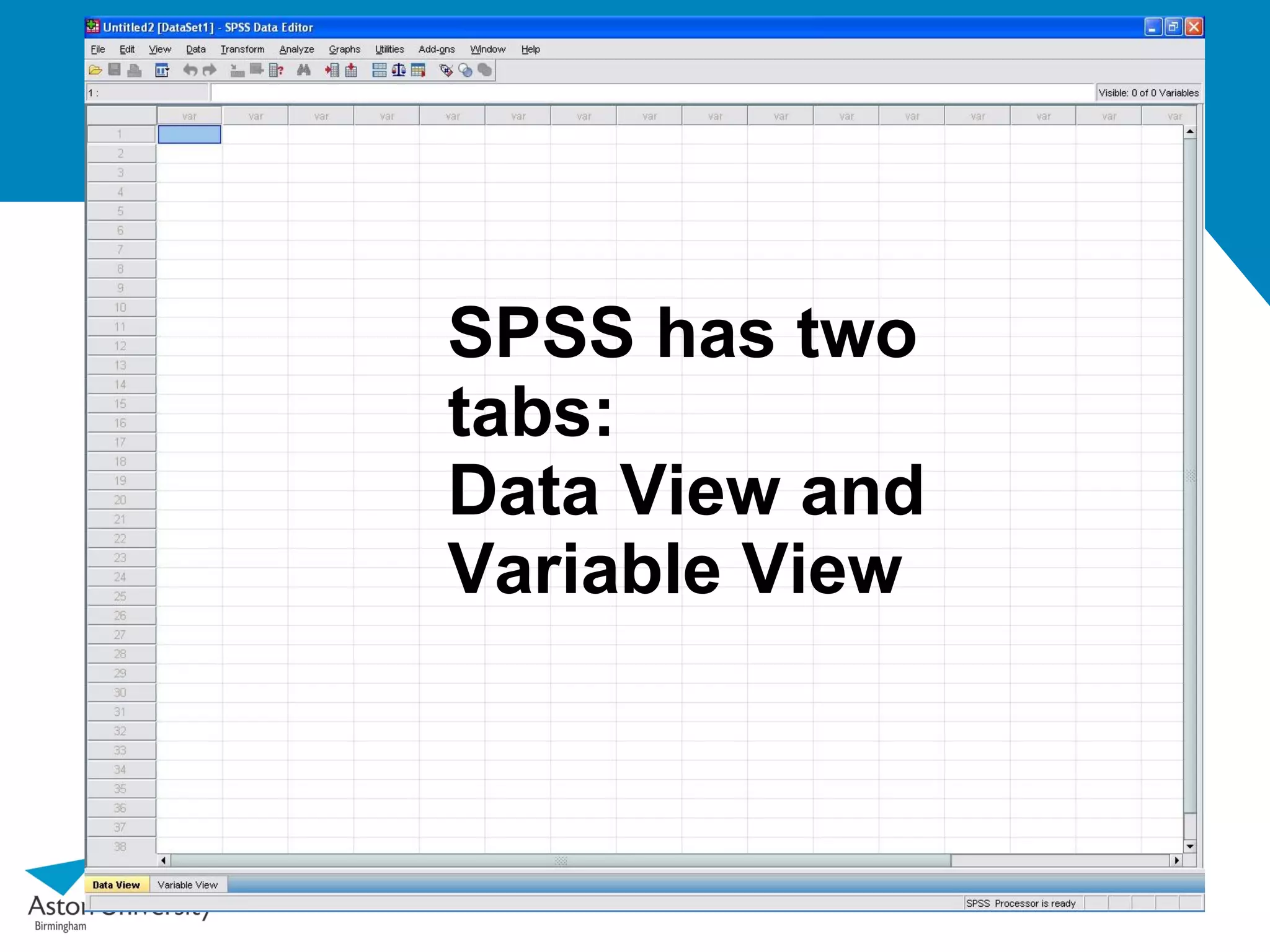
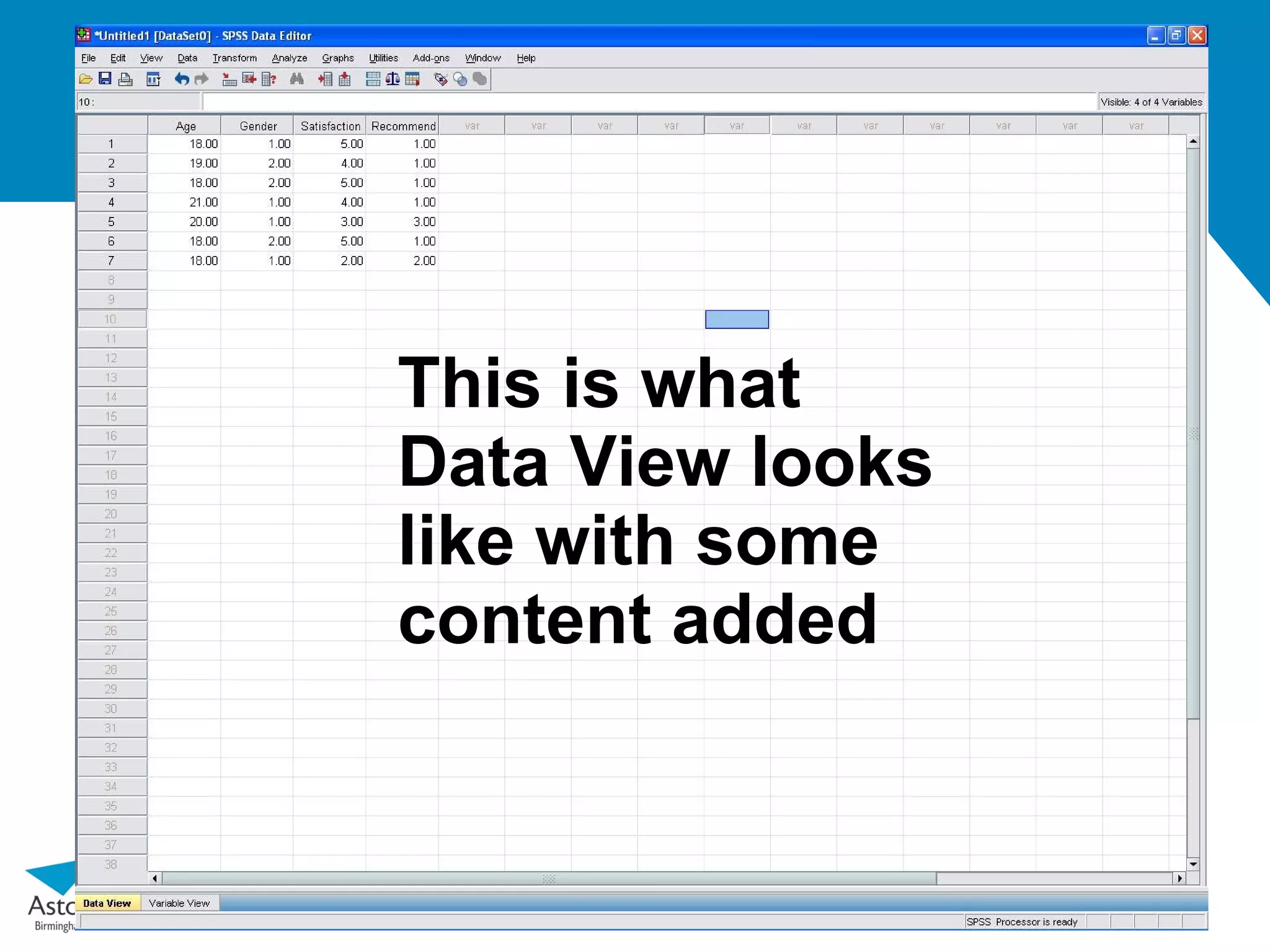
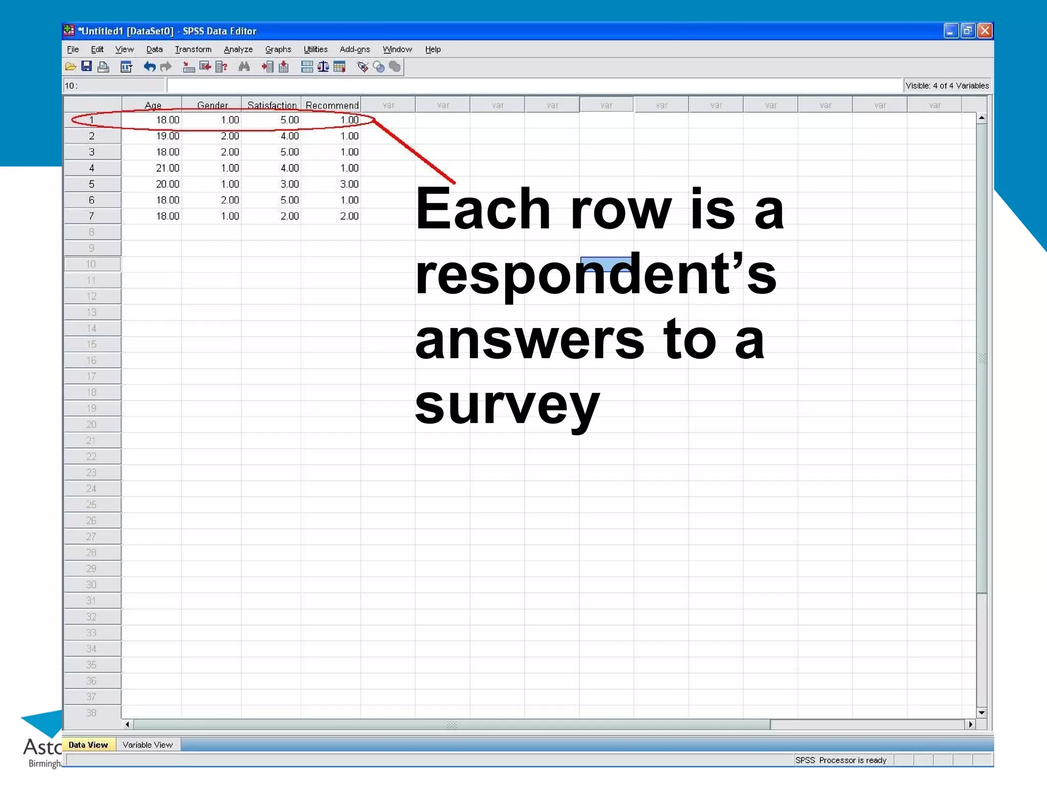
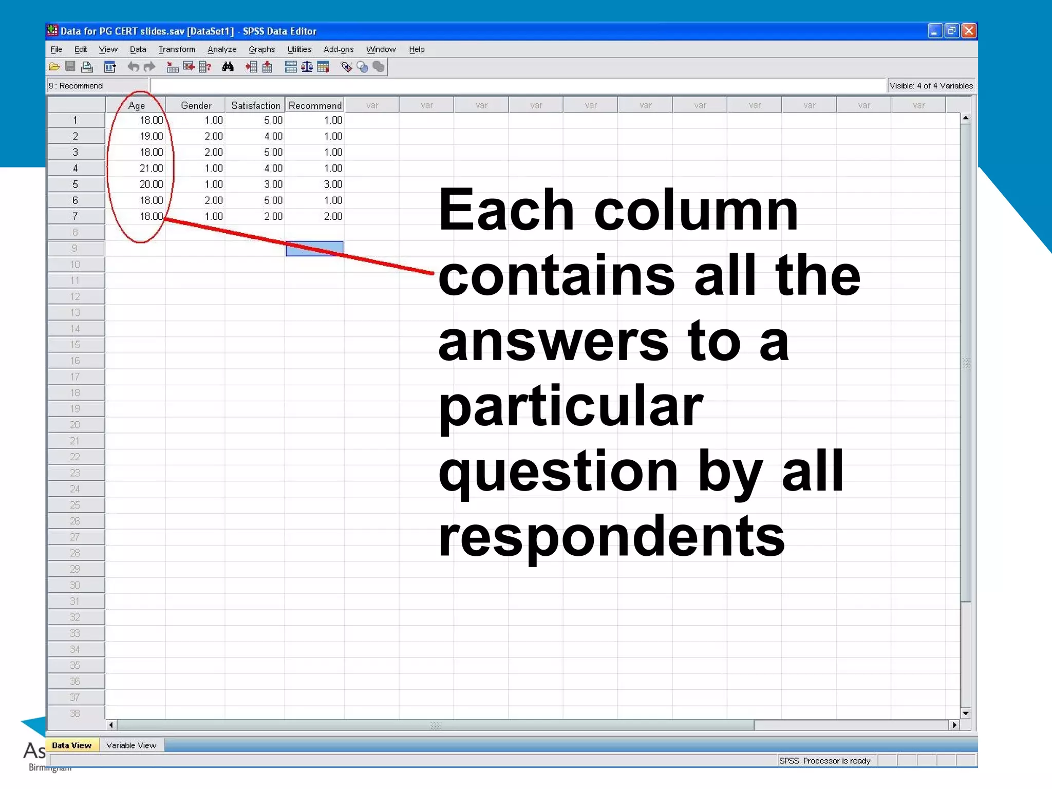
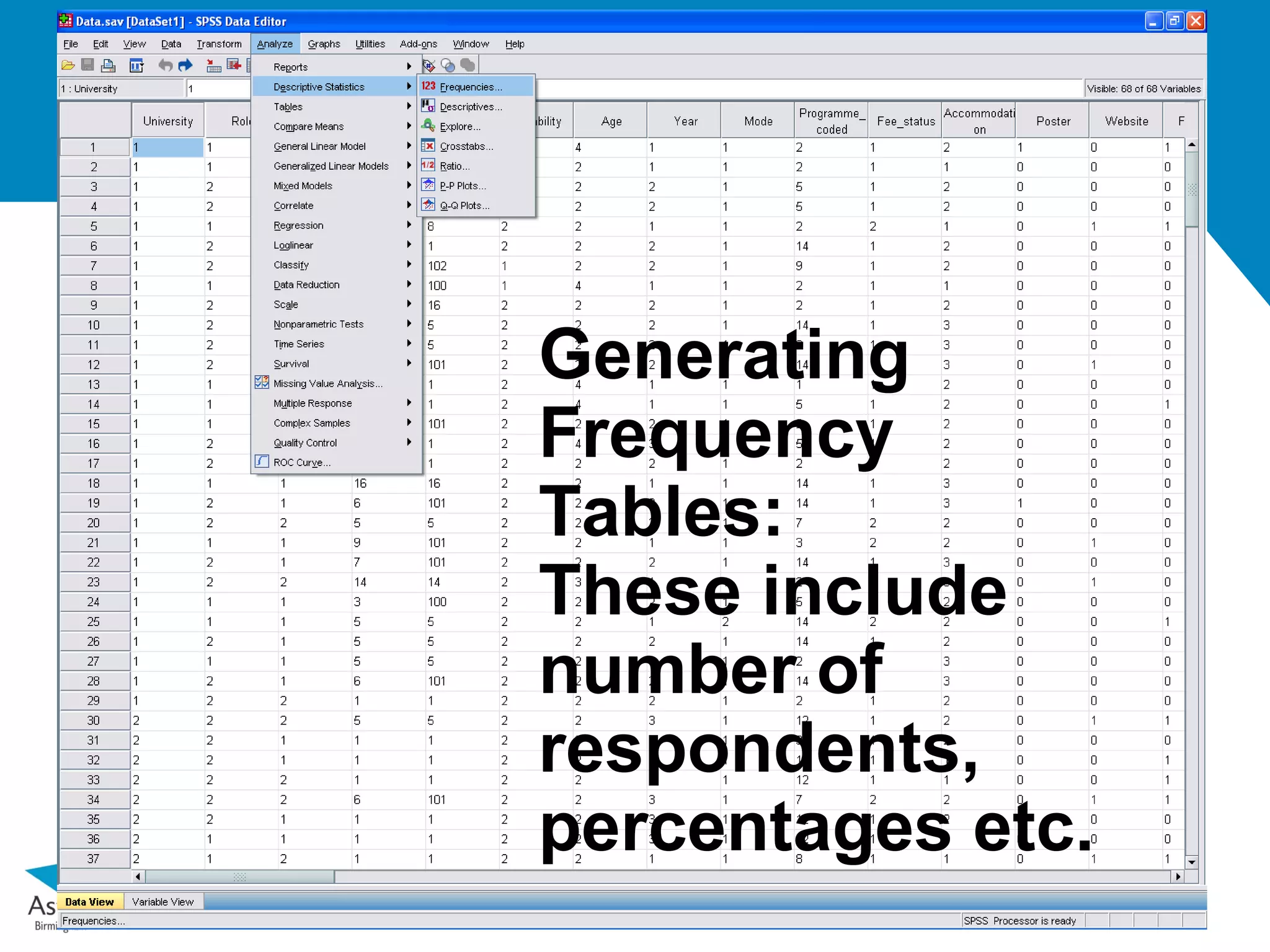
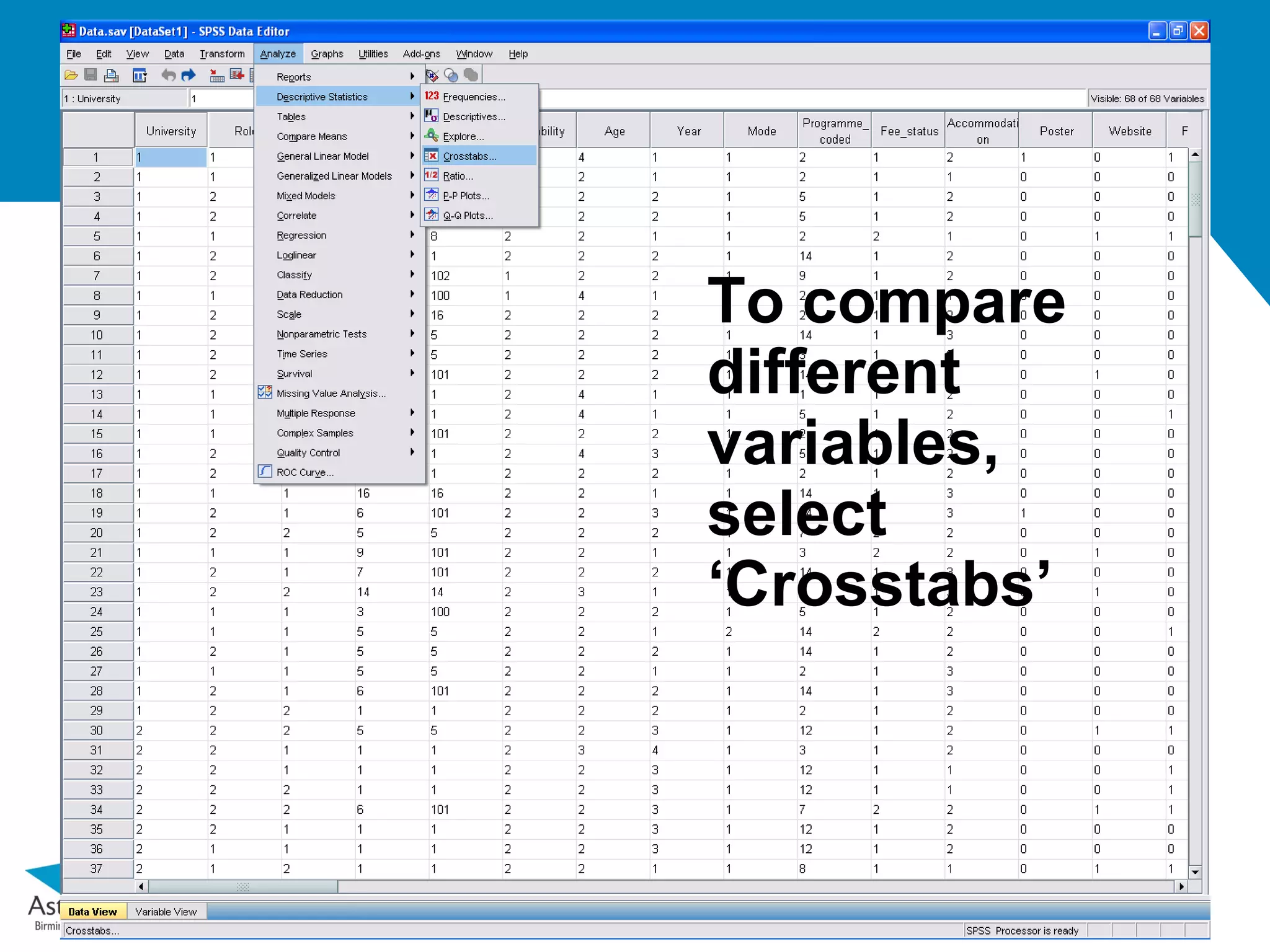
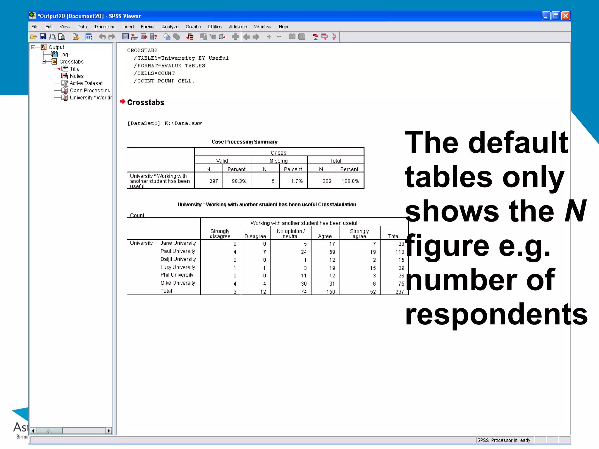
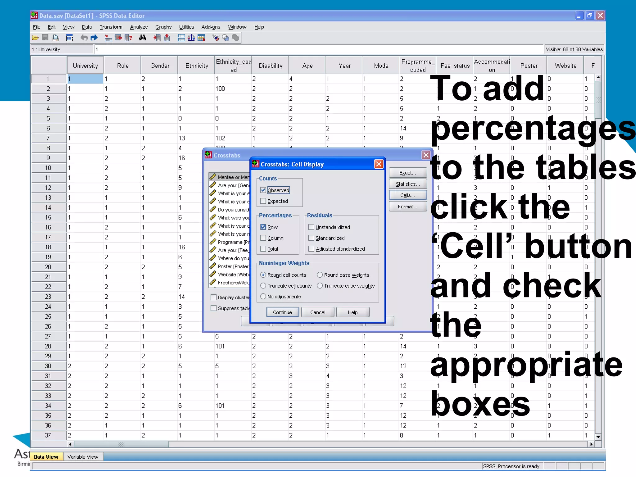
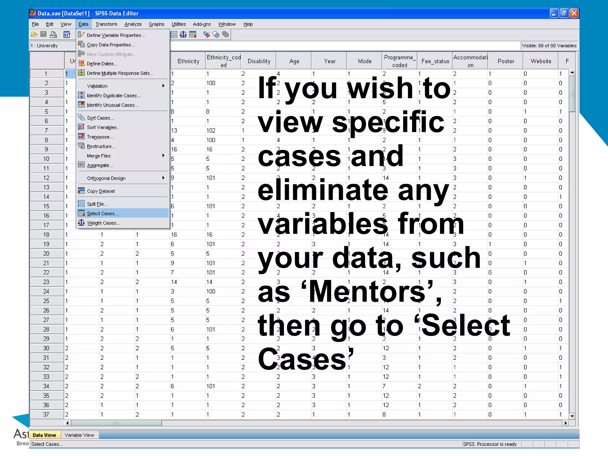
The document provides a basic guide to using SPSS, detailing the two main views: data view for inputting survey responses and variable view for defining what those numbers represent. It explains how to work with numeric and string data, assign meaningful labels, and utilize descriptive statistics to analyze the data effectively. Additionally, the document covers functionalities like exporting data, generating frequency tables, and creating charts for data visualization.
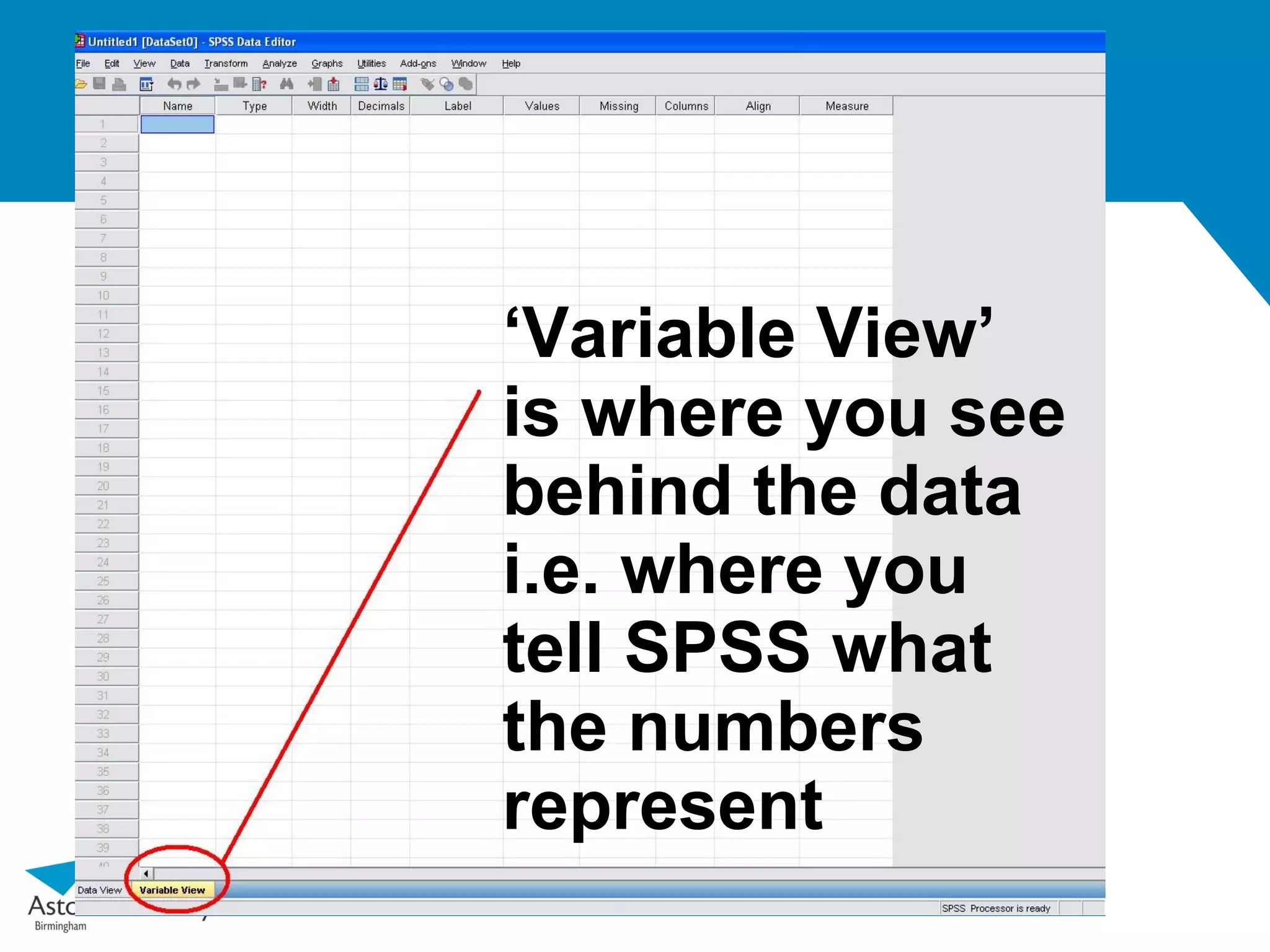
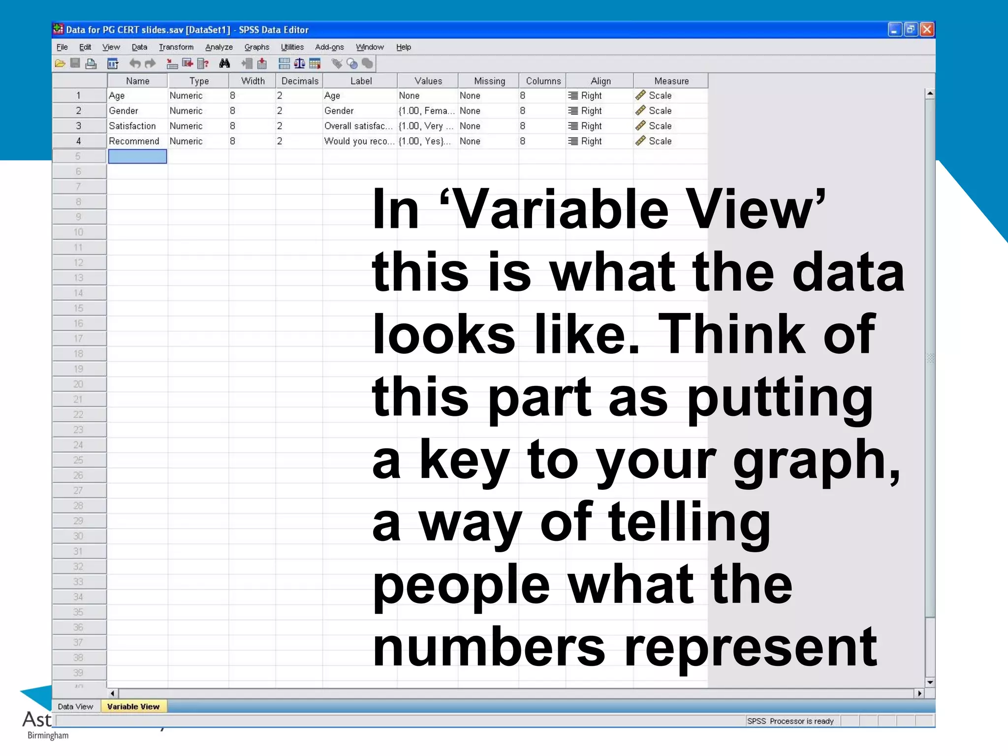
In ‘Variable View’
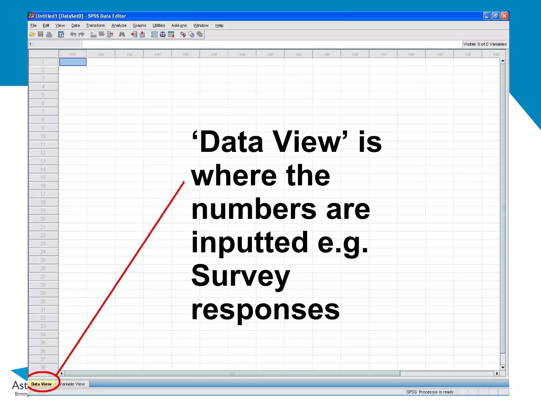
thisis what the data
looks like. Think of
this part as putting
a key to your graph,
a way of telling
people what the
numbers represent
9.
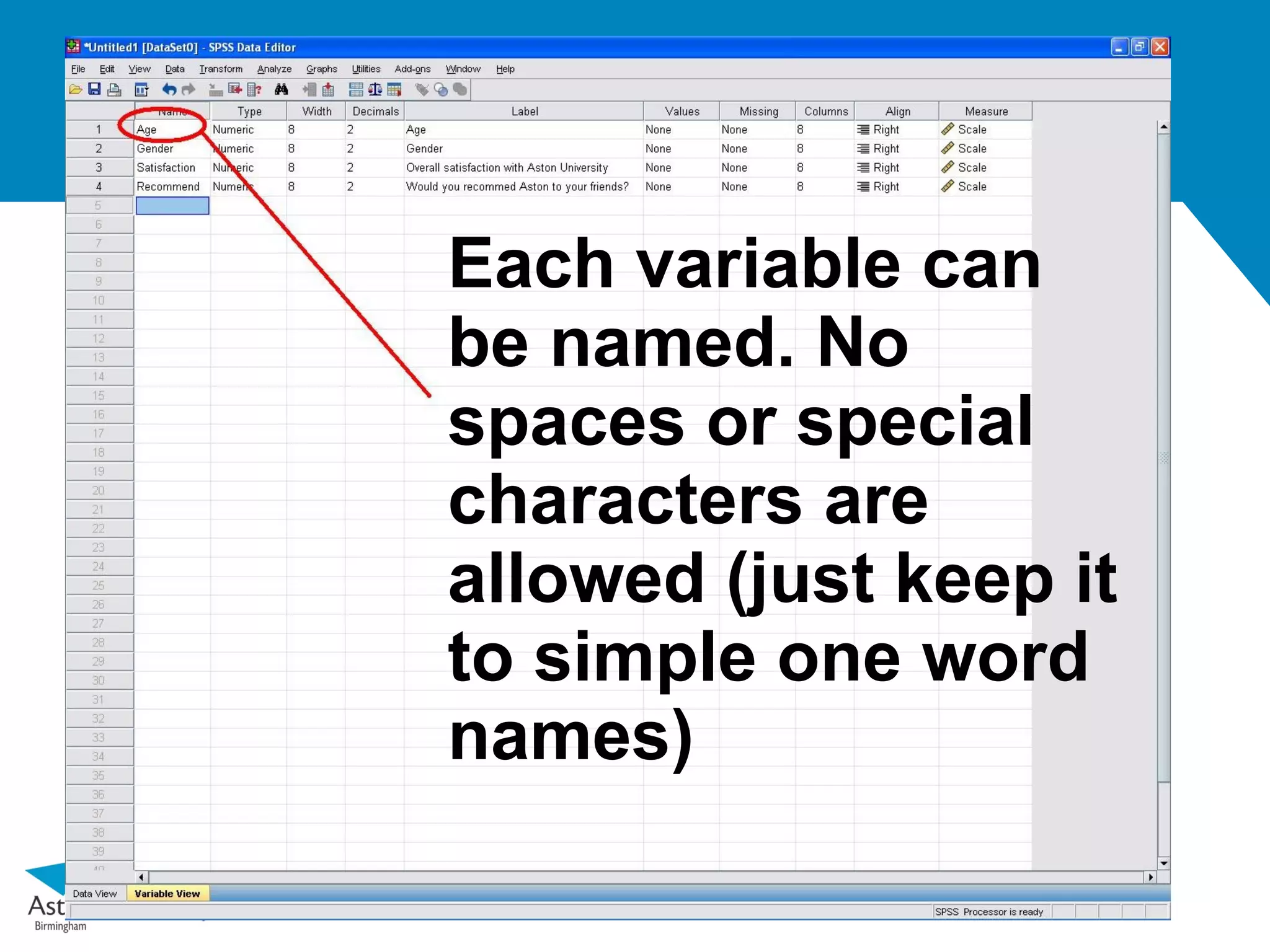
Each variable can
benamed. No
spaces or special
characters are
allowed (just keep it
to simple one word
names)
10.
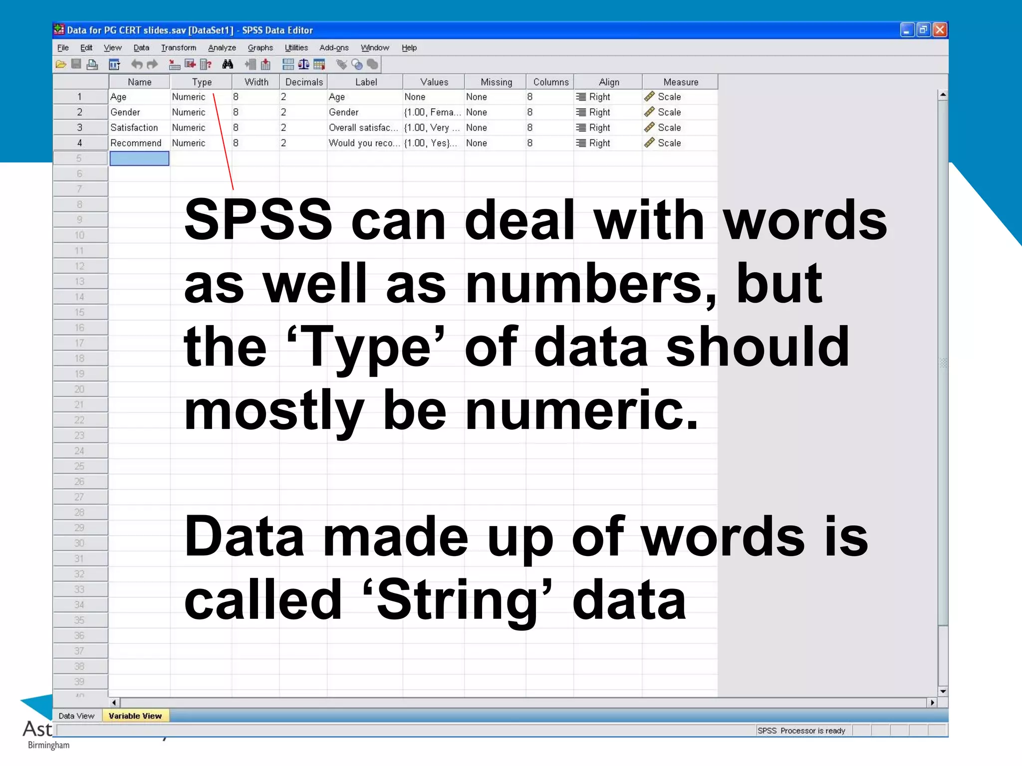
SPSS can dealwith words
as well as numbers, but
the ‘Type’ of data should
mostly be numeric.
Data made up of words is
called ‘String’ data
11.
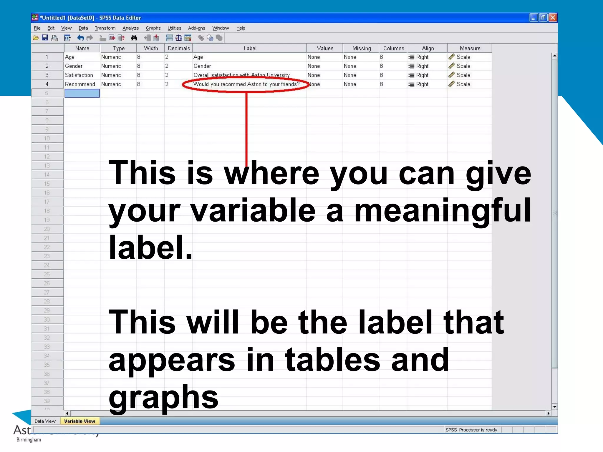
This is whereyou can give
your variable a meaningful
label.
This will be the label that
appears in tables and
graphs
12.
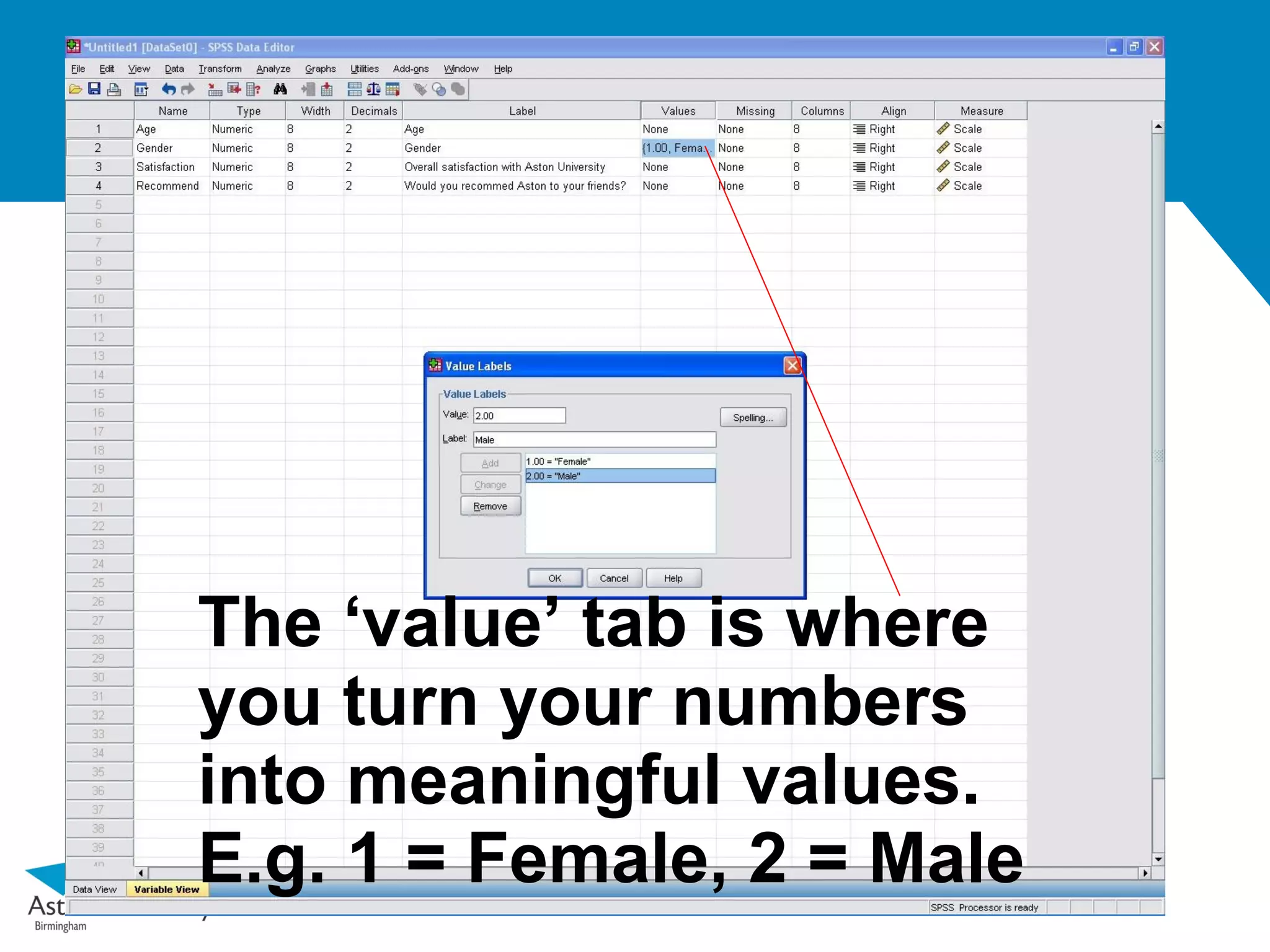
The ‘value’ tabis where
you turn your numbers
into meaningful values.
E.g. 1 = Female, 2 = Male
13.
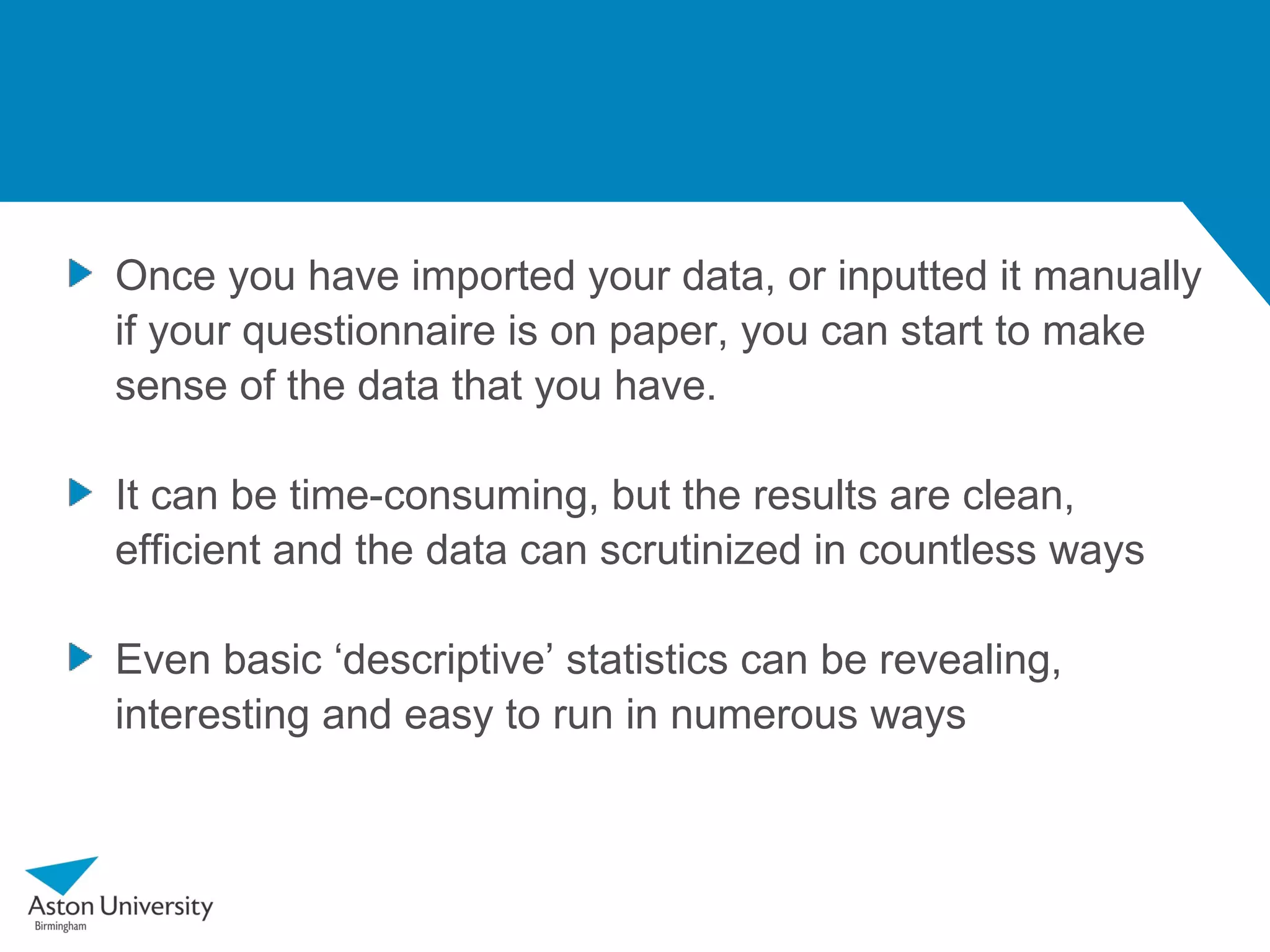
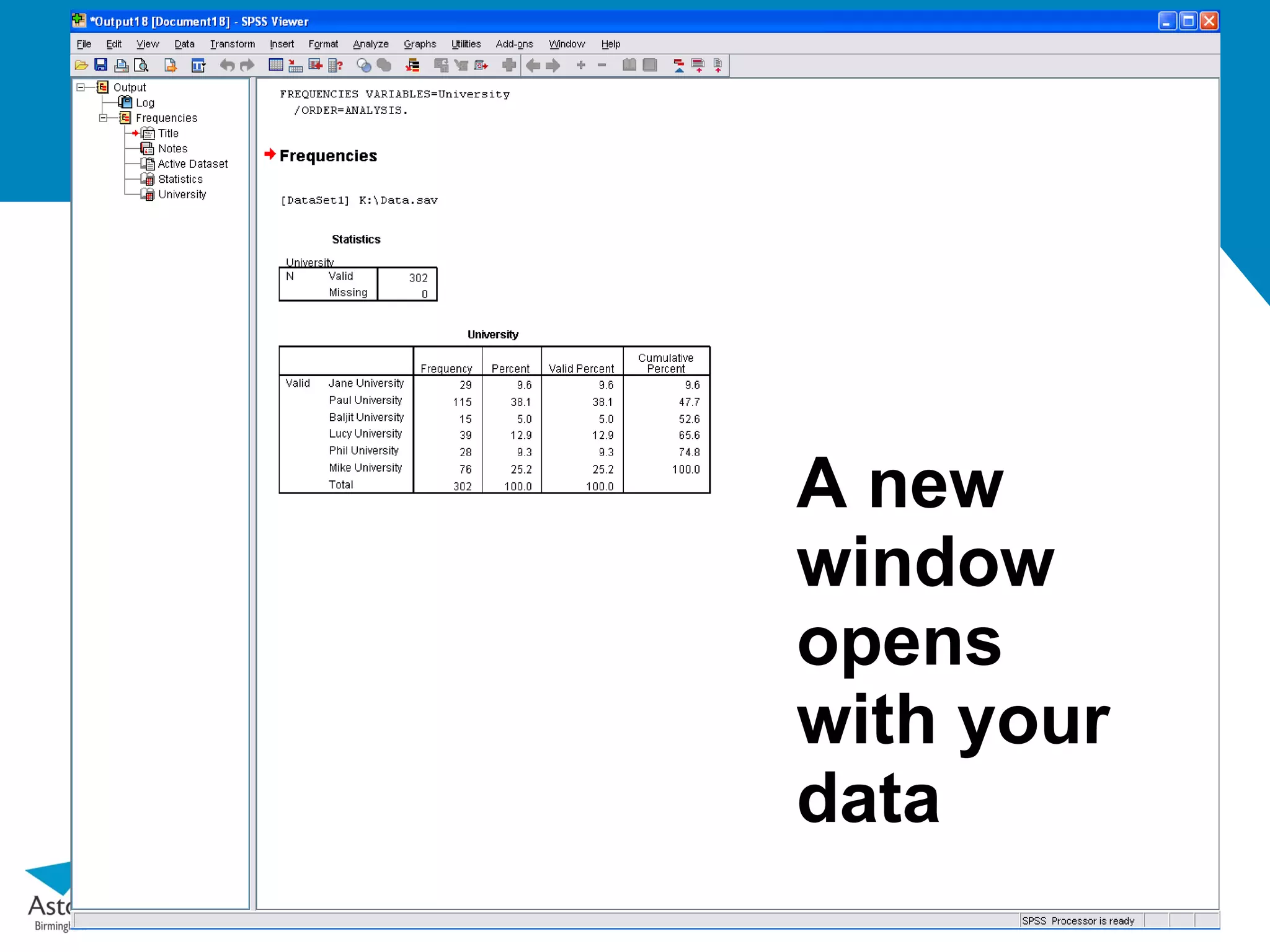
Once you haveimported your data, or inputted it manually
if your questionnaire is on paper, you can start to make
sense of the data that you have.
It can be time-consuming, but the results are clean,
efficient and the data can scrutinized in countless ways
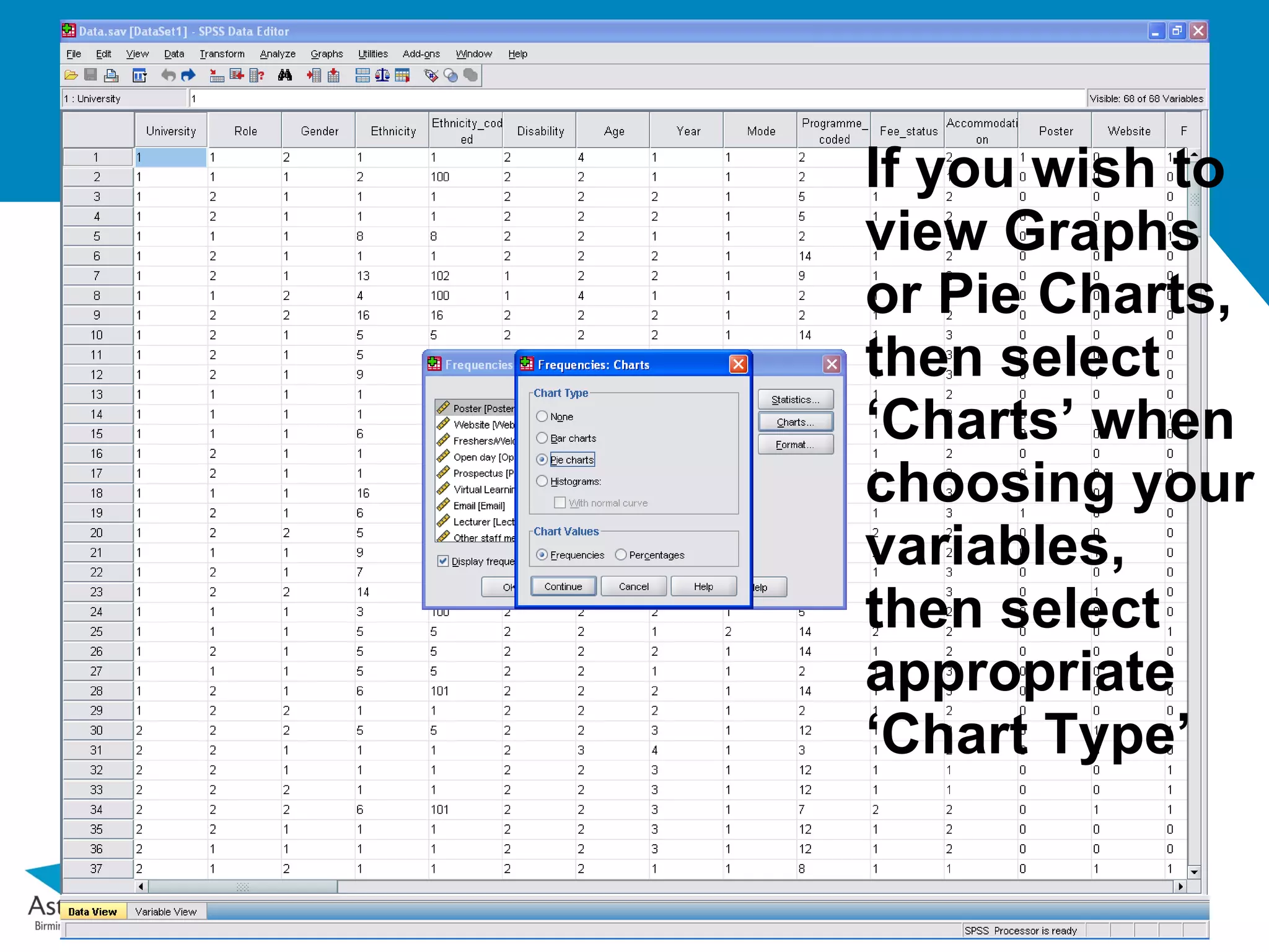
Even basic ‘descriptive’ statistics can be revealing,
interesting and easy to run in numerous ways
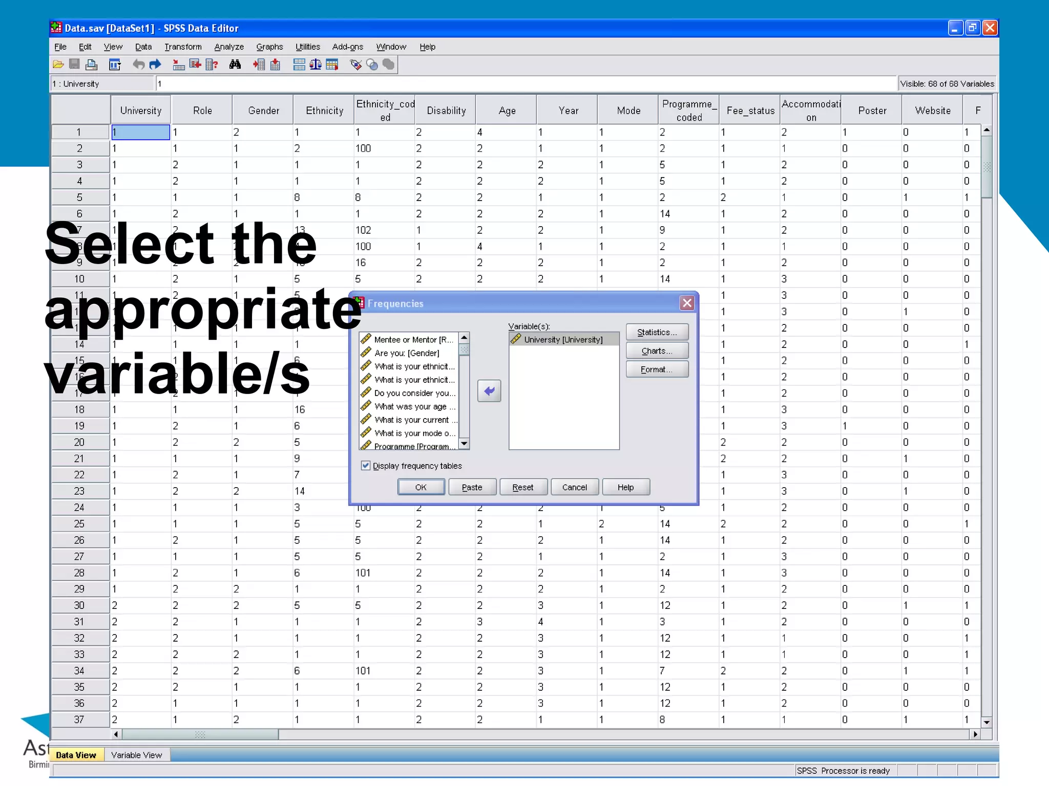
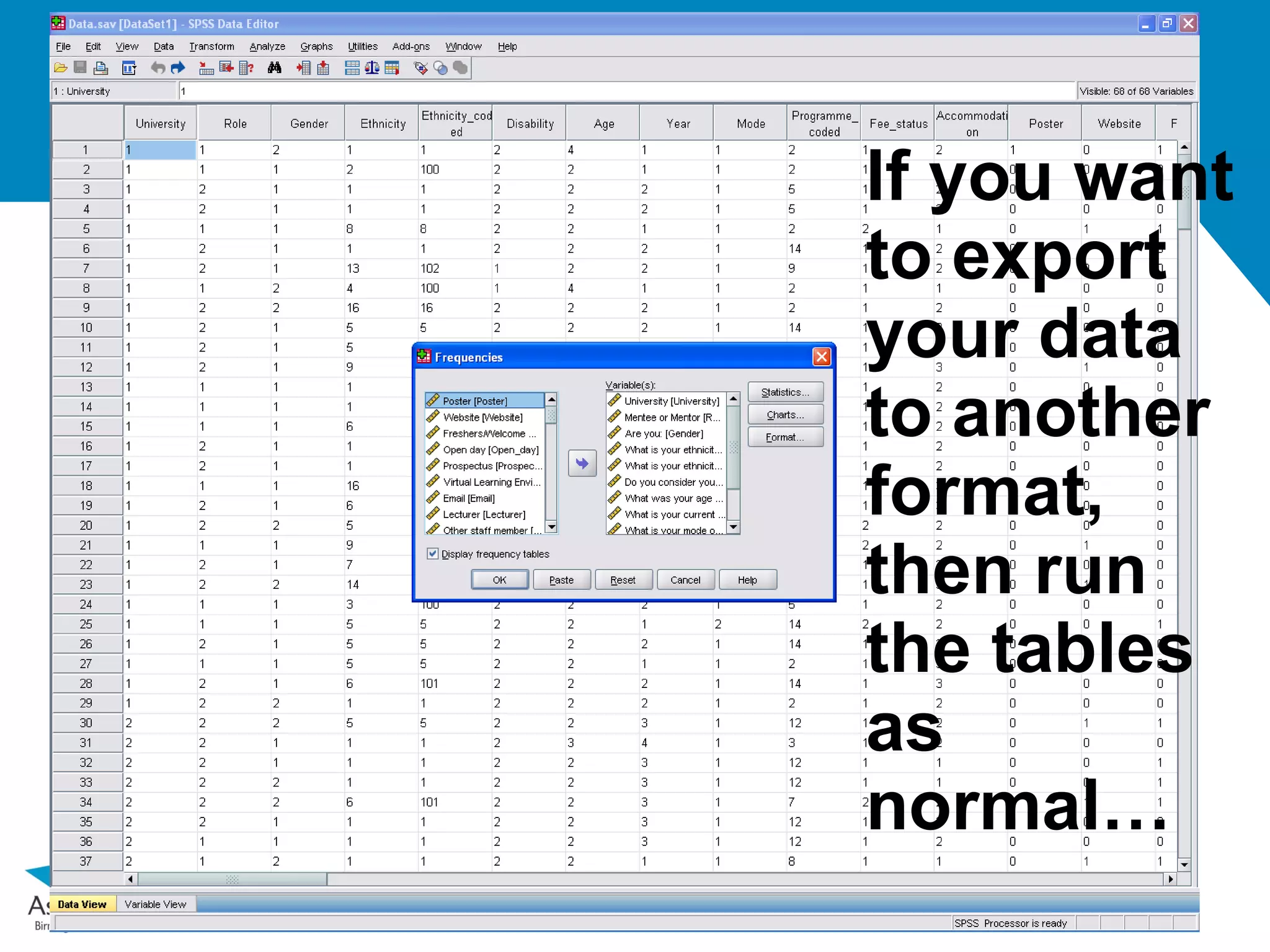
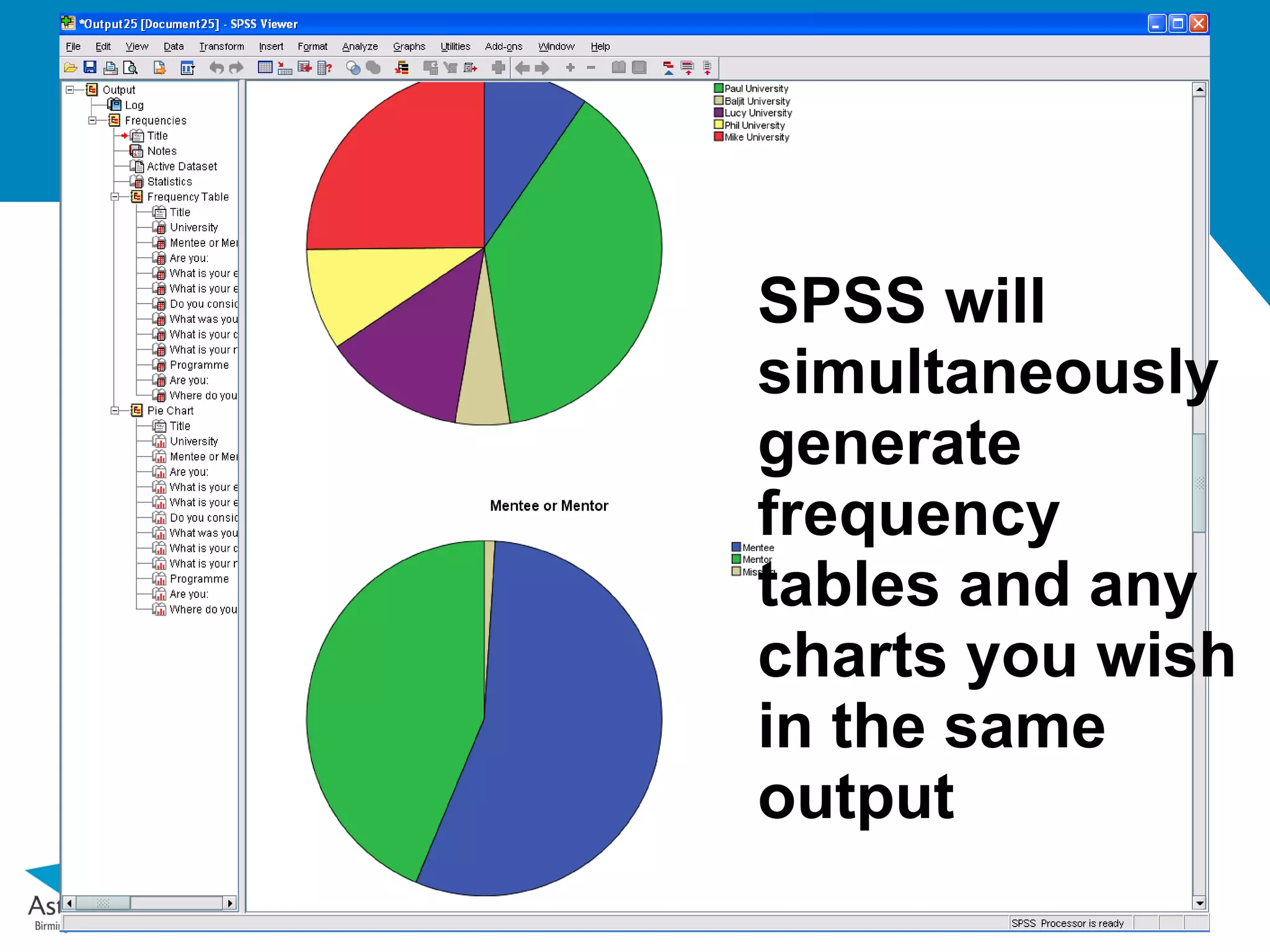
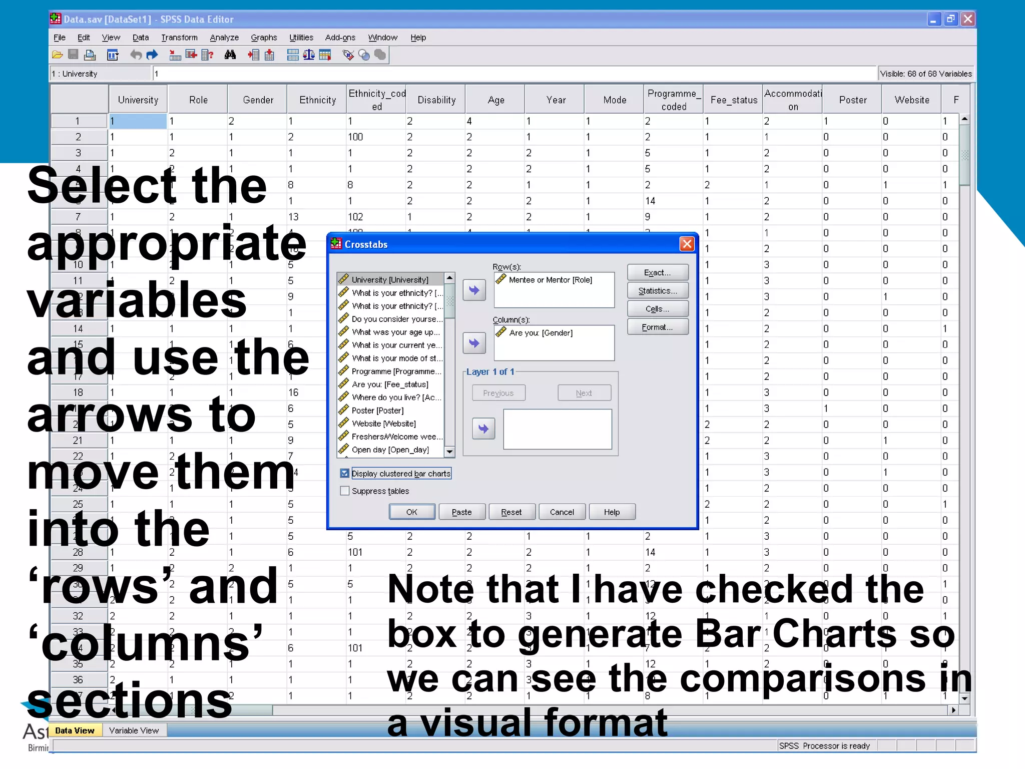
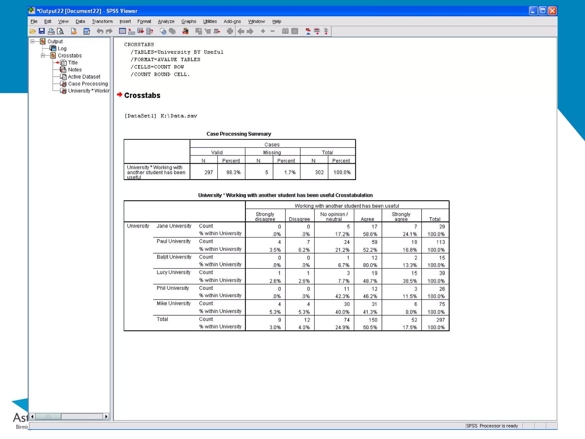
Select the
appropriate
variables
and usethe
arrows to
move them
into the
‘rows’ and Note that I have checked the
‘columns’ box to generate Bar Charts so
we can see the comparisons in
sections a visual format
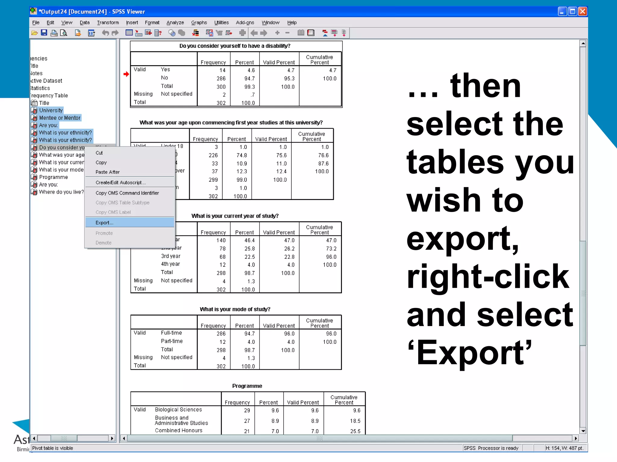
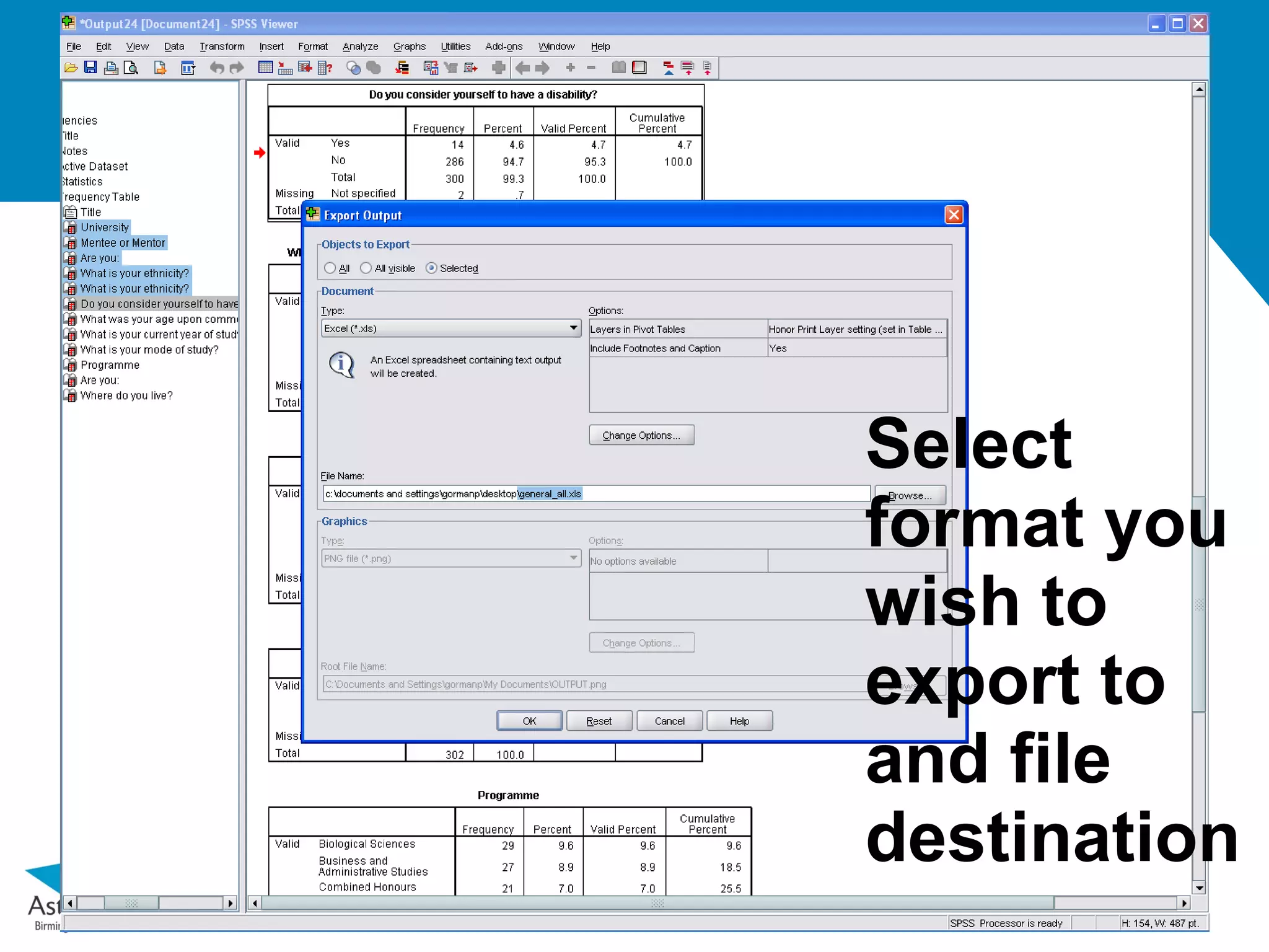
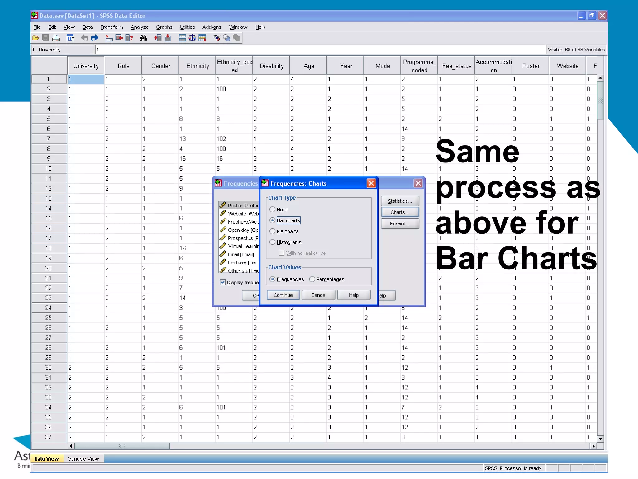
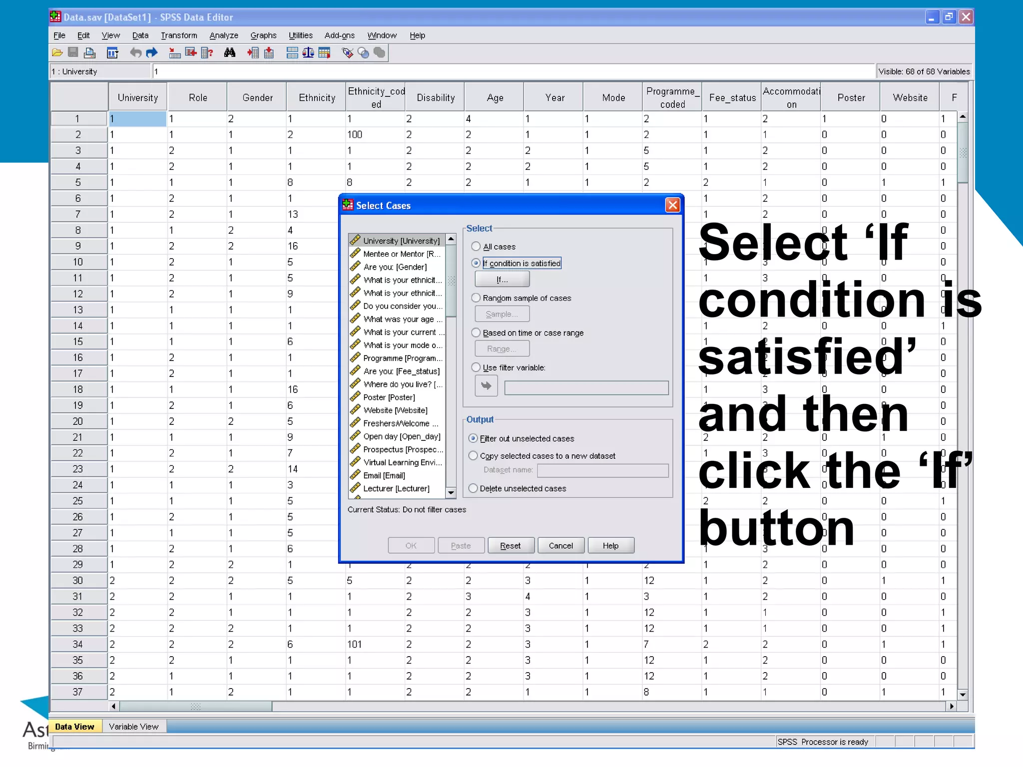
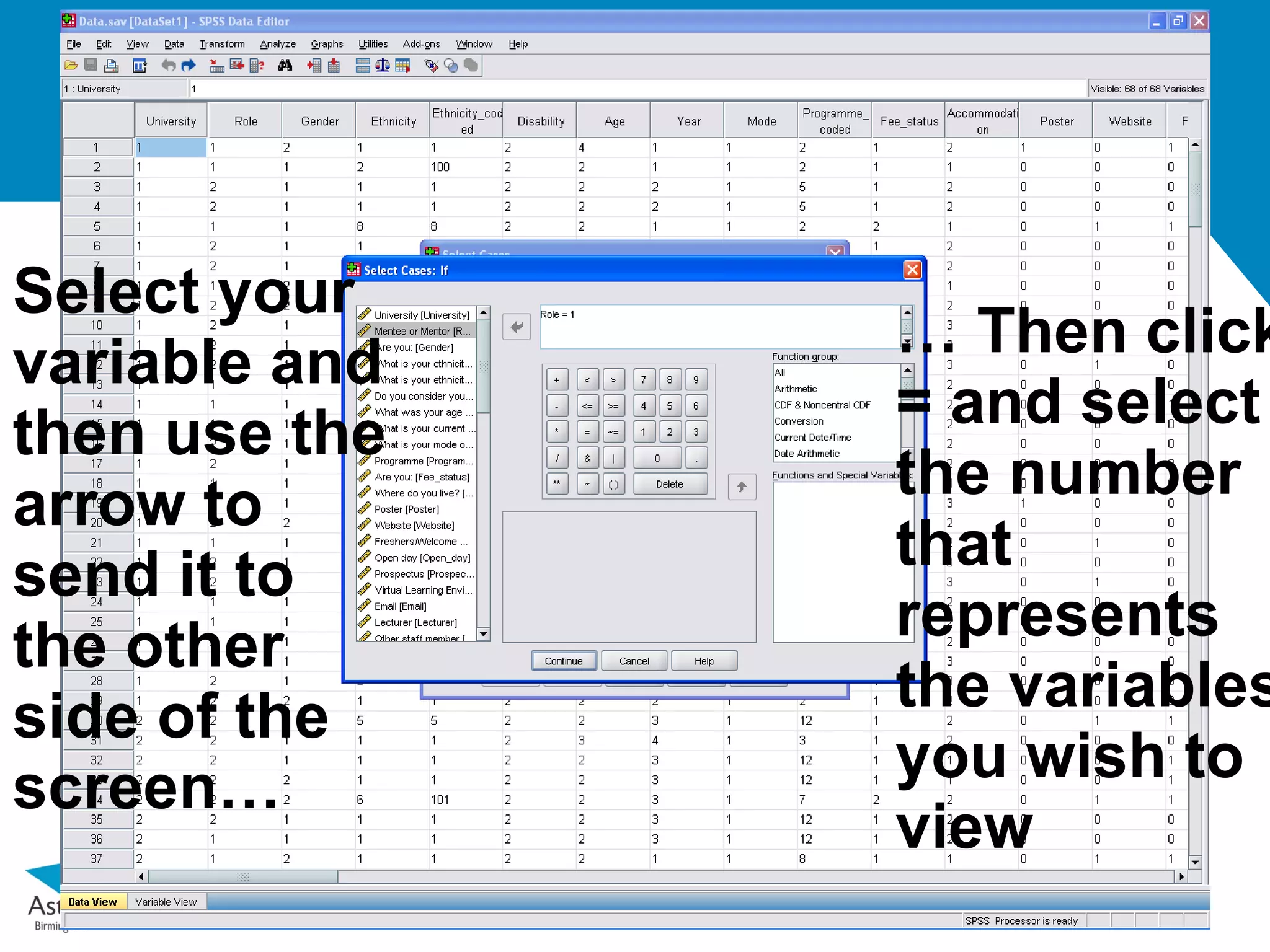
Select your
variable and … Then click
then use the = and select
arrow to the number
send it to that
the other represents
side of the the variables
screen… you wish to
view
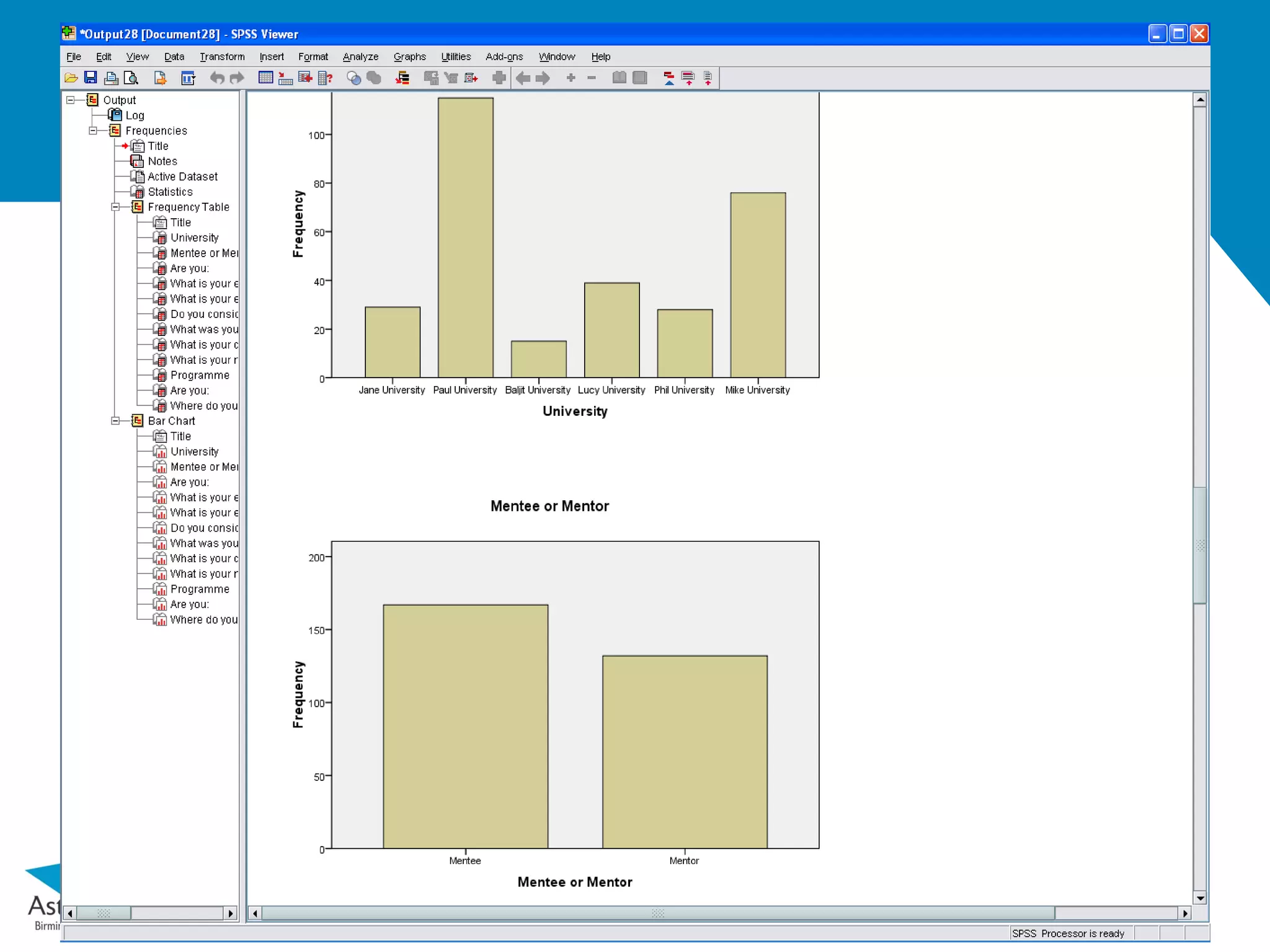
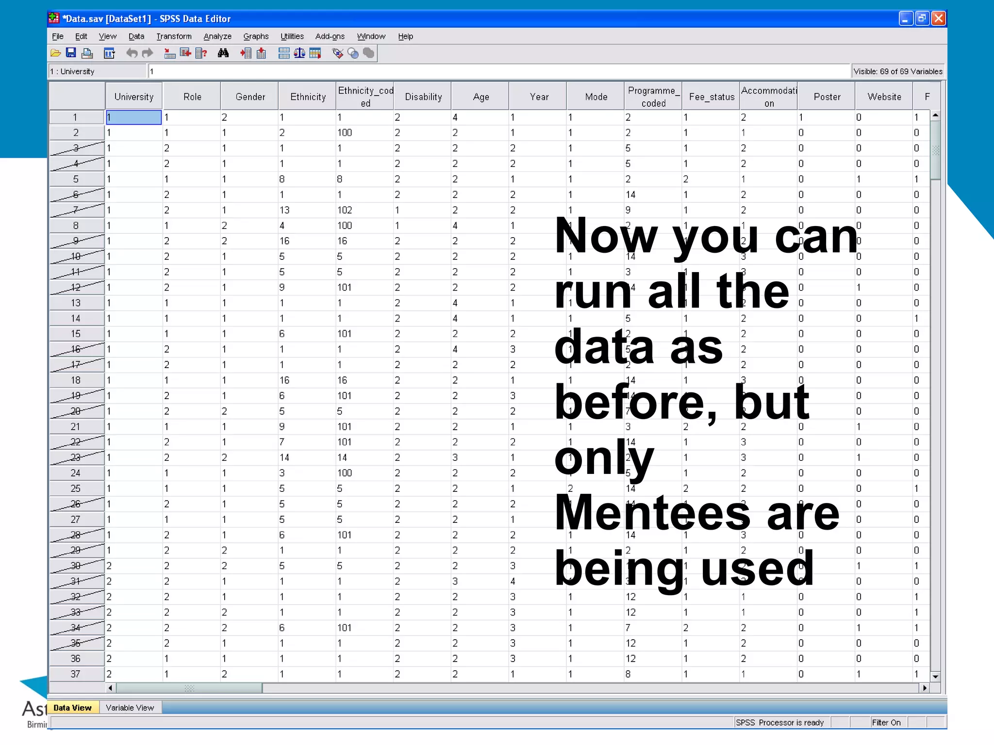
33.
Now you can
runall the
data as
before, but
only
Mentees are
being used


![SPSS Lecture_1 [Autosaved].pptx](https://cdn.slidesharecdn.com/ss_thumbnails/spsslecture1autosaved-231105165336-b29c7b18-thumbnail.jpg?width=640&height=640&fit=bounds)