Download as PDF, PPTX


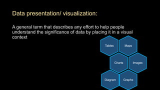
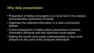

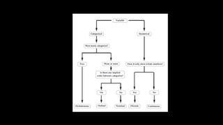
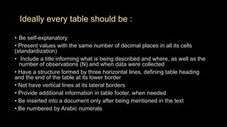
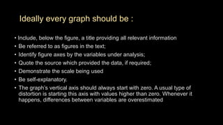
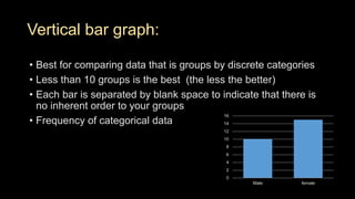
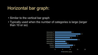
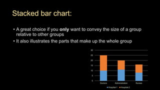
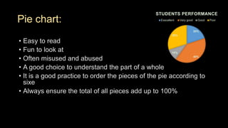
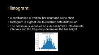
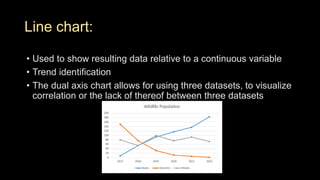
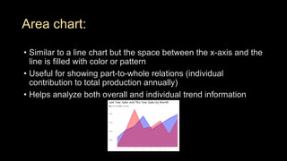
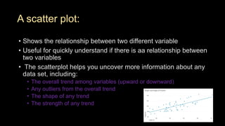
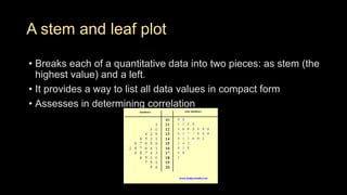
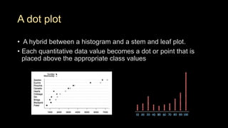
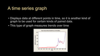


This document discusses different methods for presenting data visually, including tables, charts, graphs, and diagrams. It describes various types of graphs like bar graphs, line charts, scatter plots, and histograms that can be used to summarize different types of data like categorical, numerical, and relationships between variables. For each graph type, it provides examples and discusses when they are best used to present data clearly and help people understand the significance and trends in the data. The key message is that the correct presentation of data through high-quality tables and graphs is important for efficient and clear communication of results.


![PERI-PROSTHETIC FRACTURE NAIL-PLATE CONSTRUCT [NPC].pptx](https://cdn.slidesharecdn.com/ss_thumbnails/drarunkumardrmohamedashrafperiprostheticfrasturenail-plateconstructnpc-260209164459-7e9d15a1-thumbnail.jpg?width=640&height=640&fit=bounds)


![ONFH[AVN HIP] -TRIPLE REGIME -A NOVAL SURGICAL CONCEPT .pptx](https://cdn.slidesharecdn.com/ss_thumbnails/onfhavnhip2026koaconcalicutdrgokuldevdrmashraf-260210064517-213ec005-thumbnail.jpg?width=640&height=640&fit=bounds)