Downloaded 11 times
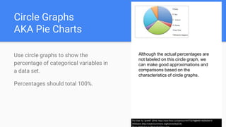
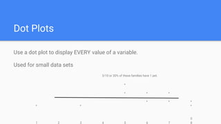
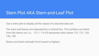
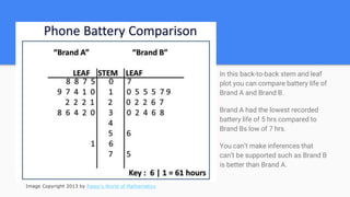
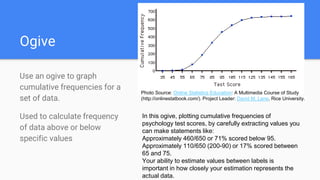
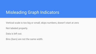

This document discusses various methods for graphically displaying data in statistics, including time series graphs, bar charts, histograms, circle graphs, dot plots, stem plots, ogives, and indicators of misleading graphs. It provides examples and descriptions of how to properly interpret and construct each type of graph. Key points include showing change over time with time series graphs, comparing categories with bar charts, displaying continuous or binned data with histograms, showing percentages with circle graphs, listing all values with dot and stem plots, and calculating cumulative frequencies with ogives. Misleading graphs are identified as those that distort scale, lack labels, omit data, or have uneven bins.