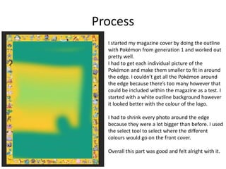
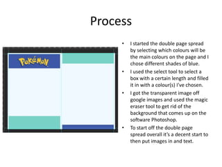
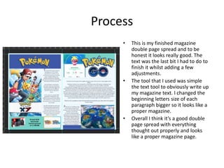
Production Reflection
Your Name
Process
I started my magazine cover by doing the outline
with Pokémon from generation 1 and worked out
pretty well.
I had to get each individual picture of the
Pokémon and make them smaller to fit in around
the edge. I couldn’t get all the Pokémon around
the edge because there’s too many however that
could be included within the magazine as a test. I
started with a white outline background however
it looked better with the colour of the logo.
I had to shrink every photo around the edge
because they were a lot bigger than before. I used
the select tool to select where the different
colours would go on the front cover.
Overall this part was good and felt alright with it.
Process
• When I finished my outline for my front
cover I started on what the main picture
would be on and I chose a picture to do
with the TV series.
• The tools that I use whilst making this
magazine cover were the likes of a rubber
tool / magical eraser tool, cropping tool,
colour too and many more.
• I used most of these tools on transparent
images.
• For the text I used two different fonts that
looked good.
• Overall I think it looks good as a front cover
of a magazine. I filled every part of the front
cover without any mistakes so I think it’s
good.
Process
• I started the double page spread
by selecting which colours will be
the main colours on the page and I
chose different shades of blue.
• I used the select tool to select a
box with a certain length and filled
it in with a colour(s) I've chosen.
• I got the transparent image off
google images and used the magic
eraser tool to get rid of the
background that comes up on the
software Photoshop.
• To start off the double page
spread overall it’s a decent start to
then put images in and text.
Process
• This part of making the double
page spread is getting all the
images and ready to write up the
text. I got the images of google
images and wanted some of them
to have similar colours in the
background so it fits well.
• The pictures are from the TV
series and the games of Pokémon.
When putting these images onto
the double page I had to make
sure that I put them in a decent
place so text is available.
• The pictures are good because
they all involve the colour blue
which is from the logo and
background.
Process
• This is my finished magazine
double page spread and to be
honest it looks really good. The
text was the last bit I had to do to
finish it whilst adding a few
adjustments.
• The tool that I used was simple
the text tool to obviously write up
my magazine text. I changed the
beginning letters size of each
paragraph bigger so it looks like a
proper magazine.
• Overall I think it’s a good double
page spread with everything
thought out properly and looks
like a proper magazine page.

Visual - Production Reflection

  • 1.
  • 2.
    Process I started mymagazine cover by doing the outline with Pokémon from generation 1 and worked out pretty well. I had to get each individual picture of the Pokémon and make them smaller to fit in around the edge. I couldn’t get all the Pokémon around the edge because there’s too many however that could be included within the magazine as a test. I started with a white outline background however it looked better with the colour of the logo. I had to shrink every photo around the edge because they were a lot bigger than before. I used the select tool to select where the different colours would go on the front cover. Overall this part was good and felt alright with it.
  • 3.
    Process • When Ifinished my outline for my front cover I started on what the main picture would be on and I chose a picture to do with the TV series. • The tools that I use whilst making this magazine cover were the likes of a rubber tool / magical eraser tool, cropping tool, colour too and many more. • I used most of these tools on transparent images. • For the text I used two different fonts that looked good. • Overall I think it looks good as a front cover of a magazine. I filled every part of the front cover without any mistakes so I think it’s good.
  • 4.
    Process • I startedthe double page spread by selecting which colours will be the main colours on the page and I chose different shades of blue. • I used the select tool to select a box with a certain length and filled it in with a colour(s) I've chosen. • I got the transparent image off google images and used the magic eraser tool to get rid of the background that comes up on the software Photoshop. • To start off the double page spread overall it’s a decent start to then put images in and text.
  • 5.
    Process • This partof making the double page spread is getting all the images and ready to write up the text. I got the images of google images and wanted some of them to have similar colours in the background so it fits well. • The pictures are from the TV series and the games of Pokémon. When putting these images onto the double page I had to make sure that I put them in a decent place so text is available. • The pictures are good because they all involve the colour blue which is from the logo and background.
  • 6.
    Process • This ismy finished magazine double page spread and to be honest it looks really good. The text was the last bit I had to do to finish it whilst adding a few adjustments. • The tool that I used was simple the text tool to obviously write up my magazine text. I changed the beginning letters size of each paragraph bigger so it looks like a proper magazine. • Overall I think it’s a good double page spread with everything thought out properly and looks like a proper magazine page.

Editor's Notes

  • #3 Discuss the tools and processes used in your production. Log your thoughts and feelings about your work.
  • #4 Discuss the tools and processes used in your production. Log your thoughts and feelings about your work.
  • #5 Discuss the tools and processes used in your production. Log your thoughts and feelings about your work.
  • #6 Discuss the tools and processes used in your production. Log your thoughts and feelings about your work.
  • #7 Discuss the tools and processes used in your production. Log your thoughts and feelings about your work.