SlideShare a Scribd company logo
Production Reflection
Amy foster
Photography
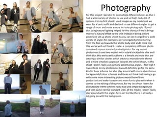
For this project I decided to do multiple different shoots so that I
had a wide variety of photos to use and so that I had a lot of
options. For my first shoot I used Imogen as my model and we
went for a basic outfit and decided to use different angles to get a
range of shots and make a more intricate photograph, I found
that using natural lighting helped for this shoot as I feel it brings
more of a natural effect to the shot instead of being a more
posed and set up photo shoot. As you can see I ranged for a wide
variety of angles for example a very elongated photo starting
from the foot up towards the whole body shot and I think that
this works well as I think it creates a completely different photo
compared to your standard portrait photo. For my second
photoshoot I used two models with a dark black/white vibe and I
think that this works well as there is a female and male that are
wearing a similar clothes which creates a monochrome theme
and a more simplistic approach towards the whole shoot, in this
shoot I didn’t really use as many adventurous angles. I feel that if
I were to re do my photoshoot I would definitely go for the same
kind of basic scheme but also play around with more adventurous
backgrounds/colour schemes and ideas as I think that having a go
with some more interesting pictures would benefit my
production and make it easier and more fun to play with when it
comes to the editing of the photos. For my last shoot I went for
an outdoors theme where I had a nice and simple background
and took some normal standard shots of the model, I didn’t really
play around with the angles here as I feel like there is already a
lot going on with the background.
ProcessBack cover
Process – back cover
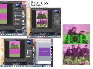
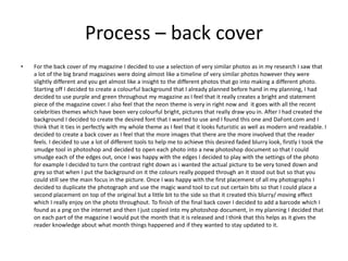
• For the back cover of my magazine I decided to use a selection of very similar photos as in my research I saw that
a lot of the big brand magazines were doing almost like a timeline of very similar photos however they were
slightly different and you get almost like a insight to the different photos that go into making a different photo.
Starting off I decided to create a colourful background that I already planned before hand in my planning, I had
decided to use purple and green throughout my magazine as I feel that it really creates a bright and statement
piece of the magazine cover. I also feel that the neon theme is very in right now and it goes with all the recent
celebrities themes which have been very colourful bright, pictures that really draw you in. After I had created the
background I decided to create the desired font that I wanted to use and I found this one and DaFont.com and I
think that it ties in perfectly with my whole theme as I feel that it looks futuristic as well as modern and readable. I
decided to create a back cover as I feel that the more images that there are the more involved that the reader
feels. I decided to use a lot of different tools to help me to achieve this desired faded blurry look, firstly I took the
smudge tool in photoshop and decided to open each photo into a new photoshop document so that I could
smudge each of the edges out, once I was happy with the edges I decided to play with the settings of the photo
for example I decided to turn the contrast right down as i wanted the actual picture to be very toned down and
grey so that when I put the background on it the colours really popped through an it stood out but so that you
could still see the main focus in the picture. Once I was happy with the first placement of all my photographs I
decided to duplicate the photograph and use the magic wand tool to cut out certain bits so that I could place a
second placement on top of the original but a little bit to the side so that it created this blurry/ moving effect
which I really enjoy on the photo throughout. To finish of the final back cover I decided to add a barcode which I
found as a png on the internet and then I just copied into my photoshop document, in my planning I decided that
on each part of the magazine I would put the month that it is released and I think that this helps as it gives the
reader knowledge about what month things happened and if they wanted to stay updated to it.
ProcessDouble page spread
Process- double page spread
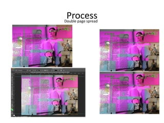
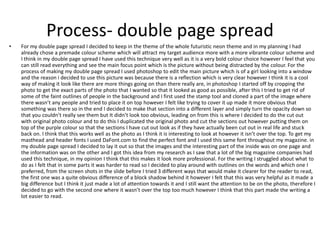
• For my double page spread I decided to keep in the theme of the whole futuristic neon theme and in my planning I had
already chose a premade colour scheme which will attract my target audience more with a more vibrante colour scheme and
I think in my double page spread I have used this technique very well as it is a very bold colour choice however I feel that you
can still read everything and see the main focus point which is the picture without being distracted by the colour. For the
process of making my double page spread I used photoshop to edit the main picture which is of a girl looking into a window
and the reason i decided to use this picture was because there is a reflection which is very clear however I think it is a cool
way of making it look like there are more things going on than there really are, in photoshop I started off by cropping the
photo to get the exact parts of the photo that I wanted so that it looked as good as possible, after this I tried to get rid of
some of the faint outlines of people in the background and I first used the stamp tool and cloned a part of the image where
there wasn’t any people and tried to place it on top however I felt like trying to cover it up made it more obvious that
something was there so in the end I decided to make that section into a different layer and simply turn the opacity down so
that you couldn’t really see them but It didn’t look too obvious, leading on from this is where I decided to do the cut out
with original photo colour and to do this I duplicated the original photo and cut the sections out however putting them on
top of the purple colour so that the sections I have cut out look as if they have actually been cut out in real life and stuck
back on. I think that this works well as the photo as I think it is interesting to look at however it isn’t over the top. To get my
masthead and header fonts I used DaFont.com to find the perfect font and I used this same font throughout my magazine. in
my double page spread I decided to lay it out so that the images and the interesting part of the inside was on one page and
the information was on the other and I got this idea from my research as I saw that a lot of the big magazine companies had
used this technique, in my opinion I think that this makes it look more professional. For the writing I struggled about what to
do as I felt that in some parts it was harder to read so I decided to play around with outlines on the words and which one I
preferred, from the screen shots in the slide before I tried 3 different ways that would make it clearer for the reader to read,
the first one was a quite obvious difference of a block shadow behind it however I felt that this was very helpful as it made a
big difference but I think it just made a lot of attention towards it and I still want the attention to be on the photo, therefore I
decided to go with the second one where it wasn’t over the top too much however I think that this part made the writing a
lot easier to read.
ProcessFront cover
Process- front cover
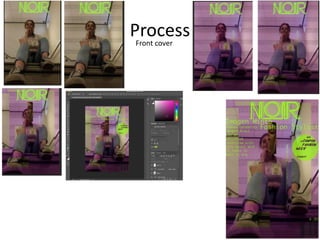
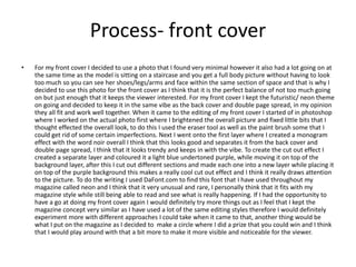
• For my front cover I decided to use a photo that I found very minimal however it also had a lot going on at
the same time as the model is sitting on a staircase and you get a full body picture without having to look
too much so you can see her shoes/legs/arms and face within the same section of space and that is why I
decided to use this photo for the front cover as I think that it is the perfect balance of not too much going
on but just enough that it keeps the viewer interested. For my front cover I kept the futuristic/ neon theme
on going and decided to keep it in the same vibe as the back cover and double page spread, in my opinion
they all fit and work well together. When it came to the editing of my front cover I started of in photoshop
where I worked on the actual photo first where I brightened the overall picture and fixed little bits that I
thought effected the overall look, to do this I used the eraser tool as well as the paint brush some that I
could get rid of some certain imperfections. Next I went onto the first layer where I created a monogram
effect with the word noir overall I think that this looks good and separates it from the back cover and
double page spread, I think that it looks trendy and keeps in with the vibe. To create the cut out effect I
created a separate layer and coloured it a light blue undertoned purple, while moving it on top of the
background layer, after this I cut out different sections and made each one into a new layer while placing it
on top of the purple background this makes a really cool cut out effect and I think it really draws attention
to the picture. To do the writing I used DaFont.com to find this font that I have used throughout my
magazine called neon and I think that it very unusual and rare, I personally think that it fits with my
magazine style while still being able to read and see what is really happening. If I had the opportunity to
have a go at doing my front cover again I would definitely try more things out as I feel that I kept the
magazine concept very similar as I have used a lot of the same editing styles therefore I would definitely
experiment more with different approaches I could take when it came to that, another thing would be
what I put on the magazine as I decided to make a circle where I did a prize that you could win and I think
that I would play around with that a bit more to make it more visible and noticeable for the viewer.

More Related Content

What's hot

6. production reflection
6. production reflection6. production reflection
6. production reflection
fin sedgwick
 
6. production reflection
6. production reflection6. production reflection
6. production reflection
fin sedgwick
 
6. production reflection
6. production reflection6. production reflection
6. production reflection
fin sedgwick
 
Complete FMP Evaluation
Complete FMP EvaluationComplete FMP Evaluation
Complete FMP Evaluation
Jack Ward
 
Production diary
Production diaryProduction diary
Production diary
Daniel Thompson
 
Evaluation of unit 21
Evaluation of unit 21Evaluation of unit 21
Evaluation of unit 21willeatscake
 
3. fmp production experiments
3. fmp production experiments3. fmp production experiments
3. fmp production experiments
chrislaw34
 
FMP Reflective Journal
FMP Reflective JournalFMP Reflective Journal
FMP Reflective Journal
ShaniceYates
 
Production Experiments
Production ExperimentsProduction Experiments
Production Experiments
ShaniceYates
 
Evaluation
EvaluationEvaluation
Evaluation
joshh12
 
Evaluation- Photography
Evaluation- PhotographyEvaluation- Photography
Evaluation- Photography
joshh12
 
Production Experiments
Production ExperimentsProduction Experiments
Production Experiments
ShaniceYates
 
Double page spread
Double page spreadDouble page spread
Double page spreadKatieMould27
 
6. production reflection
6. production reflection6. production reflection
6. production reflection
fin sedgwick
 
On going evaluations.pptx2.
On going evaluations.pptx2.On going evaluations.pptx2.
On going evaluations.pptx2.
em-monsey
 
6. Production Reflection
6. Production Reflection6. Production Reflection
6. Production Reflection
Leon Boyce
 
Construction
ConstructionConstruction
Construction
salaffina
 

What's hot (20)

6. production reflection
6. production reflection6. production reflection
6. production reflection
 
6. production reflection
6. production reflection6. production reflection
6. production reflection
 
6. production reflection
6. production reflection6. production reflection
6. production reflection
 
Complete FMP Evaluation
Complete FMP EvaluationComplete FMP Evaluation
Complete FMP Evaluation
 
Production diary
Production diaryProduction diary
Production diary
 
Weekly diary
Weekly diaryWeekly diary
Weekly diary
 
Evaluation of unit 21
Evaluation of unit 21Evaluation of unit 21
Evaluation of unit 21
 
Evaluation
EvaluationEvaluation
Evaluation
 
Evaluation
EvaluationEvaluation
Evaluation
 
3. fmp production experiments
3. fmp production experiments3. fmp production experiments
3. fmp production experiments
 
FMP Reflective Journal
FMP Reflective JournalFMP Reflective Journal
FMP Reflective Journal
 
Production Experiments
Production ExperimentsProduction Experiments
Production Experiments
 
Evaluation
EvaluationEvaluation
Evaluation
 
Evaluation- Photography
Evaluation- PhotographyEvaluation- Photography
Evaluation- Photography
 
Production Experiments
Production ExperimentsProduction Experiments
Production Experiments
 
Double page spread
Double page spreadDouble page spread
Double page spread
 
6. production reflection
6. production reflection6. production reflection
6. production reflection
 
On going evaluations.pptx2.
On going evaluations.pptx2.On going evaluations.pptx2.
On going evaluations.pptx2.
 
6. Production Reflection
6. Production Reflection6. Production Reflection
6. Production Reflection
 
Construction
ConstructionConstruction
Construction
 

Similar to 6. production reflection(1) (1) (1)

Construction
ConstructionConstruction
Construction
salaffina
 
3. experiments finished
3. experiments finished3. experiments finished
3. experiments finished
amy foster
 
Production Experiments
Production ExperimentsProduction Experiments
Production Experiments
Hannah Palfreeman
 
Production reflection - print project
Production reflection - print projectProduction reflection - print project
Production reflection - print project
JoyLucyBuck
 
Print Rotation Evaluation
Print Rotation EvaluationPrint Rotation Evaluation
Print Rotation Evaluation
Charlie Atkin
 
6. production reflection(1) 1
6. production reflection(1) 16. production reflection(1) 1
6. production reflection(1) 1
jackedwards46
 
Task 2A evaluation photography
Task 2A  evaluation photographyTask 2A  evaluation photography
Task 2A evaluation photography
gaetan lundula
 
Daily Reflections
Daily ReflectionsDaily Reflections
Daily Reflections
Leticia Pozze
 
6. production reflection(1)
6. production reflection(1)6. production reflection(1)
6. production reflection(1)
OliviaWaller2
 
Production diary
Production diaryProduction diary
Production diary
fintansedgwick
 
3. fmp production experiments
3. fmp production experiments3. fmp production experiments
3. fmp production experiments
amy foster
 
Evaulation (1)
Evaulation (1)Evaulation (1)
Evaulation (1)
amy foster
 
Evaluation/reflection
Evaluation/reflectionEvaluation/reflection
Evaluation/reflection
Emma Garthwaite
 
Production Experiments FMP
Production Experiments FMPProduction Experiments FMP
Production Experiments FMP
Tommy Lister
 
Production Reflection
Production ReflectionProduction Reflection
Production Reflection
Imogen Minto
 
Production Reflection
Production ReflectionProduction Reflection
Production Reflection
Imogen Minto
 
Question 6
Question 6Question 6
Question 6
molliewilkin
 
4. production experiments(1) (1)
4. production experiments(1) (1)4. production experiments(1) (1)
4. production experiments(1) (1)
Emma Garthwaite
 
Planning and production
Planning and productionPlanning and production
Planning and production
fintansedgwick
 

Similar to 6. production reflection(1) (1) (1) (20)

Construction
ConstructionConstruction
Construction
 
3. experiments finished
3. experiments finished3. experiments finished
3. experiments finished
 
Production Experiments
Production ExperimentsProduction Experiments
Production Experiments
 
Production reflection - print project
Production reflection - print projectProduction reflection - print project
Production reflection - print project
 
Print Rotation Evaluation
Print Rotation EvaluationPrint Rotation Evaluation
Print Rotation Evaluation
 
6. production reflection(1) 1
6. production reflection(1) 16. production reflection(1) 1
6. production reflection(1) 1
 
Task 2A evaluation photography
Task 2A  evaluation photographyTask 2A  evaluation photography
Task 2A evaluation photography
 
Daily Reflections
Daily ReflectionsDaily Reflections
Daily Reflections
 
6. production reflection(1)
6. production reflection(1)6. production reflection(1)
6. production reflection(1)
 
Fmp ps
Fmp psFmp ps
Fmp ps
 
Production diary
Production diaryProduction diary
Production diary
 
3. fmp production experiments
3. fmp production experiments3. fmp production experiments
3. fmp production experiments
 
Evaulation (1)
Evaulation (1)Evaulation (1)
Evaulation (1)
 
Evaluation/reflection
Evaluation/reflectionEvaluation/reflection
Evaluation/reflection
 
Production Experiments FMP
Production Experiments FMPProduction Experiments FMP
Production Experiments FMP
 
Production Reflection
Production ReflectionProduction Reflection
Production Reflection
 
Production Reflection
Production ReflectionProduction Reflection
Production Reflection
 
Question 6
Question 6Question 6
Question 6
 
4. production experiments(1) (1)
4. production experiments(1) (1)4. production experiments(1) (1)
4. production experiments(1) (1)
 
Planning and production
Planning and productionPlanning and production
Planning and production
 

More from amy foster

Essay research (4)
Essay research (4)Essay research (4)
Essay research (4)
amy foster
 
Dslr workshop camera audit form blank 20
Dslr workshop camera audit form blank 20Dslr workshop camera audit form blank 20
Dslr workshop camera audit form blank 20
amy foster
 
Planning
PlanningPlanning
Planning
amy foster
 
Essay research (4)
Essay research (4)Essay research (4)
Essay research (4)
amy foster
 
Essay pt2
Essay pt2Essay pt2
Essay pt2
amy foster
 
Researchfmpcopy 190611085118
Researchfmpcopy 190611085118Researchfmpcopy 190611085118
Researchfmpcopy 190611085118
amy foster
 
Fmpproposal1 190501141411-190611090437
Fmpproposal1 190501141411-190611090437Fmpproposal1 190501141411-190611090437
Fmpproposal1 190501141411-190611090437
amy foster
 
Researchfmpcopy 190611085118
Researchfmpcopy 190611085118Researchfmpcopy 190611085118
Researchfmpcopy 190611085118
amy foster
 
5. evaluation(1) fin
5. evaluation(1) fin5. evaluation(1) fin
5. evaluation(1) fin
amy foster
 
4. pre production(1)
4. pre production(1)4. pre production(1)
4. pre production(1)
amy foster
 
Fmpproposal1 190501141411
Fmpproposal1 190501141411Fmpproposal1 190501141411
Fmpproposal1 190501141411
amy foster
 
Research fmp copy
Research fmp copyResearch fmp copy
Research fmp copy
amy foster
 
4. pre production(1)
4. pre production(1)4. pre production(1)
4. pre production(1)
amy foster
 
Fmp proposal (1)
Fmp proposal (1)Fmp proposal (1)
Fmp proposal (1)
amy foster
 
1. initial plans(2) (1) finished
1. initial plans(2) (1) finished1. initial plans(2) (1) finished
1. initial plans(2) (1) finished
amy foster
 
Fmp proposal (1)
Fmp proposal (1)Fmp proposal (1)
Fmp proposal (1)
amy foster
 
1. initial plans(2)
1. initial plans(2)1. initial plans(2)
1. initial plans(2)
amy foster
 
7. evaluation
7. evaluation7. evaluation
7. evaluation
amy foster
 
6. production reflection
6. production reflection6. production reflection
6. production reflection
amy foster
 
0. grade response
0. grade response0. grade response
0. grade response
amy foster
 

More from amy foster (20)

Essay research (4)
Essay research (4)Essay research (4)
Essay research (4)
 
Dslr workshop camera audit form blank 20
Dslr workshop camera audit form blank 20Dslr workshop camera audit form blank 20
Dslr workshop camera audit form blank 20
 
Planning
PlanningPlanning
Planning
 
Essay research (4)
Essay research (4)Essay research (4)
Essay research (4)
 
Essay pt2
Essay pt2Essay pt2
Essay pt2
 
Researchfmpcopy 190611085118
Researchfmpcopy 190611085118Researchfmpcopy 190611085118
Researchfmpcopy 190611085118
 
Fmpproposal1 190501141411-190611090437
Fmpproposal1 190501141411-190611090437Fmpproposal1 190501141411-190611090437
Fmpproposal1 190501141411-190611090437
 
Researchfmpcopy 190611085118
Researchfmpcopy 190611085118Researchfmpcopy 190611085118
Researchfmpcopy 190611085118
 
5. evaluation(1) fin
5. evaluation(1) fin5. evaluation(1) fin
5. evaluation(1) fin
 
4. pre production(1)
4. pre production(1)4. pre production(1)
4. pre production(1)
 
Fmpproposal1 190501141411
Fmpproposal1 190501141411Fmpproposal1 190501141411
Fmpproposal1 190501141411
 
Research fmp copy
Research fmp copyResearch fmp copy
Research fmp copy
 
4. pre production(1)
4. pre production(1)4. pre production(1)
4. pre production(1)
 
Fmp proposal (1)
Fmp proposal (1)Fmp proposal (1)
Fmp proposal (1)
 
1. initial plans(2) (1) finished
1. initial plans(2) (1) finished1. initial plans(2) (1) finished
1. initial plans(2) (1) finished
 
Fmp proposal (1)
Fmp proposal (1)Fmp proposal (1)
Fmp proposal (1)
 
1. initial plans(2)
1. initial plans(2)1. initial plans(2)
1. initial plans(2)
 
7. evaluation
7. evaluation7. evaluation
7. evaluation
 
6. production reflection
6. production reflection6. production reflection
6. production reflection
 
0. grade response
0. grade response0. grade response
0. grade response
 

Recently uploaded

Unit 8 - Information and Communication Technology (Paper I).pdf
Unit 8 - Information and Communication Technology (Paper I).pdfUnit 8 - Information and Communication Technology (Paper I).pdf
Unit 8 - Information and Communication Technology (Paper I).pdf
Thiyagu K
 
aaaaaaaaaaaaaaaaaaaaaaaaaaaaaaaaaaaaaaaaa
aaaaaaaaaaaaaaaaaaaaaaaaaaaaaaaaaaaaaaaaaaaaaaaaaaaaaaaaaaaaaaaaaaaaaaaaaaaaaaaaaa
aaaaaaaaaaaaaaaaaaaaaaaaaaaaaaaaaaaaaaaaa
siemaillard
 
Fish and Chips - have they had their chips
Fish and Chips - have they had their chipsFish and Chips - have they had their chips
Fish and Chips - have they had their chips
GeoBlogs
 
Sectors of the Indian Economy - Class 10 Study Notes pdf
Sectors of the Indian Economy - Class 10 Study Notes pdfSectors of the Indian Economy - Class 10 Study Notes pdf
Sectors of the Indian Economy - Class 10 Study Notes pdf
Vivekanand Anglo Vedic Academy
 
Digital Tools and AI for Teaching Learning and Research
Digital Tools and AI for Teaching Learning and ResearchDigital Tools and AI for Teaching Learning and Research
Digital Tools and AI for Teaching Learning and Research
Vikramjit Singh
 
1.4 modern child centered education - mahatma gandhi-2.pptx
1.4 modern child centered education - mahatma gandhi-2.pptx1.4 modern child centered education - mahatma gandhi-2.pptx
1.4 modern child centered education - mahatma gandhi-2.pptx
JosvitaDsouza2
 
Synthetic Fiber Construction in lab .pptx
Synthetic Fiber Construction in lab .pptxSynthetic Fiber Construction in lab .pptx
Synthetic Fiber Construction in lab .pptx
Pavel ( NSTU)
 
Model Attribute Check Company Auto Property
Model Attribute  Check Company Auto PropertyModel Attribute  Check Company Auto Property
Model Attribute Check Company Auto Property
Celine George
 
Instructions for Submissions thorugh G- Classroom.pptx
Instructions for Submissions thorugh G- Classroom.pptxInstructions for Submissions thorugh G- Classroom.pptx
Instructions for Submissions thorugh G- Classroom.pptx
Jheel Barad
 
Operation Blue Star - Saka Neela Tara
Operation Blue Star   -  Saka Neela TaraOperation Blue Star   -  Saka Neela Tara
Operation Blue Star - Saka Neela Tara
Balvir Singh
 
The Roman Empire A Historical Colossus.pdf
The Roman Empire A Historical Colossus.pdfThe Roman Empire A Historical Colossus.pdf
The Roman Empire A Historical Colossus.pdf
kaushalkr1407
 
Additional Benefits for Employee Website.pdf
Additional Benefits for Employee Website.pdfAdditional Benefits for Employee Website.pdf
Additional Benefits for Employee Website.pdf
joachimlavalley1
 
ESC Beyond Borders _From EU to You_ InfoPack general.pdf
ESC Beyond Borders _From EU to You_ InfoPack general.pdfESC Beyond Borders _From EU to You_ InfoPack general.pdf
ESC Beyond Borders _From EU to You_ InfoPack general.pdf
Fundacja Rozwoju Społeczeństwa Przedsiębiorczego
 
2024.06.01 Introducing a competency framework for languag learning materials ...
2024.06.01 Introducing a competency framework for languag learning materials ...2024.06.01 Introducing a competency framework for languag learning materials ...
2024.06.01 Introducing a competency framework for languag learning materials ...
Sandy Millin
 
How to Make a Field invisible in Odoo 17
How to Make a Field invisible in Odoo 17How to Make a Field invisible in Odoo 17
How to Make a Field invisible in Odoo 17
Celine George
 
Supporting (UKRI) OA monographs at Salford.pptx
Supporting (UKRI) OA monographs at Salford.pptxSupporting (UKRI) OA monographs at Salford.pptx
Supporting (UKRI) OA monographs at Salford.pptx
Jisc
 
Overview on Edible Vaccine: Pros & Cons with Mechanism
Overview on Edible Vaccine: Pros & Cons with MechanismOverview on Edible Vaccine: Pros & Cons with Mechanism
Overview on Edible Vaccine: Pros & Cons with Mechanism
DeeptiGupta154
 
CLASS 11 CBSE B.St Project AIDS TO TRADE - INSURANCE
CLASS 11 CBSE B.St Project AIDS TO TRADE - INSURANCECLASS 11 CBSE B.St Project AIDS TO TRADE - INSURANCE
CLASS 11 CBSE B.St Project AIDS TO TRADE - INSURANCE
BhavyaRajput3
 
The Challenger.pdf DNHS Official Publication
The Challenger.pdf DNHS Official PublicationThe Challenger.pdf DNHS Official Publication
The Challenger.pdf DNHS Official Publication
Delapenabediema
 
Introduction to Quality Improvement Essentials
Introduction to Quality Improvement EssentialsIntroduction to Quality Improvement Essentials
Introduction to Quality Improvement Essentials
Excellence Foundation for South Sudan
 

Recently uploaded (20)

Unit 8 - Information and Communication Technology (Paper I).pdf
Unit 8 - Information and Communication Technology (Paper I).pdfUnit 8 - Information and Communication Technology (Paper I).pdf
Unit 8 - Information and Communication Technology (Paper I).pdf
 
aaaaaaaaaaaaaaaaaaaaaaaaaaaaaaaaaaaaaaaaa
aaaaaaaaaaaaaaaaaaaaaaaaaaaaaaaaaaaaaaaaaaaaaaaaaaaaaaaaaaaaaaaaaaaaaaaaaaaaaaaaaa
aaaaaaaaaaaaaaaaaaaaaaaaaaaaaaaaaaaaaaaaa
 
Fish and Chips - have they had their chips
Fish and Chips - have they had their chipsFish and Chips - have they had their chips
Fish and Chips - have they had their chips
 
Sectors of the Indian Economy - Class 10 Study Notes pdf
Sectors of the Indian Economy - Class 10 Study Notes pdfSectors of the Indian Economy - Class 10 Study Notes pdf
Sectors of the Indian Economy - Class 10 Study Notes pdf
 
Digital Tools and AI for Teaching Learning and Research
Digital Tools and AI for Teaching Learning and ResearchDigital Tools and AI for Teaching Learning and Research
Digital Tools and AI for Teaching Learning and Research
 
1.4 modern child centered education - mahatma gandhi-2.pptx
1.4 modern child centered education - mahatma gandhi-2.pptx1.4 modern child centered education - mahatma gandhi-2.pptx
1.4 modern child centered education - mahatma gandhi-2.pptx
 
Synthetic Fiber Construction in lab .pptx
Synthetic Fiber Construction in lab .pptxSynthetic Fiber Construction in lab .pptx
Synthetic Fiber Construction in lab .pptx
 
Model Attribute Check Company Auto Property
Model Attribute  Check Company Auto PropertyModel Attribute  Check Company Auto Property
Model Attribute Check Company Auto Property
 
Instructions for Submissions thorugh G- Classroom.pptx
Instructions for Submissions thorugh G- Classroom.pptxInstructions for Submissions thorugh G- Classroom.pptx
Instructions for Submissions thorugh G- Classroom.pptx
 
Operation Blue Star - Saka Neela Tara
Operation Blue Star   -  Saka Neela TaraOperation Blue Star   -  Saka Neela Tara
Operation Blue Star - Saka Neela Tara
 
The Roman Empire A Historical Colossus.pdf
The Roman Empire A Historical Colossus.pdfThe Roman Empire A Historical Colossus.pdf
The Roman Empire A Historical Colossus.pdf
 
Additional Benefits for Employee Website.pdf
Additional Benefits for Employee Website.pdfAdditional Benefits for Employee Website.pdf
Additional Benefits for Employee Website.pdf
 
ESC Beyond Borders _From EU to You_ InfoPack general.pdf
ESC Beyond Borders _From EU to You_ InfoPack general.pdfESC Beyond Borders _From EU to You_ InfoPack general.pdf
ESC Beyond Borders _From EU to You_ InfoPack general.pdf
 
2024.06.01 Introducing a competency framework for languag learning materials ...
2024.06.01 Introducing a competency framework for languag learning materials ...2024.06.01 Introducing a competency framework for languag learning materials ...
2024.06.01 Introducing a competency framework for languag learning materials ...
 
How to Make a Field invisible in Odoo 17
How to Make a Field invisible in Odoo 17How to Make a Field invisible in Odoo 17
How to Make a Field invisible in Odoo 17
 
Supporting (UKRI) OA monographs at Salford.pptx
Supporting (UKRI) OA monographs at Salford.pptxSupporting (UKRI) OA monographs at Salford.pptx
Supporting (UKRI) OA monographs at Salford.pptx
 
Overview on Edible Vaccine: Pros & Cons with Mechanism
Overview on Edible Vaccine: Pros & Cons with MechanismOverview on Edible Vaccine: Pros & Cons with Mechanism
Overview on Edible Vaccine: Pros & Cons with Mechanism
 
CLASS 11 CBSE B.St Project AIDS TO TRADE - INSURANCE
CLASS 11 CBSE B.St Project AIDS TO TRADE - INSURANCECLASS 11 CBSE B.St Project AIDS TO TRADE - INSURANCE
CLASS 11 CBSE B.St Project AIDS TO TRADE - INSURANCE
 
The Challenger.pdf DNHS Official Publication
The Challenger.pdf DNHS Official PublicationThe Challenger.pdf DNHS Official Publication
The Challenger.pdf DNHS Official Publication
 
Introduction to Quality Improvement Essentials
Introduction to Quality Improvement EssentialsIntroduction to Quality Improvement Essentials
Introduction to Quality Improvement Essentials
 

6. production reflection(1) (1) (1)

  • 2. Photography For this project I decided to do multiple different shoots so that I had a wide variety of photos to use and so that I had a lot of options. For my first shoot I used Imogen as my model and we went for a basic outfit and decided to use different angles to get a range of shots and make a more intricate photograph, I found that using natural lighting helped for this shoot as I feel it brings more of a natural effect to the shot instead of being a more posed and set up photo shoot. As you can see I ranged for a wide variety of angles for example a very elongated photo starting from the foot up towards the whole body shot and I think that this works well as I think it creates a completely different photo compared to your standard portrait photo. For my second photoshoot I used two models with a dark black/white vibe and I think that this works well as there is a female and male that are wearing a similar clothes which creates a monochrome theme and a more simplistic approach towards the whole shoot, in this shoot I didn’t really use as many adventurous angles. I feel that if I were to re do my photoshoot I would definitely go for the same kind of basic scheme but also play around with more adventurous backgrounds/colour schemes and ideas as I think that having a go with some more interesting pictures would benefit my production and make it easier and more fun to play with when it comes to the editing of the photos. For my last shoot I went for an outdoors theme where I had a nice and simple background and took some normal standard shots of the model, I didn’t really play around with the angles here as I feel like there is already a lot going on with the background.
  • 4. Process – back cover • For the back cover of my magazine I decided to use a selection of very similar photos as in my research I saw that a lot of the big brand magazines were doing almost like a timeline of very similar photos however they were slightly different and you get almost like a insight to the different photos that go into making a different photo. Starting off I decided to create a colourful background that I already planned before hand in my planning, I had decided to use purple and green throughout my magazine as I feel that it really creates a bright and statement piece of the magazine cover. I also feel that the neon theme is very in right now and it goes with all the recent celebrities themes which have been very colourful bright, pictures that really draw you in. After I had created the background I decided to create the desired font that I wanted to use and I found this one and DaFont.com and I think that it ties in perfectly with my whole theme as I feel that it looks futuristic as well as modern and readable. I decided to create a back cover as I feel that the more images that there are the more involved that the reader feels. I decided to use a lot of different tools to help me to achieve this desired faded blurry look, firstly I took the smudge tool in photoshop and decided to open each photo into a new photoshop document so that I could smudge each of the edges out, once I was happy with the edges I decided to play with the settings of the photo for example I decided to turn the contrast right down as i wanted the actual picture to be very toned down and grey so that when I put the background on it the colours really popped through an it stood out but so that you could still see the main focus in the picture. Once I was happy with the first placement of all my photographs I decided to duplicate the photograph and use the magic wand tool to cut out certain bits so that I could place a second placement on top of the original but a little bit to the side so that it created this blurry/ moving effect which I really enjoy on the photo throughout. To finish of the final back cover I decided to add a barcode which I found as a png on the internet and then I just copied into my photoshop document, in my planning I decided that on each part of the magazine I would put the month that it is released and I think that this helps as it gives the reader knowledge about what month things happened and if they wanted to stay updated to it.
  • 6. Process- double page spread • For my double page spread I decided to keep in the theme of the whole futuristic neon theme and in my planning I had already chose a premade colour scheme which will attract my target audience more with a more vibrante colour scheme and I think in my double page spread I have used this technique very well as it is a very bold colour choice however I feel that you can still read everything and see the main focus point which is the picture without being distracted by the colour. For the process of making my double page spread I used photoshop to edit the main picture which is of a girl looking into a window and the reason i decided to use this picture was because there is a reflection which is very clear however I think it is a cool way of making it look like there are more things going on than there really are, in photoshop I started off by cropping the photo to get the exact parts of the photo that I wanted so that it looked as good as possible, after this I tried to get rid of some of the faint outlines of people in the background and I first used the stamp tool and cloned a part of the image where there wasn’t any people and tried to place it on top however I felt like trying to cover it up made it more obvious that something was there so in the end I decided to make that section into a different layer and simply turn the opacity down so that you couldn’t really see them but It didn’t look too obvious, leading on from this is where I decided to do the cut out with original photo colour and to do this I duplicated the original photo and cut the sections out however putting them on top of the purple colour so that the sections I have cut out look as if they have actually been cut out in real life and stuck back on. I think that this works well as the photo as I think it is interesting to look at however it isn’t over the top. To get my masthead and header fonts I used DaFont.com to find the perfect font and I used this same font throughout my magazine. in my double page spread I decided to lay it out so that the images and the interesting part of the inside was on one page and the information was on the other and I got this idea from my research as I saw that a lot of the big magazine companies had used this technique, in my opinion I think that this makes it look more professional. For the writing I struggled about what to do as I felt that in some parts it was harder to read so I decided to play around with outlines on the words and which one I preferred, from the screen shots in the slide before I tried 3 different ways that would make it clearer for the reader to read, the first one was a quite obvious difference of a block shadow behind it however I felt that this was very helpful as it made a big difference but I think it just made a lot of attention towards it and I still want the attention to be on the photo, therefore I decided to go with the second one where it wasn’t over the top too much however I think that this part made the writing a lot easier to read.
  • 8. Process- front cover • For my front cover I decided to use a photo that I found very minimal however it also had a lot going on at the same time as the model is sitting on a staircase and you get a full body picture without having to look too much so you can see her shoes/legs/arms and face within the same section of space and that is why I decided to use this photo for the front cover as I think that it is the perfect balance of not too much going on but just enough that it keeps the viewer interested. For my front cover I kept the futuristic/ neon theme on going and decided to keep it in the same vibe as the back cover and double page spread, in my opinion they all fit and work well together. When it came to the editing of my front cover I started of in photoshop where I worked on the actual photo first where I brightened the overall picture and fixed little bits that I thought effected the overall look, to do this I used the eraser tool as well as the paint brush some that I could get rid of some certain imperfections. Next I went onto the first layer where I created a monogram effect with the word noir overall I think that this looks good and separates it from the back cover and double page spread, I think that it looks trendy and keeps in with the vibe. To create the cut out effect I created a separate layer and coloured it a light blue undertoned purple, while moving it on top of the background layer, after this I cut out different sections and made each one into a new layer while placing it on top of the purple background this makes a really cool cut out effect and I think it really draws attention to the picture. To do the writing I used DaFont.com to find this font that I have used throughout my magazine called neon and I think that it very unusual and rare, I personally think that it fits with my magazine style while still being able to read and see what is really happening. If I had the opportunity to have a go at doing my front cover again I would definitely try more things out as I feel that I kept the magazine concept very similar as I have used a lot of the same editing styles therefore I would definitely experiment more with different approaches I could take when it came to that, another thing would be what I put on the magazine as I decided to make a circle where I did a prize that you could win and I think that I would play around with that a bit more to make it more visible and noticeable for the viewer.

Editor's Notes

  1. Discuss the tools and processes used in your production. Log your thoughts and feelings about your work.
  2. Discuss the tools and processes used in your production. Log your thoughts and feelings about your work.
  3. Discuss the tools and processes used in your production. Log your thoughts and feelings about your work.