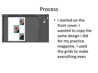
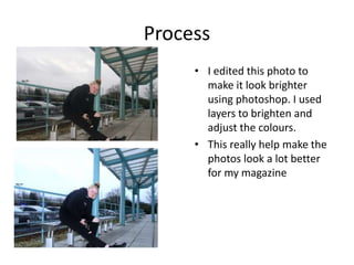
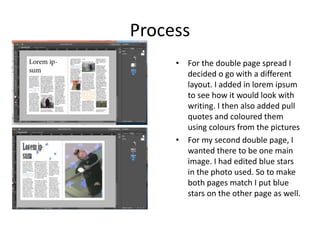
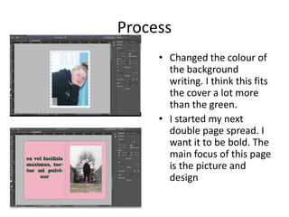
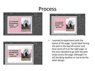
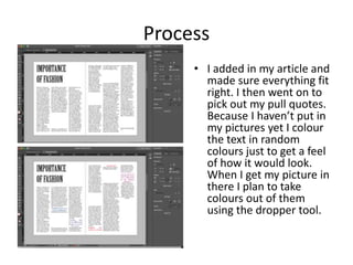
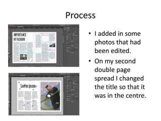
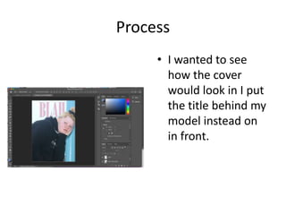
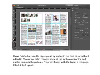
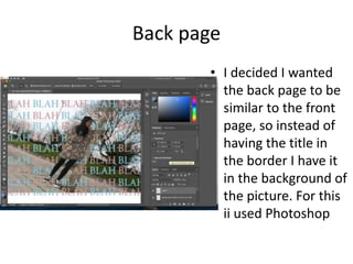
Production Reflection
Your Name
Pictures taken
Process
• I started on the
front cover. I
wanted to copy the
same design I did
for my practice
magazine. I used
the grids to make
everything even
Process
• I edited this photo to
make it look brighter
using photoshop. I used
layers to brighten and
adjust the colours.
• This really help make the
photos look a lot better
for my magazine
Process
• I tried to make the
grid design work
with my photo. I
decided to fill
some of the blank
with another photo
just to experiment
with what it would
look like.
Process
I edited some other photos in
photoshop. Basically just
doing the same thing as the
last photo, adjusting colors
and making it brighter. To
make the photos fit the style I
wanted I decided to paint on
them
I then started designing my
double page spread. I know
for sure that I want my article
layout in columns
Process
• For the double page spread I
decided o go with a different
layout. I added in lorem ipsum
to see how it would look with
writing. I then also added pull
quotes and coloured them
using colours from the pictures
• For my second double page, I
wanted there to be one main
image. I had edited blue stars
in the photo used. So to make
both pages match I put blue
stars on the other page as well.
Process
• I decided to have a
different design for
the cover.
• I added in some
repeated text in the
background for
aesthetic purposes.
• Made the image
bigger and made all
the text capitals.
Process
• Changed the colour of
the background
writing. I think this fits
the cover a lot more
than the green.
• I started my next
double page spread. I
want it to be bold. The
main focus of this page
is the picture and
design
Process
• I wanted to experiment with the
layout of this page. I quite liked having
the pink in the top left corner and
have some of it on the right page. In
the end I decided to go with the pink
stripe across the page. Although I'm
still deciding weather or not to do the
other design.
Article bibliography
• For my article I had to do some research. These are the
websites I used:
• https://www.thefashionisto.com/content/essay-fashion-
important/
• https://www.quora.com/Why-is-fashion-important-to-you
• http://www.teenink.com/opinion/all/article/511574/Why-
is-Fashion-
Importanthttp://www.teenink.com/opinion/all/article/5115
74/Why-is-Fashion-Important
• https://www.dw.com/en/how-fashion-impacts-our-mental-
wellbeing/a-50562794
• https://positivepsychologynews.com/news/emily-
vansonnenberg/2012052122126
Process
• I added in my article and
made sure everything fit
right. I then went on to
pick out my pull quotes.
Because I haven’t put in
my pictures yet I colour
the text in random
colours just to get a feel
of how it would look.
When I get my picture in
there I plan to take
colours out of them
using the dropper tool.
Process
• I added in some
photos that had
been edited.
• On my second
double page
spread I changed
the title so that it
was in the centre.
Process
• I added in a boarder
to make the cover
look bolder. Making
the title bigger
made it look bolder
and better/more like
a magazine
• On my second
double page I made
the picture bigger.
Process
• I wanted to see
how the cover
would look in I put
the title behind my
model instead on
in front.
Process
• Rather than having
the stripe of pink
across the page I
decided to switch it
to this design. I
think it fits more
with my brand.
Process
• Edited the picture in Photoshop using brightness
layers to make the photos look brighter and more
cheerful. This came in useful since the weather
outside wasn't too great and the sky looked pretty
dull
I have finished my double page spread by adding in the final pictures that I
edited in Photoshop. I also changed some of the font colours of the pull
quotes to match the pictures. I'm pretty happy with the layout o this page,
I think it looks good.
Back page
• I decided I wanted
the back page to be
similar to the front
page, so instead of
having the title in
the border I have it
in the background of
the picture. For this
ii used Photoshop
Process-back page
• After editing the
back page in
Photoshop I edited
it into In Design. I
quite liked how the
front and back page
designs and linked. I
changed the colour
of the words to
match the picture it
was on
6. production reflection

6. production reflection

  • 1.
  • 2.
  • 3.
    Process • I startedon the front cover. I wanted to copy the same design I did for my practice magazine. I used the grids to make everything even
  • 4.
    Process • I editedthis photo to make it look brighter using photoshop. I used layers to brighten and adjust the colours. • This really help make the photos look a lot better for my magazine
  • 5.
    Process • I triedto make the grid design work with my photo. I decided to fill some of the blank with another photo just to experiment with what it would look like.
  • 6.
    Process I edited someother photos in photoshop. Basically just doing the same thing as the last photo, adjusting colors and making it brighter. To make the photos fit the style I wanted I decided to paint on them I then started designing my double page spread. I know for sure that I want my article layout in columns
  • 7.
    Process • For thedouble page spread I decided o go with a different layout. I added in lorem ipsum to see how it would look with writing. I then also added pull quotes and coloured them using colours from the pictures • For my second double page, I wanted there to be one main image. I had edited blue stars in the photo used. So to make both pages match I put blue stars on the other page as well.
  • 8.
    Process • I decidedto have a different design for the cover. • I added in some repeated text in the background for aesthetic purposes. • Made the image bigger and made all the text capitals.
  • 9.
    Process • Changed thecolour of the background writing. I think this fits the cover a lot more than the green. • I started my next double page spread. I want it to be bold. The main focus of this page is the picture and design
  • 10.
    Process • I wantedto experiment with the layout of this page. I quite liked having the pink in the top left corner and have some of it on the right page. In the end I decided to go with the pink stripe across the page. Although I'm still deciding weather or not to do the other design.
  • 11.
    Article bibliography • Formy article I had to do some research. These are the websites I used: • https://www.thefashionisto.com/content/essay-fashion- important/ • https://www.quora.com/Why-is-fashion-important-to-you • http://www.teenink.com/opinion/all/article/511574/Why- is-Fashion- Importanthttp://www.teenink.com/opinion/all/article/5115 74/Why-is-Fashion-Important • https://www.dw.com/en/how-fashion-impacts-our-mental- wellbeing/a-50562794 • https://positivepsychologynews.com/news/emily- vansonnenberg/2012052122126
  • 12.
    Process • I addedin my article and made sure everything fit right. I then went on to pick out my pull quotes. Because I haven’t put in my pictures yet I colour the text in random colours just to get a feel of how it would look. When I get my picture in there I plan to take colours out of them using the dropper tool.
  • 13.
    Process • I addedin some photos that had been edited. • On my second double page spread I changed the title so that it was in the centre.
  • 14.
    Process • I addedin a boarder to make the cover look bolder. Making the title bigger made it look bolder and better/more like a magazine • On my second double page I made the picture bigger.
  • 15.
    Process • I wantedto see how the cover would look in I put the title behind my model instead on in front.
  • 16.
    Process • Rather thanhaving the stripe of pink across the page I decided to switch it to this design. I think it fits more with my brand.
  • 17.
    Process • Edited thepicture in Photoshop using brightness layers to make the photos look brighter and more cheerful. This came in useful since the weather outside wasn't too great and the sky looked pretty dull
  • 18.
    I have finishedmy double page spread by adding in the final pictures that I edited in Photoshop. I also changed some of the font colours of the pull quotes to match the pictures. I'm pretty happy with the layout o this page, I think it looks good.
  • 19.
    Back page • Idecided I wanted the back page to be similar to the front page, so instead of having the title in the border I have it in the background of the picture. For this ii used Photoshop
  • 20.
    Process-back page • Afterediting the back page in Photoshop I edited it into In Design. I quite liked how the front and back page designs and linked. I changed the colour of the words to match the picture it was on

Editor's Notes

  • #3 Discuss the tools and processes used in your production. Log your thoughts and feelings about your work.
  • #4 Discuss the tools and processes used in your production. Log your thoughts and feelings about your work.
  • #5 Discuss the tools and processes used in your production. Log your thoughts and feelings about your work.
  • #6 Discuss the tools and processes used in your production. Log your thoughts and feelings about your work.
  • #7 Discuss the tools and processes used in your production. Log your thoughts and feelings about your work.
  • #8 Discuss the tools and processes used in your production. Log your thoughts and feelings about your work.
  • #9 Discuss the tools and processes used in your production. Log your thoughts and feelings about your work.
  • #10 Discuss the tools and processes used in your production. Log your thoughts and feelings about your work.
  • #11 Discuss the tools and processes used in your production. Log your thoughts and feelings about your work.
  • #12 Discuss the tools and processes used in your production. Log your thoughts and feelings about your work.
  • #13 Discuss the tools and processes used in your production. Log your thoughts and feelings about your work.
  • #14 Discuss the tools and processes used in your production. Log your thoughts and feelings about your work.
  • #15 Discuss the tools and processes used in your production. Log your thoughts and feelings about your work.
  • #16 Discuss the tools and processes used in your production. Log your thoughts and feelings about your work.
  • #17 Discuss the tools and processes used in your production. Log your thoughts and feelings about your work.
  • #18 Discuss the tools and processes used in your production. Log your thoughts and feelings about your work.
  • #19 Discuss the tools and processes used in your production. Log your thoughts and feelings about your work.
  • #20 Discuss the tools and processes used in your production. Log your thoughts and feelings about your work.
  • #21 Discuss the tools and processes used in your production. Log your thoughts and feelings about your work.
  • #22 Discuss the tools and processes used in your production. Log your thoughts and feelings about your work.