1) The document describes the process of creating a magazine cover and double page spread over 3 days of production.
2) On day 1, the author edited photos for the cover in Photoshop, adding text over an earth-toned photo, and banners advertising the magazine contents.
3) On day 2, the author used polygon and pen tools to layout photos and text for the double page spread, experimenting with new tools.
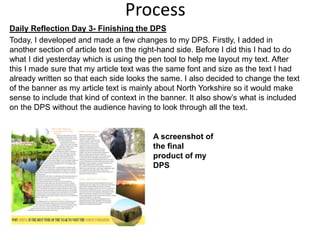
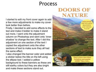
4) On day 3, the author finished the double page spread layout and made final adjustments to the cover design.