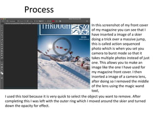
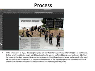
Production Reflection
Your Name
Process
To complete this logo of my
magazine and position the title of
the logo I had to use many
different tools. One tool which I
have used is the gradient tool,
this tool allowed me to fade from
a dark rich coloured blue into
brighter light coloured blue,
behind the text “THROUGH THE”,
this has given the logo more
character and made it more
interesting instead of having just
a plain blue background behind
the text.
I also used the paint tool to make the logo more interesting by adding some funky
looking straight lines. I did this by holding down shift whilst using the paint tool, I did this
because it allowed me the draw completely straight line. I then added a thin mid dark
blue boarder around this logo, this is to make it stand out to any coloured back ground I
insert.
Process
In this screenshot of my front cover
of my magazine you can see that I
have inserted a image of a skier
doing a trick over a massive jump,
this is called action sequenced
photo which is when you set you
camera to burst mode so that it
takes multiple photos instead of just
one. This allows you to make an
image like the one I have used for
my magazine front cover. I then
inserted a image of a camera lens,
after doing so I removed the middle
of the lens using the magic wand
tool,
I used this tool because it is very quick to select the object you want to remove. After
completing this I was left with the outer ring which I moved around the skier and turned
down the opacity for effect.
Process
• In this screenshot of my double page spread you can see that I have talked about
many different things to make up the four columns. For the start of each column
I have increased the starting letter to 44, instead of the normal font size which is
12. I have done this to catch the readers attention to read the articles, and to
look more at action sequenced photography.
Process
• In this screen shot of my double page spread you can see that I have used many different rulers,
doing this allowed me to position every different block of text In the correct position for the
magazine. This makes my magazine look to higher a professional standard. I organized the
paragraphs in to columns just like a real magazine would, this show my understanding of how
magazines should look and what they need to include.
Process
• In this screen shot of my A3 double spread, you can see that I have used many different tools and techniques.
On tool which I used is the magic wand tool, this aloud to use my proffered back ground and insert it behind
the image of the skate boarder. Now you can no longer tell that I have inserted a new background. I also used
text to cover up any black spaces as shown on the right side of the double page spread. I have chosen use a
font which make the name of the skateboarder look like he has signed the photo.

6. production reflection(3)

  • 1.
  • 2.
    Process To complete thislogo of my magazine and position the title of the logo I had to use many different tools. One tool which I have used is the gradient tool, this tool allowed me to fade from a dark rich coloured blue into brighter light coloured blue, behind the text “THROUGH THE”, this has given the logo more character and made it more interesting instead of having just a plain blue background behind the text. I also used the paint tool to make the logo more interesting by adding some funky looking straight lines. I did this by holding down shift whilst using the paint tool, I did this because it allowed me the draw completely straight line. I then added a thin mid dark blue boarder around this logo, this is to make it stand out to any coloured back ground I insert.
  • 3.
    Process In this screenshotof my front cover of my magazine you can see that I have inserted a image of a skier doing a trick over a massive jump, this is called action sequenced photo which is when you set you camera to burst mode so that it takes multiple photos instead of just one. This allows you to make an image like the one I have used for my magazine front cover. I then inserted a image of a camera lens, after doing so I removed the middle of the lens using the magic wand tool, I used this tool because it is very quick to select the object you want to remove. After completing this I was left with the outer ring which I moved around the skier and turned down the opacity for effect.
  • 4.
    Process • In thisscreenshot of my double page spread you can see that I have talked about many different things to make up the four columns. For the start of each column I have increased the starting letter to 44, instead of the normal font size which is 12. I have done this to catch the readers attention to read the articles, and to look more at action sequenced photography.
  • 5.
    Process • In thisscreen shot of my double page spread you can see that I have used many different rulers, doing this allowed me to position every different block of text In the correct position for the magazine. This makes my magazine look to higher a professional standard. I organized the paragraphs in to columns just like a real magazine would, this show my understanding of how magazines should look and what they need to include.
  • 6.
    Process • In thisscreen shot of my A3 double spread, you can see that I have used many different tools and techniques. On tool which I used is the magic wand tool, this aloud to use my proffered back ground and insert it behind the image of the skate boarder. Now you can no longer tell that I have inserted a new background. I also used text to cover up any black spaces as shown on the right side of the double page spread. I have chosen use a font which make the name of the skateboarder look like he has signed the photo.

Editor's Notes

  • #3 Discuss the tools and processes used in your production. Log your thoughts and feelings about your work.
  • #4 Discuss the tools and processes used in your production. Log your thoughts and feelings about your work.
  • #5 Discuss the tools and processes used in your production. Log your thoughts and feelings about your work.
  • #6 Discuss the tools and processes used in your production. Log your thoughts and feelings about your work.
  • #7 Discuss the tools and processes used in your production. Log your thoughts and feelings about your work.